保利锦江里 | 住宅设计 | 2023
项目信息
项目名称丨梦 呓
Name丨Meng Yi
项目地址丨成都 ·双流区
Location | ChengDu · ShuangLiu District
项目面积 | 95㎡
Area | 95㎡
设计主创 丨观白设计
Chief Designer丨Blank Space
施工丨观白设计施工团队
Construction丨Blank Space Construction team
本次案例是一套95㎡三居室,90后年轻屋主追求舒适温馨的生活空间,享受一个人在家独处时的幸福时光,喜欢温馨治愈的奶油法式风格,空间整体以舒适为主不需要过多繁琐的装饰。
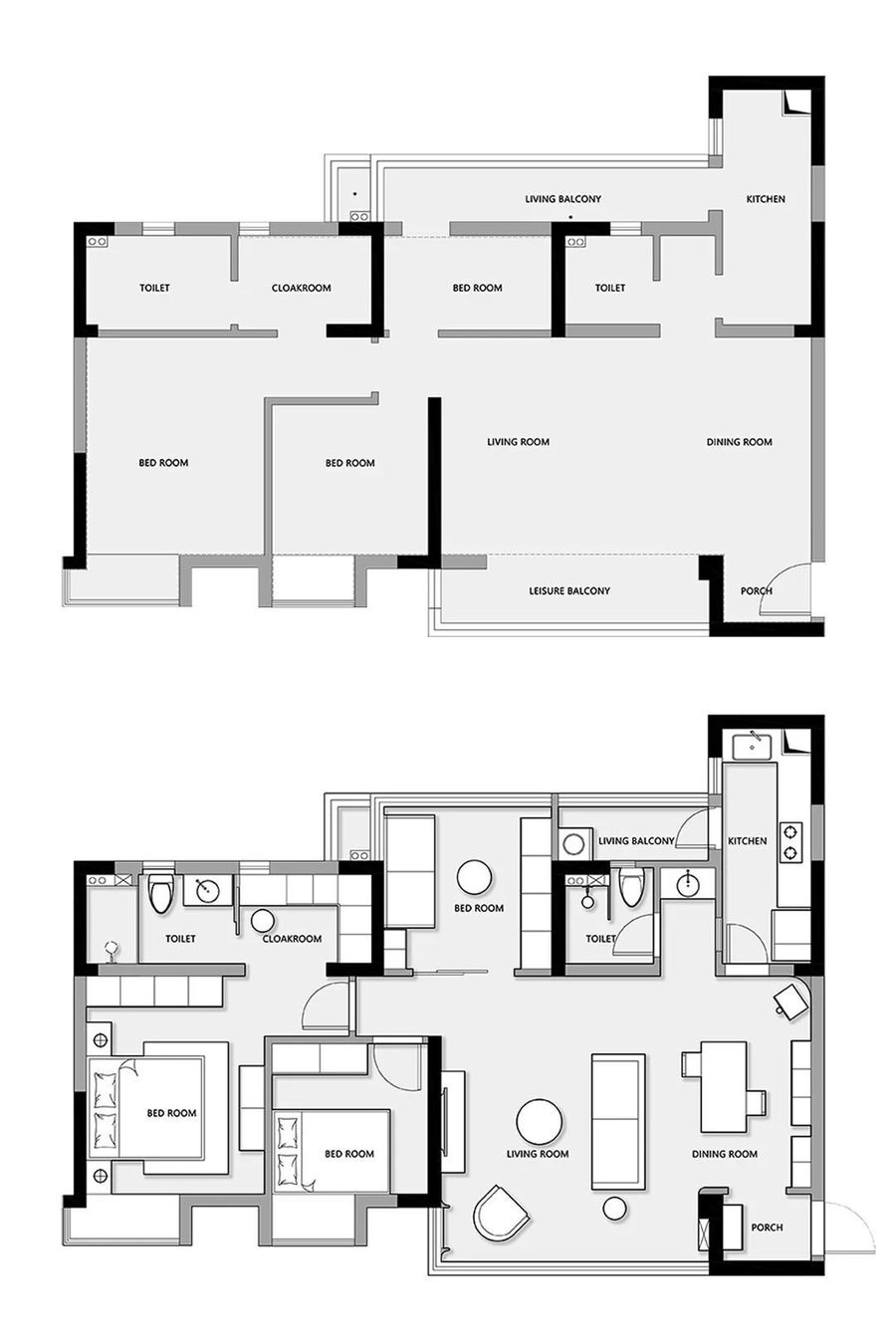
原始空间整体布局规整,但空间布局尺寸结合屋主的生活需求不够舒适,设计师在原始户型基础上结合屋主的喜好与需求重新打造属于屋主独特的生活空间。
■屋主需求:
①.需要两个卧室,主卧需要一个衣帽间和化妆区域。
②.需要一个多功能房要满足休息,收纳等多种不同功能。
③.卫生间需要干湿分离。
④.有晾晒衣物的生活习惯,需要生活阳台功能。
⑤.喜欢法式风格,空间里要有温馨治愈的氛围。
This case is a set of 95 square meters of three-bedroom, after 90 young house owners pursue comfortable and warm living space, enjoy a person at home alone happy time, like warm and cured cream French style, the whole space to comfort does not need too much cumbersome decoration.
The overall layout of the original space is regular, but the space layout size combined with the living needs of the owners is not comfortable, the designer on the basis of the original house type combined with the preferences and needs of the owners to create a unique living space belonging to the owners.
■ Landlord needs:
①.It needs two bedrooms, and the master bedroom needs a cloakroom and makeup area.
②.Need a multifunctional room to meet the rest, storage and other different functions.
③.The toilet needs to separate dry and wet.
④.Have the habit of drying clothes, need the function of living balcony.
⑤.Like French style, the space should have a warm and healing atmosphere.
■改造后:
1. 将入户大门改为外开,为换鞋区域留出空间。
2. 采用玻璃砖封闭厨房原始门洞,将新门洞位置设计在厨房与餐厅之间,动线上更加便利。
3. 将原本狭长的生活阳台一分为二,一半保留做生活阳台为洗衣晾晒留有空间,一半融入多功能室,增加多功能室空间的同时还带来充裕的自然光。
4. 将休闲阳台纳入客厅空间,拆除隔墙合并的空间让动线更流畅,视线更加开阔,采光更充裕。
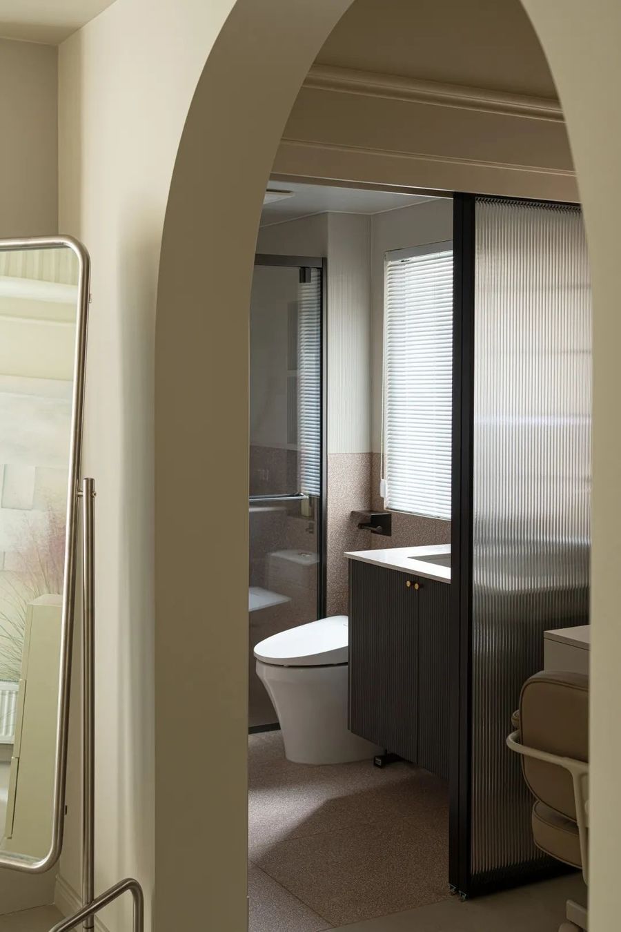
5. 将主卫与衣帽间墙体隔断拆除,改成玻璃推拉门隔断,特殊的玻璃材质区分两个空间的同时也连接着两个空间。
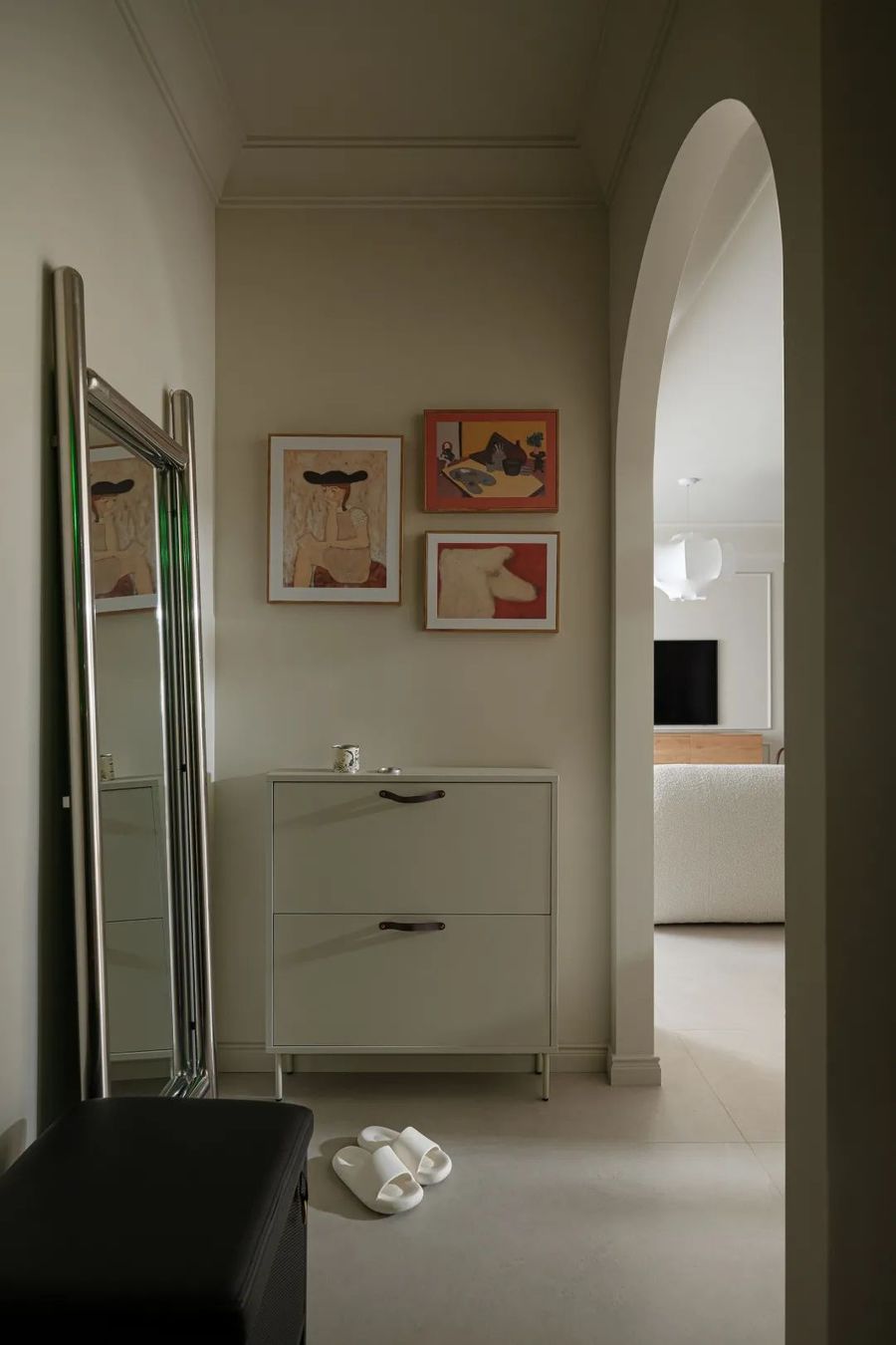
入户玄关处置入成品小柜子,满足日常小物品收纳功能;墙面采用色彩丰富的挂画为淡雅的空间带来一些俏皮感,使空间显得干净明亮。
The entrance door is disposed into the finished products small cabinet to meet the daily storage function of small items; The wall uses colorful hanging pictures to bring some playful sense to the elegant space, so that the space appears clean and bright.
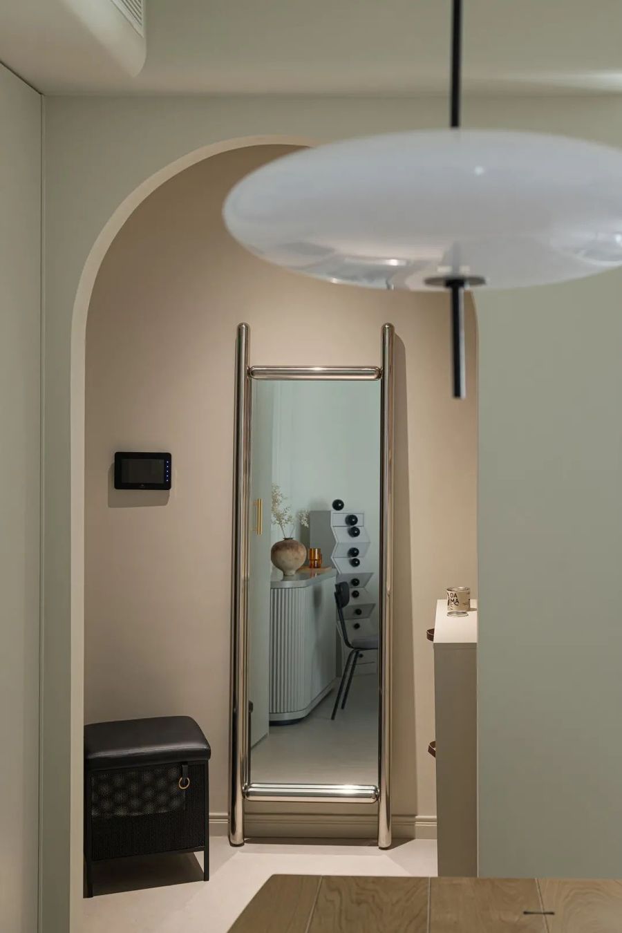
将入户大门开门方向更改为外开,为穿衣镜与换鞋凳留出空间解决出入家门时的需求。玄关进入餐厅的门洞设计成圆弧造型,圆润的弧形造型尽显线条美感。
Change the door opening direction to the outside door, leaving space for the clothes mirror and shoe stool to solve the needs of entering and leaving the door. The entrance to the restaurant is designed as an arc shape, and the rounded arc shape shows the beauty of the lines.
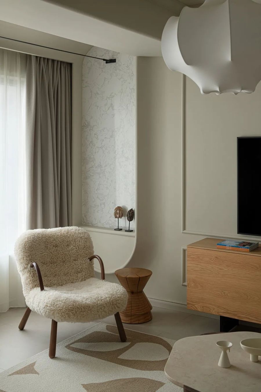
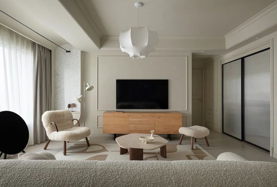
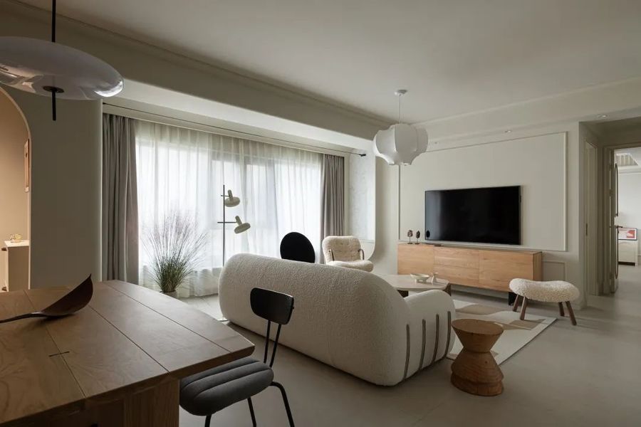
将原本的休闲阳台与客厅合成一体,为客厅区域增添舒适度。在自然光充足的情况下将侧面的窗户封上用石膏板做椭圆造型为优雅的法式带来柔和,椭圆造型中使用纹理清晰质感细腻的白色石材,给空间带来华丽优雅的气质。
The original leisure balcony and living room are integrated to add comfort to the living room area. In the case of sufficient natural light, the side Windows are sealed with gypsum board to make oval shape, which brings softness to the elegant French style. White stone with clear texture and delicate texture is used in oval shape, bringing gorgeous and elegant temperament to the space.
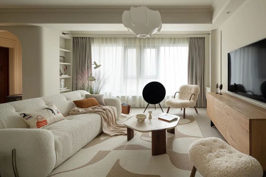
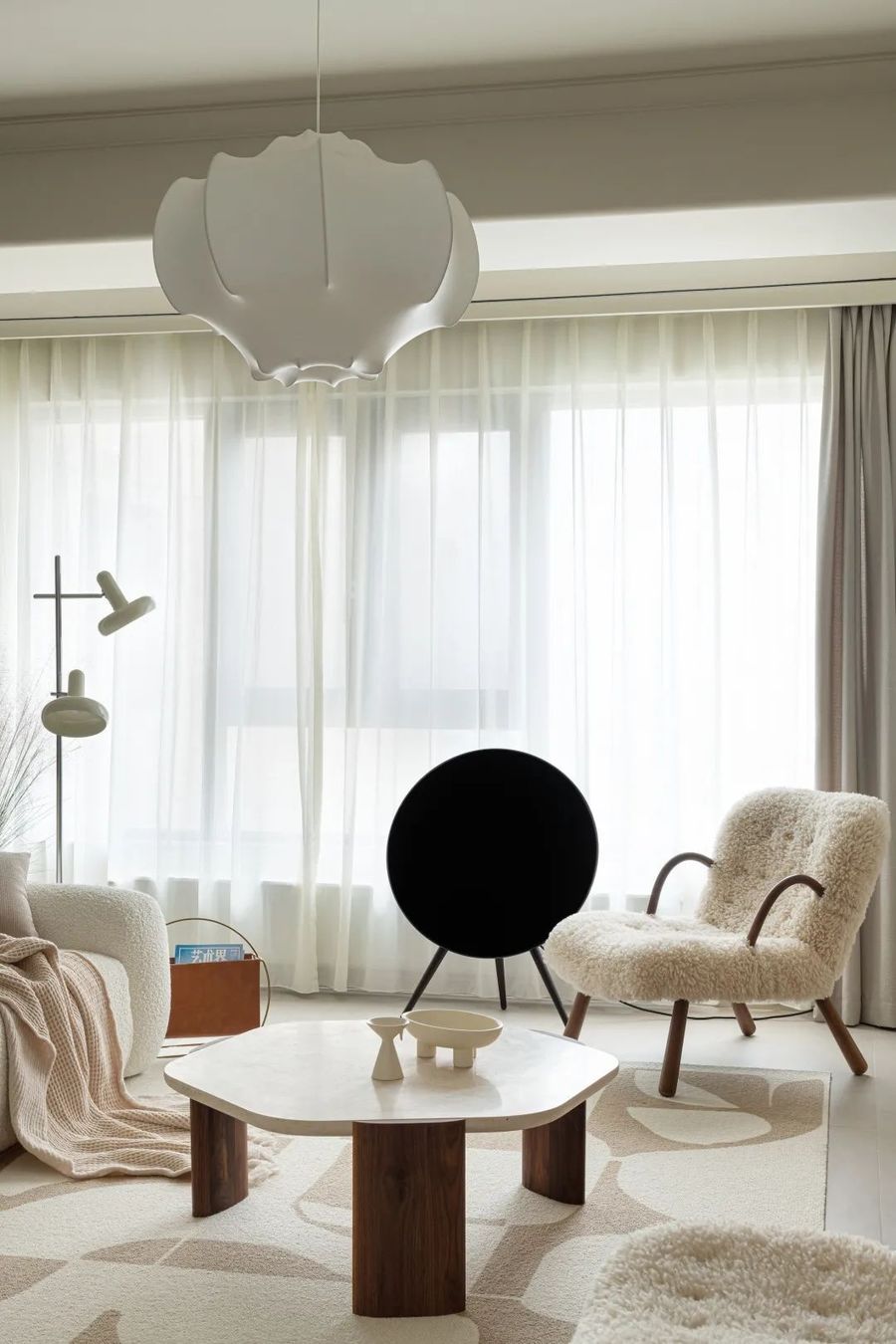
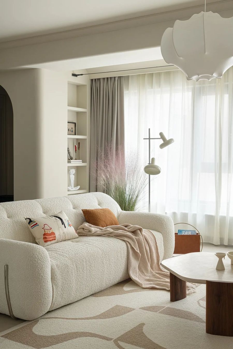
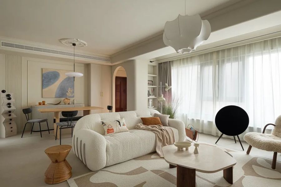
整面落地窗为空间提供了充足的自然光,阳光穿过透明纱窗洒入让光影在空间中自由穿梭。
The whole floor-to-ceiling window provides ample natural light for the space. Sunlight pours in through the transparent screen window, allowing light and shadow to move freely through the space.
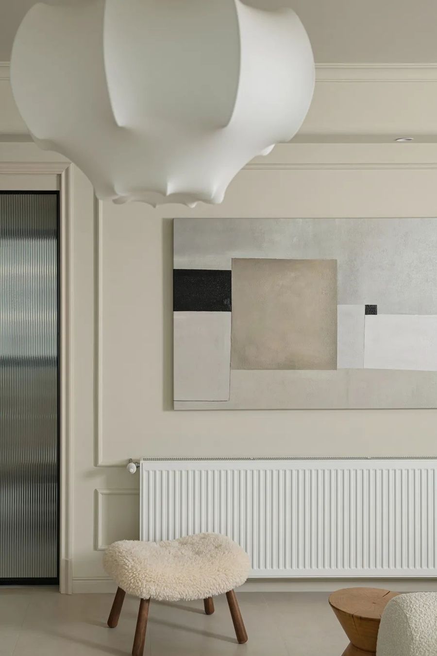
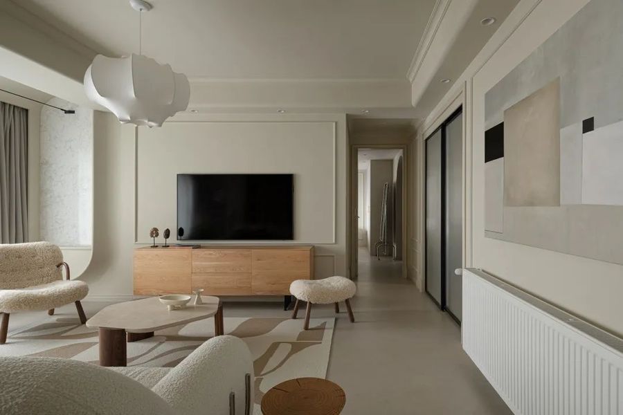
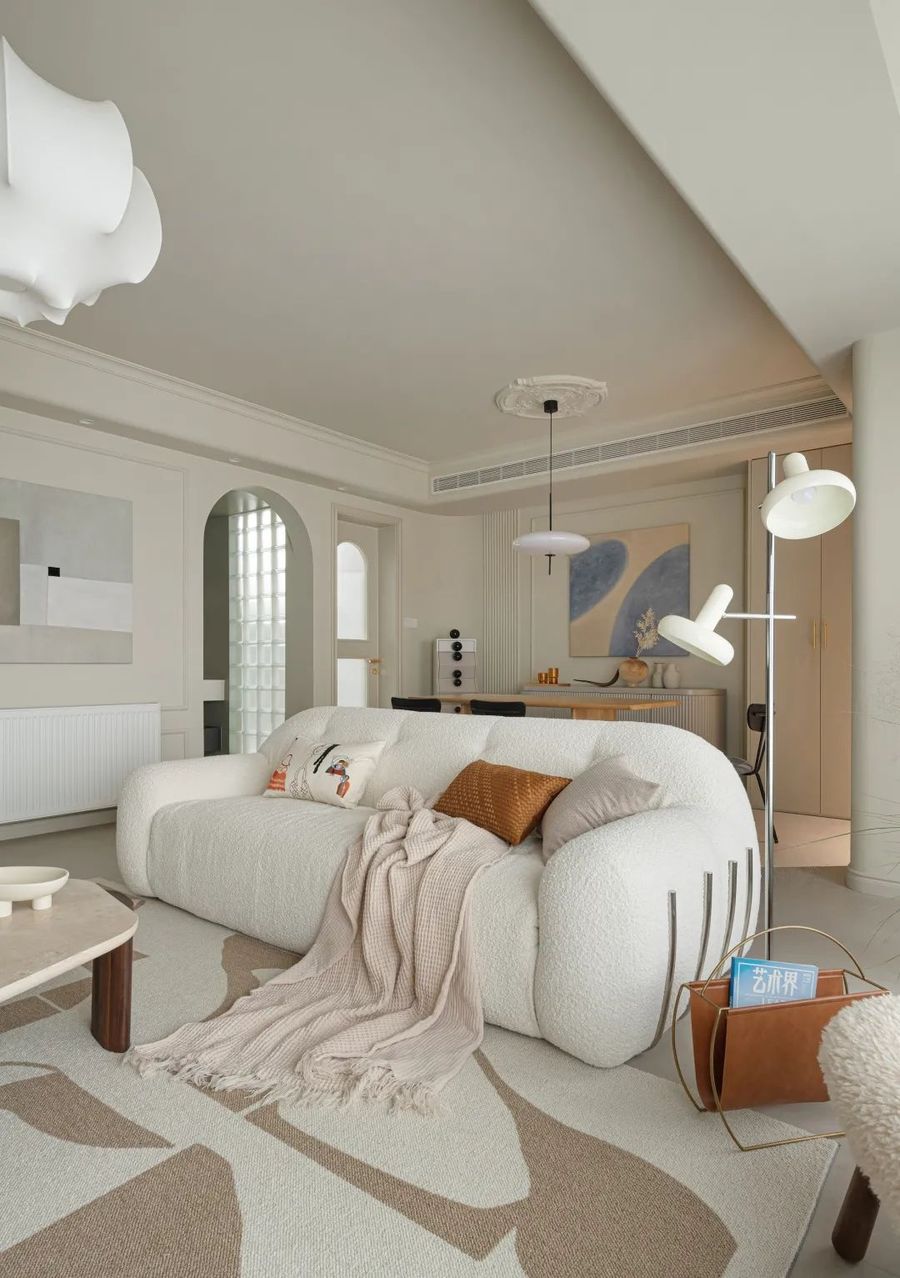
在淡雅的奶油色空间中,细腻的奶油色艺术涂料由始至终贯穿整个顶面与墙面,吊顶四周圆弧线条搭配上纯白蚕丝吊灯给空间带来梦幻感。客厅摆放了舒适的羊羔毛沙发,蓬松柔软的毛绒沙发为空间带来慵懒舒适感,相近的色调营造出空间舒雅治愈的氛围。
In the elegant cream space, the delicate cream art paint runs through the whole top and wall. The circular lines around the ceiling and the pure white silk chandelier bring a sense of dream to the space. The living room is placed with comfortable lamb hair sofa. Fluffy and soft plush sofa brings a lazy and comfortable feeling to the space. The similar tone creates a comfortable and healing atmosphere in the space.
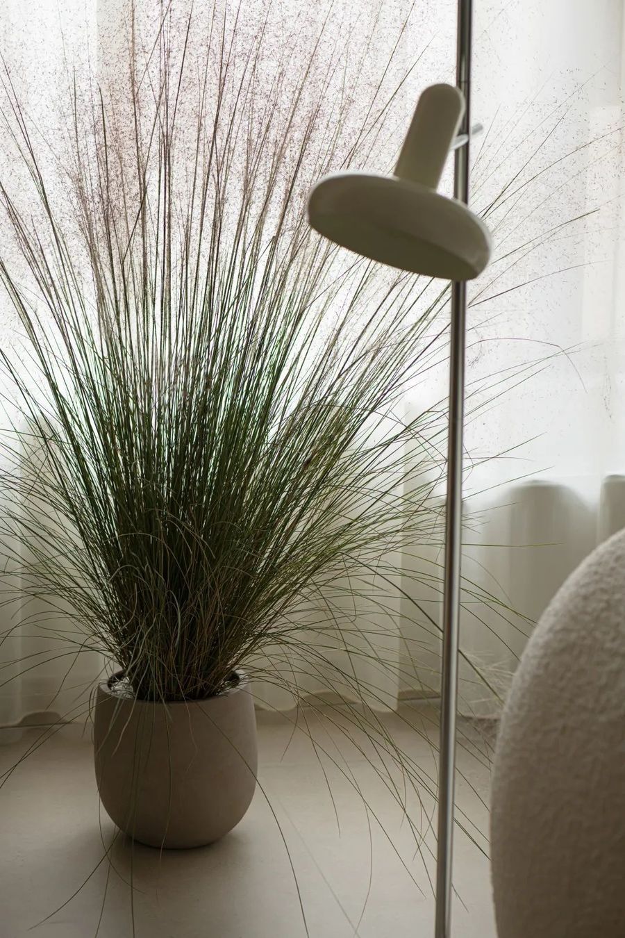
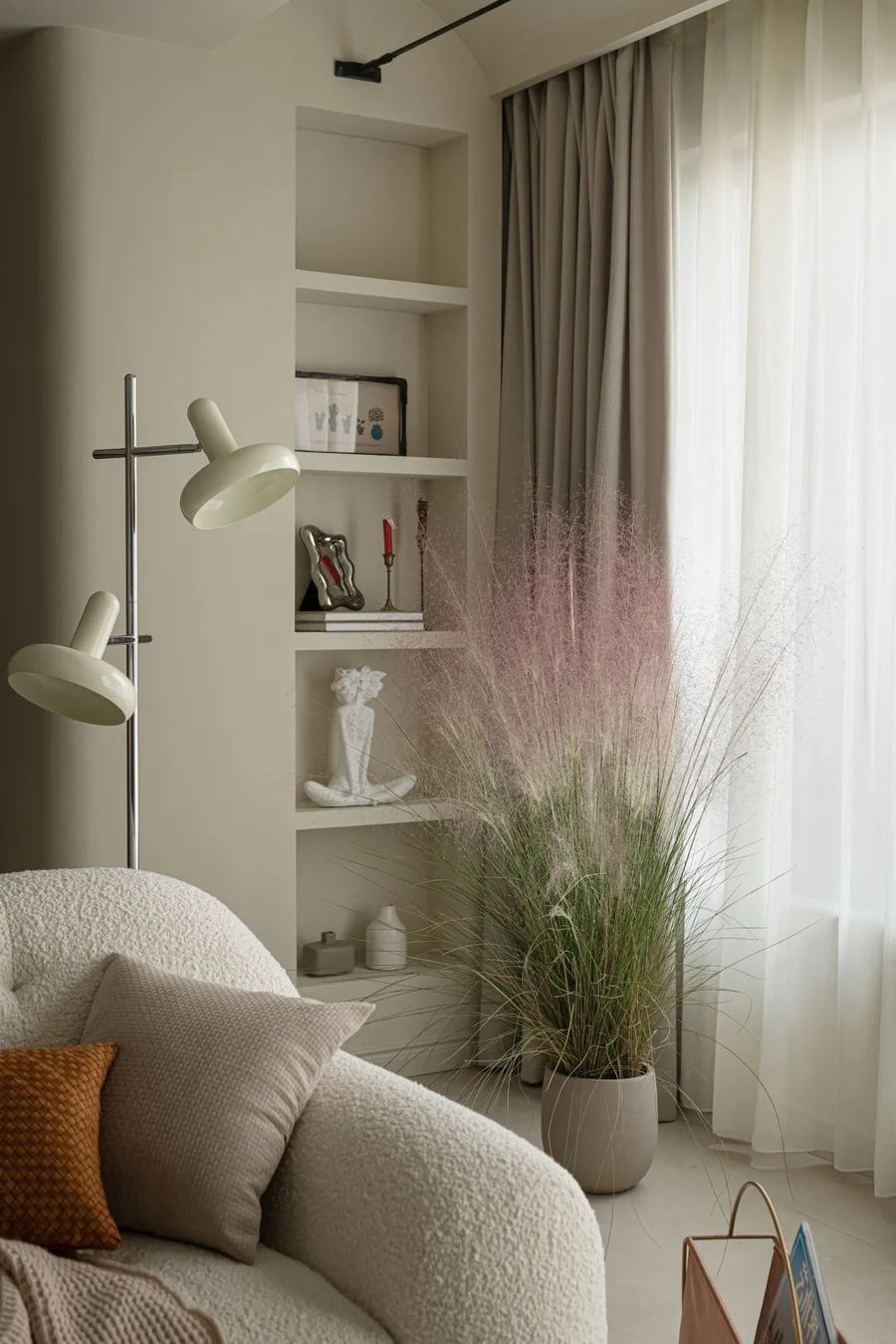
利用不可改动的承重墙体空间设计成壁龛,用来展示摆件的同时还添加空间的跳跃感,开放式的格子让空间更具立体感。配上柔美且繁荣的绿植点缀惬意的空间氛围。
The unchangeable load-bearing wall space is designed as a niche, which is used to display the ornaments while adding a sense of space jumping, and the open lattice makes the space more three-dimensional. With soft and prosperous green plants adorn the cozy space atmosphere.
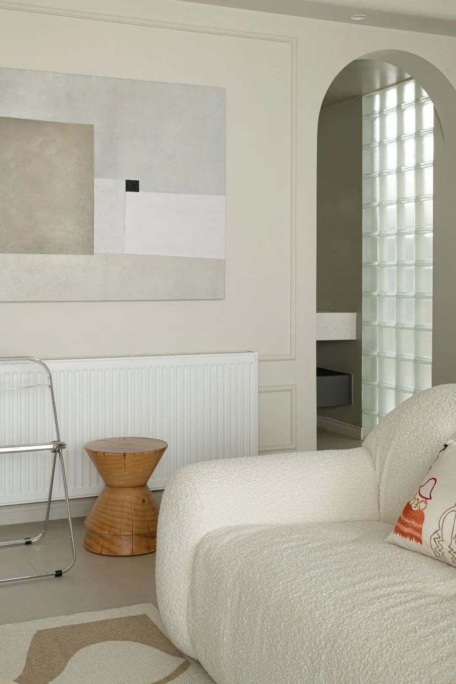
过道墙面使用优雅简约的线条跟装饰画丰富墙面造型契合全屋基调,盥洗间的门洞设计成圆弧造型,与玄关处的圆弧门洞相呼应,盥洗间与厨房之间使用玻璃砖做隔断,玻璃砖自带的纹理为空间带来了一缕特别的光影。
The corridor wall uses elegant and simple lines and rich decorative paintings to fit the tone of the whole house. The door of the bathroom is designed as an arc shape, which echoes the arc door of the porch. The glass block is used as a partition between the bathroom and the kitchen, and the texture of the glass block brings a special light and shadow to the space.
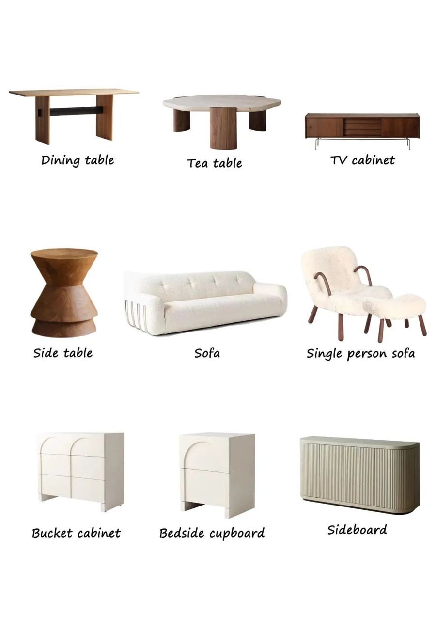
舒适乖巧的家具为空间增添了温馨与稳重。整屋大面积的奶油色系自带温柔治愈的气息,柔和流动的线条体现了空间的慵懒舒适。
Comfortable and clever furniture adds warmth and stability to the space. The cream color of the whole house is gentle and healing, and the soft flowing lines reflect the lazy comfort of the space.
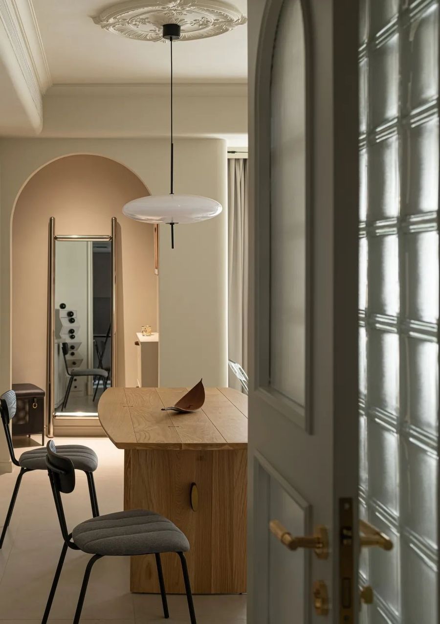
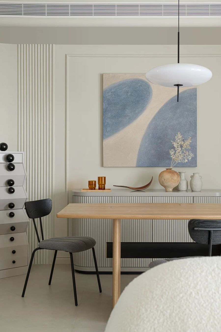
从客厅看向餐厅,一顶简约没有多余线条的吊灯点亮餐厅氛围,简约的吊灯对应上精致雕刻的花盘让顶面造型不在单一,客餐厅统一的奶油色搭配哑光地砖,和谐一致的色彩营造出空间舒雅治愈的氛围。
Looking from the living room to the dining room, a simple chandelier without redundant lines lights up the atmosphere of the dining room. The simple chandelier corresponds to the exquisite carved flower plate so that the top surface is not a single shape. The uniform cream color of the guest restaurant matches the matte floor tile, and the harmonious color creates the atmosphere of the space and the comfort and cure.
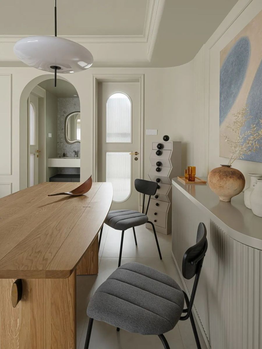
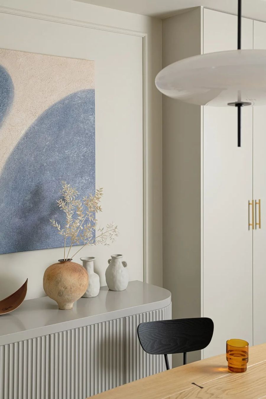
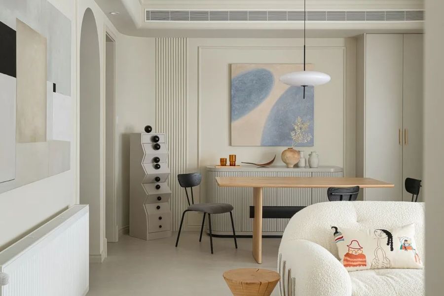
风格类型不同的餐边柜让储物更易分类,高低不一的造型划分出空间层次,家庭氛围轻松跳跃且不失自身格调。
Different style types of side cabinets make storage easier to classify, high and low do not depend on the shape of space level, family atmosphere easy to jump and do not lose their own style.
吊顶圆润的弧形与统一的奶油色调奠定客餐厅基调,靠近厨房的餐厅背景墙设计成圆弧造型,与盥洗间,玄关处的圆弧门洞相呼应,丰富空间层次。餐桌采用保留原始纹理的原木餐桌,搭配灰色餐椅两个丰富色彩为空间增加活力。
The rounded arc of the ceiling and the uniform cream tone set the tone of the guest restaurant. The background wall of the restaurant near the kitchen is designed as an arc shape, which echoes the arc door in the lavatory and entrance, enriching the space level. The dining table uses the log dining table that retains the original texture, and two rich colors of grey dining chairs add vitality to the space.
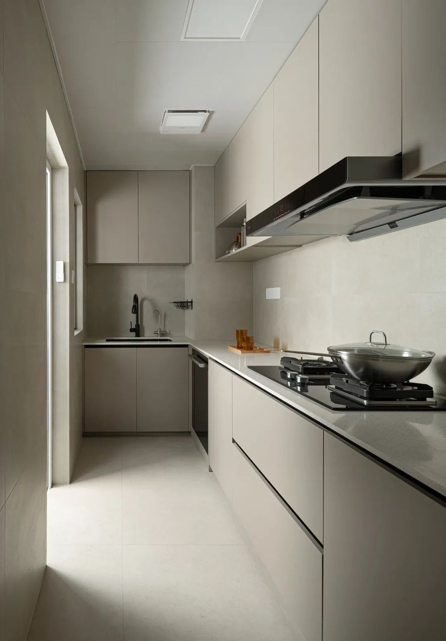
根据厨房面积设计了”L“形的操作台,满足厨房洗切炒功能,米色系的厨房搭配温柔的法式显得格外温馨,橱柜采用无拉手设计显得更有质感,空间更加整洁透亮,通往生活阳台的门窗洞为厨房带来充足的自然光。
According to the kitchen area, an "L" shaped operating platform is designed to meet the kitchen washing, cutting and frying function. The beige kitchen is particularly warm with gentle French style. The cabinets are designed without handles to make the space more textured, and the space is more neat and transparent.
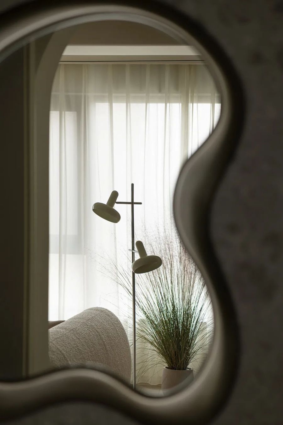
盥洗间采用不规则的银镜,圆润特有的线条造型搭配柔情温馨的奶油法式设计,两者的气质完美契合空间体现更加柔和美观。
Lavatory using irregular silver mirror, rounded unique line modeling with soft and warm cream French design, the temperament of the two perfectly fit the space reflects more soft and beautiful.
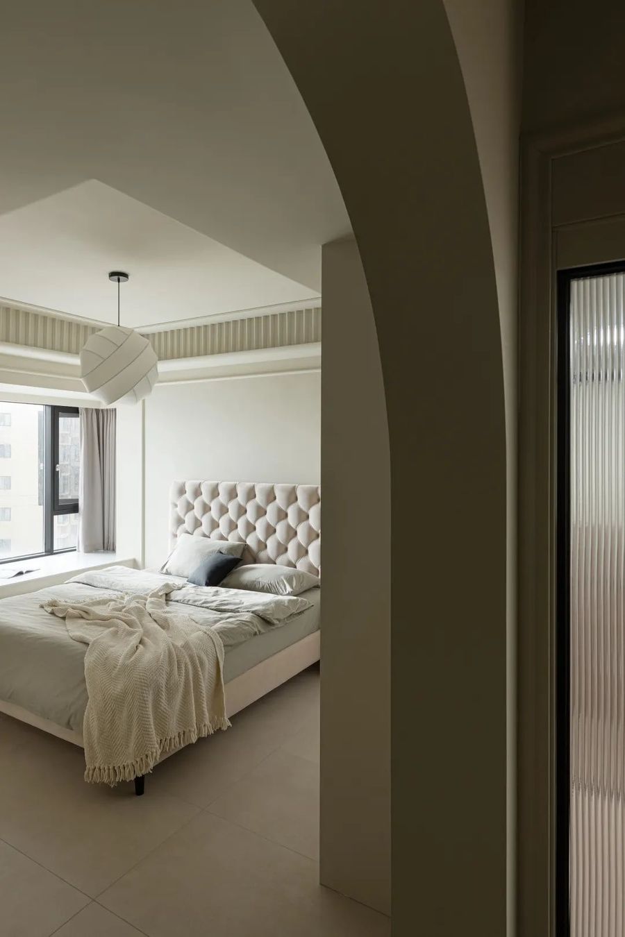
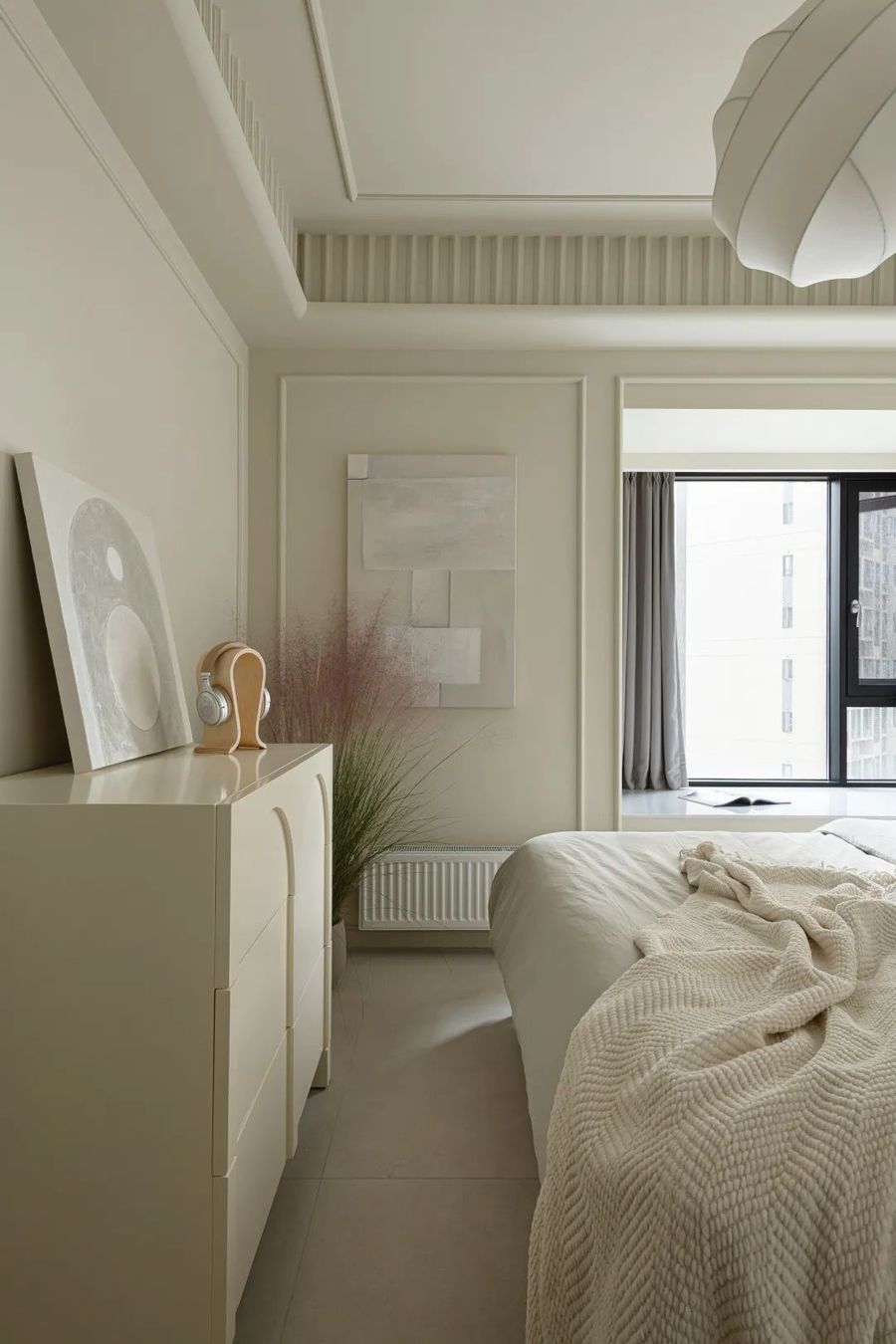
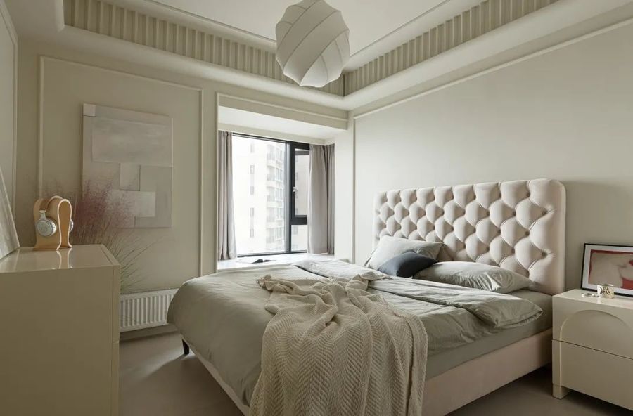
主卧简雅舒适,延续公区基础奶油色调,空间统一通铺的浅色地砖清爽高级。采用拥有艺术氛围的蚕丝吊灯点缀空间,纯洁无瑕的蚕丝吊灯夜晚开灯时,暖暖的灯光照射出蚕丝纹理,使空间颇有韵味。
The master bedroom is simple and comfortable, continuing the basic cream tone of the common area, and the light-colored floor tile of the unified space is fresh and advanced. The silk chandelier with artistic atmosphere is used to decorate the space. When the pure and flawless silk chandelier turns on the light at night, the warm light shines out the silk texture, making the space quite appealing.
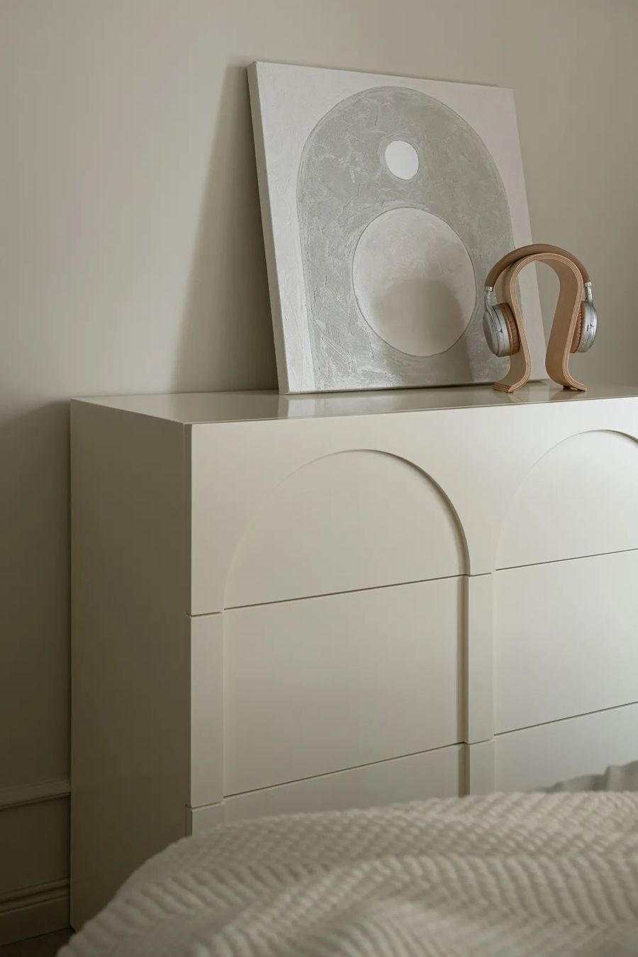
墙面采用简单利落的法式线条饰面,简约的线条增加了卧室的仪式感,床尾选择与空间色调统一的奶油色系成品斗柜,斗柜不同的材质为空间带来别样的质感。
The wall is decorated with simple and neat French lines, and the simple lines increase the sense of ceremony in the bedroom. The end of the bed chooses the cream color system of finished bucket cabinet with the same hue as the space. The different materials of bucket cabinet bring different texture to the space.
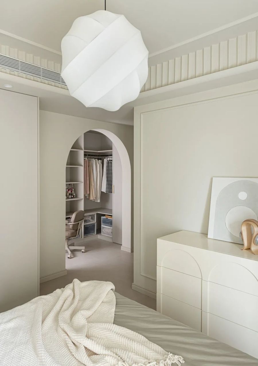
圆弧形的门洞衔接着主卧与衣帽间,步入式衣帽间设计让空间更加开阔通透,无柜门设计使柜子更轻盈让收纳更方便快捷。
The circular doorway connects the master bedroom with the cloakroom. The design of the walk-in cloakroom makes the space more open and transparent. The design of the non-cabinet door makes the cabinets more light and convenient for storage.
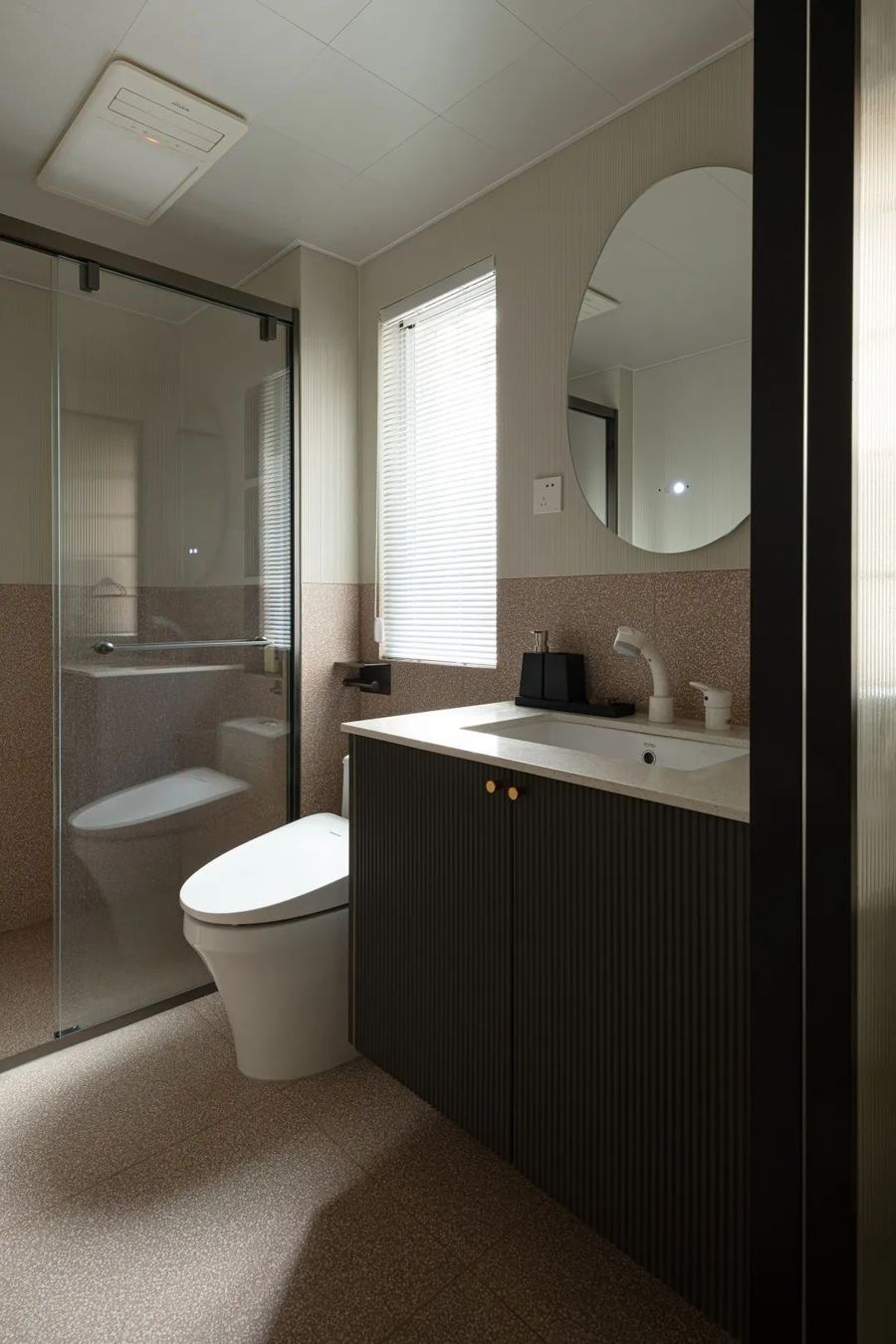
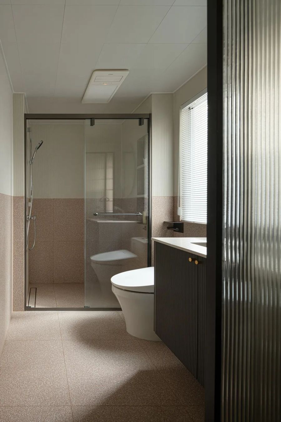
主卫生间采用两种低饱和的砖拼接,为空间增添一些复古自然的氛围;搭配上圆形的梳洗镜子和黑色浴室柜提升空间的法式复古的氛围感。
The main bathroom uses two low saturation brick splicing to add some retro natural atmosphere to the space; Paired with round grooming mirrors and black bathroom cabinets, the space has a retro French ambience.
卫生间沿用主卫的色调,整体氛围搭配十分和谐,上墙部分采用米色竖纹砖搭配下墙连接地面的红色波点花砖,自带纹理与花纹的砖丰富了空间层次。采用透明玻璃推拉门分隔干湿区域,保持通透感的同时又不影响空间的采光。
The bathroom follows the hue of the main bathroom, and the overall atmosphere is very harmonious. The upper wall part uses beige vertical grain brick with the lower wall connected to the ground red wave dot tile, which brings its own texture and pattern brick to enrich the space level. Transparent glass sliding doors are used to separate wet and dry areas to keep the sense of transparency without affecting the lighting of the space.








评论(0)