自然,有自然的和非自然的形式,自然也有类自然的形式,不同形式的混合,呈现出了一种真实存在的或虚构的、模拟的、含糊不清的有机立体,形态各异又十分确切,进而被身体所感知、被语言所描述、被认知所定义。
Nature has natural and unnatural forms, naturally it also has forms similar to nature. The mixing of different forms presents a real or fictional, simulated and ambiguous organic three-dimensional, with different and very accurate forms, which are then perceived by the body, described by words and defined by cognition.
把广义自然的宏观进行拆解,引向生活的日常细微,构成内心深处平和的、自我修正的自然状态,成为空间积极探索的意义。“自然是上帝的艺术”,也是场所和品牌成长、发展、进化的艺术。
The macro of nature in a broad sense is disassembled, leading to the daily nuances of life, forming a peaceful and self correcting natural state deep in the heart, which has become the significance of active exploration of space. "Nature is the art of God" is also the art of the growth, development and evolution of places and brands.
临街界面
Frontage Interface
━
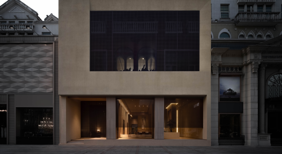
并排而立的临街欧式建筑里,作为“自然生活方式”的倡导者,光益地板体验店迎来了新的蜕变。与周围装饰主义的繁复样式相对照,简洁有力的现代建筑外立面成为不言而喻的显性品牌店招。
In the European style buildings facing the street side by side, as the advocate of "natural lifestyle", KUANGYI flooring experience store has ushered in a new transformation. In contrast to the complicated styles of the surrounding decorationism, the simple and powerful facade of modern buildings has become an obvious brand store move.
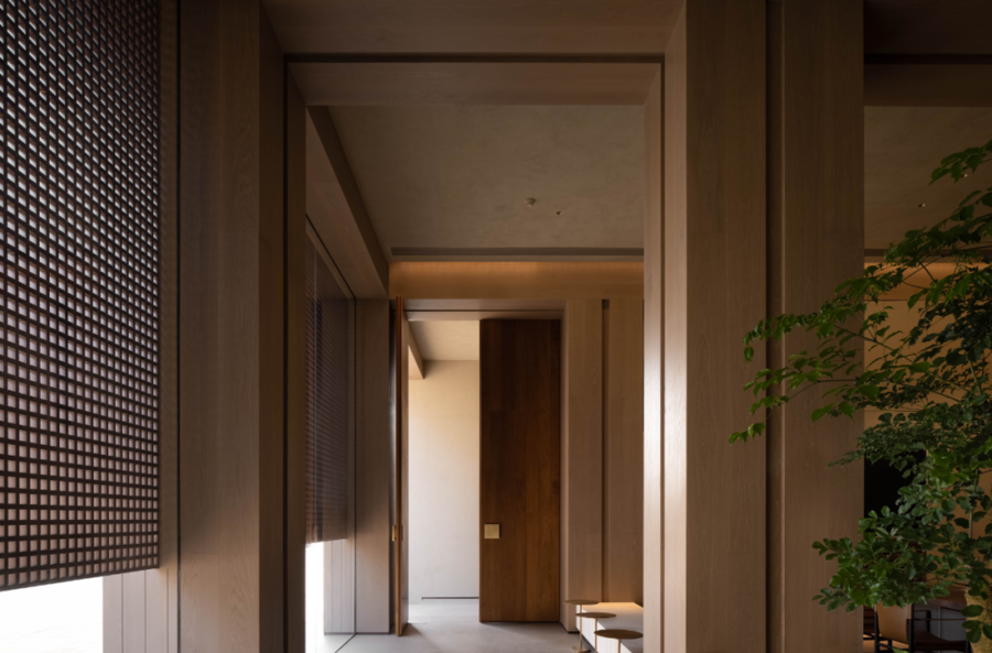
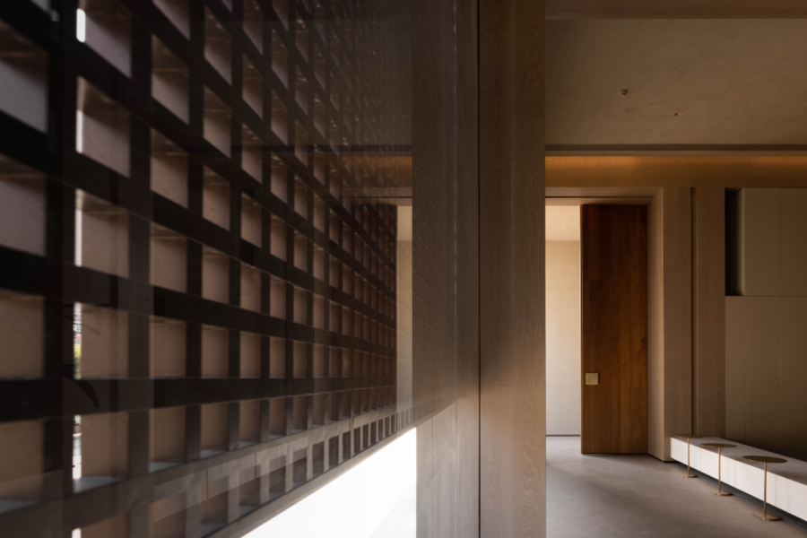
门头以三层结构的比例约束了建筑的体量,上部几何斜角开口回应了二层、三层的实际采光问题;下部独立出柱网,以木作格栅相连。基于外立面视觉整体性,格栅的隐约形成了虚实尺度的对比,含蓄朦胧之中,功能的本质建构流露出东方的自然美学。
The door head constrains the volume of the building in the proportion of the three-story structure, and the upper geometric bevel opening responds to the actual lighting problems of the second and third floors; The lower part is separated from the column grid and connected with a wooden grid. Based on the visual integrity of the facade, the grid vaguely forms a contrast between the virtual and the real scales. In the obscurity, the essential construction of the function reveals the Oriental natural aesthetics.
有异传统空间中关于依次排布的等级秩序和中心轴对称的布局,入口由一侧而入。外立面非对称的均衡感使空间室内外有效流动,吸引顾客拾级而上,转身、然后立定,推门而进,建立节奏有趣的情绪变化。
Different from the hierarchical order and central axisymmetric layout in the traditional space, the entrance enters from one side. The asymmetrical sense of balance on the facade makes the space flow effectively indoors and outdoors, attracting customers to step up, turn around, then stand, push the door and enter, and establish rhythmic and interesting emotional changes.
自然寓意
Natural Implication
━
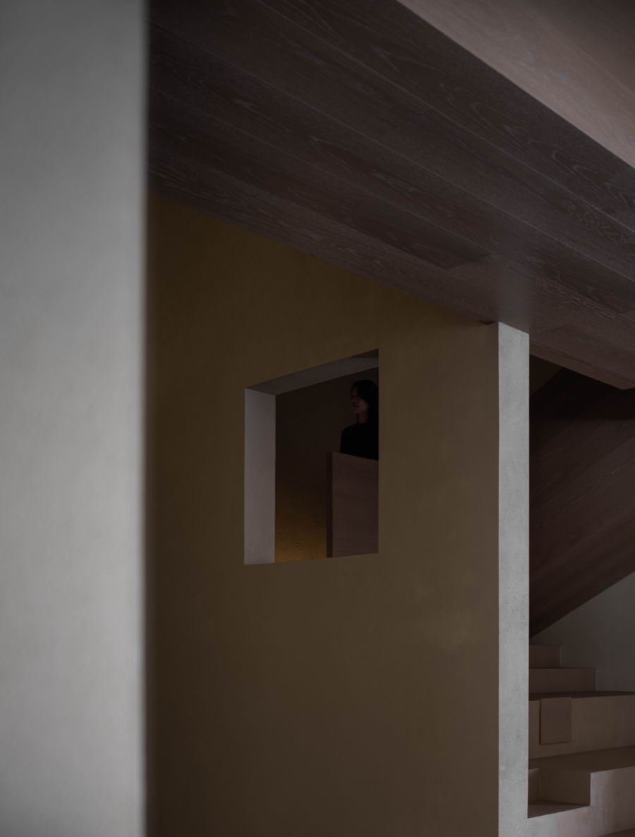
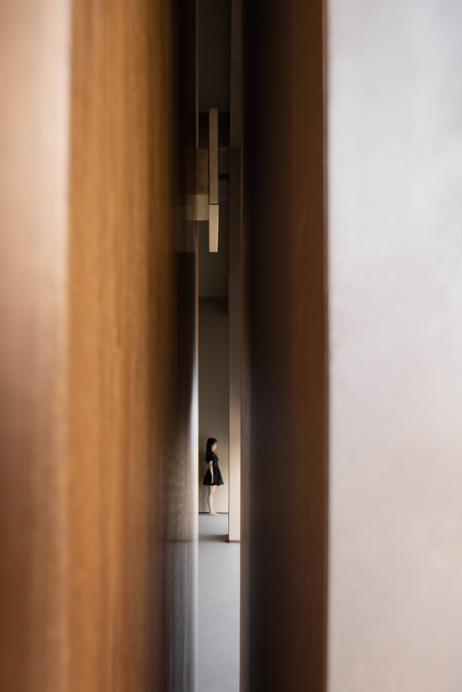
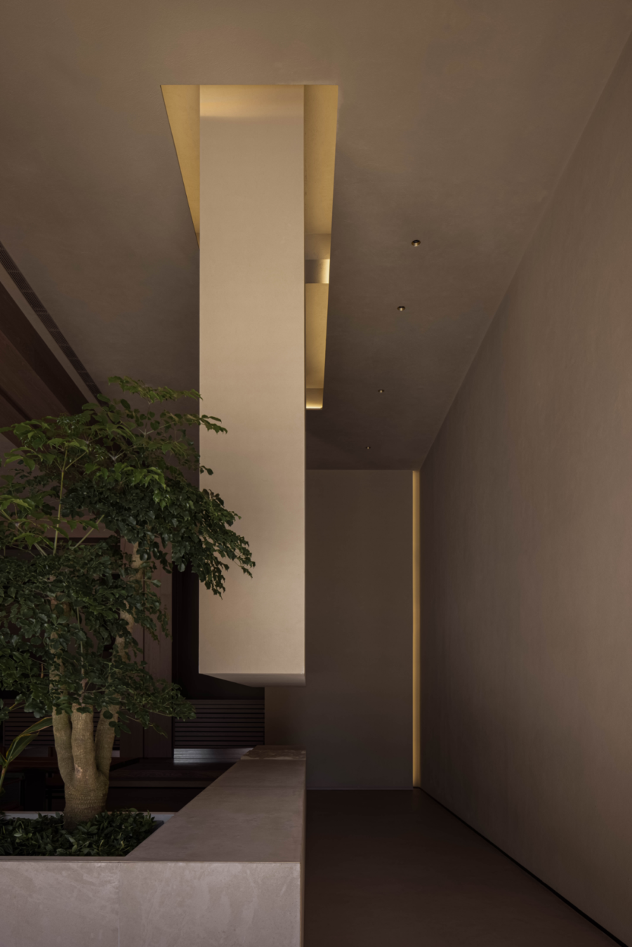
“走廊的出现本来旨在促进交流,却也削减了人和人的接触。这其中真正的意图是要促进有目的和必要的交流,而同时减少偶然性的交流。”罗宾·埃文斯在《人物、门和通道》里提出“走廊”的思考。而门廊折返回复的路径设计,除了引导顾客循序渐进,也增加灰空间即时的互动。
"The corridor was originally designed to promote communication, but it also reduced human contact. The real intention is to promote purposeful and necessary communication, while reducing accidental communication." Robin Evans put forward the thinking of "corridor" in 'Figures, Doors and Passages'. The path design of the vestibule turn back reply not only guides customers to step by step, but also increases the real-time interaction of the gray space.
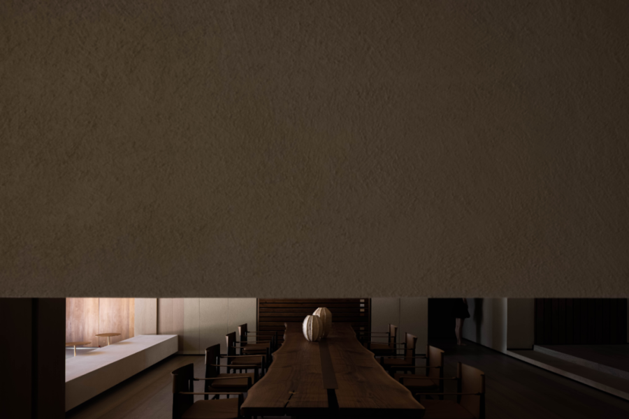
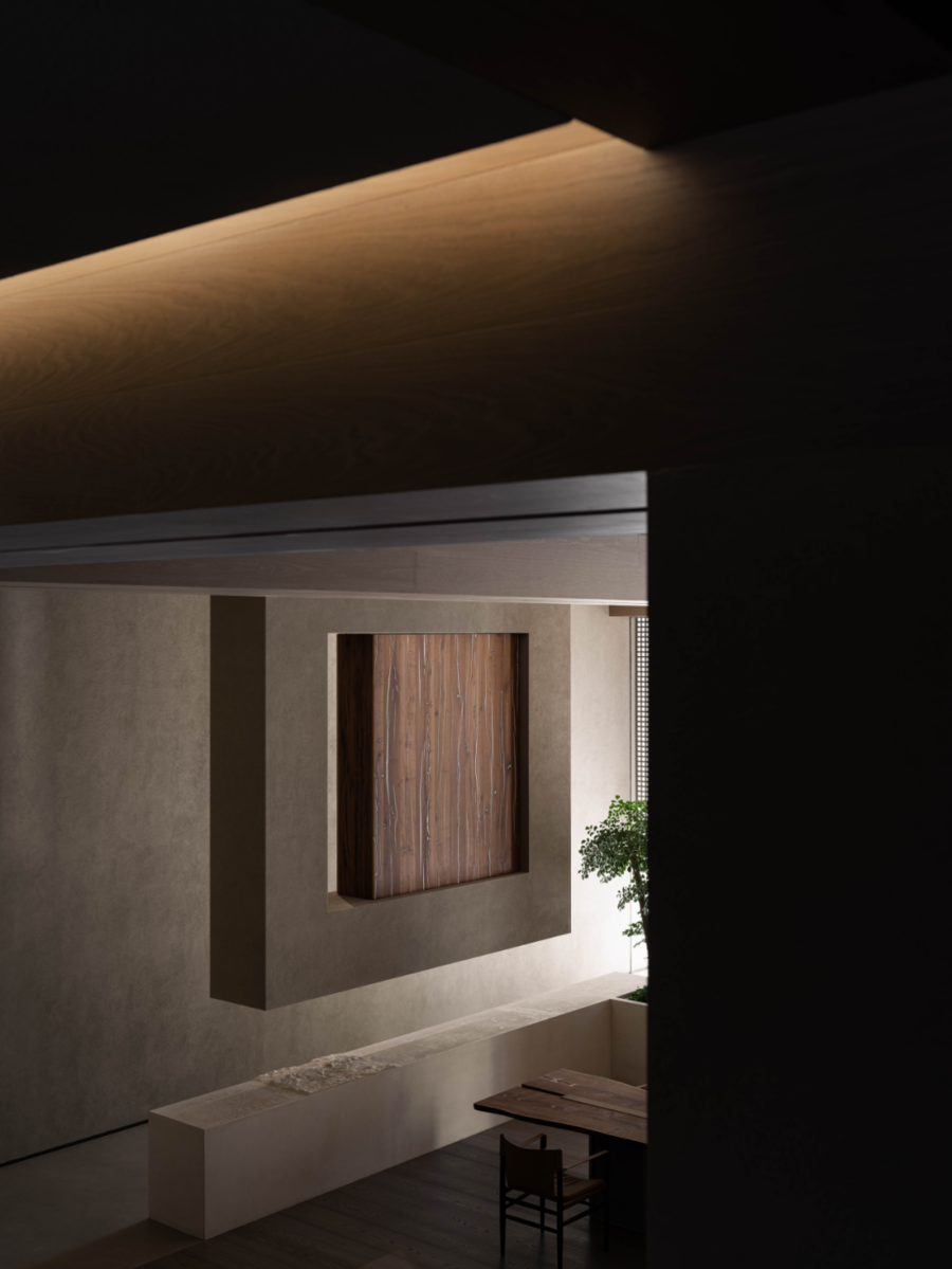
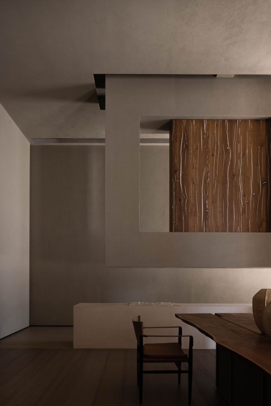
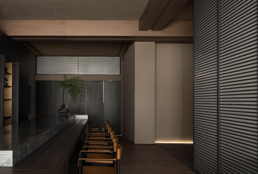
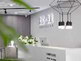
由小及大,接洽区借助长桌与立面悬吊的展示柜构成轴线的关系,从走廊延续而来的及膝台面,自哑面平滑过渡到涟漪的石材水面,其间穿插以盆栽绿植和进口原木面材的展示,连续性和自然寓意给空间注入新鲜活力。
From small to large, the contact area forms an axis relationship with the long table and the display cabinet suspended on the facade. The knee high table from the corridor smoothly transits from the dumb surface to the rippling stone water surface, interspersed with the display of potted green plants and imported log surface materials. Continuity and natural meaning inject fresh vitality into the space.
观看之道
Way Of Seeing
━
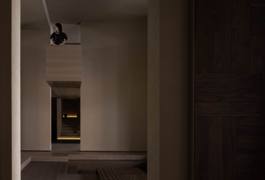
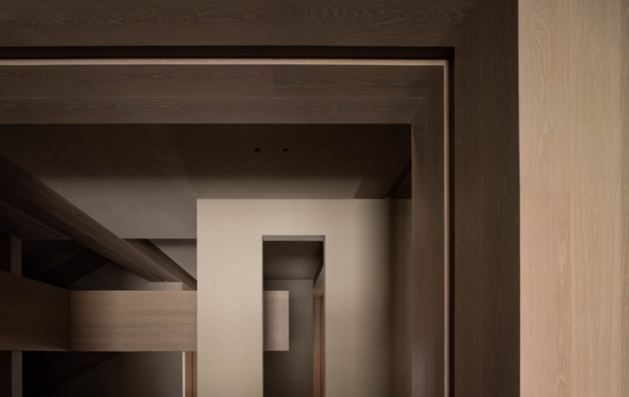
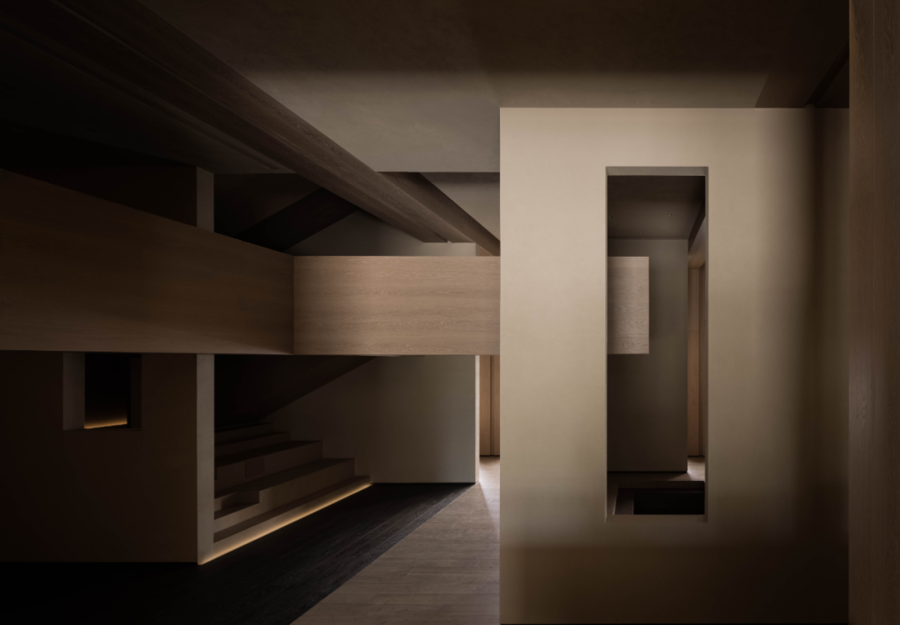
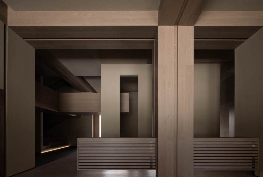
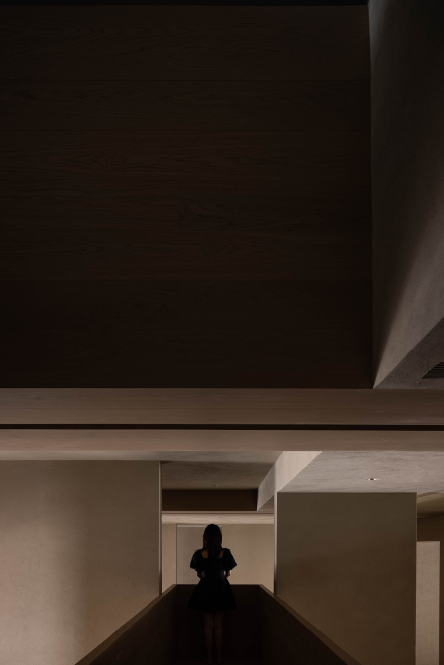
“观看先于言语。”约翰·伯格论述视觉的优先性,强调“正是观看确立了我们在周围世界的地位;我们用语言解释这个世界,可是语言并不能掩盖我们处于该世界包围之中这一事实。”当完全解构的“混沌空间”被重新有序建立,身处其境,可见的纵横交错、大小开口、粗粝与细腻,展现有限空间的丰富趣味性。
"Look before words." John Berg discusses the priority of vision, emphasizing that "it is viewing that establishes our position in the world around us; we use language to explain the world, but language can not cover up the fact that we are surrounded by the world." When the completely deconstructed "chaos space" is re established in an orderly manner, the crisscross, large and small openings, coarseness and delicacy can be seen in its environment, showing the rich interest of the limited space.
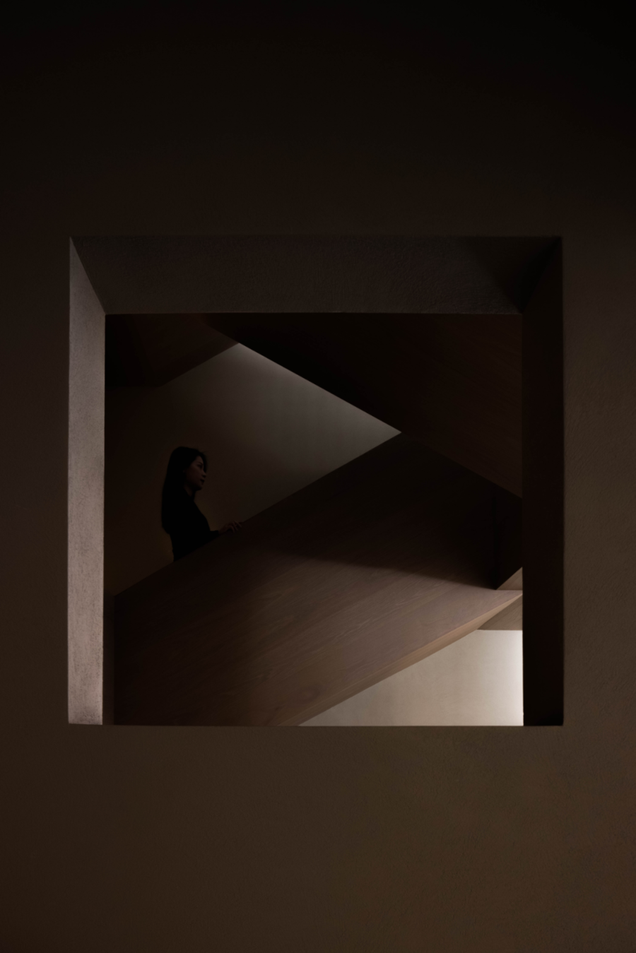
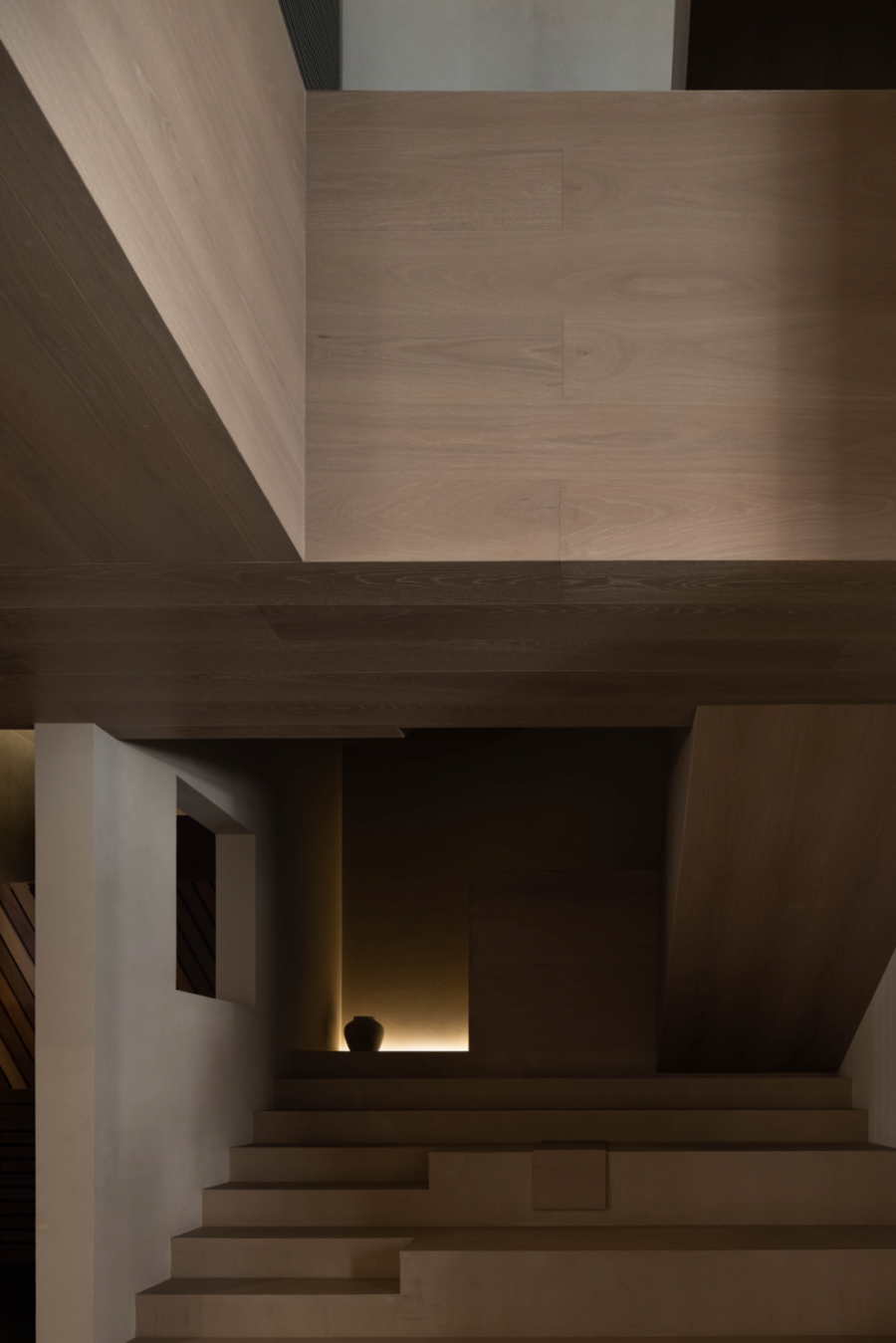
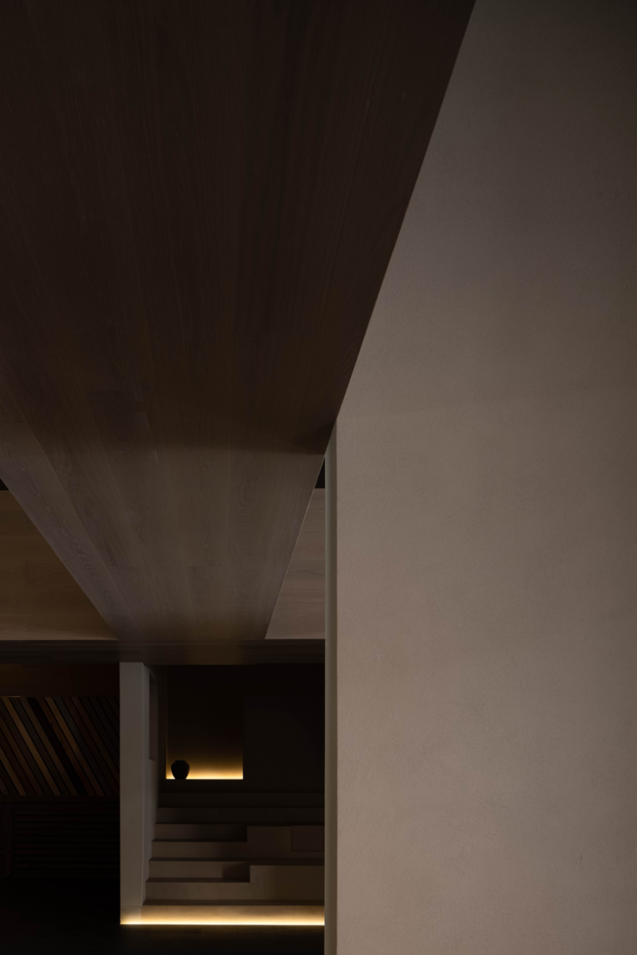
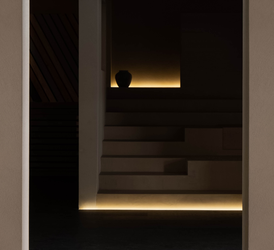
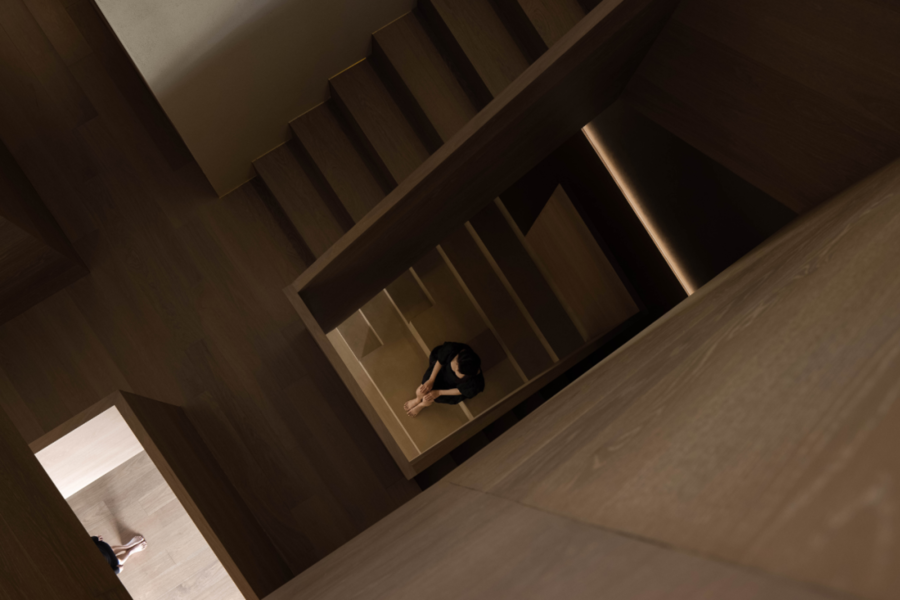
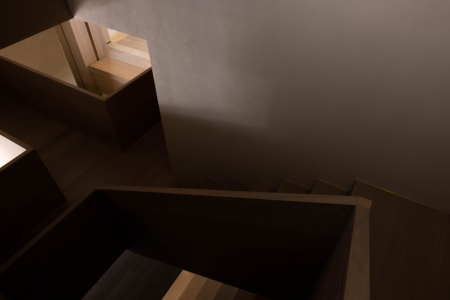
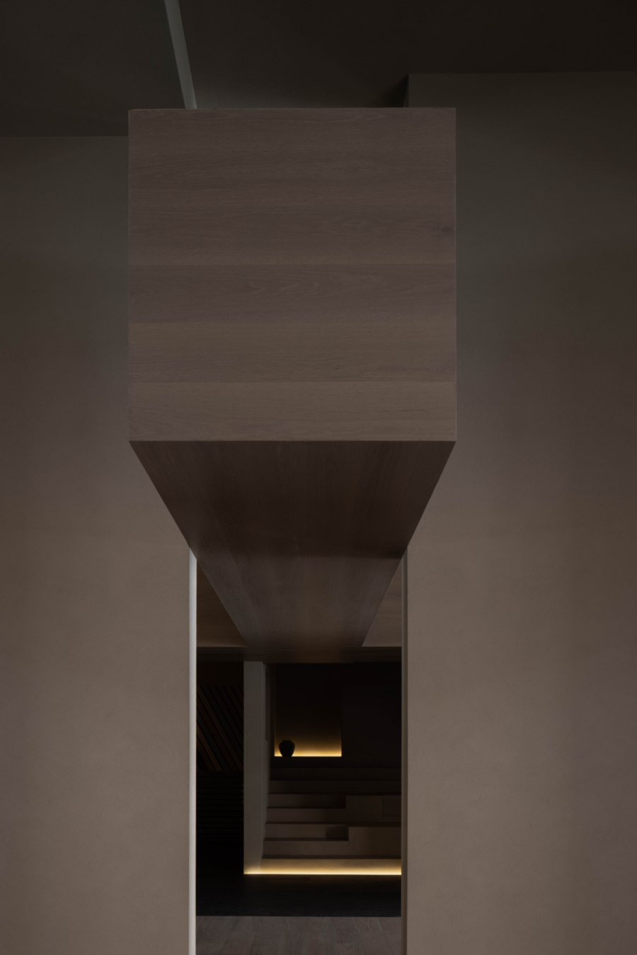
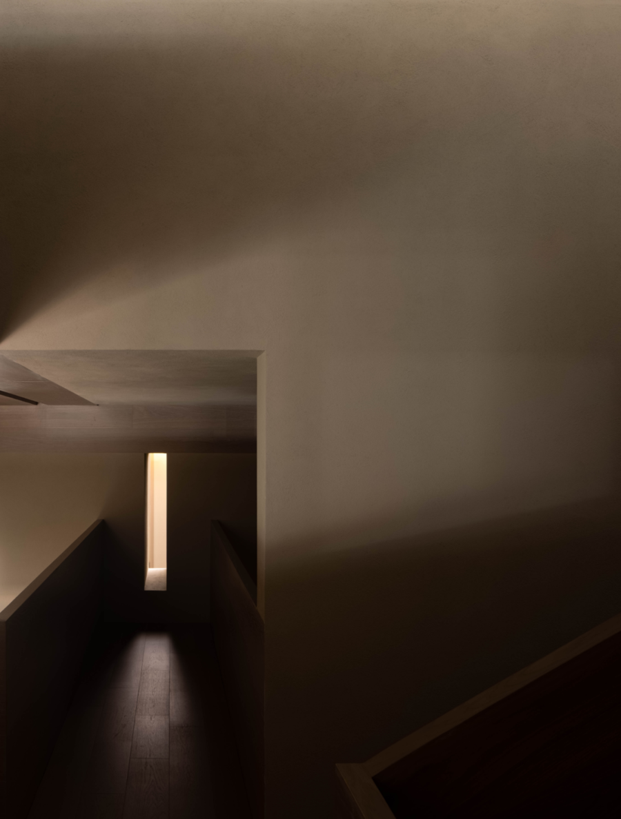
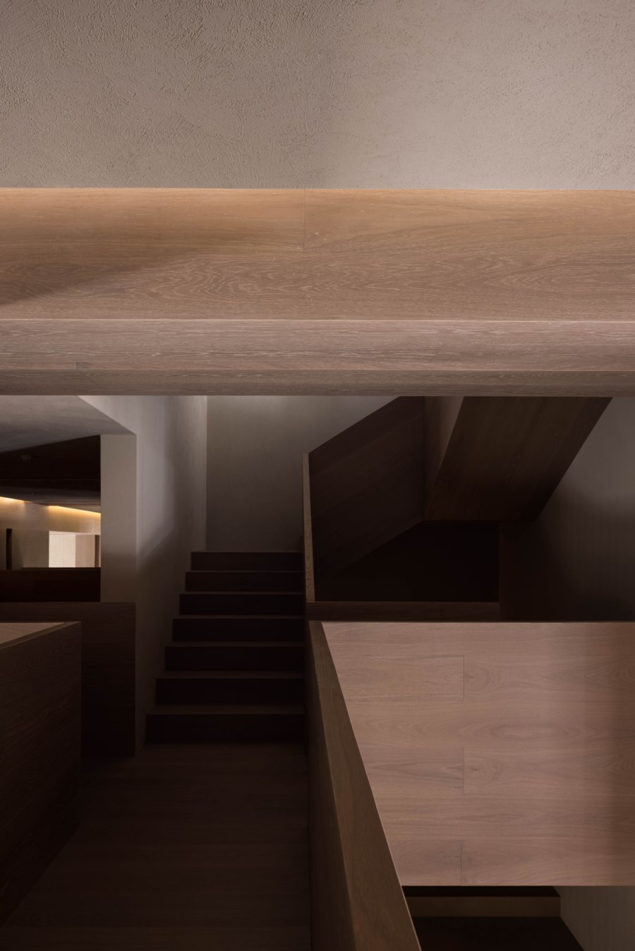
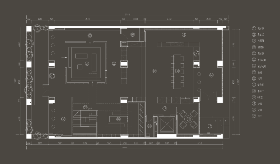
对于裸露的梁柱结构、功能楼梯,从里到外,原木薄板的木地板以饰面材料本身同时又作为展品被展示的特性贯穿着整体空间。原建筑5m的层高,正常配置两跑楼梯,来回转折过于局促,于是介于二者之间的、起到缓冲的眺望平台应运而生。
For the exposed beam column structure and functional stairs, from the inside to the outside, the wood floor of the log sheet runs through the whole space with the characteristics of the decorative material itself and being displayed as an exhibit. The original building is 5m high, and the two running stairs normally configured are too cramped to turn back and forth, so a buffer viewing platform between the two came into being.
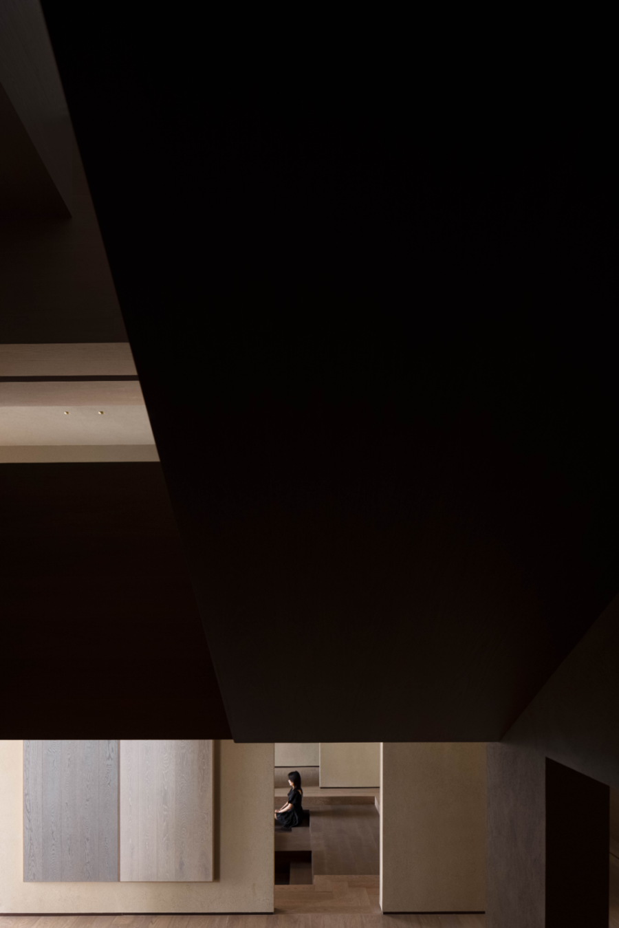
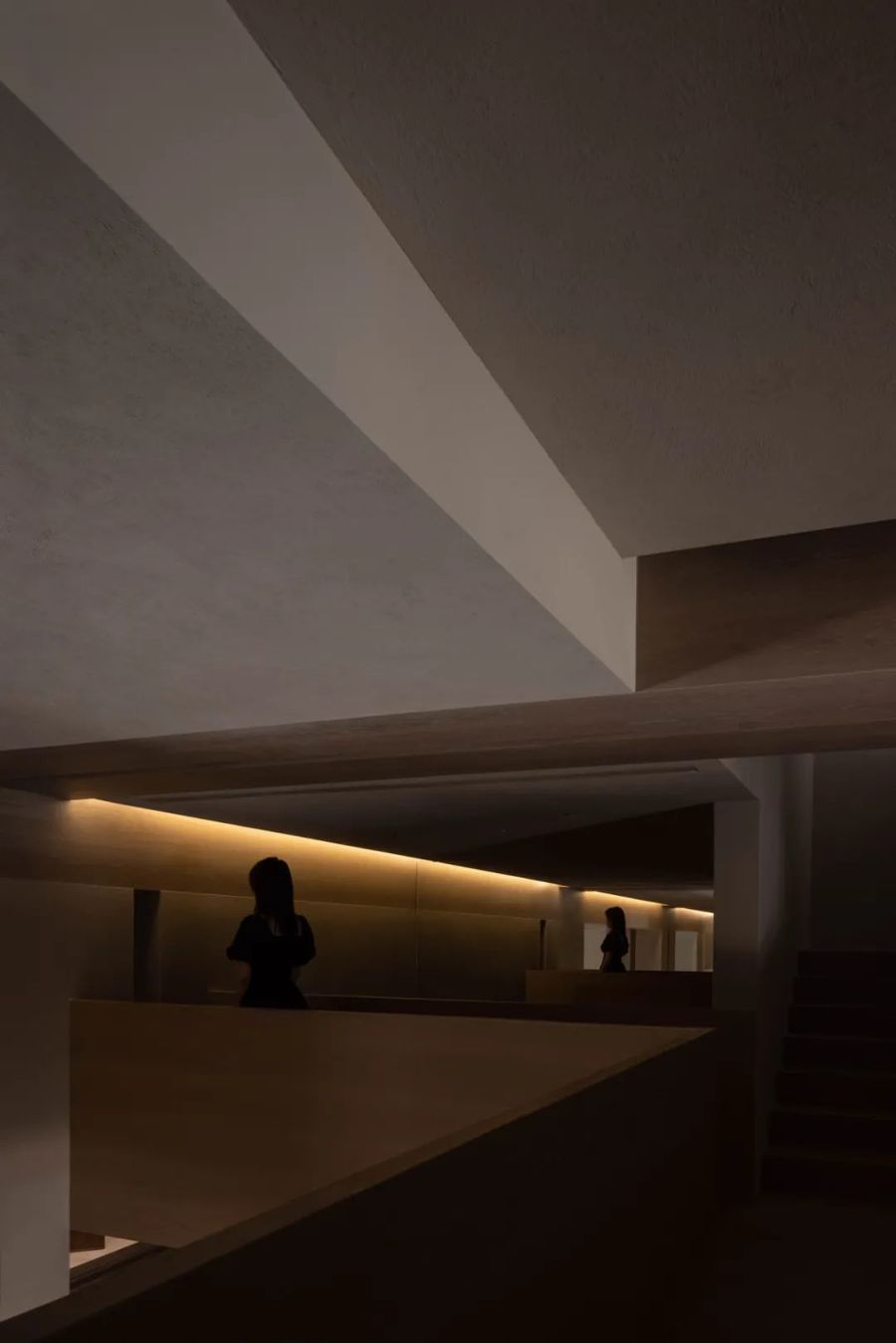
交叉的体块通过剖面的相互作用,空间彼此渗透,创造了垂直层面的视觉联动。“看与被看”随着步移景异而发生“主观和客观”的身份变化,深浅的光影渲染于此,使空间趋向于产品发布会的秀场,更具有戏剧性和体验感。
The intersecting blocks penetrate into each other through the interaction of sections, creating a visual linkage at the vertical level. "Seeing" and "being seen" have a "subjective and objective" identity change with the change of scenery. The deep and shallow light and shadow render here, making the space tend to the show of product launch, which is more dramatic and experiential.
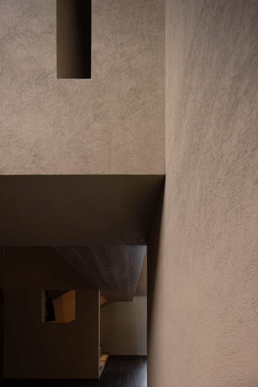
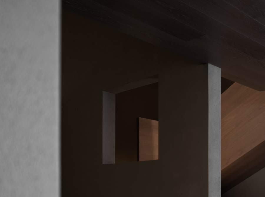
纹理突出的木作和涂料的粗糙肌理,以及不为目之所见,但确实存在的风、空气、意韵流动于重构的错位空间,创造“虽然感觉不到风,但水中月却碎成了千万片”的巧妙意境。同时木地板楼梯结构和下沉式展示区,展现了实木地板与拼花产品的更多可能。
The rough texture of wood and paint with prominent texture, as well as the invisible but real wind, air and charm flow in the reconstructed dislocation space, creating a clever artistic conception of "although the wind is not felt, the moon in the water is broken into thousands of pieces". At the same time, the wooden floor stair structure and the sunken exhibition area show more possibilities for solid wood flooring and parquet products.
高朋宴会
Gaopeng Banquet
━
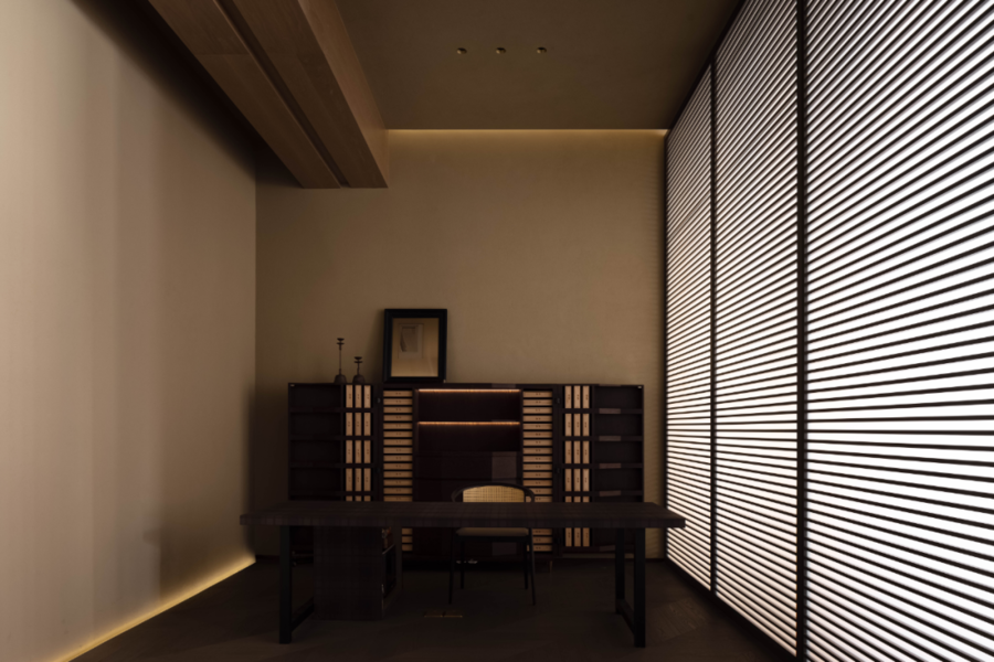
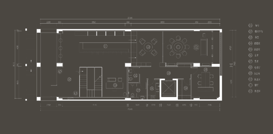
及至二楼,水平的平面布局展开了双动线推进的路线。木格栅和纸屏风围合出隔而不断的独立楼梯区和二楼茶室,横向瘦长线条具有明显的方向性和踊跃动势,牵引着自下而上的身体和场所的情境转化。
Up to the second floor, the horizontal plane layout has launched the route of double moving line promotion. The wooden grille and paper screen enclose the separated and continuous independent stair area and the tea room on the second floor. The horizontal thin and long wind lines have obvious directionality and enthusiasm, leading to the situation transformation of the body and place from bottom to top.
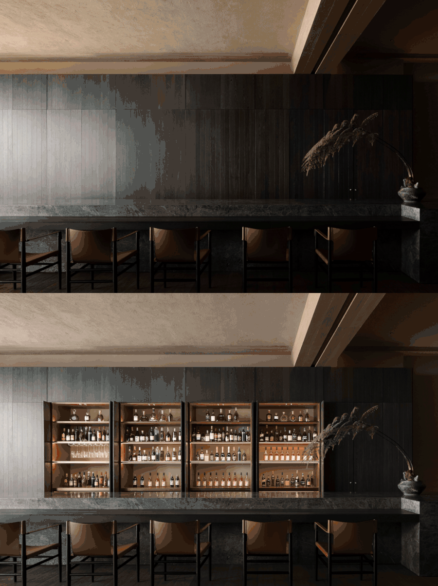
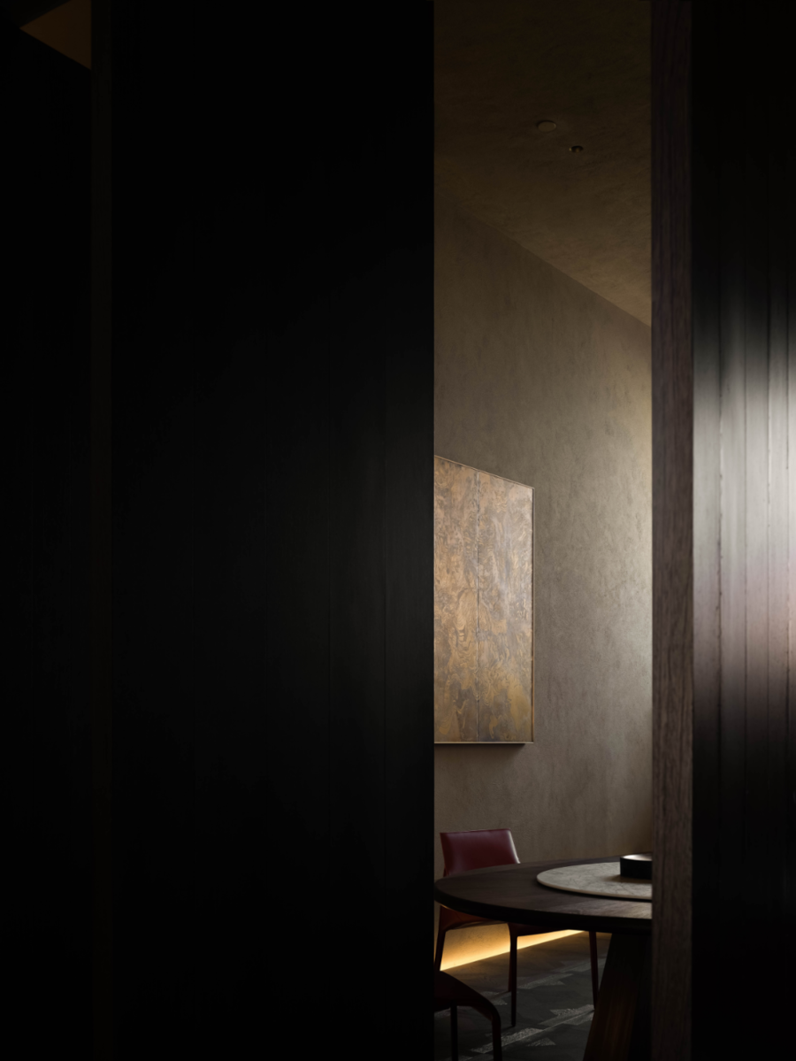
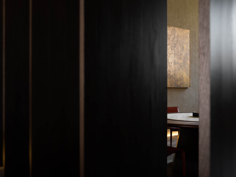
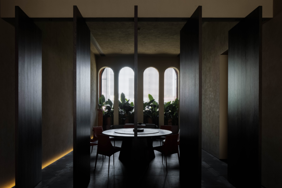
承担着主要功能的服务岛台兼作聚会吧,满足日常的大型讲座会,或作新品发布酒会之用,觥筹交错,各种“声音的纹理”变得清晰、饱满起来。灵活闭合的转轴门,成为公区和私密区需要的可控开关,由喧闹转向静谧的所在。
The service island, which bears the main functions, is also used as a gathering bar to meet the daily large-scale lectures or new product release cocktail parties. The "texture of sound" becomes clear and full. The flexible closed revolving shaft door becomes a controllable switch for public and private areas, turning from noisy to quiet.
时间意义
Temporal Meaning
━
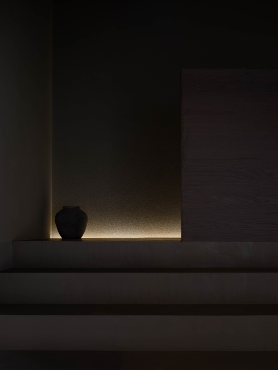
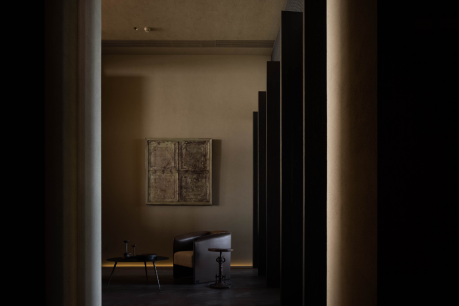
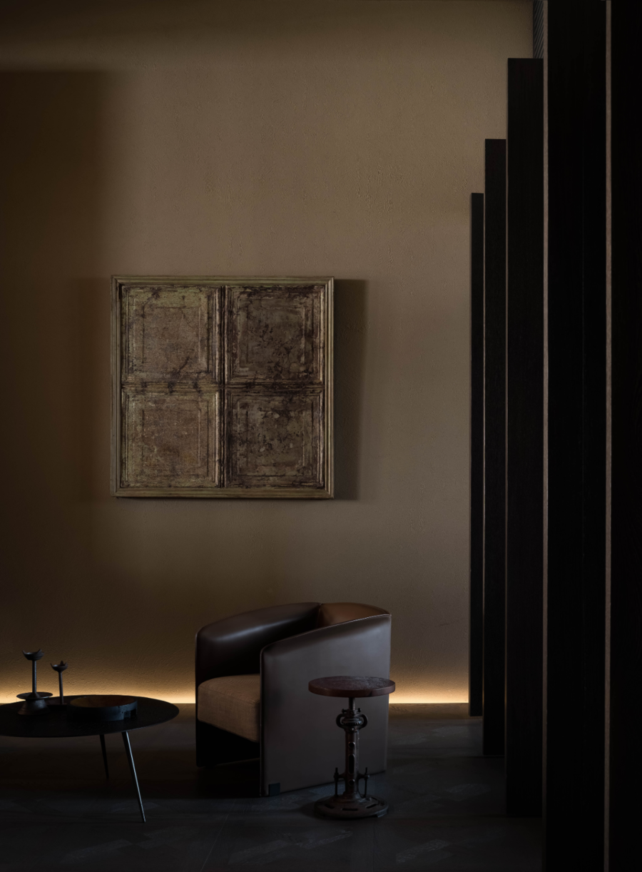
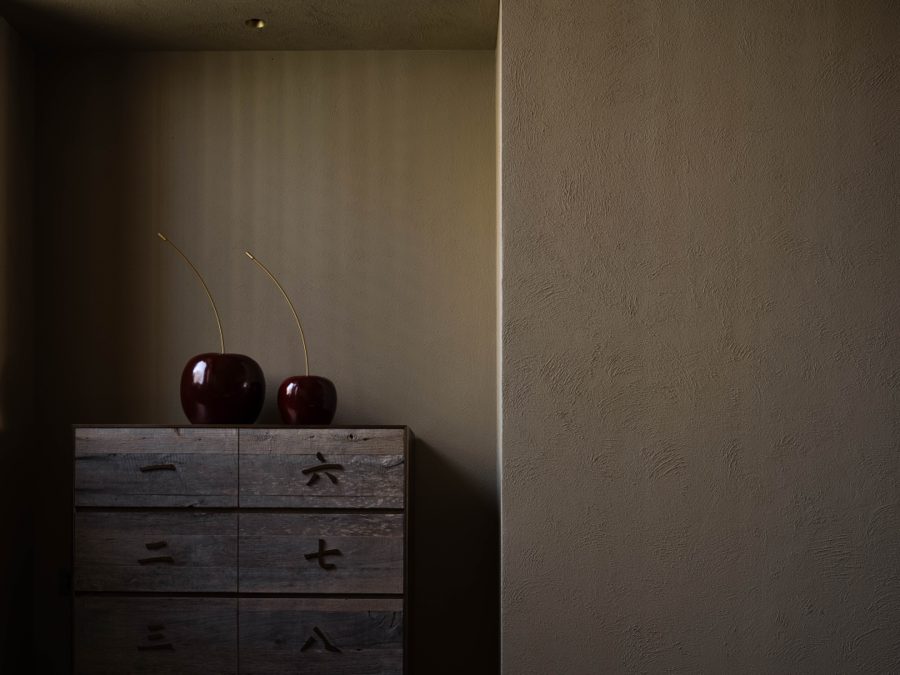
在光益地板体验店里,除了“自然性”的探索之外,“时间性”表现的同样重要,历经岁月的木作、石材、古铜、肌理漆,表面发生着物理的细微反应,累积了时间的遗留和痕迹,散发情感温度与独特韵味。
In the KUANGYI flooring experience store, in addition to the exploration of "naturalness", the expression of "timeliness" is equally important. After years of woodwork, stone, bronze and textural paint, the surface has a physical subtle reaction, accumulating the legacy and traces of time, emitting emotional temperature and unique charm.
“自然的生活方式”是一种隐喻,也是一种品牌追求,于设计而言,空间只是产品的载体,避免多余的人为干预,使其真实的还原,裸露出原始的、未经过度修饰的、饱含真情的自然材料本身。我们感知自然,因为相互的作用力,反过来,同样被自然所感知。
"Natural lifestyle" is a metaphor and a brand pursuit. In terms of design, space is only the carrier of products, avoiding unnecessary human intervention and making it true, exposing the original, unmodified and full of true natural materials. We perceive nature because the mutual forces, in turn, are also perceived by nature.
项目信息
Information
━
项目名称:光益地板体验店
Project Name:KUANGYI Flooring
项目地点:广东东莞
Project Location:Dongguan, China
建筑规模:500平米
Construction Scale:500㎡
设计机构: 圣奢设计
Design Company:SSD
主创设计师:文治国
Chief Designer:Wen Zhiguo
参与设计:星图计划、杨柳
Participatory Design:Xingtu Plan, Yang Liu
执行深化:香港怡筑
Execution Deepening:Hong Kong East Joint Limited
完成时间: 2021.10
Completion Date:October, 2021
项目撰文:无远文字/月球
Project Writing: Off-words/Moon
项目摄影:欧阳云
Photography:Ouyang Yun
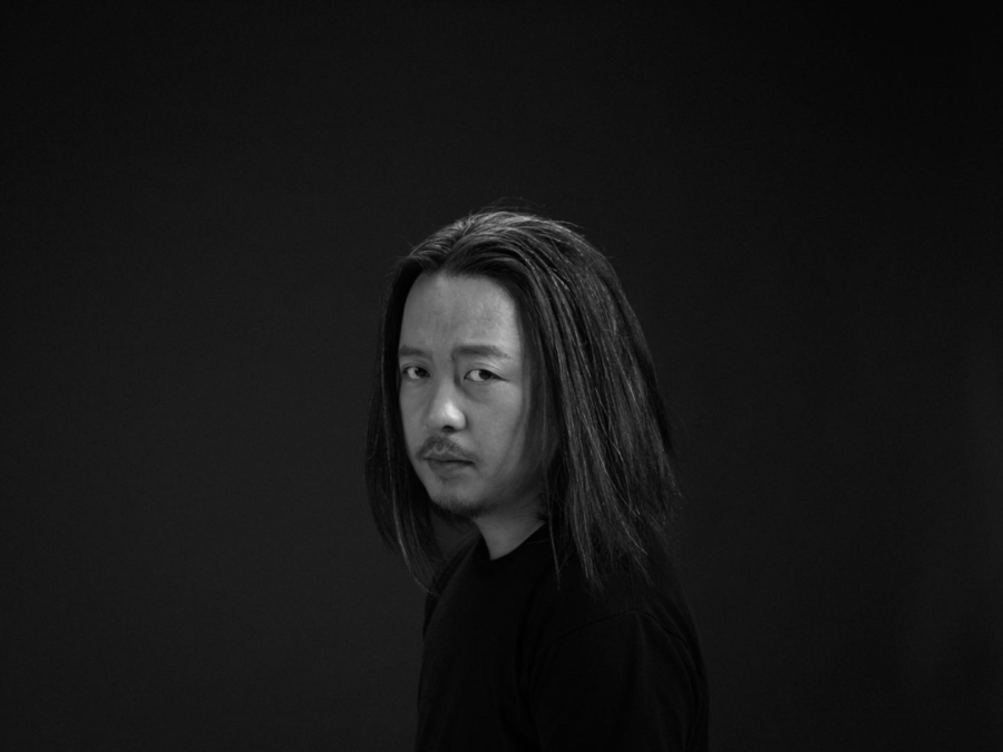
文治国
圣奢设计创始人
━
圣奢设计2014年创立于北京,设计主张“反潮流、反模式化”,坚持每一个设计都是对自己的反省和批判,突出“矛盾”形成的美学宗旨,表达作品的独立性,注入强烈的个人情感使设计更具生命力。








评论(0)