改“斜”归正的房子 ©立明
设计单位:北京里白空间设计事务所
项目地点:北京朝阳区
建成时间:2022年3月
室内面积:43平方米
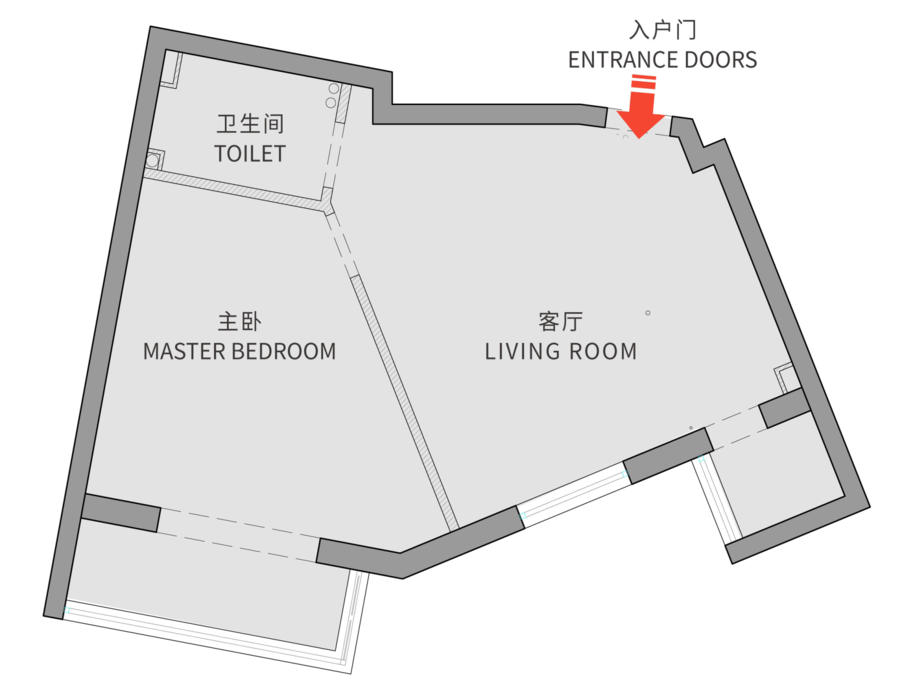
从大连搬来北京,做设计最大的变化就是做了很多小而美的家。关于设计的手法,大有大的做法,小有小的套路,奇葩有奇葩的意思。现代建筑师们之所以钟爱“极小化住宅与奇葩户型”,很可能更像是在迎接一种极限挑战。北京真的是这两类户型的高发地,这个项目把这两个特点都占了。40多平方米的套内面积,全屋稍微长一点的墙体都不是直角,异形套异形,形成了一套“钻石户型”。
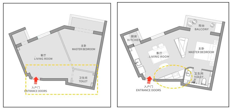
原始户型平面图 ©里白空间
屋主是一位程序员,像千百个北漂的年轻人一样,怀揣安居梦,首套房子选择了小户型住宅。项目在一座1985年落成的塔楼里,原主人为了分隔空间,砌了一道Y形隔断,将空间分成了客厅、卧室、卫生间三部分。室内的每个空间都很小且是异形,房子中央还立着一根不可移位的燃气管道,使用率极低且居住感受也很不适,连电视都要斜角看。The owner is a programmer. Like thousands of ‘Beijing Drifter’ young people, he has a dream of living in his own apartment. The first one starts from a small apartment. The house is a tower completed in 1985. In order to separate it, the original owner built a Y-shaped partition to divide the space into three parts: living room, bedroom, and bathroom, each room is small and irregular. Very uncomfortable, every day to watch TV at an angle. There is also a gas pipe in the center of the house, which cannot be moved.
方案整体概念
设计的通常做法是房间越小越要打开分隔、砸墙,使各部分融为一体,尽量创造连续的墙面,让室外的光线尽可能照进房子深处角落,消除拥堵感,然而假设这间房子里没有墙,异形的缺点就会被放大。我们希望通过设计一系列有效隔断,一来满足屋主所有的功能诉求;二来消除空间的异形感,重新构想空间体验感,在有限的空间里,尽善尽美地让小家变大、变规则。As a general practice, the smaller the room, the more you need to open the partitions and smash the walls, so that all parts are integrated, try to create a continuous wall, let the outdoor light illuminate the deep corners as much as possible, and eliminate the sense of congestion. However, suppose that in this house Without walls, the irregular shortcomings are magnified. Seeing the big from the small, having a partition wall does not necessarily make the space smaller. We hope that by designing a series of effective partitions, firstly, to satisfy all the functional demands of the owner, and secondly, to eliminate the irregular sense of space, reimagine the sense of space experience, and perfectly make the small home bigger and rules in a limited space.
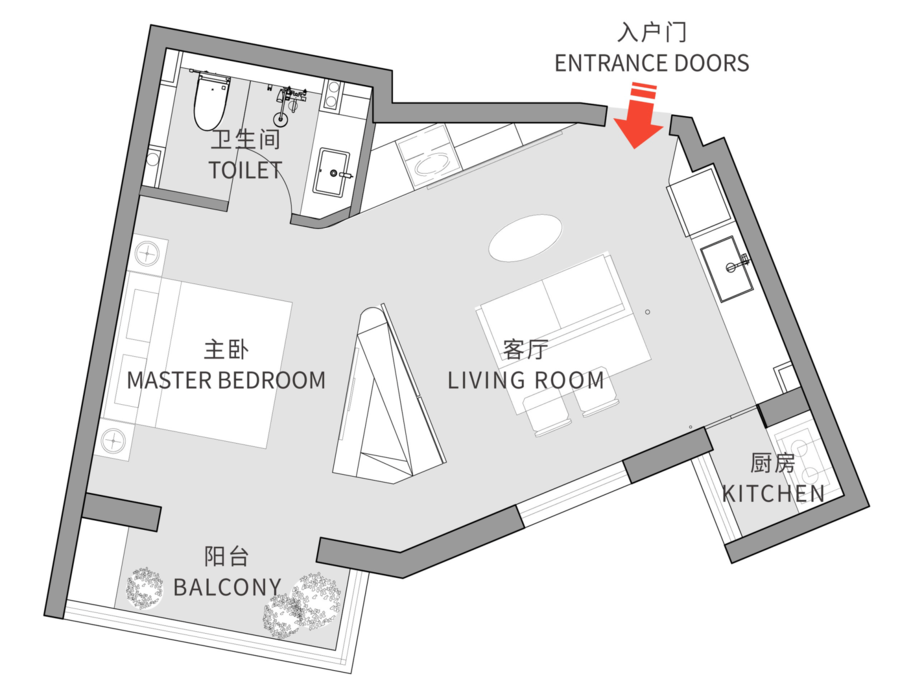
改造后户型平面图 ©里白空间
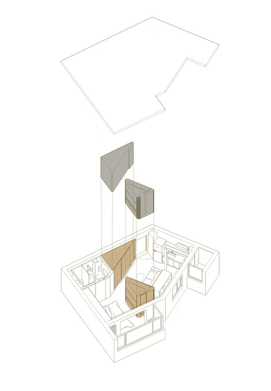
轴测爆炸示意图 ©里白空间
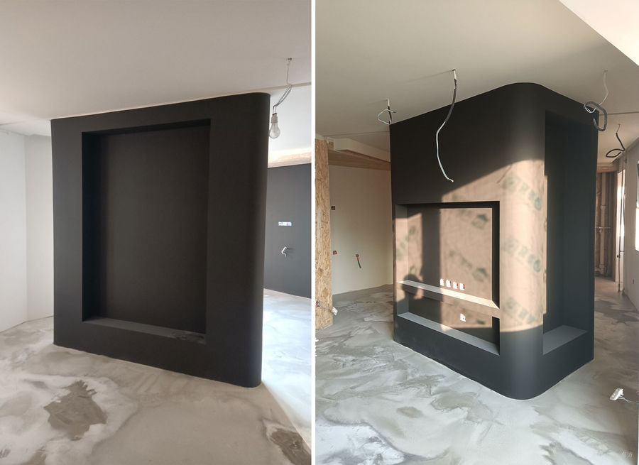
于是,我们把突破口放在了客厅与卧室的隔墙上,植入了一个飞机形状的多面体组合柜,作为空间的隔断。这么改动的优势有很多,一则能捋直空间,将柜体的每一面与毗邻的墙体平行,使得客厅、主卧变得方正,且过道间距也会变的规整宽敞;二则能优化功能和收纳容量,使得柜子的每个面都大有用途。Therefore, we put the breakthrough on the partition wall between the living room and the bedroom, and implanted a polyhedral combination cabinet in the shape of an "airplane" as a partition of the space. There are many advantages to this change. Straighten the space: each side of the cabinet is parallel to the adjacent wall, which can make the living room and master bedroom square, and the aisle spacing will also become regular and spacious. Optimize the function and storage capacity, each side of the cabinet is very useful.
多面体组合柜的安装 ©里白空间
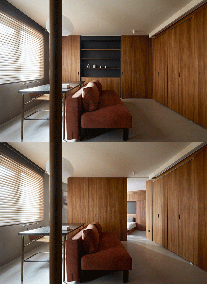
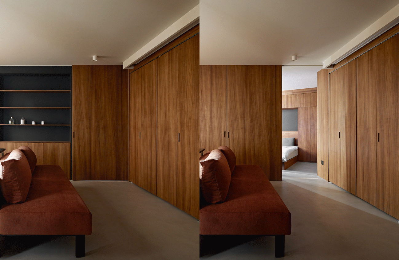
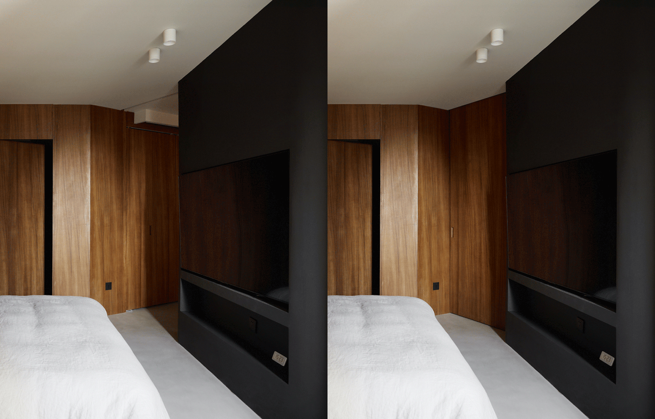
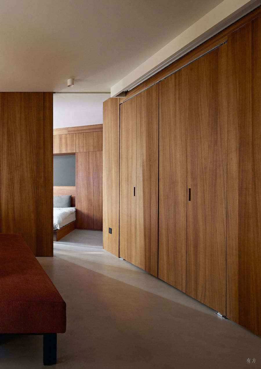
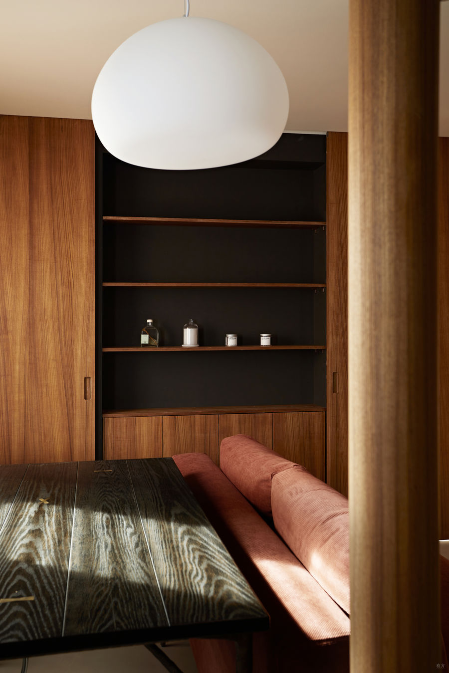
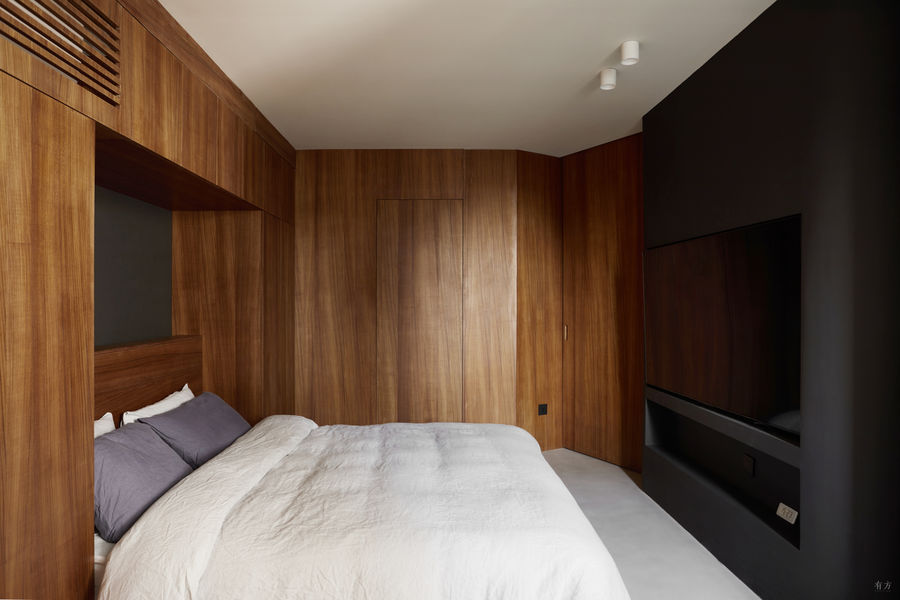
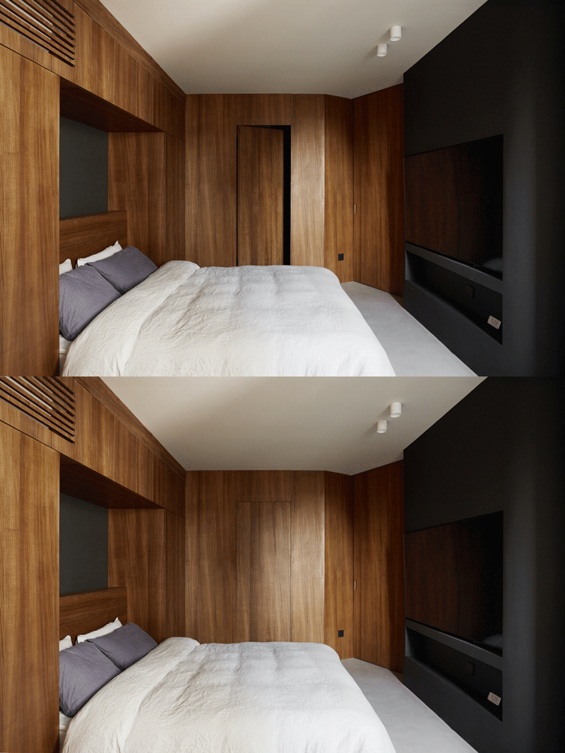
面向客厅的立面,便可以作为书架与杂物柜,柜深40厘米,一门二用,两侧的门既是卧室的房门,也是书架的柜门。面向主卧的一面则作为电视墙使用,柜子的结构刚好可以暗装电视的数位线路和电源插座,平时屋主躺在床上就能看电视,视线平行舒适。而面向南侧走廊的墙被设计成文件柜,由于屋主平时喜欢收集邮票,他所有的邮票夹和办公文件都存储在这里。The facade facing the living room can be used as a bookshelf and a storage cabinet. The depth of the cabinet is 40cm, and one door is used for two purposes. The doors on both sides are not only the bedroom door, but also the cabinet door of the bookshelf. The side facing the master bedroom is used as a TV wall. The structure of the cabinet is just enough to conceal the digital circuit and power socket of the TV. Usually, the owner can watch TV while lying on the bed, with a parallel and comfortable line of sight. The wall facing the south-facing corridor is designed as a filing cabinet. The owner usually likes to collect stamps. All stamp folders and office documents are stored here.
卧室门开关 ©立明
从客厅看卧室门开关 ©立明
从卧室看卧室门开关 ©立明
另外,动线也随之优化,这组多面柜正好在房屋中间,四周形成循回动线,生活起来也更加方便。同时也放大了视觉空间,柜子两侧的门洞平时敞开,视线得以穿透,使得空间进深变长,让奇葩老屋立马显得更大。The moving line is optimized accordingly. This group of multi-faceted cabinets is just in the middle of the house, forming a migratory line around it, making life more convenient. Visually enlarge the space: The door openings on both sides of the cabinet are usually open, the line of sight can penetrate, and the depth of the space becomes longer, making the irregular old apartment appear larger immediately.
打开的卧室门 ©立明
玄关
拉直斜角墙面,藏下鞋柜和洗衣房
进入大门的右手边原先也是异形墙体,墙的尽端与卫生间产生了一个犄角,而且没有任何修饰,将异形暴露无疑。为了截断这种不规则感,我们拆除了Y形的隔断墙,并将卫生间门改到卧室这一面。Entering the gate, the original right-hand side is also a special-shaped wall, and the end of the wall forms a corner with the bathroom, without any decoration, the abnormal-shaped is undoubtedly exposed. In order to cut off this sense of irregularity, we removed the Y-shaped partition wall and changed the bathroom door to the bedroom side.
改造后户型平面图 ©里白空间
玄关组合柜 ©立明
我们在原来鸡肋的斜角区,定制了一整面的三角柜,拉直墙面,让客厅变规整。三角柜内分成了三个部分,右侧部分靠近门,进深40厘米有余,能作为鞋柜使用,补充玄关的收纳空间;中间部分进深大约60厘米,刚好能塞下滚筒式洗衣机和烘干机,上下叠放,不用担心柜体受潮变形,平时洗完衣服,敞开柜门散掉水汽就好;左侧部分最深,是杂物区,柜内藏下了乱七八糟的家政工具。此外,洗衣区背面留下的三角形的检修口刚好可以从杂物区这边进,使得房间内的面积一点都没有浪费。In the oblique area of the original chicken ribs, a whole triangular cabinet was customized, and the wall was straightened to make the living room more regular. The triangular cabinet is divided into three parts. The right part is close to the door, with a depth of more than 40 cm. It can be used as a shoe cabinet to supplement the storage space of the entrance. The depth of the middle part is about 60 cm, which is just enough to plug the front-load washing machine and dryer, and stack them up and down. Don't worry about the cabinet body being damp and deformed. Usually, after washing clothes, just open the cabinet door to disperse the water vapor. The deepest part on the left is the cluttered area, which hides messy housekeeping tools. In addition, the triangular inspection port left on the back of the laundry area can just enter the clutter area, and no area is wasted.
三角柜功能的依次排列,加上旁边就是卫生间和开放式厨房的水盆,在满足入户清洁问题的同时,也形成了一条高效的生活动线。每天回家,换鞋→洗手→把脏衣服扔进洗衣机→洗漱→休息可以在同一条动线上完成,不用重复进进出出。与此同时,家务的动线也被缩短,平时做家务,可以直接从杂物区里取出工具→清洁整屋→回到玄关收起工具→转身就能去浴室洗手。The functions of the triangular cabinets are arranged in sequence, and the toilet and the open kitchen sink are next to each other, which not only meets the household cleaning problem, but also forms an efficient living line. Going home every day, changing shoes → washing hands → throwing dirty clothes into the washing machine → washing → resting can be done on the same moving line, without repeating in and out. At the same time, the movement of housework has also been shortened. When doing housework, you can directly take out the tools from the sundries area → clean the whole house → go back to the entrance to put away the tools → turn around and go to the bathroom to wash your hands.
客厅
沙发后设置办公区,空间更灵活
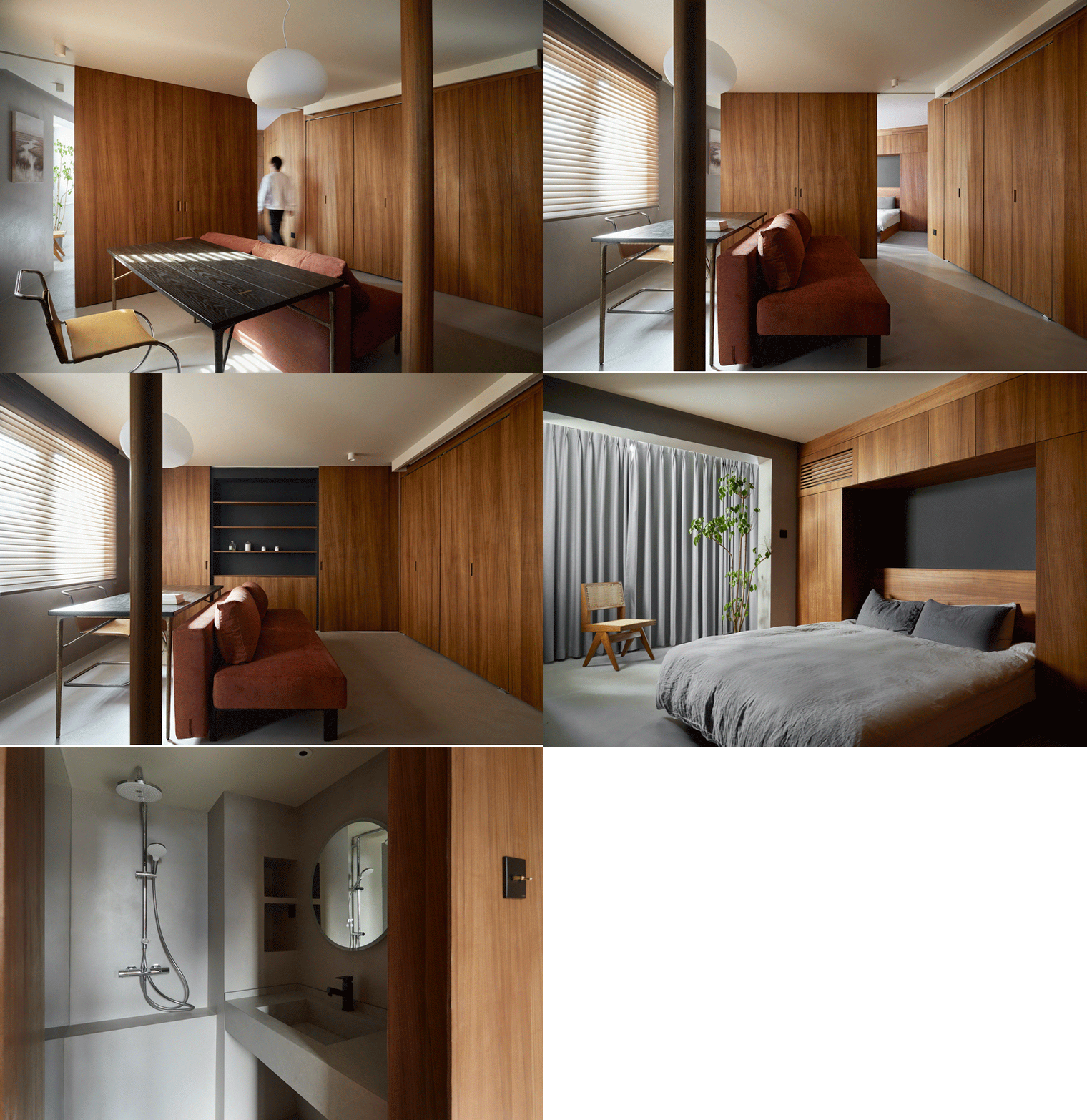
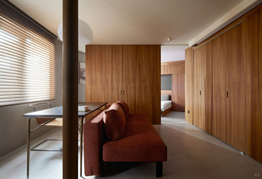
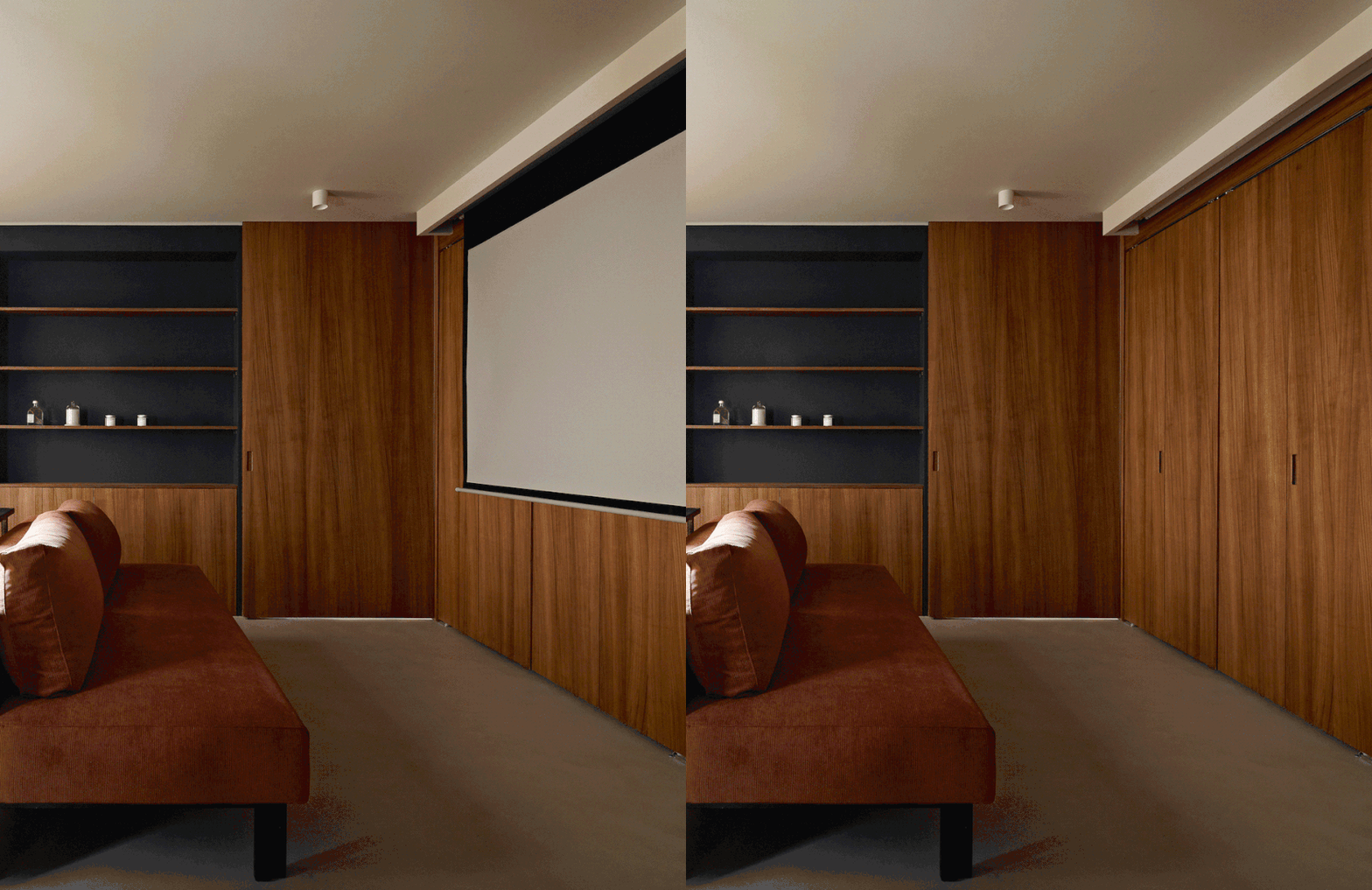
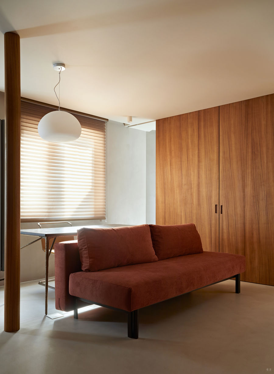
屋主经常在家加班,工作台被放在沙发背后,这里是整个家中光线最好的区域,工作台对面三角柜的上方,还隐藏了电动幕布,平时也可以把工作投在幕布上,不看的时候能收上去。工作台也能作为餐桌使用,可以一边吃饭,一边看电视。沙发背后靠着餐桌,四周也形成了循回动线,这样的布局很适合小户型,使空间的利用率变高。餐桌右侧是多面体组合柜的书架面,补充客厅与餐厅的收纳,平时摆放了屋主最爱的香水、香氛蜡烛与摆件。Above this triangular cabinet, there is also a hidden electric curtain, which can be put up when not looking. The homeowner often works overtime at home, and the workbench is placed behind the sofa. This is the area with the best light in the entire home, and the work can also be cast on the screen at ordinary times. The workbench can also be used as a dining table. You can watch TV while eating. There is a dining table behind the sofa, and a migratory line is also formed around it. This layout is very suitable for small apartments, and the utilization rate of space is higher. On the right side of the dining table is the bookshelf surface of the polyhedral combination cabinet, which supplements the storage in the guest dining room. The homeowner's favorite perfume, scented candles, and ornaments are usually placed.
三角柜上的电动幕布 ©立明
沙发背后的工作台 ©立明
工作台及书架面 ©立明
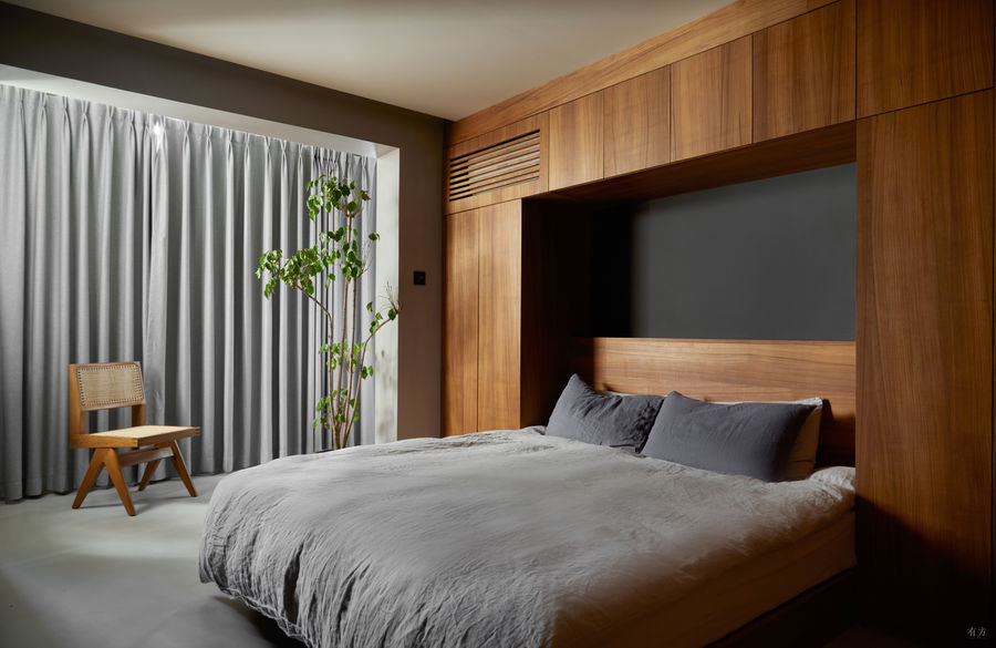
由于屋主喜欢偏暗的色调,黑色、灰色、深一点的木色,倘若不加思索地堆砌,不光做不出层次感,反而会损害空间。该项目深色调的搭配有逻辑可循。首先黑色深邃,我们把卧室背景墙、多面体隔断柜以及厨房背景墙刷成了黑色,由东西向增加空间的纵深,突出中间的主体结构。Since the owner likes darker tones, black, gray, and darker wood colors, if they are stacked without thinking, not only will they fail to create a sense of hierarchy, but it will damage the space. The combination of dark tones has logic to follow. First of all, the black color is deep. We painted black on the background wall of the bedroom, the polyhedral partition cabinet, and the background wall of the kitchen. The east-west direction increases the depth of the space and highlights the main structure in the middle.
考虑到屋主喜欢柚木色的沉稳,因此对着窗户的迎光面,全部包了柚木色的饰面板,增加室内的漫反射,随时欢迎阳光的到来。全屋地面则采用了磐多魔水泥漆,不仅能实现无缝的效果,而且表面光滑不容易开裂,能提升整个空间的氛围。最后,保留开阔的层高,顶面留白,使空间更具呼吸感。Considering that the male protagonist likes the calmness of the teak color, the light-facing side facing the window is all wrapped with teak-colored veneers, welcoming the arrival of sunlight at any time and increasing the diffuse reflection in the room. The floor of the whole house is made of Pandomo cement paint, which can achieve a seamless effect. The surface is smooth and not easy to crack, which can enhance the atmosphere of the entire space. Finally, keep the floor height and leave the top blank to make the space more breathing.
卧室电视柜 ©立明
厨房
难看的厨房管道,全部隐藏修饰
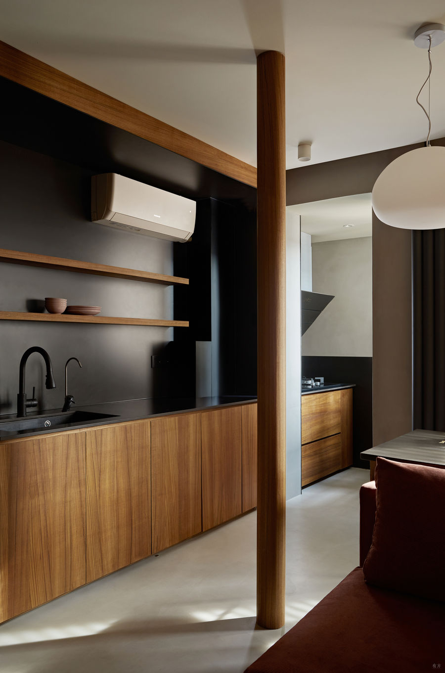
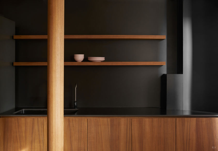
为了达到功能平效最大化,我们将厨房的烹饪区挪到了生活阳台上,做成一字型开放式厨房,不再局限于小户型的固有模式。一字型厨房布局,从左往右依次是冰箱、洗菜区、操作台、烹饪区,动线顺畅。厨房墙面没有用瓷砖作为挡水板,而是改用黑色的铝板,使得墙体表面没有缝隙。同时墙面空间也没有浪费,设置了置物架。In order to maximize the functional floor effect, we moved the cooking area of the kitchen to the living balcony to make a one-line open kitchen, which is no longer limited to the inherent mode of small units. The one-line kitchen layout, from left to right, is the refrigerator, the vegetable washing area, the operating table, and the cooking area, with smooth moving lines. The kitchen wall does not use tiles as a water baffle, but uses a black aluminum plate instead. There is no gap, and the wall space is not wasted. Shelving is set up.
厨房的所有管道都做了修饰,其中主下水管道在右侧墙角,被包上黑色立管,并做了一个黑色的盒子把水表也藏了起来,保持了色调的统一。原先突兀在房子中间的燃气管道则被一个110毫米的实木圆柱所包裹,也成了这个空间的亮点所在。All the pipes in the kitchen have been decorated. The main water is in the right corner, and the black riser is covered. A black box is made to hide the water meter to keep the color uniform. The gas pipe that was abruptly in the middle was wrapped with a 110mm solid wood column, which has also become the highlight of this space.
厨房布局 ©立明
厨房管道修饰 ©立明
卧室
床头做满柜子,小房间能收又宽敞
卧室面积不大,没有多余的空间做衣柜,为了满足屋主大量物品的收纳需求,我们在床的两侧结合床体定制了整排的收纳柜,代替了床头柜和衣柜的功能,同时也隐藏了空调,做了和柜门材质一样的百叶,不会影响使用,整体要好看多了。The bedroom is not large, and there is no extra space for wardrobes. In order to meet the storage needs of the owner of a large number of items, we have customized a whole row of storage cabinets on both sides of the bed combined with the bed body, which replaces the functions of the bedside table and wardrobe, and also hides it. After the air conditioner is installed, the shutters are made of the same material as the cabinet door, which will not affect the use, and the overall look is much better.
卧室布局 ©立明
卫生间
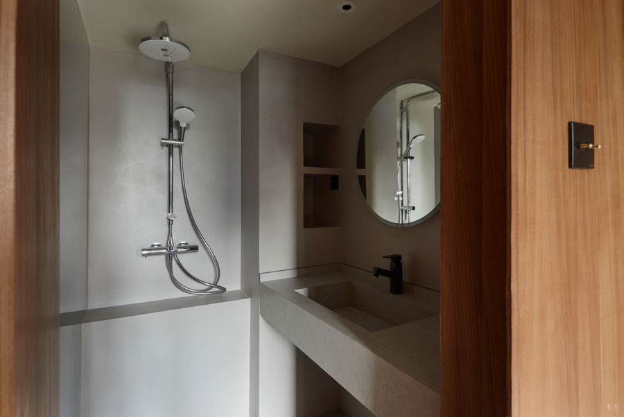
以磐多魔涂料打造空间无缝感
卫生间是一个暗卫,我们将其设计成开门后刚好对着卧室窗户,能直接引入光线。为了空间的整体感,我们做了柚木色的隐形门。业主不喜欢马桶对着床,因此我们将淋浴与马桶的位置对换了一下,卫生间整体用磐多魔防水漆代替常规的瓷砖,延续空间的无缝感。The bathroom was originally a hidden door. After the door was moved, it just faced the bedroom window, which could directly introduce light. For the overall sense of the space, we made a teak-colored invisible door. The owner did not like the toilet facing the bed, so the positions of the shower and the toilet were reversed, and Pandomo waterproof paint was used instead of conventional tiles to continue the seamlessness of the space.
厕所隐形门 ©立明
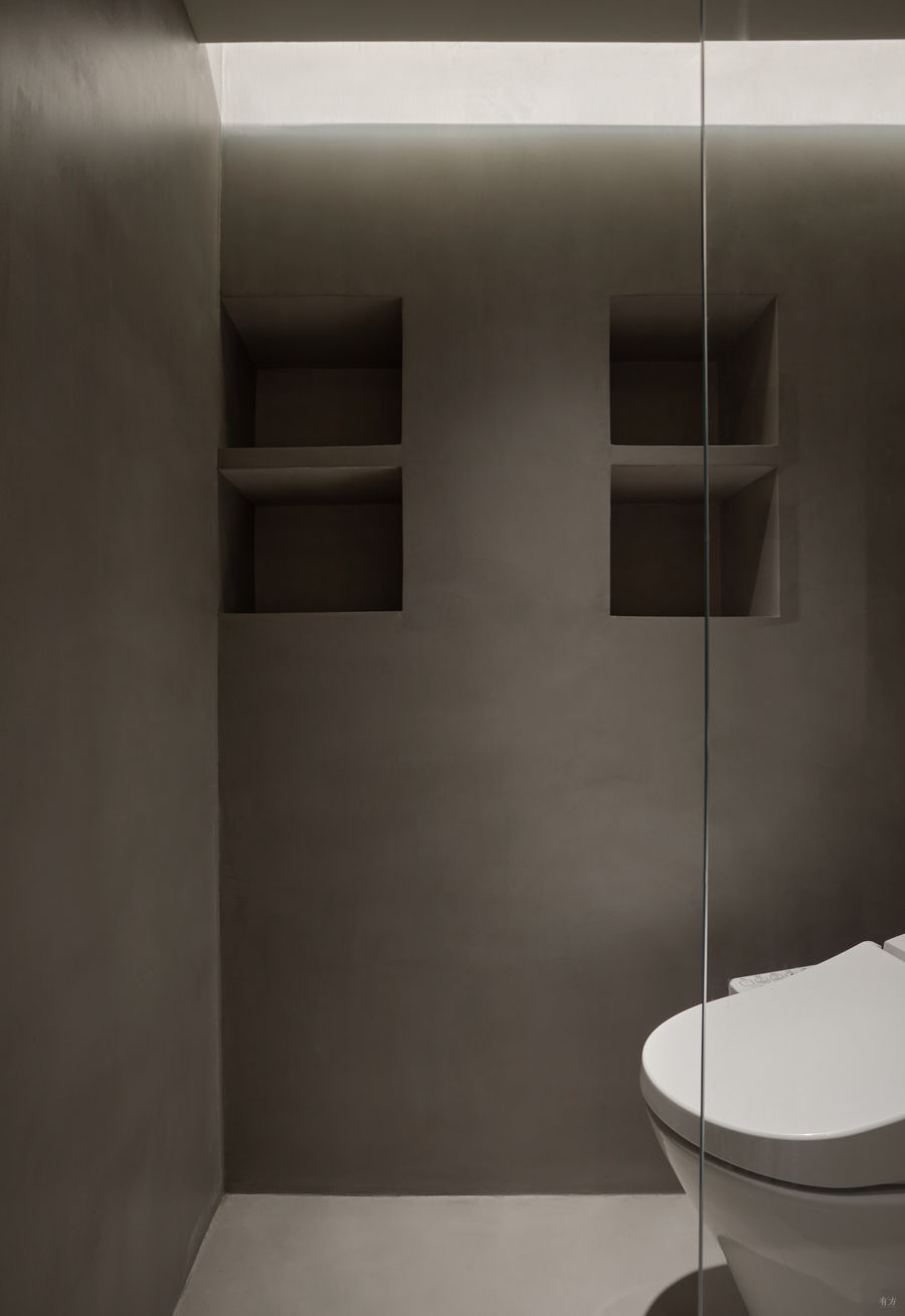
浴室的主下水管道也很杂乱,为此我们加厚了左内侧墙面,这样既可以隐藏管道,又多出了两个壁龛作为洗浴用品的收纳区。马桶移位后,采用110毫米pvc管走墙排和原来的点位连接,不会发生堵塞。The main sewer pipe in the bathroom is also very messy, so we thickened the left inner wall, which can hide the pipe, and add two more niches as a storage area for toiletries. After the toilet is displaced, the 110mmpvc pipe is used to go to the wall row and the original point, and there will be no blockage.
厕所布局 ©立明
厕所壁龛 ©立明
“钻石”户型虽然看着烂,改造好照样住的香。在屋子中心设置多面柜,既为这个小家扩大了收纳空间,又提供了循回动线,对争分夺秒的上班族来说,真是刚需了。The irregular apartment looks like a headache, but it is still perfect after the renovation. Setting up a multi-faceted cabinet in the center of the house not only expands the storage space for this home, but also provides a migratory line. It is really necessary for office workers who are racing against time.
完整项目信息
项目名称:改斜归正的房子
项目类型:室内改造
竣工日期:2022年3月
房屋坐标:北京朝阳
室内面积:43平方米
设计团队:里白空间
主案设计:解伟康
项目摄影:立明








评论(0)