生命之光
The Light of Life
-
生命是每个人的财富,世界因有了生命而绚丽多姿,生机勃勃,让我们热爱与珍惜自己的生命,把握人生中的每分每秒。生命是短暂的,是一去不复返的,人的一生就如白驹过隙,时间不可倒转,我们只能在有限的生命里绽放无限的光彩。
——唐忠汉
-韻味饗宴-
Taste Feast
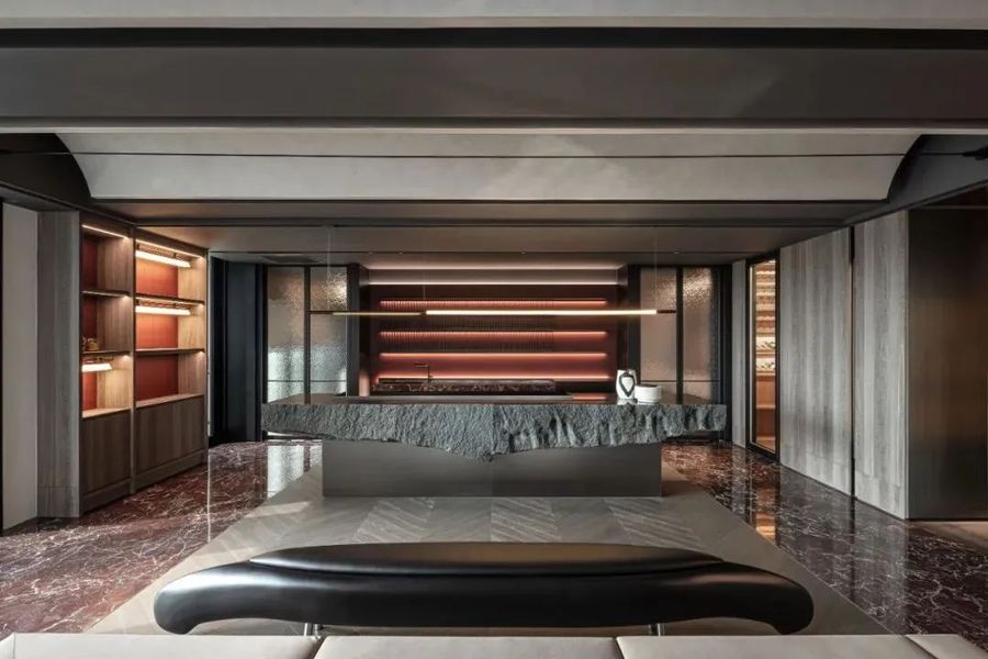
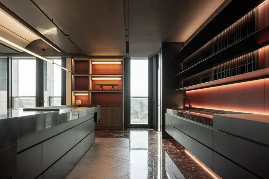
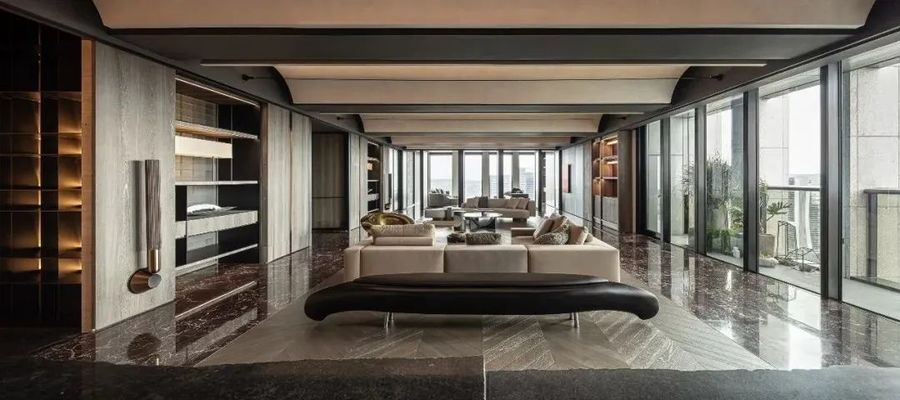
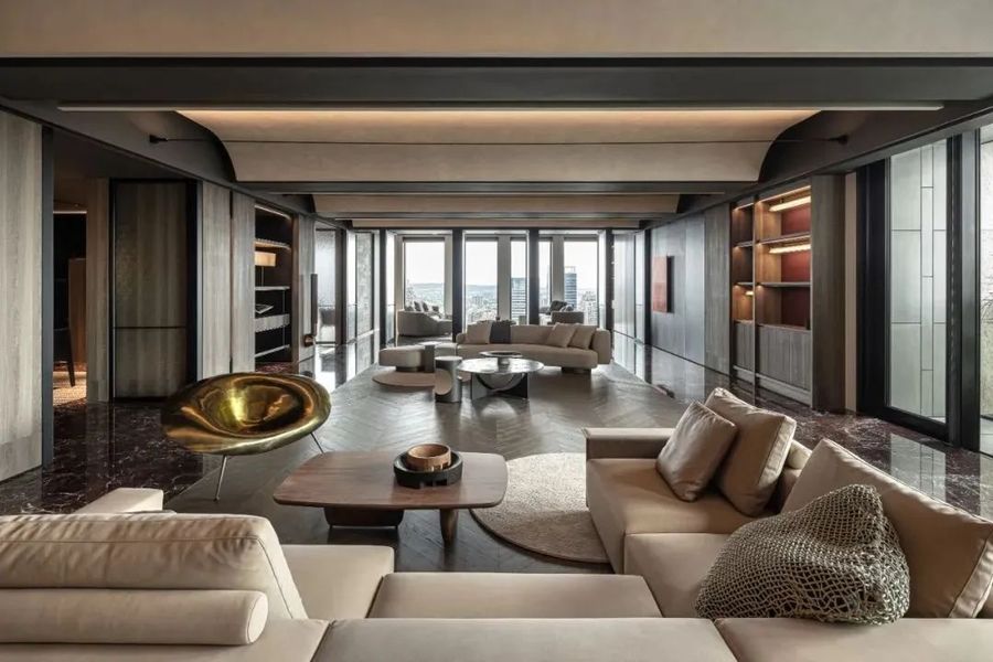
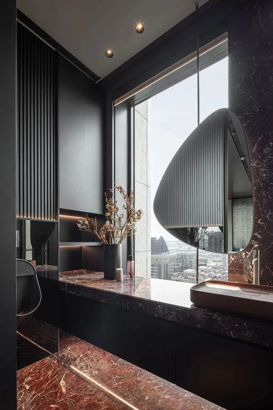
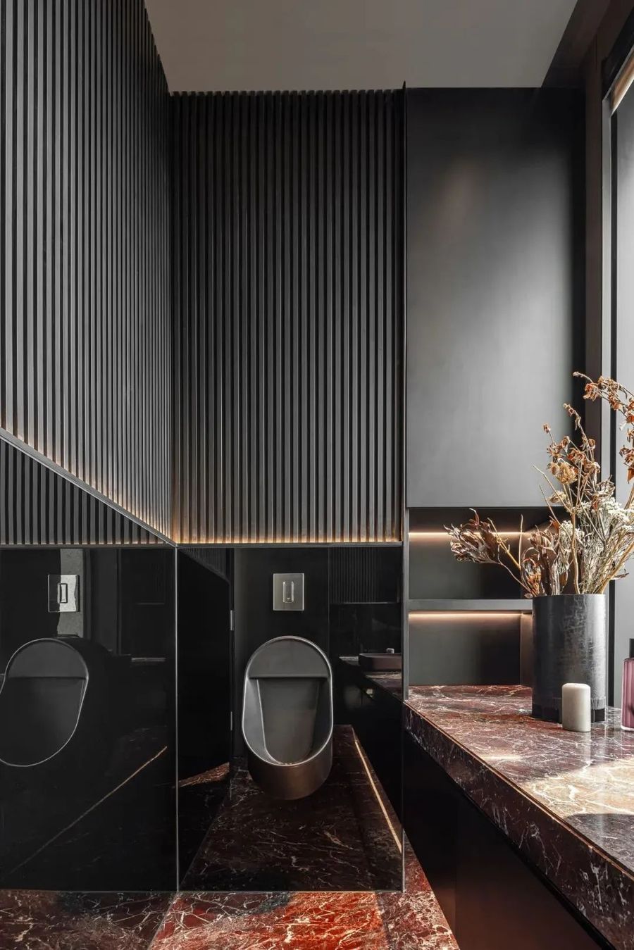
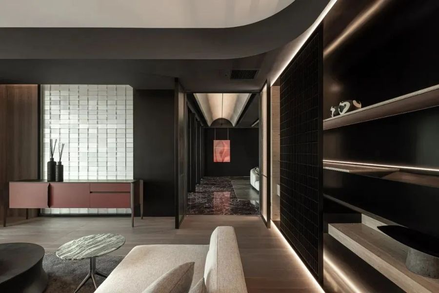
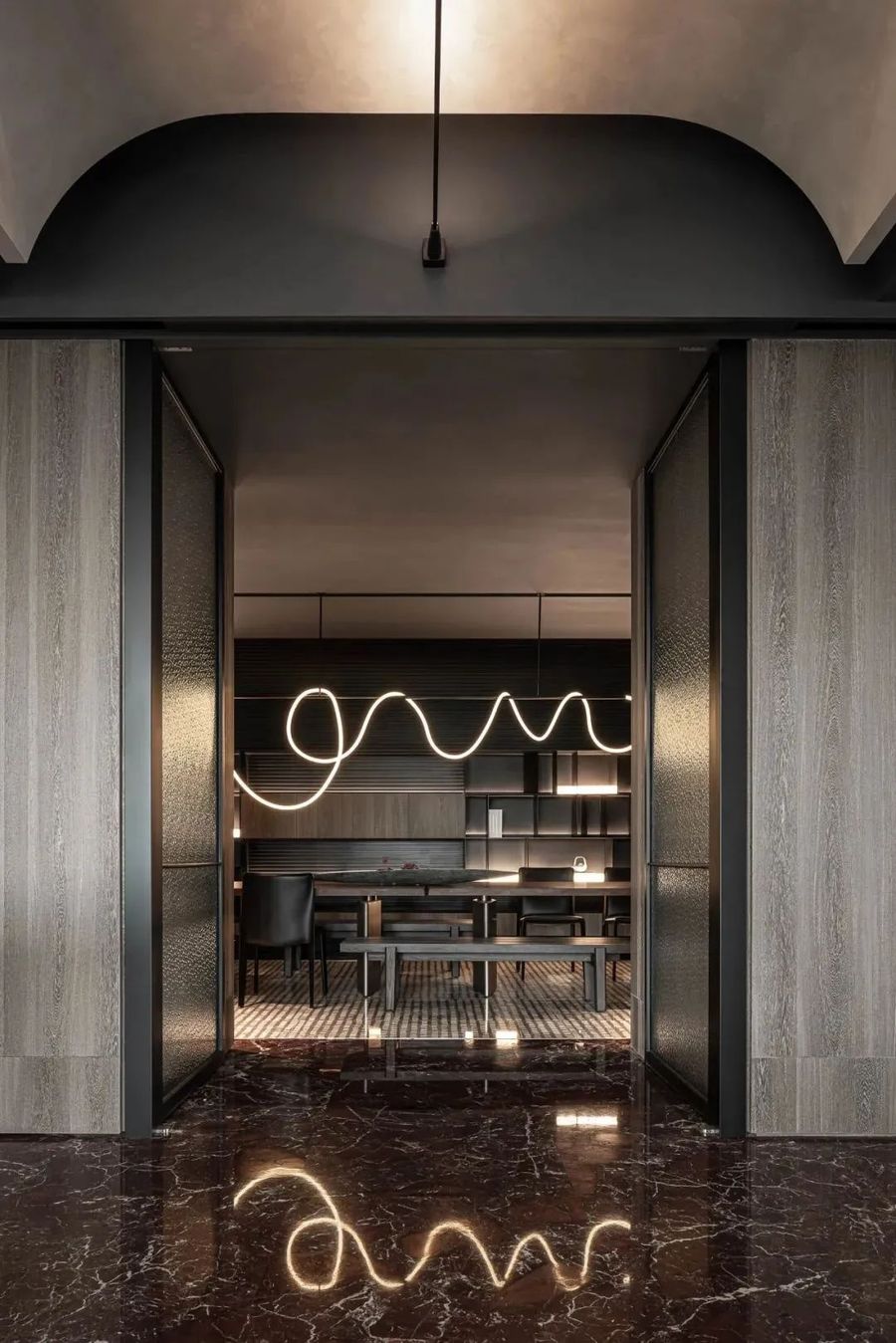
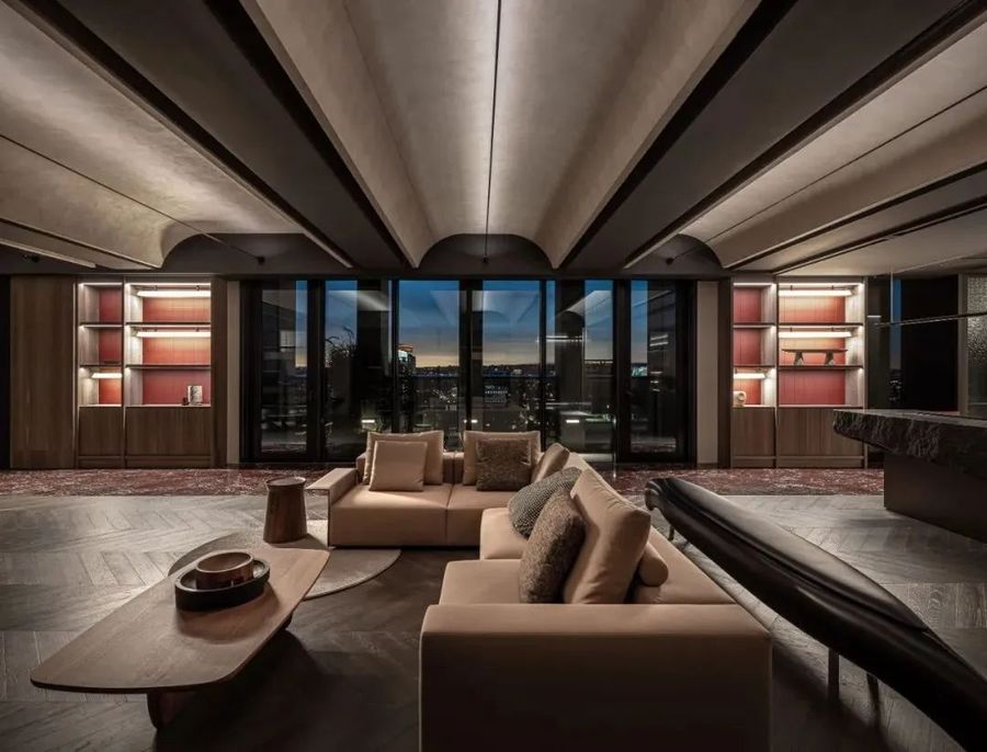
入口的空间铺陈,进到主体空间,转个弯,不同空间尺度,灯光由暗渐亮的转换,空间用红色材料的渲染带出红酒的主题,地板的红色石材、墙面柜体的红色皮革,不同纹理、不同光泽,就像红酒有不同味觉般的多变,让空间富有主题而有层次。
The entrance space is laid out, entering the main space, turning around, with different spatial scales and lighting changing from dark to bright. The space is rendered with red materials, bringing out the theme of red wine. The red stone on the floor and the red leather on the wall cabinets have different textures and glosses, just like red wine has different tastes and changes, making the space full of themes and layers.
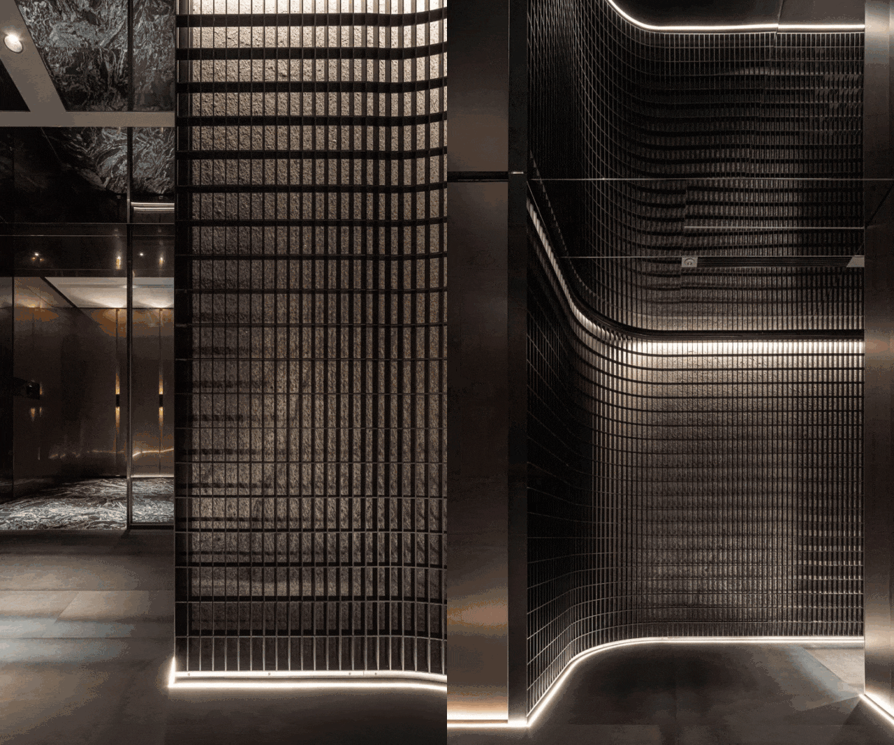
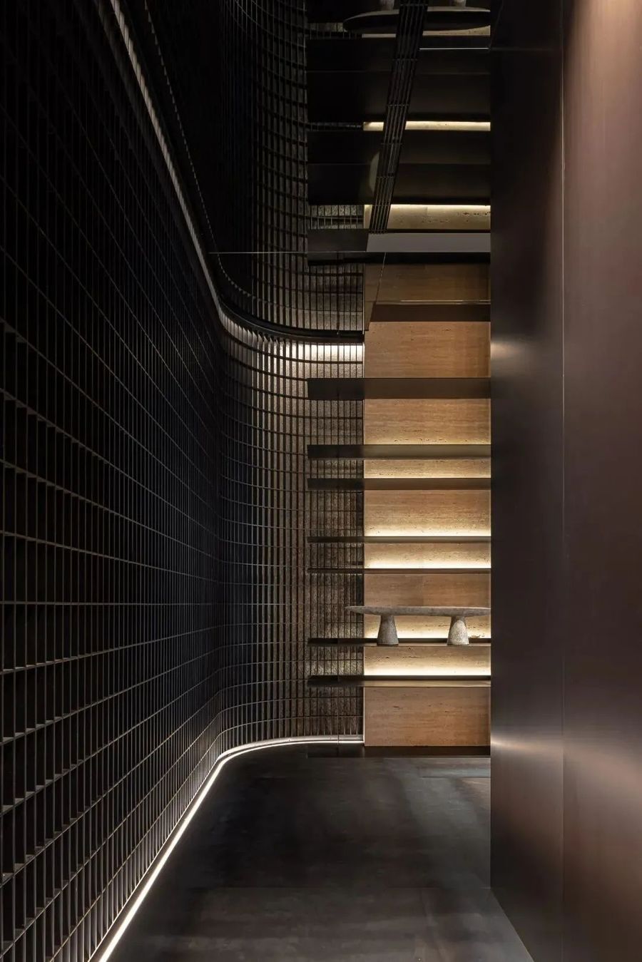
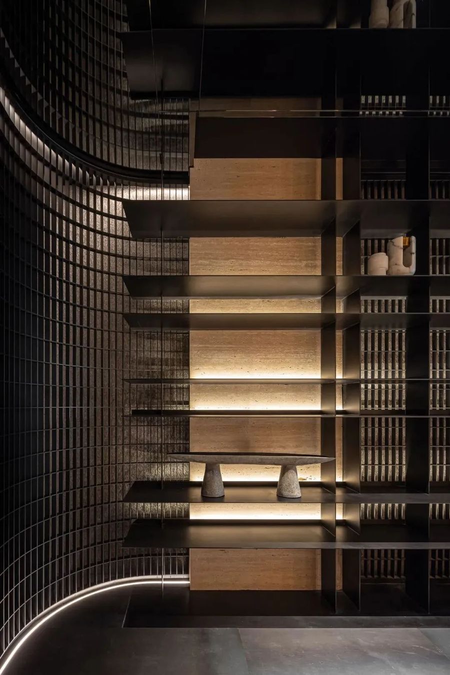
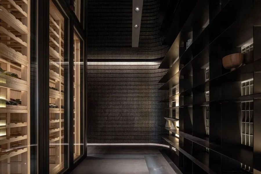
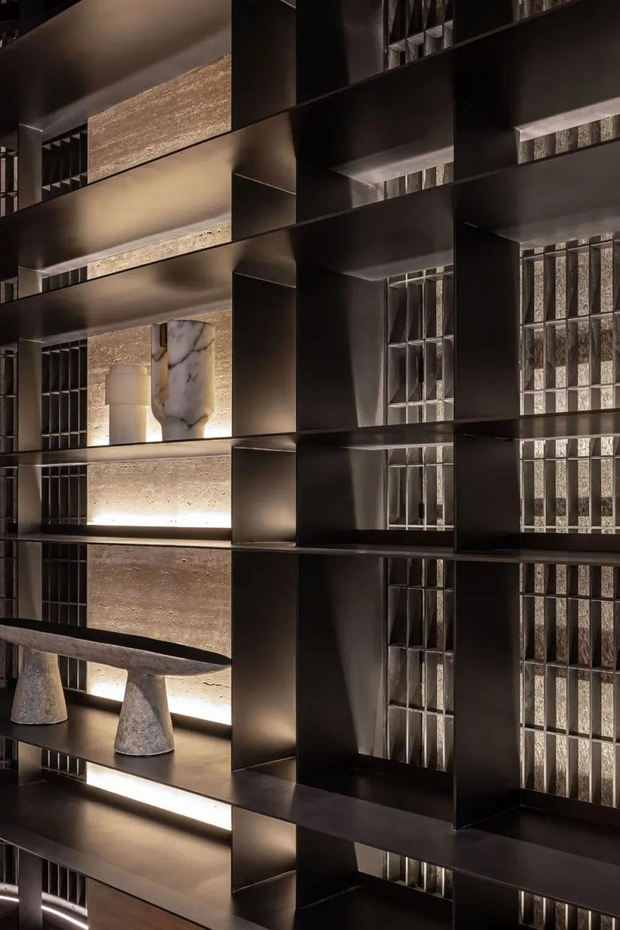
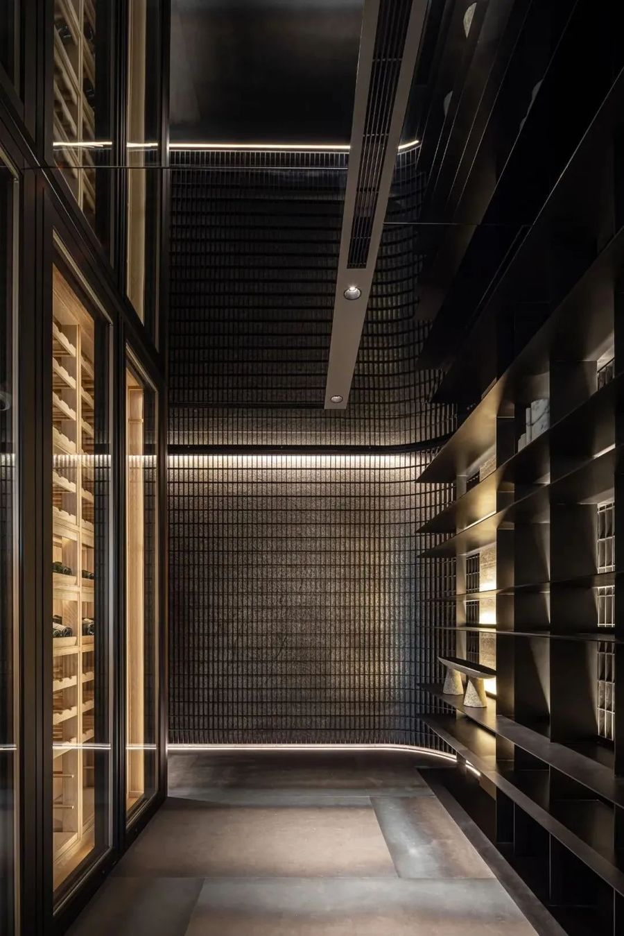
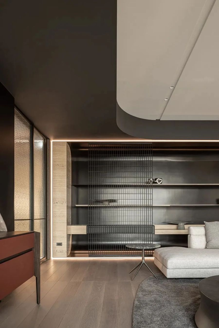
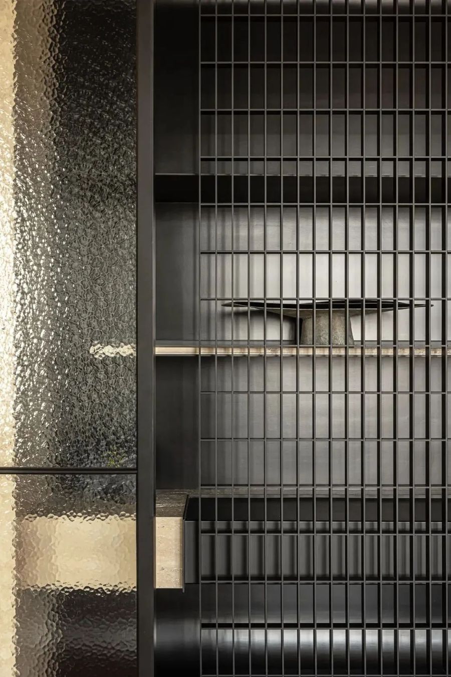
地面金属板材料与墙面和天花板产生对比的视觉效果,介质是光影的火花,地板灯光的动线引导,弧形金属格栅的屏风,金属小构件黄金比例分割,成为光线留存的地方。大面不同比例分割的金属柜体,是延续格栅屏风的语汇,用不同分割比例呈现,就像红酒有不同韵味般,细心品尝。
The ground metal sheet material creates a visual effect that contrasts with the walls and ceilings. The medium is the sparks of light and shadow, the dynamic lines of floor lighting guide, the curved metal grille screen, and the golden ratio division of metal small components become the place where light remains. The metal cabinet with large surfaces and different proportions is a continuation of the vocabulary of grille screens, presented in different proportions, just like red wine with different flavors, carefully tasted.
-味道的守護者-
Guardian of Taste
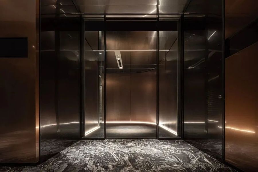
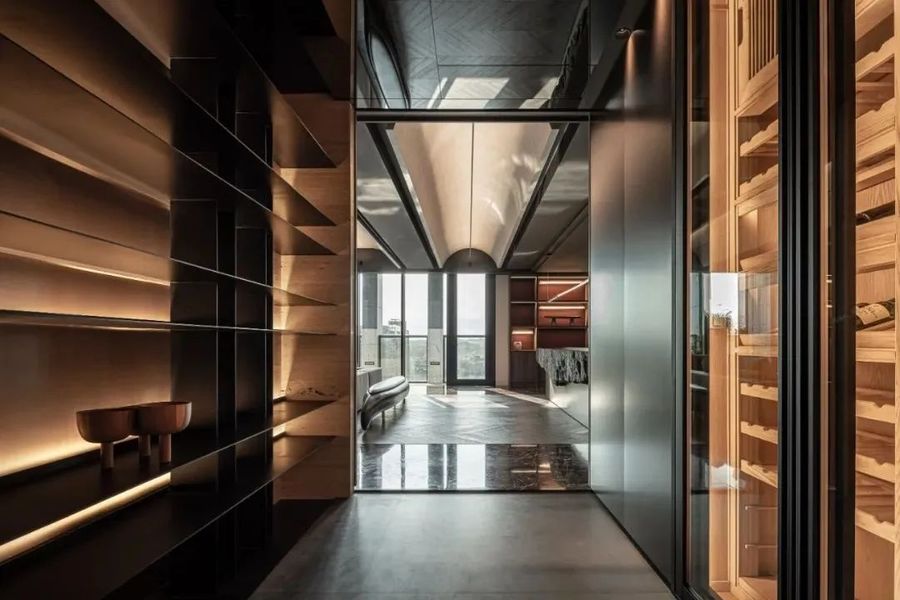
入口像是红酒瓶上的软木塞,守护红酒的韵味,廊道降低空间亮度,守护主体空间,制造场域中的神秘感,像是打开红酒前的期待,低调却又高贵气质。
The entrance is like a cork on a red wine bottle, guarding the flavor of the wine. The corridor reduces the brightness of the space, guarding the main space, creating a sense of mystery in the field, like the anticipation before opening the red wine, low-key yet noble temperament.
映入眼帘的是金属手刷铜墙面,利用镜面天花板延伸墙面金属板,让步入其中的人感受空间的仪式感。
What catches the eye is the metal hand brushed copper wall, which uses a mirrored ceiling to extend the metal plate on the wall, allowing those who enter it to feel the sense of ritual in the space.
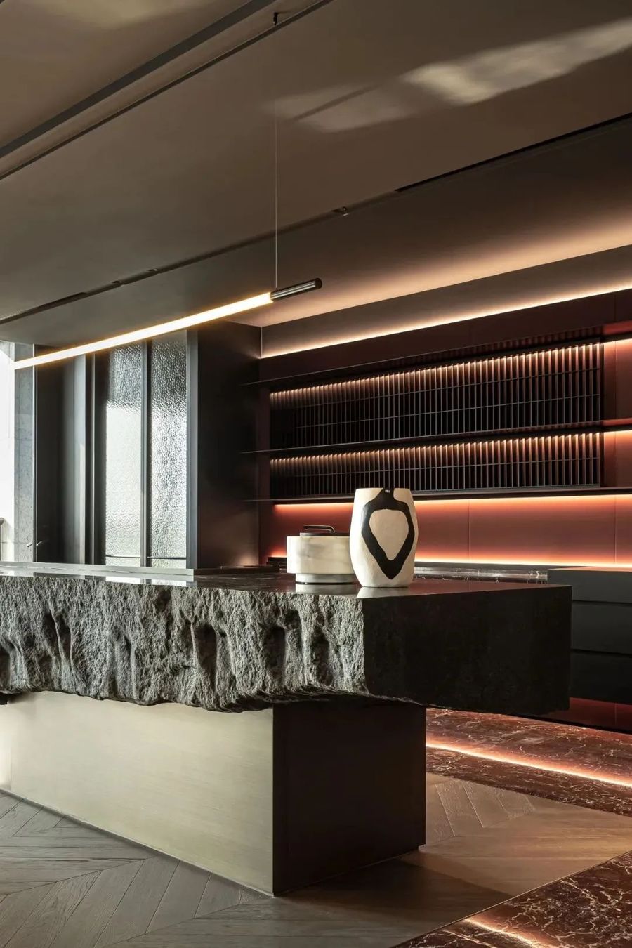
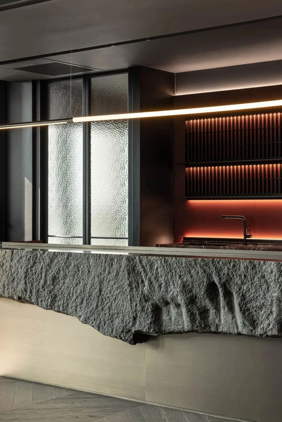
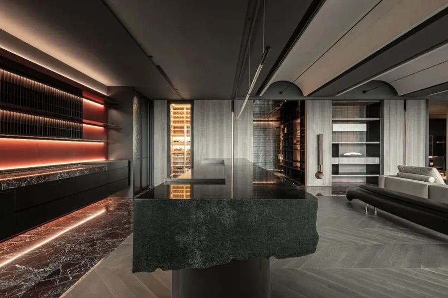
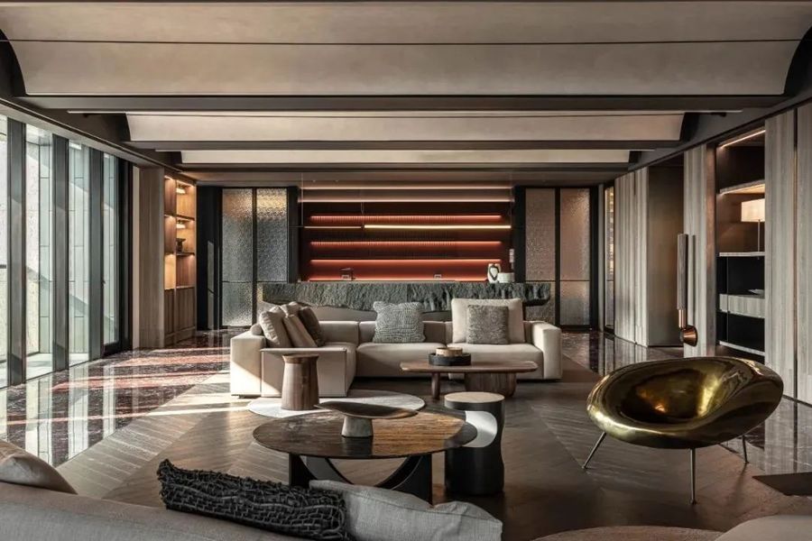
天然原石的中岛吧台,呈现大自然的鬼斧神工,创造出强烈的视觉效果,与后方红色皮革墙面相对应,自然与创新交织相融,在新的地域、新的时代换发发新的光彩。
The Nakajima Bar counter, made of natural raw stones, presents the extraordinary craftsmanship of nature, creating a strong visual effect that corresponds to the red leather wall behind it. It blends nature and innovation, giving off new brilliance in new regions and times.
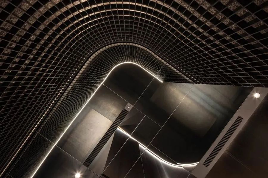
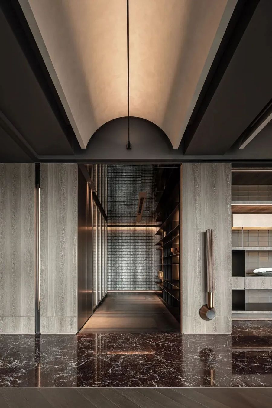
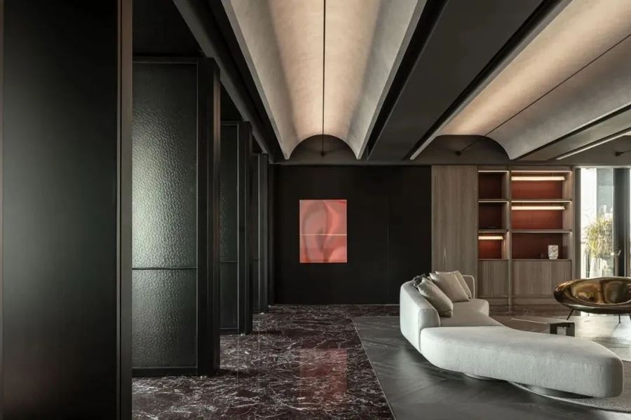
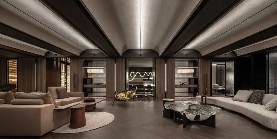
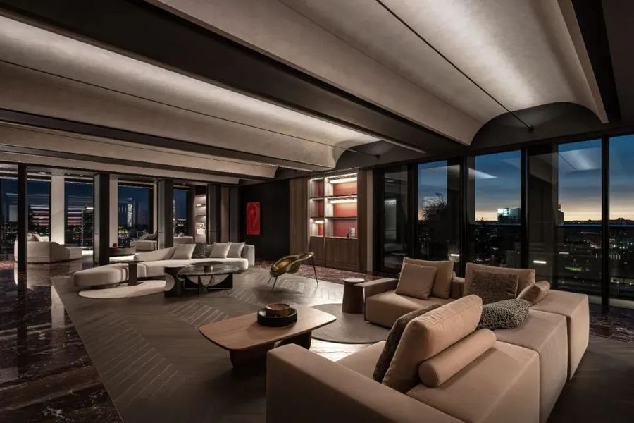
进入开放场域连接的连续的拱顶,由于结构的关系将原有的梁柱系统,将原有的梁柱系统转化为平面,消失的梁把拱顶变成完整空间形式,这样形式的意义也是一种场所精神与空间型态的转化。
Entering the continuous arch connected by an open field, the original beam column system is transformed into a plane due to the structural relationship, and the disappearing beam transforms the arch into a complete spatial form. The significance of this form is also a transformation of place spirit and spatial form.
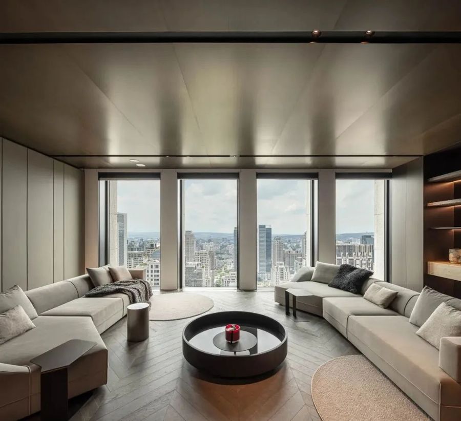
圆弧型天花板造型强化了空间视觉张力,延伸的曲面亦带来来多维的视觉广度,弧形表面覆以香槟银色的艺术漆涂料,微弱反射的材质特性呈现高贵质感,映应着窗外不断变幻的四时光景,光影流转的动态美感交织浮现。
The arc-shaped ceiling design enhances the visual tension of the space, and the extended curved surface also brings multi-dimensional visual breadth. The arc-shaped surface is covered with champagne silver art paint, and the weakly reflected material characteristics present a noble texture, reflecting the constantly changing four hour scenery outside the window. The dynamic beauty of light and shadow flow interweaves and emerges.
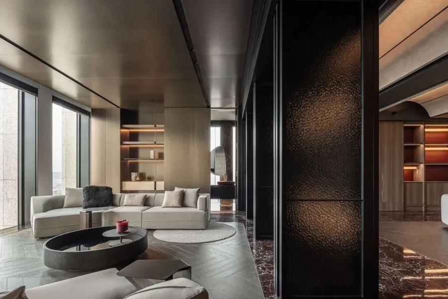
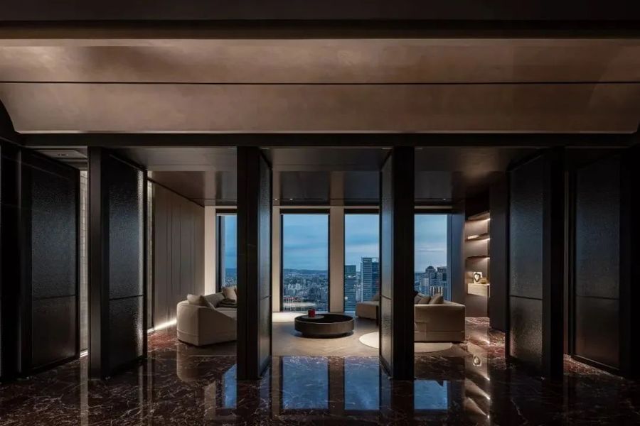
Vip洽谈空间,天花板利用大面积的金属板延伸至墙面,引导视觉的秩序和知觉的连续,与玻璃转呈现不同材料肌理的视觉层次。
Vip negotiates the space, with a large area of metal panels extending from the ceiling to the wall, guiding the visual order and continuity of perception, and presenting different material texture visual layers with glass.
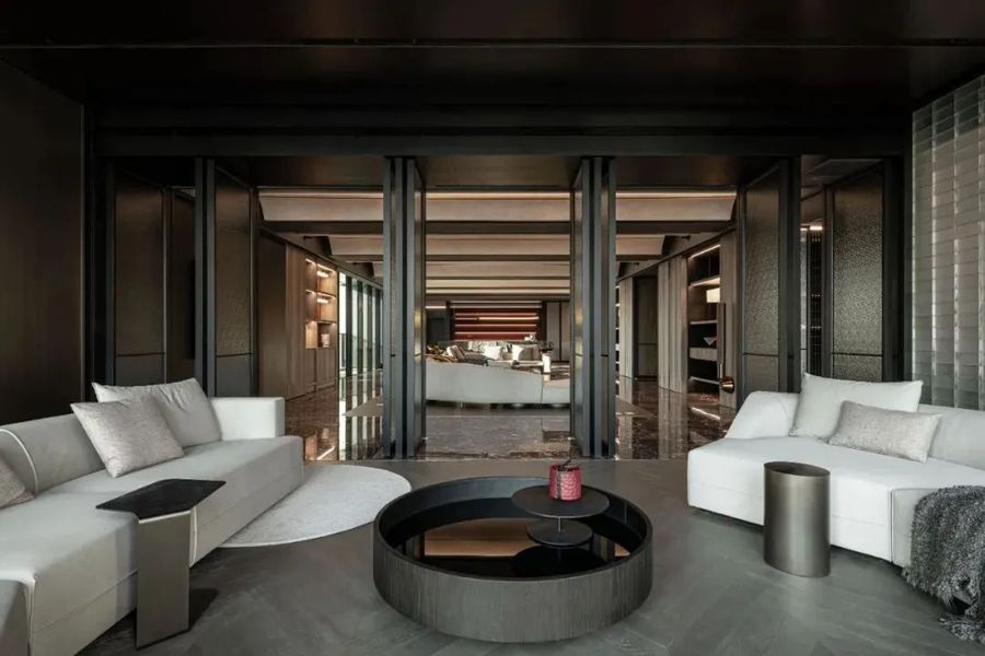
穹顶的连续感造成序列阵列与仪式感强化场所精神, 入口主题大的巨石中央吧台, 透过探访-寻找的材料萃取, 挑选 裁切 制作 搬运的一系列工序所构筑, 半穿透的玻璃砖与弧形金属格栅的屏风, 金属小构件黄金比例分割, 成为光线留存的地方。
The continuity of the dome creates a sequence array and a sense of ritual that strengthens the spirit of the place. The entrance theme is a large stone central bar, which is constructed through a series of processes of material extraction, selection, cutting, production, and transportation through exploration and search. The semi permeable glass bricks and curved metal grilles are used as screens, and small metal components are divided in golden proportion, becoming a place for light to be preserved.
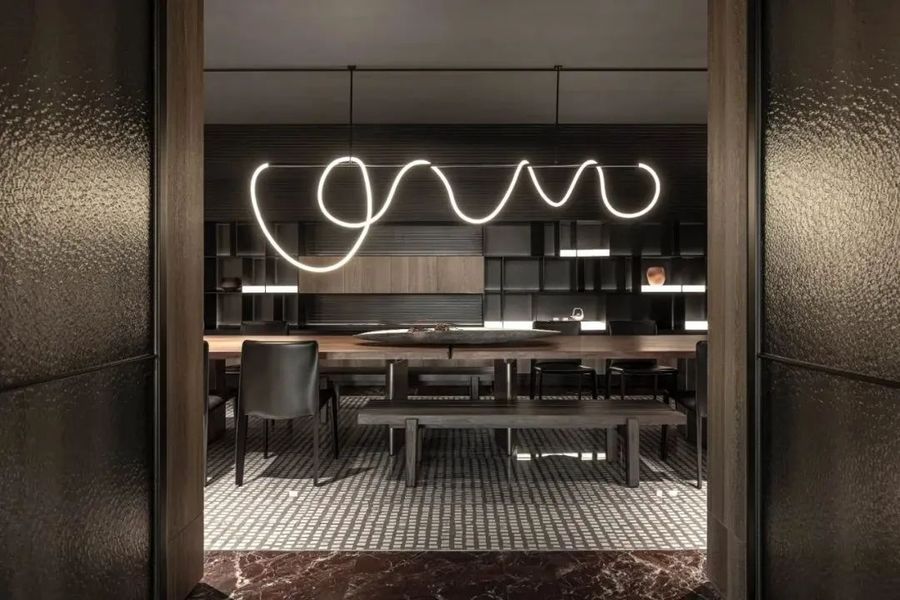
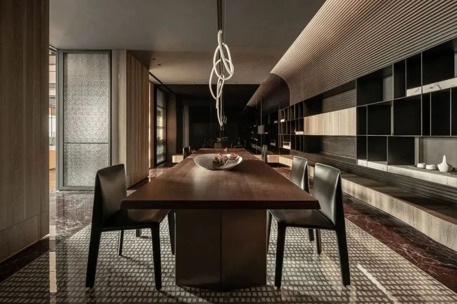
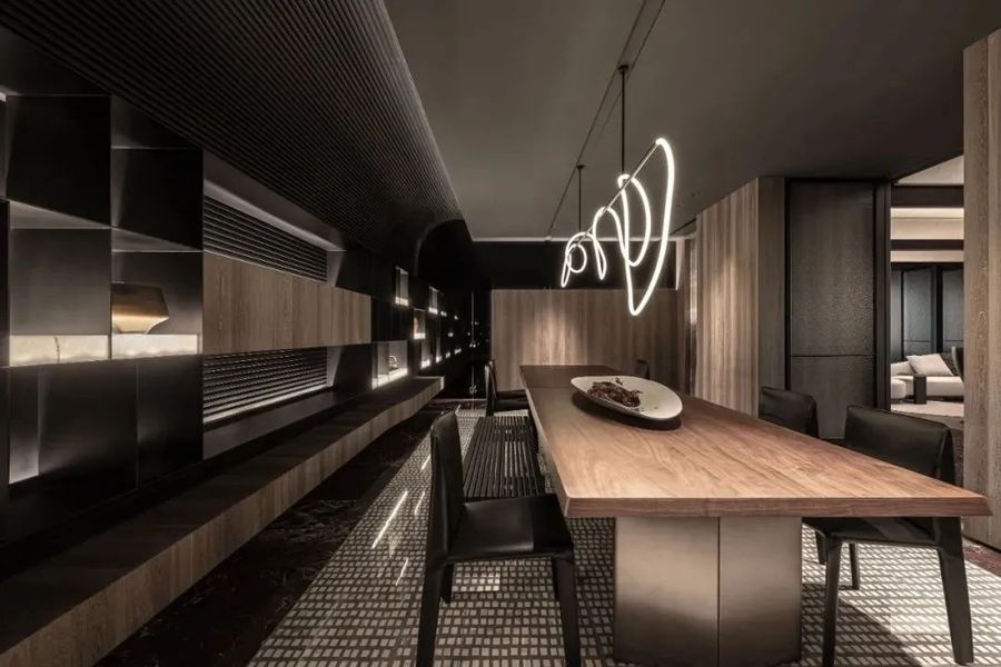
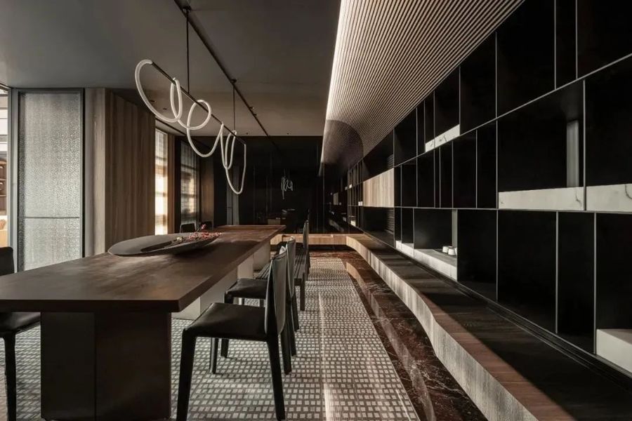
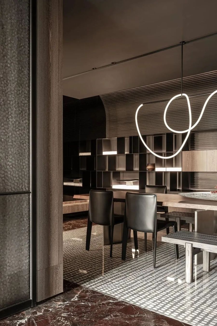
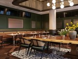
活动空间,延续入口铁件柜体的语汇,增加灯盒创造出不同的柜台层次,就像像珠宝盒般的存在,低调而高雅,配上流线型的吊灯,和弧型格栅的天花板,使视觉感受更显柔和圆润,地板小方块纹理的磁砖,呼应入口格栅的元素,也用不同材料分割形式,呈现地毯的视觉效果。
The activity space continues the vocabulary of the entrance iron cabinet, adding light boxes to create different counter levels, just like a jewelry box. It is low-key and elegant, paired with streamlined chandeliers and curved grille ceilings, making the visual experience more soft and rounded. The small square texture tiles on the floor echo the elements of the entrance grille, and different material segmentation forms are used to present the visual effect of the carpet.
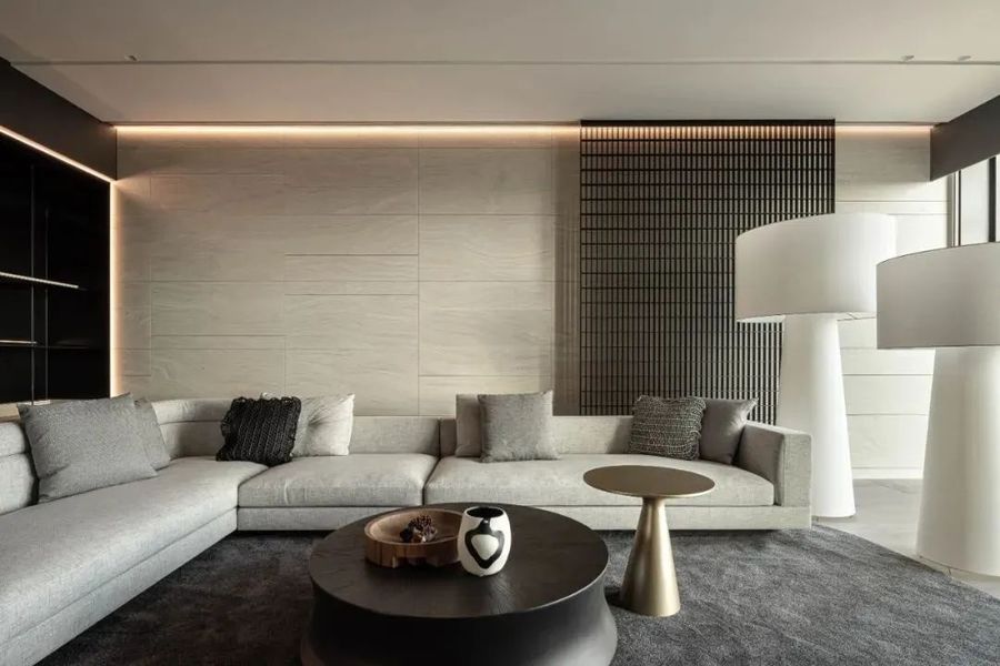
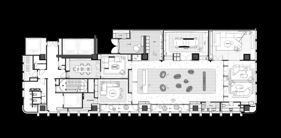
洽谈空间延续格栅屏风的语汇、地坪红色石材、红色皮革的元素,呈现空间主题创作空间层次及视觉效果。The negotiation space continues the vocabulary of grille screens, the elements of red stone and red leather on the floor, presenting the spatial theme, creating spatial levels, and visual effects.
平面图
▼
项目名称|生命之光
项目位置|台中
项目类型|私人会所
项目面积|400m2
设计单位|近境制作
设计总监|唐忠汉
项目摄影|崴米锶空间摄影







评论(0)