本期女业主[email protected]故事的飘飘,是全网全平台粉丝量近百万的家居博主,这是她装修的第二套房子,也是我们的第一次合作,该项目房型本身比较理想,户型方正,空间敞亮,3面环窗视野极好(在北京能拥有270°采光属实凡尔赛),改造原因主要是不喜欢原始老土的装修风格,以及内部的功能性空间有所欠缺与浪费,不符合她与先生的生活需求,最后设计师从空间布局、生活习惯/需求、风格偏好上带她进行了重新梳理,打造了如今被她赞不绝口的“飘飘的小小城堡”。
The female owner of the project, Piaopiao (@没故事的飘飘), is a home blogger with nearly one million fans on the whole network and all platforms. This is the second house she has renovated and our first collaboration. The house type itself is rather perfect with a square layout, and the space is light and spacious with windows on three sides and terrific views (In Beijing, possessing a house with natural light on three sides is indeed something to boast about). The main reason for the renovation is that the owner does not like the original old-fashioned decoration style, and some internal functions are deficient with a waste of space, failing to meet the needs of her and her husband. Finally, the designer assisted her to re-organize the interior space in terms of the spatial layout, life style/demands, and preference to the decoration style, and hence created “Piaopiao’s cute castle” that she is full of praise now.
▼项目概览,Project overview © 周琛
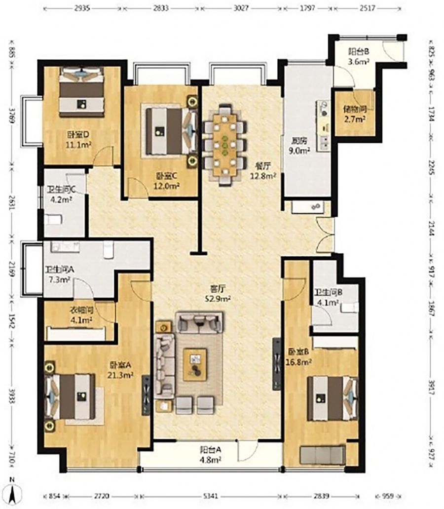
户型痛点:
Weakness
①入户空间过于简单,直通内部,缺乏过渡;
②二手房装修风格老旧,不符合预期审美;
③原始户型中的功能性空间、走廊分割过多,屋主无需使用,造成空间浪费;
④缺乏供人工作/娱乐的独立空间;
①The entrance foyer is too simple that is straightly connected to the interior, lacking of a buffer zone;
②The decoration style of resold apartment is old-fashioned, not in line with the expected aesthetics;
③The functional space and corridor in the original layout were divided too much, and the owners did not need to use them, resulting in a waste of space;
④Lack of independent space for owners to work/play;
▼原始户型图,Original floor plan
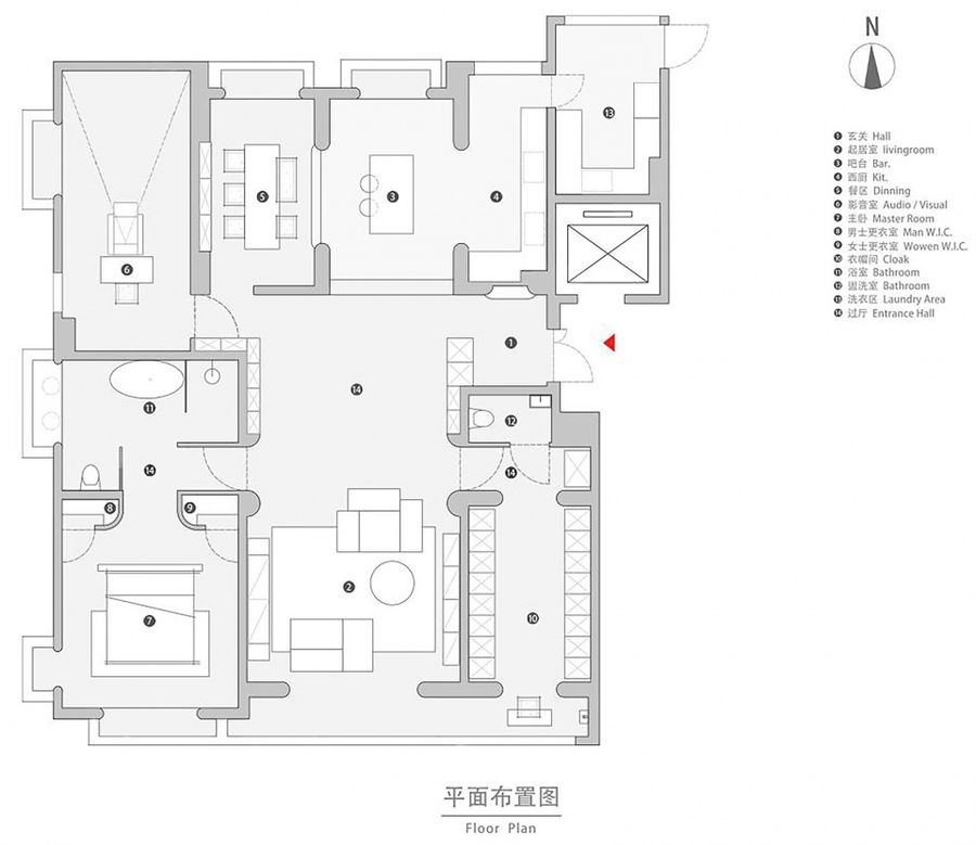
▼改造后平面图, Floor plan after renovation © Bridge Lab
改造亮点:
Light spots of innovation
①拆解原始装修,加入穹顶、弯弧、高踢脚等元素,营造空间的风格和层次感;
②阳台改装大面积落地玻璃,拆除隔断并入客厅与衣帽间,彼此互通,完善采光;
③原始餐厅变岛台区,拓充厨房操作空间,卧室C改餐厅,打造LDK餐厨一体化设计;
④卧室B改为衣帽间,重点解决衣物收纳问题;
⑤卫生间C与卧室D空间合并,改为影音室,引领沉浸式影院级视听体验;
⑥原始卧室A+衣帽间+卫生间合并互通,方便日常使用。
① The original decoration was removed, and elements such as dome, curve and high skirting were added to create a unique spatial style and sense of depth;
② Large scale floor-to-ceiling glasses are installed for the balcony, the partition is removed, and the living room and cloakroom are combined to communicate with each other and further improve the lighting conditions;
③ The original dining room was transformed into a kitchen island area, so as to expand the operating space. Bedroom C was transformed into a dining room to create an integrated design of living room, dining room and kitchen (LDK);
④ Bedroom B was changed into a cloakroom, focusing on solving the problem of clothing storage;
⑤ The space of bathroom C and bedroom D is integrated into a media room to create an immersive cinema-level audio-visual experience;
⑥ The original bedroom A is integrated with the cloakroom and bathroom for easy daily use.
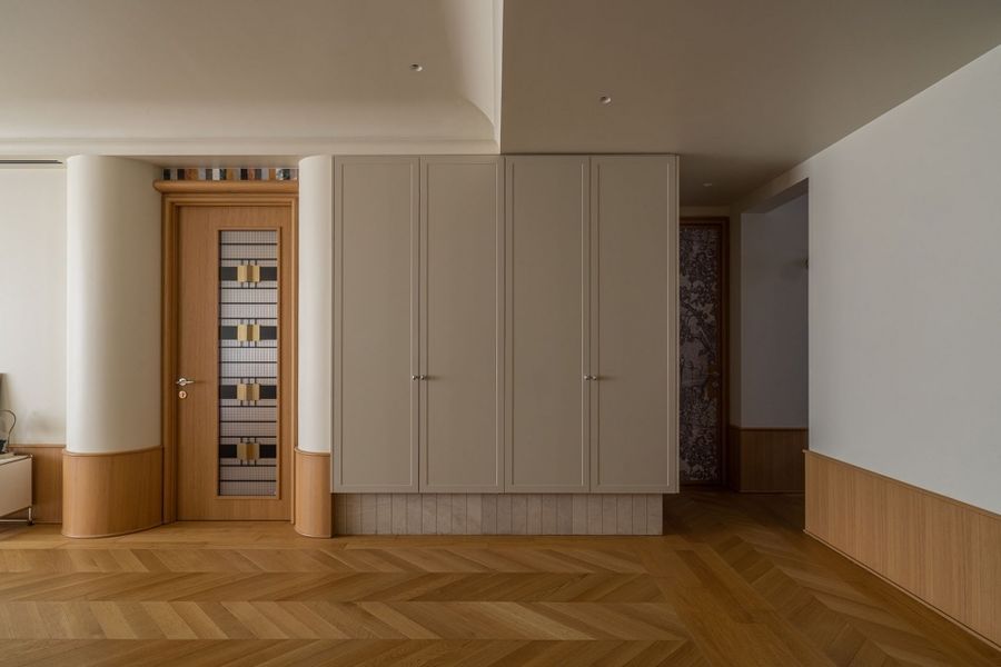
▼玄关,Entrance foyer © 周琛
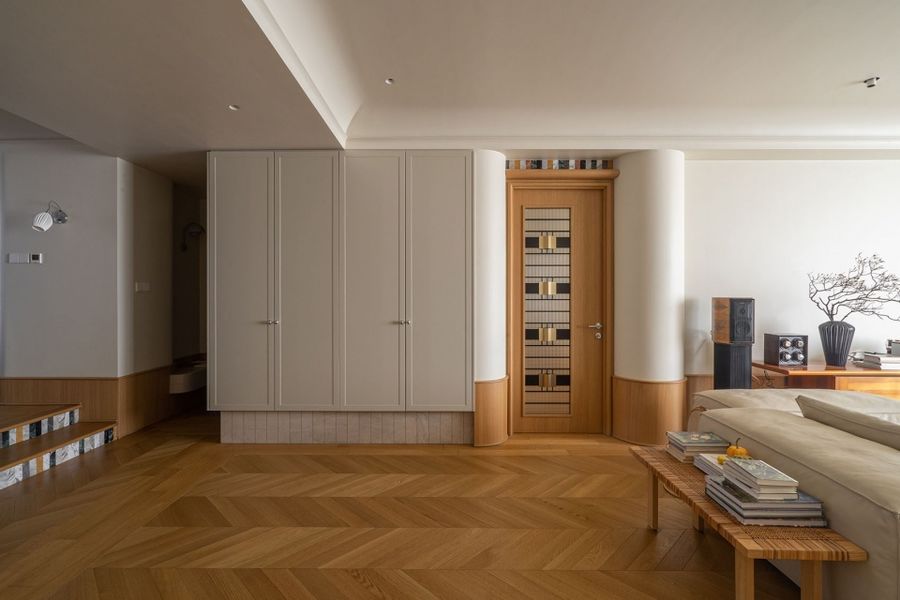
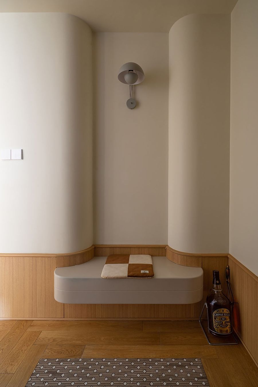
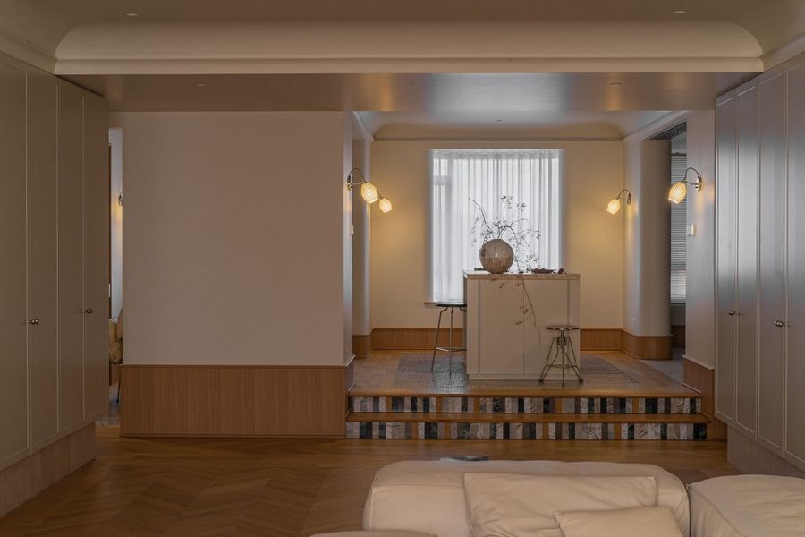
拆除了原始空间中从餐厅延伸而出的一块墙体之后,玄关与过厅空间敞亮不少,后方过厅的两面墙体做了对称式收纳柜体设计,不仅在极大程度上拓充了室内的收纳空间,更是起到了过渡入户空间的作用,并成为了客餐厨的视觉连接点。
After the removal of a wall extending from the original dining room, the entrance foyer and hallway became more spacious and bright. Symmetrical storage cabinets were designed for the two walls of the rear hall, which not only greatly expanded the indoor storage space, but also played a role in the transition between the entrance foyer and interior, and became the visual connection of the LDK area.
▼过厅,Entrance hallway © 周琛
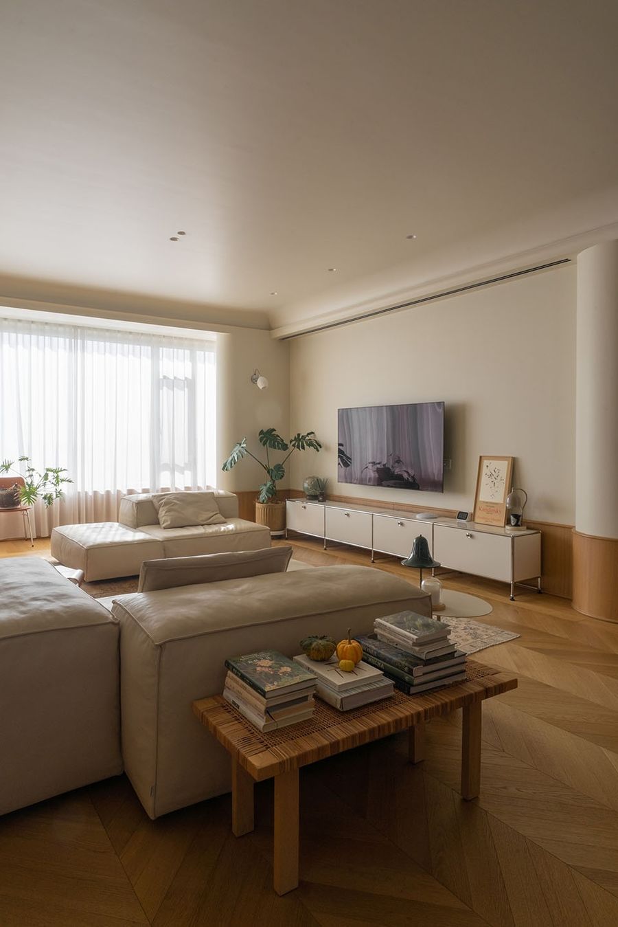
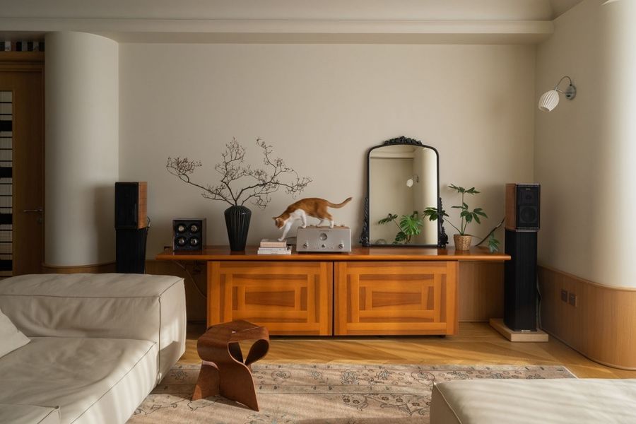
作为入户之后首要目及的起居室,充满了轻法式的复古仪式感和几何韵律,这里以方圆作基调,简洁的块面感穿插其中,用圆弧处理的转角结构使空间更显柔和、自然,让人能在轻松的家居氛围中舒展自我。
As the first sight once entering, the living room is full of French retro sense of ritual and geometric rhythm. Here, with the square as the central theme, simple blocks interspersed among them. The corner structure with curved lines makes the space more soft and natural, so that people can relax in a comfortable home atmosphere.
▼客厅,Living room © 周琛
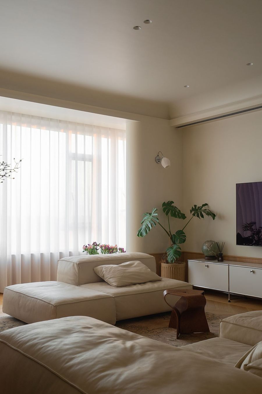
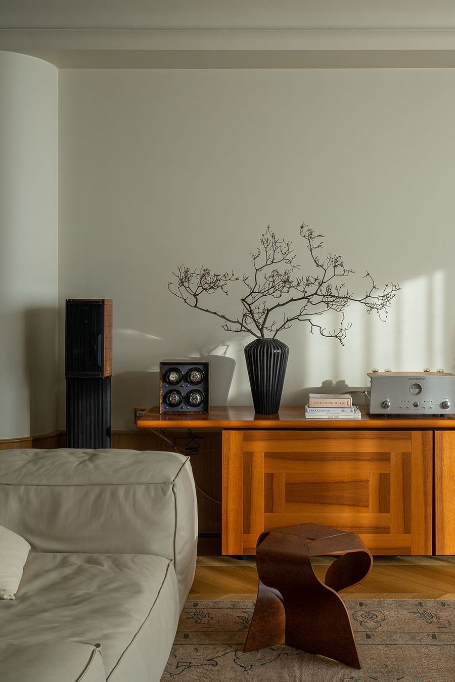
▼客厅局部,Living room corner © 周琛
模块化的沙发可以根据心情或者需求随意变换组合方式,因为它的不断变化,空间在起承转合中也展现出了无数的可能。
The combination of modular sofa can be changed at will according to the mood or needs, the space also shows countless possibilities in the ever-changing combinations.
▼模块化沙发,modular sofa © 周琛
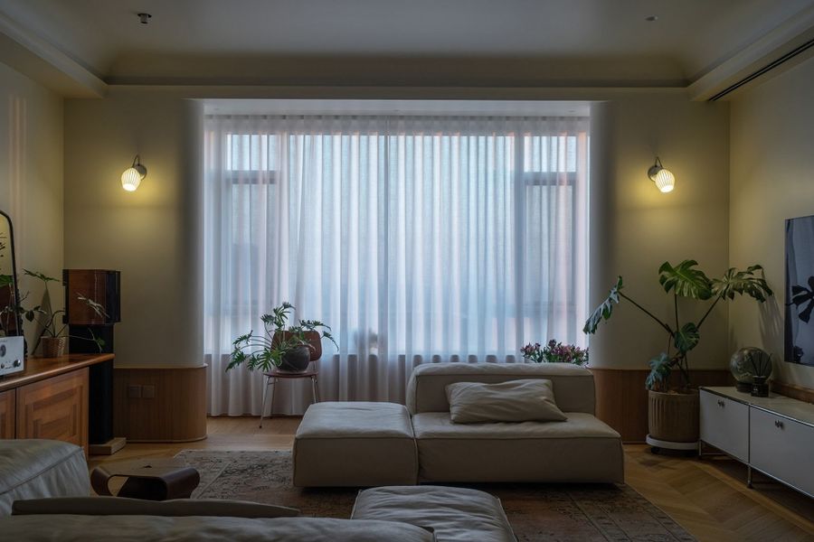
原本细窄的生活阳台并入室内空间,外立面玻璃也换成了整片式,视线更通透完整,采光更优渥。
The originally narrow living balcony is combined with the interior space, and the glass of the facade is also replaced by a full-piece glazing, so that the line of sight is more unobstructed and the lighting is more abundant.
▼客厅良好的采光,Abundant lighting in living room © 周琛
▼客厅一角,detial of the livving room © 周琛
在尊重原始空间布局的基础上,我们将最大的开放区改造为集起居室+厨房+岛台+餐厅为一体的多功能生活空间,更顺应业主所希冀的休闲的生活方式。
On the basis of respecting the original layout, we renovated the largest open area into a multi-functional living space integrating living room, kitchen, kitchen island and dining room, which is more in line with the casual lifestyle desired by the owner.
▼岛台区,Kitchen island© 周琛
室内用到了多种铺贴方法:鱼骨拼、直板拼以及木地板与马赛克砖相拼接。客厅、走廊、卧室大部分空间是用标准板做了鱼骨拼的样式,边缘再用两层直板拼框起中间的鱼骨拼,做出嵌套效果,既可以划分空间,又能起到调整空间方正的作用。
The interior surfaces are paved in a variety of ways: fishbone tiling, straight tiling, and combination of wood flooring with Mosaic tiles. The fishbone tiling with standard panels is paved in most of the living rooms, corridors and bedrooms, and the edge is framed with two layers of straight tiling to make a nested effect, which can not only divide the space but also play the role of showing the square effect of the space.
▼多种材料铺贴,various paved materials © 周琛
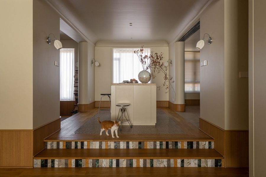
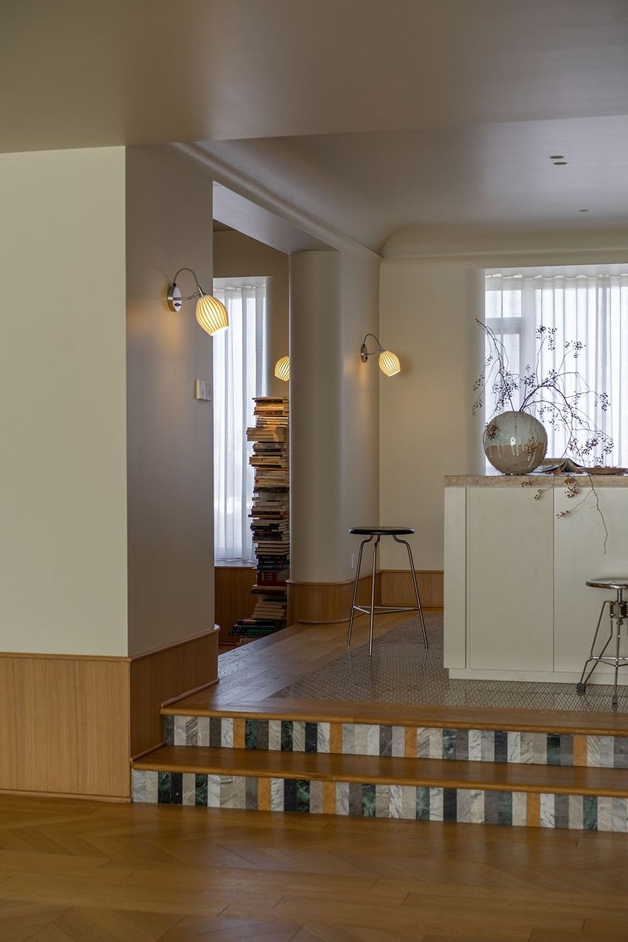
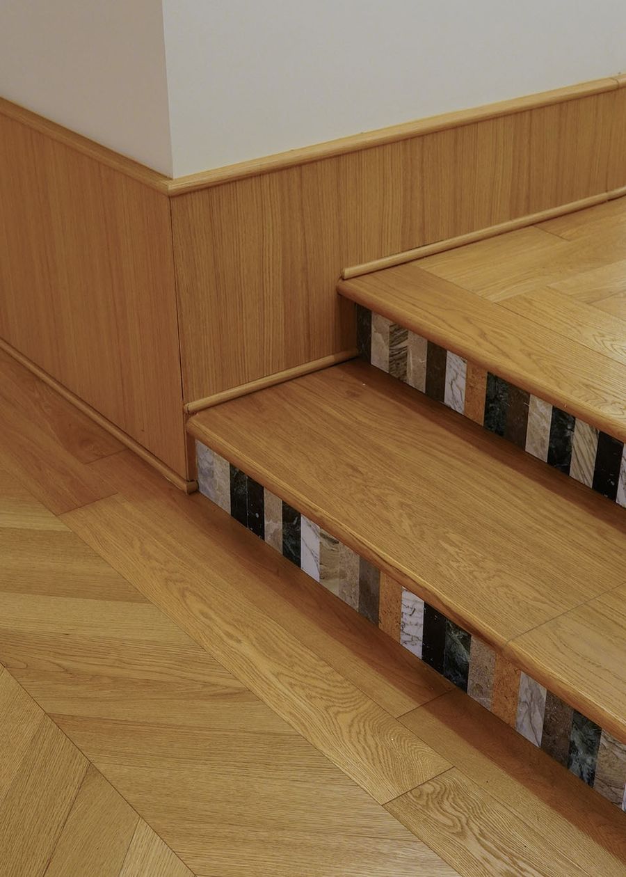
原始户型的餐厅中就存在的空间高差,因为精致的台阶而变得更有就餐仪式感,立面贴上不同颜色的彩砖,仿佛一排钢琴键,踏上就能奏出欢快的琴音。
There is a certain height difference in the original layout of restaurant, and the exquisite steps bring more sense of dining ceremony. The risers are paved with colorful bricks, like a row of piano keys, which can play a happy music when you step on it.
▼彩砖细节,detail of the colorful bricks © 周琛
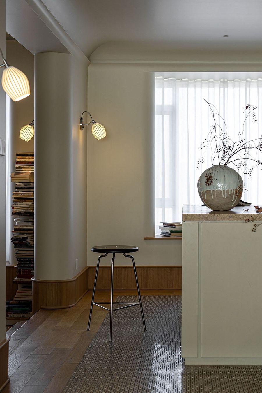
玄关、餐厅以及岛台区,中间铺设拼花马赛克砖,周围再嵌套木地板,在地板与瓷砖之间,要考虑到两种铺贴材料的高差,因此选定产品之后,在已知厚度数据的情况下,需先贴完砖,再根据地板的厚度,将地板区域的地面找平做好(采用环氧水泥自流平,保证胶粘地板的地面强度),如此再贴地板,高差问题迎刃而解,且二者之间也不用贴收口条(干区无水汽影响),更整洁美观。
Mosaic tiles are paved in the middle of the entrance foyer, dining room and kitchen island area, surrounded by wooden flooring. Between the flooring and tiles, the height difference between the two paving materials should be taken into account. Therefore, after the selection of the product, it is necessary to finish the brick first when the thickness is given, and then level the floor area according to the thickness of the floor (with self-leveling epoxy cement to ensure the strength of the adhesive floor). In this way, the problem of height difference will be readily solved when paving the flooring. Also, there is no need to attach the closing strip between the two materials (without influence of water vapour in the dry area), which is more tidy and beautiful.
▼拼花马赛克砖,Mosaic tiles © 周琛
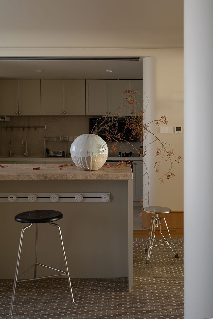
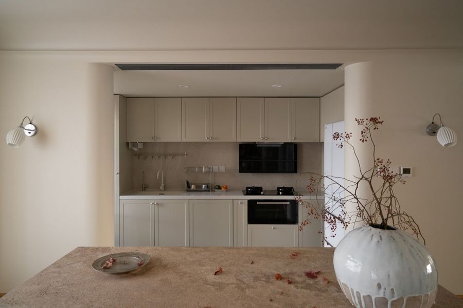
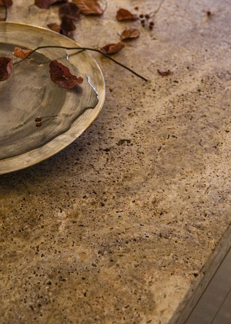
平常用的小家电都放在了中岛下方的收纳柜里,方便平时取用,加上面积较大的洞石材料的操作台面,变成了厨房的有力辅助。
Frequently-used small home appliances are placed in the storage cabinet below the middle island, easy to use at ordinary times. In addition, the larger area of the operating table paved with travertine has become a powerful aid in the kitchen operation.
▼洞石材料的操作台面, the operating table paved with travertine © 周琛
原始户型的厨房不变,根据女主人的烹饪习惯,油烟并不是负担,所以还是决定把厨房区打开,烹饪区、大家电、上下水都放在了厨房,以承担基础的功能,其中洗碗机做了全嵌入式的设计,外部装上了和橱柜完全一样的面板,做到了完全隐形。
The original layout of kitchen is kept unchanged according to the female owner’s cooking habits, because she believes that kitchen fumes are not a burden, so it is decided to open the kitchen area. The cooking area, home appliances, and water supply lines are all placed or set in the kitchen to support the basic functions. Among them, the dishwasher is fully embedded in the cabinet, and its surface is installed with the same panel as the cabinet to be completely invisible.
▼厨房,Kitchen © 周琛
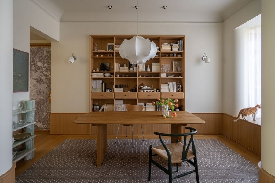
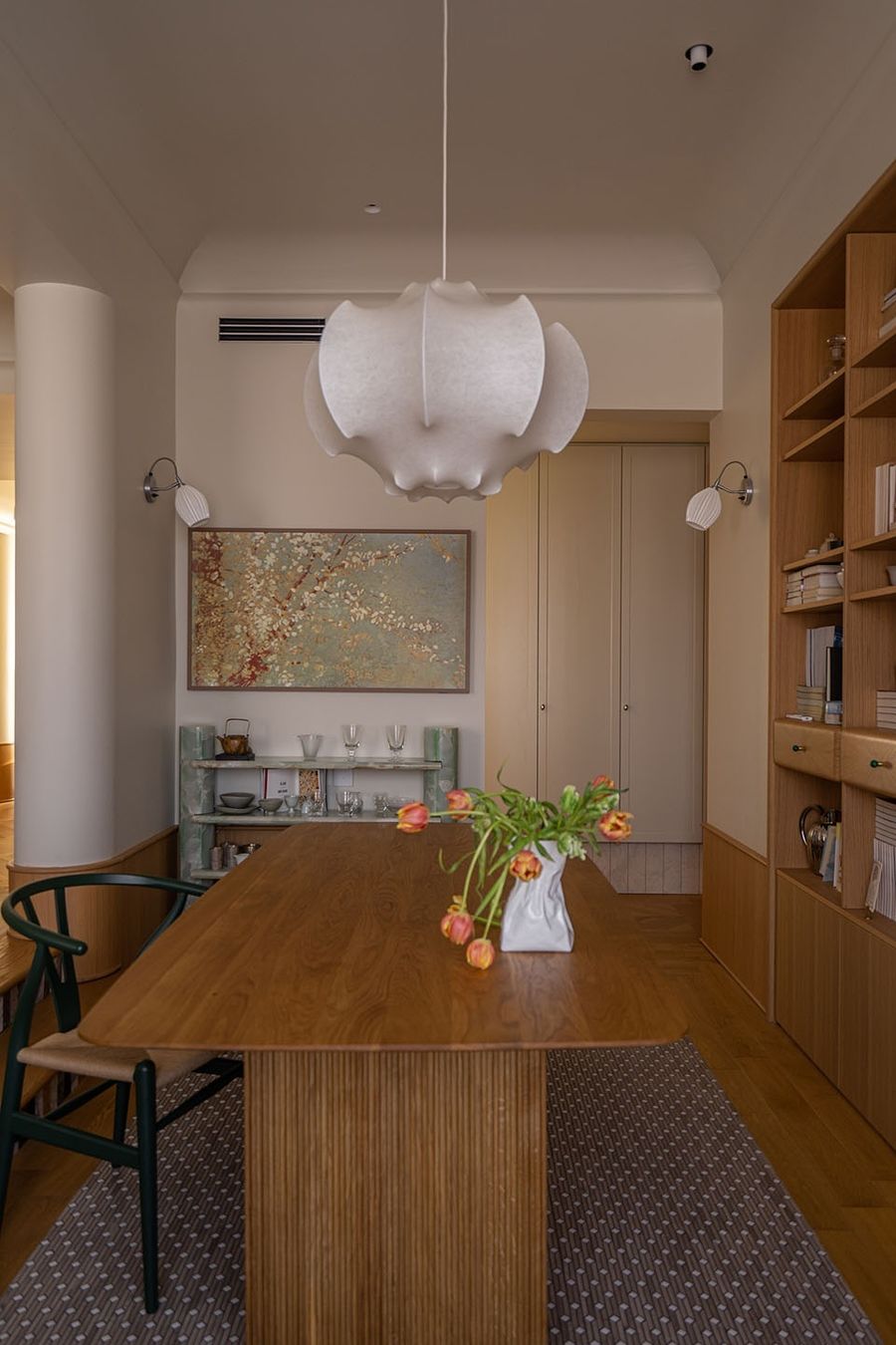
因为女主人平常在家有码字办公的需求,她希望拥有一个让她能同时工作/阅读/日常享受生活的空间,所以这个带收纳展示柜的餐厅应运而生。
Because the female owner usually needs to write articles and work at home, she wants to have a space where she can work, read and enjoy daily life at the same time, so the restaurant with storage display cabinet emerged at the right moment.
▼餐厅,Dining room © 周琛
▼带收纳展示柜的餐厅,the restaurant with storage display cabinet © 周琛
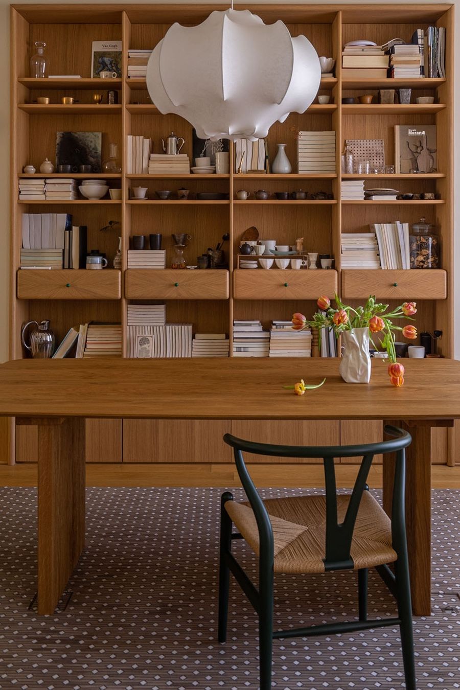
2米的实木中古餐桌,既可以在此享用一日三餐,又能具备办公功能,后方收纳柜做有层高不同的隔板/抽屉,方便收藏不同尺寸的书籍与器物。
There is a 2-meter-long solid wood medieval dining table, where the owner can both enjoy three meals a day and work. The storage cabinet in the rear is designed with partitions/drawers of different heights to facilitate the collection of books and utensils of different sizes.
▼实木中古餐桌,solid wood medieval dining table © 周琛
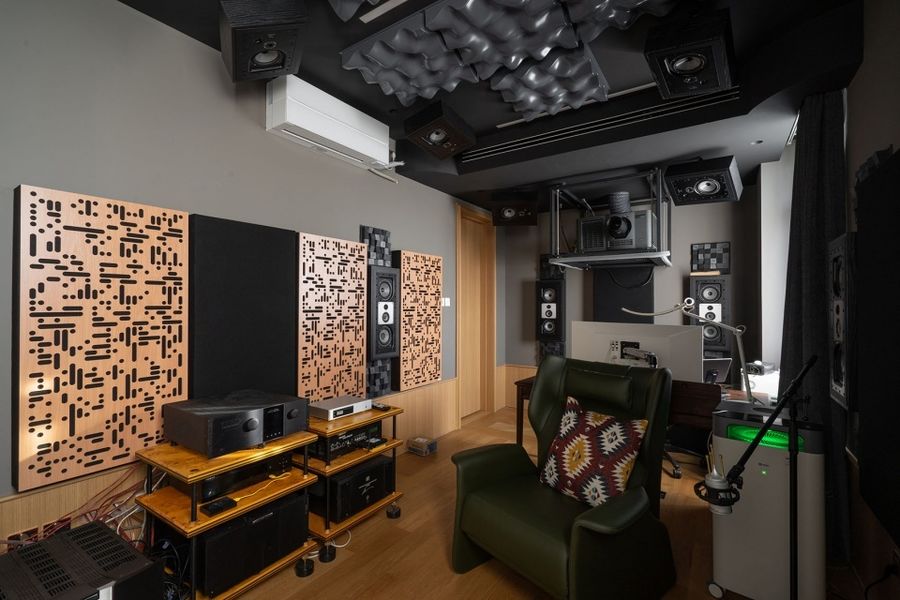
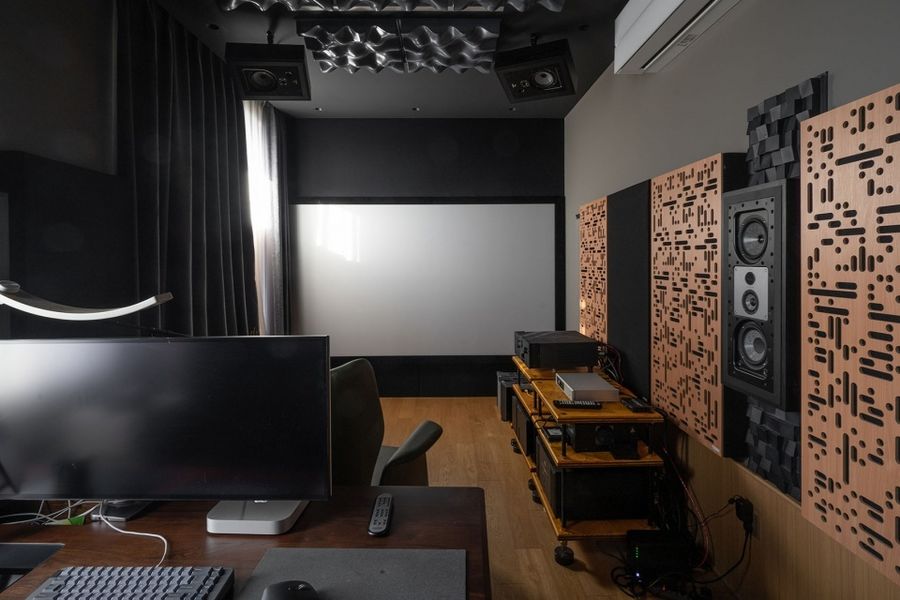
男主人是视听器材发烧友,这间卧室改造而来的影音室如今变成了可供他自由发挥的基地,专业设备比比皆是,效果可以媲美专业影院。
The male owner is a zealot for audiovisual equipment, thus the media room renovated from the bedroom has now become a base for his free play, full of professional equipment with the effect that can be comparable to a professional cinema.
▼影音室概览,overview © 周琛
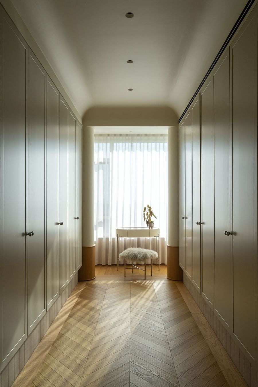
由原始户型中的卧室B改造成的衣帽间,带来了足够的收纳空间,对称设计的立柜满足了家里所有衣物的收纳需求,并与外面连廊的柜体造型相互呼应。主卧作为私密空间,舒适度放在了第一位,因为生活需要,这里的设计摒弃了墙和门的作用,让它与卫生间互通,旨为打造一个自由流动的享受型空间。
The cloakroom renovated from the original bedroom B has brought enough storage space, and its symmetrical cabinet meets the storage needs of all clothes of the owners, corresponding to the cabinet shape of the porch outside. As a private space, the comfort of the master bedroom is given top priority. Due to the needs of life, the design here has abandoned the walls and doors, so that the master bedroom and the bathroom are interlinked, aiming to create a free flowing enjoyment space.
▼衣帽间与主卧过道,Cloakroom and master bedroom pathway © 周琛
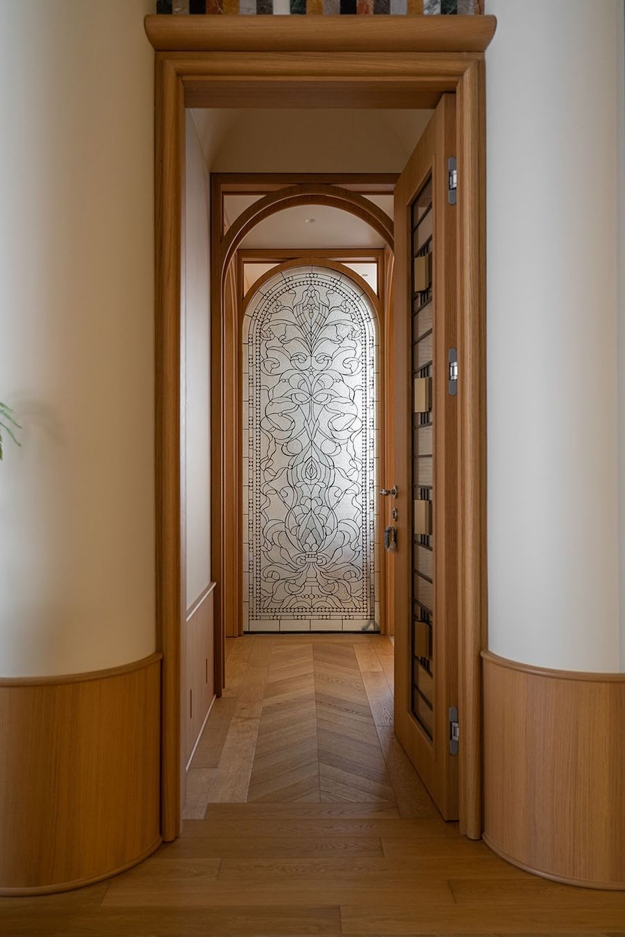
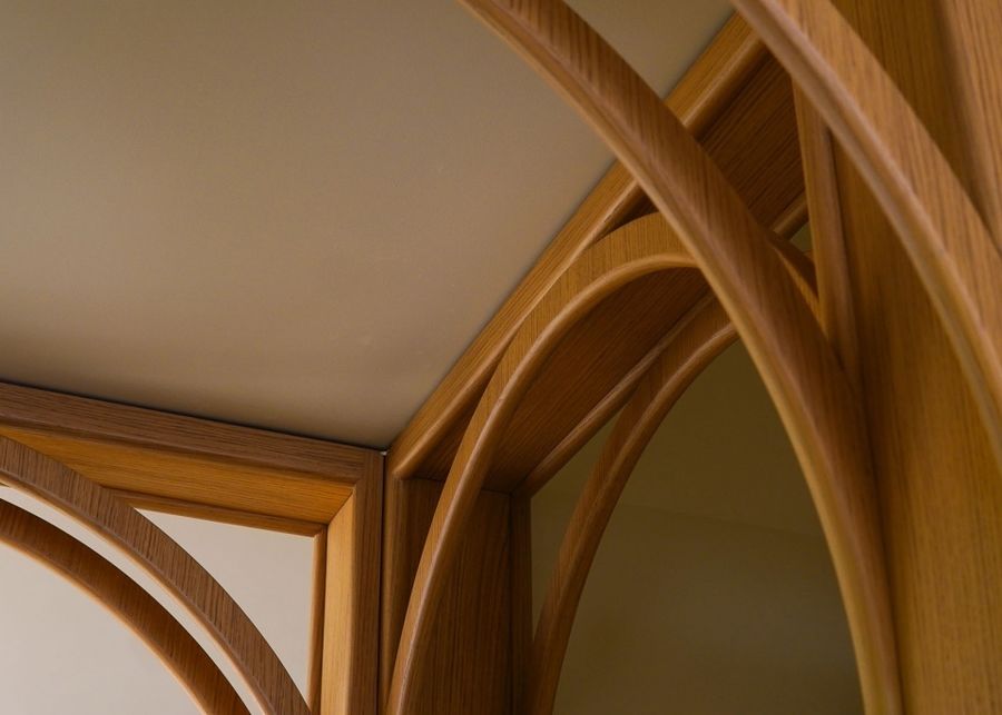
通道中定制的木作拱门无疑是整个空间的点睛之笔,四面都做了造型,工艺复杂,对于精度要求很苛刻(基本不可能刚做完就能达到与空间严丝合缝的效果),所以它是在工厂初步生产完之后,先在厂里组装,第一步修正基础问题,修正好了再拆分拿到现场,又在现场组装一遍,找出还需继续修改的细节,最后再返回工厂继续打磨,彻底确认完善后才能到现场安装。
The custom-made arched timber door in the passageway is undoubtedly the key point of the entire space, with modeling on all four sides. Its craft is rather complicated, and the requirements for accuracy are very demanding (it is basically impossible to achieve the exactly matched seam with the space right after the production). As a result, after the initial production in the factory, it is first assembled in the factory, in which the basic problems are corrected in advance. Then it will be disassembled to transport to the site, and assembled again to find out the details that need to be modified. And finally it will be returned to the factory to continue polishing until it can be perfectly installed on the site.
▼通道中定制的木作拱门,The custom-made arched timber door in the passageway © 周琛
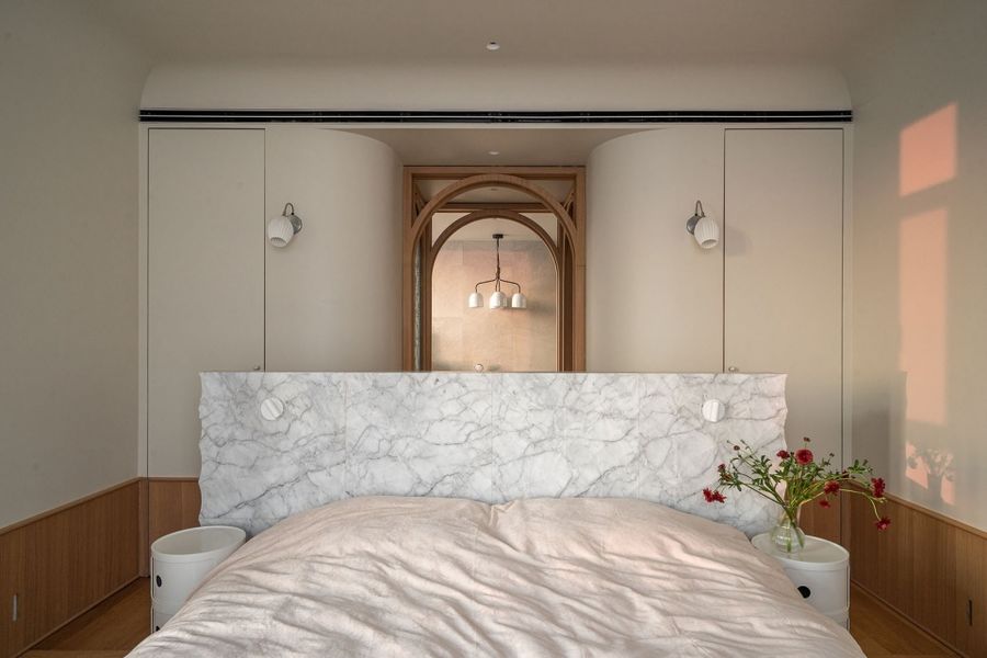
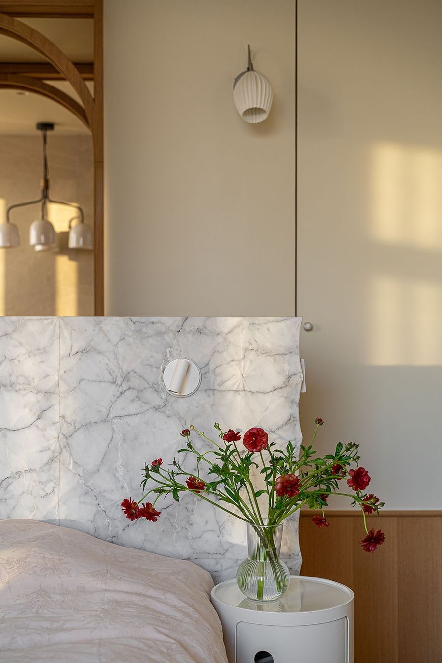
卧室床头由意大利进口艺术雕刻石材拼贴而来,起伏的雕刻纹样走势,结合不同的光线,能展现出不同的光影效果。卧室里还有两个小小的衣帽间,做了隐形门,和整个卧室墙面融为一体,分别在男女主人的床头后面,里面可放两人的内衣/睡衣以及床品被子,看着不大但很能装。
The headboard of the bed in the bedroom is collaged with art carved stone imported from Italy. The trend of winding engraving pattern, combined with different lighting, can show different light and shadow effects. The bedroom also has two small wardrobes with invisible doors, integrated with the entire interior of the bedroom. They are embedded respectively behind the headboard of the male and female owners, to accommodate their underwear/pajamas and bedclothes, with a very strong storage capacity in spite of small appearance.
▼床头后面的隐形衣帽间,invisible wardrobes behind the headboard © 周琛
▼床头光影,The light and shadow effects at headboard © 周琛
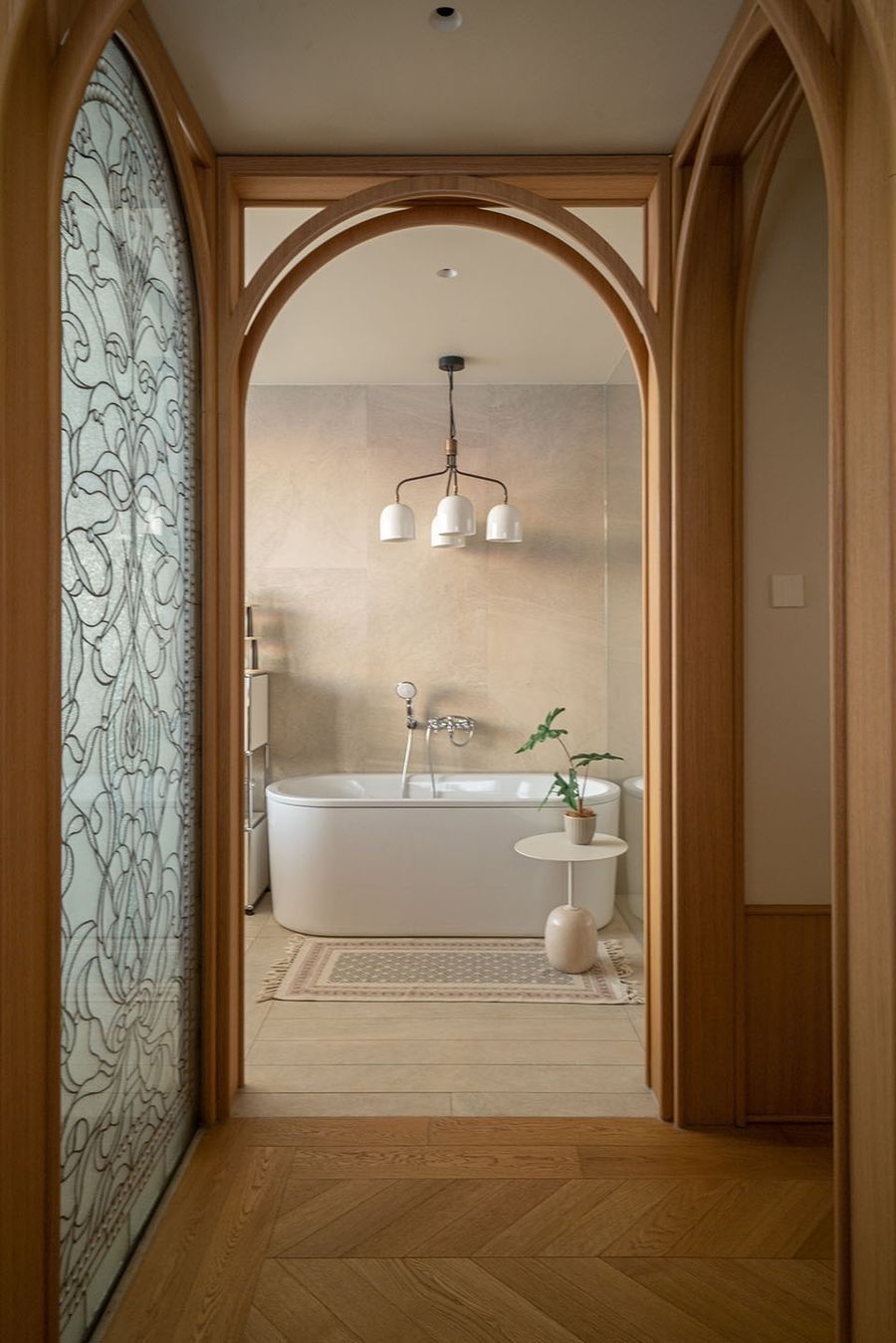
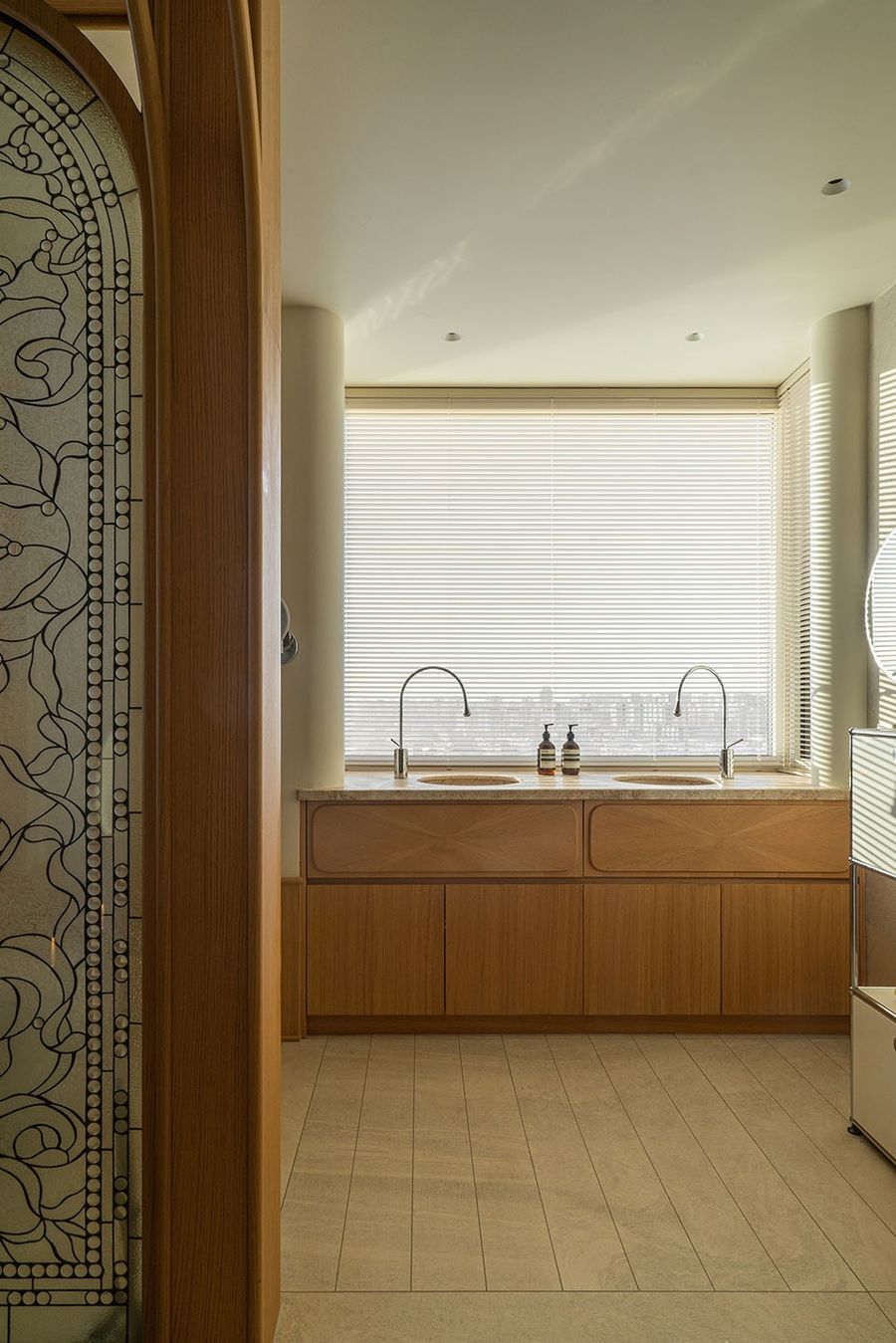
穿过仪式感满满的拱形门洞,便是专为女主人打造的泡澡区,可以随时随心享受沐浴时刻,卸去身上的疲惫,感受度假般的惬意。
A specially designed bathing area for the female owner could be seen when passing through the arched door full of sense of ritual, where she can enjoy the moment of bathing at any time, to take off her tiredness and feel like a vacation.
▼浴室 ,Bathroom © 周琛
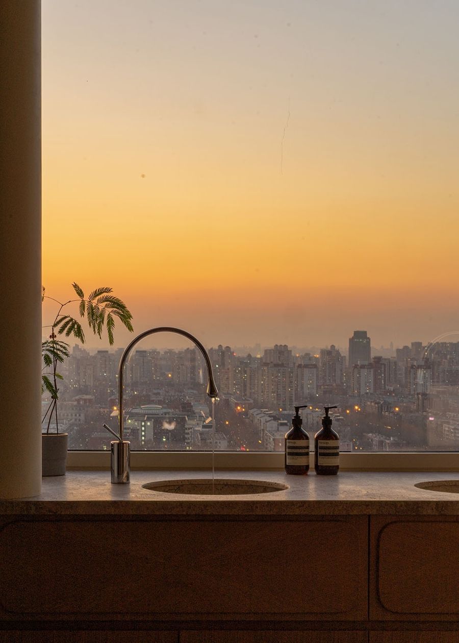
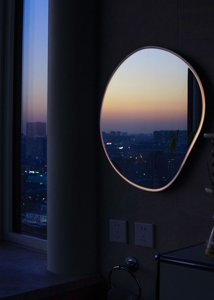
相较于不经常使用的浴缸,西侧窗户视野最佳位置最终让给了日常使用频繁的洗手台,旨在让频繁使用的功能区享有最好的风景,开阔的大面积窗户将窗外美景自然“框”进室内,俯瞰之下是熙熙攘攘的车水马龙,身心却在宁静的港湾里安顿,窗户一关,喧嚣自然也被隔绝开了。
Compared to the infrequently used bathtub, the optimum view position beside the west window is eventually spared to the frequently used wash basin, aiming to give the best view to the frequently used functional area. With the large-scale window, the scenery outside the window is naturally “framed” into the room. The owners can overlook the bustling traffic, but their bodies and minds are settled in a peaceful harbor. When the window is closed, the noise is naturally shut out.
▼西侧窗户的风景,the best view framed in the west window © 周琛
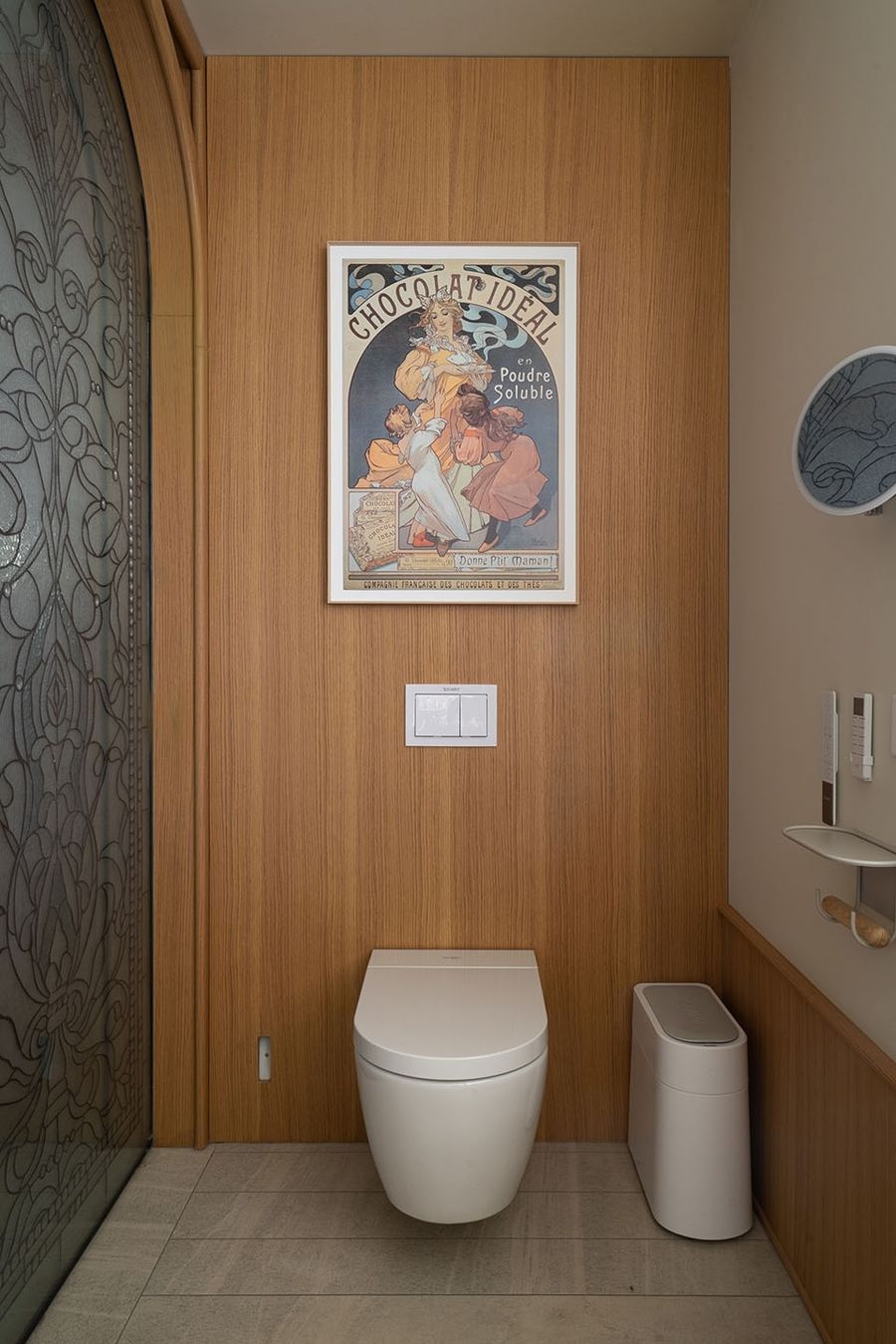
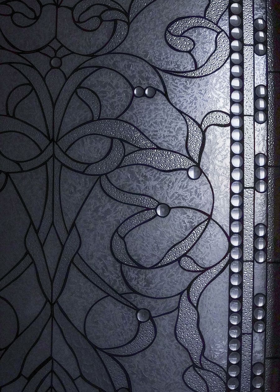
拱门花窗后方是如厕区,悬浮式马桶方便日常打扫,隐蔽且实用。
The toilet area is behind the flowered window of the arched door. The wall hung toilet is convenient for daily cleaning, both hidden and practical.
▼如厕区,The toilet area © 周琛
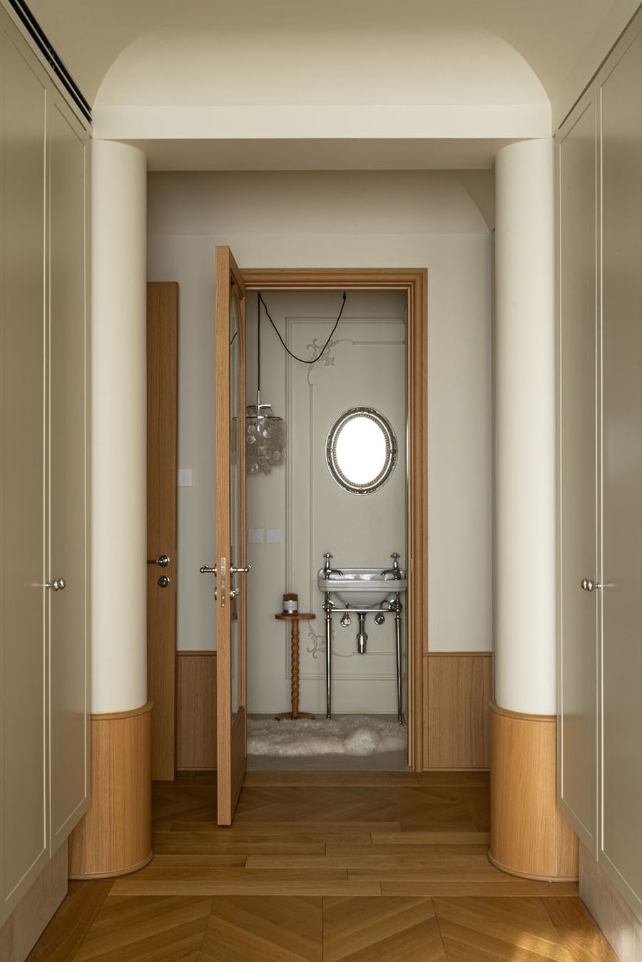
该卫生间没有淋浴要求,主要以实用为主,因此没有贴砖,只布置了手盆+马桶,为了让空间效果更丰盈,后续加上了复古的PU线条与雕花灯盘,再配上精致的吊灯,视觉张力直接拉满。
This restroom has no shower requirements, giving priority to pragmatism, therefore no tile is used here, only a wash basin and a toilet are installed. In order to make a more plentiful space, retro PU lines and a carved lamp tray are added, combined with the exquisite chandelier, leading the visual effect directly to the best state.
▼洞石与玻璃门细节,detials of travertine and glass door © 周琛
项目名称:飘飘的小小城堡
项目类型:住宅室内设计
设计方:乔和桥治建筑实验室
项目设计:2021
完成年份:2023
设计团队:刘一汀
项目地址:北京市朝阳区
建筑面积:200㎡
摄影版权:周琛
Project name 
Project type:Residential Interior Design
Design:Bridge Lab
Design year:2021
Completion Year:2023
Leader designer & Team:Yvonne Liu
Project location:Chaoyang District, Beijing
Gross built area: 200㎡
Photo credit: Chen Zhou




评论(0)