COCHA,作为“咖啡”和“茶”的合成词,在西班牙语里意为“湖泊”,也是本案形式原型与空间组织方式的出发点。
COCHA, a coined word that combines coffee and cha(tea), has a Spanish etymological origin that means lake or lagoon, which serves as a starting point for both formal prototype and spatial organization.
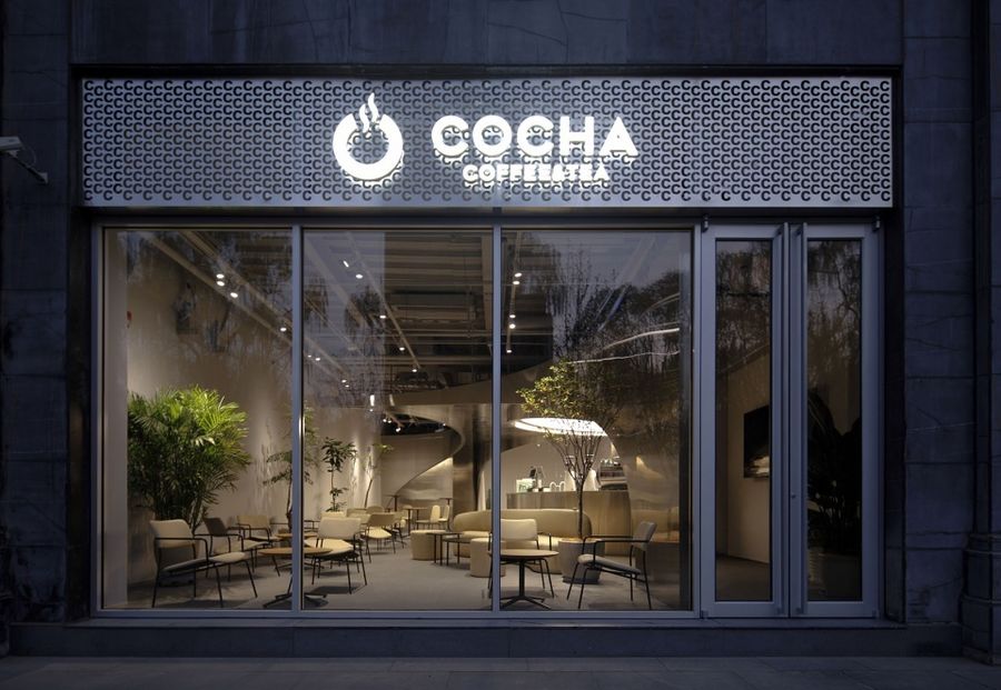
▼店铺门头,The door © BWAO
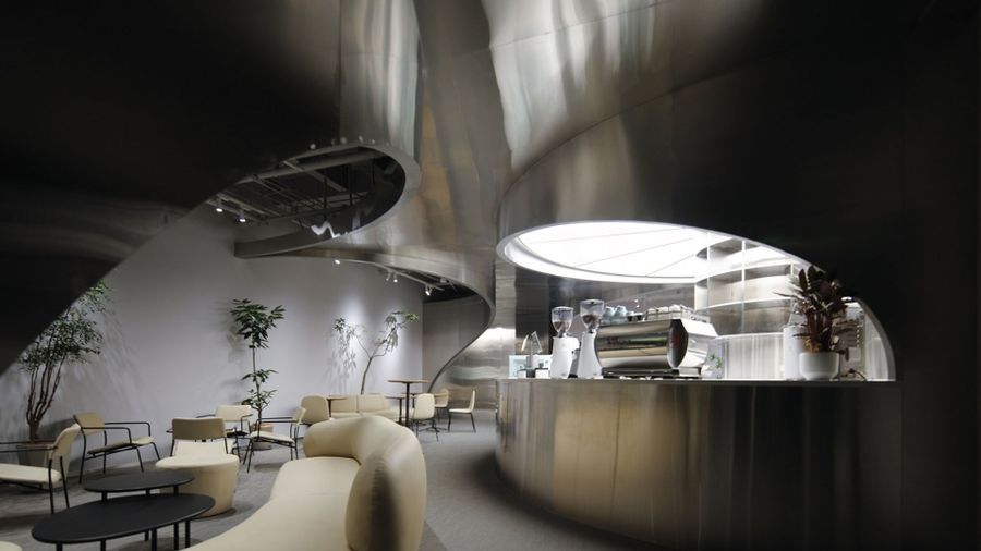
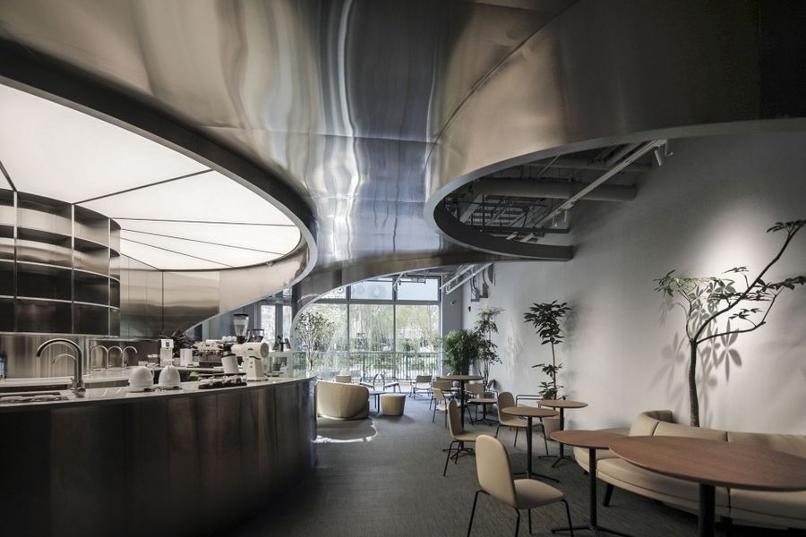
▼室内概览,Overall view © BWAO
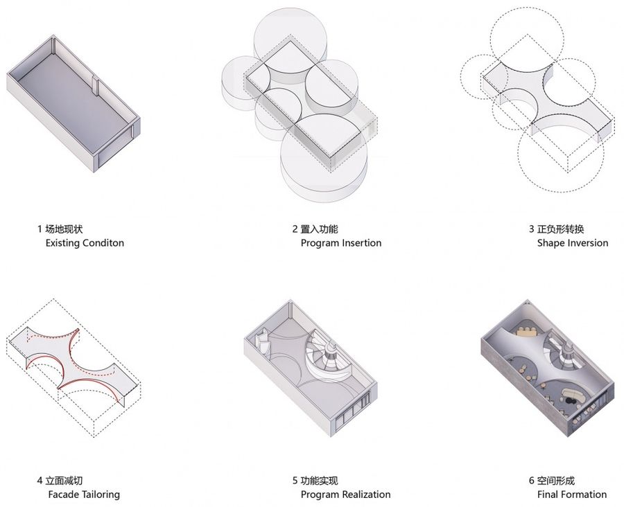
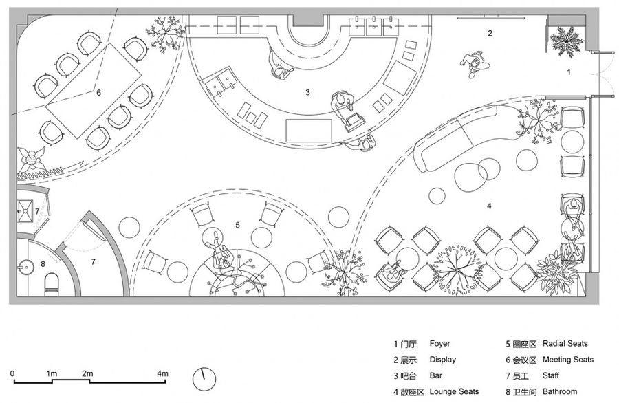
平面引入五个圆形,被边界切成半圆或四分之一圆:一个成为吧台,一个成为卫生间及员工间,三个成为座位区。吧台作为空间主角将人们从门厅引入到房间最深区域。 三个座位区各具特点:外圆场景灵活松散排列,中圆呼应平面向心摆设,内圆召开会议正式布置。
▼空间生成分析图,concept diagram © BWAO
Five rings are introduced into the space, cut by the existing plan boundary to form semi-circles or quarter-circles: one for bar area, one for storage and bathroom, and three for seating areas. Being the center piece of the space, the bar area channels people all the way from the entry foyer to the bathroom. The three seating areas are arranged to have different characteristics: one in a loosey-goosey fashion to be more sporadic, one in a centripetal figure to correspond to the plan, and one in a formal layout to host meetings.
▼从室内空间望向入口处,View back to entry © BWAO
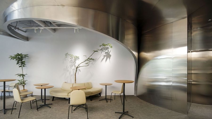
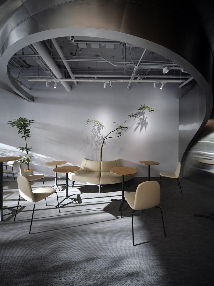
▼散座区,Lounge area © BWAO
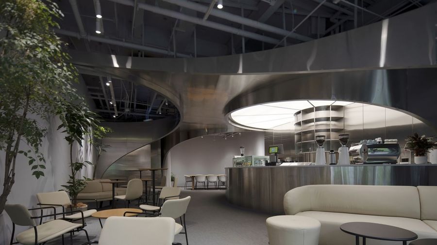
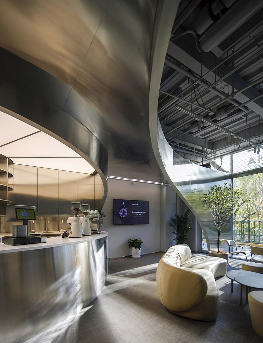
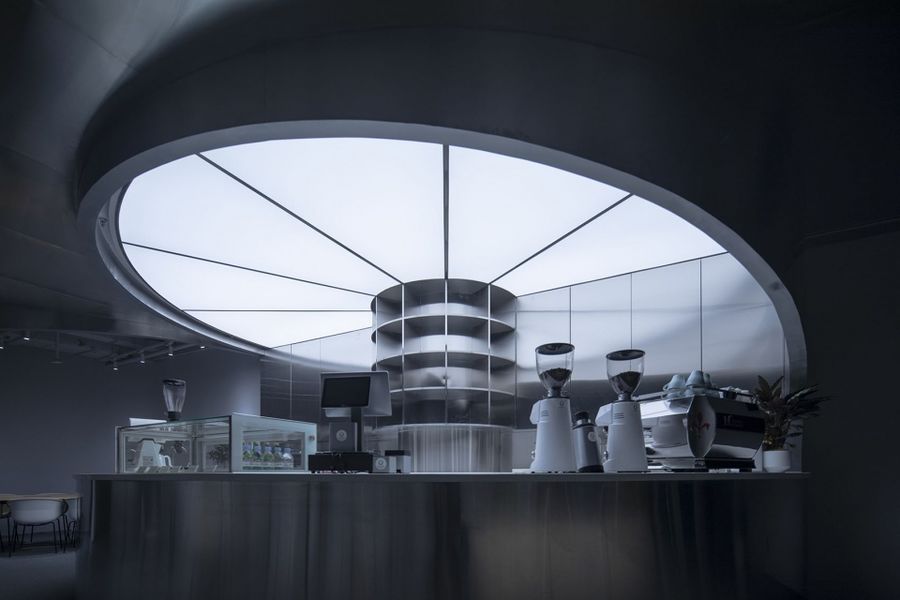
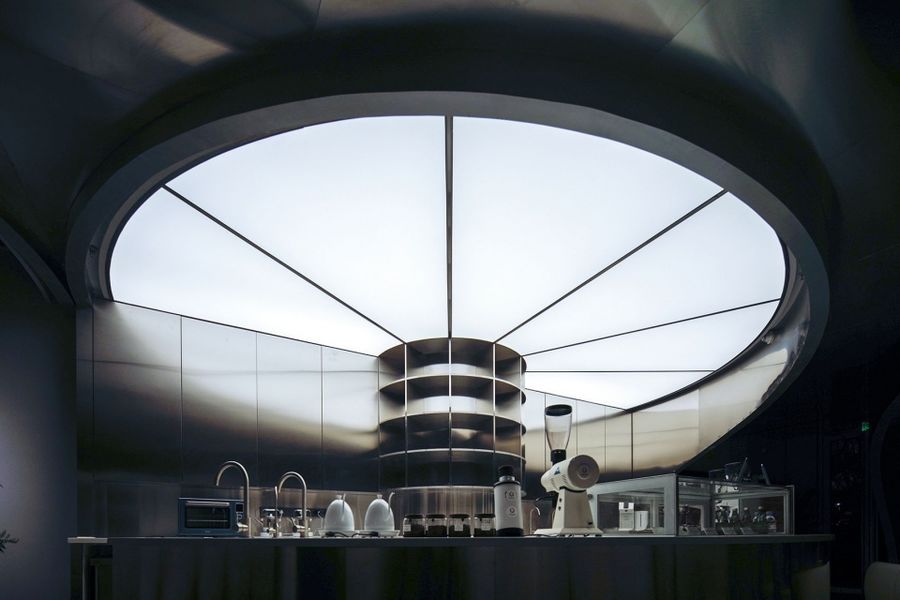
▼圆形的服务吧台,Service counter © BWAO
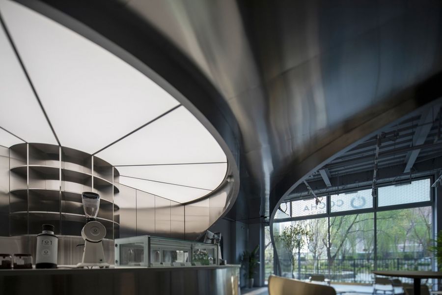
▼从圆形的吧台处看向室外景色,Service counter with landscape © BWAO
被圆切掉形成的负形反转为正形,变为金属装置介入空间。立面上的曲线沿对角线布置保持形式连续。表面材料使用拉丝不锈钢板,结合灯光创造科技氛围。装置与立面相交划分为入口及落地窗,立面上方对外店招为穿孔金属板,对内为可开启消防窗,与周边商业立面协调的同时让室外景观最大化的融入室内空间。
The negative space cut out by the rings are made positive to form a metallic installation that dominates the space. The elevation curves are smoothed out diagonally to have a continuous configuration. Brushed stainless steel panels are applied to the surface to create a technological ambience. The installation connects to the storefront in a way that separates the entrance from window area. The upper facade faces the outside with perforated metal panels for signage fixtures, and opens to the inside with mechanical windows for ventilation. The facade maximizes the views out to the riverbank landscape while blending into the building facade as a whole.
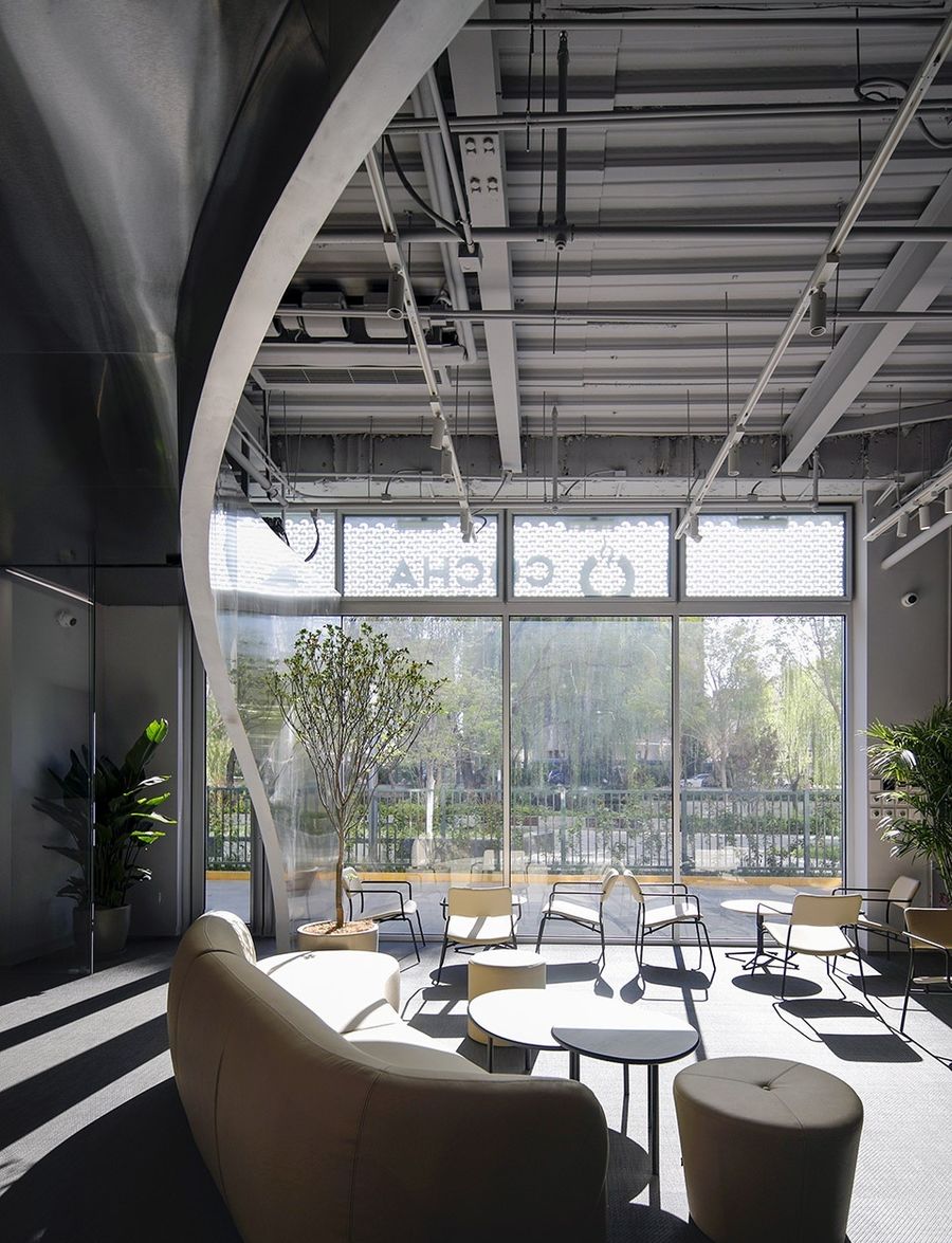
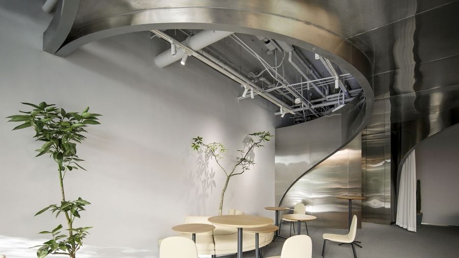
▼客座区,Radial seating © BWAO
▼客座区与绿植相结合,Radial seating with plant © BWAO
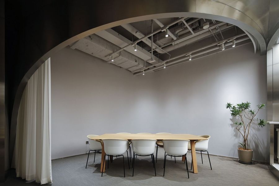
软装设计尝试加强空间逻辑:外圆弧形沙发与立面弧线一起界定空间走势,中圆半圆沙发与平面半圆同心定义空间范围,内圆纱帘直接将空间封闭。绿植造型的选择也结合家具摆放的节奏,起到划分小区域与强化空间领域的作用。
The furnishing design strengthens the spatial logic. The curved sofa set at the entrance goes along with the facade curve to define the flow of space. The circular sofa set in the middle is centered on the plan circle to define the edge of space. The transparent curtain is pulled to close the inner circular space completely. The selection of plants works with the furniture plan, further defining seating areas with their shape and presence.
▼会议区,Meeting area © BWAO
平面功能既各自独立,又合并形成统一整体,创造供人们交流与链接的空间。
As islands of programs that are independent from each other and converge to unify as a whole, COCHA serves as a metaphor for a space that makes people communicate and connect.
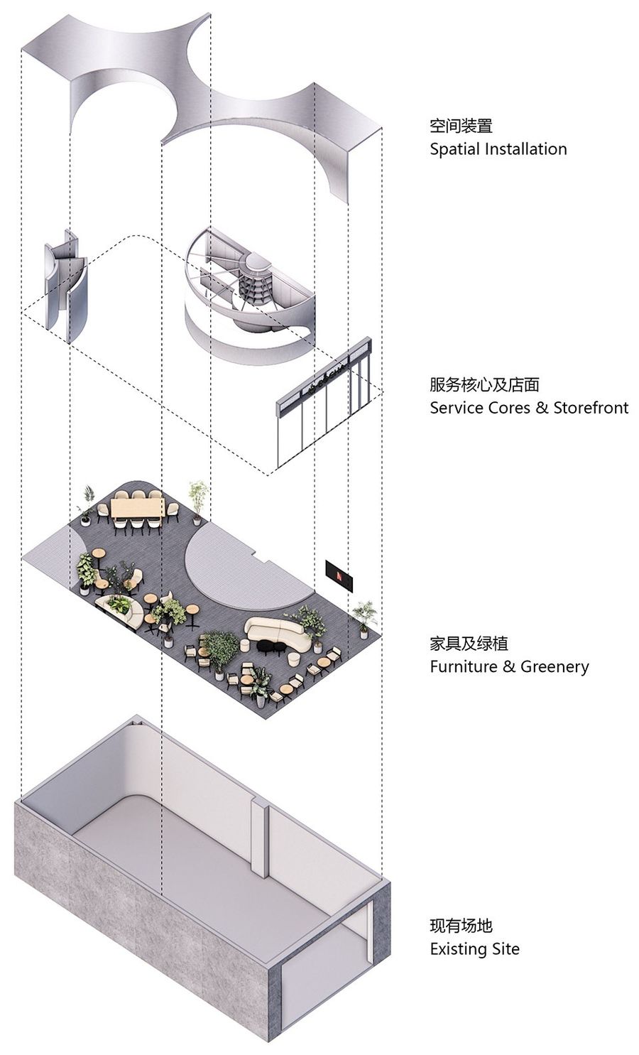
▼轴测分析图,explode axon © BWAO
▼平面图,plan © BWAO
▼立面图,unfolded facade © BWAO
项目建筑面积:120平米
项目地址:北京市东城区亮马河畔
设计时间:2022/11 – 2022/12
施工时间:2022/12 – 2023/02
建筑设计:BWAO/鲍威建筑工作室
水暖电设计:赵祖平
Logo及VI应用设计:郏珂磊
总体施工: 北京金牌吉祥建筑装饰工程有限公司
摄影:BWAO
Building Area: 120 sm
Building Location: Lingma Riverside, Dongcheng District, Beijing
Design Period: 11/2022 – 12/2022
Construction Period: 12/2022 – 02/2023
Architects: BWAO
MEP Engineers: Zhao Zuping
Logo and VI Application Design: Jia Kelei
Contractor: Beijing JPJX Construction
Photography: BWAO






评论(0)