创造出有层次的情绪体验与审美享受。
Create a level of emotional experience and aesthetic enjoyment.
林晓晴美妆集合店
Lin Xiaoqing Beauty Collection Shop
━
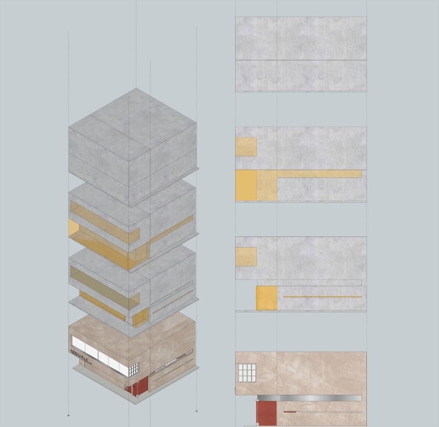
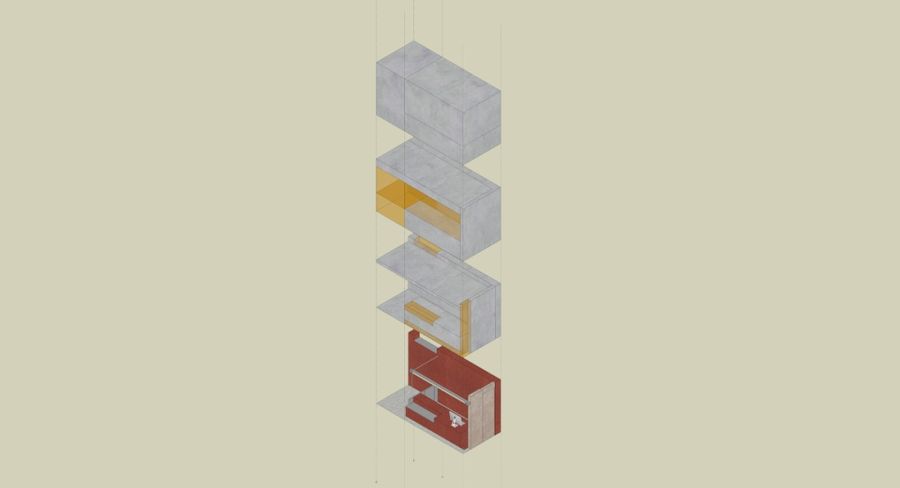
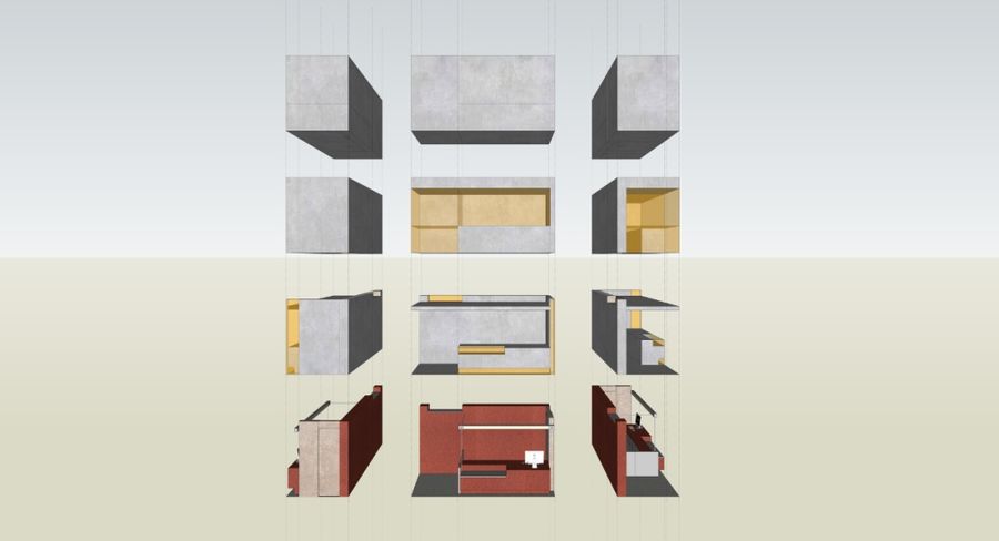
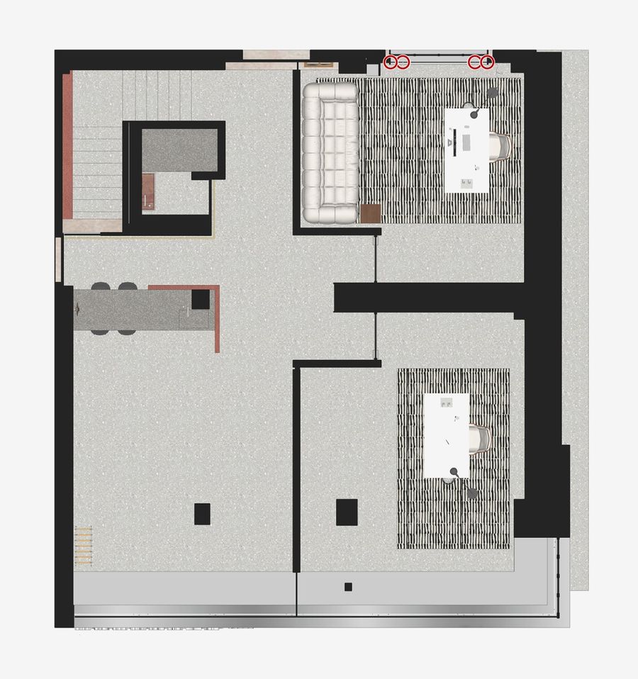
设计师剖析空间、尽数推演人境关系,多用体块表达空间脉络,以理性尺度明确功能分区、互动趣味、美学格调。融入板片、金属、杆件,通过不同材质间的强对比彰显视觉张力。以人造光源为主,结合自然光影,把控整体效果。
Designers analyze the space, deduce the relationship between people and environment, use the volume to express the space vein, and define the functional division, interactive interest and aesthetic style with a rational scale. Integrated into the plate, metal, rod, through the strong contrast between different materials to highlight the visual tension. Based on artificial light source, combined with natural light and shadow, control the overall effect.
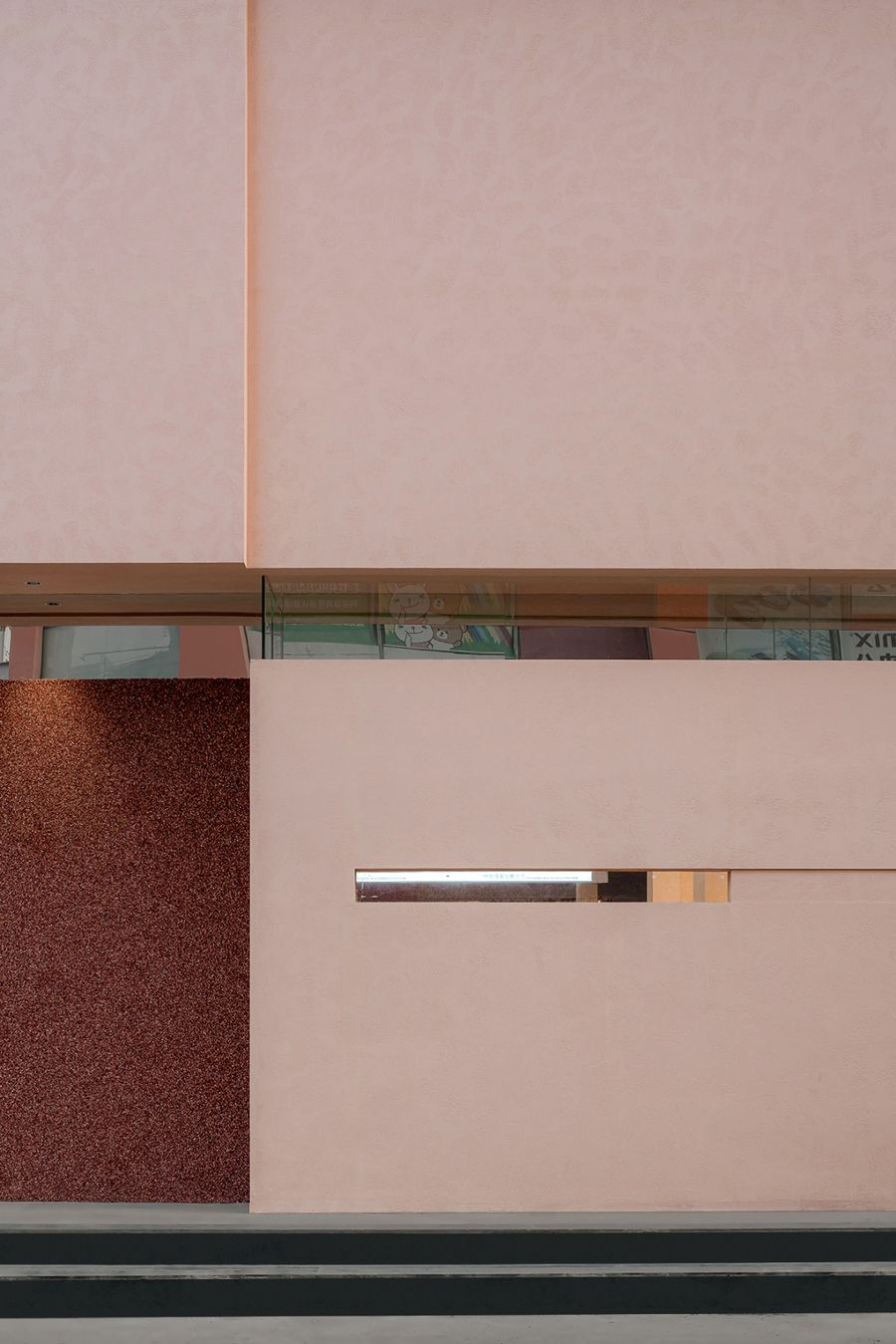
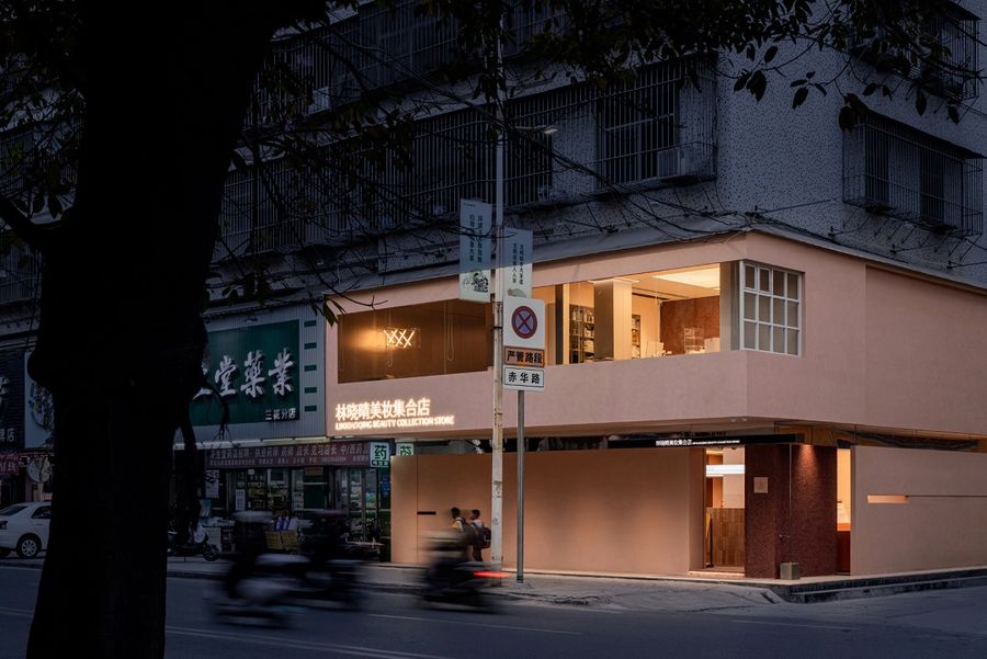
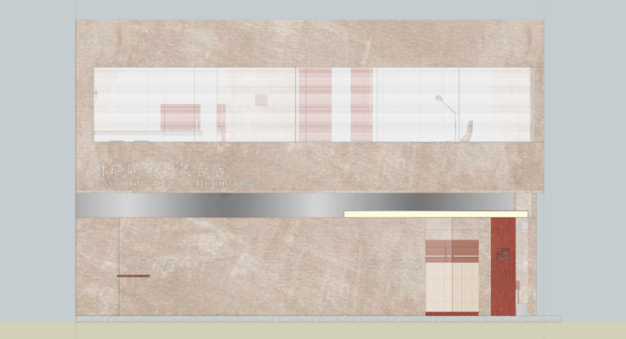
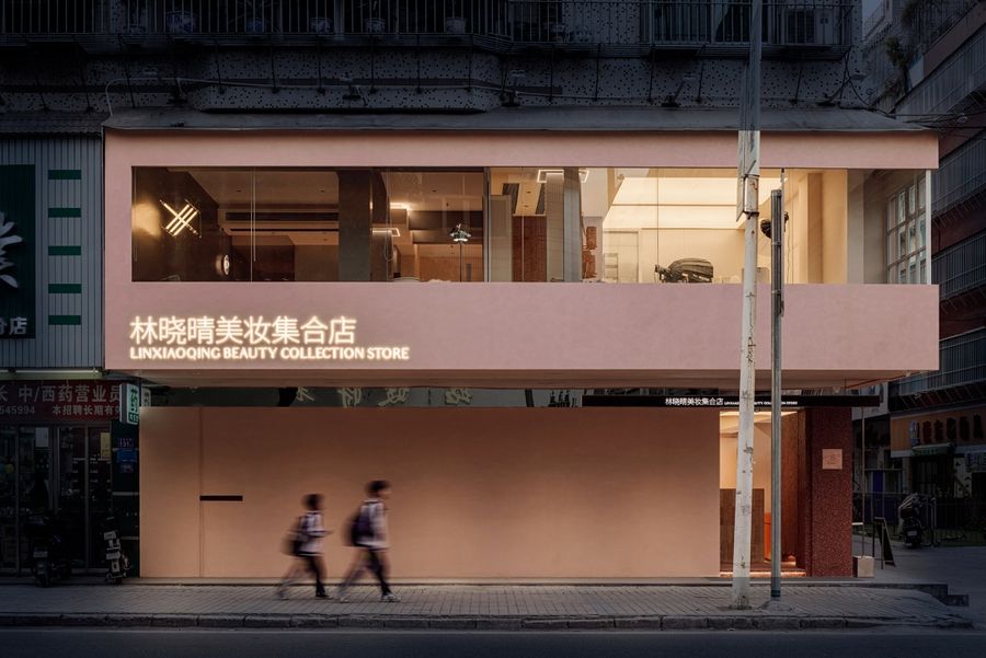
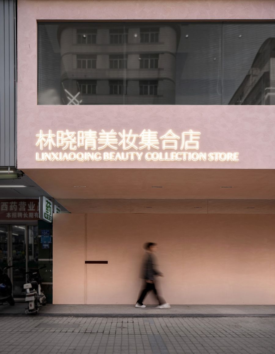
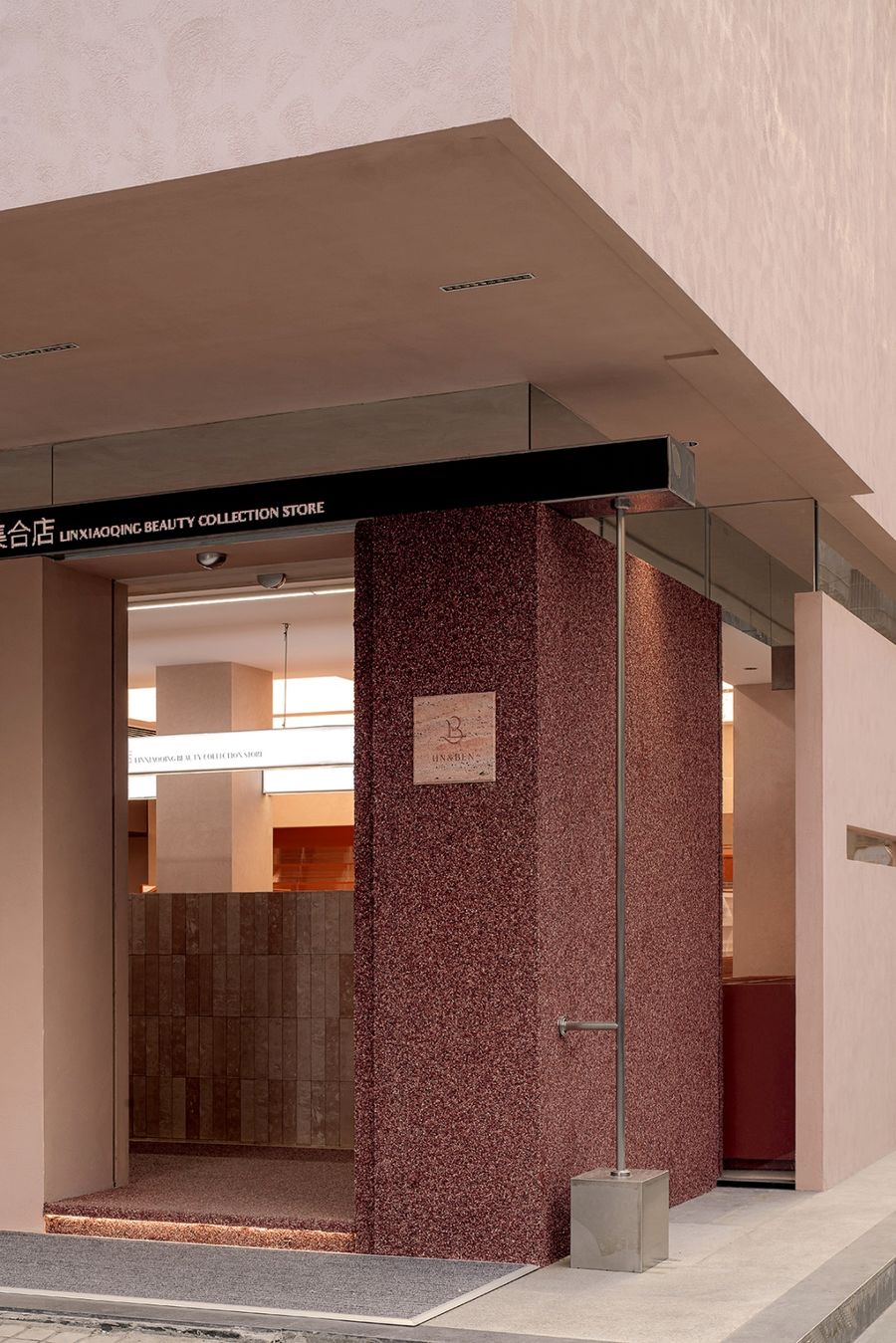
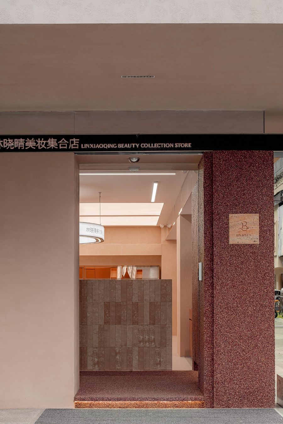
外立面采用纯色打底的手法,呈现裸粉色系所代表的浪漫印象。强化凹凸结构,搭配一大一小、一左一右的品牌标识,实现重复灌输加深印象的目的。收敛一层立面的透光面积,以全景玻璃集中凸显二层空间的布局内容。
The facade adopts the technique of solid color foundation, presenting the beauty impression represented by nude pink. Strengthen the concave-convex structure, with a large and small, one left and one right brand identity, to achieve the purpose of repeated inculcating and deepening the impression. Converging the light transmittance area of the first floor facade, the panoramic glass concentrates to highlight the layout content of the second floor space.
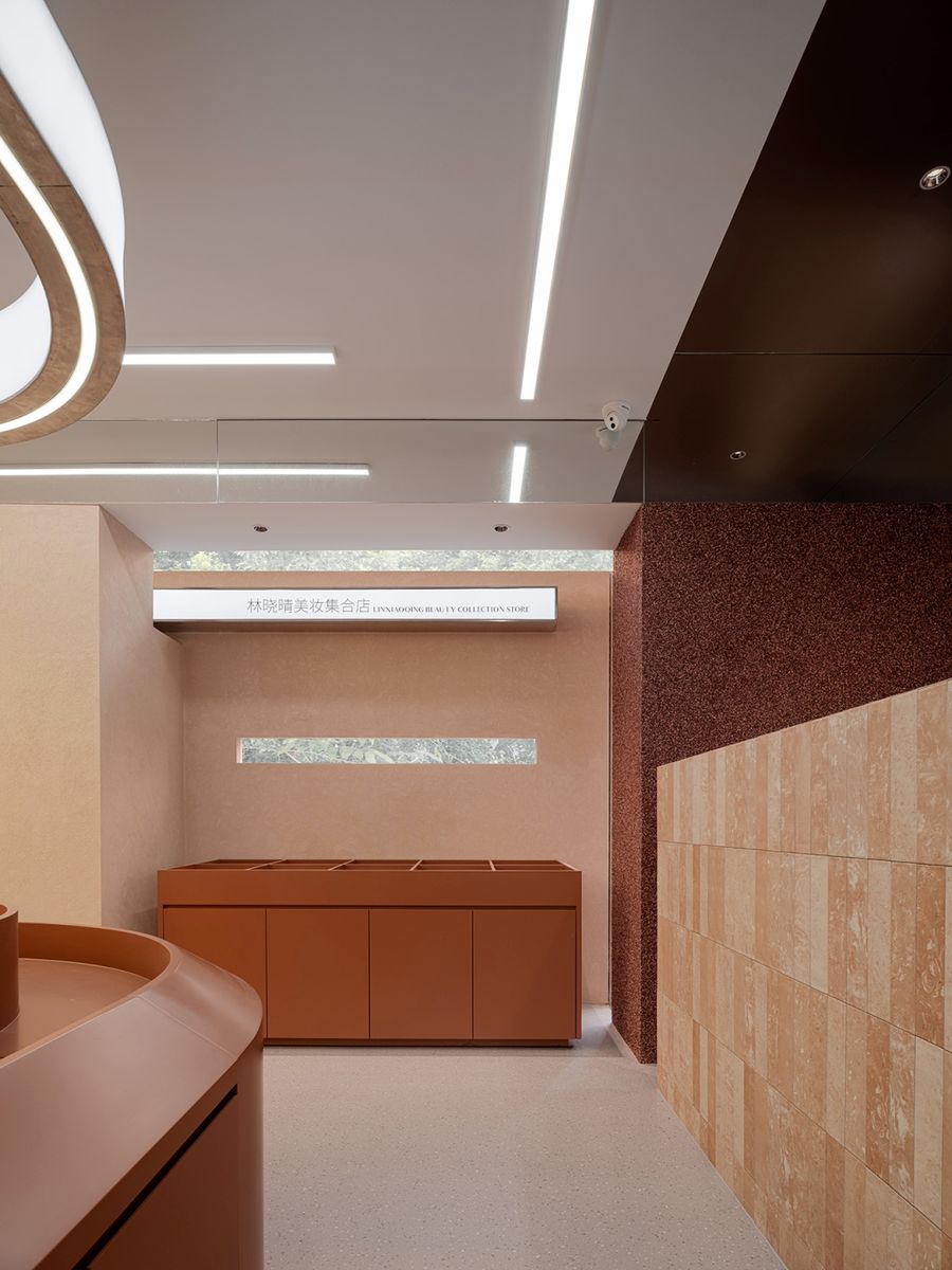
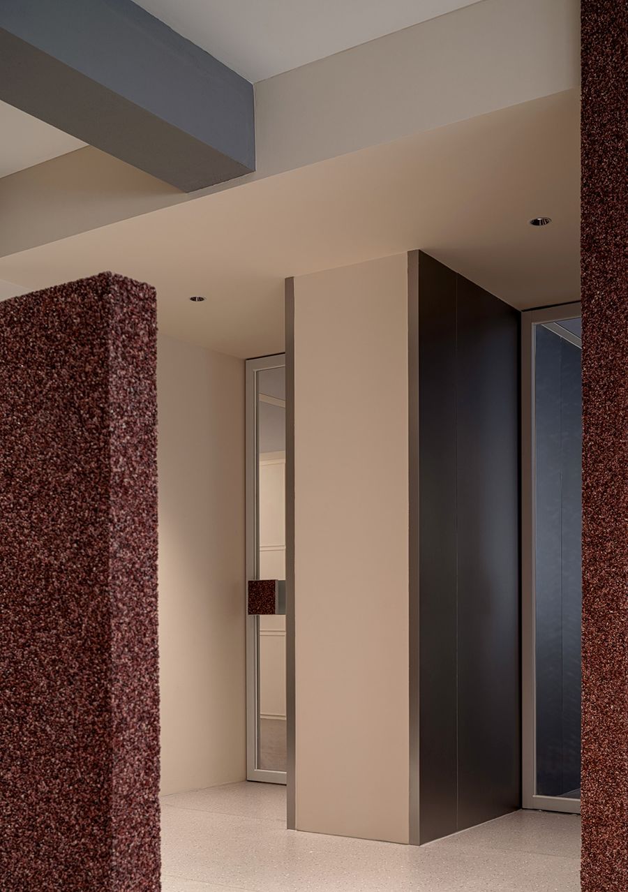
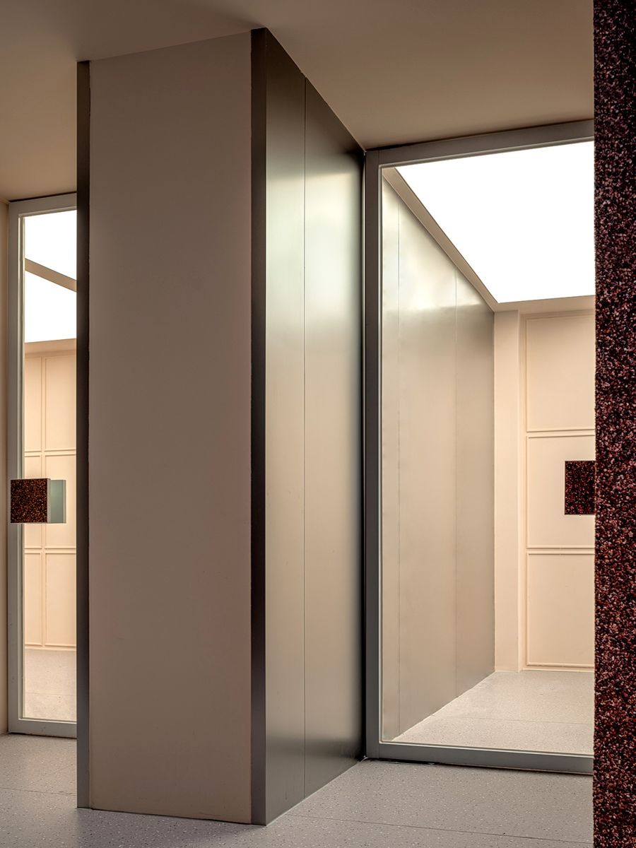
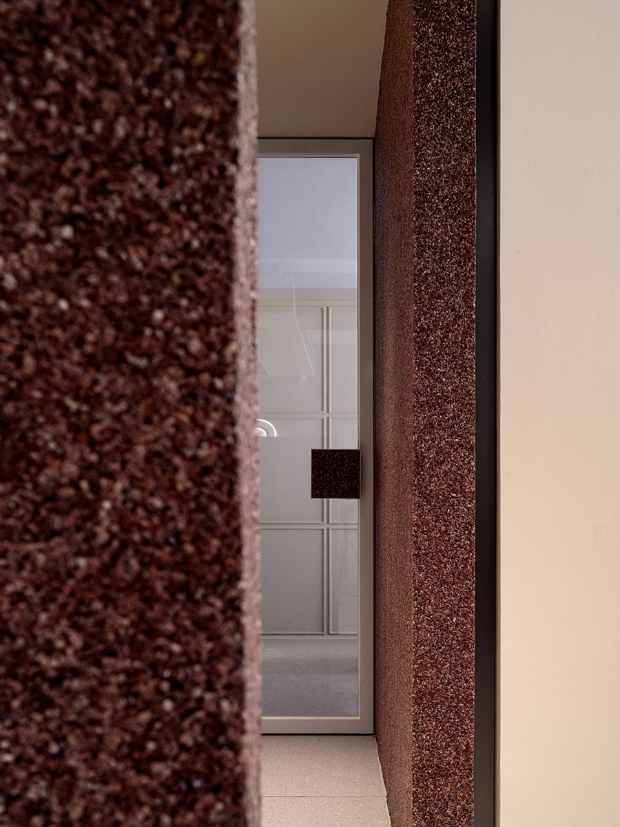
考量诸多的环境因素,将入口方向调整至结构转折处,导引交汇街区的客流。饰面于同色系基础上注入鲜明纹理,拟态自然调性,缓和纯色块面的单一感。金属与玻璃保留结构穿插的气势,提供透光性与合围效果,透景与框景层层叠叠,定格空间的延展感。
Considering many environmental factors, the entrance direction is adjusted to the structural turning point to guide the passenger flow of intersection blocks. Finish in the same color system based on the injection of bright texture, mimics natural tonality, ease the pure color block surface of the single sense. The metal and glass retain the momentum of the structure interspersed, providing light transmittance and enclosure effect. The view transmittance and frame view are layered on top of each other, and the sense of extension of the frozen space.
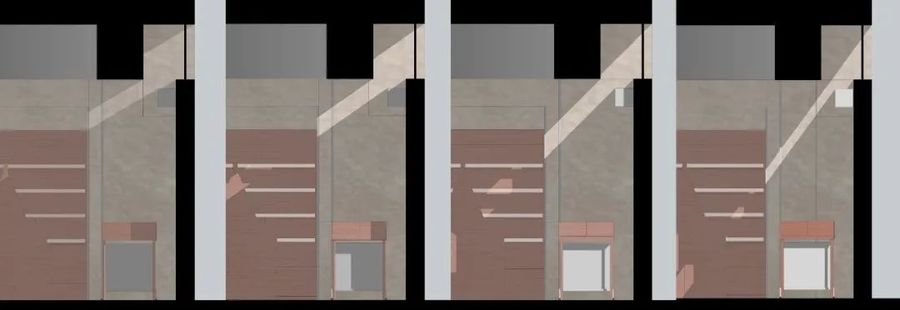
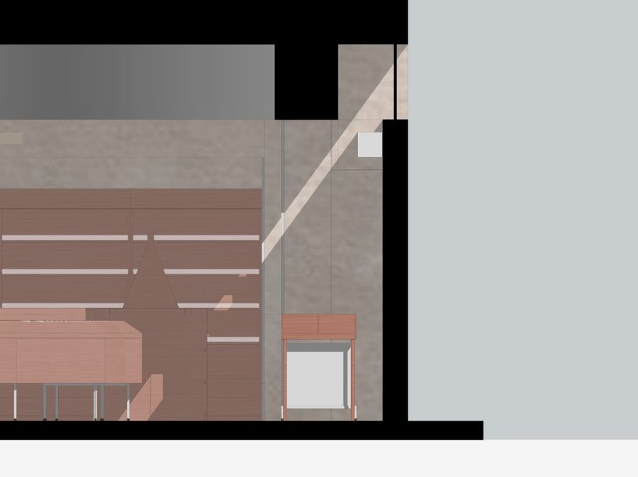
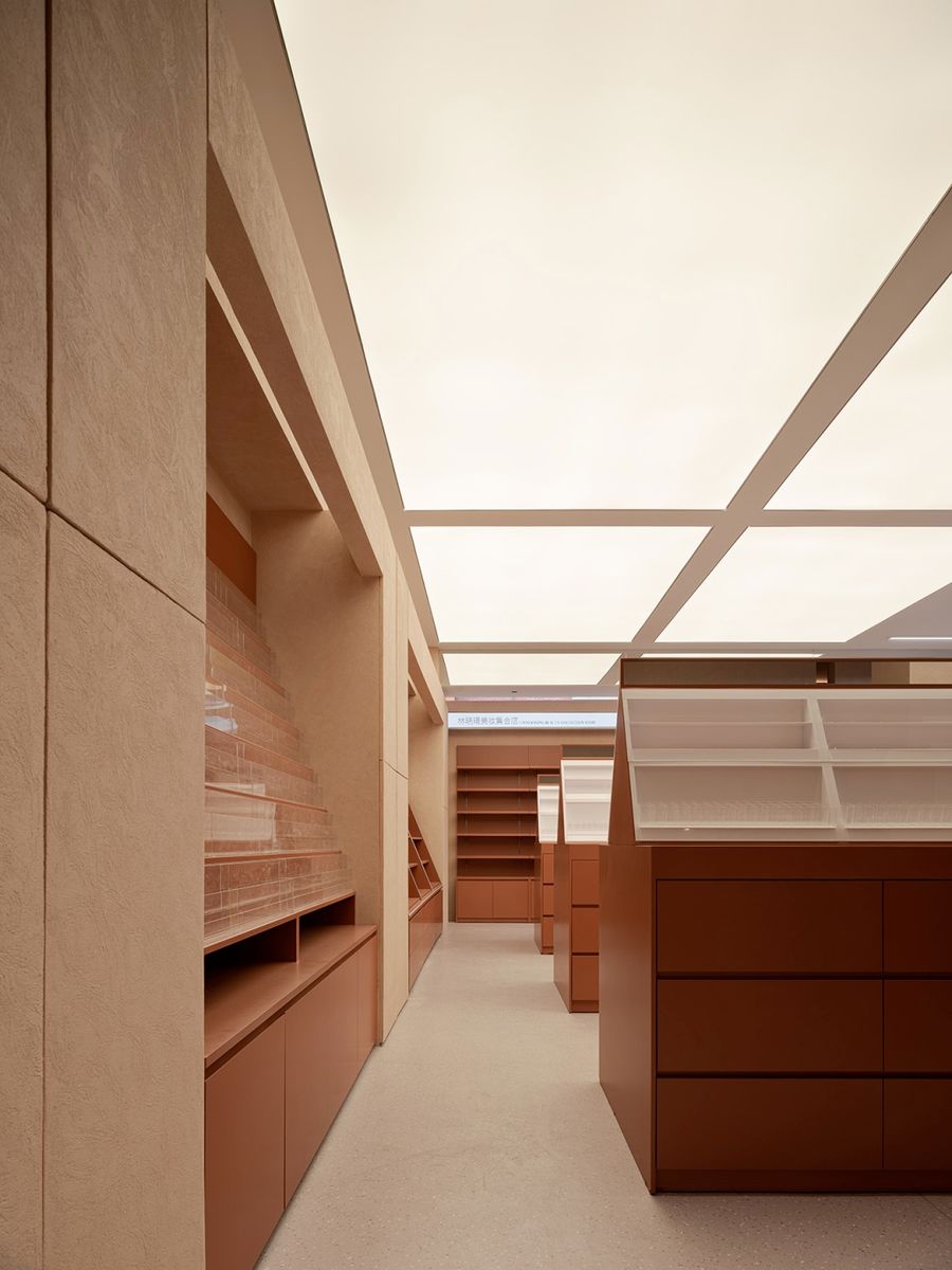
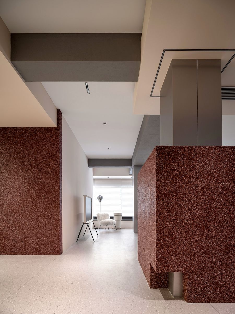
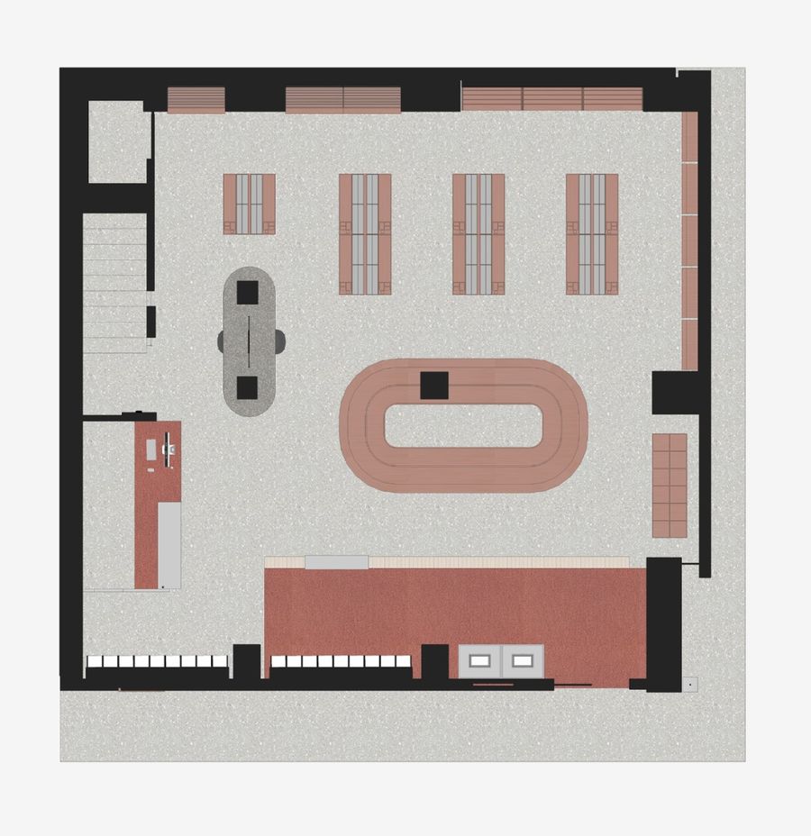
人造光源,按照分区比例由左向右次第减弱,利落边界跟随一贯到底的动线指向采光窗。摒弃既定窗型,运用几何切割、精准镂空的笔法,诠释错落的透景之美,在若隐若现之间将自然光引入室内,留下动态光影给予客人沐浴在光里的治愈感。
Artificial light source, according to the partition ratio from left to right weakening, clean boundary following the consistent bottom moving line pointing to the lighting window. Instead of the established window type, geometric cutting and precise hollowed-out strokes are used to interpret the beauty of scattered scenery, and natural light is introduced into the room between looming and emerging, leaving a dynamic light and shadow to give guests a healing sense of bathing in light.
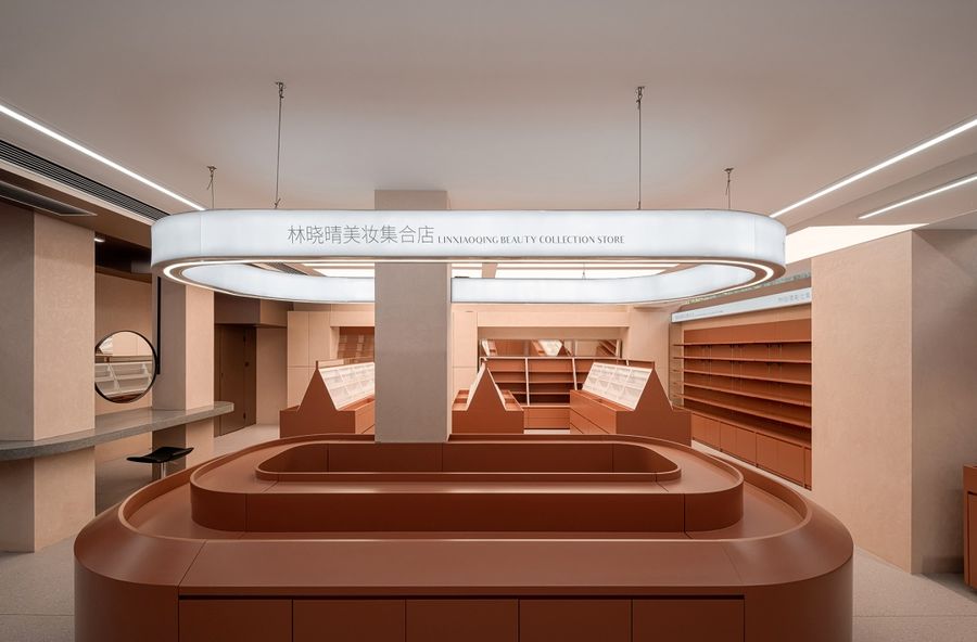
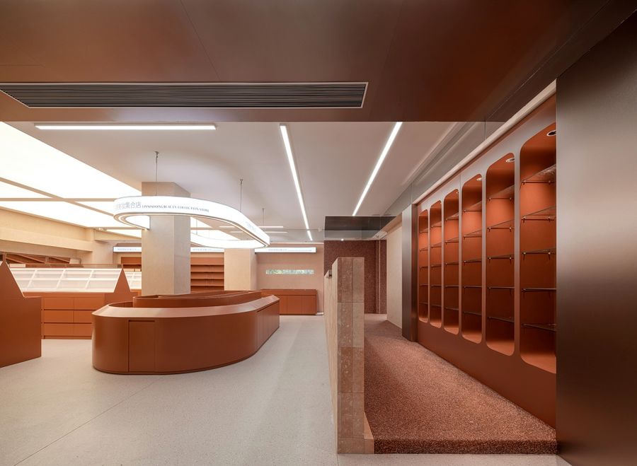
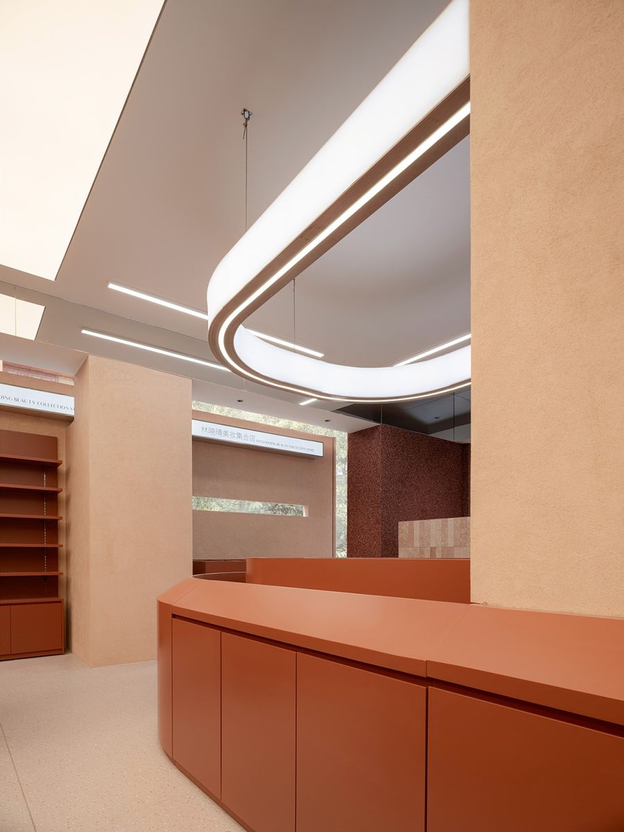
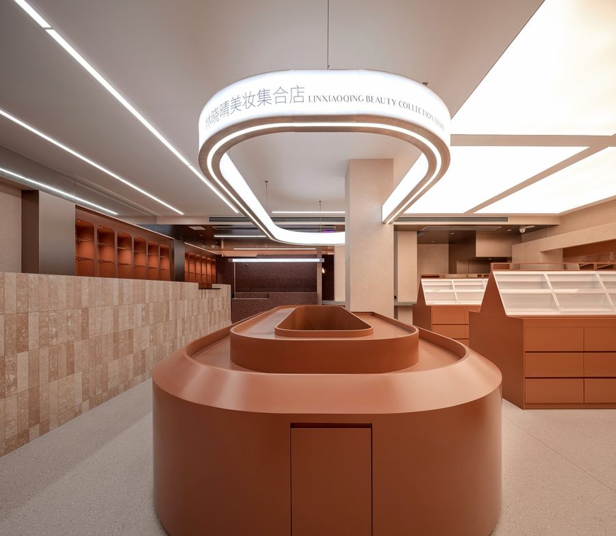
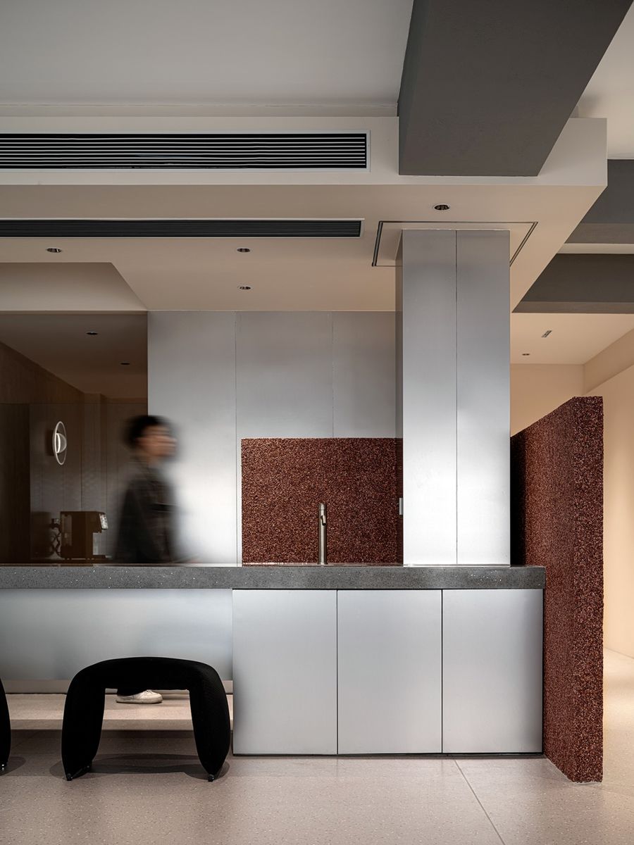
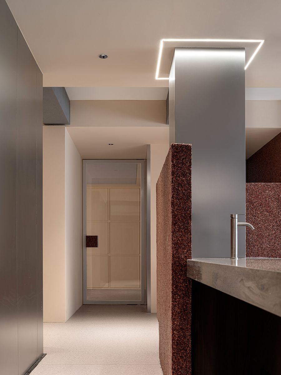
构筑曲面岛台,以分层形式消弭刻板沉闷的视感,环形线光与之上下呼应,渗透出几分对仗诗意。汲取环境色与极简主义的内核,打造精巧适宜的枢纽区域,延续光线流动于上方的浪漫感,让空间维度形成自然转换。
The curved island is constructed to eliminate the stereotyped and dull visual sense in the form of stratification. The ring line light echoes up and down with it, permeating a bit of antithetical poetry. Absorbing the core of environmental color and minimalism, creating an exquisite and appropriate hub area, continuing the romantic sense of light flowing above, and forming a natural transformation of space dimensions.
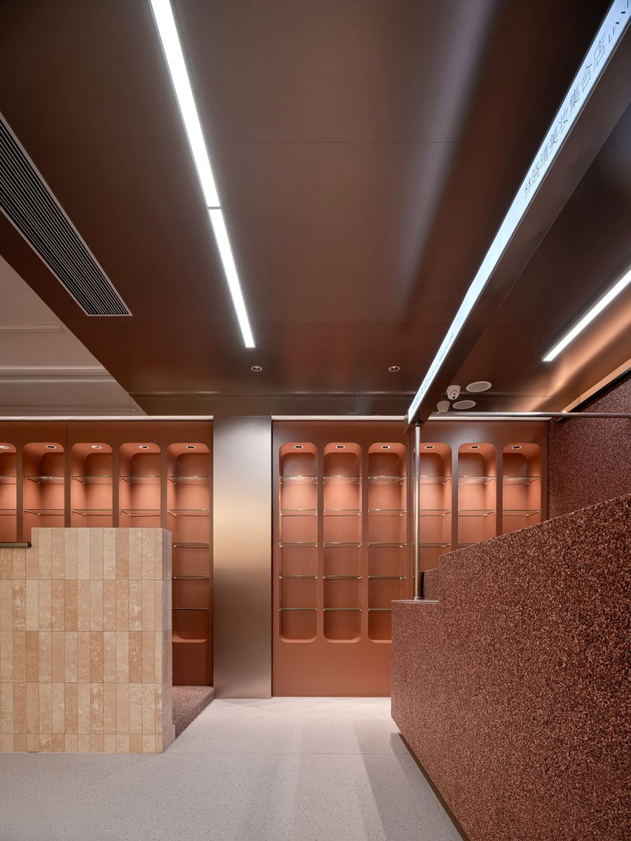
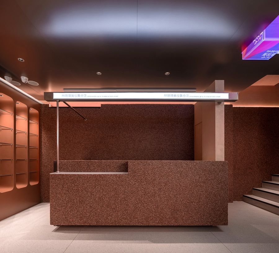
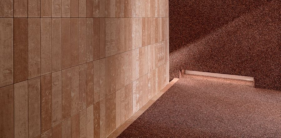
直角边、重色底、点状光加强了独立区域的特色感,同时以贯通整体的色彩、纹理、拼合形态营造体验场景,兼容区域内外的情态。
Right-angle edges, heavy color base and dotted light enhance the unique sense of the independent area. Meanwhile, color, texture and splicing form through the whole is used to create the experience scene, compatible with the modality inside and outside the area.
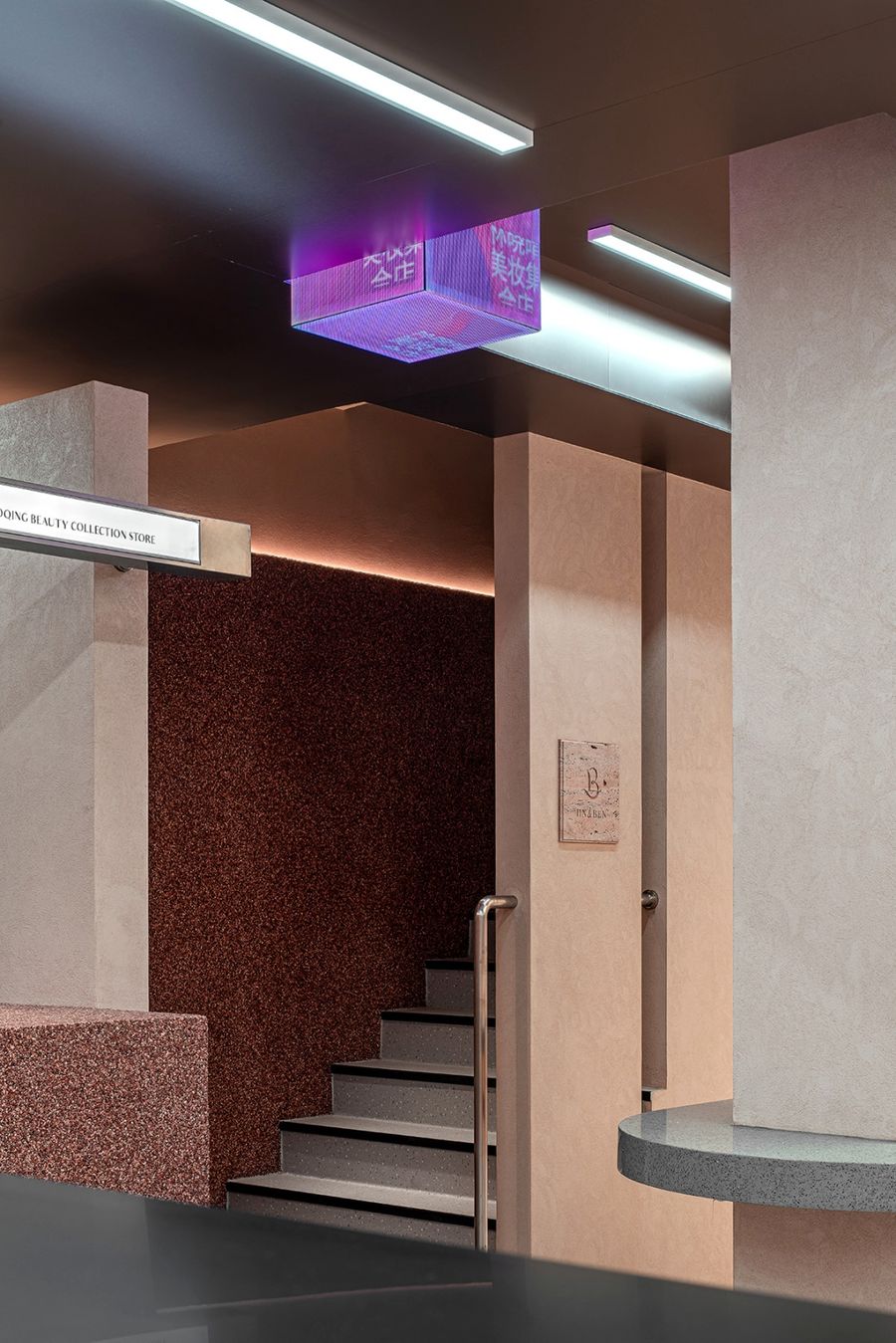
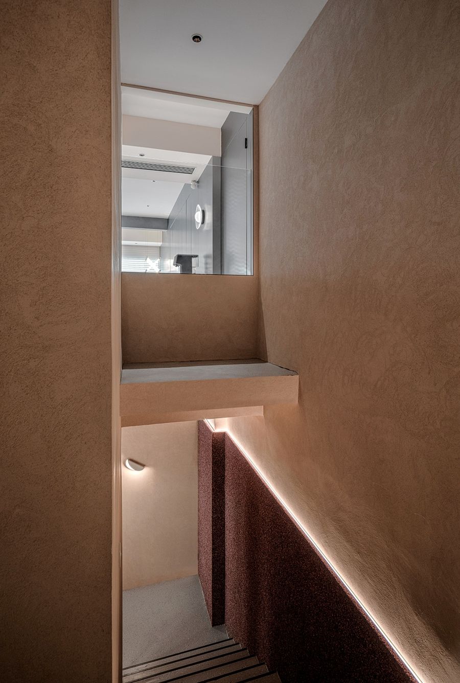
利用挑空优势,烘托纯粹静谧的氛围,楼梯空间,是嫁接上下空间丰富性的“管道”,亦是重新酝酿探索情绪的空间。The use of empty advantage, foil pure quiet atmosphere, staircase space, is the grafting of the upper and lower space of the "pipeline", is also a space for re-brewing and exploring emotions.
延展冷调金属,以平面形态修饰立体造型,吸纳自然光线作弱化处理,焕发高雅、隽永且迷人的氛围。叠加纹理,规划功能,勾勒线性光效,培养空间情调,创造出有层次的情绪体验与审美享受。
Extend the cold tone metal, modify the three-dimensional shape with the plane form, absorb natural light for weakening treatment, glow elegant, meaningful and charming atmosphere. Overlay texture, plan function, outline linear light effect, cultivate space sentiment, create hierarchical emotional experience and aesthetic enjoyment.
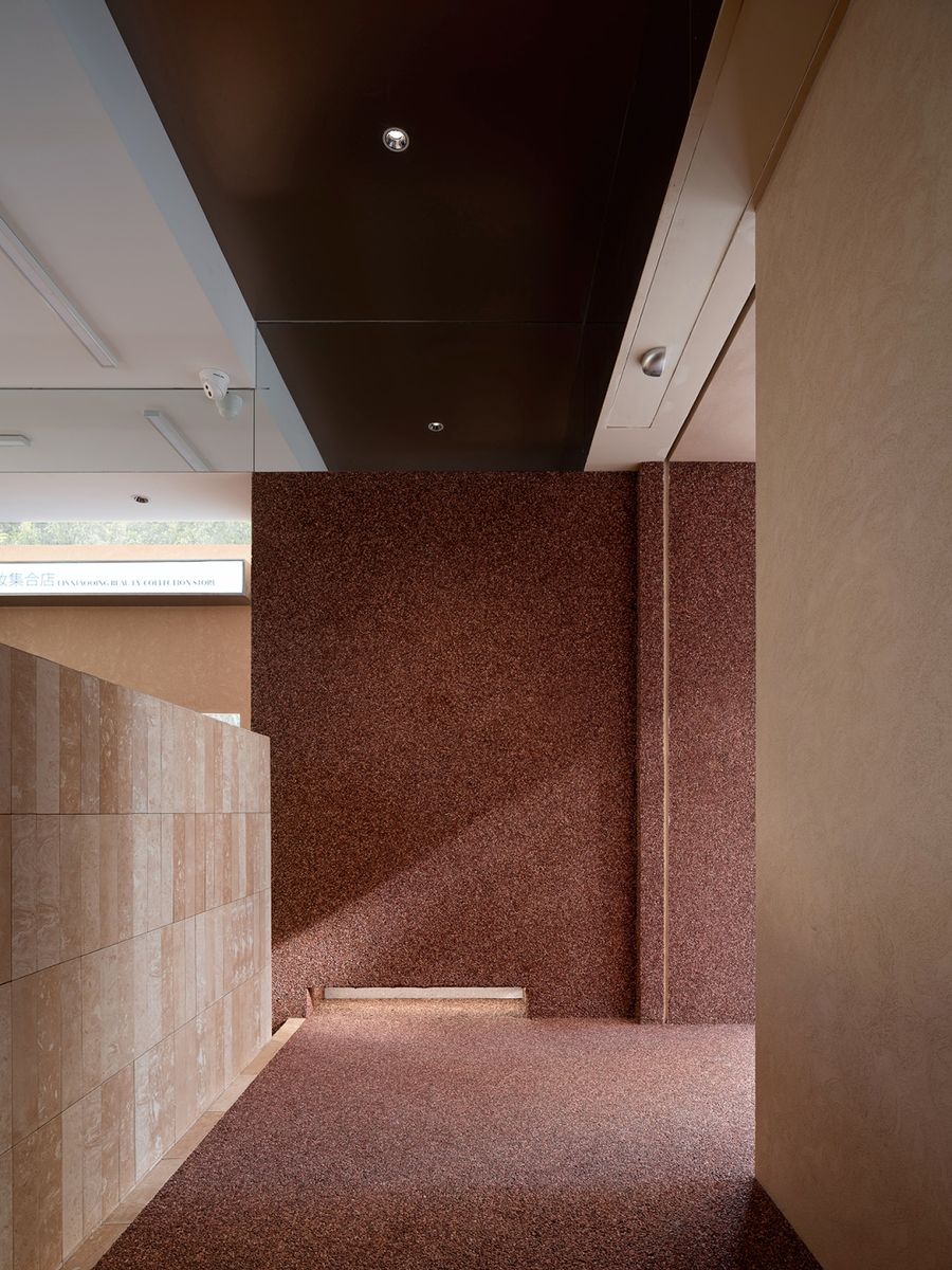
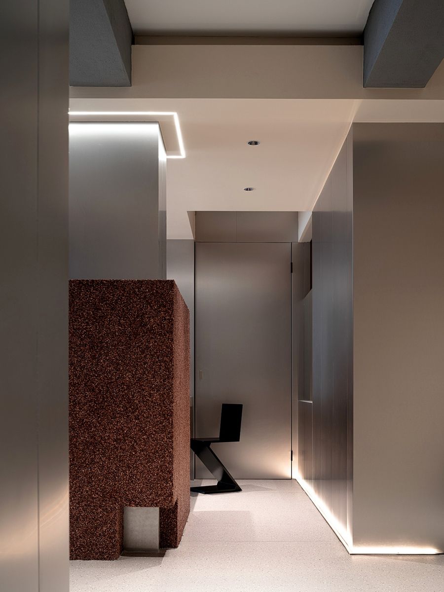
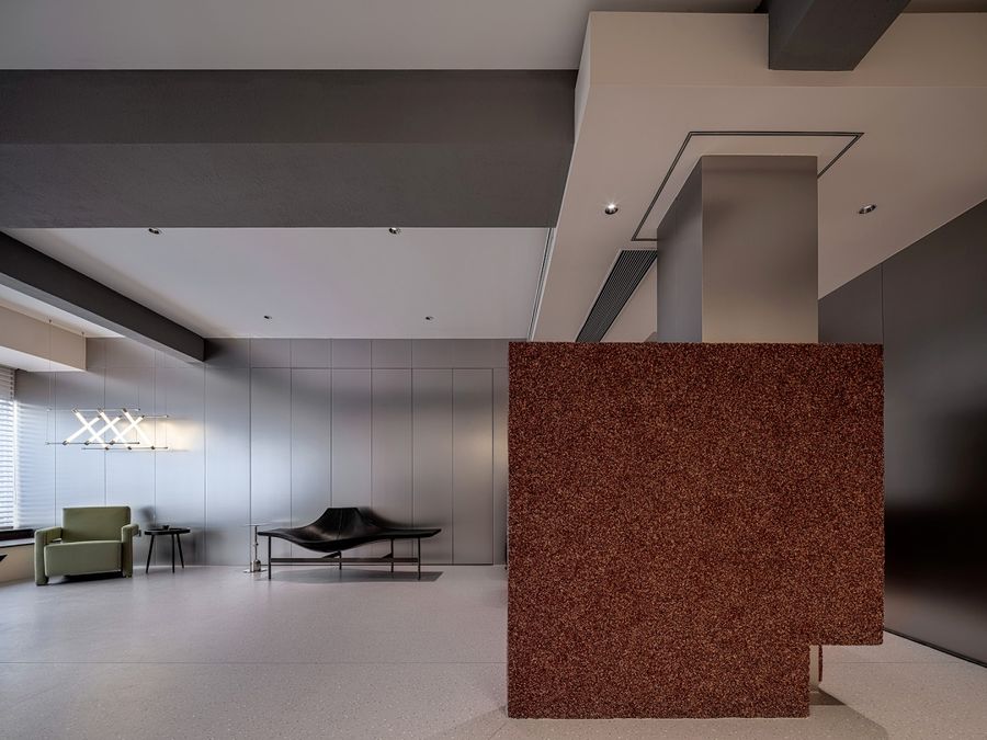
硬朗廓形,通过简洁直白的语素,将干扰梁柱化为美学构成,利用色块碰撞与纹理变化的灵动感、和谐感、统一性,构建层级分明的主次空间。调节光照的强与弱,共鸣真实的体感与需求,悄然分界,柔和疏导。
The rigid outline, through simple and straightforward morpheme, transforms the interference beam and column into aesthetic composition, and uses the spirit, sense of harmony and unity of color block collision and texture change to build a hierarchical primary and secondary space. Adjust the strong and weak light, resonate the real sense of body and demand, quietly demarcate, soft and soothing.
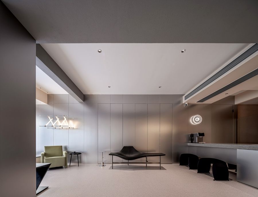
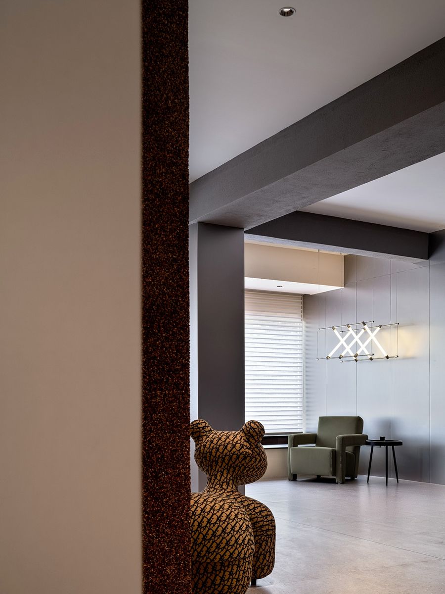
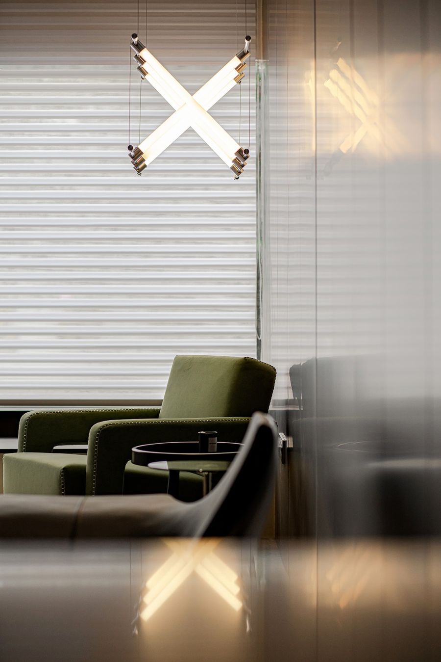
休憩区,以留白底蕴放大材质的高级调性,以及多样化家具的创意与趣致,为一隅一域树立不同的场景叙事,连续又独立。淡雅绿意,为空间迎来一丝清雅,交叉灯管,隐喻在此交流的顺畅与满足。
The rest area, with the white background to enlarge the advanced tonality of materials, and the creativity and interest of diversified furniture, sets up different scene narration for each area, continuous and independent. Elegant and green, for the space ushered in a trace of elegant, cross lamp, metaphor in this communication smooth sense and satisfaction.
项目信息Information━
项目名称:林晓晴美妆集合店
Project Name:Lin Xiaoqing Beauty Collection Shop
设计机构 :陈浩鹏(深圳)室内设计有限公司
Design Agency :Chen Haopeng (Shenzhen) Interior Design Co., LTD
项目设计:陈浩鹏、王珣、林宏
Project Design:Chen Haopeng, Wang Xun, Lin Hong
项目施工图:陈洁敏、赖嘉伟、蔡旭荣、吴梓铭、刘泽娜、庄基霖
Project Construction Drawing:Chen Jiemin, Lai Jiawei, Cai Xurong, Wu Ziming, Liu Zena, Zhuang Jilin
项目软装:陈浩鹏
Project Software Installation:Chen Haopeng
项目灯光:浩彬灯饰全案灯光设计
Project Lighting:Haobin lighting whole case lighting design
施工单位:金艺装饰
Construction Unit:Gold art decoration
项目地址:广东普宁
Project Address:Puning, Guangdong
项目面积:230㎡
Project Area:230㎡
项目摄影:余荣力
Project Photography:Yu Rongli
项目文案:修合文化
Project copy:Xiuhe Culture
更多相关内容推荐






评论(0)