第一次与Martin见面:“您想要一家怎么样的店?”Martin说:“一家专业的沙龙。”舍弃多余,干净简单。
First meeting with Martin: “What kind of store do you want?”“A professional salon,” Martin says.Abandon superfluous, clean and simple.
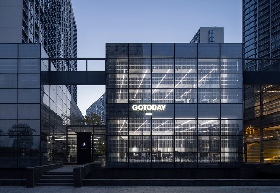
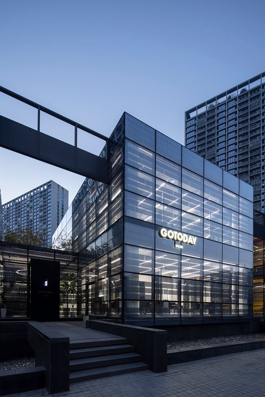
▼建筑外观,the exterior ©黑水
Martin来自香港,因之前的雇主开拓内地市场而作为外派员工来到杭州。继而在此落地生根,2015年租下一间30平米的店铺开始了barber shop的创业之路。2022年,又与合伙人一起租下这间400平米+的大空间,创立新品牌“GOTODAY SALON”。
Martin, originally from Hong Kong, came to Hangzhou as an expatriate after his previous employer expanded into the mainland market. In 2015, he rented a 30-square-meter shop and started his business as a barber shop. In 2022, together with his partners, he rent this 400+ square meters space and creates a new brand “GOTODAY SALON”.
▼非常现代的全落地玻璃建筑, floor-to-ceiling glass buildings, very modern ©黑水
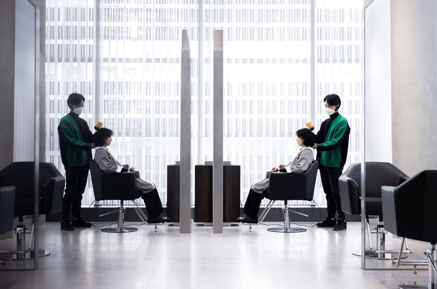
Martin和他的伙伴们有一种匠人气息。在他的店里,不会看到奇怪发型的美发师,或是游说充值办卡的销售,只有干净利落的造型师和助理们。在这里更关注头发本身,针对不同人群的脸型、发质、发量裁剪出适合的发型,专业而纯粹。
Martin and his buddies have an air of craftsmanship. There are no hairdressers with strange haircuts or card sales persuade you to charge and recharge cards, just clean-cut stylists and assistants. Here is more attention to the hair itself, according to different people’s face shape, hair quality, hair volume cut, to out suitable hairstyle, professional and pure.
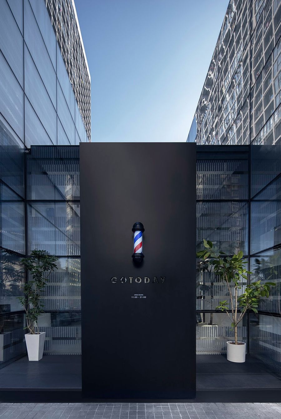
▼黑色铁板悬挂标志型红蓝旋转灯,镂空的GOTODAY字体将店内若隐若现,又恰好做了回旋、避免入店的一览无余,Black iron plate hanging red and blue rotating lights, hollowed out GOTODAY font, the store is hidden behind, this design also avoids entering the store at a glance ©黑水
“克制”的坚持the persistence of the “restraint”
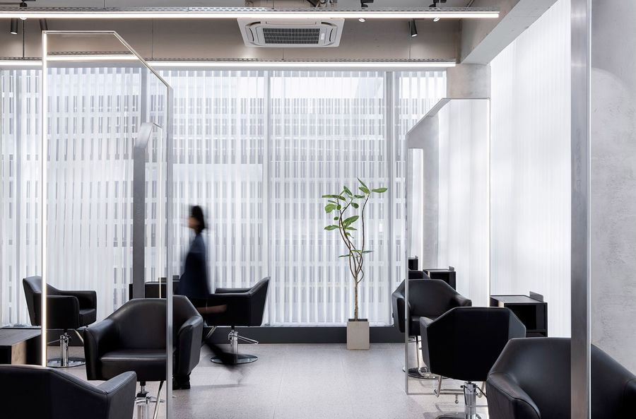
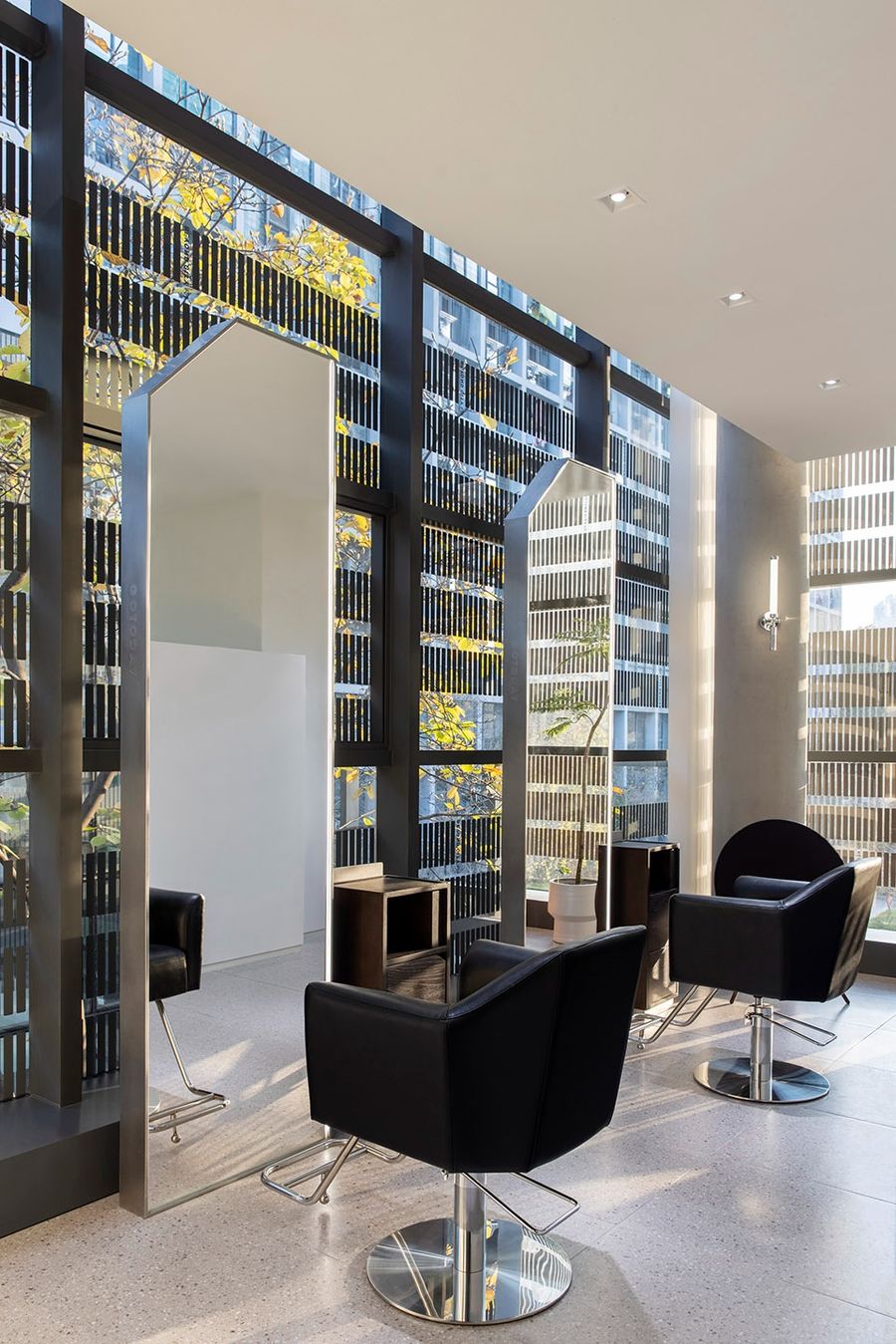
原建筑是一个四方的现代玻璃盒子,线条干净利落,采光通透明朗,本身即非常优秀。设计中本着“克制”的原则,尽量对建筑做到最小的干预,用含蓄无痕的手法来体现。
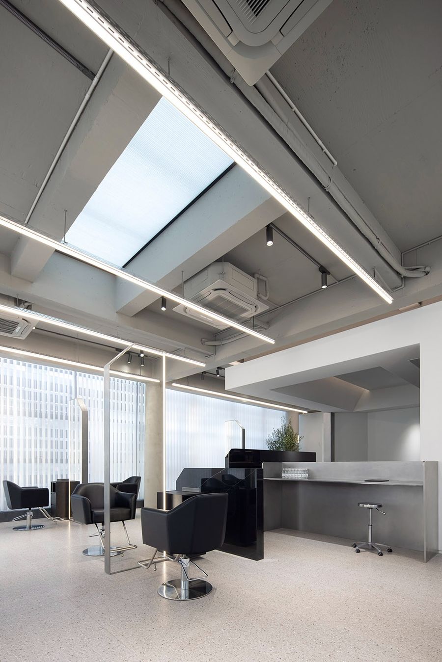
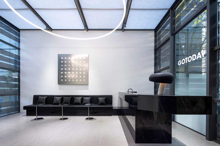
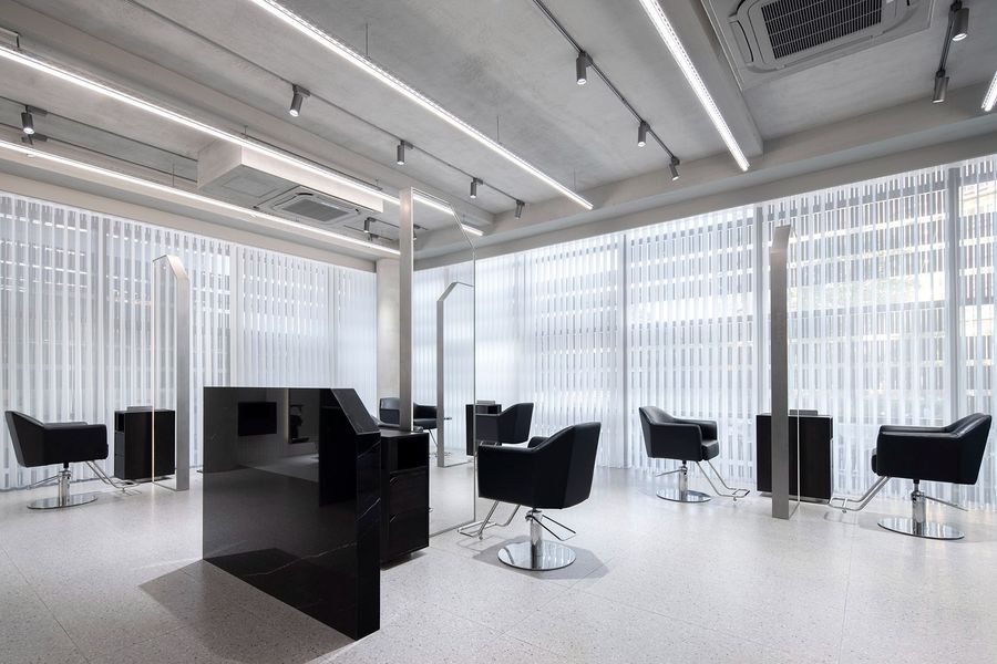
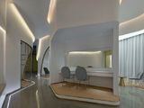
我们以白色作为空间的主基调,代表可以足够包容,选用黑色亮面大理石及乱纹不锈钢点缀,结合线性光源,从而提升空间的整体层次感与时尚度。
The original building is a square modern glass box, clean lines, transparent lighting, itself is very excellent. In the design of the principle of “restraint”, as far as possible to achieve minimal intervention in the building, with subtle and traceless techniques to reflect.
We take White as the main tone of the space, which can be inclusive enough, choose black bright marble and random stainless steel ornament, combined with linear light source, so as to improve the overall sense of layer and fashion of the space.
▼白色作为空间的主基调, white as the main tone of the space ©黑水
▼含蓄无痕的空间设计, spatial design with subtle and traceless techniques ©黑水
▼黑色亮面大理石及乱纹不锈钢点缀了室内空间, interior spaces decorated with black bright marble and random stainless steel ornament ©黑水
▼结合线性光源的设计, design combined with linear light source ©黑水
等位与接待区the reception area
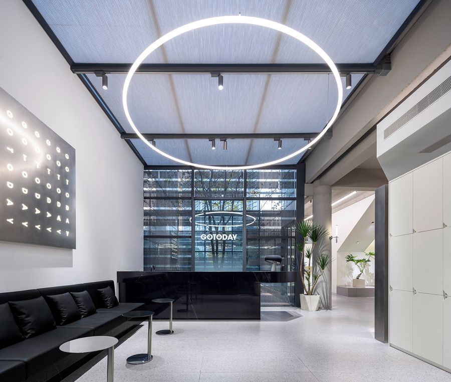
穿过黑色门廊来到接待区,客服小姐姐在吧台后站立服务,询问客户的预约及需求详情。早到的客人们可以在左侧沙发区稍事休息;右侧的存包柜同时又起到隔断作用,为正在做发型的客人们提供隐私保护。
After walking through the black porch to the reception area, the customer service stands behind the bar and asks customers about the reservation and details of demand. Early guests can have a rest in the left sofa area. The storage cabinet on the right also acts as a partition, providing privacy protection for guests who are making their hair.
▼接待区,the reception area ©黑水
▼黑白色调,简洁明朗,Black and white color, simple and clear ©黑水
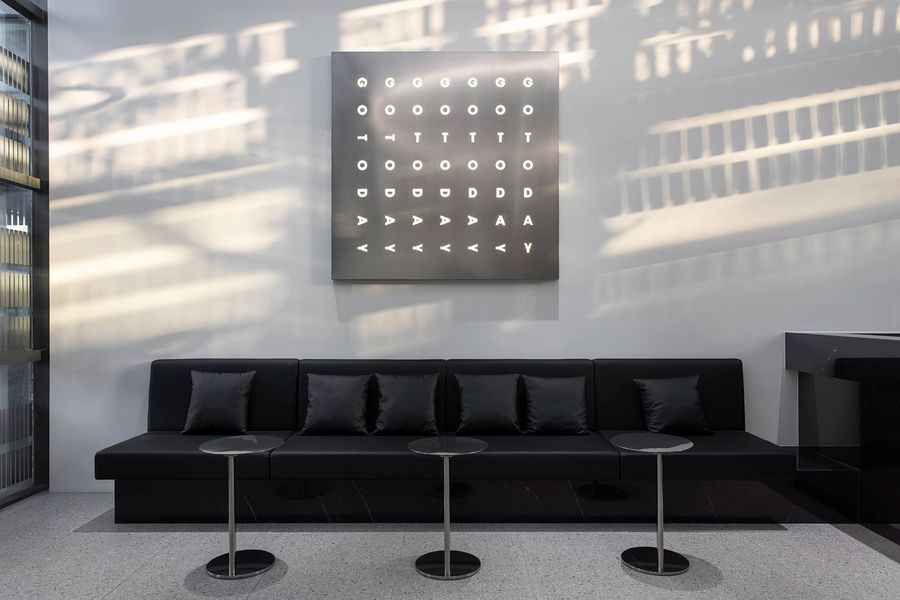
▼阳光洒在GOTODAY的logo画上,温暖而梦幻,The sun shines on the GOTODAY logo, warm and dreamy ©黑水
以“剪”切入空间to “cut” into space
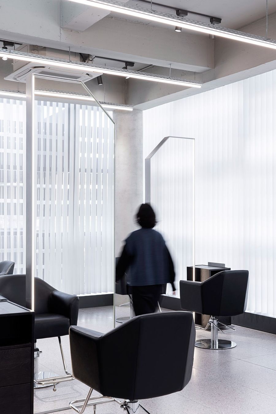
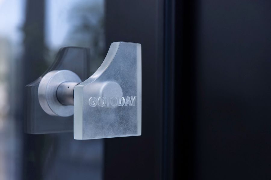
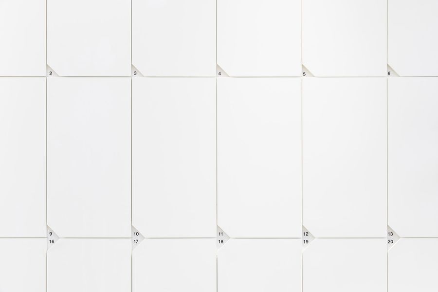
原空间是一个四周全落地玻璃的现代建筑,有着极好的自然采光条件。设计中,结合建筑本身特点与GOTODAY的业态所属,我们将“剪”的概念引入空间,舍弃多余,裁其角以获新生,“切角”的设计语言贯穿整体店铺之中。
The original space is a modern building surrounded by floor-to-ceiling glass, with excellent natural lighting conditions. In the design, combined with the characteristics of the building itself and the business type of GOTODAY, we introduce the concept of “cutting” into the space, discard the superfluous, cut its corners to gain new life. The design language of “cutting corners” runs through the whole shop.
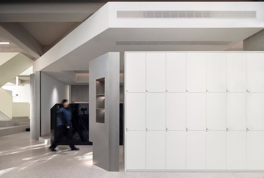
▼从等位区前往理发区,吧台、存包区顺势而“切”,形成一条自然的路径动线,From the waiting area to the barber area, the bar and bag storage area “cut” along the trend, forming a natural moving line ©黑水
▼切去一角的落地镜,Floor mirror with one corner cut off ©黑水
▼局部隔断也会呼应切角,Local partition will also echo cutting corners ©黑水
▼门把手上切去一角,Cut a corner off the door handle ©黑水
▼储物柜的标号也细心地以切角呈现,The labels of the lockers are also carefully presented with cut corners ©黑水
男士专属的Barber区man exclusive Barber area
“Barber”一词源自拉丁文,胡须的意思。Barber更是一种文化,旨在用最自然的手法为男士打理头发和胡须,近年来在大陆日益风靡。
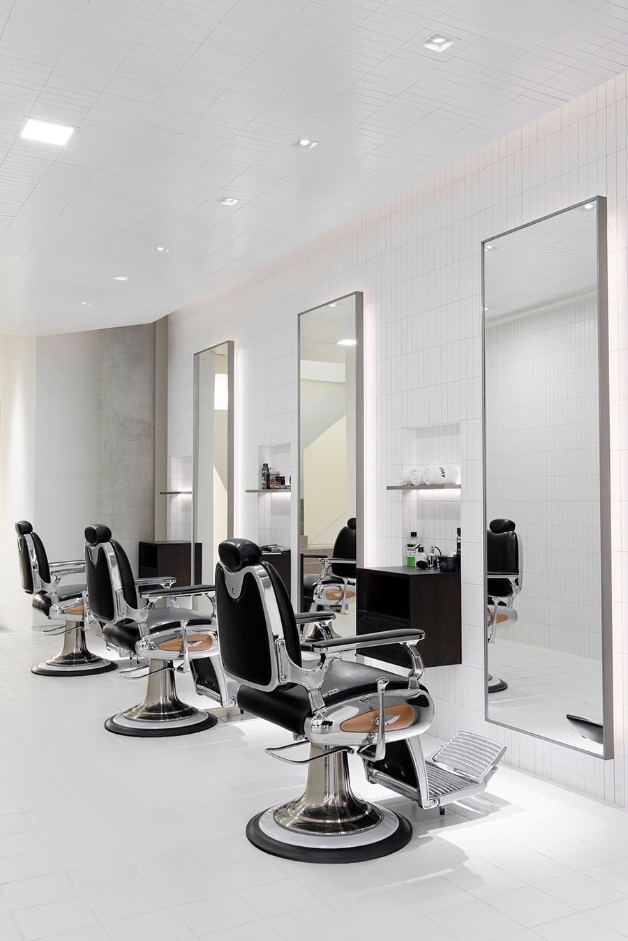
Martin的创业从一间Barber Shop开始,因而新店里也保留了男士专属的Barber区。在这里,一改传统barber的复古英式或粗犷美式,改而设计为简约明亮的现代风格,轻松、舒服、自由,让彼此更专注于修头修脸本身。
The word “Barber” comes from the Latin word for beard. Barber is a cultural practice that aims to style men’s hair and beards in the most natural way and has become increasingly popular in mainland in recent years.
Martin started his business with a Barber Shop, so the new store also has a Barber section for men. Here, instead of the retro British or rugged American style of the traditional barber, the design is simple and bright modern style, relaxed, comfortable, free, let each other more focused on the shave itself.
▼简约明亮的现代风格,the design is simple and bright modern style ©黑水
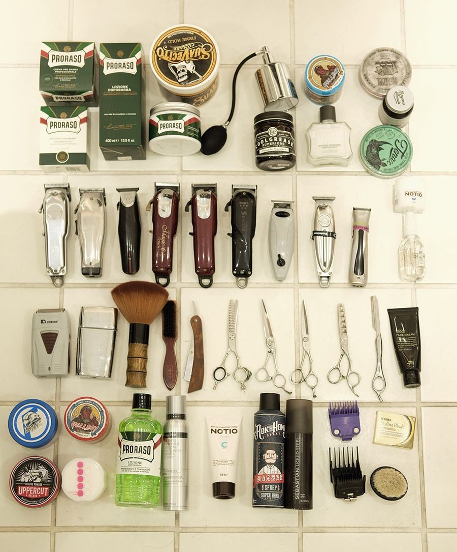
相对于普通理发,Barber的工具会更多,譬如渐变理发器、毛碎刷、刀头冷却护理液等等。在普通理发店里20分钟可以剪完的头,在这里也许要花上2小时,Barber会从头到脸到眉毛为你精心打造,一边像邻居一样聊着家常,这里更像是男士们的社交场所。
Barber has more tools than a regular haircut, such as a gradient clipper, a crushing brush, and a head-cooling treatment solution etc. What would take 20 minutes at a normal haircut shop may take up to two hours here. The Barber will carefully shape your hair from head to face to eyebrow and chat with you like a neighbor. It is more like a social place for men.
▼琳琅满目的Barber工具,A wide selection of Barber tools ©汤汤
白色楼梯white staircase
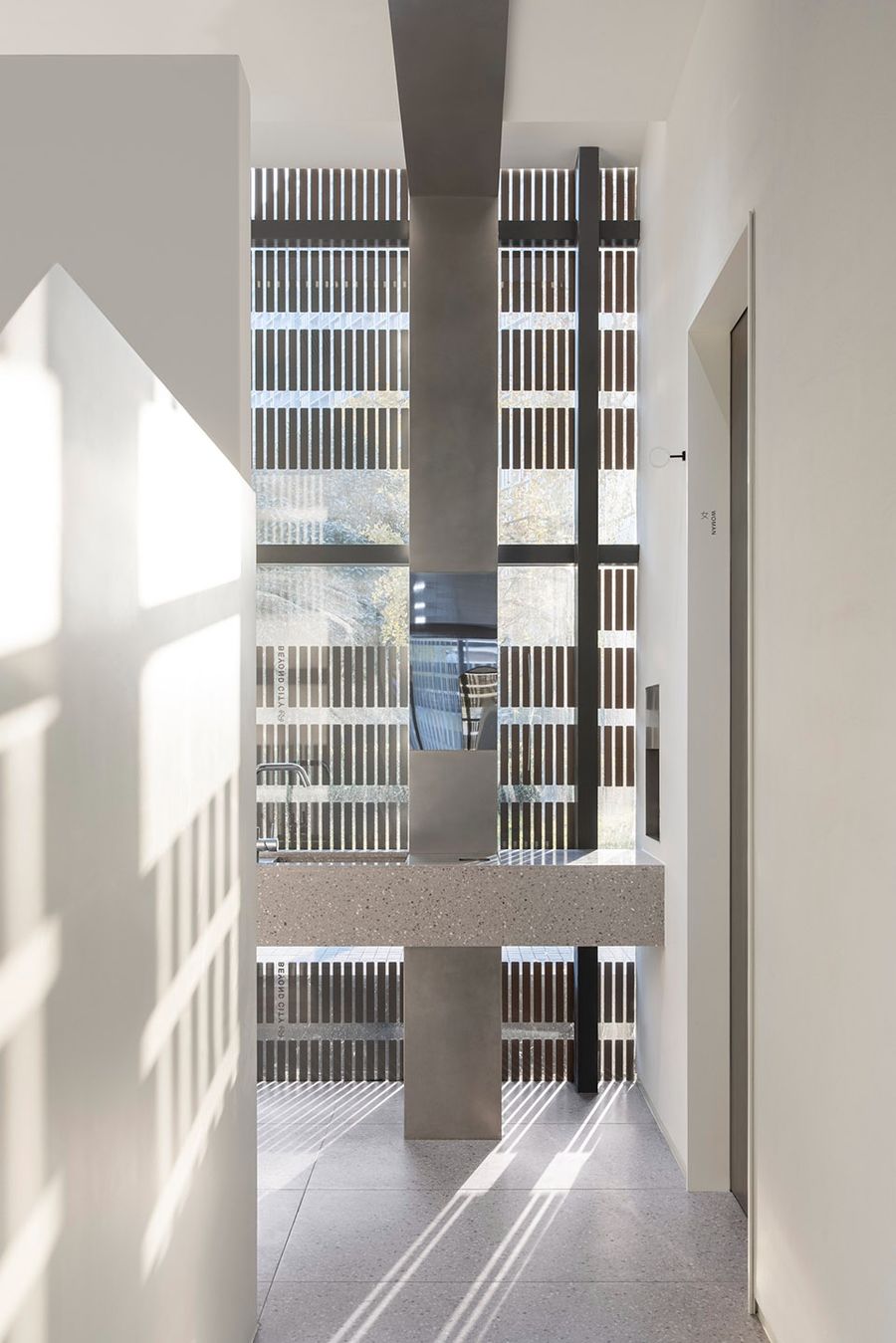
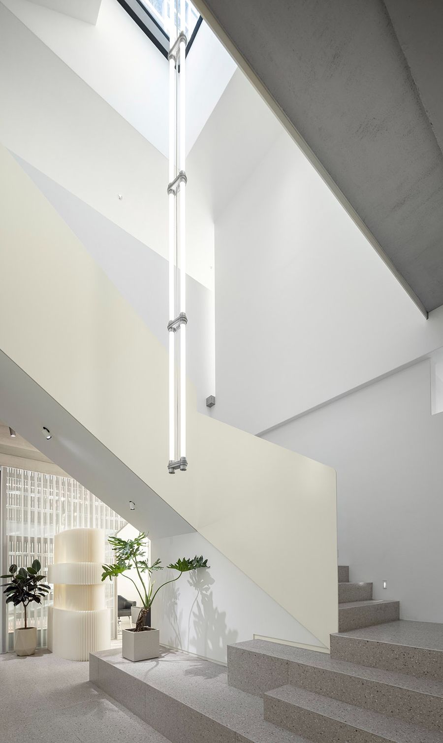
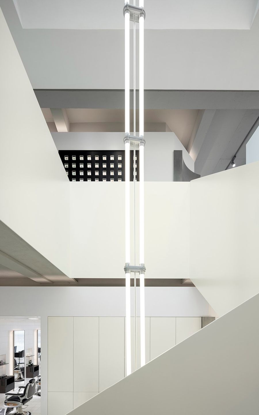
通往二层的楼梯成为着重打造的区域,白色,挑高,自上而下悬挂的双管荧光灯,将空间的气势表达得淋漓尽致。
The staircase leading up to the second floor becomes a strongly constructed area, with white, tall, double-tube fluorescent lights suspended from top to bottom, expressing the momentum of the space.
▼通往二层的楼梯,the staircase leading up to the second floor ©黑水
▼白色,挑高,自上而下悬挂的双管荧光灯,white, tall, double-tube fluorescent lights suspended from top to bottom ©黑水
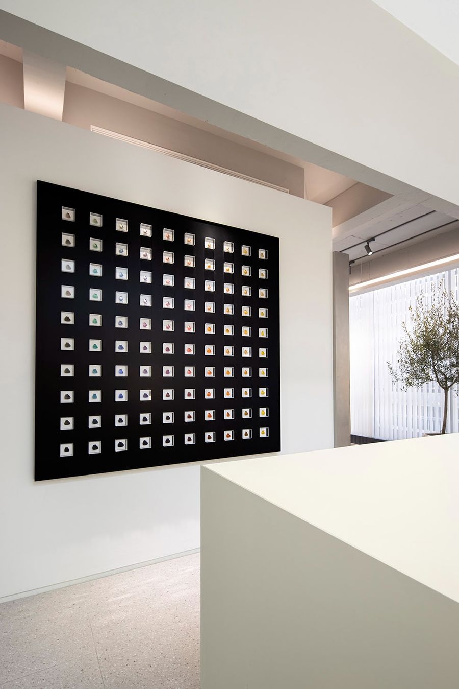
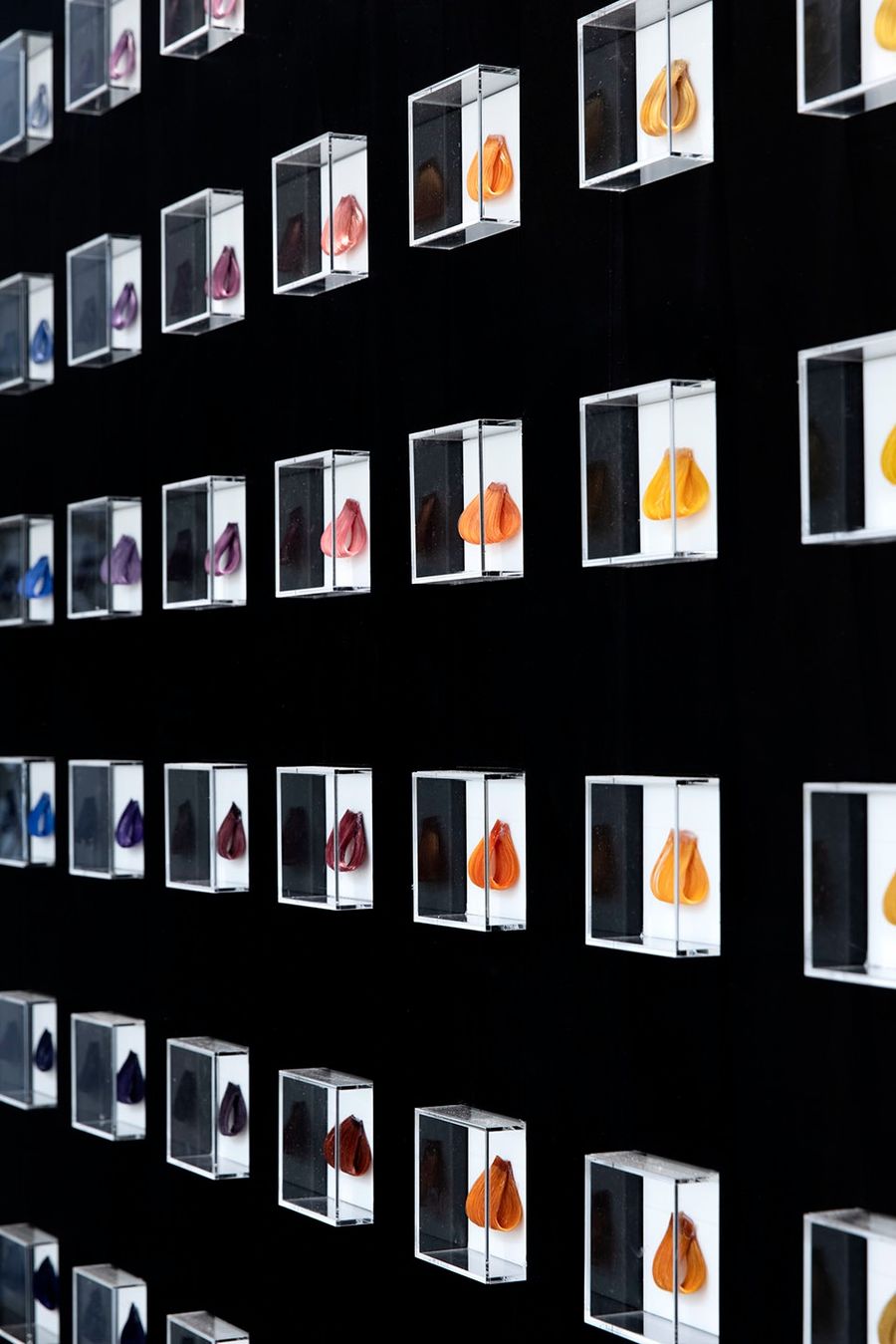
我们希望GOTODAY是一个充满艺术感的空间,纯粹,年轻,简单。
We wanted GOTODAY to be an artistic space,Pure, young and simple.
▼充满艺术感的色卡装饰,artistic color-card decoration ©黑水
▼色卡装饰细部,details of the color-card decoration ©黑水
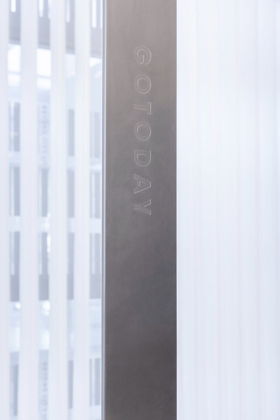
▼简单纯粹的标识设计,simple and pure signage design ©黑水
项目名称:GOTODAY SALON 高地沙龙
项目地址:杭州滨江区东信大道1228号
项目面积:440平米
竣工日期:2022年12月
空间设计:杭州观堂室内设计有限公司
平面设计:三三视觉设计
工程施工:杭州久维装饰工程有限公司
标牌制作:良良标识
灯光照明:杭州见合灯光设计事务所
窗帘布艺:宁波致品居 柔然软装
装饰灯具:年轮公园/Zoring Park
主要材料:乱纹不锈钢、乳胶漆、黑色大理石、仿水磨石瓷砖
空间摄影:黑水
Project name: GOTODAY SALON
Project address: No. 1228 Dongxin Avenue, Binjiang District, Hangzhou
Project area: 440 square meters
Completion date: December 2022
Space Design: Hangzhou Guantang Interior Design Co., LTD
Graphic design: Sansan Visual Design Studio
Project Construction: Hangzhou Jiuwei Decoration Engineering Co., LTD
Sign production: Liangliang Hangzhou
Lighting: Hangzhou JIO Light Design Office
Curtain Supply: Ningbo Zhipinju · Rouran soft outfit
Decorative light: Zoring Park
Main materials: random stainless steel, latex paint, black marble, terrazzo tile
Space photo: Hei shui






评论(0)