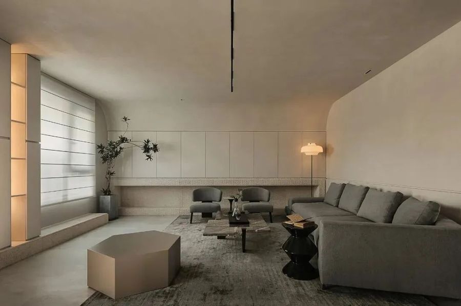
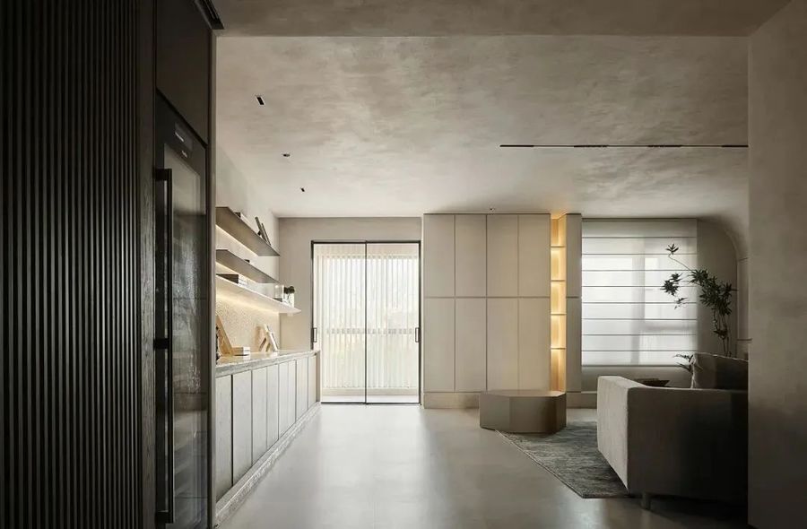
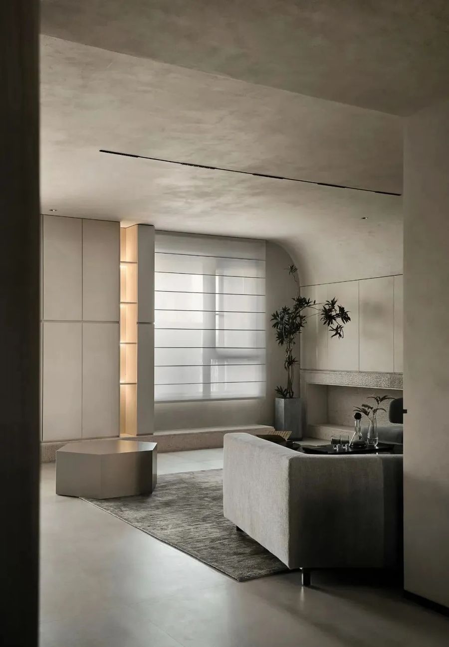
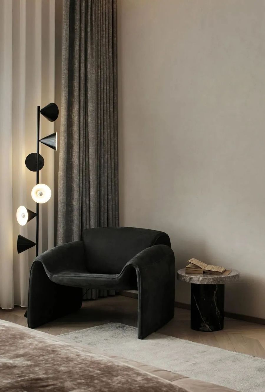
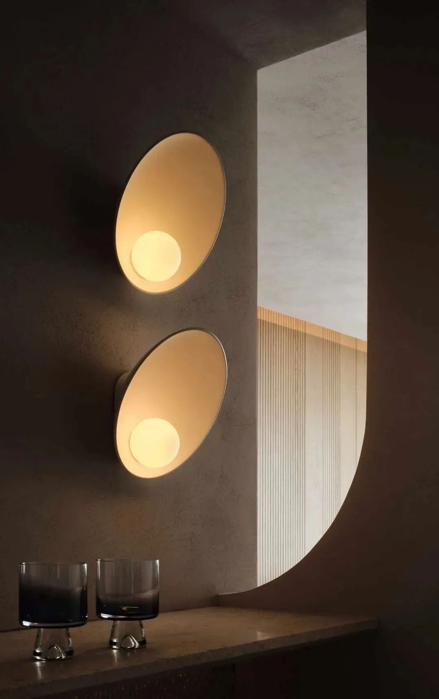
光影的效果随着时间的流逝,也在不断的发生变化,不同的设施给光线赋予了形状,与柔和的室内光源相辅相成,在内敛的环境下能够产生更强的安全感,打造温馨舒适的居所。
The effects of light and shadow as with time,It is also constantly changing,Different facilities give the light the shape,Complementary to the soft indoor light sources,Can produce a spaner sense of security in a introverted environment,Create a warm and comfortable residence.
近期男主人的家里刚好迎接了一个新生命的到来,因此需要更大程度上的凸显室内的安全感,让小宝宝得到无微不至的关怀。
Recently, the host's home just welcomed the arrival of a new life, so it needs to highlight the sense of security to a greater extent, so that the baby get meticulous care.
小宝宝的来临,让男女主人的一切心思都放在了孩子身上,室内的设计也是为其做出来诸多的调整。
The arrival of the baby, let all the thoughts of the host and hostess on the child, the interior design is also to make a lot of adjustments for it.
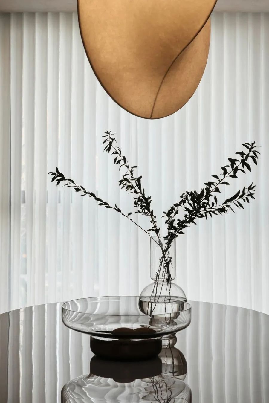
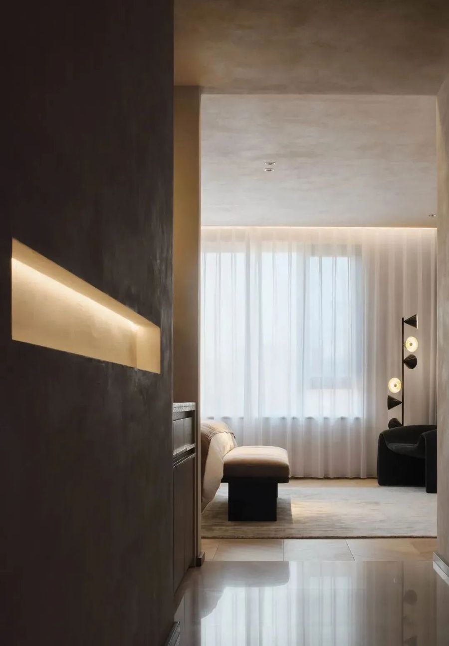
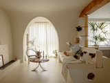
设计师在开阔地空间内之开设一扇窗户,内侧还用轻薄的窗纱遮蔽,使得空间内更加的内敛和昏暗。
Designer opens a window inside the open space, inside still cover with light window screen, make the space inside more inside collect and dim.
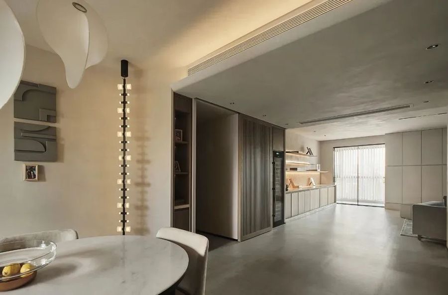
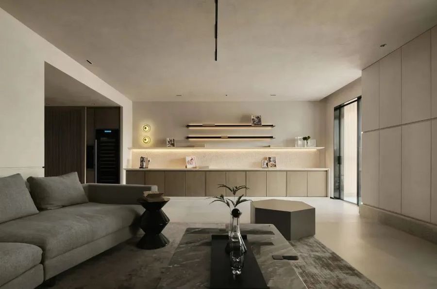
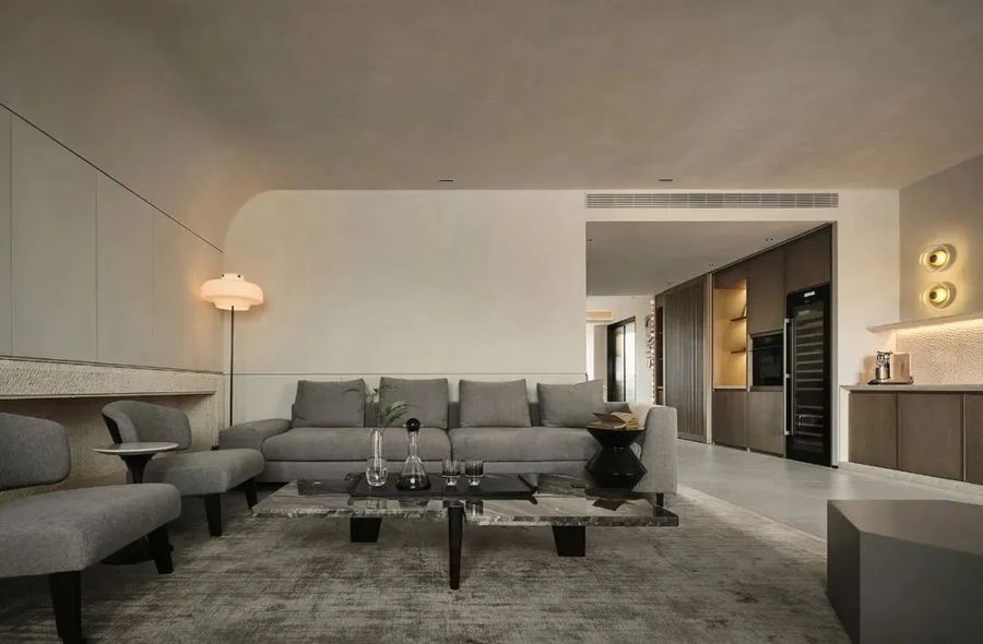
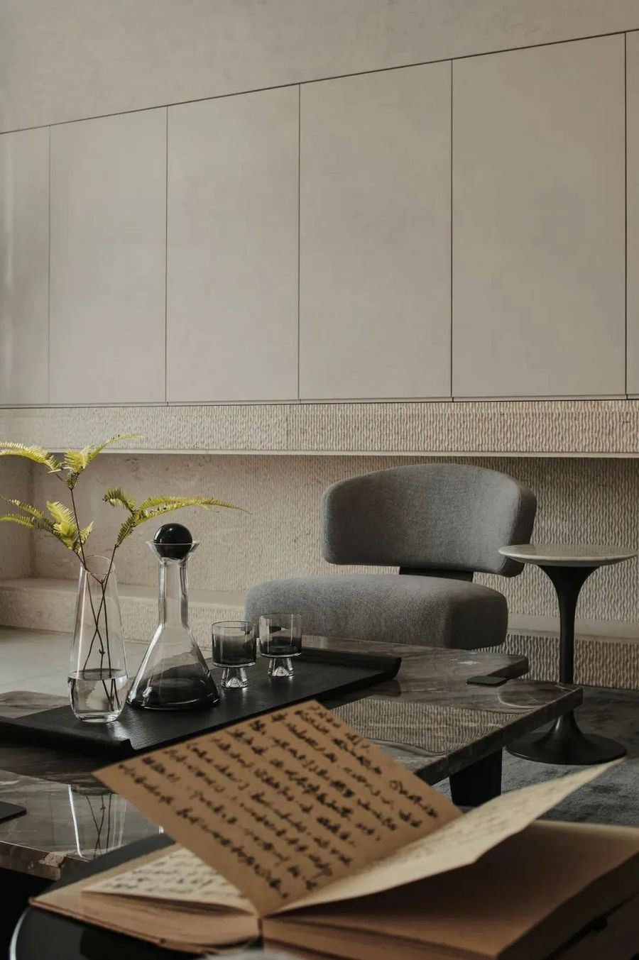
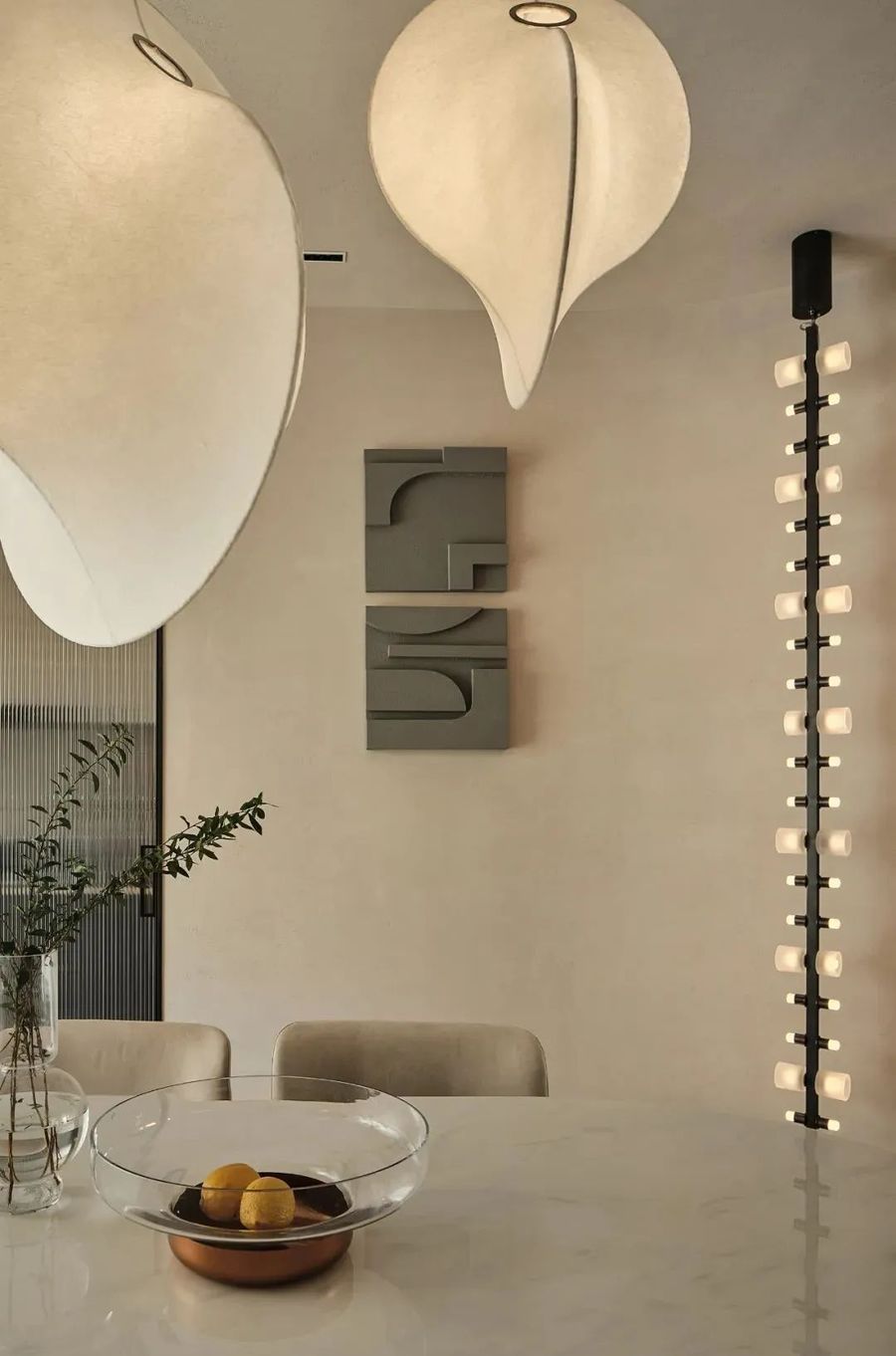
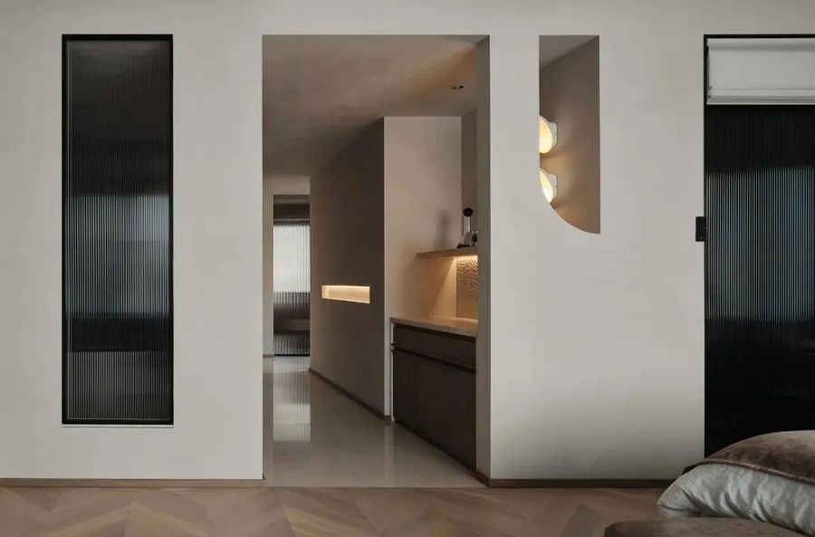
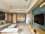
室内很少有装饰品的存在,墙壁上简约的动线勾勒出不同的功能分区。各种不同形态的灯具充满了设计感,为整体提供了不错的照明条件,营造了温馨幸福之感。
Indoor rarely has the existence of decorations, the simple moving line on the wall draws the outline of different functional partition. A variety of different forms of lamps and lanterns are full of design sense, providing good lighting conditions for the whole, creating a sense of warmth and happiness.
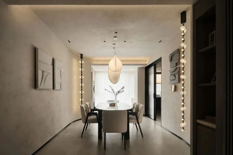
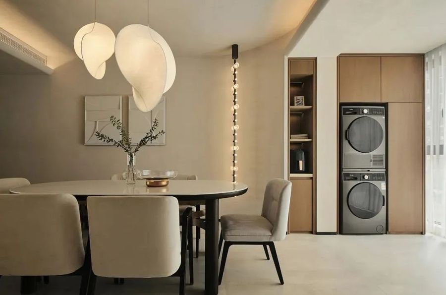
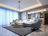
餐厅的区域相对明快活泼一些,头顶悬挂的吊灯呈现出奇异的造型,为空间内增添了些许的活力。
The area of the dining-room is relatively lively and lively some, the chandelier hanging on the top of the head presents a strange modelling, added a little vitality for the space.
餐厅和观景阳台的空间相接,通过墙体边缘处柔和的过渡,将室内室外的空间更好的结合在一起,起到良好的过渡作用。
The space of the dining room and the viewing balcony is connected. Through the soft transition at the edge of the wall, the indoor and outdoor space is better combined together to play a good transition role.
米白色和原木色的搭配,带来轻松舒适的即视感。再这样的环境下,能够放松心神,排解心中的烦恼。
The collocation of rice white and log color, bring relaxed and comfortable namely see feeling. In such an environment, you can relax the mind, solve the troubles in the heart.
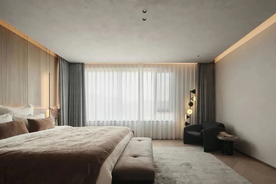
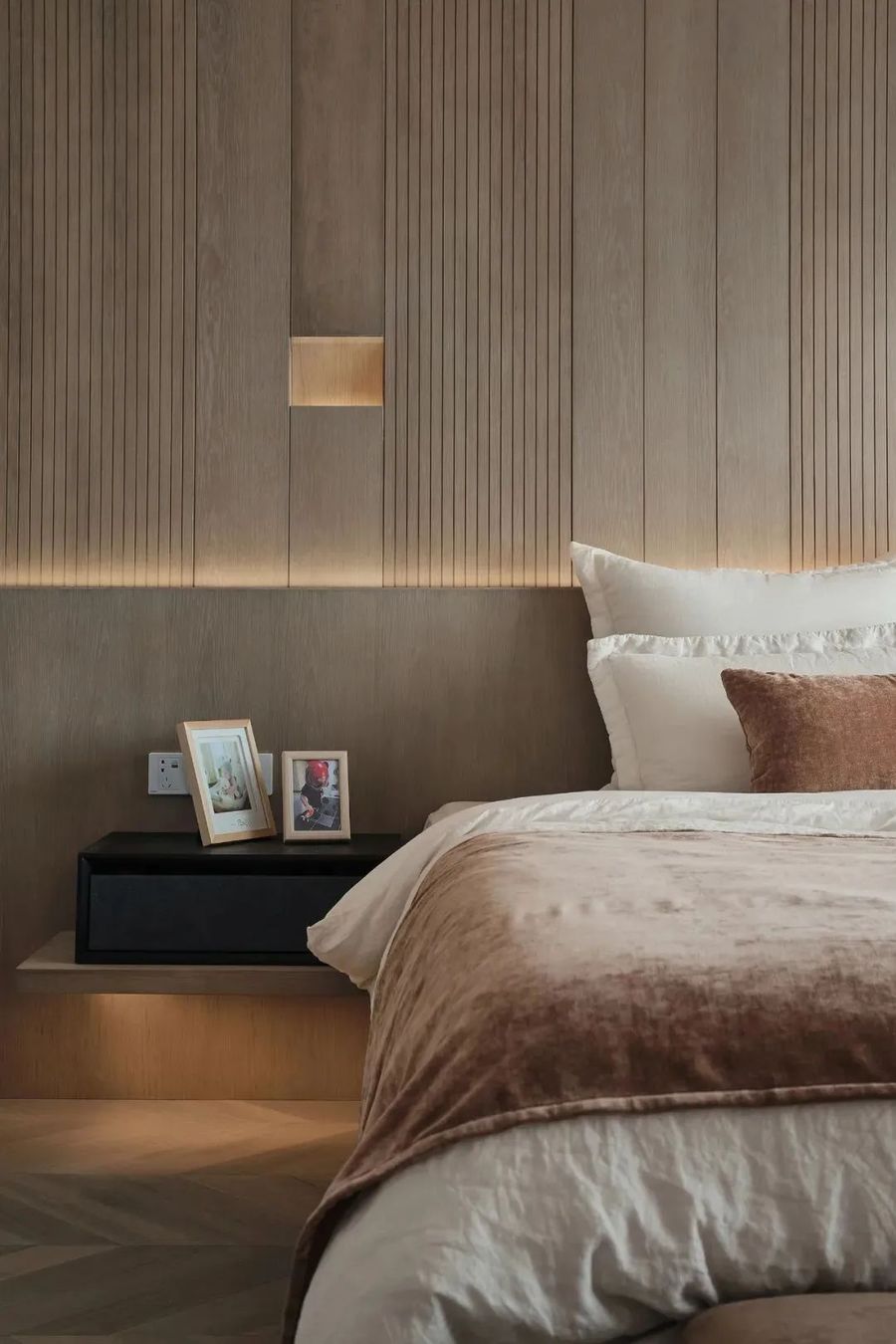
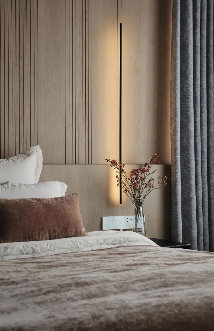
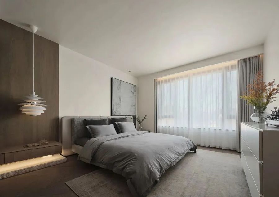
主卧内落地窗的设计,让室内拥有更好的采光条件。落地款式的床头柜更加贴近居者休息的位置,方便其取拿物品。墙壁上纵向的花纹设计,拉高了视角,看起来更加通透。
The design of the French window in the master bedroom enables the interior to have better lighting conditions. The bedside table of landing style is more close to the position of the resident to rest, convenient to take items. The longitudinal pattern design on the wall raises the Angle and looks more transparent.
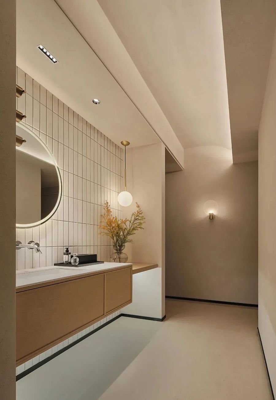
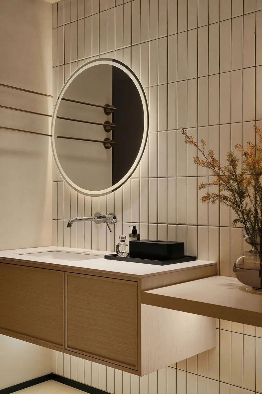
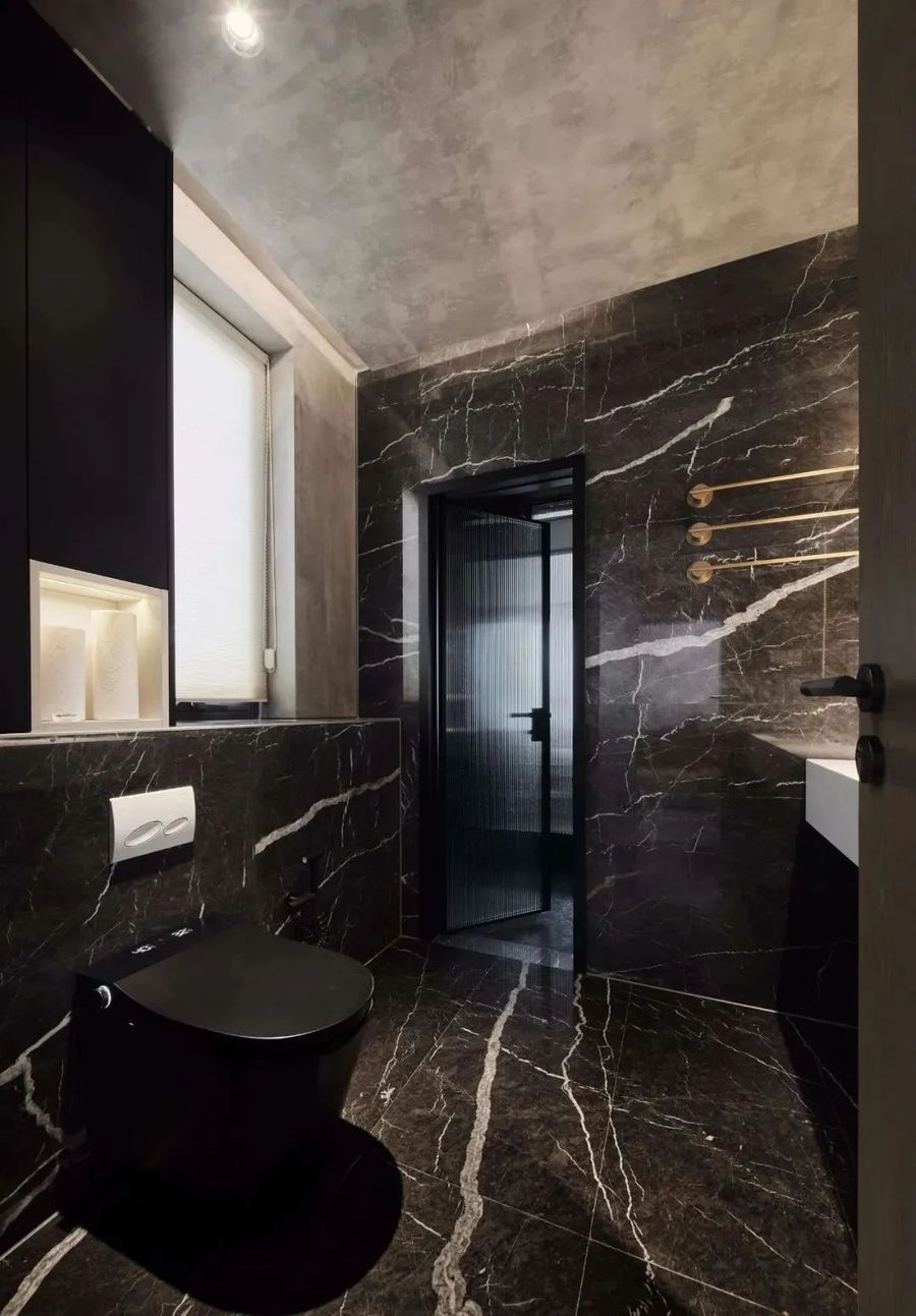
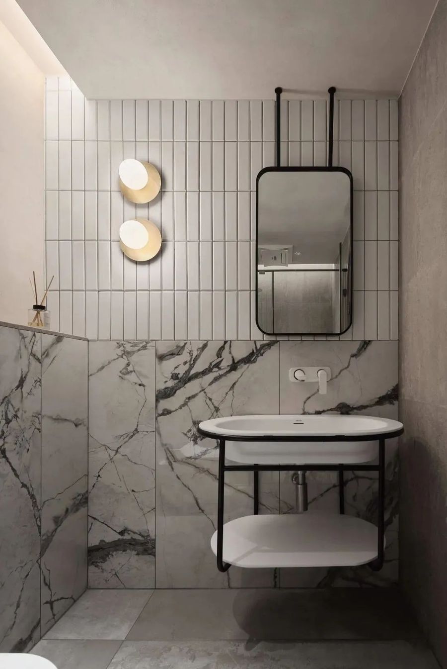
儿童房的设计也是极简的风格,独立的盥洗室内拼接风的瓷砖设计,有一种别样的美感。
The design of children's room also is minimalist style, the ceramic tile design of splicing wind inside independent lavatory, have a kind of different aesthetic feeling.







评论(0)