说在前面Preface
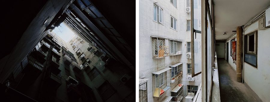
房子已有30多年的历史,是一梯10户的塔楼,每层楼的房屋围绕着一个天井排开,公共空间非常局促,而且全都是单面采光。53㎡的面积,甚至没有客厅,厨房卫生间狭小昏暗,是一个真正意义的「老破小」。这里是女主人长大的地方,许多的成长记忆都与这座房子息息相关。源于学区房的属性,加之屋主对房屋的深厚情感,她和丈夫决定带着女儿从郊区的大房子搬到这个小房子里,开启一家三口自由舒适的新生活,改造就显得尤为重要。
The house is more than 30 years old, is a tower building with 10 units on one floor, each floor of the house is lined up around a patio, the public space is very limited, and all are single-sided lighting. Although it has an area of 53 square meters, there is still not even a living room. What’s more, the kitchen and bathroom are not only small but also dark, it is a real sense of ‘old,dilapidated,and small’. This is where the lady grew up and has many childhood memories associated with this house. Due to the attributes of the school district and the owner have a deep affection for the house, the lady and her husband eventually decided to move from their large house in the suburbs to this small house with their daughter to start a new life of freedom and comfort for their family of three. Therefore, there is no doubt that fitment is extremely important.
▼概览,overview ©立明
我们根据老屋改动的可能性出了6版平面规划,逐一进行生活方式的讨论,最终定下了最大胆的一版,需要移位马桶,对于老房改造来说,技术和施工上也是难度最大的一版。我们和马桶厂家以及施工团队反复沟通讨论,确认可行性,最终打造了最开阔的公区,厨房开放、客餐厅一体……屋主想要的美好尽都实现,连邻居都表示想抄作业。项目施工的时候,邻居们经常讨论「这么个房子,怎么值得你们花这些心思去改造」,完工后邻居大妈进来参观了一圈,问了设计费,表示想做一个一模一样的设计。设计改变了生活态度,这让我觉得一切折腾都值得。
We provided six plans based on the possibility of changes to the old house for the house owner, and we discussed these designs one by one about lifestyle. The boldest version was finally settled on, which required the displacement of the toilet. The technical and construction difficulties were also great for an old house to remodel. We communicated and discussed with the toilet manufacturer and the construction team several times to confirm the feasibility. In the end, we created the most open common area with an open kitchen and an integrated living and dining room …… The homeowner’s ideas were realized as much as possible, and even the neighbors wanted to follow suit. When the project was being constructed, the neighbors often discussed “such a house, why is it worth all this effort for you to remodel it”, and when it was completed one of the neighbors came in for a tour and asked about the design fee, saying she wanted to do the same design. The design changed the attitude of life, which made me feel that it was worth all the effort.
▼住宅环境,living environment ©行十设计
屋主夫妇都是自由职业,待在家的时间特别多,三岁的女儿也需要比较多的空间来活动玩耍。他们一致认为卧室只是睡觉的地方,面积宽敞开阔舒适的公共区更重要!而原始户型正好相反,两个卧室向阳占据了较大面积,而正对厨卫空间的餐厅非常的昏暗,甚至没有客厅这一说。厨卫空间更是拥挤老旧混乱。
Since the homeowner couple are both freelance, they have enough time to stay at home extraordinarily often. In addition, their three-year-old daughter needed more space to move around and play. They agreed that the bedroom was just a place to sleep, and that a large, open and comfortable common area was more important! But the original house type is the opposite, the two bedrooms to the sun occupy a large area, while the dining room directly opposite the kitchen and bathroom space is very dark, and there is no living room. Besides, the kitchen and bathroom space is even more crowded, old and chaotic.
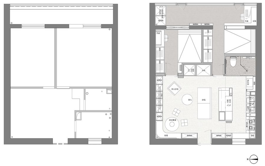
▼改造前后平面图,plan before and after renovation ©行十设计
设计后After
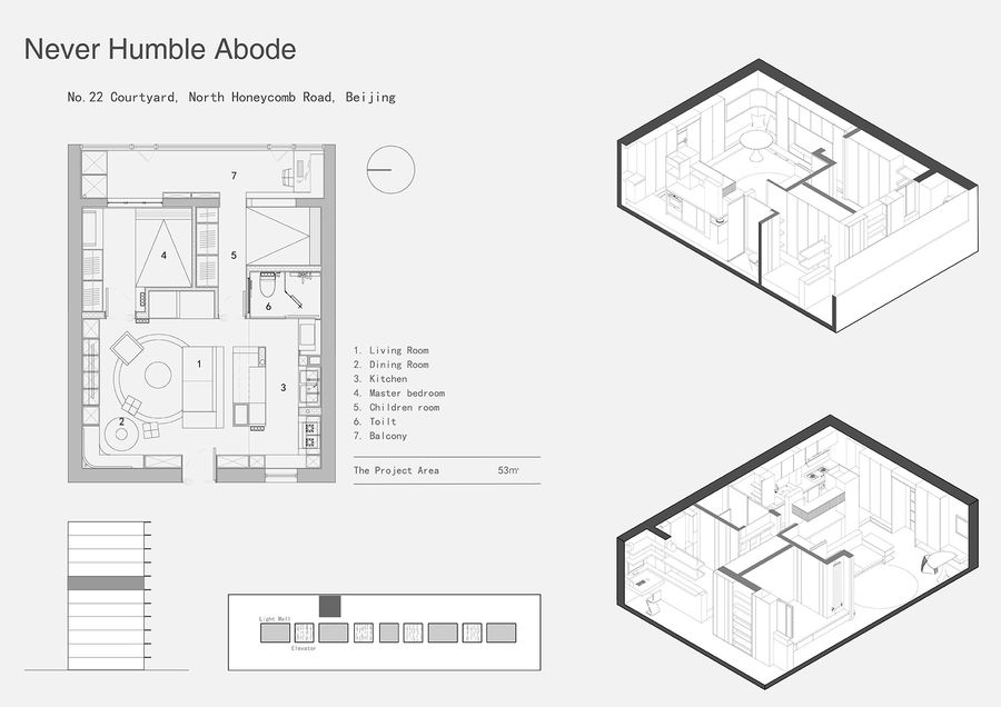
1.我们拆掉空间内部所有的墙体,重新切分卧室与公区的比例,扩大公共区域,将卧室压缩到方便休息的尺度,并做了大量的衣物收纳。2.原本的独立厨房变成开放空间,女主人想要的岛台得以实现,这对于管道繁多的老房子来说,无论是设计还是施工都是很有难度和挑战性。3.厨房与客餐厅联动使用,形成了流程舒适的洄游动线。因为厅的位置不大,我们在沿墙柜体中嵌入了转角座位,区分出餐厅功能。空间开放、功能齐备,日常生活可以轻松舒适,小朋友也能自在来往。4.给马桶移位后,我们在有限的空间内打造出了干湿分离的卫生间。台盆移到开放厨房内,使用起来更便利,最大化实现空间功能。5.除了在主卧安排了办公桌,我们还在阳台为男主人安排了独立的书桌,方便两个人高效办公。阳台的另一侧配置洗衣区和家政柜,满足日常生活的多种需要。6.除了重构空间结构解决户型问题,我们还在房子的四面墙体设置储物功能。53㎡的房子储物量达到百平配比,这对于举家家搬迁的一家三口是一个很好地生活支持。
1.All the walls inside the space were torn down, and in order to expand that area of the common room, the ratio of the bedroom to the common area was re-cut, and the bedroom was compressed to a convenient scale for resting, and a lot of storage space was made for storing clothes.2.The original separate kitchen was turned into an open space, and the kitchen island the lady wanted was realized, which was difficult and challenging for both design and construction in an old house with a lot of pipes.3.The kitchen and the living room and dining room are used together to form a flowing and comfortable migratory line. Because of the small location of the living room and dining room, we had to insert corner seats in the cabinets along the wall so that the dining room function can be distinguished. Overall, the design is open and functional, so that not only can daily life be easy and comfortable, but there is enough space for children to come and go freely.4.After our design team relocated the toilet, the wet and dry bathroom was created in a limited space. The countertop sink was moved into the open kitchen for more convenient use and to maximize the function of the space.5.In addition to the desk in the master bedroom, we also arranged a separate desk for the male master in the balcony, so that it is convenient for two people to work efficiently. In addition, the other side of the balcony is equipped with a laundry area and cabinets to meet the multiple needs of daily life.6.In addition to solving the problem of household size by reconstructing the space, we also set up storage functions on all four walls of the house. 53㎡ house has a storage capacity of 100 square meters, which is a good living support for a family of three who are moving to a new home.
▼分析图,drawings ©行十设计
客厅Living room
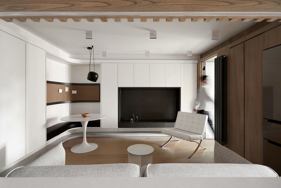
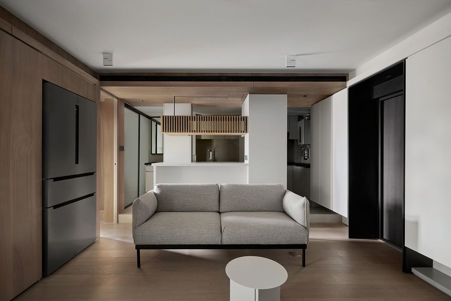
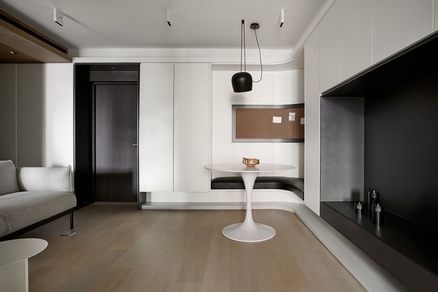
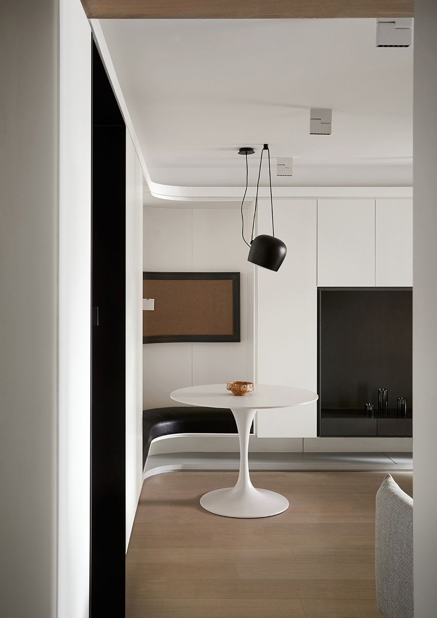
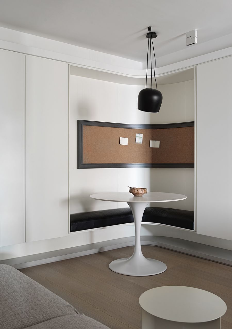
整个家以黑白原木的简约色调,打造明亮开阔的空间感。为了保证充足的储物量,整个房子的墙面几乎都被征用作为各类收纳柜,进门的悬浮柜体作为玄关鞋柜来使用。依墙打造的柜体都设计成纯白色,不影响整体空间感还能增加明亮的感觉,底部悬空的设计更显轻盈。入户鞋柜和电视柜之间嵌入转角卡座,一张圆桌、一盏吊灯,打造餐厅的陈设端景,原本没有客厅的房子,如今拥有了一体式的餐厅与客厅。
Our design team created a bright and open sense of space by designing the entire home in a minimalist palette of black and white logs. To ensure adequate storage, almost all the walls of the entire house are commandeered as various types of storage cabinets, and the suspended cabinet at the entrance is used as an entryway shoe cabinet. The cabinets against the wall are designed in pure white, which not only does not affect the overall space, but also can add brightness to the residents, and the bottom overhang design is more light. The corner card holder is embedded between the entry shoe cabinet and TV cabinet, a round table and a chandelier to create an open view of the dining room. The house that originally did not have a living room now has an integrated dining room and living room.
▼客厅,living room ©立明
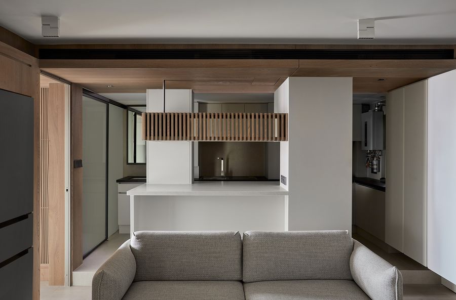
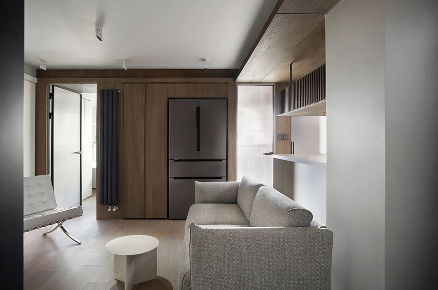
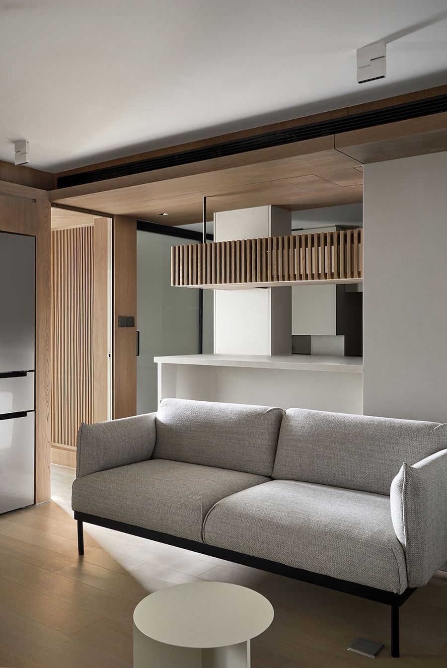
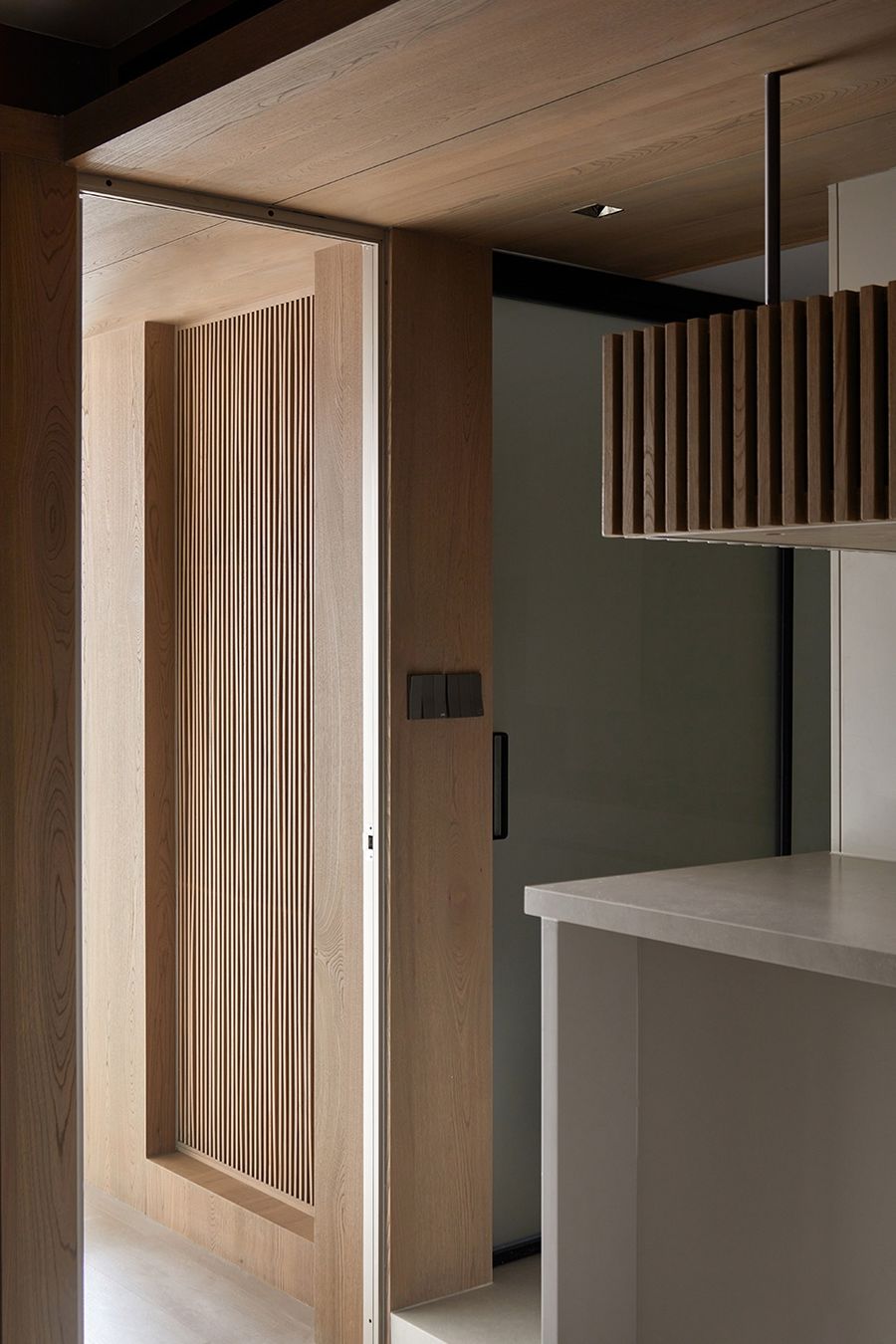
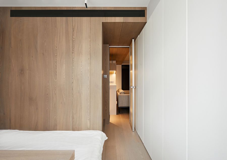
客厅与卧室之间的墙面安排成温馨的原木色。为了保留厨房电器与功能的完整性,我们提议将冰箱移到客厅区域,借用部分卧室空间打造收纳柜体,为了完美嵌入大冰箱,我们将计量单位细化到毫米,视觉上和谐美观。双人位沙发背后就是厨房岛台,这样的布局和安排既为原来昏暗的厨房空间带来了更多光线,整个公区也非常的开阔明亮。阳台的阳光透过次卧通道可以直接进入客厅,局部的木格栅营造温暖氛围的同时,也能提升空间质感,带来赏心悦目的美感。进门处的白色柜体直插入厨房,各种需要的厨房小家电都有容身之处,进一步分担了厨房收纳。
The wall between the living room and the bedroom was designed in a warm log color. In order to retain the integrity of the kitchen appliances and functions, we proposed to the client to move the refrigerator to the living room area and borrow part of the bedroom space to create a storage cabinet. In order to perfectly embed the large refrigerator, we refined the unit of measurement down to millimeters to achieve visual harmony. Behind the double sofa is the kitchen island, which not only brings more light to the original dark kitchen space, but also makes the whole common area look more open and bright. The sunlight from the balcony can enter the living room directly through the passage of the second bedroom, which not only creates a warm atmosphere but also enhances the quality of the space, which gives a beautiful view for the people. The white cabinet at the entrance is inserted directly into the kitchen to store various kitchen appliances, further sharing the kitchen storage.
▼冰箱移到客厅区域,借用部分卧室空间打造收纳柜体,the refrigerator is moved to the living room area and borrow part of the bedroom space to create a storage cabinet ©立明
▼客厅细部,details of the living room ©立明
▼木格栅营造温暖氛围,the wooden grilles create a warm atmosphere ©立明
餐厅Dining room
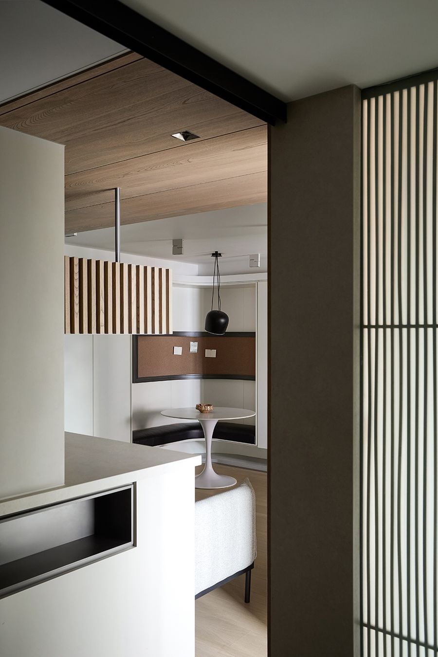
改造后的餐厅正对厨房门,平日里热炒的饭菜上桌不用多绕路,美味无需多等。岛台的另一侧也可以进入客餐厅,备餐时也能跟家人进行互动,对于形影不离的一家三口,厨房都可以变成亲子互动的空间。转角的皮质卡座柔软舒适,不仅用餐方便,还可以在这里办公,墙面的软木板可以贴工作清单,也可以无声传递家人之间的鼓励与爱意。从厨房看客餐厅,整个空间十分开阔,无拘无束;由客餐厅进入卧室的动线也很流畅。
The remodeled dining room is facing the kitchen door, so the hot fried meals on weekdays can be served straight to the table, so there is no need to wait for more delicious food. The other side of the kitchen island also has access to the living room and dining room, allowing for interaction with the family while preparing meals. For intimate families, the kitchen can be turned into a space for parent-child interaction. The soft and comfortable leather card table in the corner is not only convenient for dining, but also for working here. In addition, the cork board on the wall can be used to post work lists or to convey silently the encouragement and love between family members. From the kitchen to the living-dining room, the total picture shows that the whole space is very open and unrestrained. The route from the living-dining room into the bedroom is also very smooth.
▼餐厅区,dining room ©立明
▼转角的皮质卡座柔软舒适,the soft and comfortable leather card table in the corner ©立明
厨房Kitchen
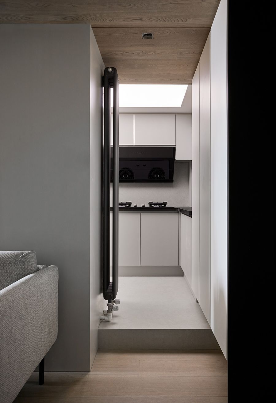
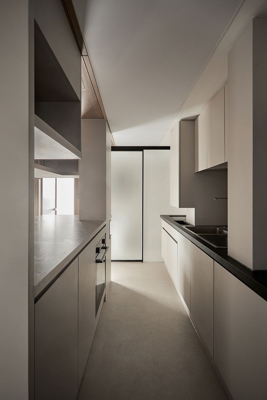
进门右手边便是厨房,拾阶而上,木地板变成水泥自流平,橱柜全部的纯白亮色,顶部还镶嵌了软膜光源,整个空间十分明亮。想要在管道繁多的现况下(都不能拆除)做出舒适的开放空间体验感,实属不易!我们在设计时依形赋势,有效的利用现场管路去切分活动区域:热炒、清洗、小电器台和操作岛台一样不少,洗碗机,蒸烤箱等厨房电器也一应俱全。
The kitchen is on the right hand side of the door. The wooden floor was changed to auto-flowing mortar, the cabinets are all pure white and bright, and the top is inlaid with soft film light source, which makes the entire space very bright. It is hard to make a comfortable open space experience with a lot of pipes (none of which can be removed). We use the alignment of the pipes and use the site piping effectively to cut the activity area: hot fry, cleaning, small appliance table and operation island, dishwasher, steam oven, and other kitchen appliances are also available.
▼厨房入口,entrance to the kitchen ©立明
▼厨房,kitchen ©立明
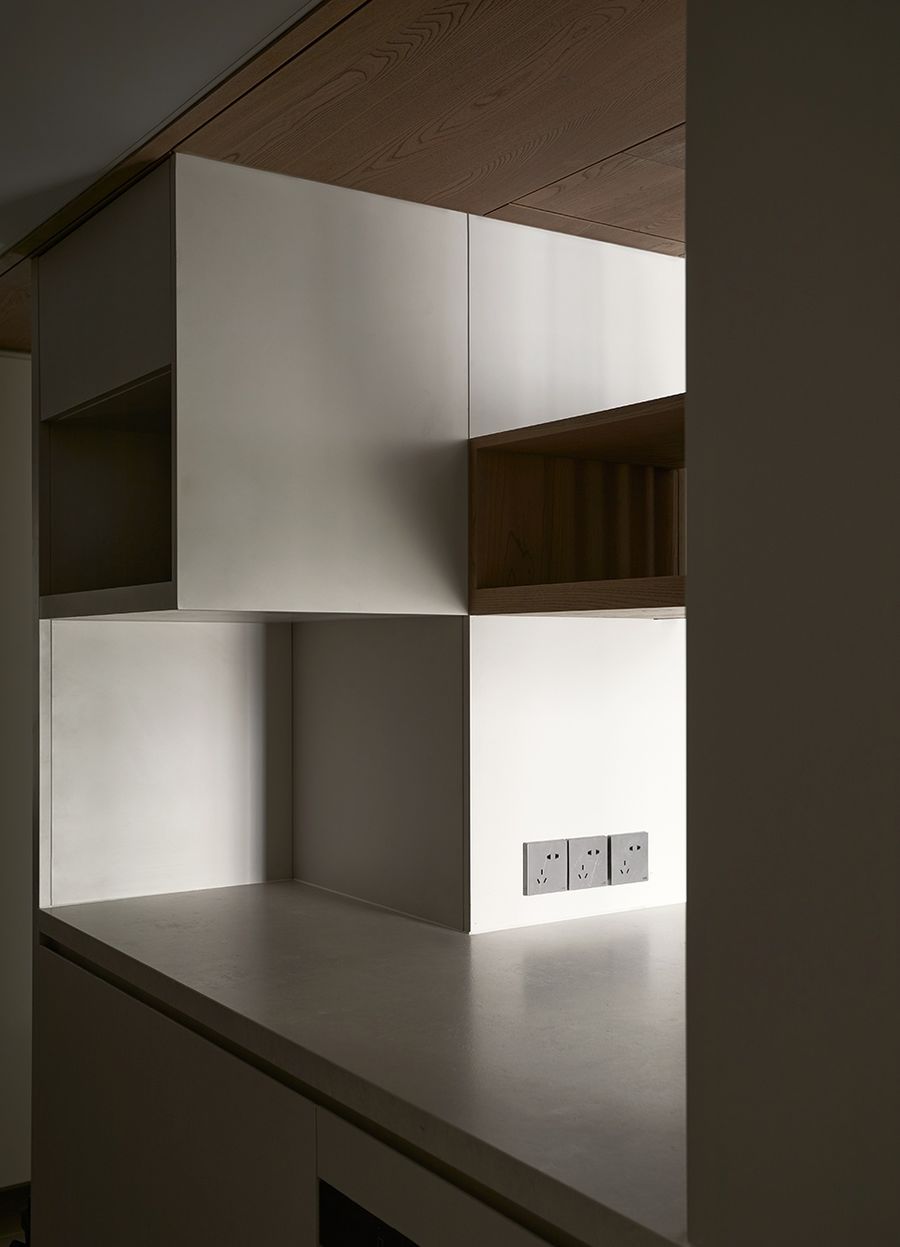
吊柜也是根据管道的走势进行设计,开放格和收纳柜相互穿插,每一寸空间都得到充分利用,整个家才能实现200%的收纳率。打开通路,居者和光都能自由穿行,白天厨房不开灯也不会很暗,下厨做饭也丝毫不觉拥挤,两端都可通行的洄游动线,让行走活动更加轻松自在。
Hanging cabinets are also designed according to the alignment of the pipes, open compartments and storage cabinets are inserted into each other, and every inch of space is fully utilized in order for the whole home to achieve a 200% storage rate. The interior path is opened up so that both the residents and the light can pass through. If the kitchen is not lit during the day, it is not dark inside the house. It is not crowded at all for cooking. In addition, both ends of the room are accessible, making it easier to walk and move around.
▼吊柜,hanging cabinets ©立明
卧室Bedroom
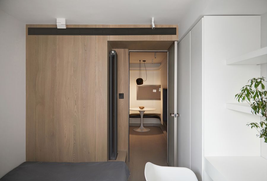
长虹玻璃门让卧室和客厅都能共享阳台的光线,完美解决客餐厅昏暗的问题,整个家更通透。卧室调整到方便休息的尺度,左边的墙面打造成储物衣柜结合地台床榻,省空间却不降低舒适度,还能增加收纳空间。右边墙面也打造了顶天立地大衣柜,旁边的书架和桌板则是女主人梳妆台兼办公区,桌面安排在靠窗的位置,光线明亮,视野开阔,梳妆工作都舒适。
Changhong glass doors allow both the bedroom and living room to share the light from the balcony, perfectly solving the problem of dimness in the living room and dining room and making the whole home more transparent. The bedroom is adjusted to a convenient scale for resting, and the left wall is made into a storage closet combined with a bed couch, saving space without reducing comfort. Besides, it can increasing storage space. The right wall also has a large closet, and the bookshelf and desk next to it are the mistress’ dressing table and office area. The desk is arranged in a window position, with bright light and a wide view, so it is comfortable for dressing and working.
▼主卧入口,entrance of the master bedroom ©立明
▼由主卧看客厅,viewing the living room from the master bedroom ©立明
▼由儿童房看客厅,viewing the living room from the children’s room ©立明
▼女主人的梳妆台兼办公区,the hostess’s dresser doubles as an office area ©立明
阳台Balcony
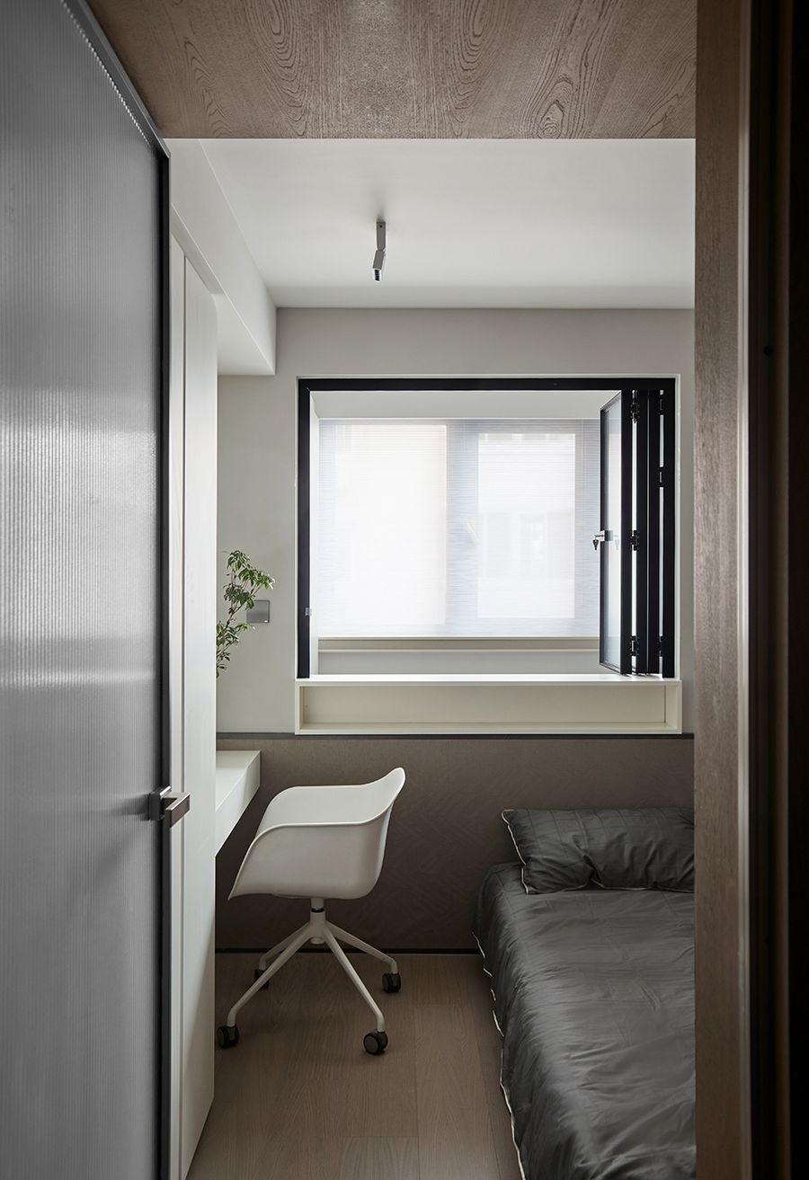
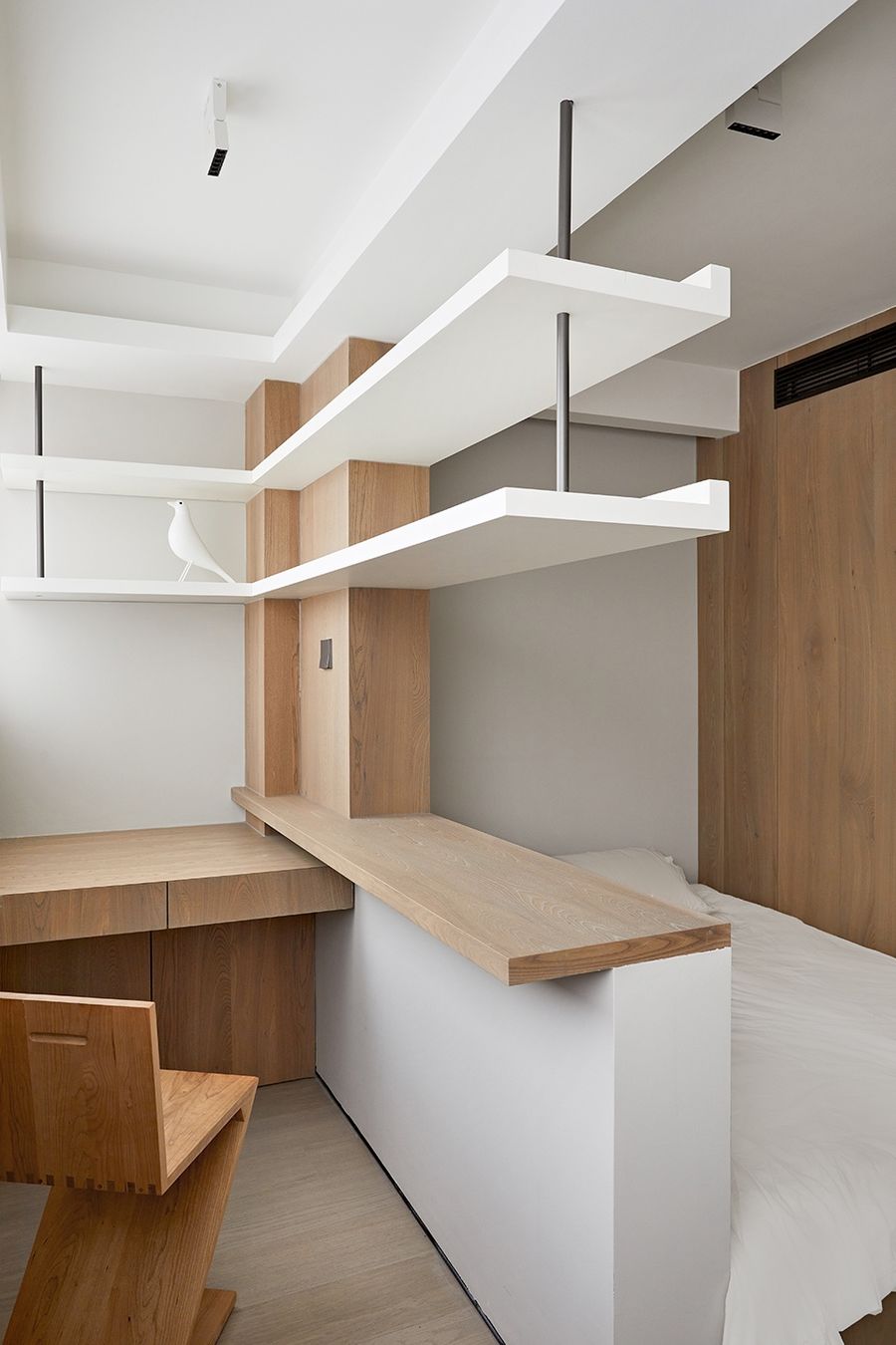
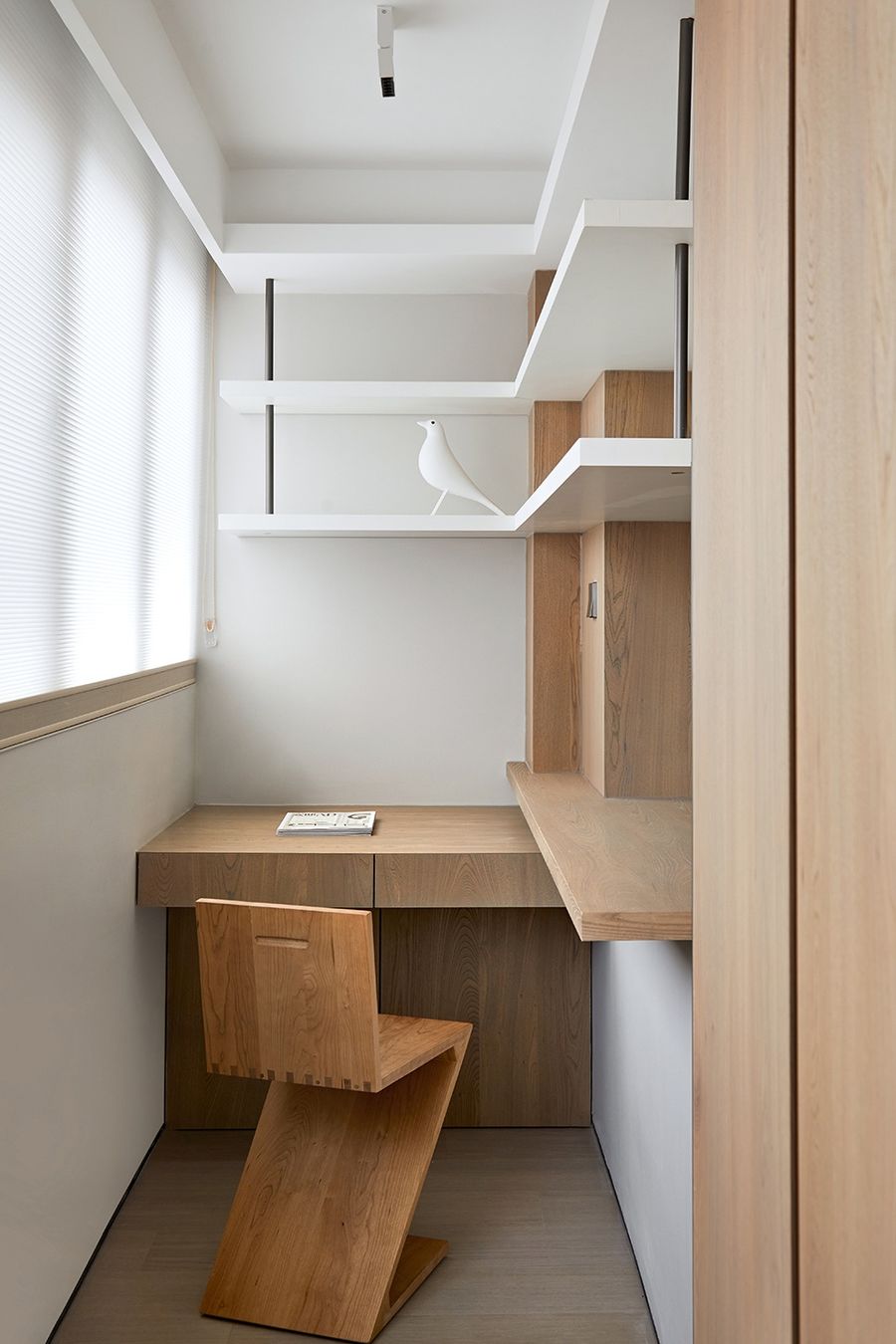
阳台与次卧打通后,形成一个功能无比丰富的空间:休息、办公、储物和清洗晾晒…… 合理的功能分区有机排列,充分挖掘户型的优势,利用好每寸空间。进门左手边做了整面墙的白色衣柜,极简的设计,完全不影响通透的空间感,而全房收纳系统又能充分满足一家三口的收纳需求,打造出这样一个井然有序的家。榻榻米床的一侧,我们为男主人定制了一个工作区。原始的墙体敲掉一半,搭配定制的桌板和悬浮书架,十分方便屋主工作,收纳空间也很充足。悬浮书架做了转角设计,两个桌面也一定的高度差,满足多种办公场景。一整面阳台都安装的香格里拉帘,柔化后的光线显得格外温馨,书架之间都满是雅致的生活情调。
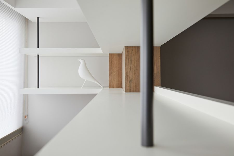
The balcony is opened with the second bedroom to form a functionally rich space: rest, office, storage and washing and drying …… Reasonable functional partitions are arranged organically to fully exploit the advantages of the household type and make good use of every inch of space. A wall of white cabinets on the left side of the entrance hallway creates such a well-organized home. The minimalist design does not affect the ventilation of the space at all, and the storage system of the whole room completely meets the storage needs of a family of three. On one side of the tatami bed, we customized a work area for the male owner. The original wall was knocked out in half, and with a custom-made desk and suspended bookshelf, it is very convenient for the owner to work and has plenty of storage space. The suspended bookshelf was made corner design, two desktop also a certain height difference, to meet a variety of office scenarios. The entire balcony is installed with Shangri-La curtains, softening the light to look extra warm, and the bookshelves are full of elegant living mood.
▼阳台上的男主人办公区,office area on the balcony ©立明
▼悬浮书架,the suspended bookcase ©立明
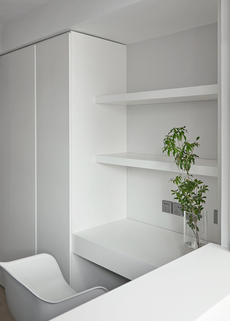
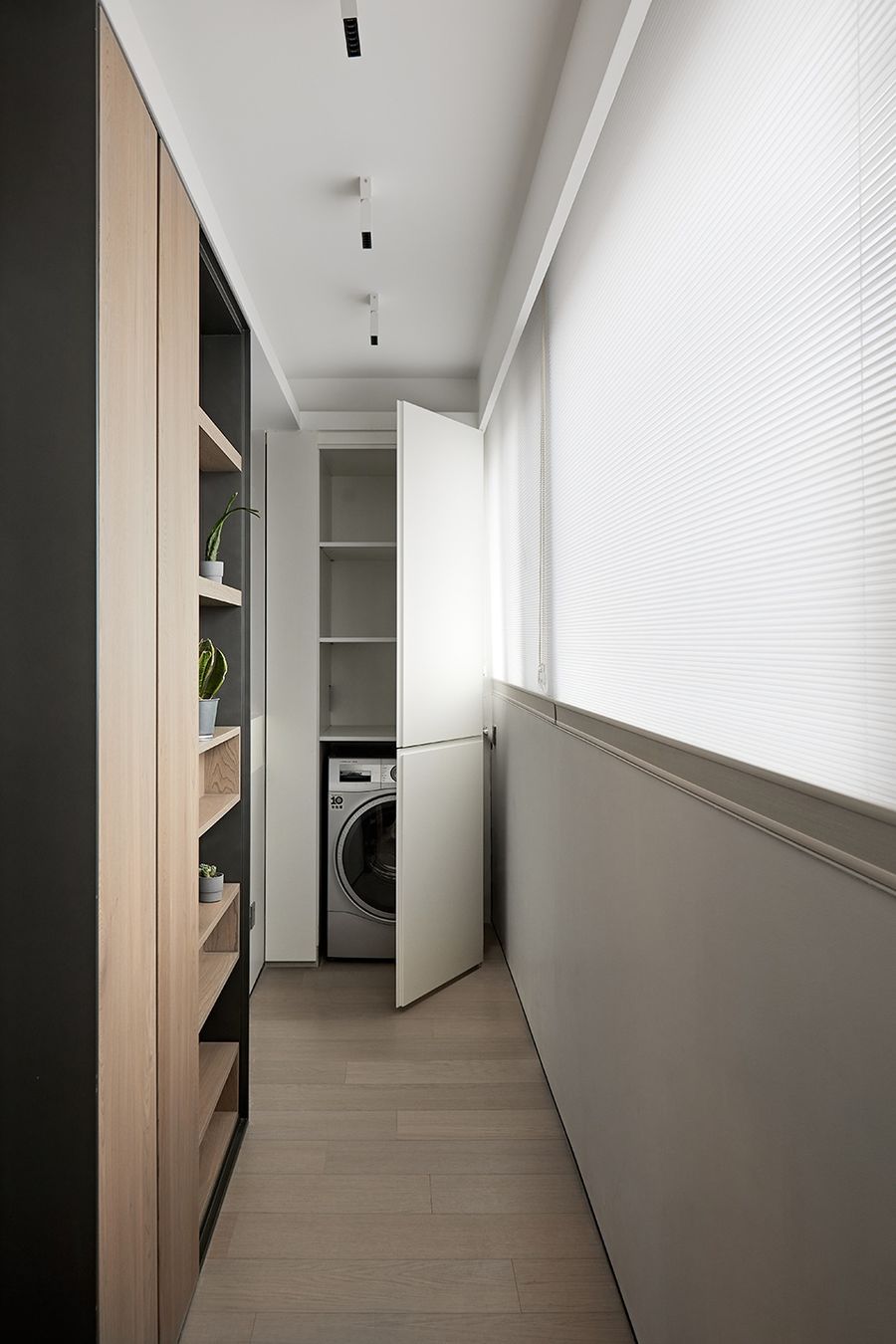
阳台另一侧是家政柜,洗烘一体机藏入其中,顶部的隔层非常方便放清洁用品的囤货,打开柜门生活物资充足,柜门关闭,视觉清爽仿若无物。除此之外,阳台内墙还利用了15cm的内空打造了一面绿植展示墙和收纳柜,富有生命力的绿意,为小家注入活力与乐趣。
The other side of the balcony is the housekeeping cabinet, washing and drying machine is embedded in it, the top compartment is very convenient to put cleaning supplies hoard. Open the cabinet door living supplies enough, if the cabinet door closed will look very neat. In addition, the inner wall of balcony also uses 15cm of inner space to create a green plant display wall and storage cabinet, which is full of vitality and greenery and makes the home look vibrant. The vibrant greenery makes the home look lively.
▼家政柜,the housekeeping cabinet ©立明
卫生间Bathroom
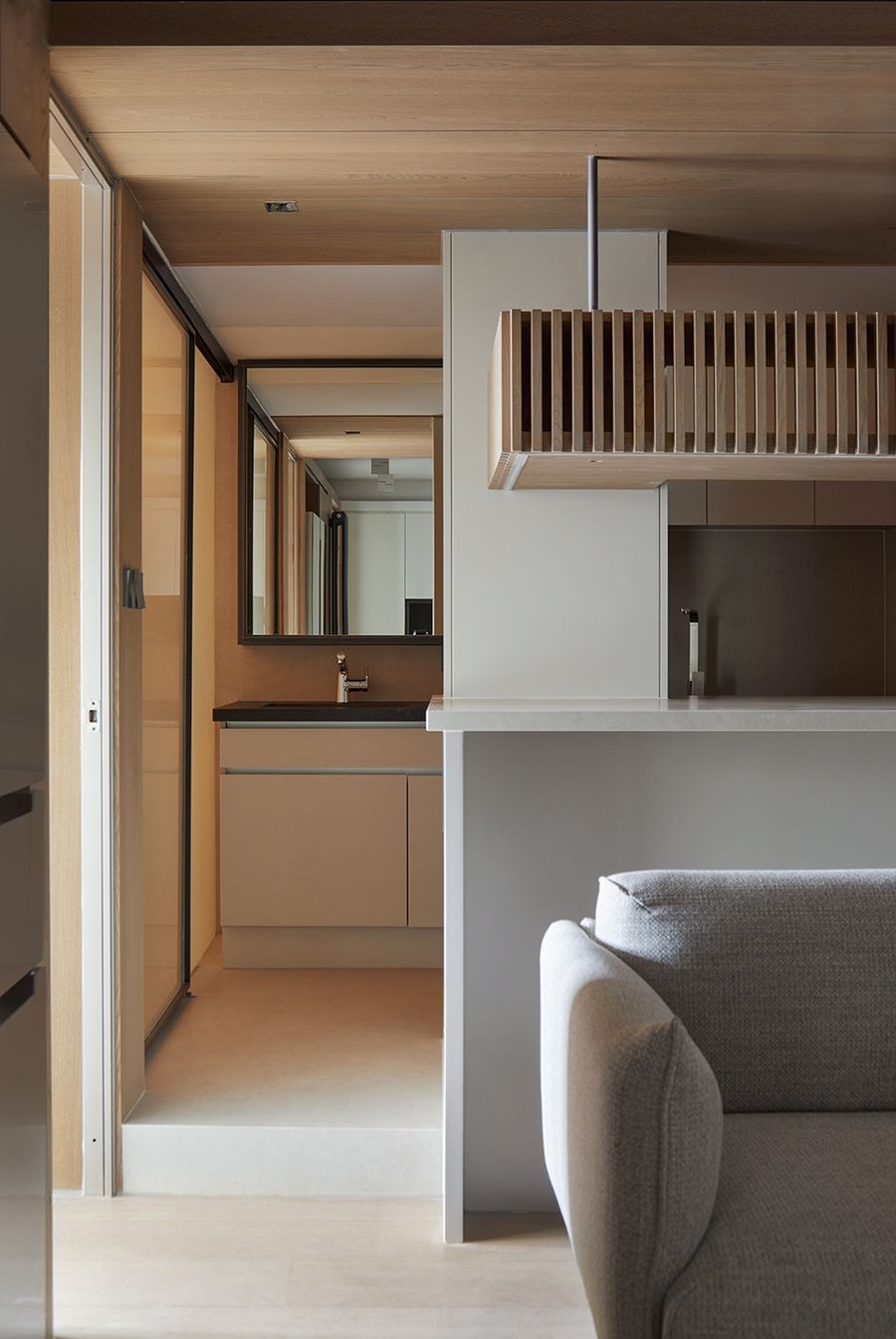
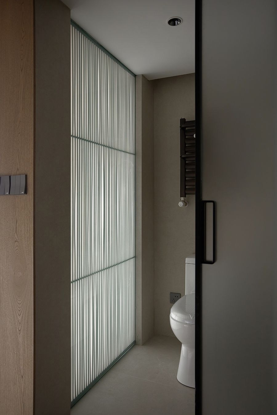
平面阶段和屋主沟通定下了马桶移位的平面方案,经过与马桶厂家和施工团队的多次沟通,最终我们借用部分次卧空间,将马桶区和淋浴区移到了合适的位置。干区则安排在开放厨房的一侧,完美实现了干湿分离。整个室内的平面规划之所以能够成立,得益于马桶移位问题得到完美解决。原始房屋老旧,排污和排水公用一个侧排的铸铁管道,所以原洗手间是被抬高的,随便移动极易造成拥堵。后来设计师想到使用办公空间常用的粉碎式马桶,反复确认可行性之后,施工团队完美落地了公共区域最开阔的一版设计,最终成就了这个开阔舒适的家。淋浴房使用玻璃移门,不占用空间,也能给卫生间带来光线。靠近次卧的一侧也安装了一整面玻璃墙,用木格栅做饰面,既能保护隐私,也能带来很有韵律的光线,提升空间的气质美感。靠近次卧的一侧也安装了一整面玻璃墙,用木格栅做饰面,既能保护隐私,也能带来很有韵律的光线,提升空间的气质美感。
During the floor plan stage, our design team communicated with the homeowner and settled on a floor plan for the toilet relocation. After many communications with the toilet manufacturer and construction team, we finally borrowed part of the second bedroom space and the toilet area and shower area were moved to a suitable location. The dry area is arranged on the side of the open kitchen, perfectly separating the wet and dry areas. The entire interior floor plan could be reorganized according to the design mainly because the toilet relocation problem was solved perfectly. The original house was old and the sewage and drainage shared a cast iron pipe with a side drainage, so the toilet, which was initially elevated, could easily be moved at will and cause congestion. Finally, the designer thought of using the crushed toilet commonly which always used in office spaces. After repeatedly confirming the feasibility, the construction team perfectly landed the most open version of the design in the public area, which finally made this open and comfortable home. Shower rooms use glass sliding doors that don’t take up space and bring light into the bathroom. A whole glass wall has also been installed on the side near the second bedroom, with a wooden grille as a finish that not only protects privacy but also brings light and enhances the beauty of the space.
▼卫生间,bathroom ©立明
项目名称:不蜗居
项目地址:中国北京海淀区
室内面积:53㎡
总花销 :40w
完成时间:2022年1月
设计总监:张威/T.E.N DESIGN 行十设计
传媒管理:小木同学/T.E.N DESIGN 行十
设计项目摄影:立明(LI MING)
Project Name|No Snail living
Project Address|Haidian District, Beijing, China
Indoor area|53㎡
Total expenses |40w RMB
Completion date|January 2022
Design Director|Wei Zhang/T.E.N
DESIGN设计团队|T.E.N DESIGN 行十设计
Design Team|T.E.N DESIGN
Media Management|Xiaomu |T.E.N DESIGN
Project Photography|Li Ming







评论(0)