表达与克制
Expression and Restraint
外放与内敛
Outward and Inward
自由与约束
Freedom and Restraint
MYHAIR 理发店的空间表达,系设计师凭借对商用空间的深度理解及对行业特质的探索洞察,抛却固化的概念式表达,由内及外,展开一场关于商用场域迭代与个性化需求的对话。
The spatial expression of MYHAIR salon is based on the designer's deep understanding of the commercial space and the exploration and insight of the industry characteristics. Instead of the rigid conceptual expression, the designer launches a dialogue about the commercial field iteration and personalized requirements from inside and outside.
商用场域的迭代升级
Iterative upgrade of commercial fields
━
随着时尚业态高速迭代升级,打造更多社交属性的复合型场域空间成为年轻一代热衷的新趋势。本案试图通过美学设计的表达,重新推演营运与体验的逻辑关系。通过互通有无形成内与外、快与慢的时空转换,探索空间的延展性与节奏感。
With the rapid iteration and upgrading of the fashion industry, it has become a new trend for the young generation to create complex field space with more social attributes. This case attempts to deduce the logical relationship between operation and experience through the expression of aesthetic design. Through the exchange of presence and absence, the space-time transformation between inside and outside, fast and slow is formed to explore the ductility and rhythm of space.
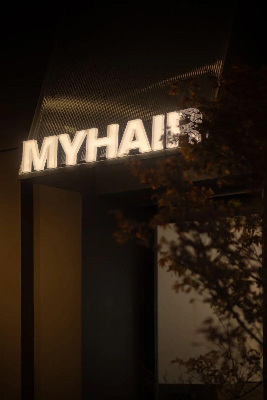
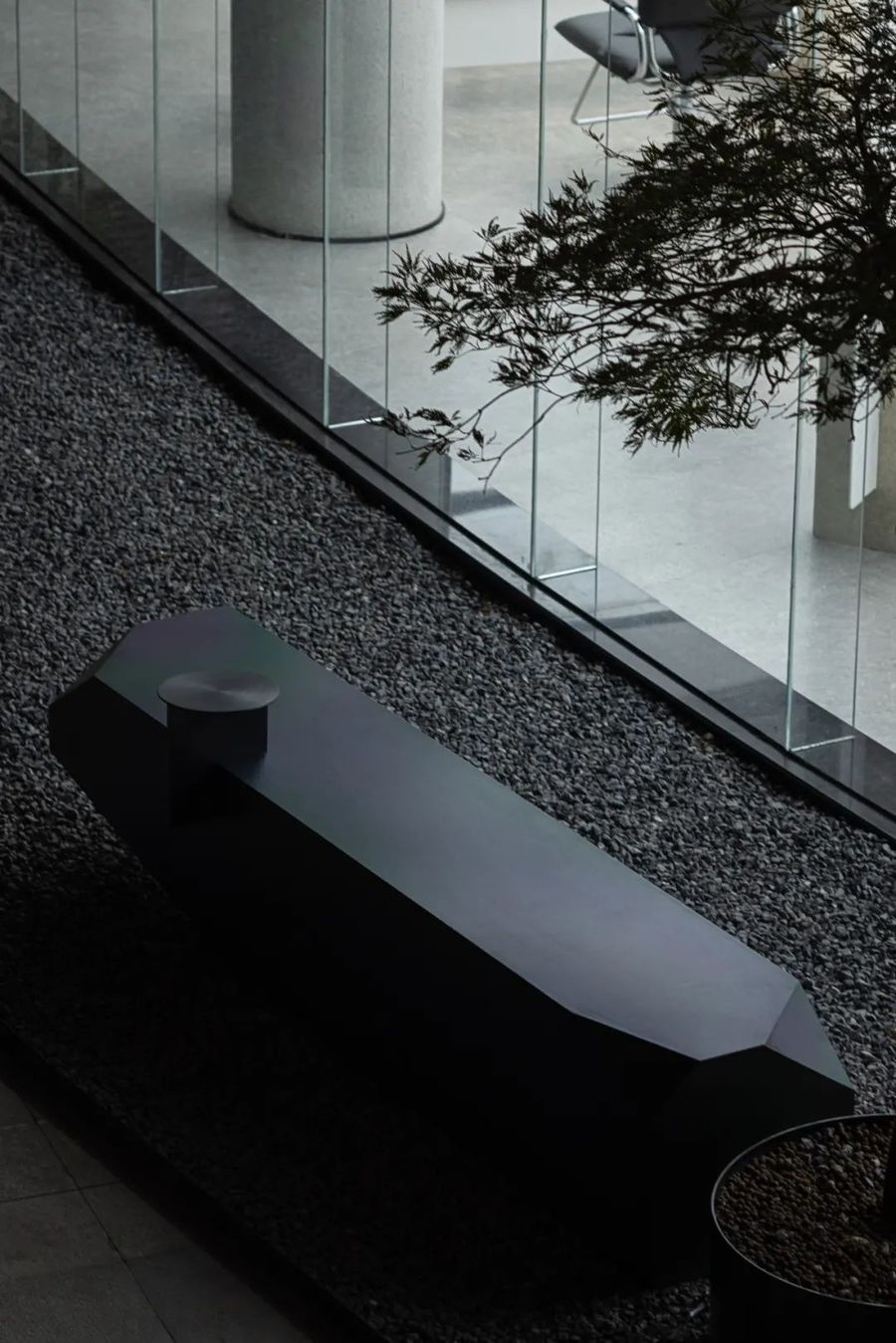
业主方对于自身行业有着独特理解,本案通过当代美学的理念浸入,形成自有品牌与消费对象之间的有机连接。自户外造景为境,层层递进,将行业独具的专业性与时尚感融入到空间内每一处细节之中。
The owner has a unique understanding of its own industry, and this case forms an organic connection between its own brand and consumer objects through the immersion of the concept of contemporary aesthetics. From the outdoor scenery as the realm, the layers are progressive, integrating the unique professionalism and fashion sense of the industry into every detail of the space.
内外兼容的自然联系
The Natural Connection Between Inner and Outer Compatibility
━
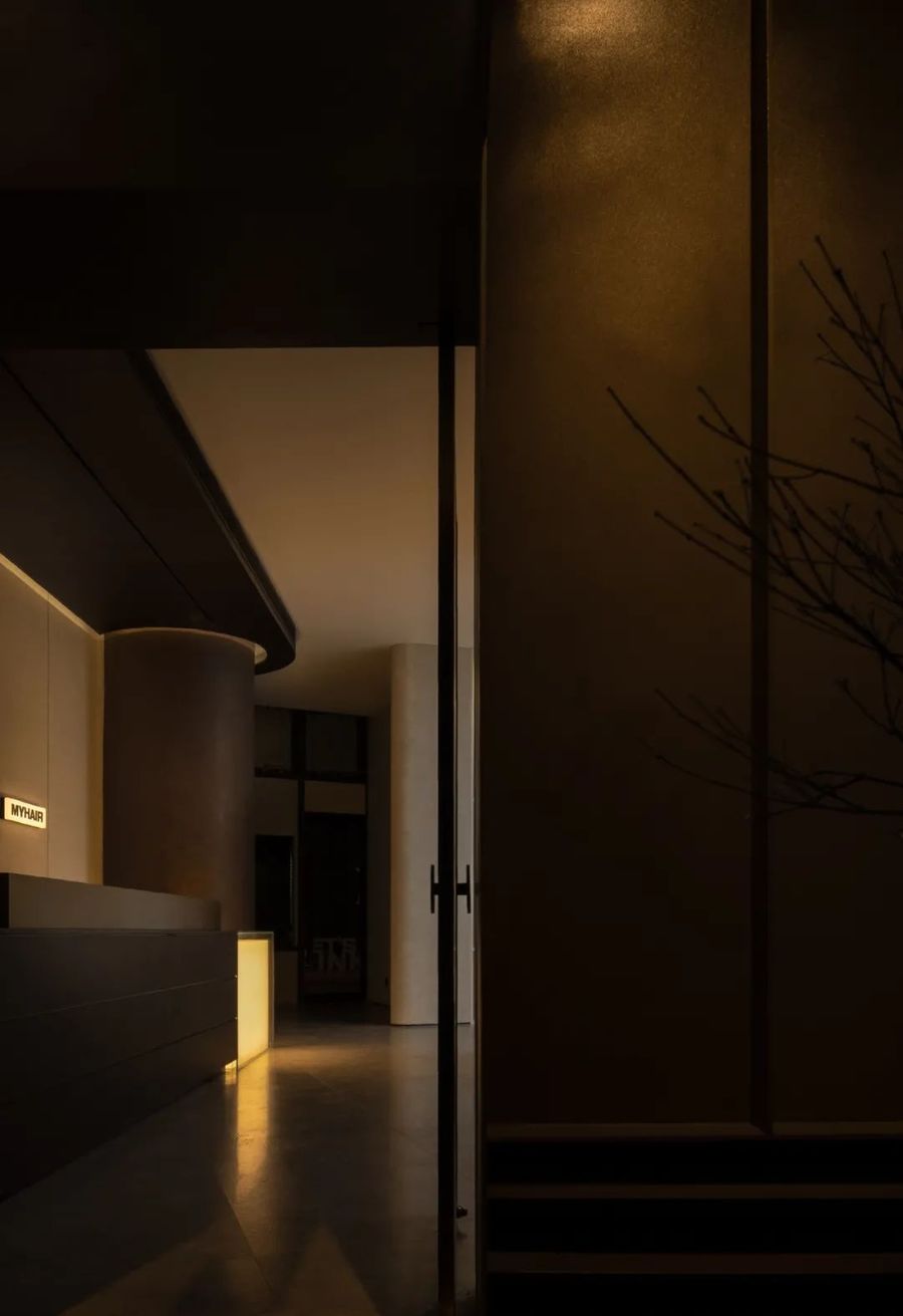
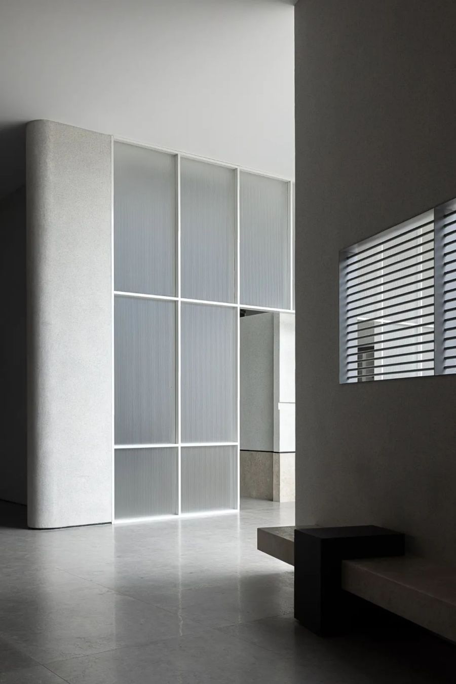
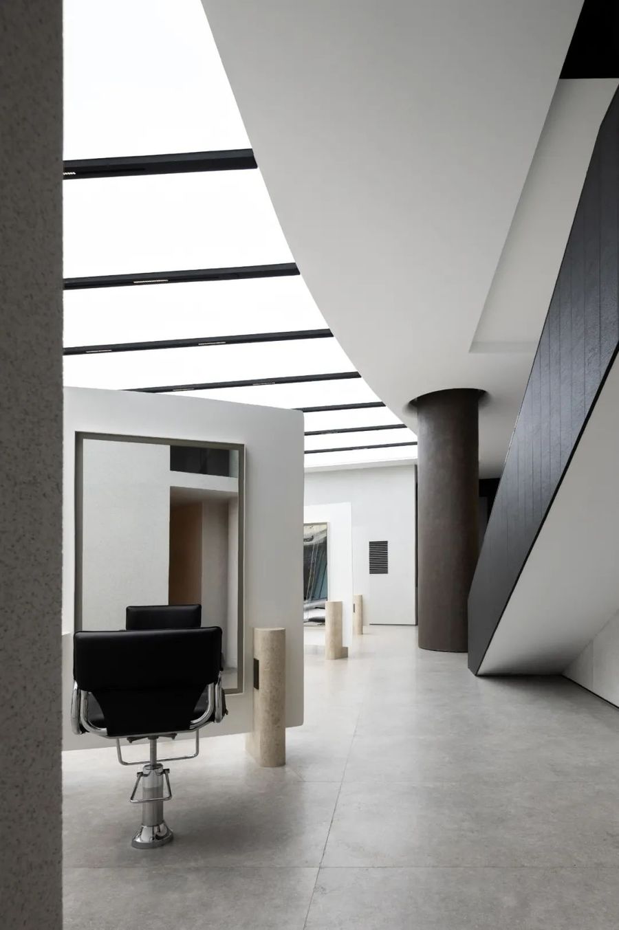
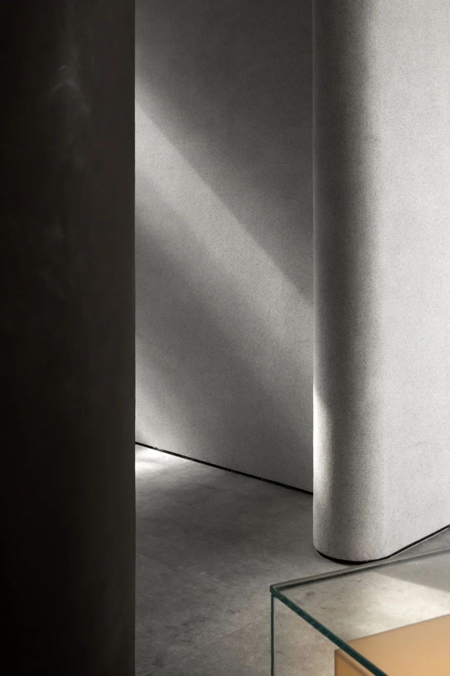
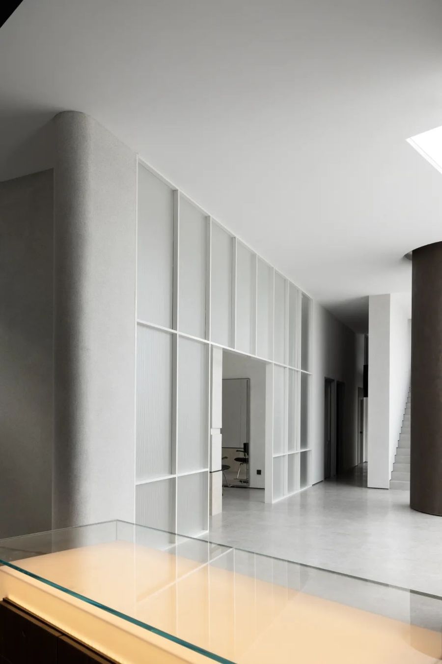
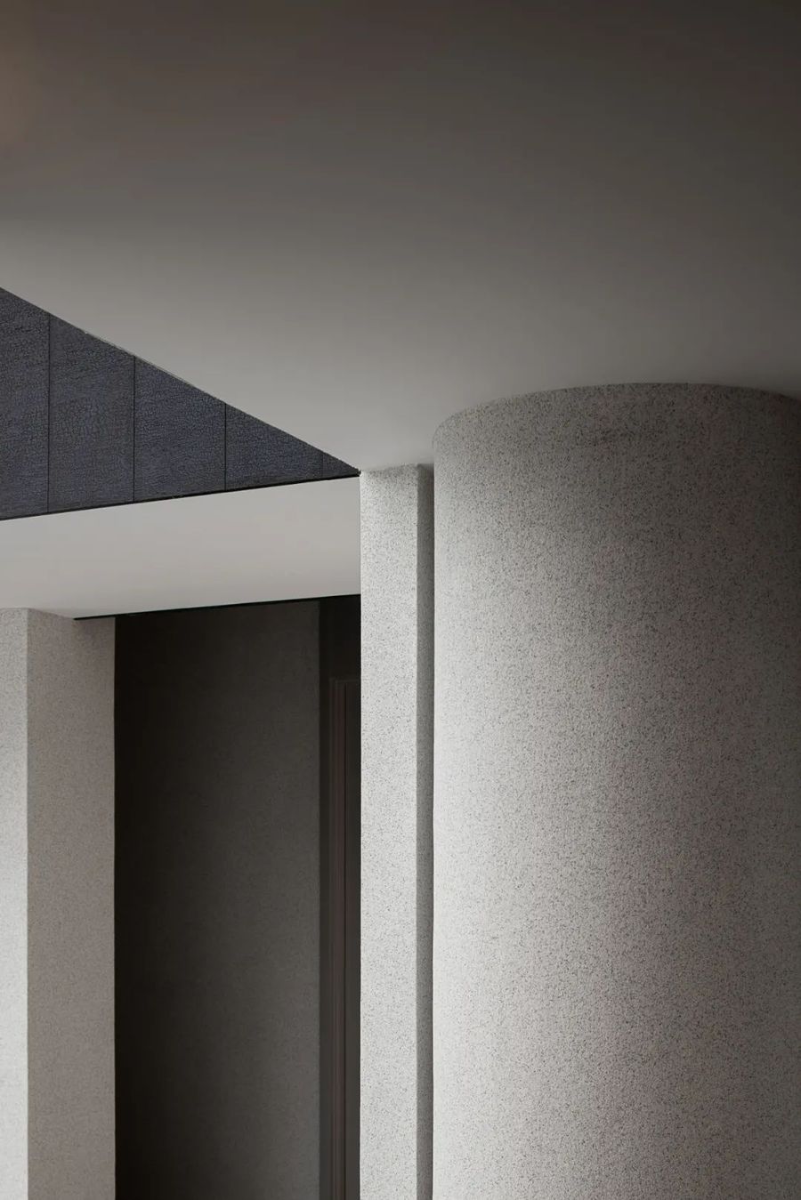
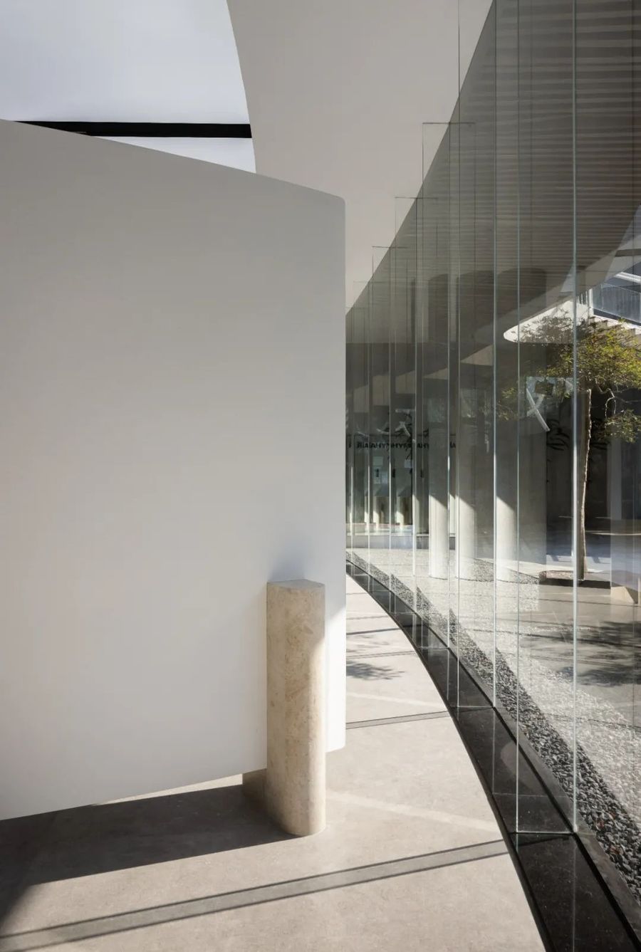
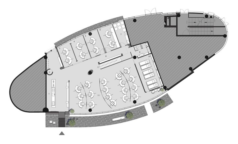
本案原空间平面为椭圆形结构,故因地制宜,空间节点多以弧面造型来表达点、线、面的构成,由此形成了空间整体框架的塑造形式。
The original space plane of this case is oval structure, so according to the local situation, the space nodes are mostly shaped by curved surface to express the composition of points, lines and surfaces, thus forming the form of the overall framework of the space.
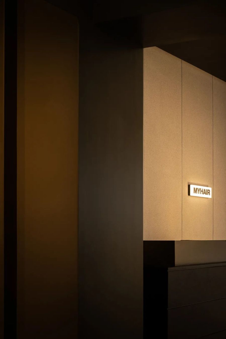
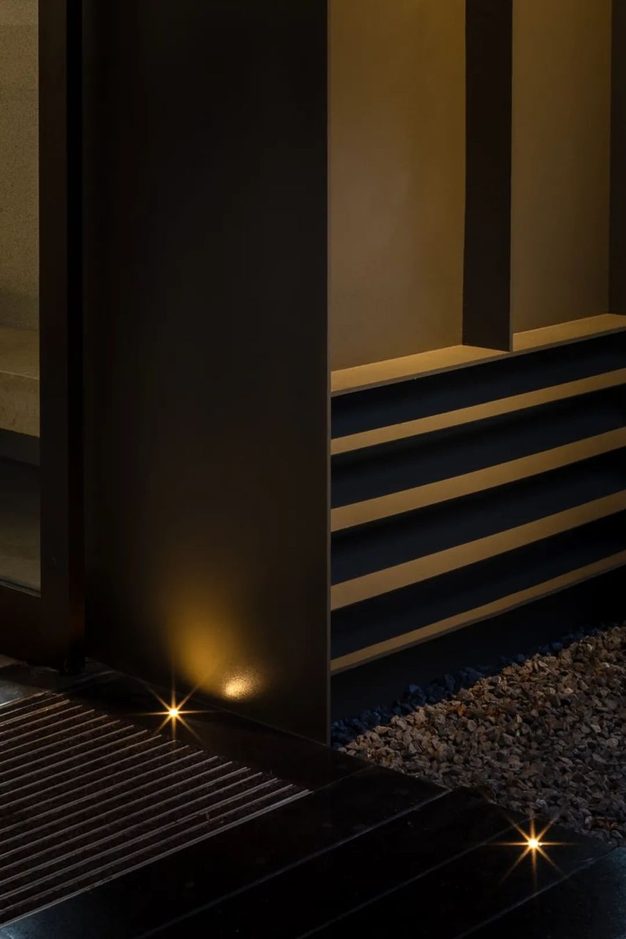
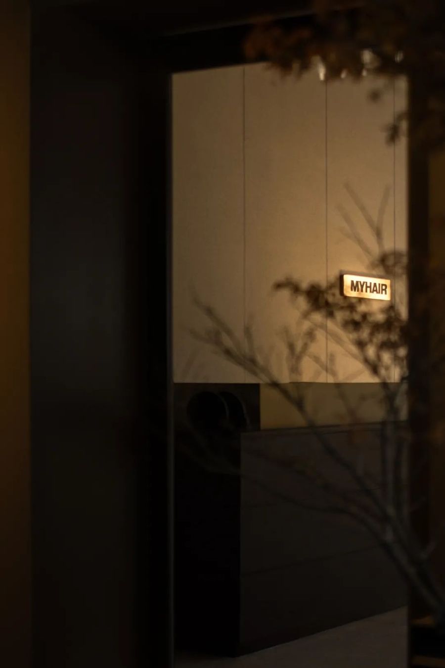
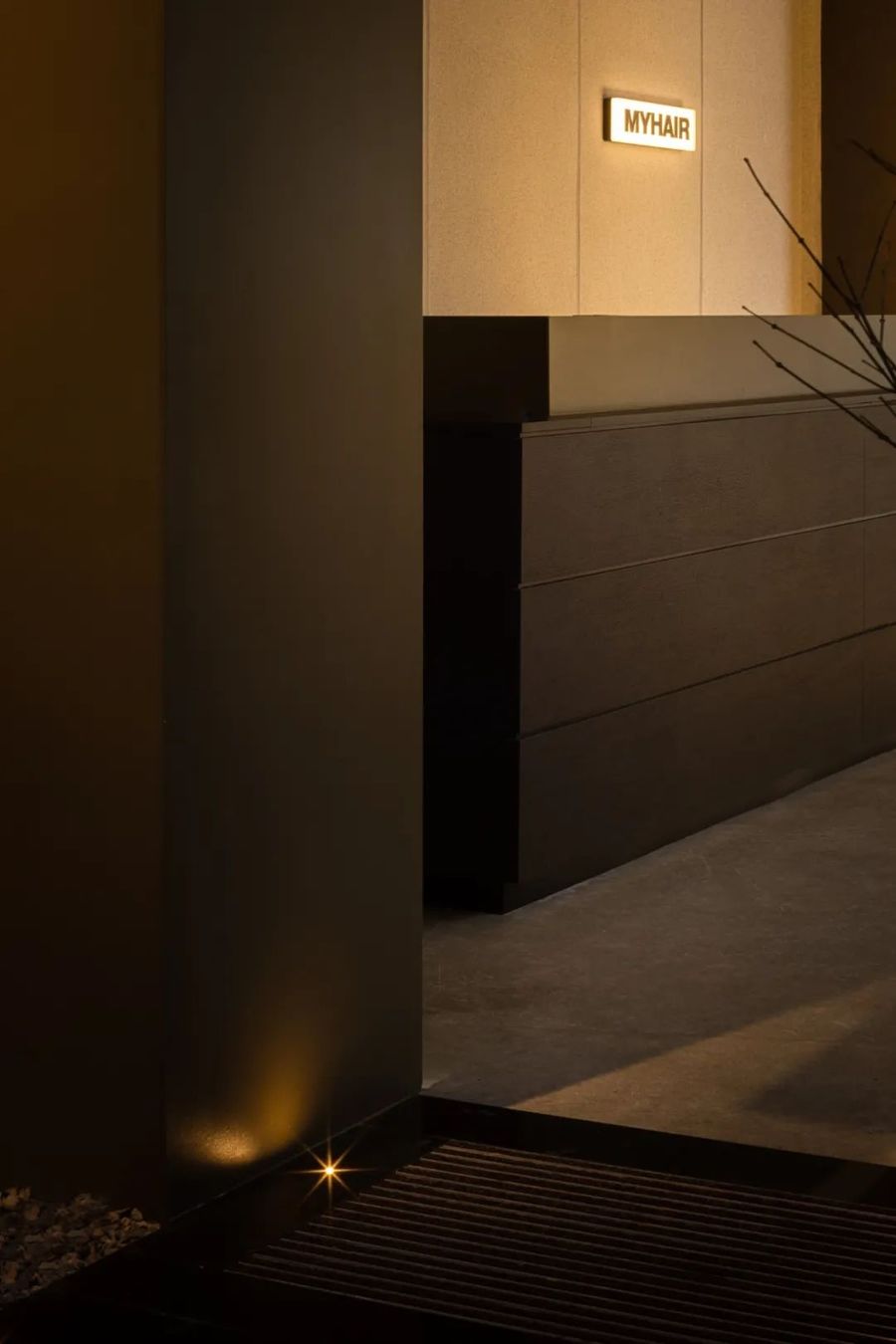
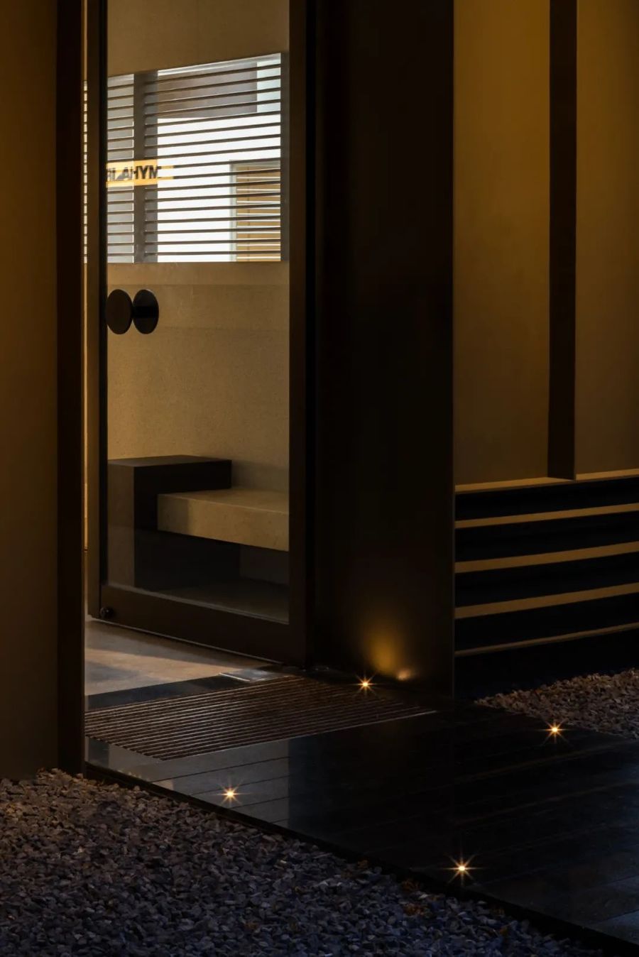
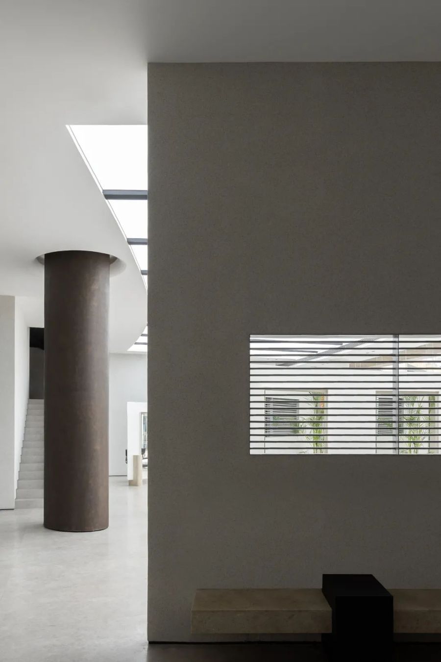
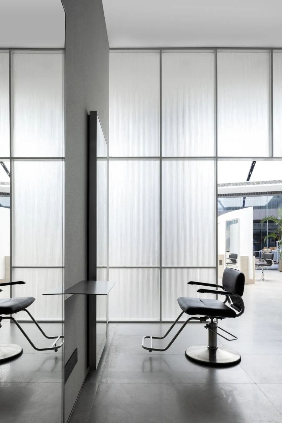
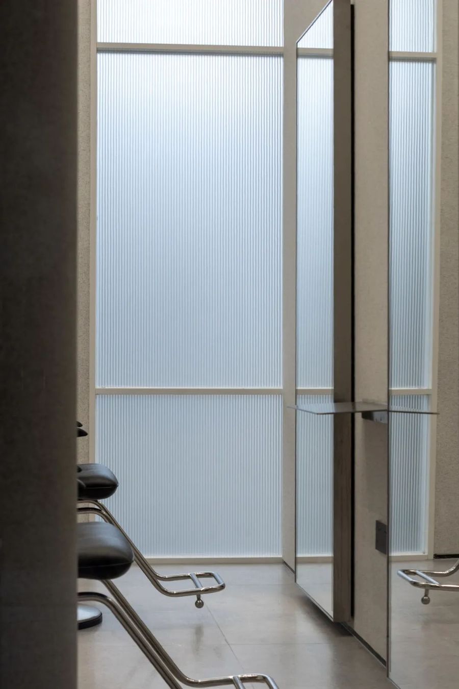
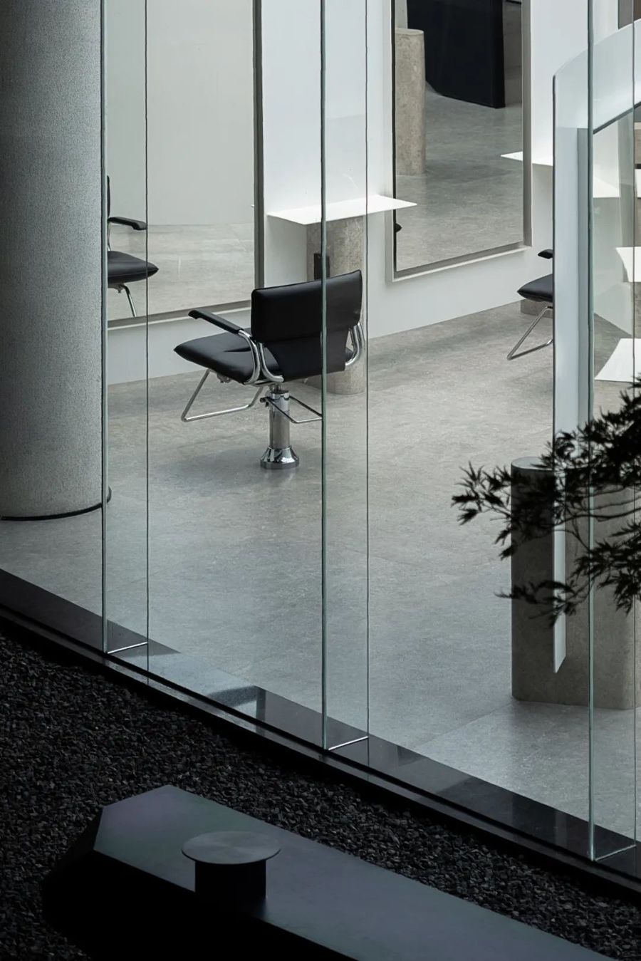
本案在空间营造上极力表达简约的风格,但不提倡形成“拒人于千里之外”的疏离感,希望通过内外部环境的相互投射,使其持续与外界维系自然而然的关系。
This case tries to express the simple style in the space construction, but instead of creating a sense of "exclusion", Hopefully, by projecting the internal and external environment into each other, to maintain a natural relationship with the outside world.
空间动线的合理思考
Rational Thinking of The Traffic Flow in Space
━
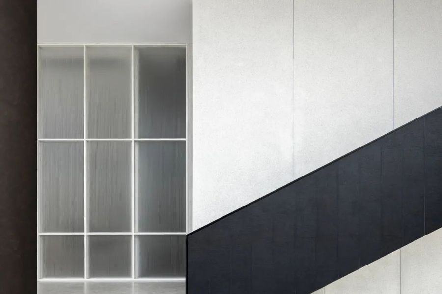
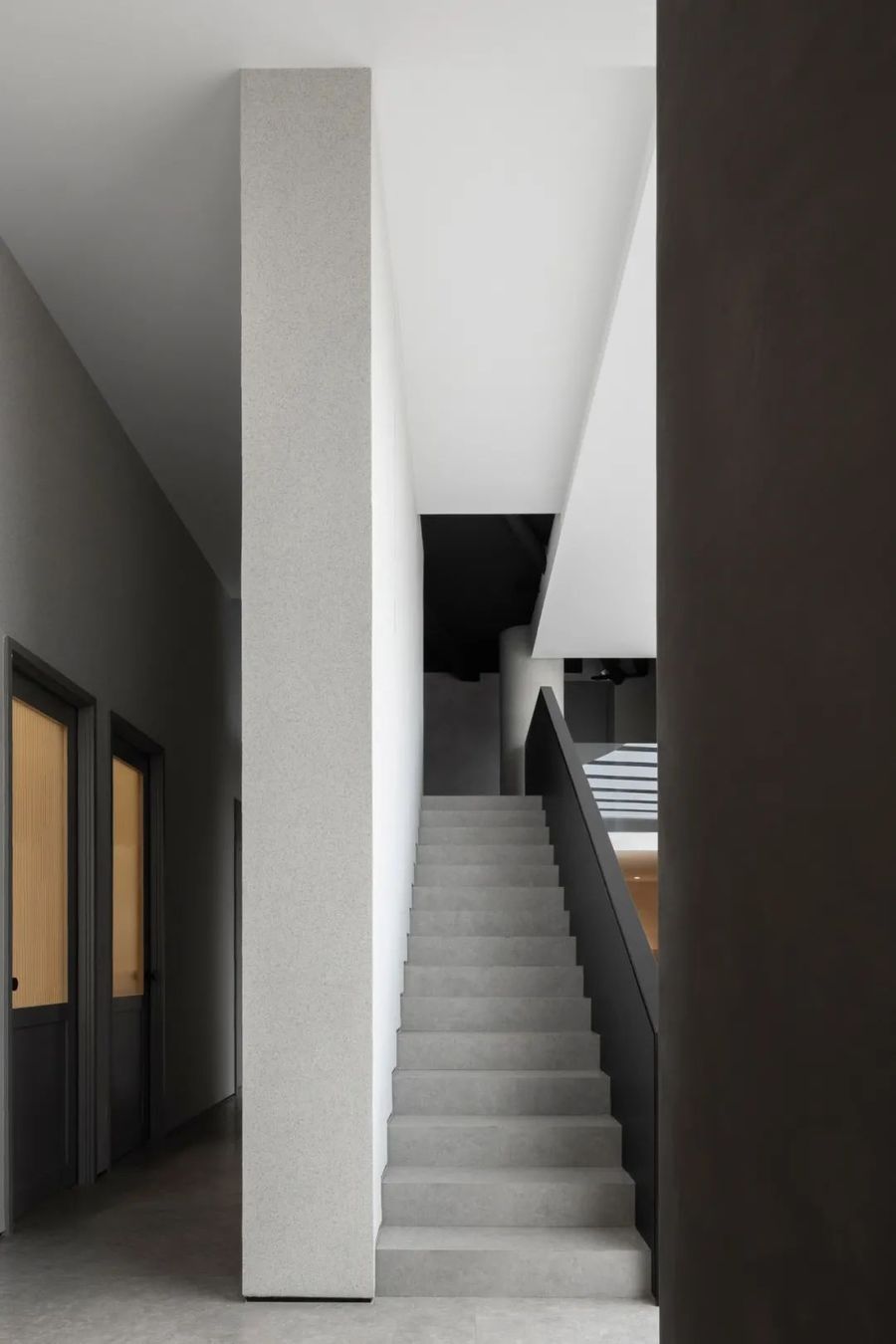
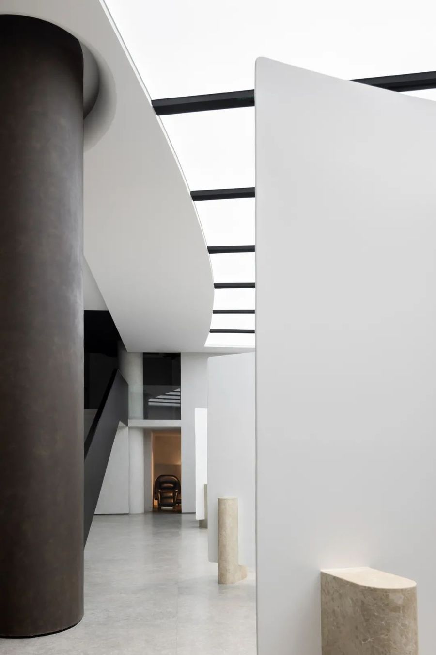
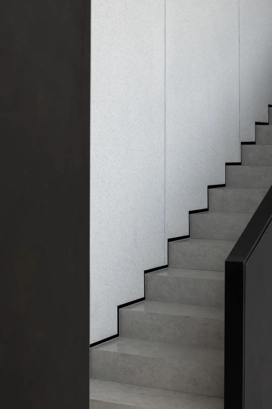
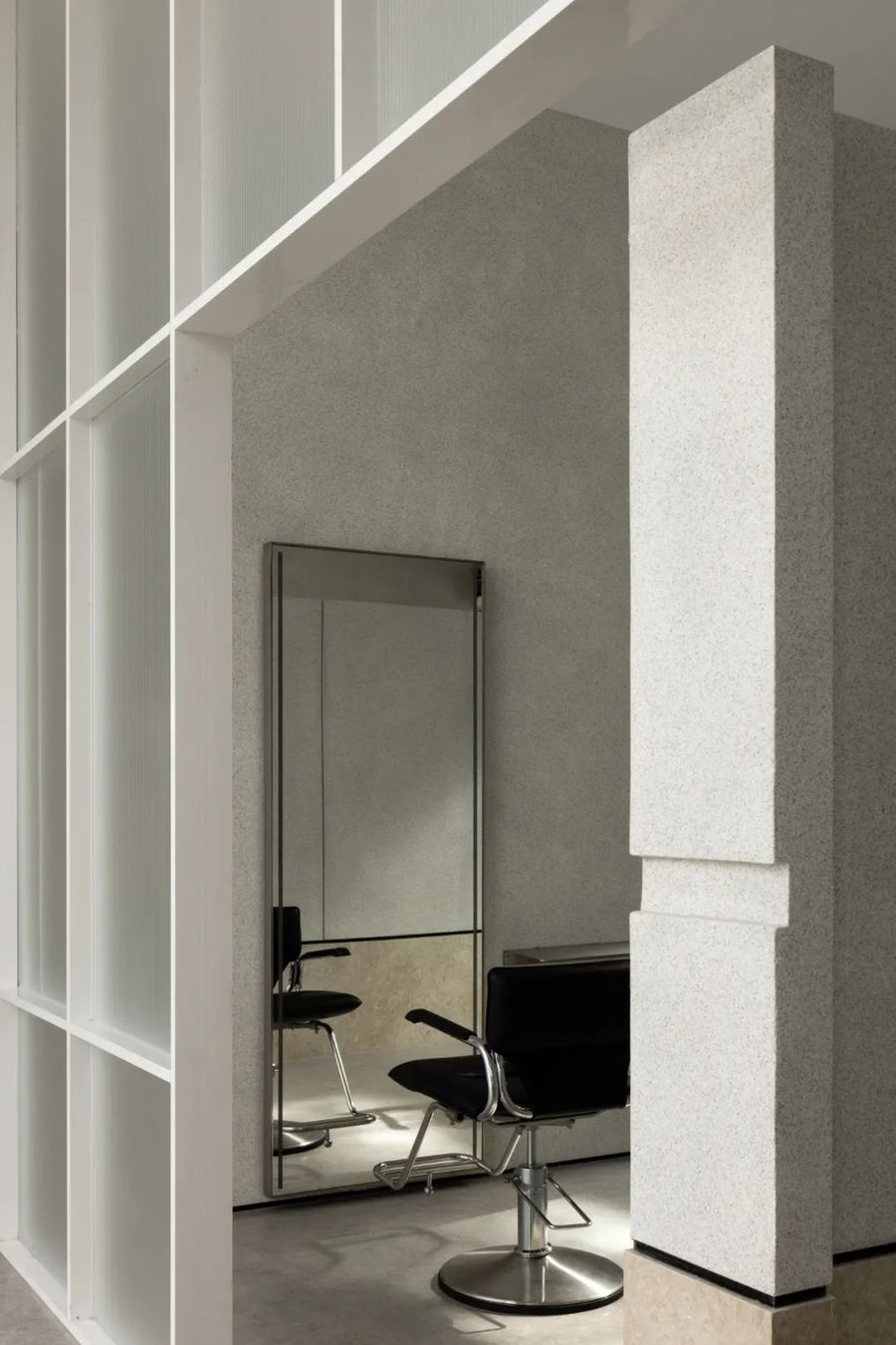
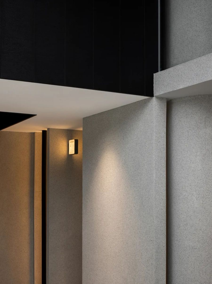
本案引入圆滑的曲线和有机形状来软化空间直线的构成,通过黑与白的比例调和达成空间秩序。基于商用空间的个性需求与气质属性,空间表达上以内容驱动形式,重新思考具象的空间维度,规划合理的动线传达。
Smooth curves and organic shapes were introduced to soften the straight lines of the space, the space order is achieved by the proportion of black and white. Based on the personality needs and temperament attributes of commercial space. The spatial expression is content driven form, rethinking the concrete space dimension and plan reasonable moving line communication.
实用冗存的设计考量
Design Considerations for Practical Redundancy
━
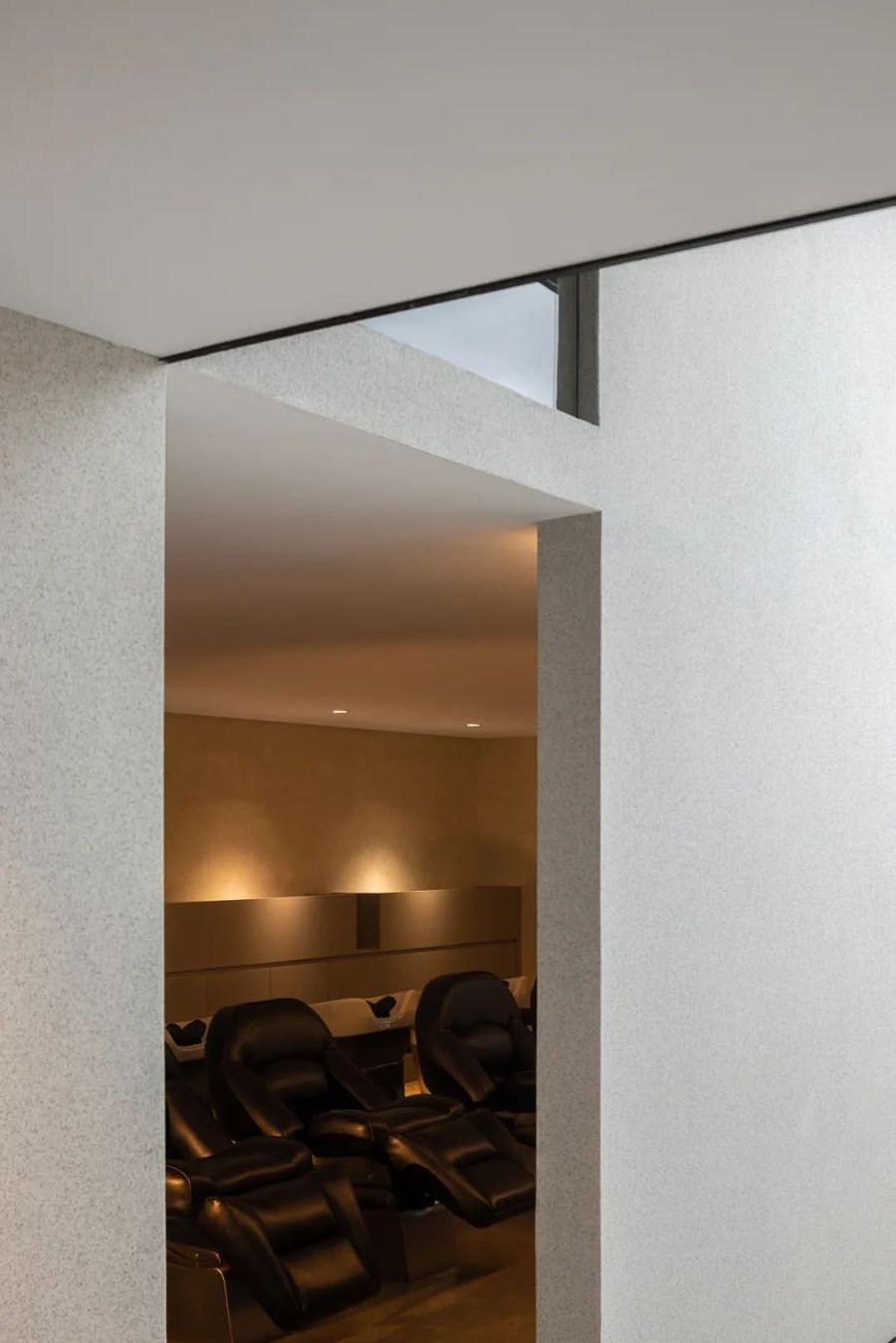
在空间内部的功能分区之间刻意模糊界线,这一构想恰与空间本身内外部的无界感契合。由此,空间被赋予开放、自由、豁达的性质,空间的边界感被弱化后,我们再试图采用明亮的白色光源,减少色彩呈现的差别,以自由平面的方向展开有序而均衡的叙述。
Deliberately blurring the boundaries between the functional divisions within the space, this idea coincides with the unbounded sense of space itself. Thus, the space is endowed with the nature of openness, freedom and openness. When the sense of boundary of space is weakened, we tried to use bright white light sources to reduce the color difference, develop an ordered and balanced narrative in the direction of the free plane.
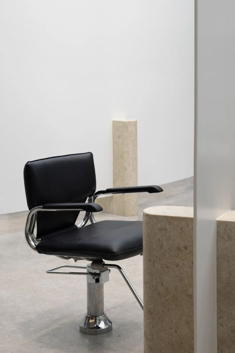
更值得关注的是,空间在抛却形式主义的束缚之后,将其本身的设计语言与关于视觉中心的表达全部让位于商用空间属性,这种在设计上的一次“退让”,更是一种遵循空间实用功能的“渐进”表达。
What is more noteworthy is that space, after shedding the shackles of formalism, its own design language and the expression of the visual center all give way to the commercial space property. This design climbdown, it is also a "progressive" expression that follows the practical function of space.
设计师寄语
Designer's Words
━
对于商用空间,理解商业行为本身的增益远比错综繁复的“设计感”来的重要,本案刻意模糊空间界线的一次尝试,实质是关于如何平衡空间内容与形式平衡的一次有益探索与实践。
For commercial space, understanding the benefits of business behavior is far more important than the intricacies of "design sense," This case is a deliberate attempt to blur the spatial boundary, which is a useful exploration and practice on how to balance the balance between spatial content and form.
项目信息
Information
━
项⽬名称:MYHAIR
Project name: MYHAIR
设计公司:D-ONE 得壹设计
Design Unit:D-ONE
项⽬地址:浙江温州瑞安
Project Address: Ruian, Wenzhou, Zhejiang
项⽬⾯积:320㎡
Project Area: 320 square meters
主案设计:吴礼力
Chief Designer: Wu Lili
执行设计:吴礼力、邵森宇、潘崇源
Executive Design: Wu Lili, Shao Senyu, Pan Chongyuan
项目摄影:吴昌乐
Project Photography:Wu Changle
文字:橙设传媒
Words: Chengshe Media
设计时间:2022.05
Design Time: 2022.05
完⼯时间:2022.09
Completion Time: 2022.09
施工单位:名珈装饰
Construction Unit: Mingjia Decoration







评论(0)