项目位于杭州江干区的松下工业园,其中智慧生活事业部门原有办公空间在2022年初开始便无法充分满足现有人员使用,同时也面临着新的人员增加问题。在此契机下,say提出了与现状办公模式不同,但更适配于当代企业的办公方式。
The project started in Panasonic Industrial Park, Jianggan District, Hangzhou. The original office space of Smart Life Business Department could not fully meet the demand of existing personnel since the beginning of 2022, as new workers increased. In this case, after communicating with the heads of various departments of Panasonic, Say carried out research and renovation design on the spatial scale and division of the office space, and proposed an office mode different from the current situation, but more suitable for contemporary enterprises.
▼项目概览,overview of the house ©汪敏杰
灵活、清晰的空间转换
Clear and flexible space conversion
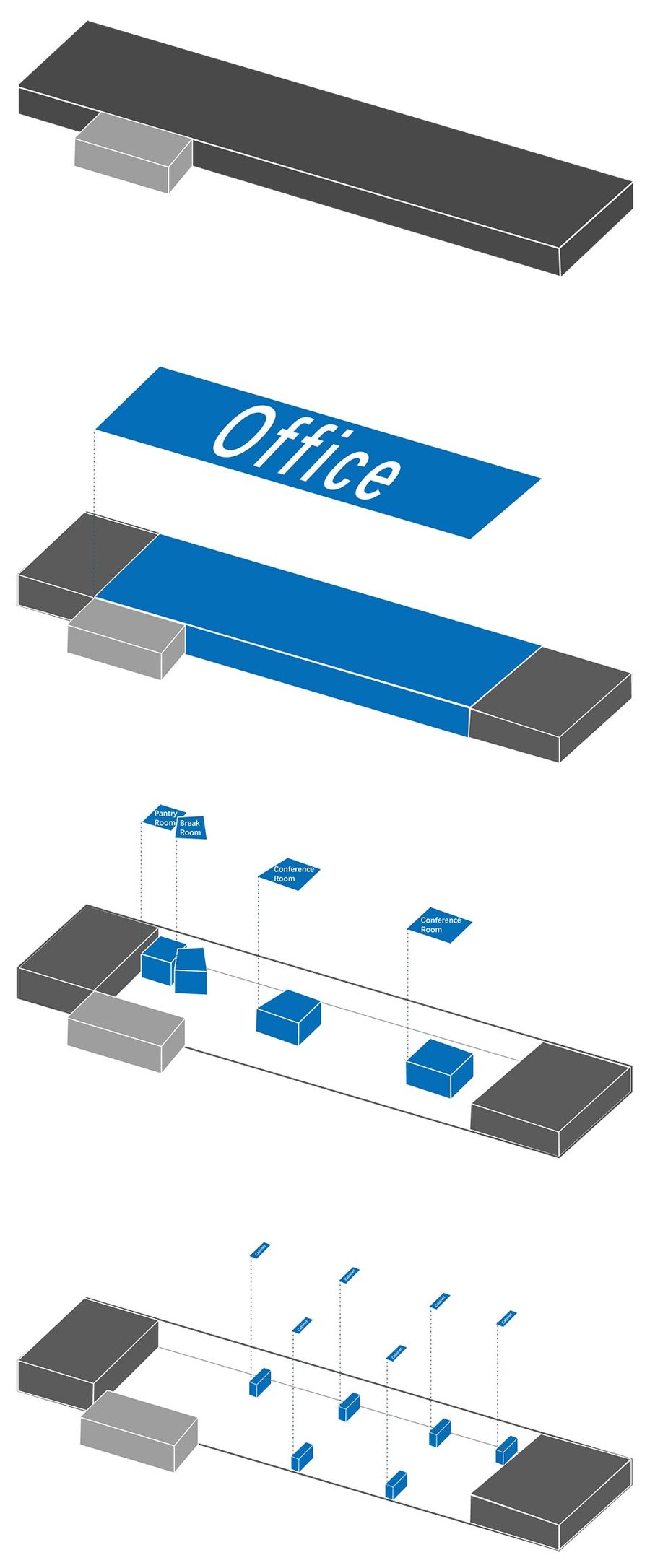
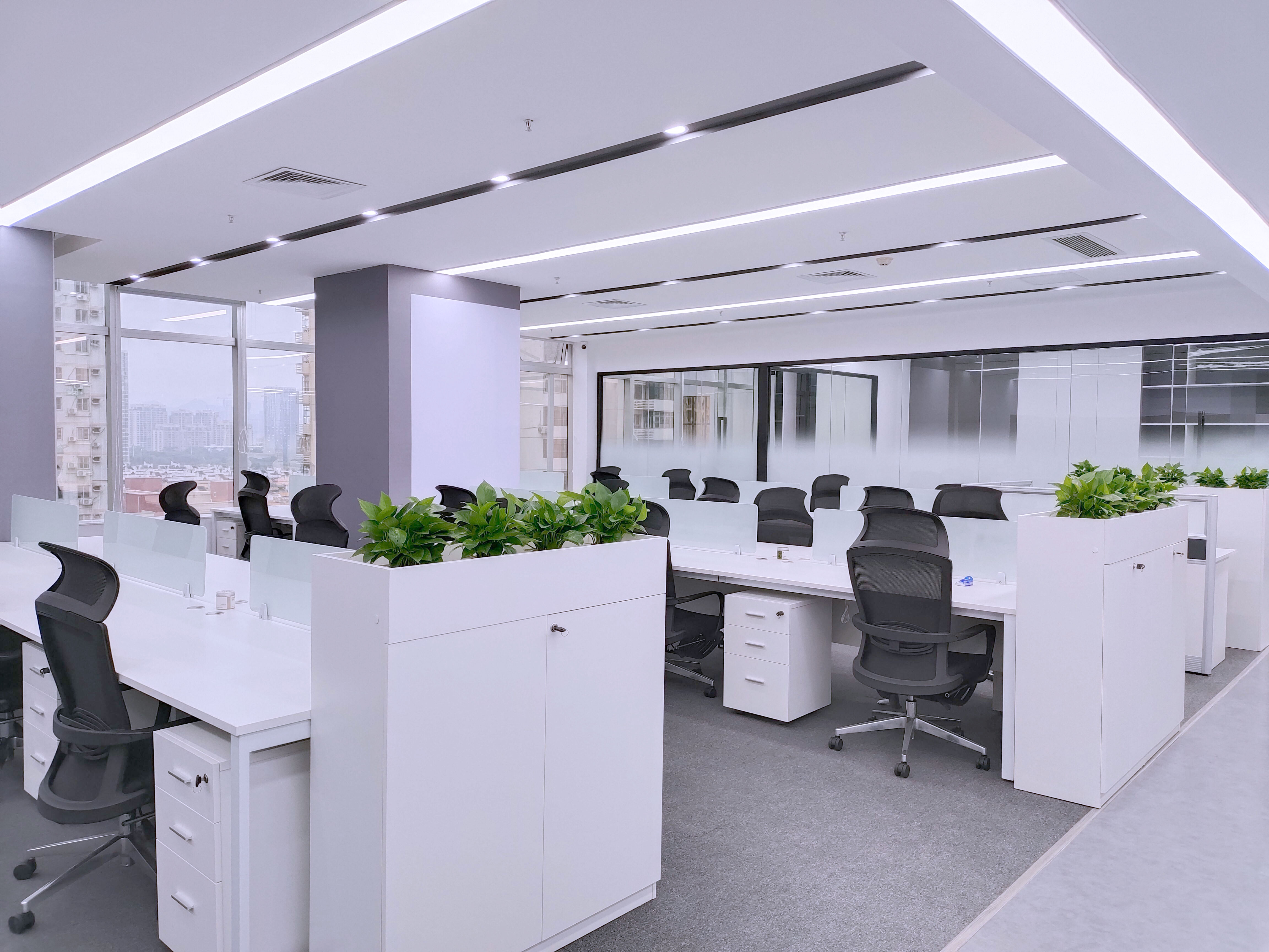
原始的办公区工位安排较为密集,形似“大通铺”的设置,在观感上工作环境易显得凌杂,而功能使用上也已无法应对人员增加带来的空间调配等问题。因此say在设计中对“办公室流线清晰化”与“功能区使用合理化”两点上加以设计改造。
▼功能分析,function analysis ©SAY ARCHITECTS
The original office station arrangement is more dense, like the setting of a large dormitory. Thus, the working environment looks messy, and the functional areas have been unable to cope with the allocation of space and other problems brought by the increase of personnel. Therefore, Say focused on “office streamlining” and “functional areas rationalization” two points to design and reform.
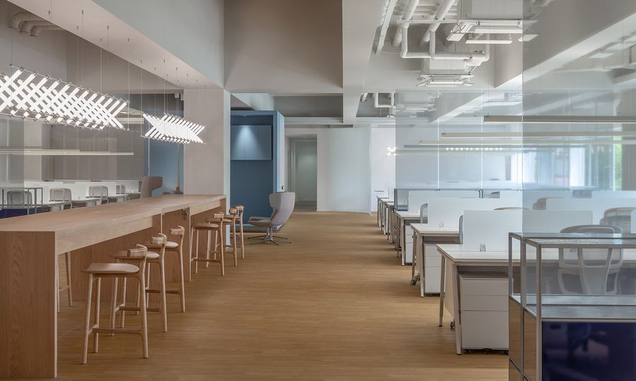
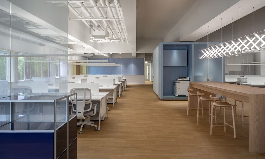
▼空间中央的通路,a clear pathway in the office center ©汪敏杰
因此say将固定办公位推到南北两侧,让空间中央留有一条清晰的通路,而两侧工位的安全玻璃作为了每个组别的隔断,将原有排布的固定工位区更加秩序化。
We pushed the fixed office stations to the north and south sides, leaving a clear pathway in the office center, and made the safety glass of the two sides of the station as the partition of each group, which brought the original fixed stations more orderly.
▼公共办公空间,public office area ©汪敏杰
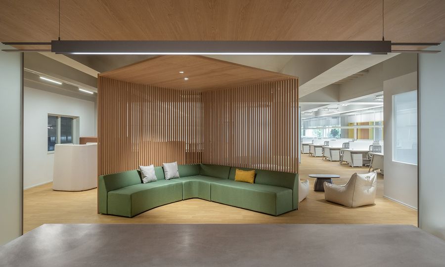
轴心通路区域同时受到原始结构影响,秉着将空间最大利用化的原则,每一柱网之间放置了员工日常办公需求最大的电话会议区、休闲区、会议室及临时办公等多种灵活空间,形成了可以高效服务于南北办公区的office hub。
The central pathway area is affected by the original structure. But adhering to the principle of maximizing the utilization of space, various flexible space such as telephone conference area, leisure area, meeting room and temporary office are placed between each column network satisfying the greatest daily office demand of employees. So an office hub that can efficiently serve the north and south areas was built.
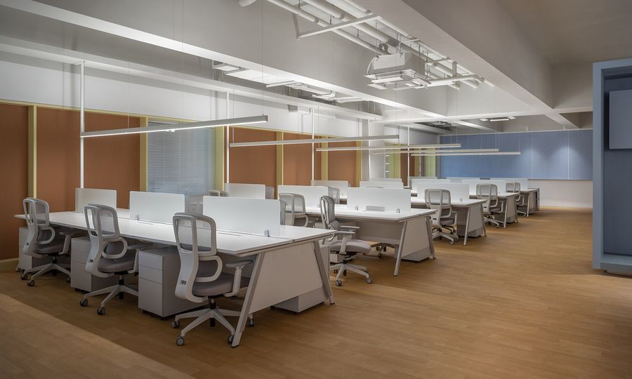
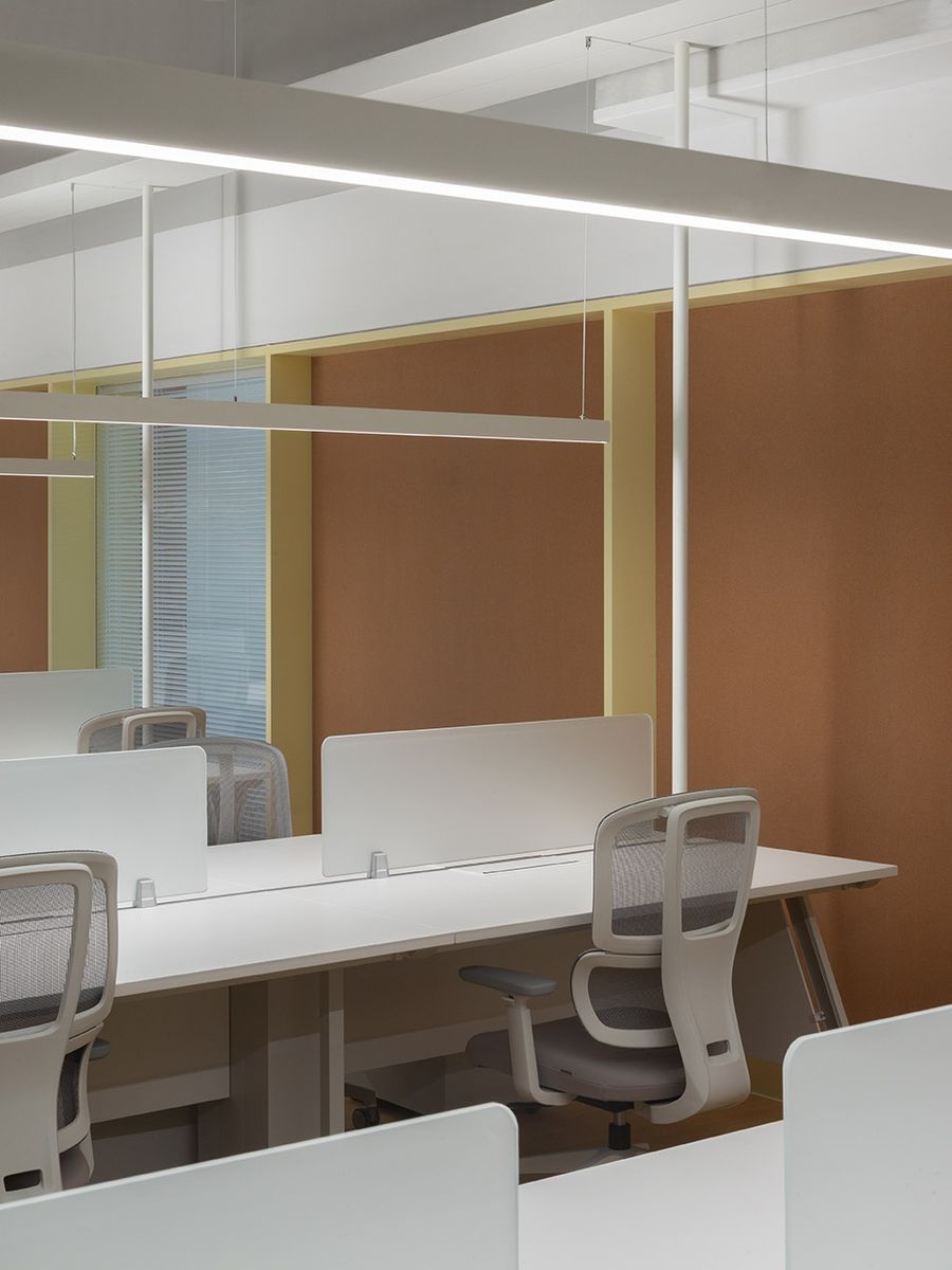
▼办公座椅近景,close shot of the seats ©汪敏杰
舒适、实用的空间分隔
Comfortable and practical space division
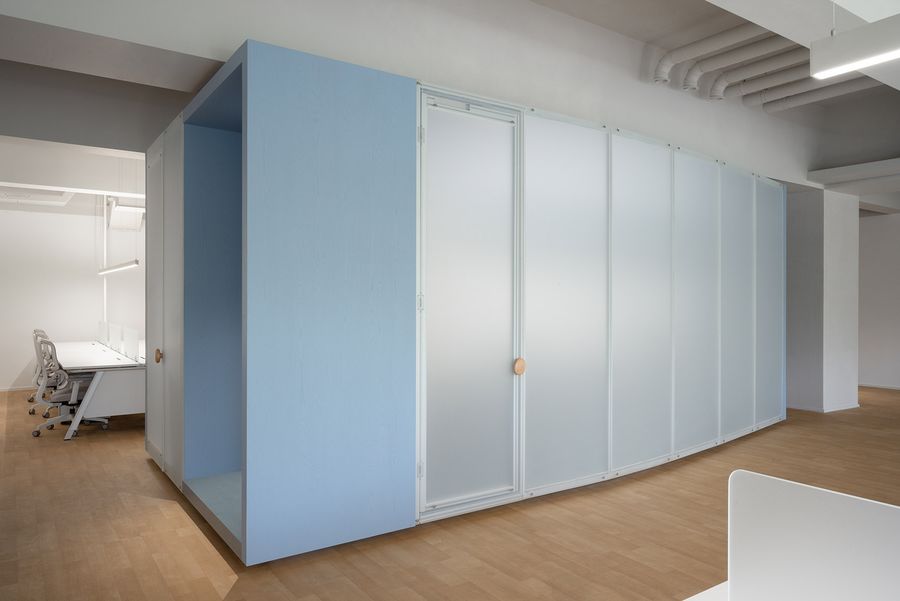
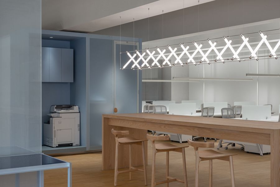
中央不同尺度的盒子适用于不同功能,通过柔性与模糊的分隔,实现空间的舒适的比例。say青睐于运用轻质的空间材料打造灵活实用的区域,两个航空铝型材制成的蓝色盒子融合了大小型会议区及电话会议区。
The central box of different scales can apply with different functions, through the soft and fuzzy separation, achieving a comfortable proportion of the space. Say is fond of using lightweight space materials to create flexible and practical areas. Two blue boxes made of aerospace aluminum are integrated into a meeting area for large or small meetings and teleconferencing.
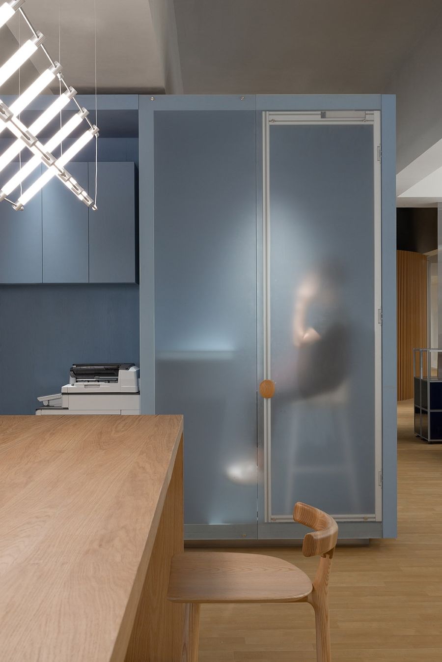
▼航空铝型材制成的蓝色盒子,blue boxes made of aerospace aluminum ©汪敏杰
▼蓝色盒子打造的会议室,boxes create meeting space ©汪敏杰
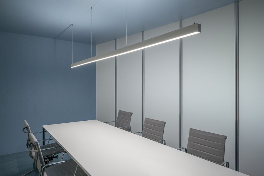
▼会议室内景,interior of the meeting space ©汪敏杰
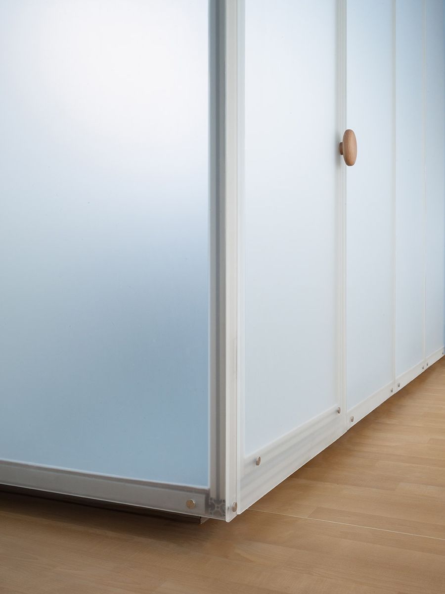
铝型材与白砂玻璃搭配出的特有模块化属性不仅满足运用的灵活性,同时也保证了空间的通透与节奏。用于供其他城市或部门人员到访临时工作的流动办公区则放置于两个盒子中间,便于应对和周围人员沟通。
The unique modular character of aluminum and white sand glass not only meets the flexibility of application, but also ensures the transparency and rhythm of space. The mobile office area used for temporary work by people from other cities or departments, is placed in the middle of the two boxes to facilitate communication with people around.
▼会议盒子表面材质近景,close shot of the surface texture of the meeting boxes ©汪敏杰
高效、活泼的空间色彩
Efficient and lively space color
空间中大面积的使用了松下的品牌蓝色,不同色阶的蓝色为空间带来层次感。say对于办公空间的色彩运用都是有迹可循的,不同的色彩点缀标明了空间特殊功能:蓝色象征沉静运用在了会议空间;红色象征激情则运用于交流空间;黄色象征开朗与创意脑暴空间与之相应,而使人放松的绿色则用于休憩空间,在既定的空间中色彩的运用也显得尤为重要。
The use of color in the established space is also of great importance. Panasonic’s brand blue is used in a large area of the space, and the different shades of blue bring a sense of hierarchy to the space. Say’s use of color in the office space is clear, different color indicates the special function of different space: blue symbolizing “calm” is used in the meeting space; Red symbolizing passion is applied to the communication space; Yellow, a symbol of cheerful, is used in the creative brainstorming space; while green, which makes people relax, is used in the rest space.
▼休闲空间,recreational space ©汪敏杰
▼休闲长桌,the long table ©汪敏杰
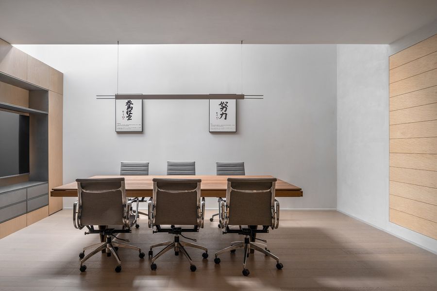
▼会议室,the meeting room ©汪敏杰
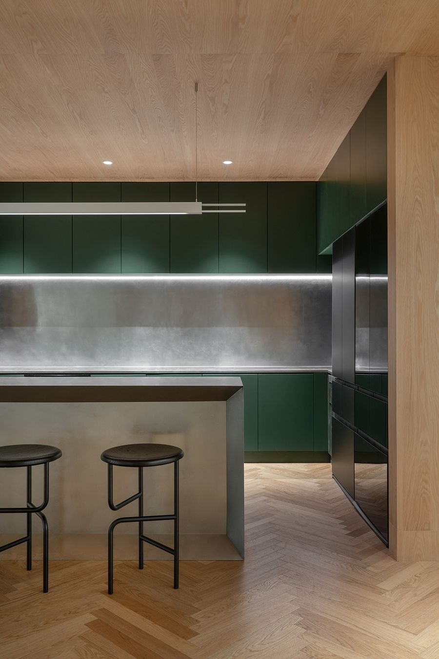
▼休闲用餐空间,recreational and dining space ©汪敏杰
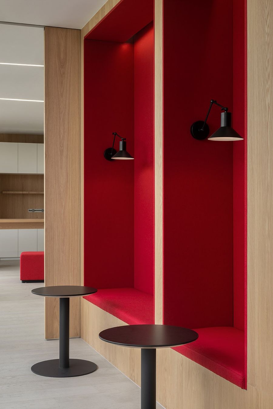
▼交流空间,the communication space ©汪敏杰
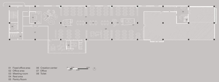
▼平面图,Plan ©SAY ARCHITECTS
Panasonic Office
业主:Panasonic
状况:完成
年份:2022
面积:1060sqm
地址:松乔街6号
项目类型:办公空间
室内设计:say architects
主持设计:张岩、单嘉男
团队:宋丹丽,何思韵
摄影:汪敏杰
施工团队:大匠工务
灯光设计:杭州光迹照明设计有限公司
软装提供:Mario Tsai、vitra、StellarWorks
家具订制:圣奥办公家具有限公司、浙江诺隐家居有限公司
Owner: Panasonic
Status: Completed
Year: 2022
Area: 1060sqm
Address: No. 6 Soncho Street
Project type: Office space
Interior design: say architects
Partner in charge:Yan Zhang , Jiannan Shan
Team: Danli Song , Siyun He
Photography : Minjie Wang
Construction team: Big Smith Works
Lighting Design: Hangzhou Light Trace Lighting Design Co., LTD
Soft furnishings provided by: Mario Tsai, vitra, StellarWorks
Furniture customization: Shengao Office Furniture Co., LTD., Zhejiang Nuoyin Home Furnishing Co., LTD








评论(0)