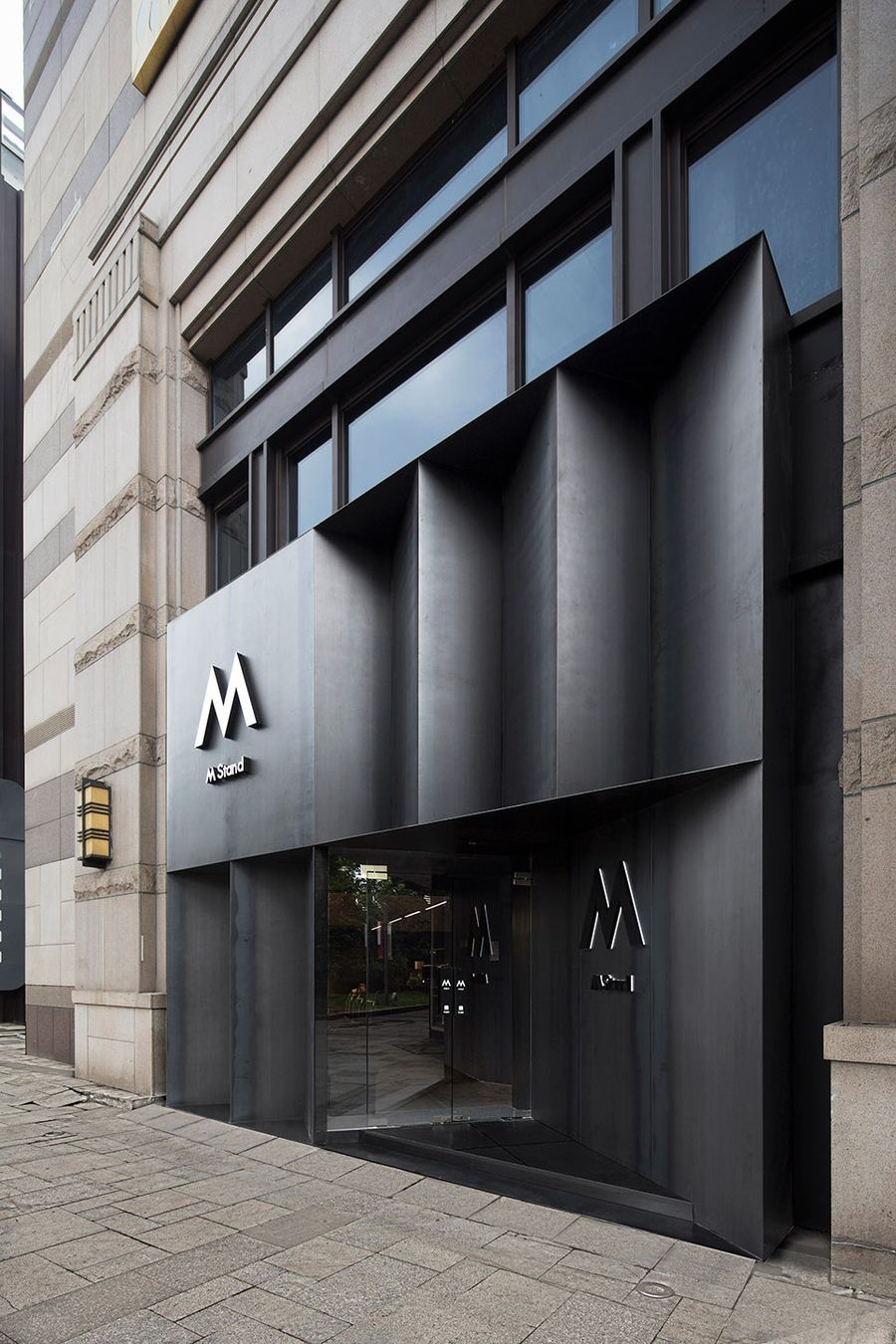
项目位于宝山区正大乐城内部道路的一个转角的位置,处在通勤人流往返顾村地铁站的路径上。在朝向两个道路的立面上各有一个相隔很远的出入口,两者让人感知不到其中的关联。
The project, located in a corner of the internal road of Baoshan Touch Mall, is on the path of the busy passenger flow out of the metro station. Each of the two entrances far apart is facing a different road, which makes them lack relevance.
▼项目主入口立面概览,overview of the project’s main exterior ©闪电储
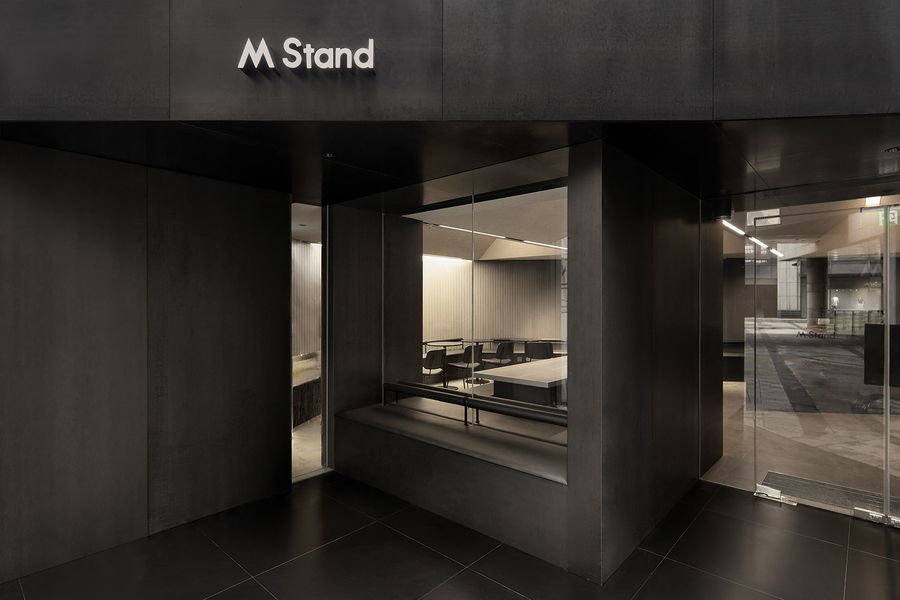
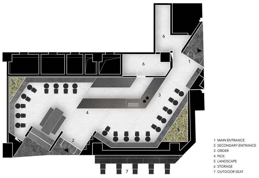
室内的矛盾在于进入主入口即面对一个柱子,空间十分局促,如果进门即要转弯会导致流线过于曲折。因此我们扭转了场地的轴线,引入斜线的要素,在避开障碍的同时也简化了流线。主次入口之间的距离被缩短,顾客在围绕吧台完成点单取单流程即可从次入口离开去往地铁站,从而营造了一种缩短路径的体验。在场地维度上,这个转角成为了一种功能性的“近路”。
The problem with indoor space lies in the column at the main entrance, which makes the space rather narrow. We shifted the figure axis, therefore, and introduce diagonal into the plan. It can avoid obstacle effectively and simplify the circulation. By shortening the distance between the two entrance, customers can finish the whole process from order to leave in a shorter path. In terms of plan, the shift is functionally a shortcut.
▼主入口空间概览,overview of the main entrance ©闪电储
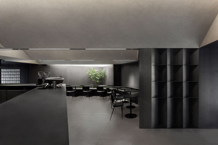
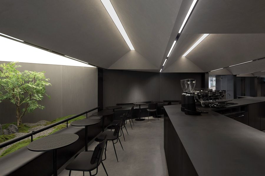
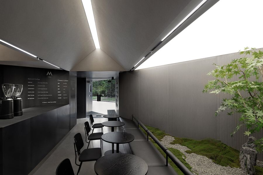
▼咖啡厅室内空间概览,overview of the cafe’s interior ©闪电储
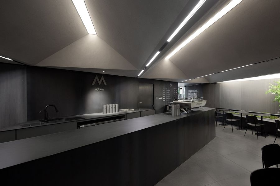
▼吧台,the bar ©闪电储
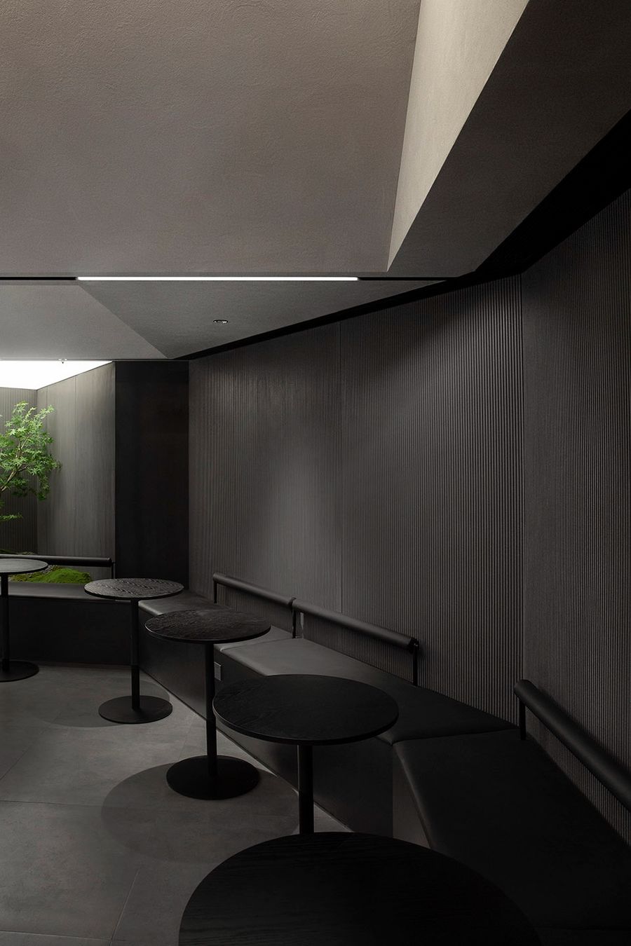
▼沿吧台布置的用餐区,dining area arranged along the bar ©闪电储
▼通向地铁的次入口,the secondary entrance that connects to the subway ©闪电储
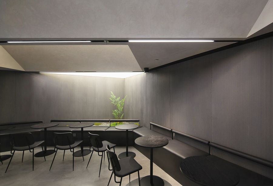
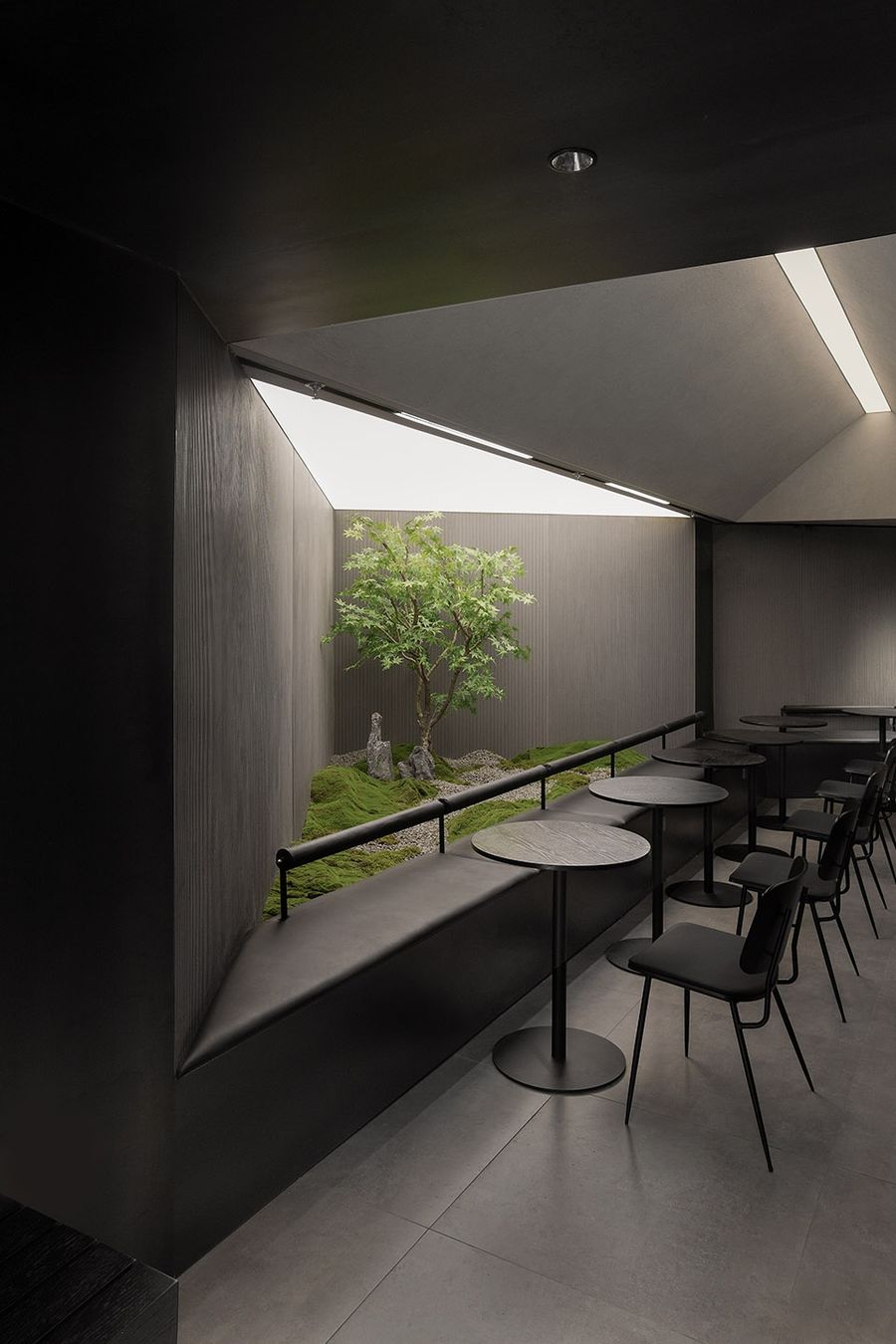
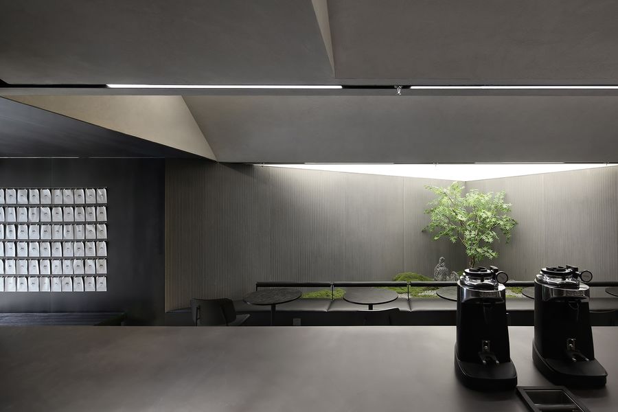
店面外侧的道路很窄,人群亦是匆匆而过,因此店面的侧面视角相比起正面更为重要。室内空间的轴线体现在门头上,面向人流来向。两种交错的轴线系统在创造出入口灰空间的同时,亦在室内创造出令人意外的明亮角落,成为尽端的视觉焦点。现有轴线和正交轴线之间的空隙包容了后勤、消防、立柱等需要被隐藏起的功能。
The road outside of the project is not wide and the people usually hurry by. Hence, an edge-on façade is easier to capture the attention by customers. These two staggered axis surprisingly create not only gray spaces but also bright corners that served as the most distant visual focus. Meanwhile, the column and the facilities of rear services and fire protection is properly concealed in that kind of interspace.
▼以绿植和灯光创造出室内的“明亮角落”,create bright corners with plants and lightings ©闪电储
▼面向室内“明亮角落”的用餐区,dining area facing the create bright corner ©闪电储
▼由吧台处看向绿植区,a view from the bar to the plantation corner ©闪电储
立面和室内材质上大量选用了黑色耐候钢,与商场复古又杂乱的石材立面做了切割。顶部的浅色单元模块在灯光的散射下,反映出一种轻盈的秩序。
The weathering steel is widely used into the façade and interior material. That gives a sharp contrast with the disorganized using of stone materials. And the light-color painting on top slope creates a light sense of order by the light.
▼用餐区座椅近景,close shots of the dining seats ©闪电储
通过M Stand正大乐城店的种种挑战,RAW architecture希望回归空间的本体,通过精确的几何维度的操作,超越室内和立面上单纯的装饰维度,创造一种具有场所意义的空间。
By solving the problems of Touch Mall M Stand, RAW architecture goes back to the essence of space itself and dedicates to create spaces with real meanings by accurate modeling conceiving instead of simply embellishment onto the surface.
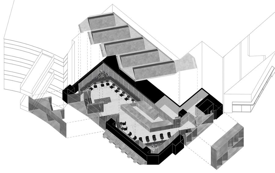
▼轴测图,axonometric drawing ©Atelier Raw
▼平面图,plan ©Atelier Raw
项目名称:M Stand宝山正大乐城店
设计方:ATELIER RAW
项目竣工时间:2022.07
方案设计:任培英
施工图设计:杜玉鹏
项目地址:上海市宝山区陆翔路111号
建筑面积:140m2
摄影:闪电储
材料:微水泥涂料,黑色耐候钢,拉槽混凝土板。
客户:M Stand
施工方:上海炫柯建筑工程有限公司
Project Name: M Stand at Baoshan Touch mall
Design: ATELIER RAW
Completion Year: 2022.07
Leader designer: Ren Peiying
Project Location: Luxiang Rd,Baoshan,ShanghaiGross
Built Area: 140㎡
Photo Credits: Chu Mingy
iClients: M Stand
Contractor: Shanghai Xuanke Construction Company







评论(0)