门外的繁华不是我的繁华,对于人潮拥挤的地方,如果你不喜欢,绕道便是,没有那么多是非曲直。如果你简单,活的美妙之处在于懂得松弛有度。——木心
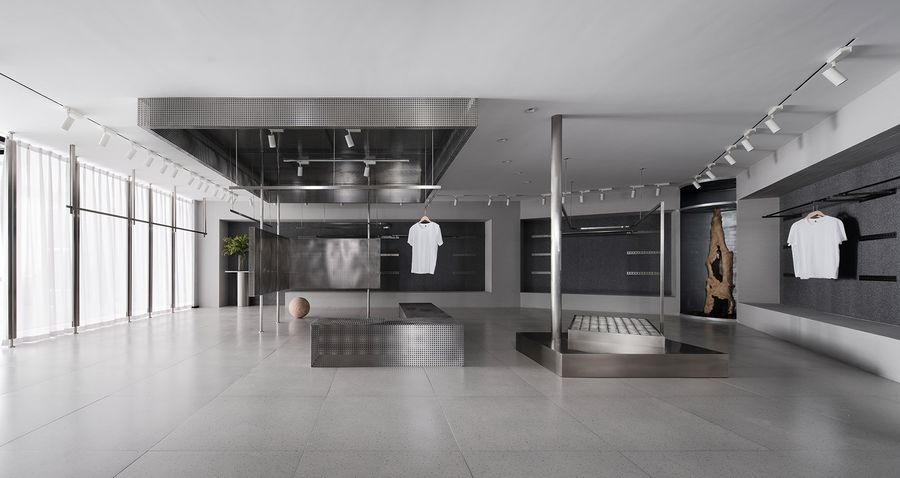
▼空间概览,overall view of the space ©戚朔迁
在人与物皆处在快节奏、形式化的年代,如何在焦虑的状态中寻找内心的宁静?
平静,不是避开车马喧嚣,而是心中修篱种菊。这一特质亦是独立设计师品牌MIGOCOO的追求,将服饰回归使用者本身,时刻关注质感和细节。因此,其展厅的思考从空间的“纯粹性”契入,强调体量与几何,运用最基础元素——体块、板片与杆件完成空间构成。
In a world stuck in fast-forward and conformity,how can we find inner peace in a state of increasing anxiety?
Real peace, not avoid going around, but repairing the fence in the hearts of Chrysanthemum.For MIGOCOO, it is an consistent religionwhich focus on texture and detail and users feeling.We therefore had to think the purity of display space which stress dimension sense and Geometrical relation,Utilize basic elements such as cuboid,flat and rod to defined by specific spatial relationship.
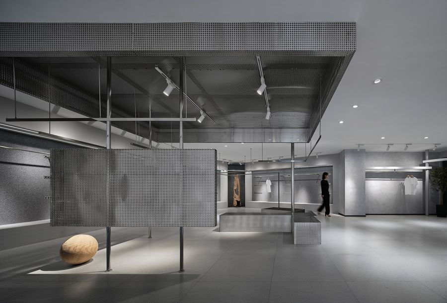
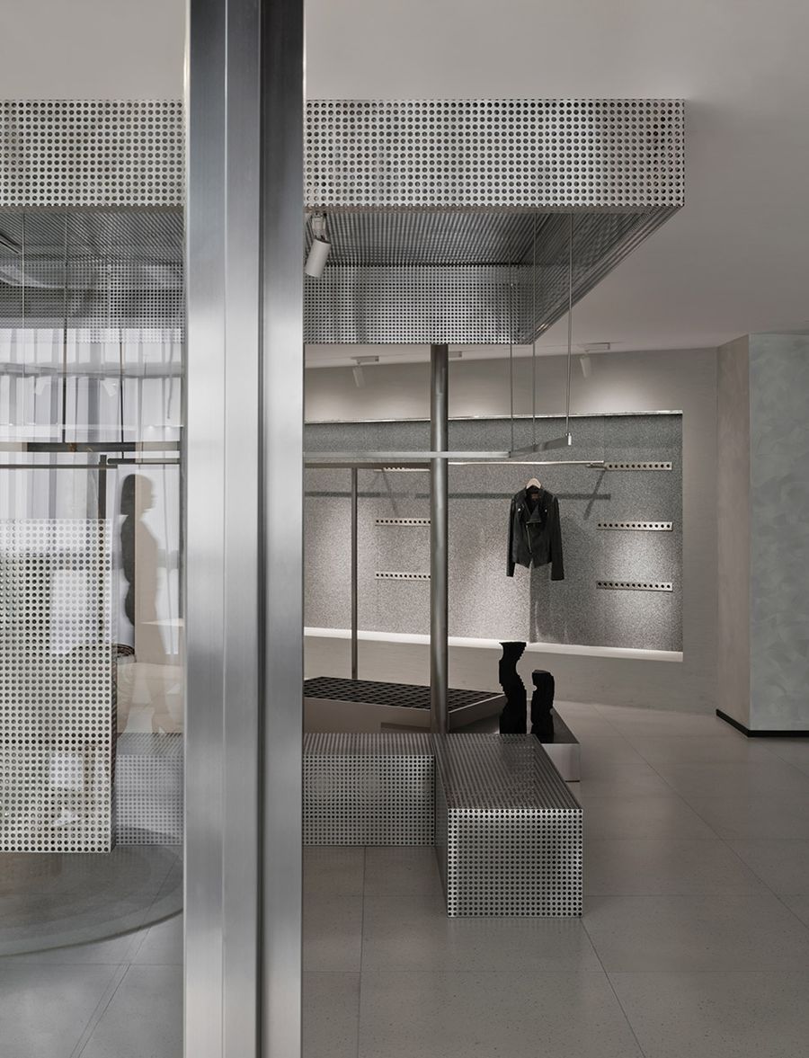
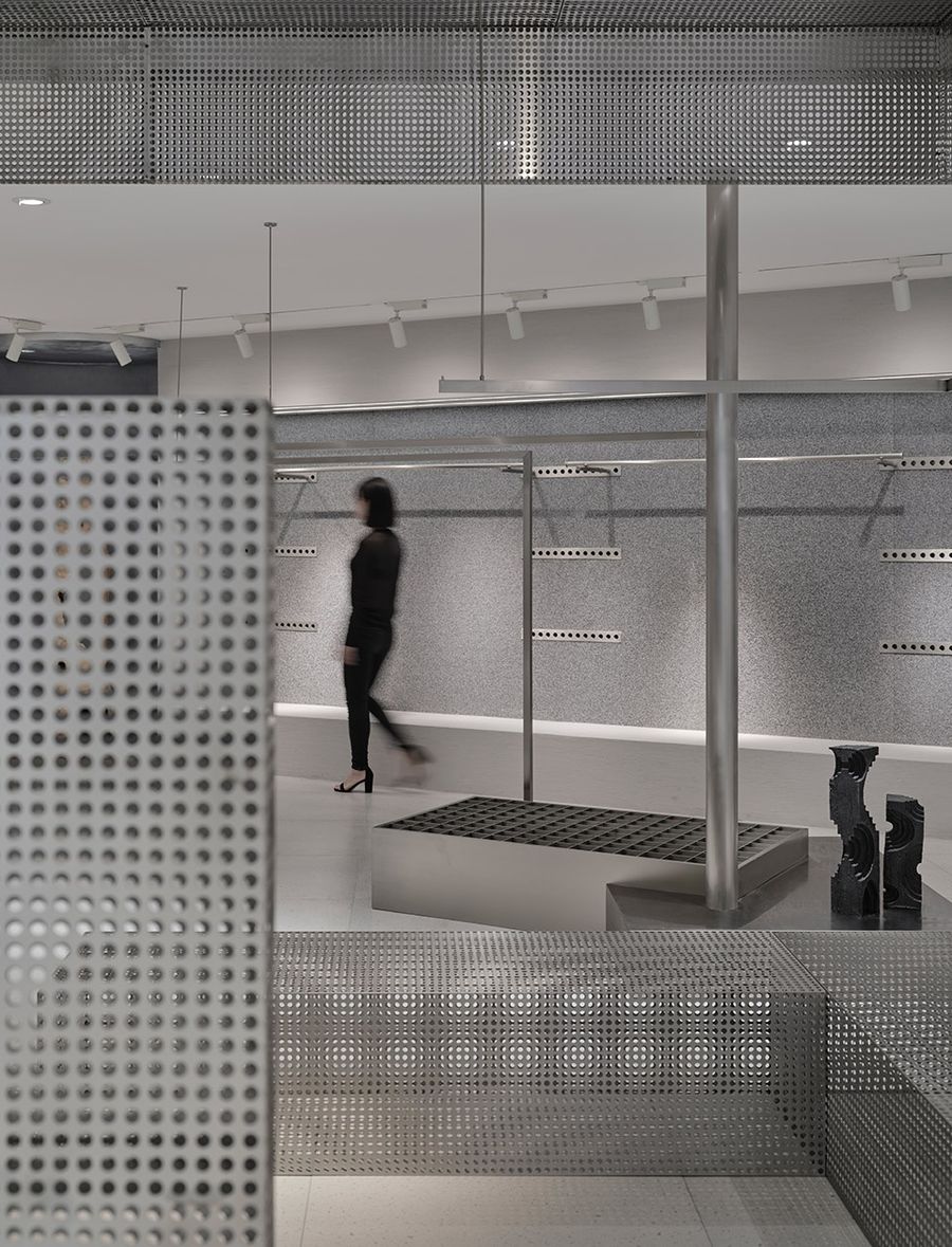
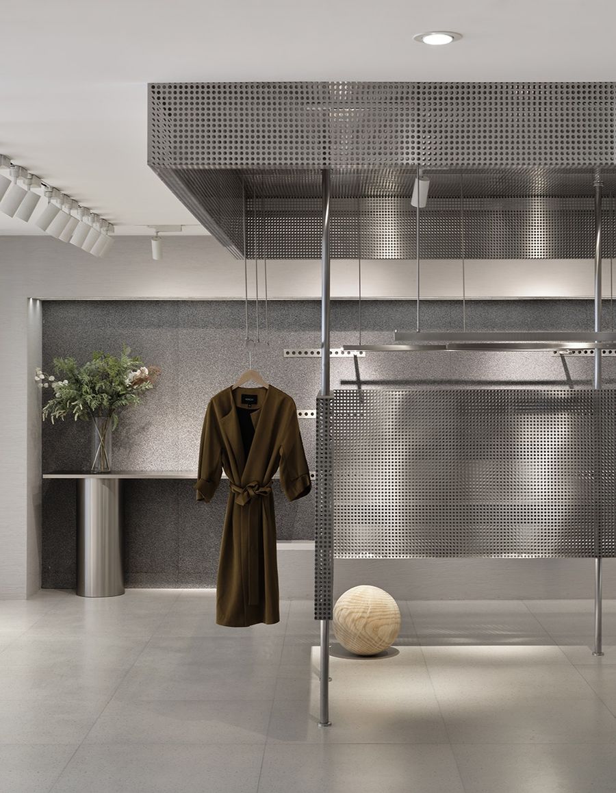
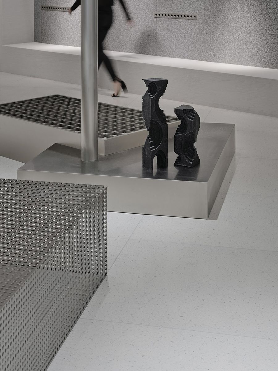
▼以灰色涂料为基底,枯树干与木球和穿孔不锈钢搭配调和整体空间氛围,构成独特的空间语言The dead wood、the wood sphere and stainless steel are matched to harmonize the overall space atmosphere ©戚朔迁
体块、板片与杆件Volumes, slabs and poles
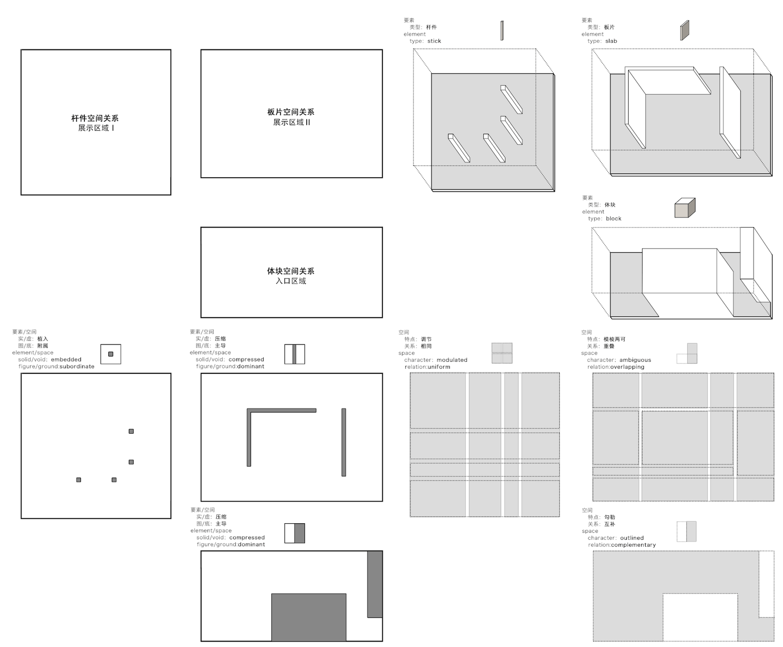
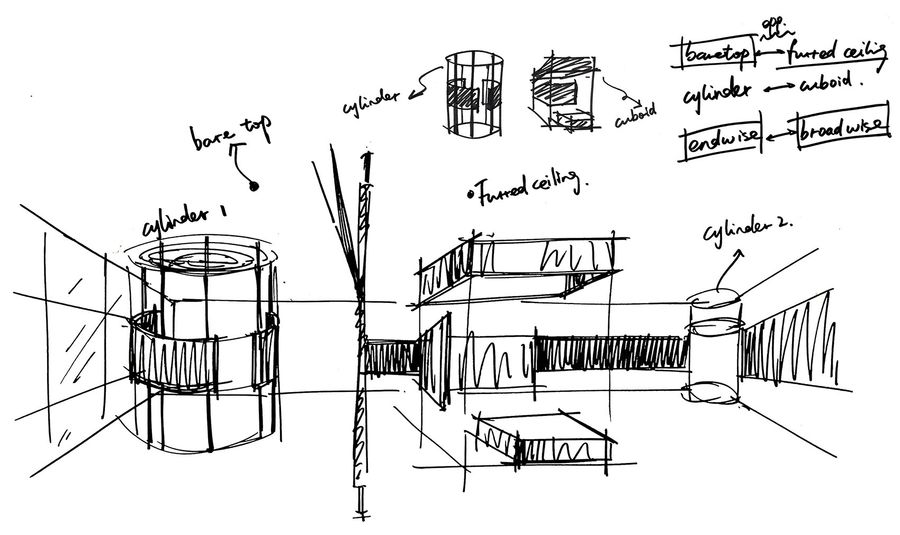
这三种要素所形成的空间具有不同的特点,相对于体块,实体与虚空、图与底处于平衡的关系,而空间具有明确的边界。实体内部的空间,以及体块之间的空间是一种互补的关系,是“勾勒空间”;相对于板片,界定出若干相互重叠的空间关系,空间定位具有“模棱两可”的特征;相对于杆件,在空间内做疏密或间隔的区分,具有“调节空间”的作用。
▼分析图,diagram gif ©哇哦设计
Different operations on the same material will result in variations of these space types. As the solid,the character of the space is outlined with each space having a clear boundary.The two types of spaces, inside or between the blocks are complementary.The slabs define many spatial zones which overlap,so we call the character of the space ambiguous.Sticks differentiate space from within,so we call the space modulated.We use the terms“outlined space”,“ambiguous space”and“modulated space”for the space types resulting.
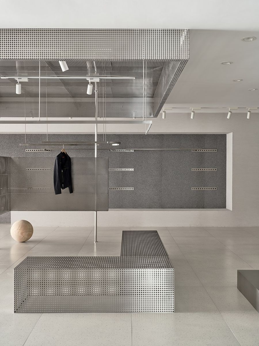
▼板片隔断与体块坐椅的对角处理呈现出均衡与稳定性the flat partition and the cuboid seat as a diagonal presents to be proportional and stable ©戚朔迁
对比与统一Contrast & Unity
两个空间并未直接用两种不同材料进行区分,而刻意统一了材质。
We used the same material on both spatial dimensions of clothing shop instead of two kinds of material.
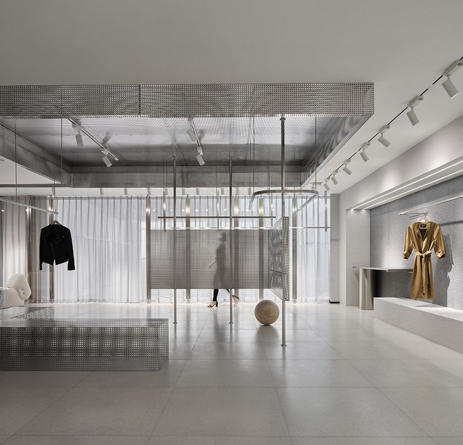
▼几何元素的穿插与交织,geometric elements interweave in the space ©戚朔迁
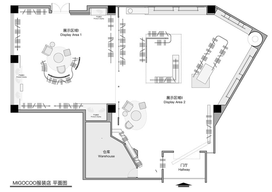
材料在视觉上令人愉悦的一致性,让人感受到两个空间的协调性,同时又使用了两个对比性形体——圆柱与方体分别作为空间中心,以此强调人们在不同形体关系中的不同体验感。
In this way, it is not only having a strong visual unify of comfort but also feeling harmony of two spaces,and then includes two forms as the center ——cylinder and cuboid,to emphasize a variety of experience In different physical relations.
▼几何感的陈列空间, geometrical display space ©戚朔迁
平衡与强调Balance & Emphasis
面积相似的两个区域用玻璃隔断分割,对称平衡中具有相同的空间特征——周围用艺术涂料,中心为穿孔不锈钢形体,圆柱形体中设置了6根圆柱,以此强调其纵向关系。方形形体中,长条的隔板与坐椅强调了其横向关系,以此创建兴趣中心和视觉焦点。
The partition of toughened glass split in two similar pieces,the well-balanced symmetrical spaces are similar —— We used textural art paint around the spaces and put the boring a hole with stainless steel in central area. Six cylinders are crammed intocylinder in order to emphasize vertical relationship. Linear partition and bench tried to emphasize horizontal relation. It structure the visual focus and interest center in this manner.
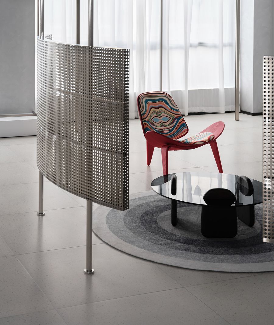
▼曲面暗示出不同的功能分区,curve hinted the different functional partition ©戚朔迁
▼无常的曲线赋予空间恣意生长的可能irregular curve give the possibility of growing-wild space ©戚朔迁
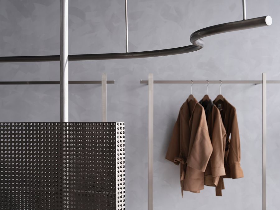
材质选择上,整体以灰色为基调,诸如艺术涂料、发泡铝、不锈钢等,以凸显服饰本身的材质及色彩,并中和整体空间的冷色基调。
The choice of material is basic color gray,in order to impress the material quality and the color of clothes,for instance, textural art paint, aluminum foam,stainless steel etc.
▼细部,details ©戚朔迁
▼平面图,plan ©哇哦设计
项目名称:MIGOCOO服装店
项目类型:服装店铺
设计方:杭州哇哦设计有限公司
项目设计:2022.03
完成年份:2022.07
设计团队:张靖琪 蒋冠航 曾亚芳
项目地址:浙江省嘉兴市
建筑面积:320㎡
摄影版权:奥观视觉 戚朔迁
客户:MIGOCOO材
料:不锈钢、发泡铝、艺术涂料
更多相关内容推荐






评论(0)