“人世间倘若有任何事情值得慎重将事者,那不是宗教,也不是学问,而是‘吃’。”作家林语堂在《吾国吾民》中如是说。现如今,提及吃,不再只是满足口腹之欲,更是一种好好生活的态度。"If there is anything in the world worthy of prudence, it is not religion, nor learning, but 'eating'."The writer Lin Yutang said so in "Our Country, Our People".Nowadays, when it comes to eating, it is no longer just about satisfying your appetite, but also an attitude of living well.
零食行业真正意义上的高端化,源头在于对食材、加工的把控。即食物的力量,更能表现品牌高端零食定位以及营造店铺销售氛围。经实地考察调研并与品牌方密切沟通,本案将在保留原有“创造”与“玩味”设计的基础上,增强凸出“食力”的表现内容。The high-end of the snack industry lies in the control of ingredients and processing.That is, the power of food, more expressive of the brand's high-end snacks positioning as well as to create a store sales atmosphere.After field research and close communication with the brand, this case will retain the original "creation" and "playful" design, and enhance the expression of "food power".
为深入了解项目,设计师特意在百度百科搜索「零食」释义。资料显示,零食指一日三餐时间点之外的的时间里所食用的食品。自带休闲、随性和欢乐等属性,在享用时更在乎氛围。In order to know more about the project, the designer searched for the definition of "snack" in Baidu Encyclopedia.According to the information, snack food refers to the food consumed outside the time of the three meals a day. It is casual, spontaneous and joyful, and the atmosphere is more important when enjoying it.
01新鲜见面和快乐撞个满怀Fresh MeetMeet with happiness
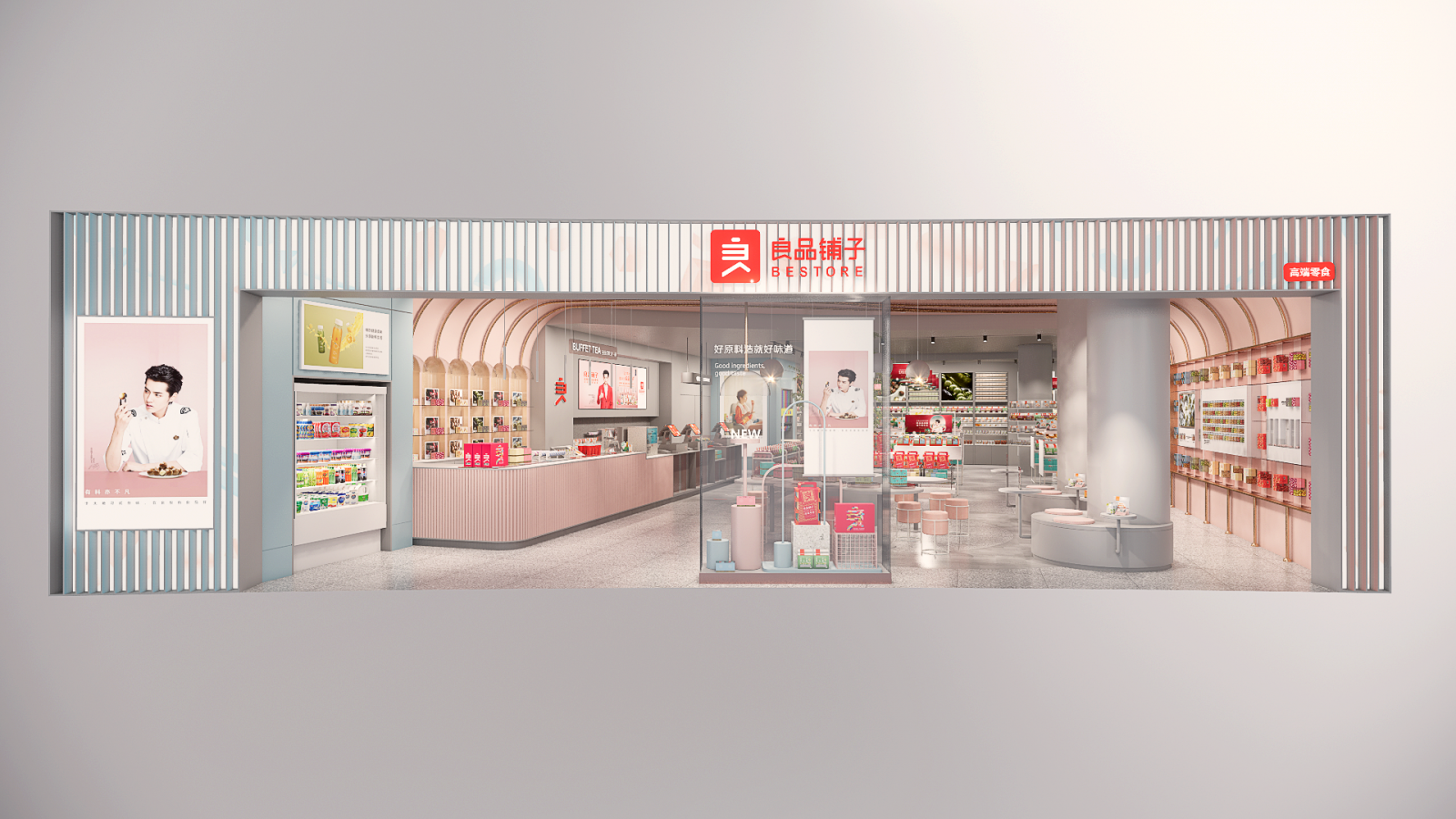
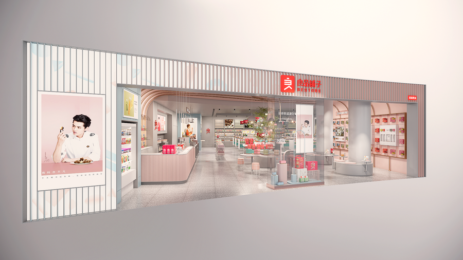
一家商店的气质与品味,往往从门面设计便可感知一二。The quality and taste of a store can often be perceived from the design of the facade.
设计师从良品零食包装标准出发,寻找有关元素进行图形艺术化处理,以打开零食王国的寓意作为门面装饰,力求迅速吸引顾客目光。Starting from the standard of BESTORE packaging, the designer searched for relevant elements for graphic artistry, and used the symbolic meaning of opening the snack kingdom as the facade decoration, aiming to quickly attract customers' attention.
从进店那一刻,打开所有感官细胞去体味好零食好味道的欢乐。From the moment you enter the store, open all the sensory cells to taste the joy of good snacks and good taste.
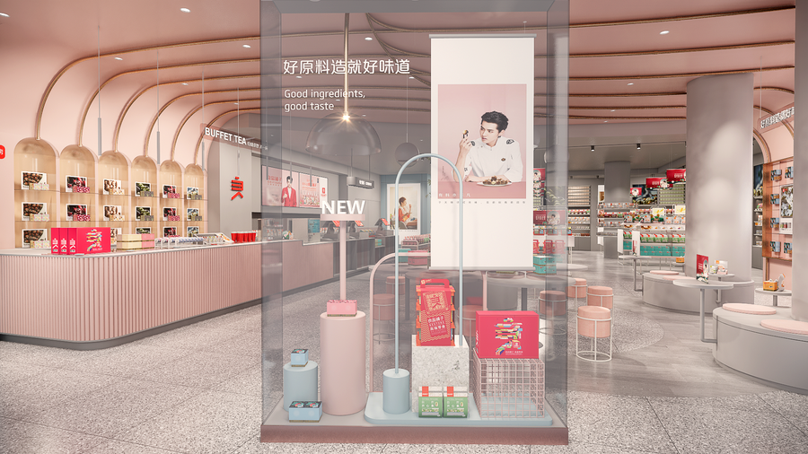
假日「主题橱窗」,是人气打卡点,也是产品推介的舞台。四季更迭,应时而食,橱窗常上新,快乐源泉不断。The holiday "theme window" is a popular spot and a stage for product promotion. The seasons change, eat in response to the times, the window is always new, a constant source of happiness.
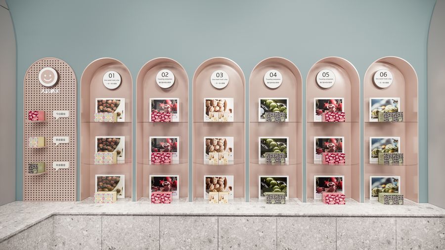
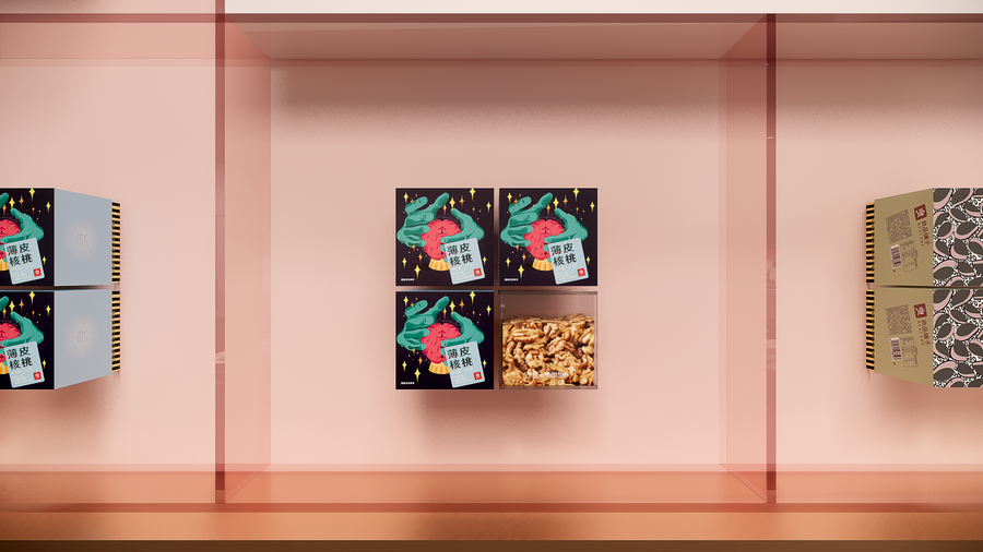
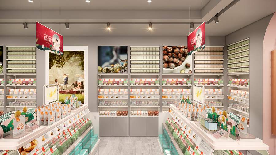
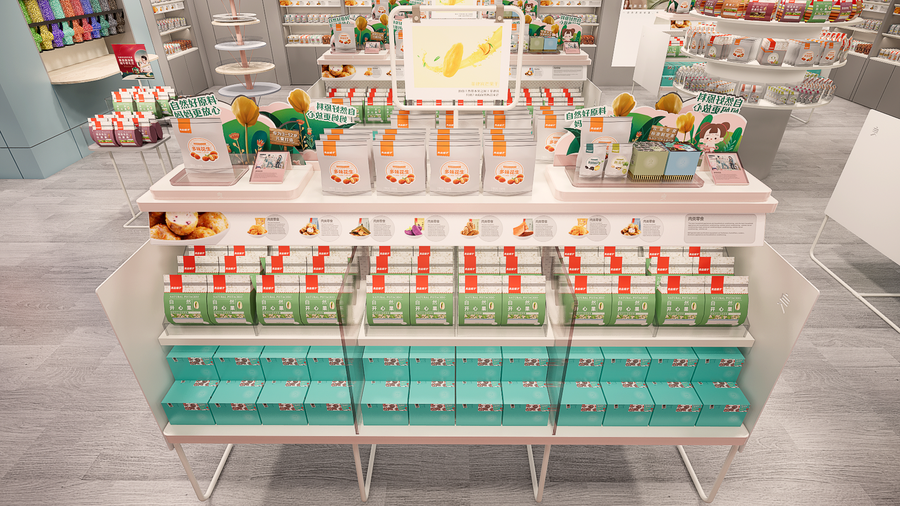
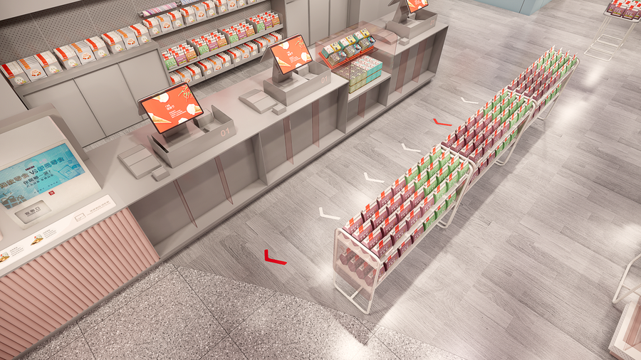
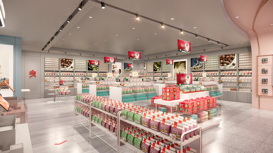
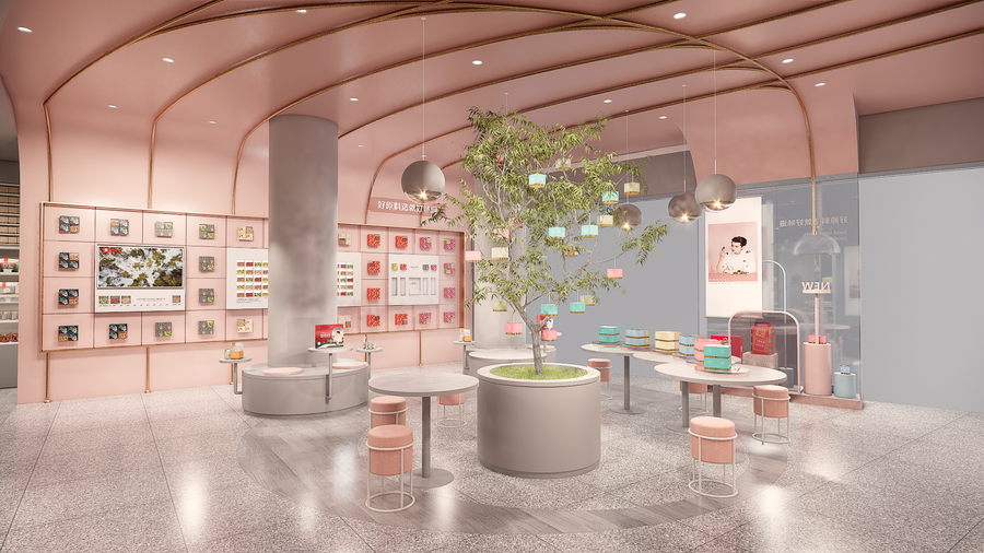
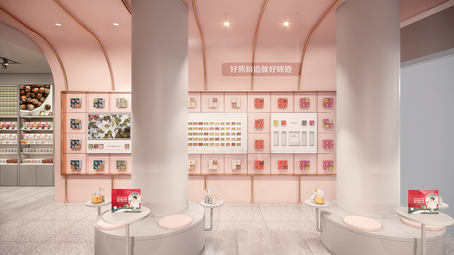
基于消费者需求,由「品类整理」到「终端精选」再到「顾客选购组合」的全流程终端体验,优化后的销售区焕然一新。中岛柜、靠墙背柜以极具秩序感的视觉化陈列,营造被心动好物包围的幸福购物体验,激发消费者的购买欲,甚至引发社交传播。Based on consumer demand, the optimized sales area has a new look with the whole process of terminal experience from "category sorting" to "terminal selection" and then to "customer shopping combination".The center island cabinet and the back cabinet against the wall create a happy shopping experience surrounded by goodies with a great sense of order, stimulating consumers' desire to buy and even triggering social communication.
02管道艺术装置如果空间会说话Pipe Art InstallationIf Space Could Talk
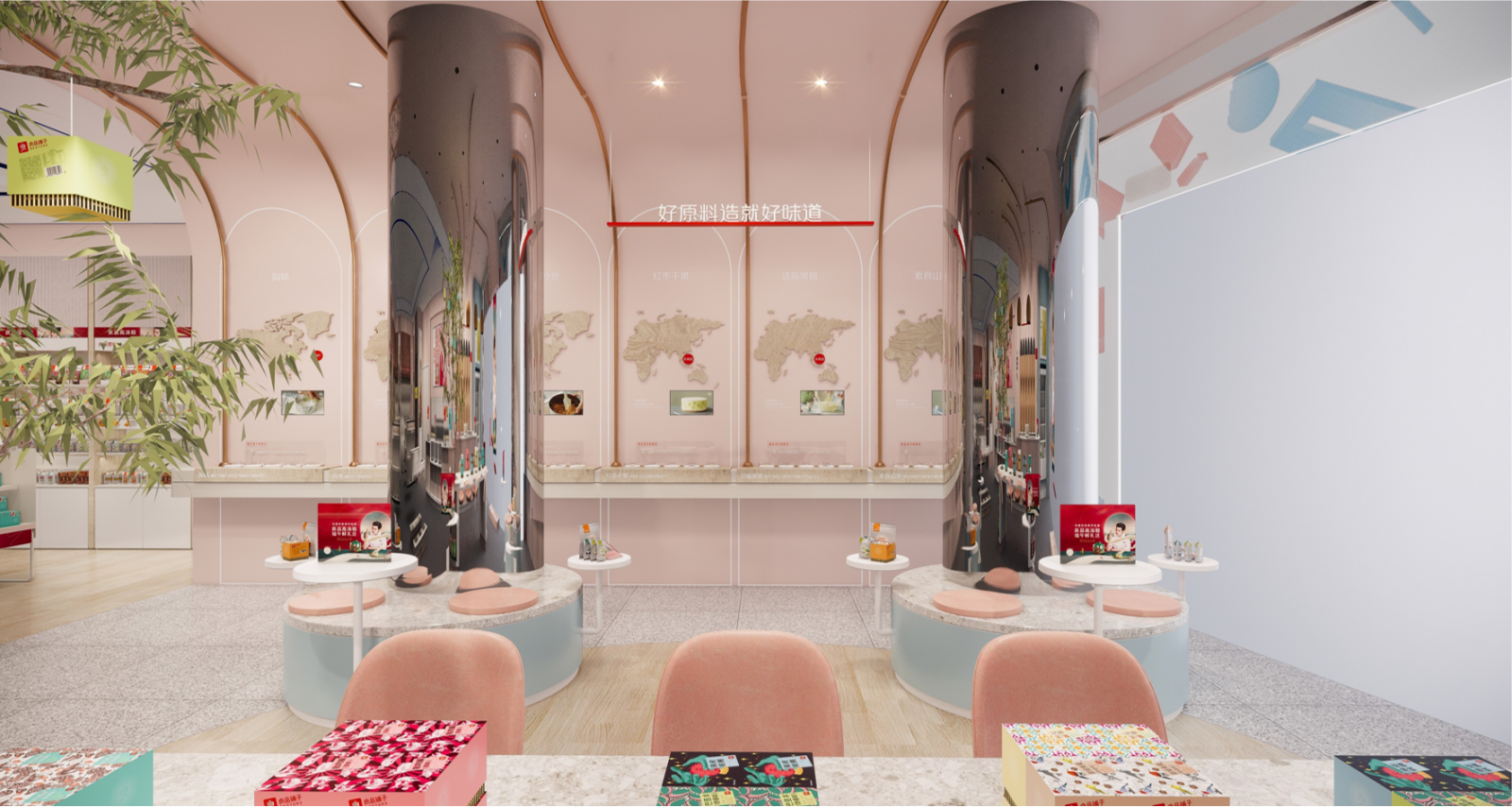
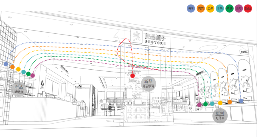
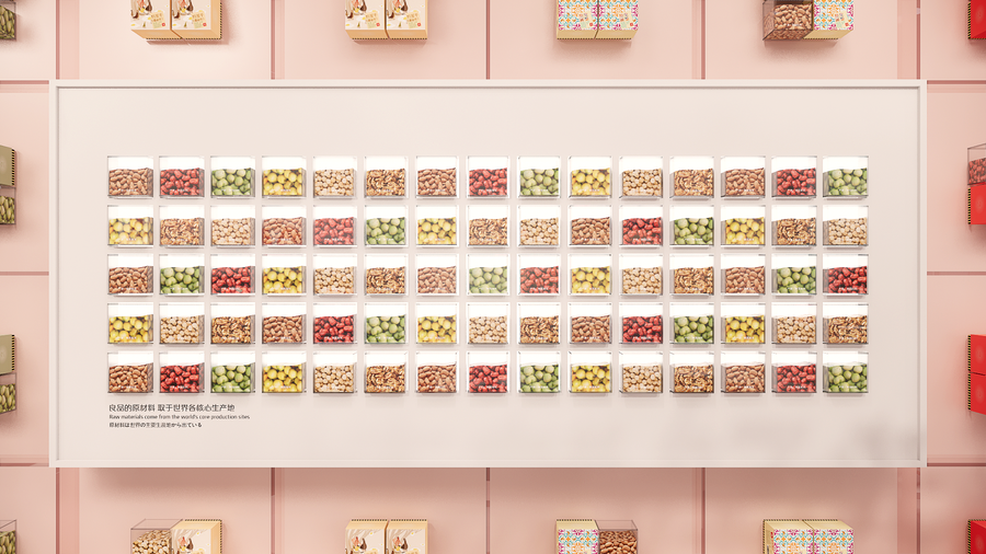
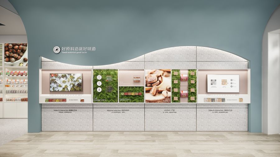
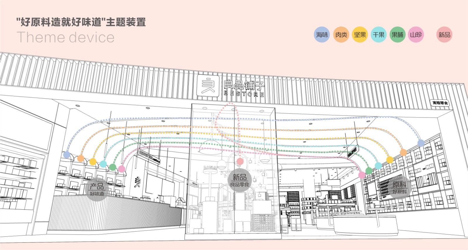
夺人眼球的空间装置,元素创意来源于管道,表现食物在制作过程中的运送,是从原材料到产品的制做过程;同时传达“好原料造就好味道”的品牌优势。从「好原料文化墙」延伸至「自助休闲区」的艺术装置,以强烈的视觉冲击,形成独特的品牌特色。An eye-catching spatial installation with elements creatively derived from pipes, showing the transportation of food during the production process, from raw materials to products.The brand advantage of "good ingredients make good taste" is conveyed at the same time.The art installation that extends from the "Good Ingredients Culture Wall" to the "Self-service Lounge" creates a strong visual impact and a unique brand identity.
03常青树下欢享全球好味Under the Evergreen TreeEnjoy the good taste of the world
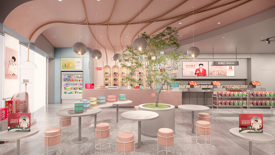
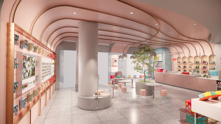
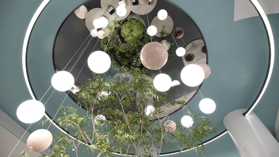
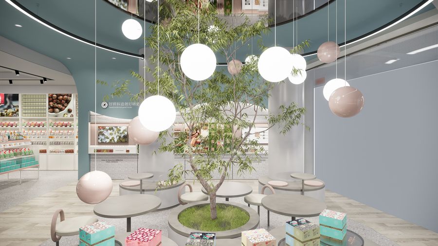
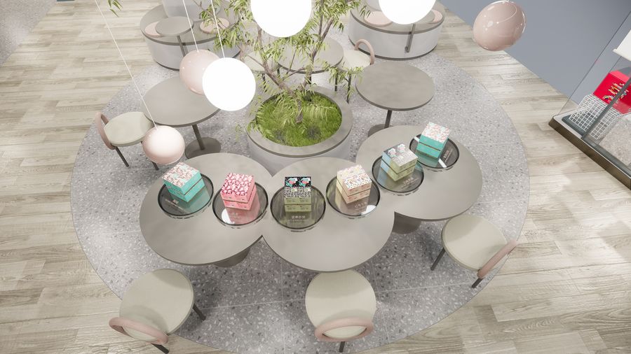
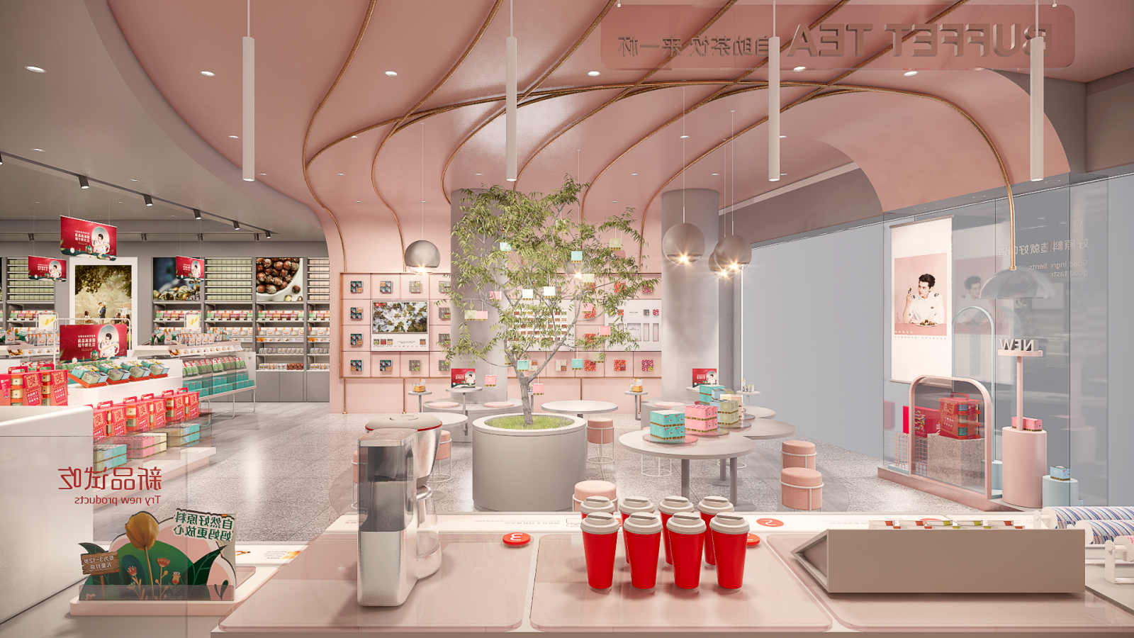
分享,让美味更加分。清新脱俗的「茶饮休闲区」,天花视觉由拿取糖果的动作演绎而来;球形灯运用多种材质,轻盈又优雅,颇有艺术感地自由悬挂着,好似一个个在零食王国里自在探索的精灵。Share, to make the delicious food more divided. The refreshing "tea and beverage lounge area", where the ceiling vision is interpreted by the action of taking sweets.The spherical lights are made of various materials, light and elegant, and hang freely in an artistic way, like a genie exploring freely in the snack kingdom.
天花运用“镜子”装置,更显空间感;借鉴园林花坛树下休憩概念,将低饱和度色调的桌椅错落分布于绿色礼盒树旁,营造轻松舒适的氛围,希望让更多人坐下来,发生更多可能。The use of "mirrors" in the ceiling to enhance the sense of space.Drawing on the concept of lounging under trees in garden flower beds, tables and chairs in low-saturation hues are staggered next to green gift trees to create a relaxed and comfortable atmosphere in the hope that more people will sit down and more possibilities will occur.
零食,是正餐之外的快乐补给。落座于「茶饮休闲区」,柔和的灯光,淡雅的色调,从视觉、触觉到心理感受,都让人极度舒适。Snacks, a happy supplement to the main meal.Sitting in the "tea and relaxation area", the soft lighting and light colors make people extremely comfortable from visual, tactile and psychological feelings.
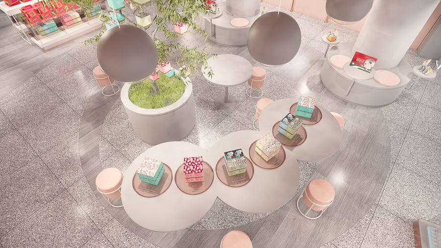
在设计过程中,也遇到了不可抗力的难点。店里有两根对零售功能相对消极的柱列,设计师运用镜面不锈钢将其包装,视觉上更显通透。同时,特设环形座位和简易圆桌,让顾客轻松的慢下来,随手试货,快乐满格。During the design process, the difficulty of force majeure was also encountered.The store has two columns that are relatively negative to the retail function, and the designer used mirrored stainless steel to wrap them for a more visually transparent look.At the same time, ad hoc circular seating and simple round table, so that customers can easily slow down and try the goods with their hands, happy full.
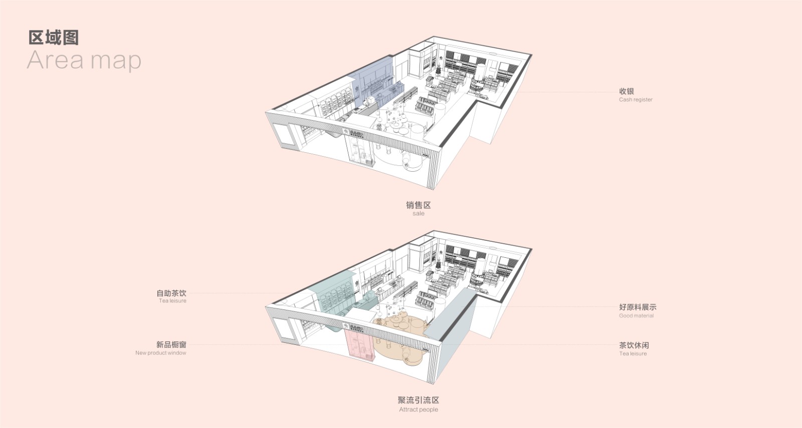
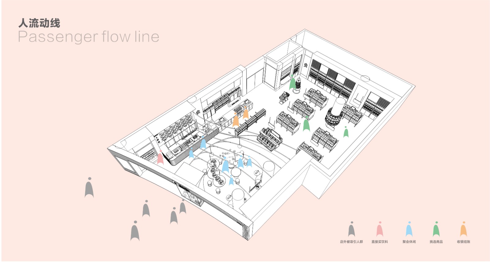
有业内人士预测,比起传统餐饮市场,休闲零食这个“第四餐的长尾市场拥有更为丰富的消费场景”。设计师试图通过营造不同的消费场景,捕获消费者心智,提升顾客的进店率和留店时间,从而带动消费。当然,这是个技术含量很高的活。Some industry insiders predict that, compared to the traditional restaurant market, casual snacks, the "fourth meal of the long tail market has a richer consumer scene.Designers try to create different consumption scenarios to capture the minds of consumers, enhance the rate of customer entry and retention time, thus driving consumption. Of course, this is a highly technical job.
04自然之礼让味蕾起舞The Gift of NatureLet the taste buds dance
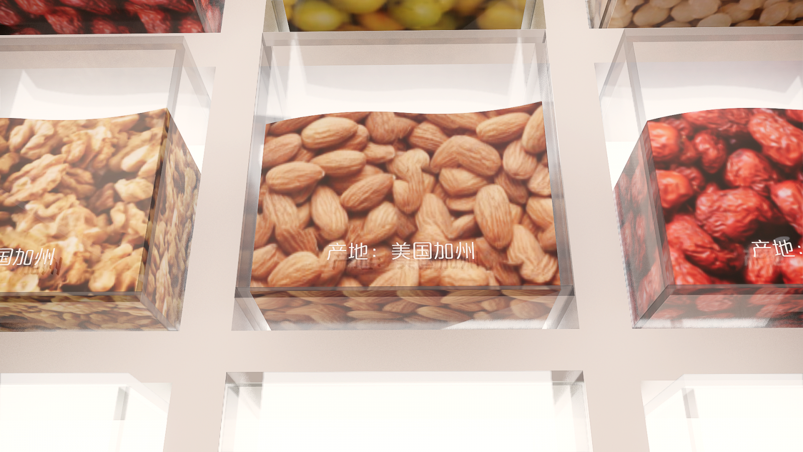
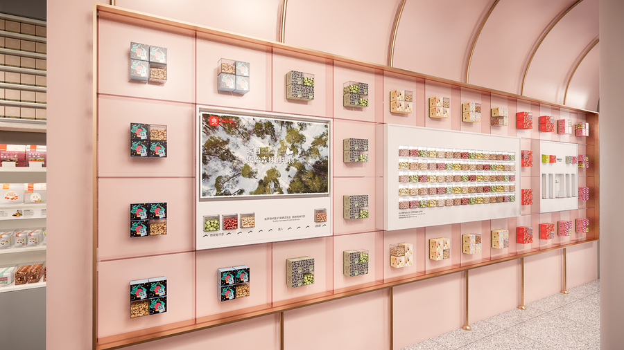
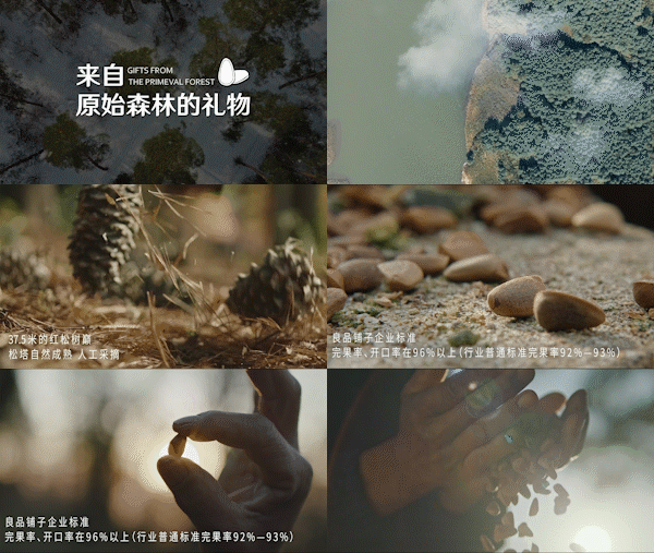
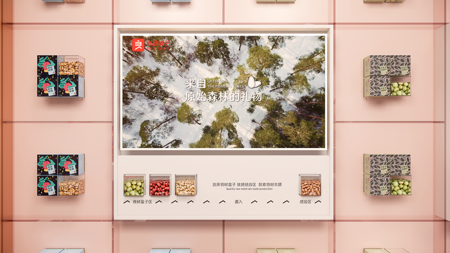
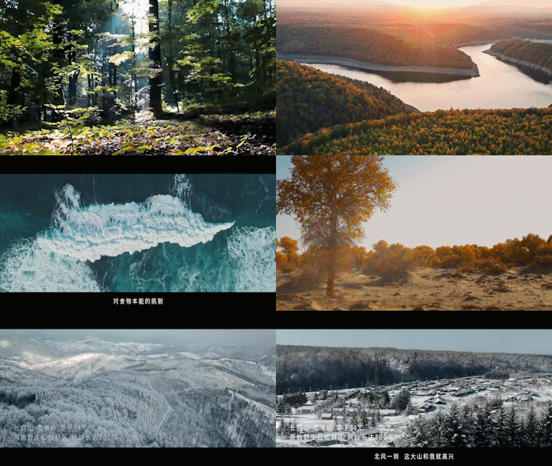
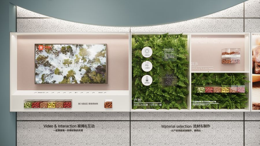
好原料是好味道的根基。“来自原始森林的礼物……”好原料视频滚动播放,和你一起探索每一份原材料的来源。若想解锁更多好味道密码,将带有芯片的原材料盒子放入感应器,感应器感应到原材料盒子后,即可开启溯味之旅。Good ingredients are the foundation of good taste. The "Gift from the Primeval Forest ......" video of good ingredients scrolls and explores with you the origin of each raw material.If you want to unlock more good taste codes, put the raw material box with the chip into the sensor, and the sensor will sense the raw material box, then you can start the traceable taste journey.
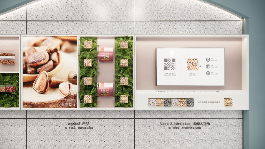
 长白山古松林,10年成一林。「各原材料产地+产品灯箱画面」组合展示,让好味道看得见。Changbai Mountain ancient pine forest, 10 years into a forest. The combination of "the origin of each raw material + product light box screen" is displayed, so that the good taste can be seen.
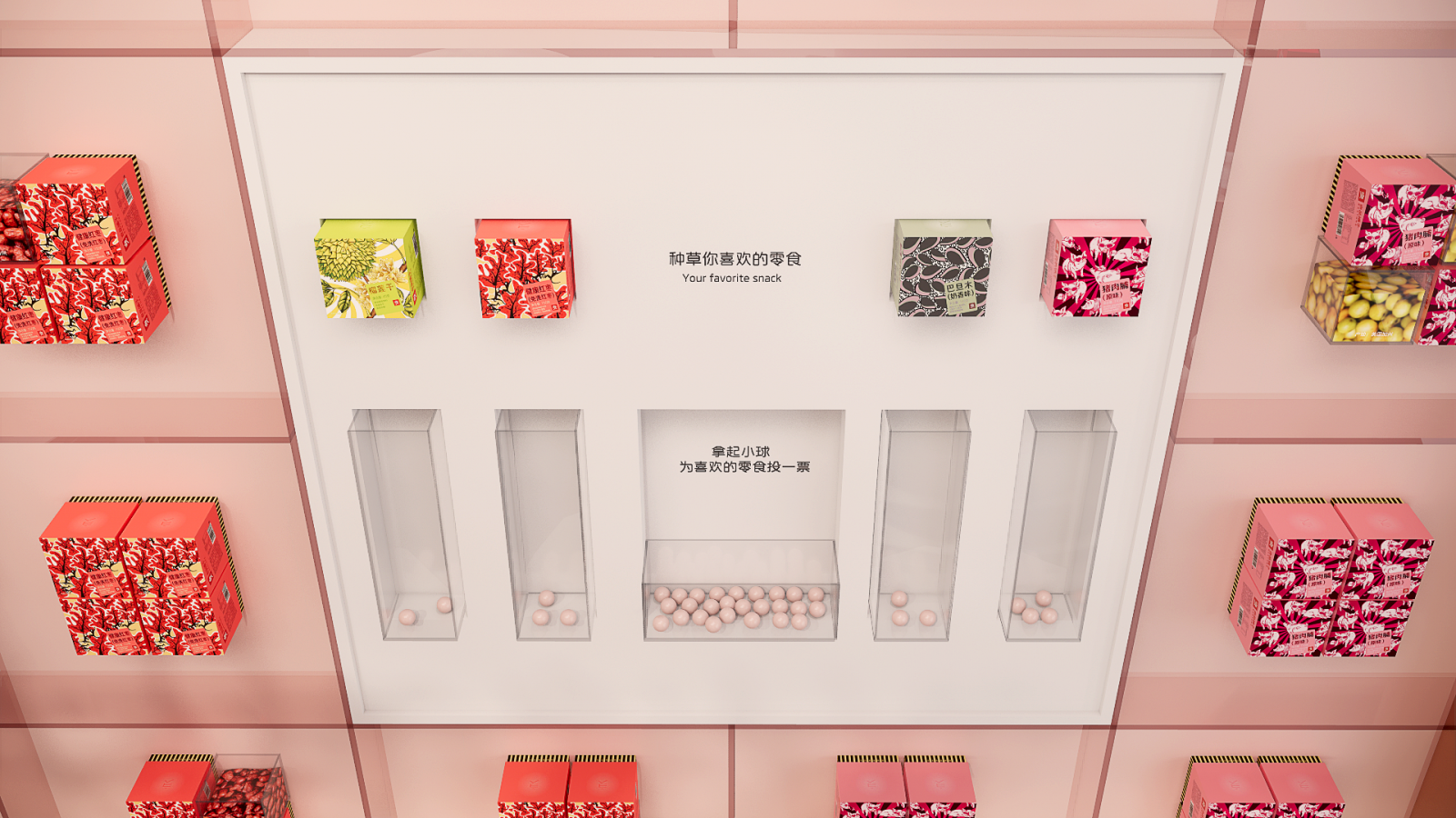 除了对好原料的溯源,还可以在「好原料文化墙」进行零食种草投票。消费者互相推荐零食,提升互动体验,且可作为单店的数据调查辅助。In addition to the traceability of good ingredients, you can also vote on snack at the "Good Ingredients Culture Wall". Consumers recommend snacks to each other to enhance the interactive experience, and it can be used as a data survey aid for single stores.
05自助创享多维度体验Self-creation ShareMulti-dimensional experience
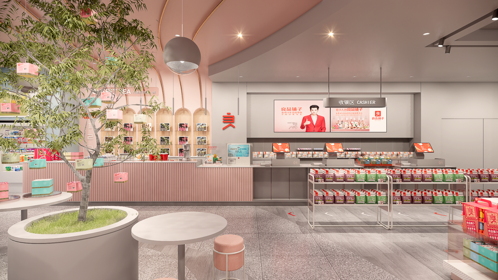
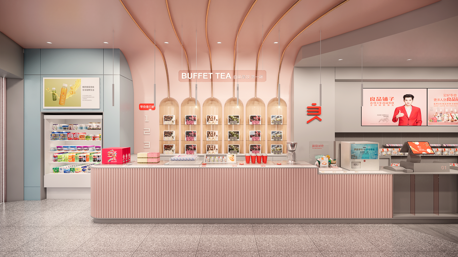
 零食点赞榜,专治选择困难。今日、季度、年度最佳,让你轻松get爆款好物。The snack spotting list is designed to cure the difficulty of choosing. Today's, quarterly and annual best, so you can easily get the Explosive Goodies.
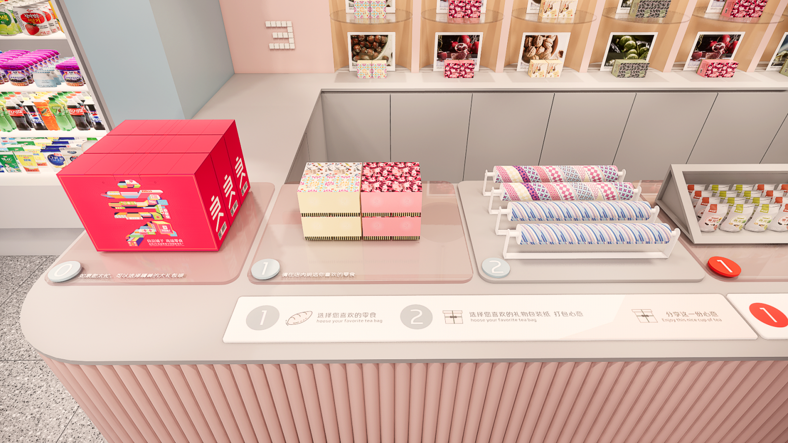 小时候,最爱和小伙伴交换手中的零食。长大后,看到好吃的,也会忍不住分享。在「礼品打包专区」,挑好零食和包装纸即可开始DIY,将心意打包送出。When I was a kid, I loved to exchange snacks with my buddies. When you grow up, you can't help but share when you see something delicious. In the "Gift Wrapping Zone", you can pick out your snacks and wrapping paper and start DIY to send them out.
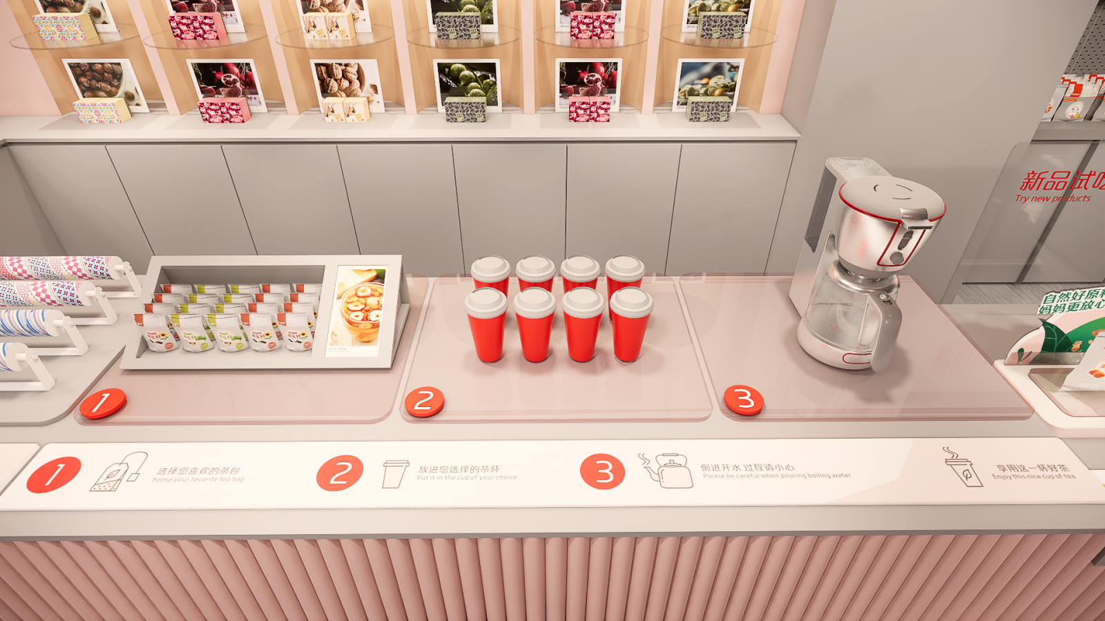
零食店,不局限于零食。一杯芬芳花茶,让好味更绵长。Snack store, not limited to snacks. A cup of fragrant flower tea, so that the good taste more long.
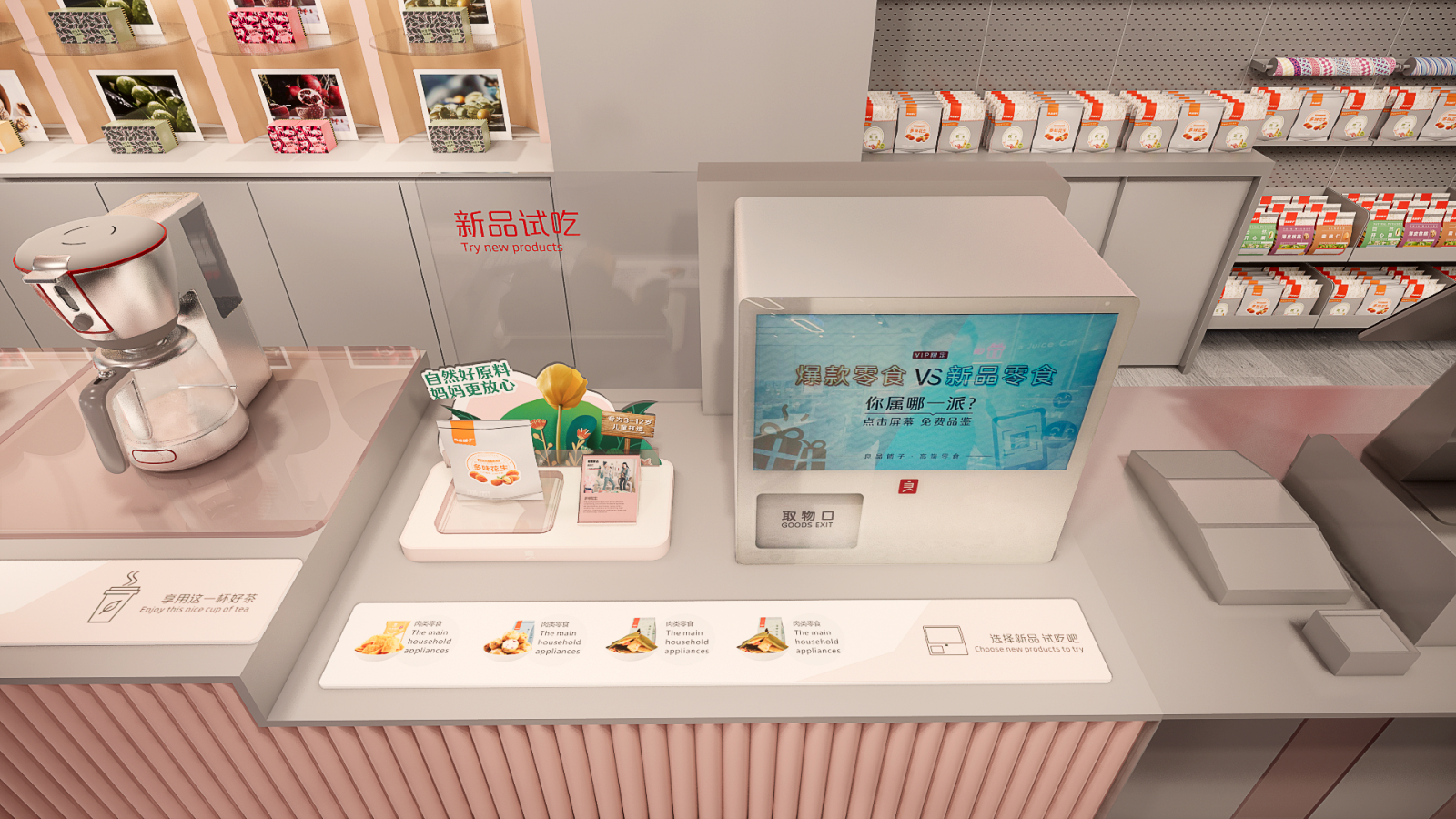 每一个执着追求好味的灵魂,从来都不将就。「新品试吃」,即刻打开味蕾新世界。肉类、坚果炒货、糖果糕点、果干果脯、素食山珍……舌尖上的美味,任君选购。以上都设在收银柜台旁边,有什么需要帮忙都可及时向店员咨询。Every soul who persists in the pursuit of good taste never settles for less. “New Tasting”,opens a new world of taste buds instantly.Meat, nuts and fried goods, sweets and pastries, dried fruit and vegetarian mountain deliciousness ...... on the tip of your tongue, at your disposal.All of the above are located next to the cashier's counter, so if you need any help, you can ask the clerk in time.
 小零食,大欢乐。遇见对味的零食,比遇见心中的Mr.right还幸福。“食力”派,敢于尝鲜。魔力零食王国,欢迎大小朋友常来探访。Small snacks, big joy.Meet the right taste of snacks, more happy than meet the Mr.right in the heart. The "food power" faction, dare to taste.Magic snack kingdom, welcome friends of all sizes to visit often.
D&M店与面,秉承“让零售创新更有趣有效”的设计理念,聚焦新零售领域的品牌升级以及空间创意体验设计。我们致力于在零售创意领域为不同行业的前瞻性客户,打造最顶级的零售空间创意体验和品牌营销推广的视觉设计。D&M adhering to the design concept of "making retail innovation more fun and effective" ,focus on brand upgrading and space creative experience design in the new retail field.We are committed to creating top-notch retail space creative experience and brand marketing visual design for forward-looking clients in different .industries,create top-notch visual design for retail space creative experience and brand marketing promotion.
平 面 动 线 图Plane diagram
项目名称:良品铺子旗舰店
委托方:店与面(广州)创意设计有限公司
设计团队:邱启平、李东辉、 陈冰宏、卢俊城
建筑面积:250㎡
视觉:李帆、Chili












评论(0)