项目名称 | 予·舒
项目地址 | 成都温江区
设计面积 | 198㎡
设计风格 | 现代极简风格
空间设计 | 观白设计工作室
施工团队 | 观白设计施工团队
户型结构 | 跃层
序
-
本次的案例是一套170㎡复式空间,原始公共空间零碎缺少联系,规划混乱,屋主是一对新婚夫妻,对生活品质要求高,喜欢在闲暇之余看书、喝茶、玩游戏;这套房子作为他们的新房,日常只有小两口居住,基于屋主对未来的规划,与屋主交流之后,设计师将空间整体围绕小两口的二人世界展开设计……
设计师打破固有的空间界限,重新构建空间之间的联系,摒弃复杂的形式,用黑、白、灰绘制空间,点缀木色为空间注入生命的活力。
The case of this time is a 170 ㎡ duplex space. The original public space is fragmented and lack of contact. The planning is chaotic. The owner is a newly married couple, who has high requirements for the quality of life. He likes reading, drinking tea and playing games in his spare time; As their new house, this house is only for the young couple. Based on the owner's planning for the future, after communicating with the owner, the designer will design the space around the young couple's world as a whole.
The designer breaks the inherent space boundary, reconstructs the connection between spaces, abandons the complex form, draws the space with black, white and gray, and embellishes the wood color to inject life vitality into the space.
■客户需求:
①.需要两个卧室,次卧可以作为未来的儿童房或客卧。
②.需要一个独立的书房,用作临时办公或玩游戏放松的空间。
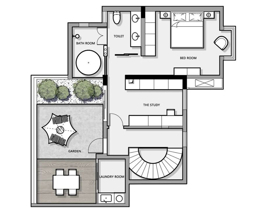
③.一、二层都需要卫生间,干湿分离,主卫想要一个大浴缸。
④.女主人需要一个化妆的地方,独立的衣帽间,满足收纳需求。
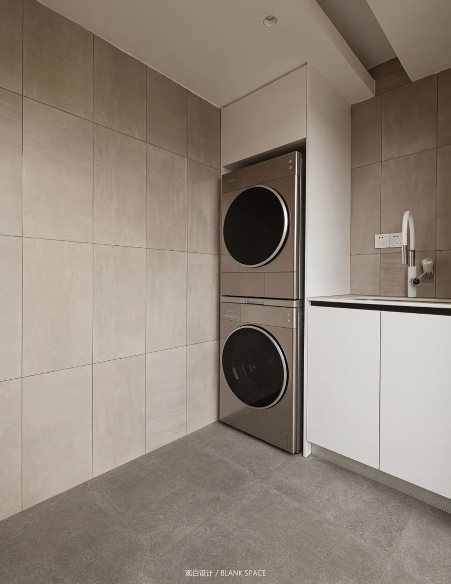
⑤.洗衣烘干机放在二楼方便晾晒。
⑥.需要中西厨,喜欢现代极简风格。
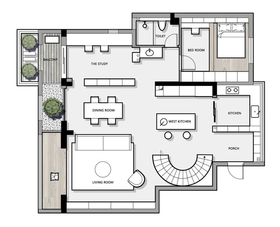
▼平面规划
PLANE PLANNING
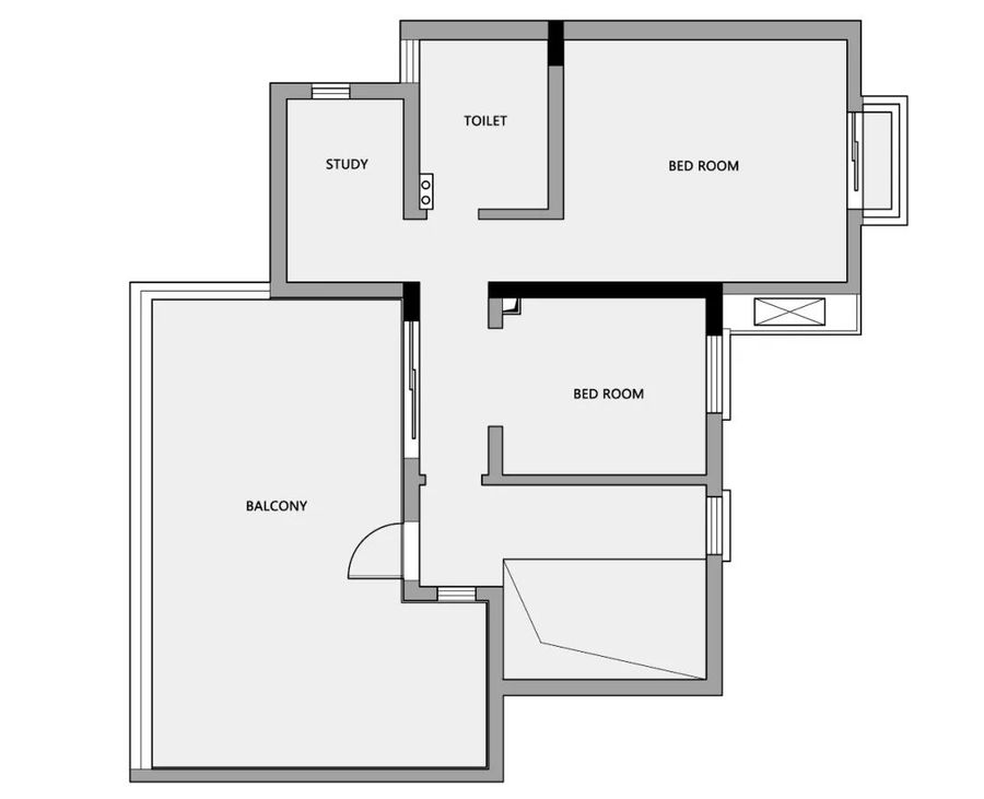
■原始户型:
①.入户空间过大,空间浪费严重。
②.餐厅、厨房过小,空间分布不合理,空间之间过于零碎。
③.原始楼梯为木制楼梯,比较陡安全性与美观不足。
■改造要点:
①.拆除入户左侧的墙体,将原始入户区域划分成两部分,一半作为中厨,一半作为玄关,中厨与玄关之间用柜体作分隔,划分空间的同时也解决玄关的储物问题。
②.将原本中厨的区域改造成西厨,拆除了中厨原本的墙体拆除了,改造成一个开放式的西厨。
③.拆除原始餐厅区域的墙体,做全开放式设计,"LDK"一体化的布局增强空间之间的统一性与互动性。
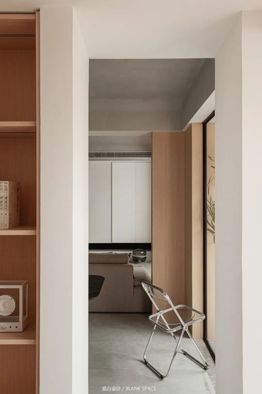
④.书房采用开放式设计,餐厅与书房空间采用柜体做隔断,既实用也不浪费空间,两边留出过道空间,优化动线的同时让空间更加通透。
⑤.次卫把洗漱台放在卫生间外面,使用上更加方便,不能拆除的下水管采用木饰面包裹,洗漱台与书房之间巧妙的留隙设计,让两个空间中都能看见彼此的一角,形成”窥探"的设计手法。
⑥.一层原始阳台过于狭长实用性不强,将阳台分成了三部分,分别融入了书房、餐厅、客厅三个不同的空间,为空间增添不同的功能。
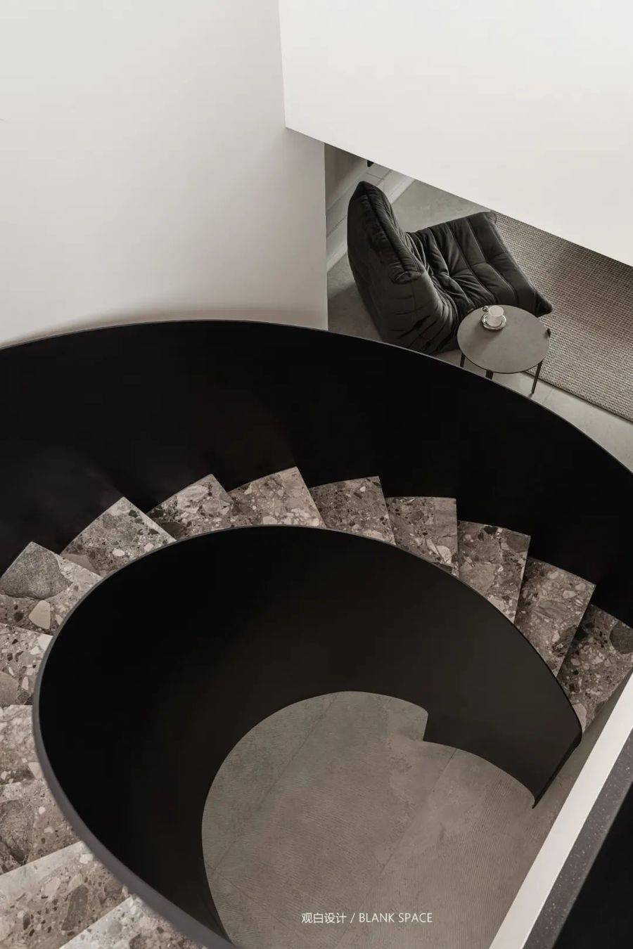
⑦.原始的木制楼梯安全性和美观上不足,将原始楼梯改为钢结构旋转楼梯,解决安全性的同时提升空间的美感。
01|玄关
HALLWAY
-
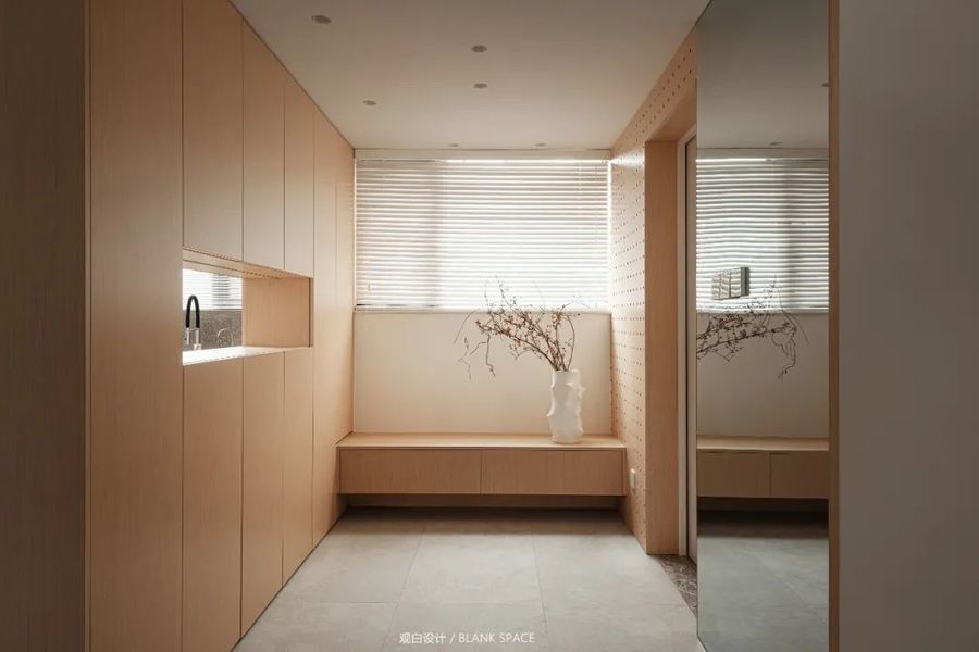
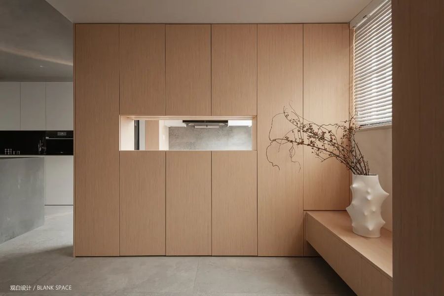
简洁的玄关设计,温润的木饰面让空间充满自然与温暖的味道;悬浮的换鞋凳让空间更具层次感,不仅可以作为换鞋凳,还可放置和装饰品作为端景台,底部预留的200mm可放置常换的鞋,集美感与功能于一体。
Simple porch design and warm wood veneer make the space full of natural and warm taste; The suspended shoe changing stool makes the space more layered. It can not only be used as a shoe changing stool, but also can be placed and decorated as an end view platform. The 200mm reserved at the bottom can be used to place shoes that are often changed, integrating beauty and function.
顶天立地的鞋柜为空间增加收纳,中间镂空让设计更具趣味性,增强空间之间的互动,让空间充满无限的遐想。
The indomitable shoe cabinet increases the storage of the space. The hollow out in the middle makes the design more interesting, enhances the interaction between the spaces, and makes the space full of infinite reverie.
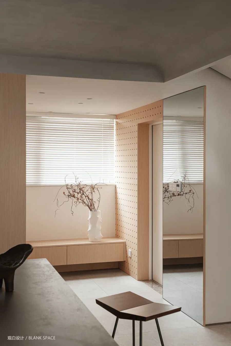
透过百叶帘进入室内稀疏的光影,让空间变得更加温柔,洞洞板的加入让墙面更具立体感,右侧的换衣镜方便出门时整理衣着。
The sparse light and shadow entering the room through the shutter makes the space more gentle. The addition of the hole board makes the wall more three-dimensional. The changing mirror on the right is convenient for finishing clothes when going out.
02|厨房
KITCHEN
-
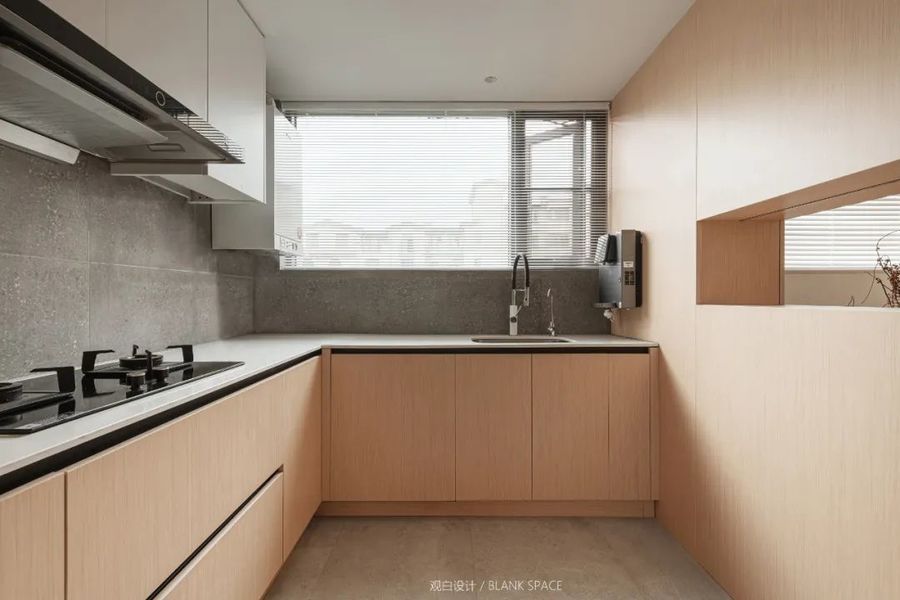
厨房“L"形的的设计在保证空间宽敞的同时,最大限度的增加操作空间,橘黄色的橱柜在灰色墙砖的映衬下格外的亮眼,左侧镂空的区域增加厨房与玄关区域的互动,让空间不封闭。
The "L" shaped design of the kitchen not only ensures the spacious space, but also maximizes the operation space. The orange cabinets are particularly bright against the gray wall tiles. The hollow area on the left increases the interaction between the kitchen and the porch area, so that the space is not closed.
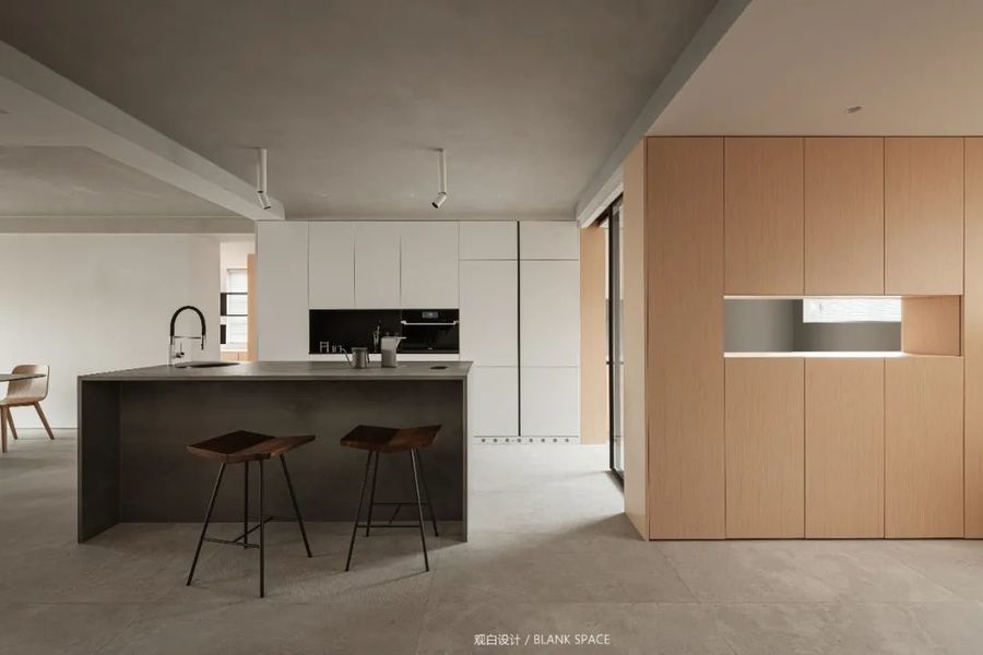
厨采用半开放式设计,极窄边框的玻璃推拉门分割中西厨的同时,隔绝中厨的油烟, 西厨岛台极具功能性与形式感,提升空间的格调。既可作为厨房操作台面的延续,还可作水吧台等。
The kitchen adopts a semi open design. The glass sliding door with a very narrow frame separates the Chinese and Western kitchens, while isolating the oil smoke from the Chinese kitchens. The western kitchen island is very functional and formal, enhancing the style of the space. It can not only be used as a continuation of the kitchen operating table, but also as a water bar, etc.
03|客厅
A LIVING ROOM
-
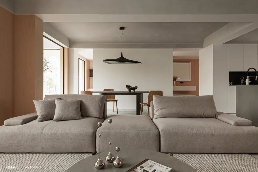
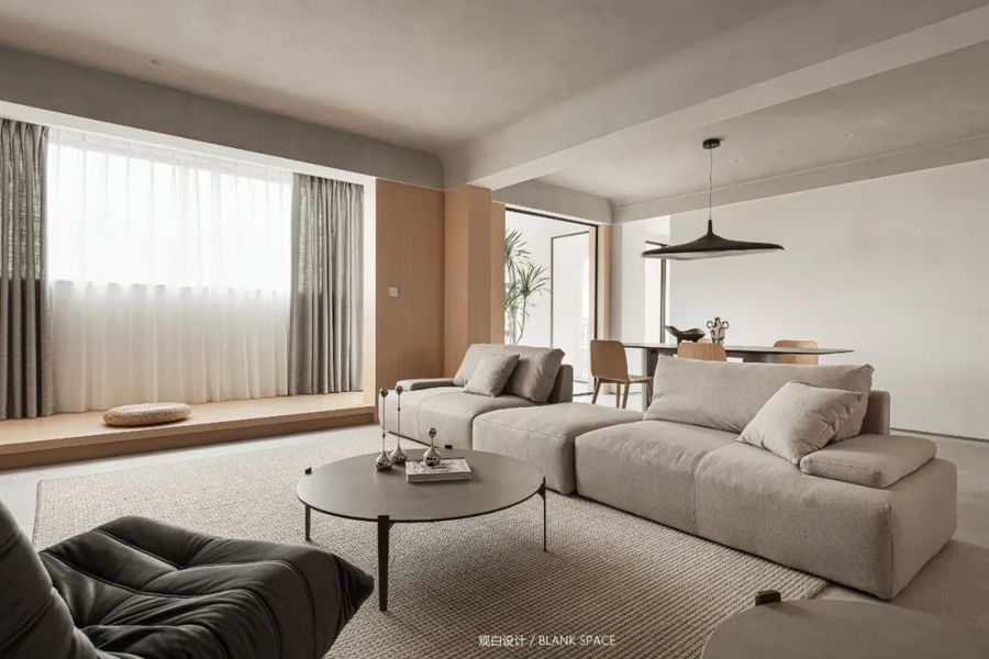
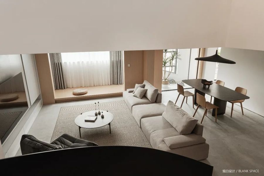
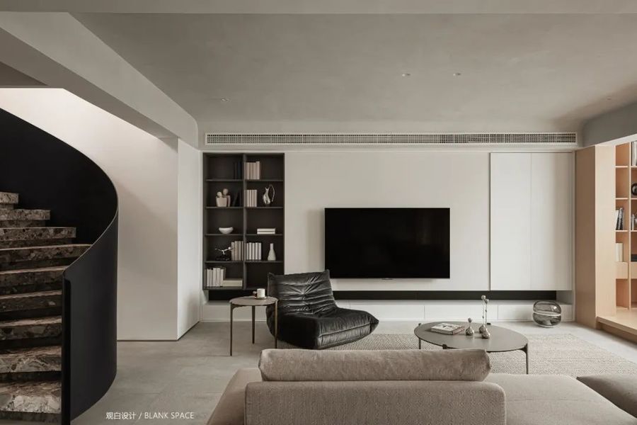
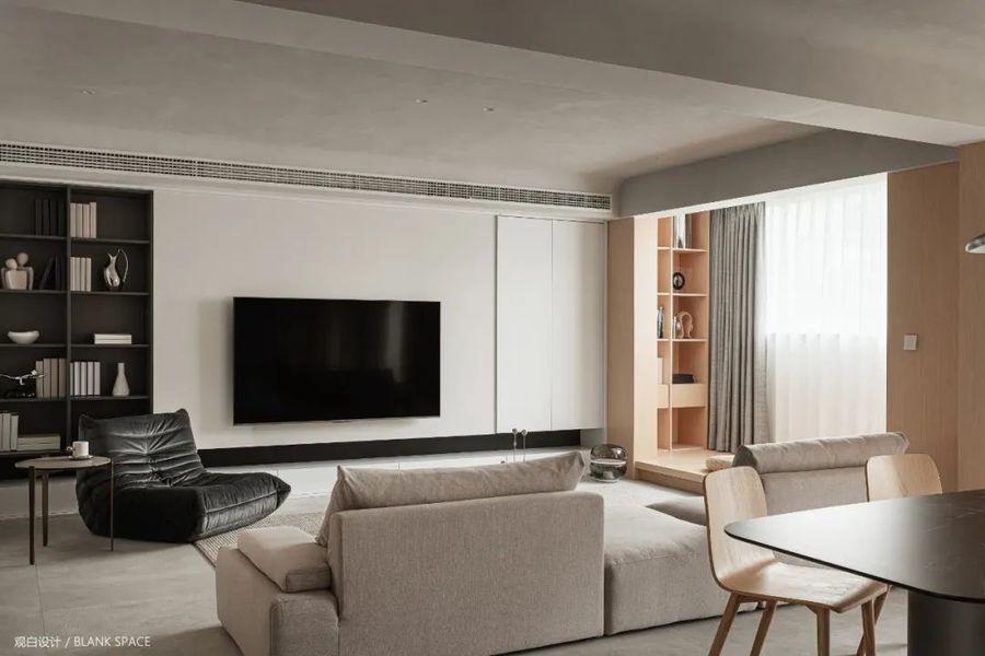
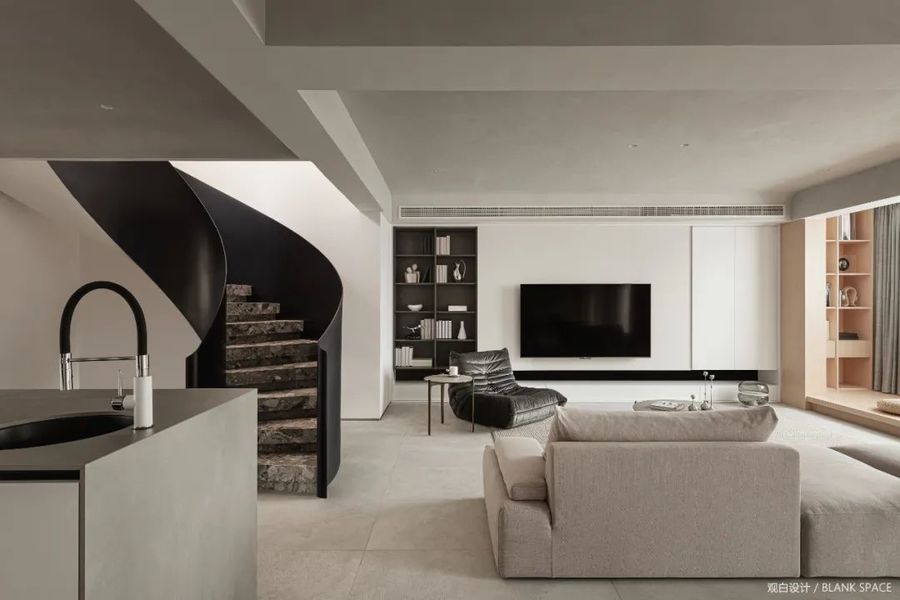
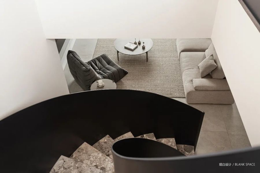
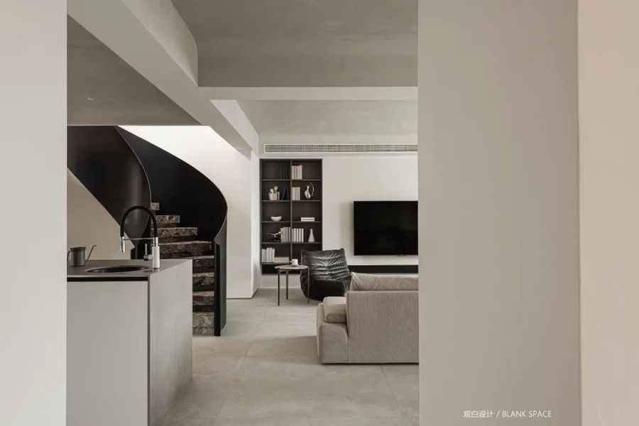
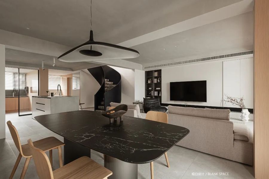
“LDK"一体化设计让空间变得更加灵活,同时促进家人之间的互动,开放式布局让空间视觉上更加通透,将空间做到最大化,每个空间又独立又共通。
The "LDK" integrated design makes the space more flexible and promotes the interaction between families. The open layout makes the space visually more transparent and maximizes the space. Each space is independent and common.
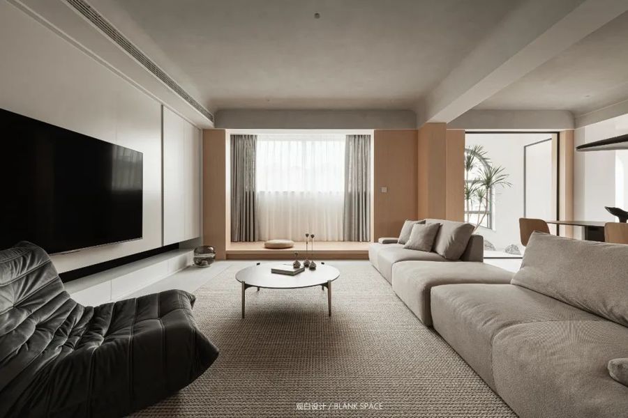
把原始的阳台分成三部分,一部分纳入客厅空间,将阳台区域抬高做地台,闲暇时光可在这看书喝茶;地台错落处安装灯带,打造空间的层次感,不仅提升颜值还能营造温馨的氛围感。
The original balcony is divided into three parts. One part is incorporated into the living room space, and the balcony area is raised as a platform. You can read and drink tea here in your spare time; Lamp strips are installed at the staggered places on the platform to create a sense of hierarchy of space, which not only improves the appearance, but also creates a warm atmosphere.
温润的木饰面与灰色水泥漆搭配,柔和与冷冽质感相融合,空间更具层次感,无主灯的设计,让空间更具简洁的质感。
The warm wood veneer is matched with gray cement paint, and the soft and cold texture are combined to make the space more hierarchical. The design without main lamp makes the space more concise.
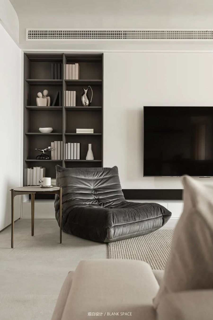
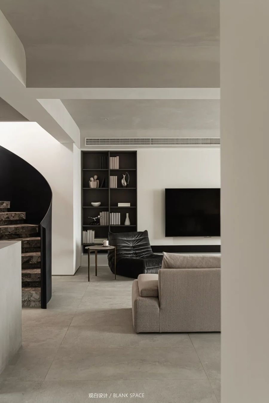
空间以黑白灰为主色调,融入温润的木纹色,营造出高级的氛围感,电视柜白色与黑色相间简洁大气,左侧黑色的开放格设计与楼梯扶手相呼应。
The space is mainly black-and-white and gray, with warm wood grain color, creating a high-level atmosphere. The TV cabinet is white and black with simple atmosphere. The black open grid design on the left echoes with the stair handrail.
弧形的旋转楼梯与极简的空间完美的配合,线与面的交织富有美感,丰富空间层次感,给人一种视觉纵深感,仿微水泥的地砖与顶面相呼应,增强空间的统一性。
The arc-shaped rotating stairs are perfectly matched with the minimalist space. The interweaving of lines and surfaces is full of aesthetic feeling, enriching the sense of spatial hierarchy, giving people a sense of visual depth. The floor tiles imitating micro cement echo with the top surface to enhance the unity of space.
04|餐厅
RESTAURANT
-
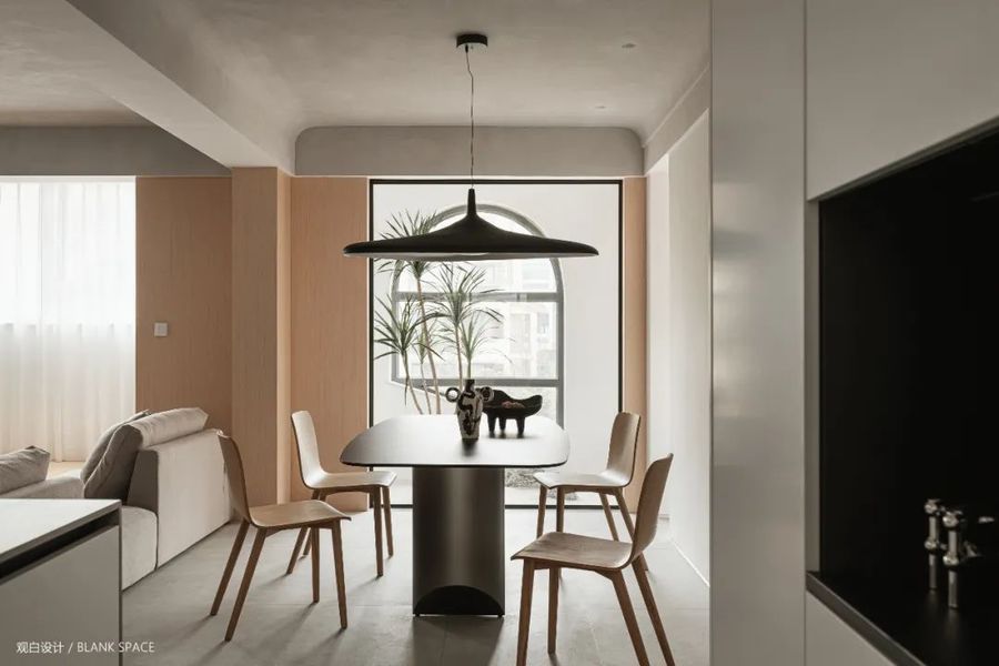
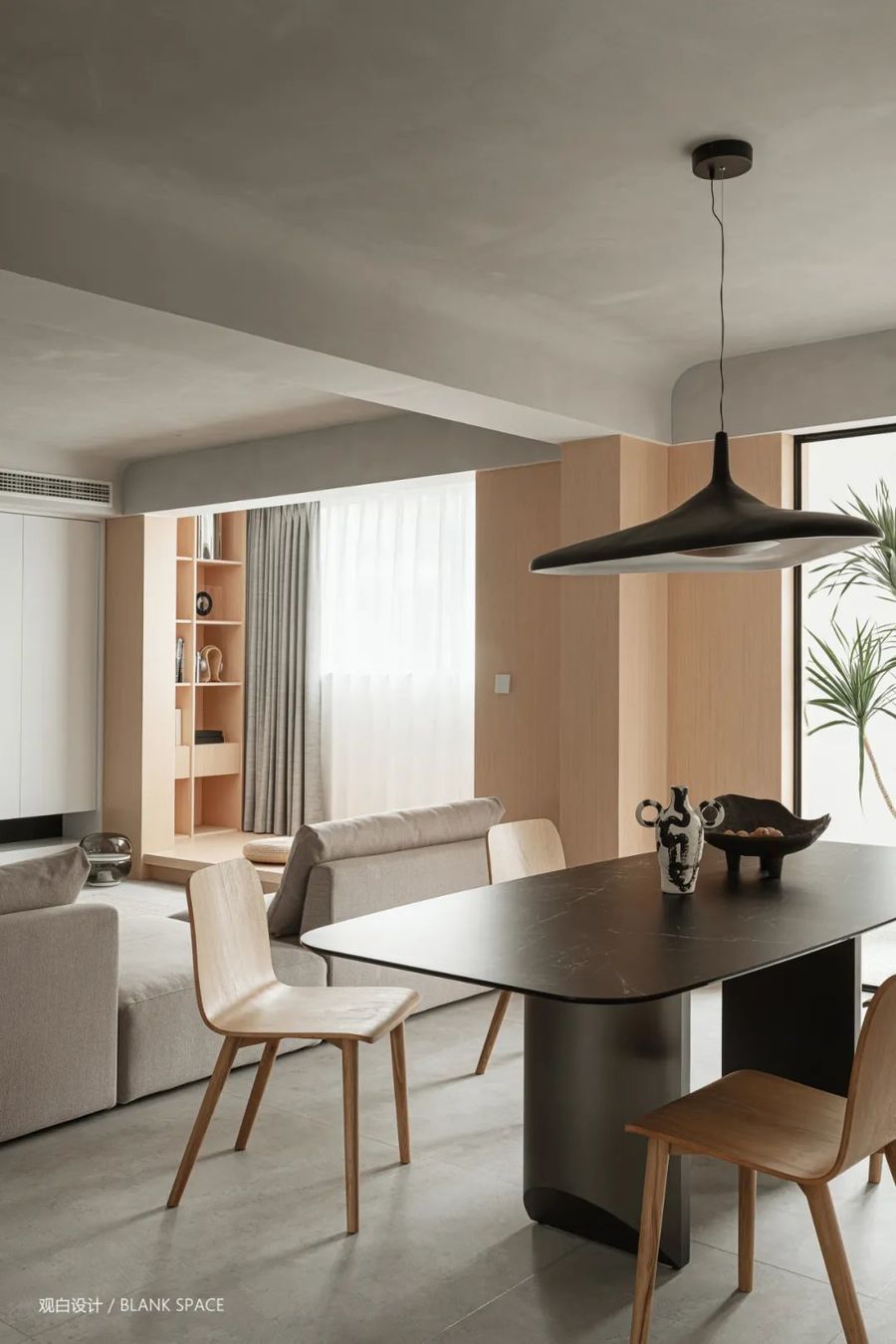
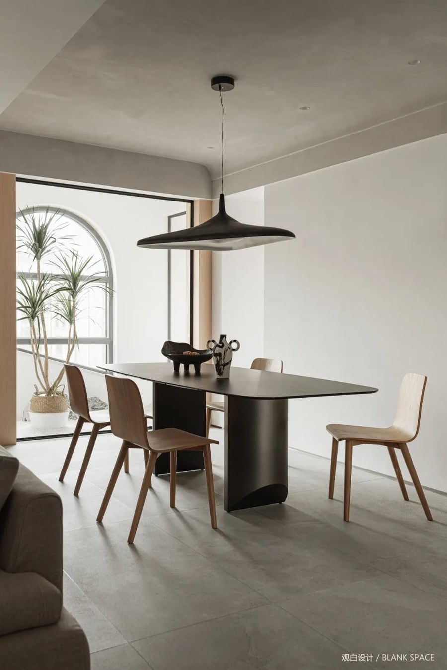
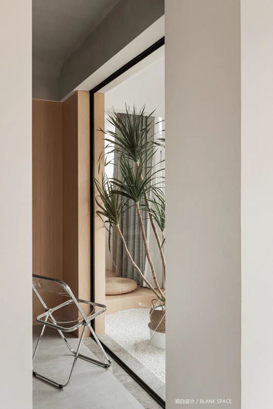
餐厅外侧的阳台造景的设计,让自然的气息融入室内,靠窗的墙面采用木纹饰面,温润的木纹色给空间增添活力,从材质不同的纹理中带出视觉的层次与质感。
The landscape design of the balcony outside the restaurant integrates the natural atmosphere into the interior. The wall near the window is decorated with wood grain. The warm wood grain color adds vitality to the space and brings out the visual level and texture from the texture of different materials.
浅灰与原木色的搭配给人回归自然的轻松感。
The combination of light grey and log color gives people a relaxed feeling of returning to nature.
顶面微水泥与地面地面仿微水泥地砖,营造出满满的静谧感,阳台的造景让空间更加惬意。
The micro cement on the top and the imitation micro cement tiles on the ground create a full sense of tranquility. The landscaping of the balcony makes the space more comfortable.
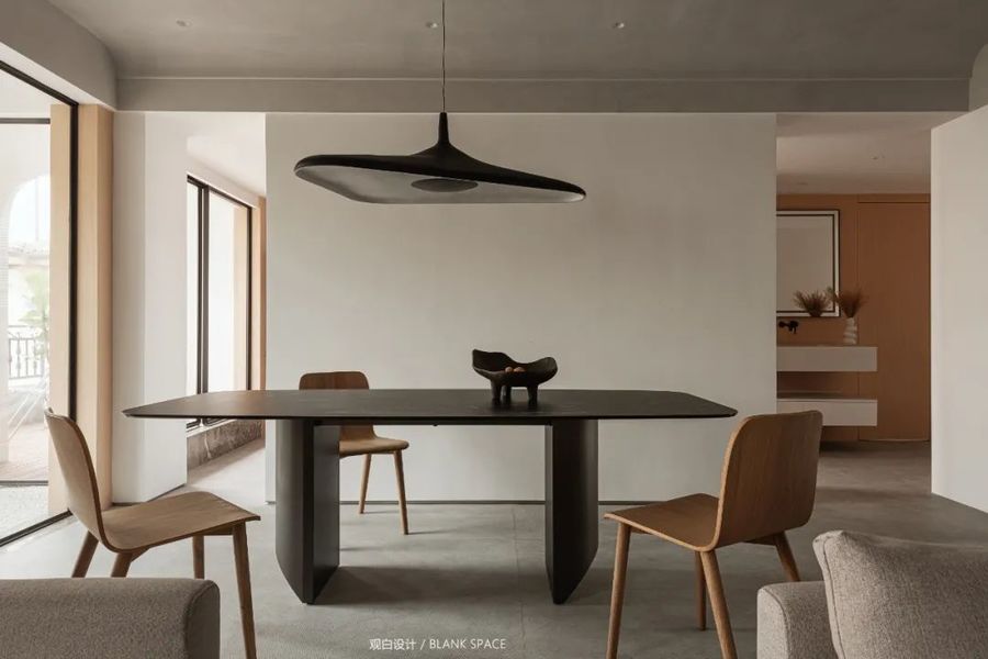
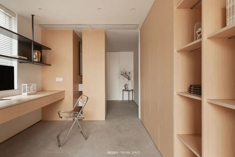
餐厅的后方为开放式书房,双向并行的通道让空间更加通透不密闭。
The back of the restaurant is an open study, and the two-way parallel passage makes the space more transparent and airless.
黑色的岩板餐桌与楼梯的扶手相呼应,增加空间色彩的层次感,开放式布局让视线在空间中一览无余。
The black rock plate dining table echoes with the handrail of the stairs to increase the sense of hierarchy of space color. The open layout allows you to have a glance in the space.
餐厅外造景的设计为空间注入自然的生命力。
The landscape design outside the restaurant injects natural vitality into the space.
05|书房
STUDY ROOM
-
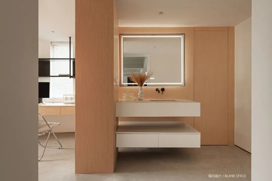
书房开放式的设计让空间更通透,温润的木纹质感,干净治愈且纯粹,大面积的原木色让空间更具暖意;开放式设计让书房与盥洗间连为一个整体,让空间显得大气,中间的镂空设计更具结构感。
The open design of the study makes the space more transparent. The warm wood grain texture is clean, cured and pure. The large area of log color makes the space more warm; The open design makes the study and lavatory connected as a whole, making the space look atmospheric, and the hollow out design in the middle has a sense of structure.
盥洗间简洁的体块更能体现出设计的美感,纯白的洗面台与柜体与温润的木饰面形成强烈的对比的同时让空间色彩也更具层次感,洗面台左侧拆不掉的下水管用木饰面包裹,增强空间的整体性,让空间更简洁明了。
The simple body of the washroom can better reflect the aesthetic feeling of the design. The white washstand and the cabinet form a strong contrast with the warm wood finish, which makes the space color more layered. The sewer pipe on the left side of the washstand that cannot be removed is wrapped with wood decoration to enhance the integrity of the space and make the space more concise and clear.
06|次卧
BEDROOM
-
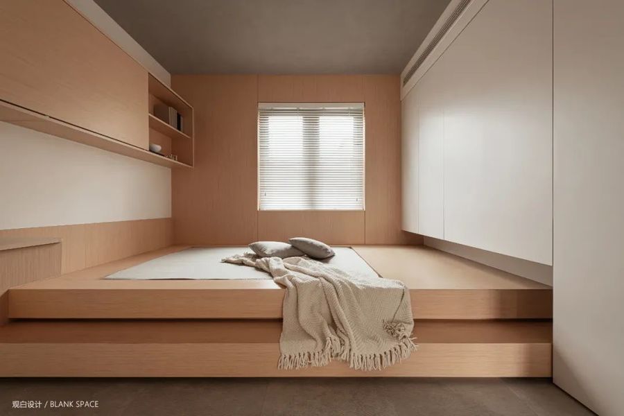
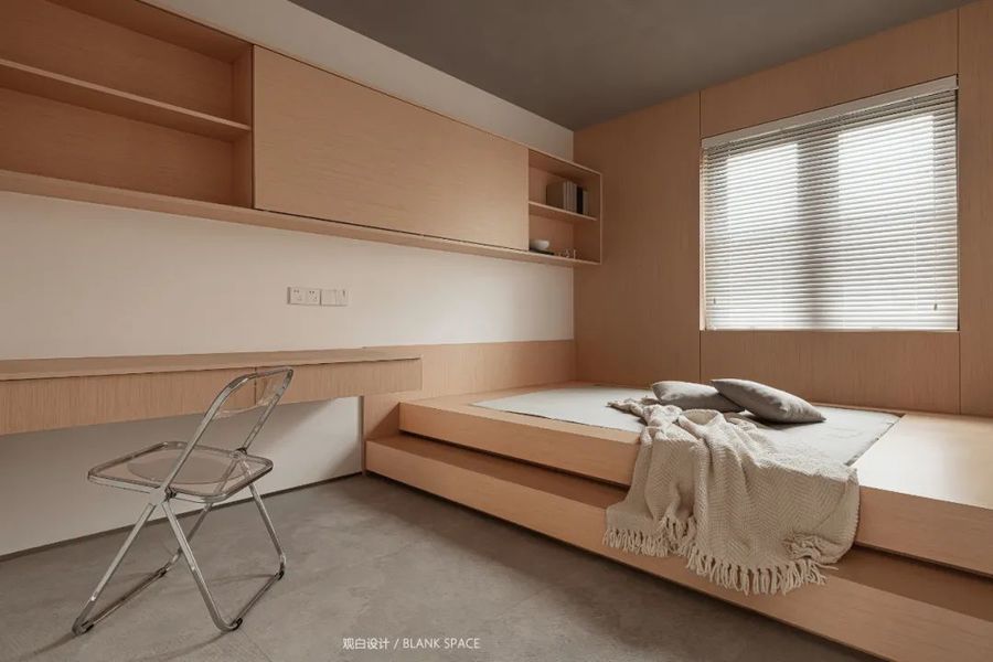
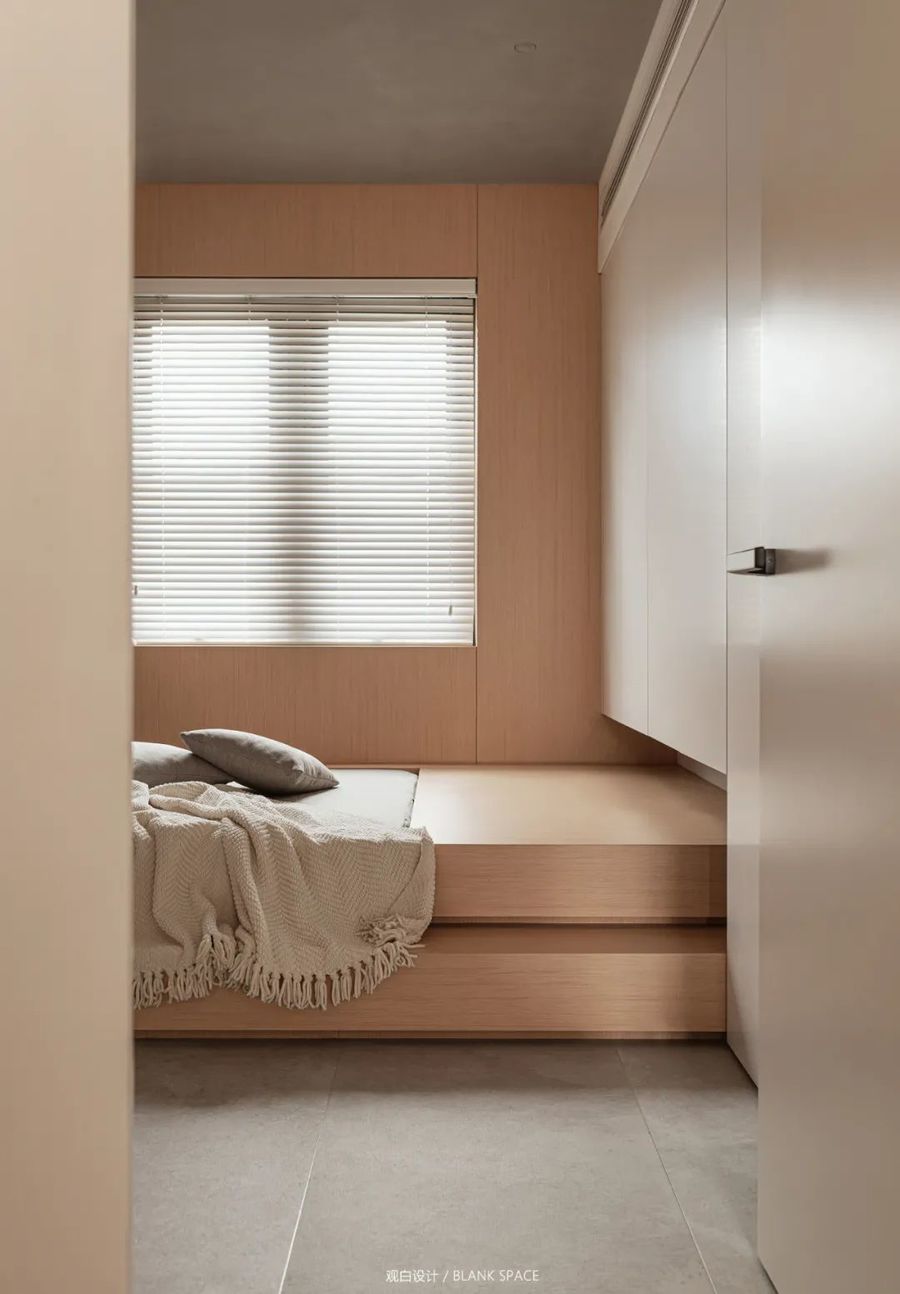
次卧采用榻榻米设计让空间功能更具多样性,整个卧室空间以日式原木风为基调,充满温馨的氛围感;床尾的柜体为空间增加储物的功能,榻榻米台阶的设计让空间更具结构的层次。
The second bedroom adopts tatami design to make the space function more diverse. The whole bedroom space is full of warm atmosphere with Japanese log style as the keynote; The cabinet at the end of the bed increases the storage function for the space. The design of tatami steps makes the space more structured.
书桌采用悬浮式设计,将现代简约发挥到极致,拉通的书柜极简的设计,让空间更加的整洁统一。
The desk adopts the suspension design, which gives full play to the modern simplicity. The minimalist design of the pull through bookcase makes the space more tidy and unified.
07|主卧
BEDROOM
-
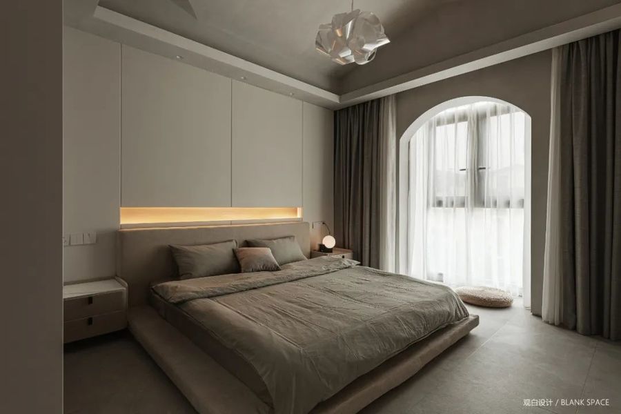
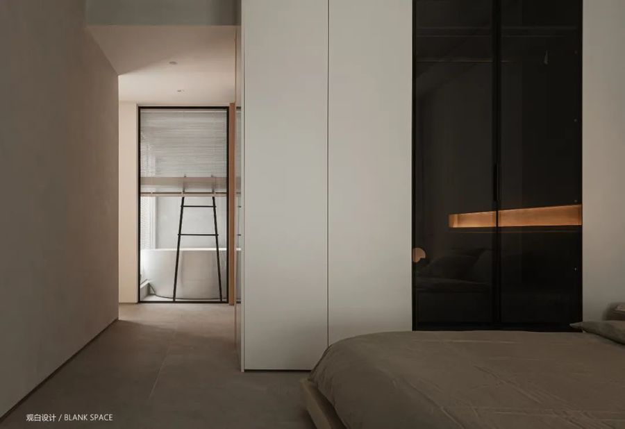
主卧保留了原始的异形顶面,让空间灵动又有氛围感,顶面采用灰色艺术漆饰面与地面相呼应,右侧窗户弧形的造型为空间增添不一样的味道。
The master bedroom retains the original shaped top surface, which makes the space flexible and atmosphere. The top surface is decorated with gray art paint to echo the ground. The curved shape of the right window adds a different flavor to the space.
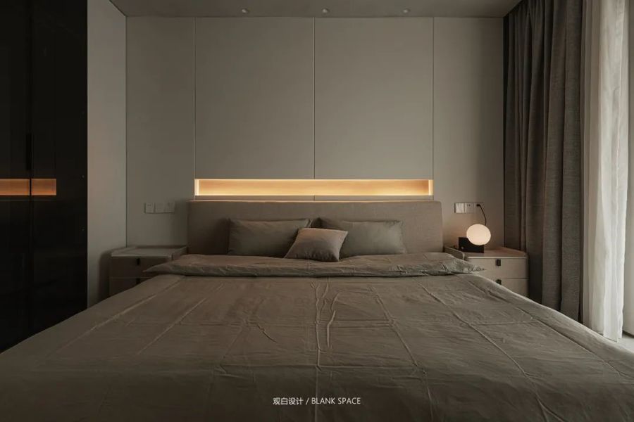
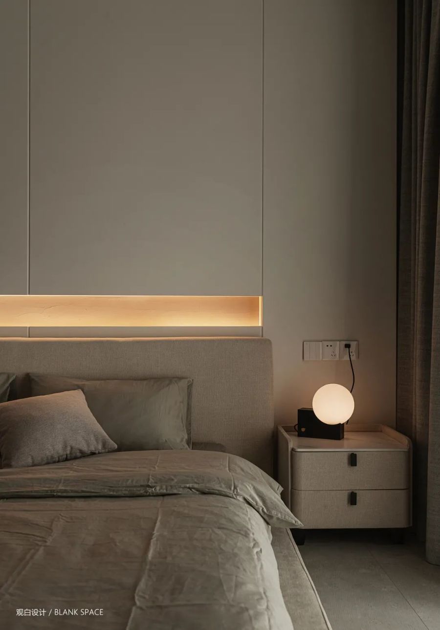
空间整体色彩以灰调为主,床头背景镂空处暖意的灯光成为空间的点睛之笔,让卧室氛围更加轻松,营造出温暖舒适的睡眠空间。
The overall color of the space is mainly gray. The warm light in the hollowed out background at the head of the bed becomes the finishing touch of the space, making the bedroom atmosphere more relaxed and creating a warm and comfortable sleeping space.
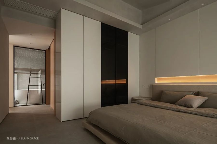
衣柜白色平板门与黑色玻璃门相间设计,玻璃门视觉上更加高级神秘;极简的设计、流畅的线条,呈现出几何的美感。
The white flat door and black glass door of the wardrobe are designed alternately, and the glass door is visually more advanced and mysterious; The minimalist design and smooth lines present the beauty of geometry.
卧室也能看见沐浴区的一角,实现空间之间的互动。
The bedroom can also see a corner of the bathing area to realize the interaction between spaces.
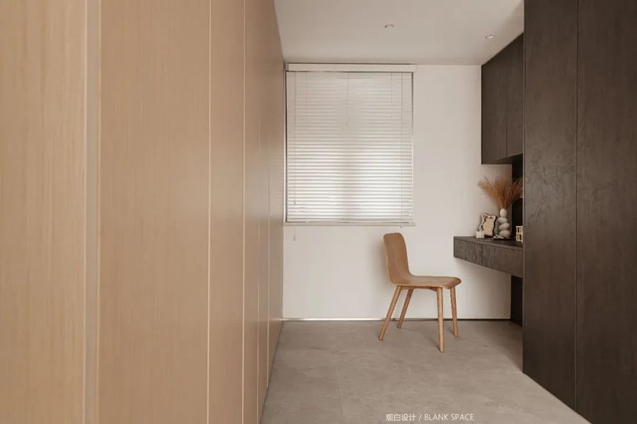
左边靠墙一侧式女主人的化妆区域,双排衣柜极大的满足了屋主对储物的需求,温润的木色与沉稳的黑色让空间更具层次感。
In the dressing area of the hostess on the left side of the wall, the double row wardrobe greatly meets the owner's needs for storage. The warm wood color and calm black make the space more layered.
07|卫生间
TOLIET
-
卫生间采用幽灵推拉门,隔绝隐私得同时让空间显得更加简约高级。
The bathroom adopts ghost sliding door to isolate privacy and make the space more simple and advanced.
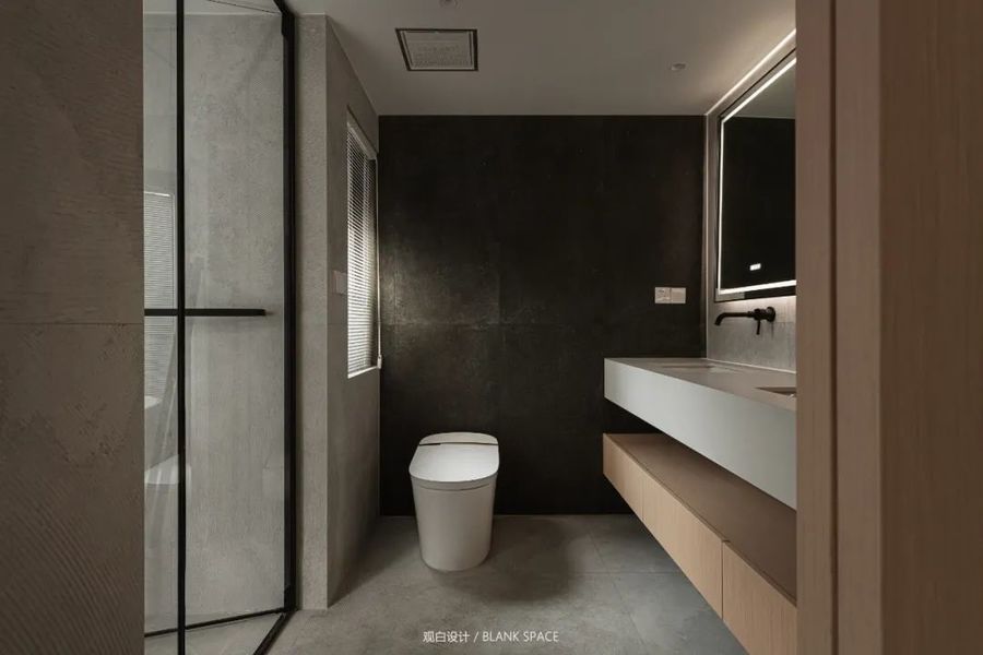
空间以灰色为主色,马桶背景墙黑色墙砖让空间多了几分深邃,洗面台双盆的设计可供夫妻俩同时使用,浴室柜温润的木色让整个空间多了几分温暖。
The main color of the space is gray. The black wall tiles of the toilet background wall make the space more profound. The double basin design of the washtable can be used by the couple at the same time. The warm wood color of the bathroom cabinet makes the whole space more warm.
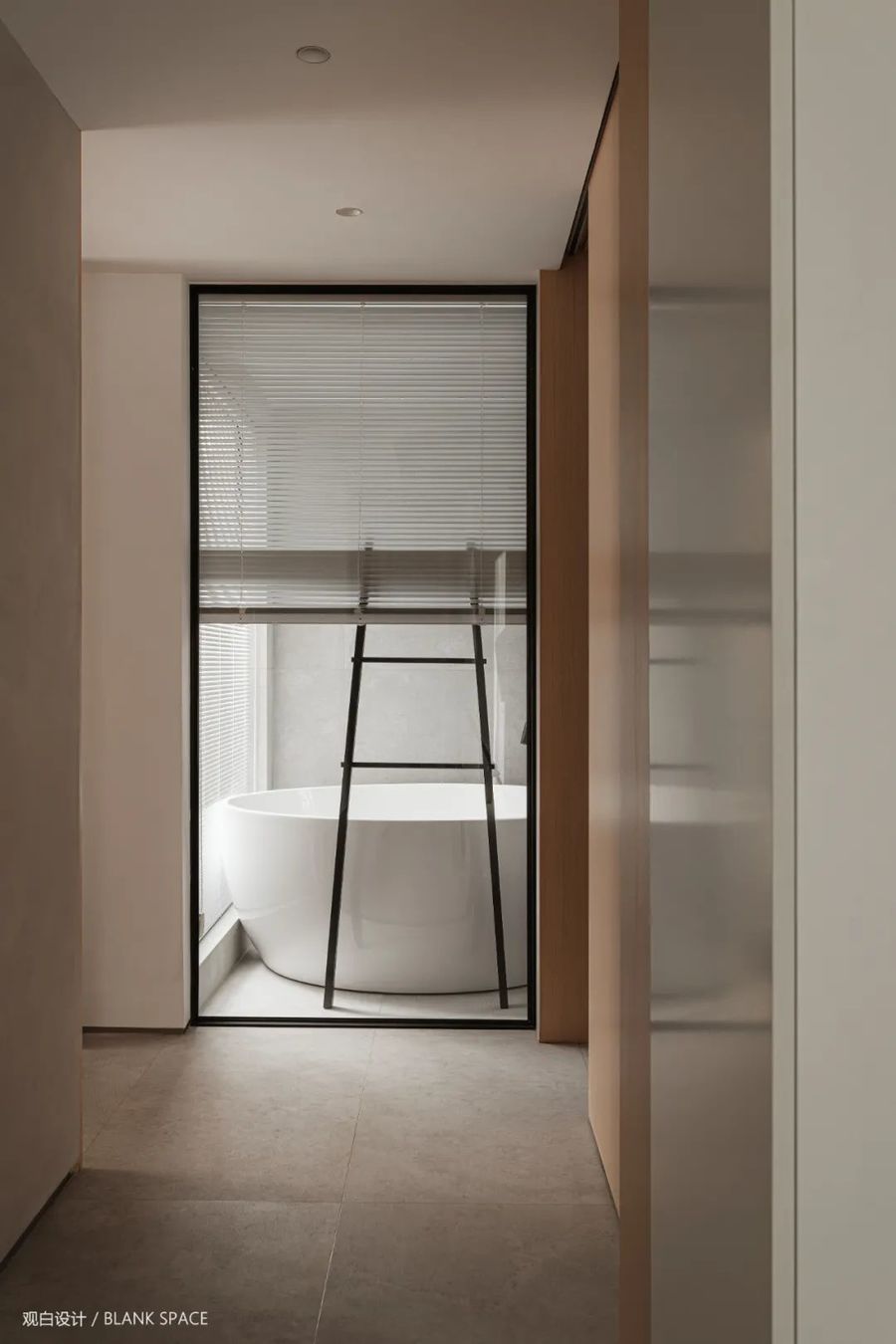
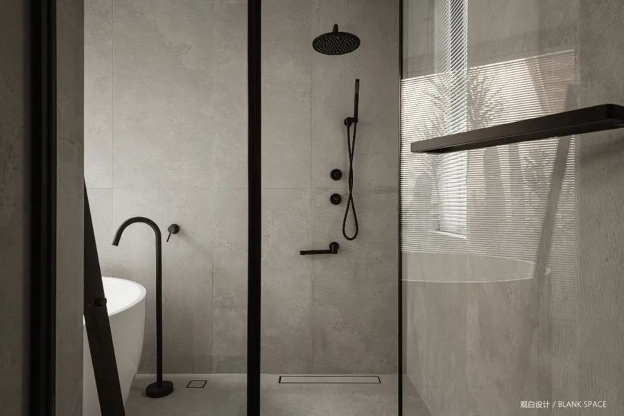
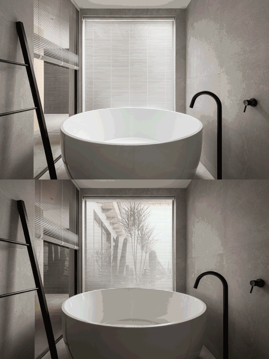
浴缸与过道的之间采用玻璃隔断,增添设计感的同时又不影响室内的采光。
The glass partition is used between the bathtub and the aisle to add a sense of design without affecting the indoor lighting.
嵌入式的淋浴花洒,外观上更加简洁大方让空间更高级,大面积的玻璃为空间提供了良好的采光,空间更通透明亮。
The embedded shower is more concise and generous in appearance, making the space more advanced. The large area of glass provides good daylighting for the space, making the space more transparent and bright.
嵌入式的淋浴花洒,外观上更加简洁大方让空间更高级,大面积的玻璃为空间提供了良好的采光,空间更通透明亮。
The embedded shower is more concise and generous in appearance, making the space more advanced. The large area of glass provides good daylighting for the space, making the space more transparent and bright.
08|阳台
BALCONY
-
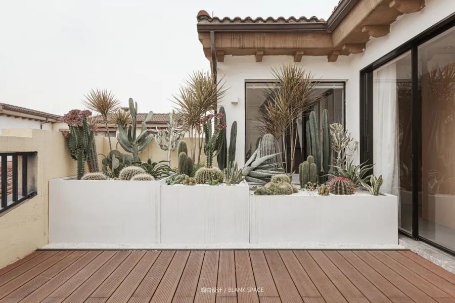
将淋浴房设计在阳台的一角,便于晾晒。
The shower room is designed in a corner of the balcony for easy drying
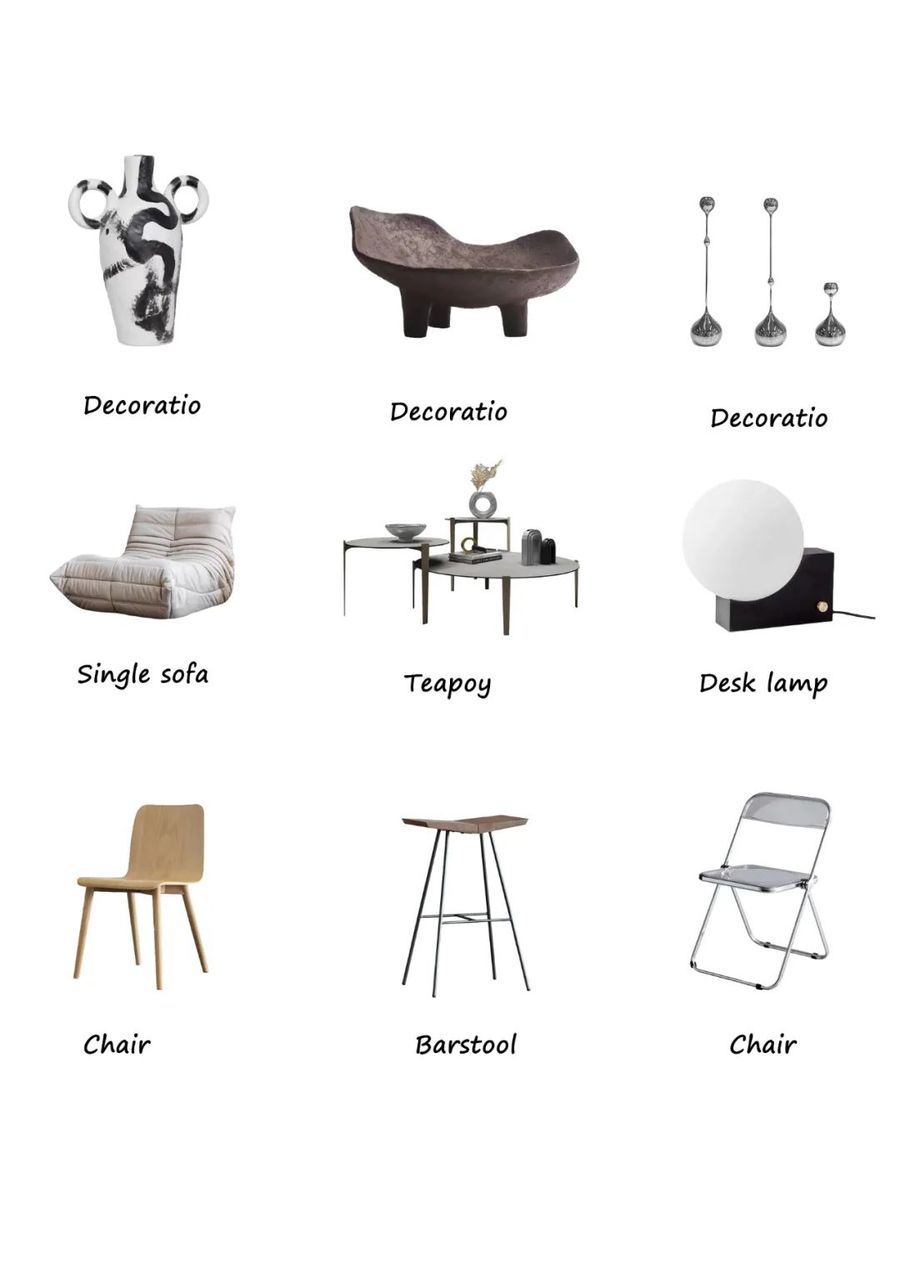
09|软装陈列
DECORATION LIST
-









评论(0)