American Italy in the interior of the new restaurant
We can describe the format of the establishment as fine dining, or a place for daily visits, with or without reason. Therefore, our task was to combine classics with light but stylish negligence, because at this junction an atmosphere is born in which you can spend your leisure time, enjoy food and relax.
Planning
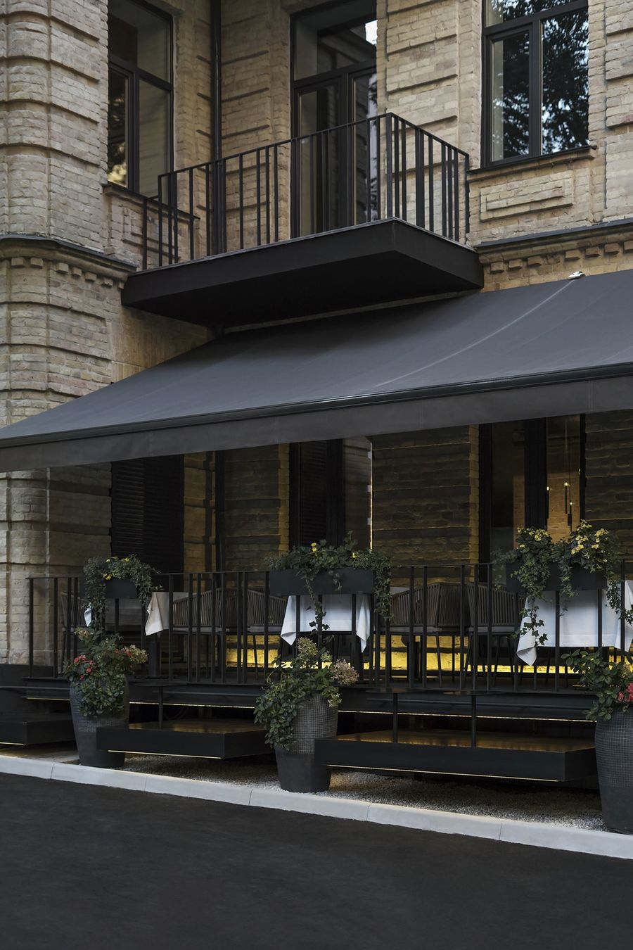
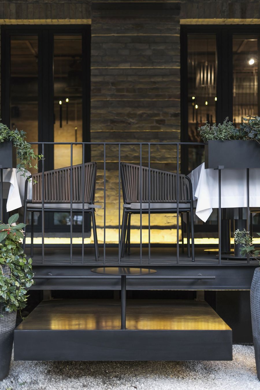
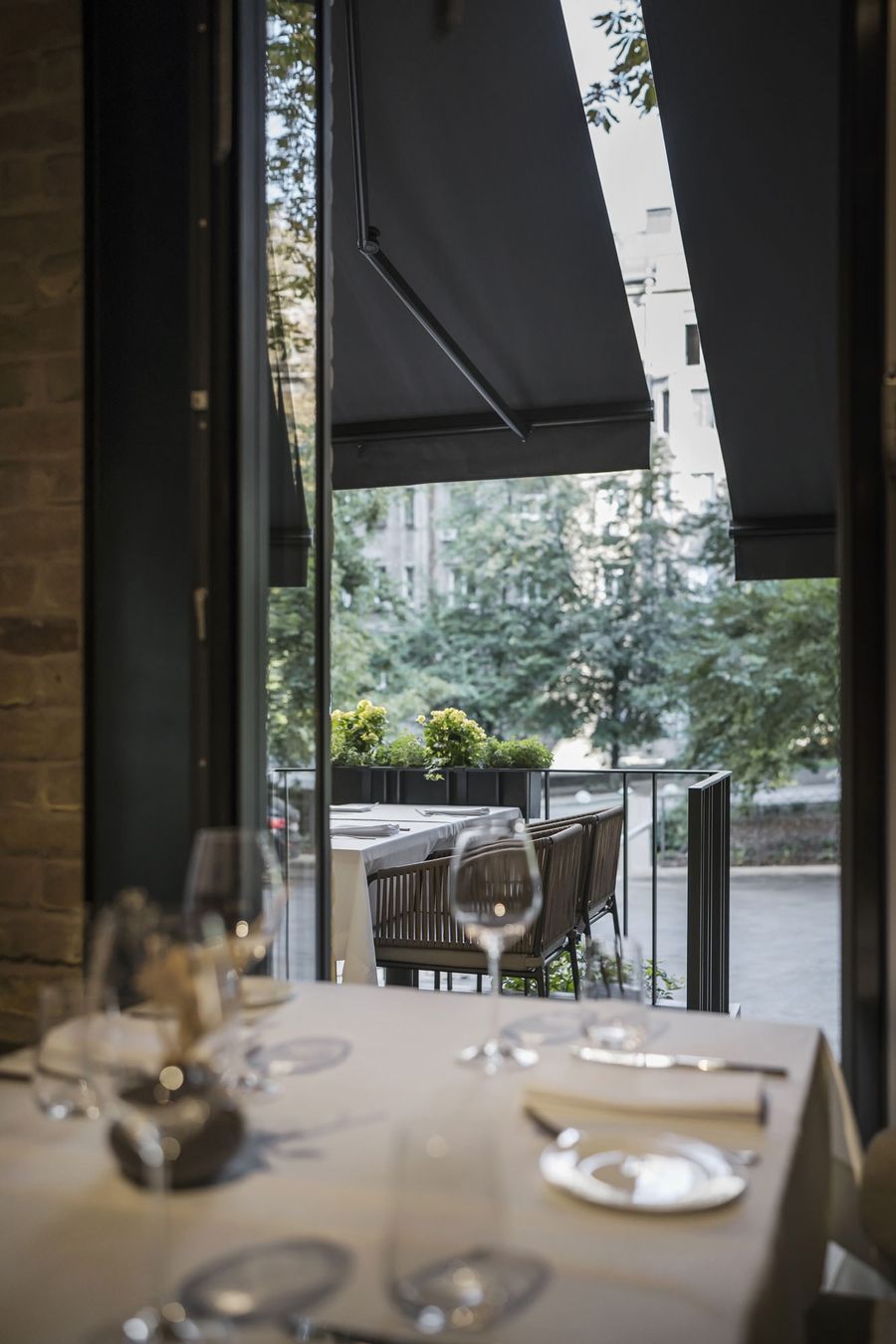
The studio team completely changed the layout of the future restaurant because, initially, the building was not supposed to have it. The area of about 250 sq.m consists of two floors, on which the main halls are, a large hall and a banquet hall, a kitchen with technical rooms and a terrace. One of the main tasks for the design team was to connect the first floor and basement by installing a staircase between them.
Concept and Realization
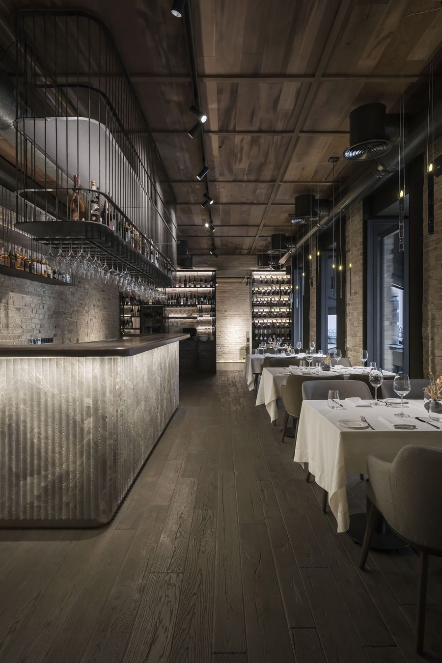
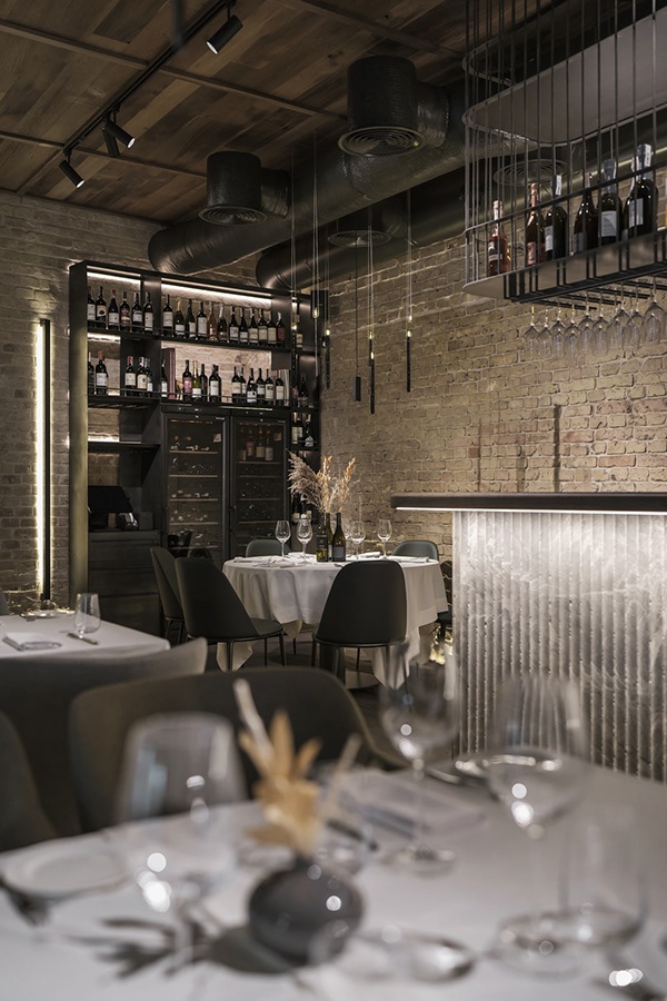
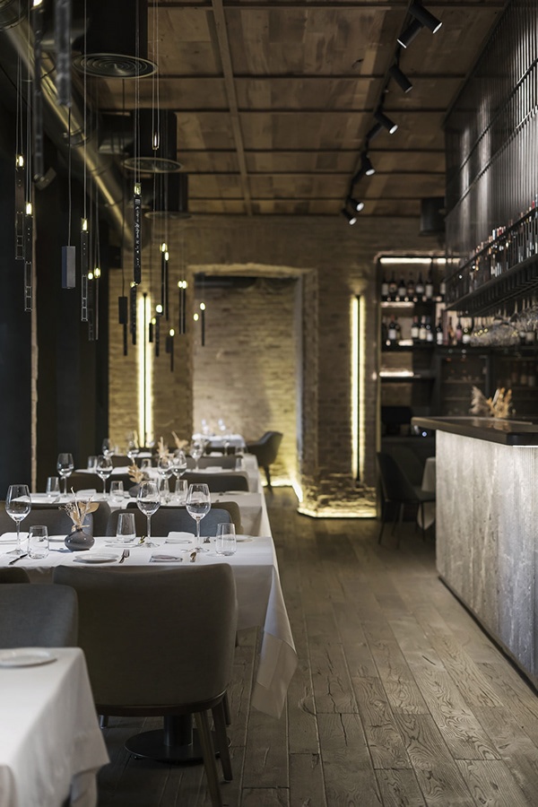
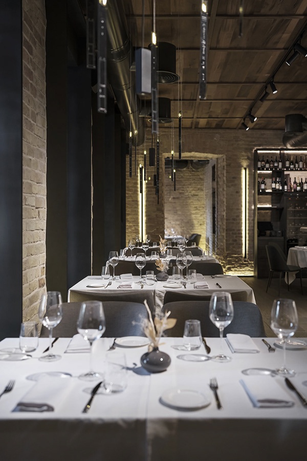
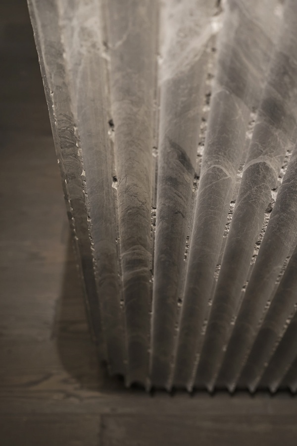
We settled on the concept of a classic Italian restaurant with a casual style that is recognizable in typical American restaurants. The designers manifested this direction for a strict interior with an abundance of asymmetric details and textures embodied by the pure brick walls, the curved floor, and the natural stone with classic flutes cracked chaotically. American Italy is about the harmonious combination of old and modern. It’s about the style of various materials and textures into one proportional design concept.
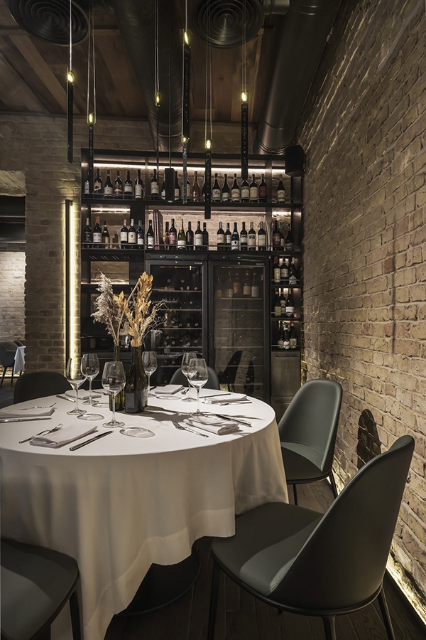
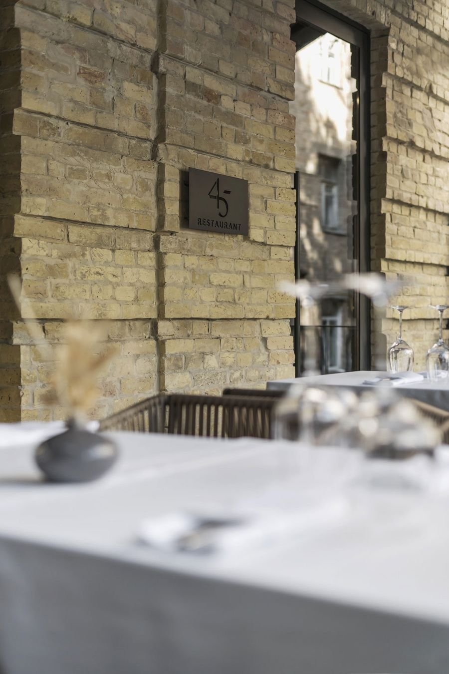
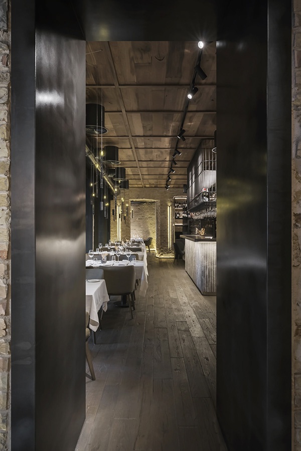
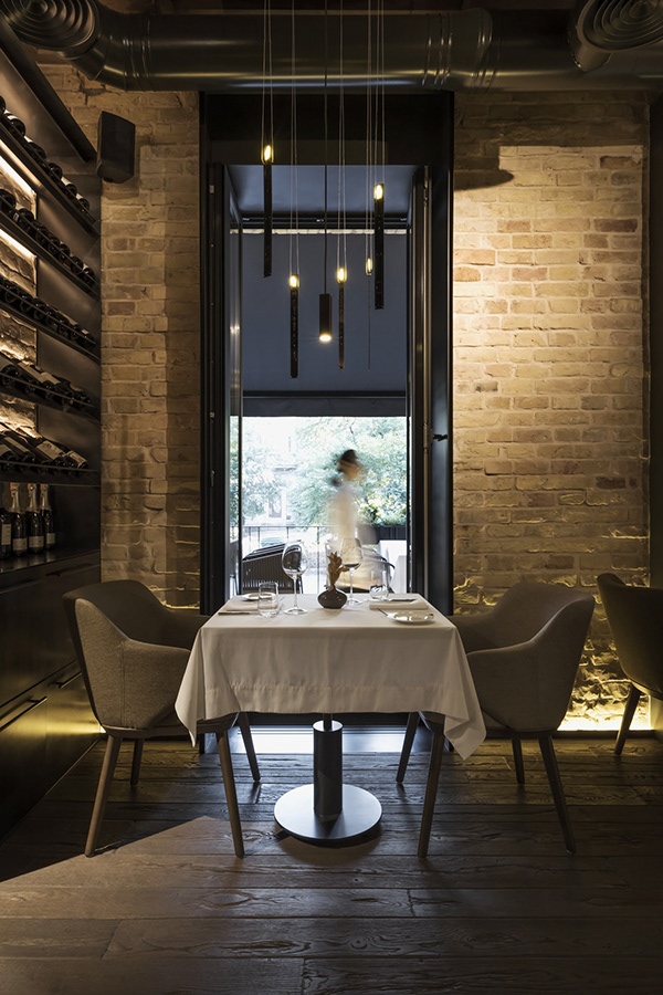
In both halls, where guests of the restaurant have dinner, the studio team laid an old oak floor. They found boards for decoration in the barns of Western Ukraine, where wood lay for many decades in anticipation of its destination. The designers cleaned it of snags, but left the surface bumpy and authentic, then toned it and made it the feature of the restaurant. Also, on the side of the “old” style, there are untouched pre-revolutionary walls, accentuated by modern lighting. The main idea was to illuminate the brick from below as much as possible. Moreover, the team additionally placed spotlights that emphasize the shape of the brick and landscaping.
Custom joinery
The central custom object of the main hall is a stone bar counter made of River marble with hanging shelves made of hot-rolled metal. The idea was to make all the shelves in the room weightless thanks to the construction of thin twigs. The team experimented with materials since they made almost all the project’s products, except for the Midj chairs. The shelving with the collection of wine is of very thin metal, which contrasts beautifully with the rough brick of the building. The thermo-ash ceiling and oak countertops are the results of the designers’ reflection on American Italy.
Location: Kyiv, Ukraine
Square meters: 250 m2
Completed: July 2021
Team: Artem Zverev, co-founder and lead architect, Arthur Sharf, co-founder and lead architect
Photographer: Andrii Shurpenkov





评论(0)