-
项目名称 | 光聿
项目地址 | 成都天府新区戛纳湾金棕榈
设计面积 | 120㎡
设计风格 | 现代极简风格
空间设计 | 观白设计工作室
施工团队 | 观白设计施工团队
户型结构 | 套四改套一
-
序
-
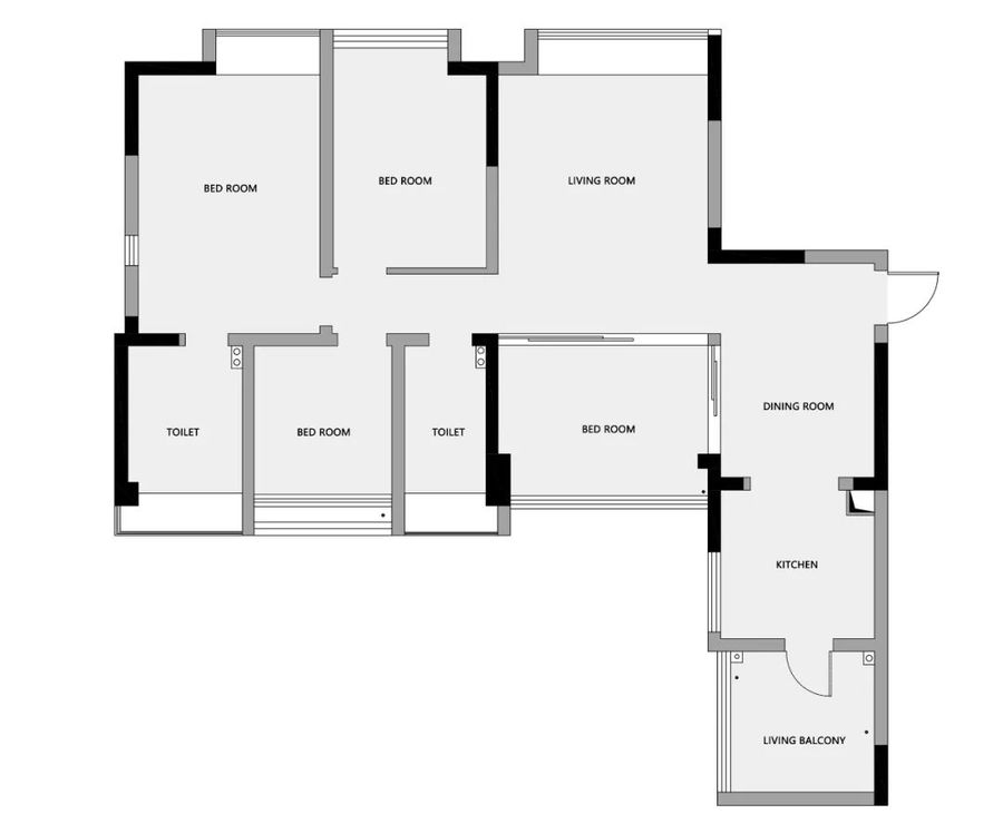
原户型是一套120㎡的四居室,屋主是90后男青年,养了一只猫,工作之余,喜欢宅在家里看书、喝咖啡、逗猫;屋主对新时代的生活品质与个性的追求,使得不被传统思想所束缚;四居室爆改一居室屋主希望空间可以更具个性化,宽敞开阔,同时让猫咪也可以在空间畅通无阻。
设计师将“窥探”的设计手法发挥到极致,开放式处理,打破空间界限,重组空间格局,视线可以在空间中畅通无阻。
The original house type is a four bedroom house with an area of 120 ㎡. The owner is a young man from the post-90s generation who has a cat. After work, he likes to stay at home reading, drinking coffee and teasing the cat; The owner's pursuit of the quality of life and personality in the new era makes him not bound by traditional ideas; At the same time, it is hoped that the four rooms can be more spacious and unobstructed.
The designer gives full play to the design method of "snooping", open processing, breaking the space boundary, reorganizing the space pattern, and the line of sight can be unobstructed in the space.
-
▼平面规划
PLANE PLANNING
■客户需求:
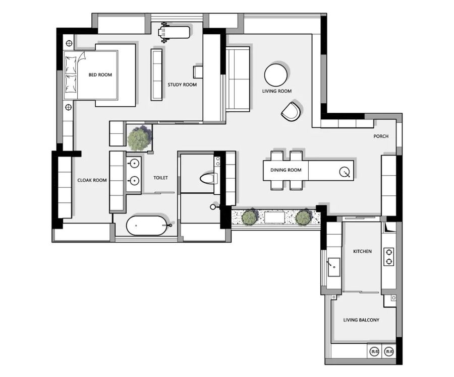
①.只需要一个大卧室,一个卫生间。
②.需要一个独立的书房,用作临时办公或玩游戏放松的空间。
③.需要一个明亮宽敞的卫生间,干湿分离。
④.衣物较多所以需要足够的储物空间和独立的衣帽间,满足收纳需求。
⑤.中西厨都要,需要一个岛台。
⑥.喜欢简洁干净的现代极简风格,色调上喜欢黑白灰色,沉着稳重。
■改造要点:
①.原始餐厅空间较为局促,将餐厅与旁边卧室打通,加大餐厅区域,满足客户对西厨、岛台、鞋柜的需求。
②.在客厅与书房之间的墙体开窗洞,增强空间之间的互动性。
③.拆除主卧室与次卧室之间的墙体,中间用柜体作隔断划分空间,左右留通道,方便进出的同时让空间更通透,增强空间互动性。
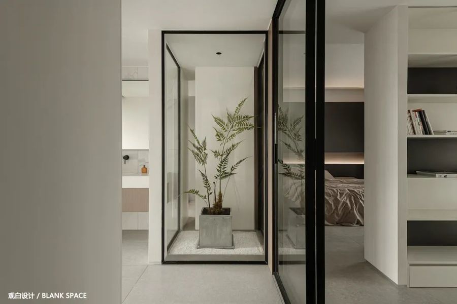
④.入户正对面的过道区域造景的手法,让它成为空间的一大亮点,主卧的门用玻璃推拉门代替,增强空间的采光与通透性。
⑤.将原来主卫的空间改做衣帽间,拆除与卫生间之间的墙体,用衣柜代替墙体,既分隔空间又增加储物功能,衣帽间与卫生间间隙,让空间变得更有趣味。
⑥.将原本卫生间扩大,酒店式卫生间四分离设计,干湿分区,使用上互不打扰,马桶与淋浴区的落地大玻璃,引入采光,让空间更通透。
▁
01|玄关
HALLWAY
-
适当的留白让空间更具想象力
使画面更有空间悠远意境和想象空间
-
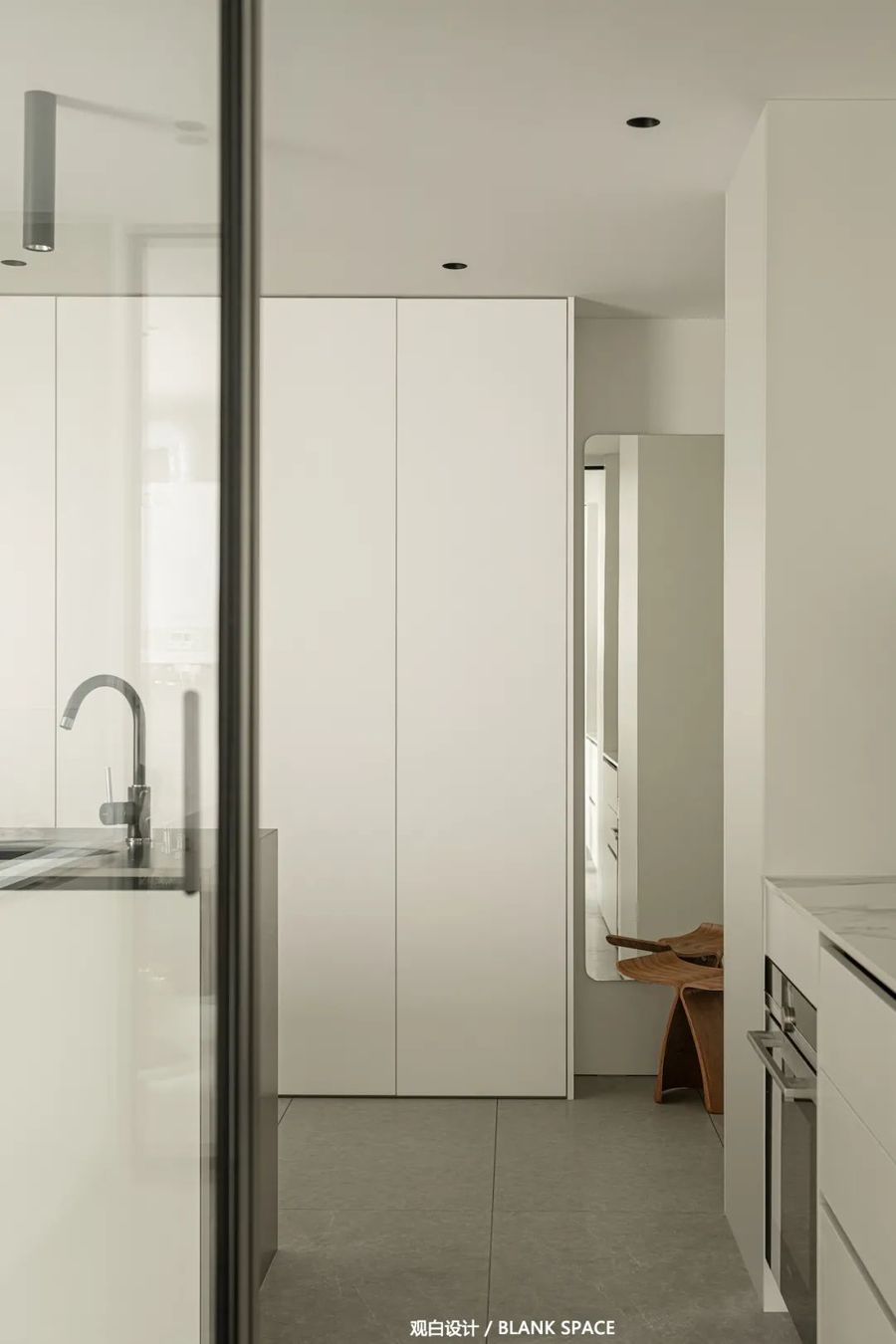
入户处预留900mm做鞋柜,到顶的玄关柜设计,为空间增加了更多的收纳空间;白色的柜子与顶面,让空间显得干净明亮,空出的区域放置穿衣镜与换鞋凳,解决出入家门时的需求。
900mm shoe cabinet is reserved at the entrance, and the porch cabinet at the top is designed to increase more storage space for the space; The white cabinet and top surface make the space appear clean and bright. The empty area is equipped with dressing glasses and shoe changing stools to meet the needs of entering and leaving the house.
▁
02|厨房
KITCHEN
-
留白手法让空间更通透
化繁为简增加空间底蕴
-
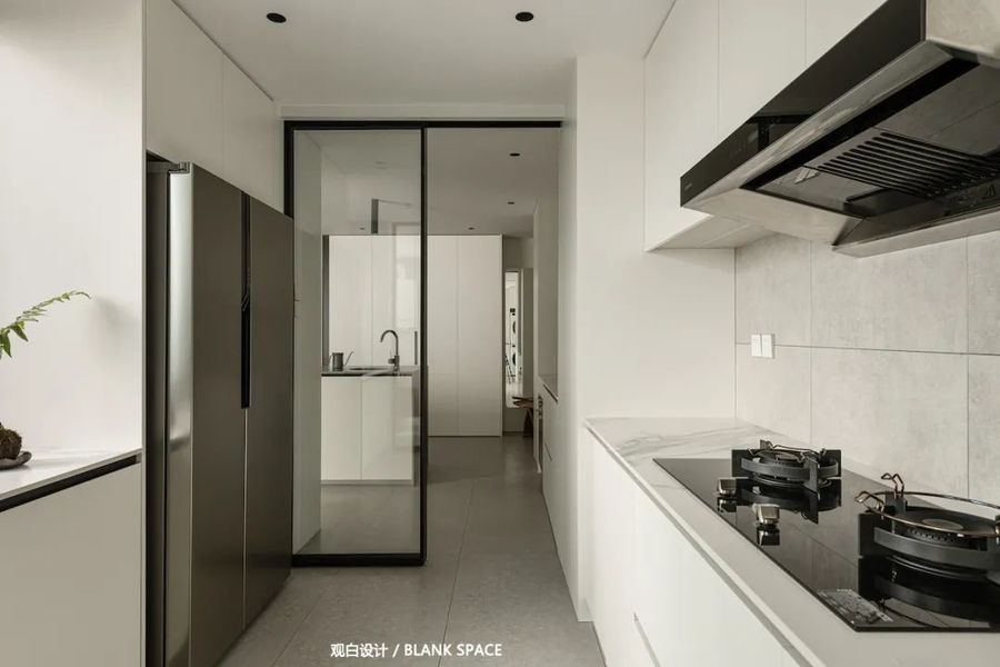
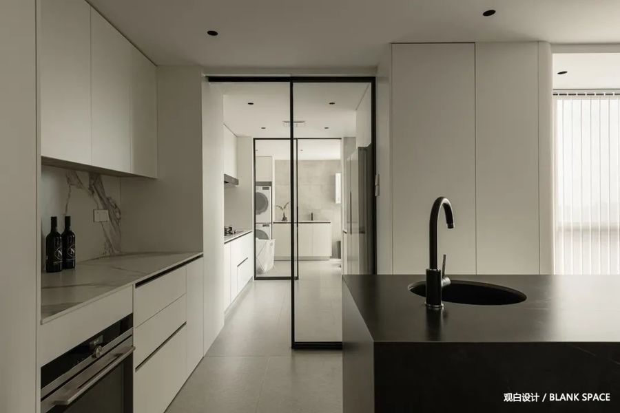
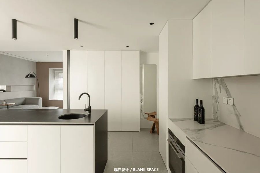
厨房以白色为基色,双一字布局增加操作台面,动线流畅,白色橱柜采用无拉手设计,让橱柜显得更有质感,干净简洁。
The kitchen takes white as the base color, the double one word layout increases the operating table, and the moving line is smooth. The white cabinet adopts the handle free design, which makes the cabinet look more textured, clean and concise.
家电嵌入式设计让空间利用最大化,极窄边框玻璃推拉门隔断中厨的油烟,又让空间之间保持简洁贯通,无地轨的设计让打扫起来更便利。
The embedded design of household appliances maximizes the use of space. The extremely narrow frame glass sliding door separates the oil fume from the Chinese kitchen, and keeps the space concise and connected. The trackless design makes it more convenient to clean.
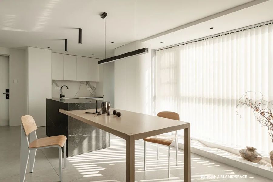
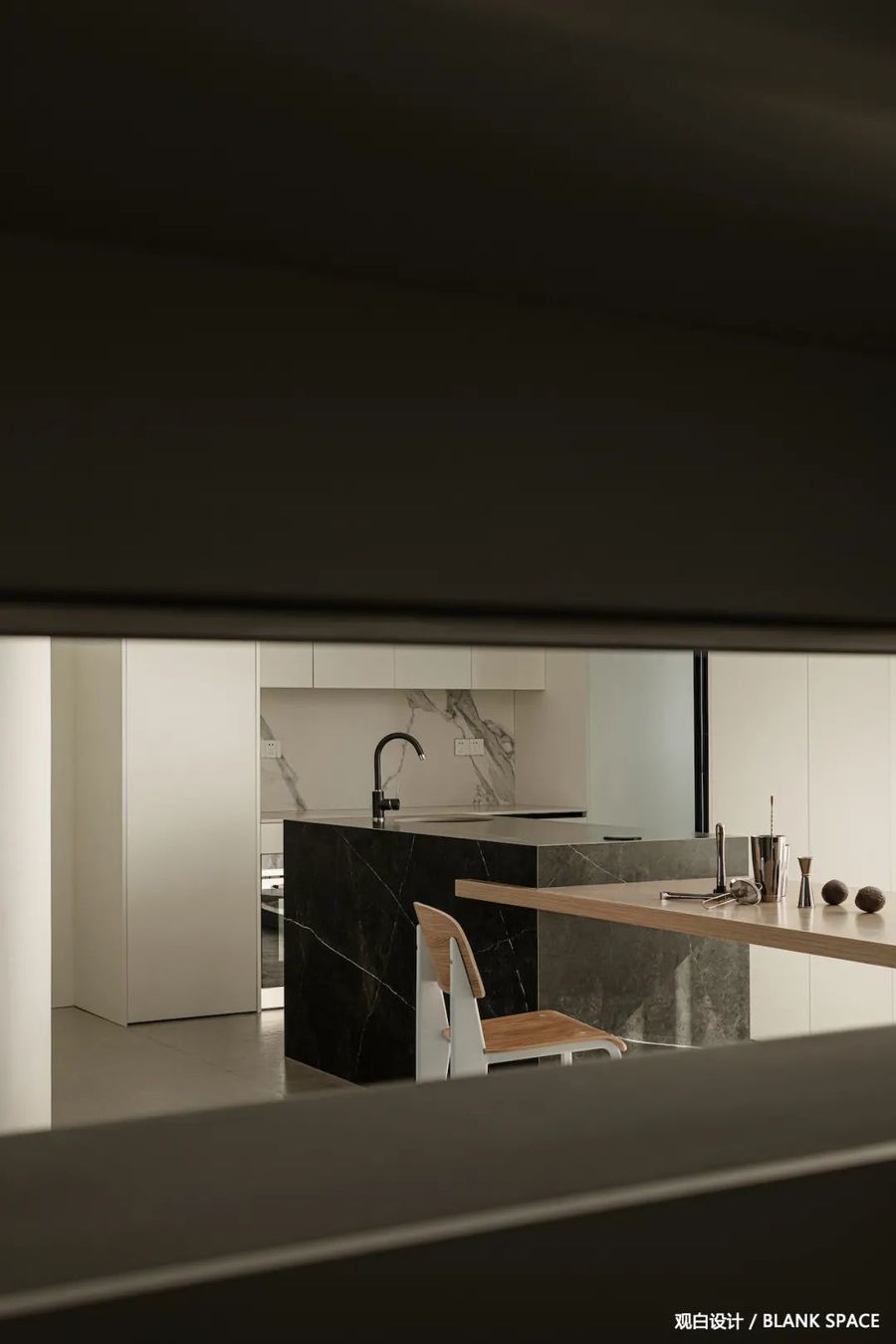
西厨与餐厅融为一体,简洁的顶面与柜体流畅的线条,让空间更加简洁明了,岛台的设计增加操作与储藏空间。
The western kitchen is integrated with the restaurant. The simple top surface and smooth lines of the cabinet make the space more concise and clear. The design of the island increases the operation and storage space.
▁
03|餐厅
RESTAURANT
-
斑驳的光影、侘寂的造景
让空间增添几分枯寂感
-
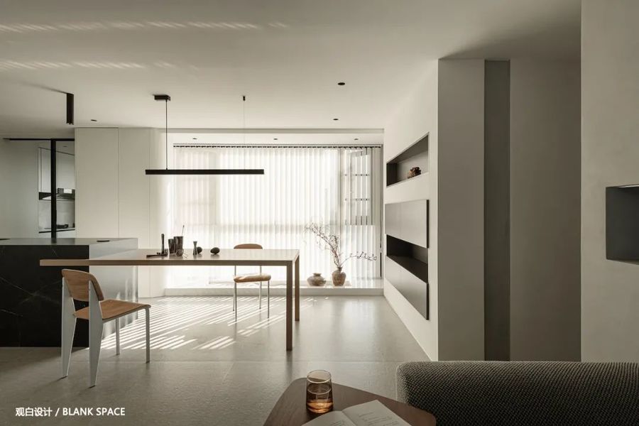
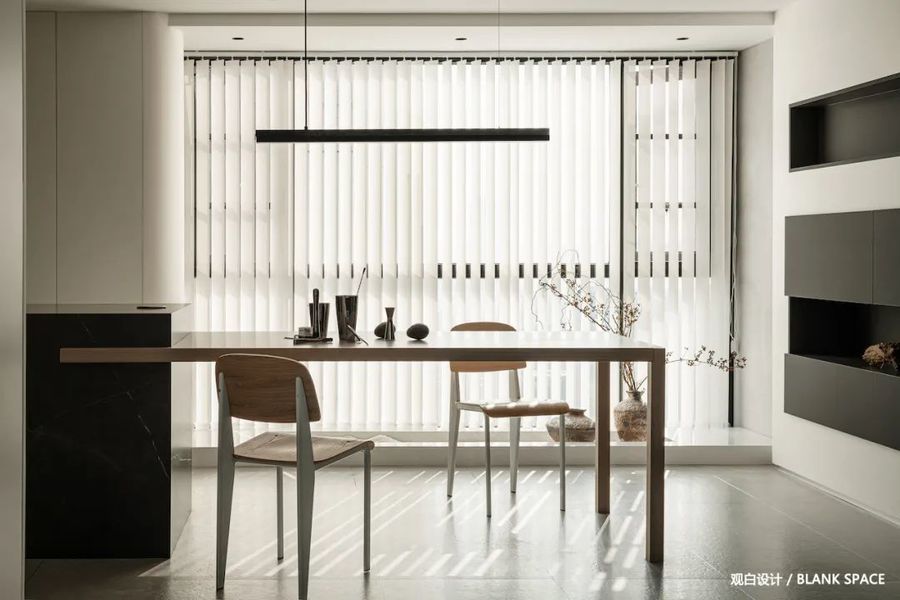
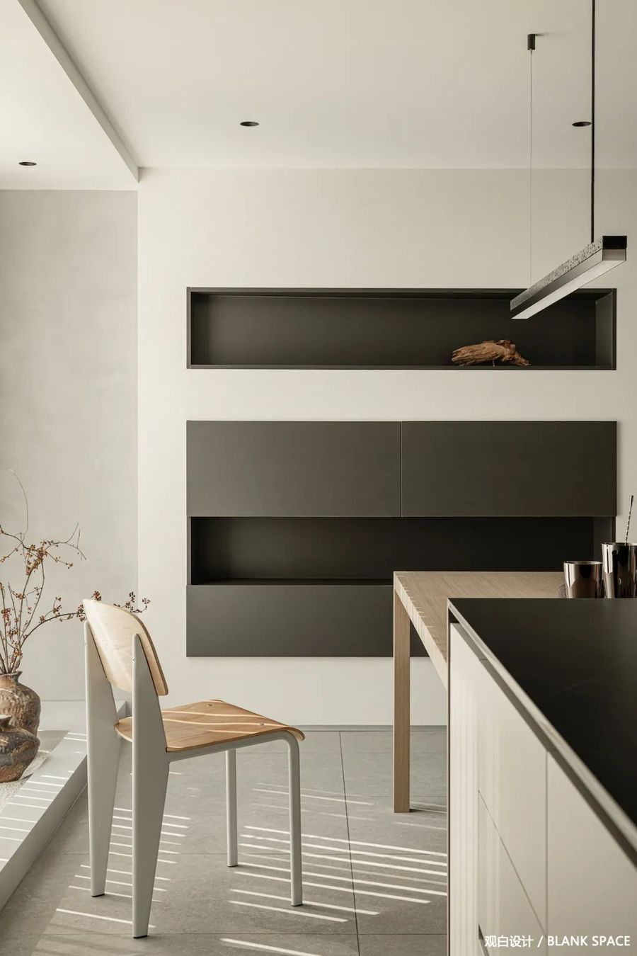
大面积的留白设计让空间更具想象力,原木色的餐桌与黑色的岛台提升空间的色彩,让空间更具设计感。
The large-area blank design makes the space more imaginative. The log colored dining table and the black island enhance the color of the space and make the space more sense of design.
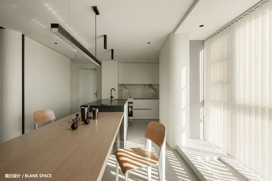
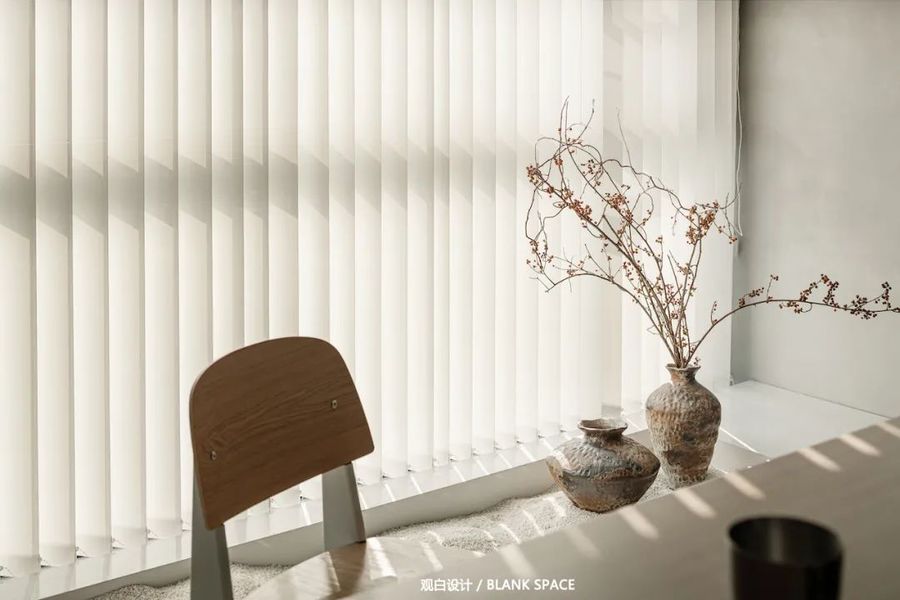
落地窗为餐厅提供了充足的采光,竖百叶在阳光的洗礼后留下了自己的印迹,光从百叶的缝隙透进来,仿佛整个空间上了一层柔光滤镜。
The floor to ceiling windows provide sufficient daylighting for the restaurant. The vertical shutters leave their own footprints after the baptism of the sun. The light penetrates through the gaps of the shutters, as if a layer of soft light filters were on the whole space.
餐岛一体化设计,形成洄游动线,成为空间的中心点,岛台增强餐厅的功能性,提升餐厅的高级感。
The integrated design of the dining Island forms a migratory moving line and becomes the central point of the space. The island platform enhances the functionality of the restaurant and enhances the sense of high-grade of the restaurant.
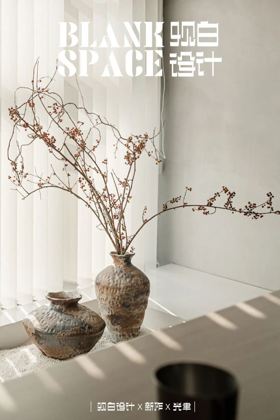
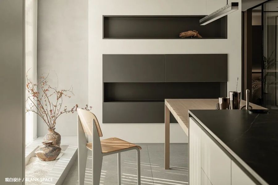
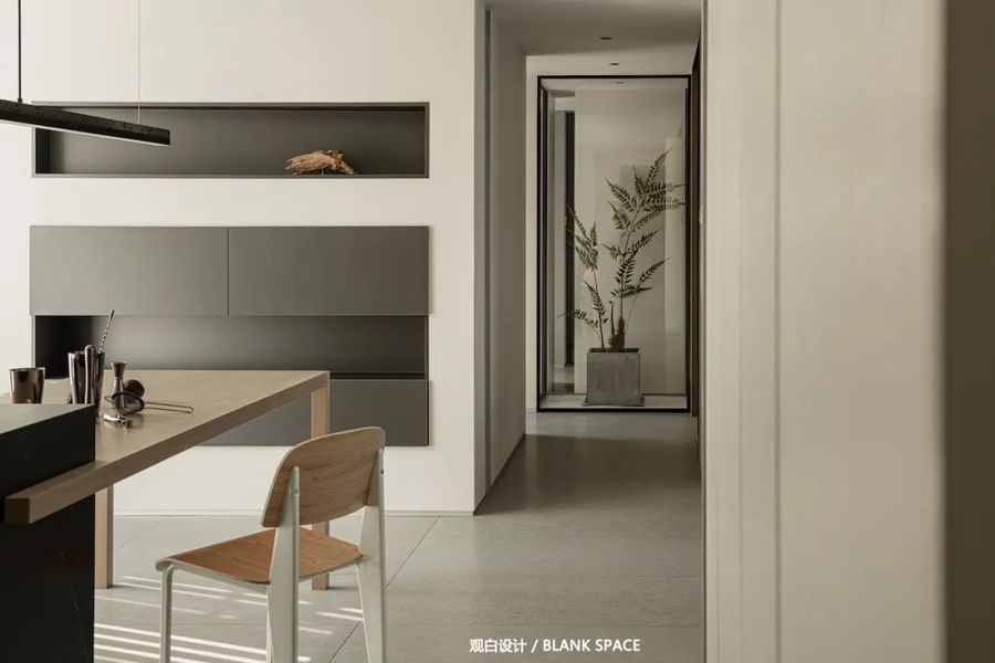
餐边柜的设计黑白相间,错落有致,开放格让空间更具立体感。左侧的造景细白的沙石,配上斑驳的花瓶与枯枝,增添几分侘寂的枯寂感。
The design of the side cabinet is black-and-white, scattered, and the open grid makes the space more three-dimensional. The fine white sand and stone on the left, coupled with mottled vases and dead branches, add a sense of silence.
过道尽头的绿植让空间活了起来,把自然气息融入室内,高级感满满。
The green plants at the end of the corridor make the space live, and integrate the natural atmosphere into the interior, with a full sense of high-grade.
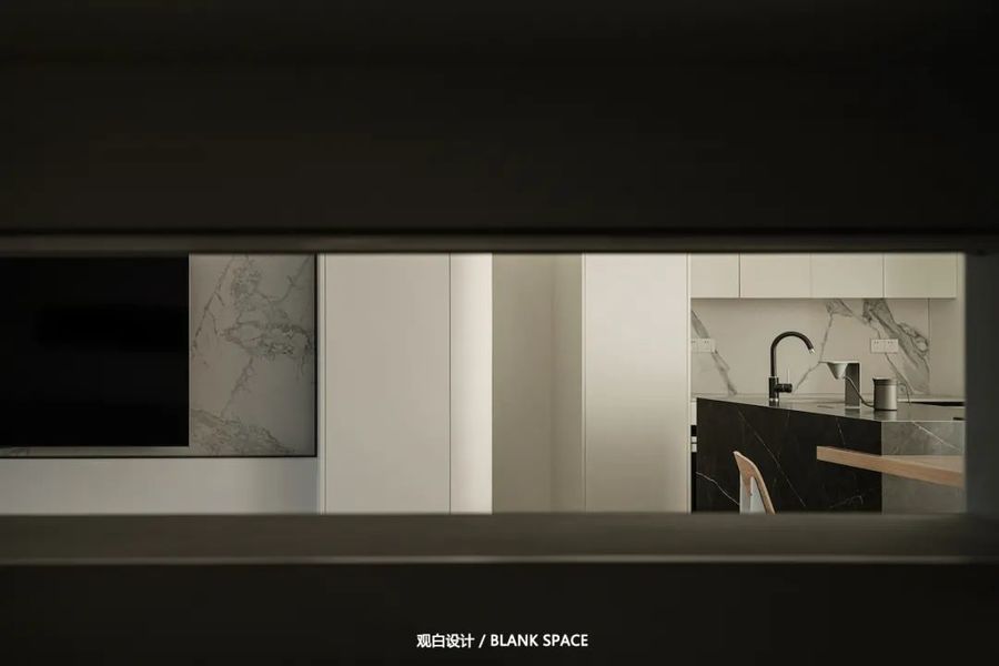
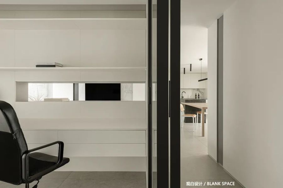
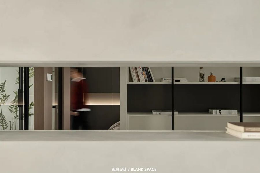
从书房可以观测到餐厅的一角,让空间之间的互动更有趣。
A corner of the restaurant can be observed from the study, which makes the interaction between spaces more interesting.
▁
04|客厅
A LIVING ROOM
-
通过不同材质的对比
勾勒出空间的层次
-
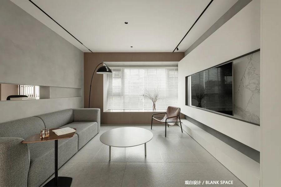
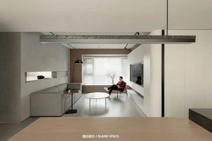
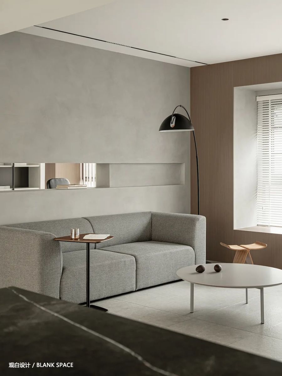
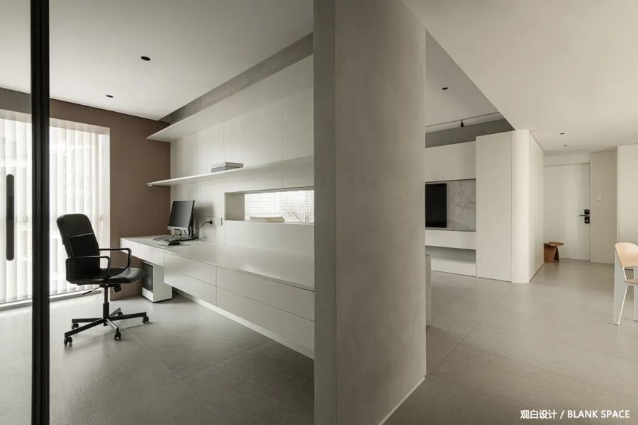
客厅采用无主灯设计,空间整体更加简洁轻盈。灰色水泥漆与木纹饰面丰富了空间的质感。在客厅和书房之间的缝隙,增加了空间的美感和层次感,也更通透。
The living room adopts the design of no main lamp, and the overall space is more concise and light. Gray cement paint and wood grain finish enrich the texture of the space. The gap between the living room and the study increases the sense of beauty and hierarchy of the space and is more transparent.
简洁的电视墙整体给人感觉干净舒服,悬浮式设计让空间的层次感更加明了,中间镂空设计可放置一些小物品。
The simple TV wall as a whole feels clean and comfortable. The suspended design makes the sense of hierarchy of the space clearer. The hollow design in the middle can place some small items.
客厅与书房之间的留缝处理,让空间之间的交流畅通无阻,灰色的水泥漆搭配同色系的沙发让空间更具质感。
The seam treatment between the living room and the study makes the communication between the spaces unimpeded. The gray cement paint and the sofa of the same color make the space more textured.
▁
05|书房
STUDY ROOM
-
开放式处理
增强空间之间的互动性
-
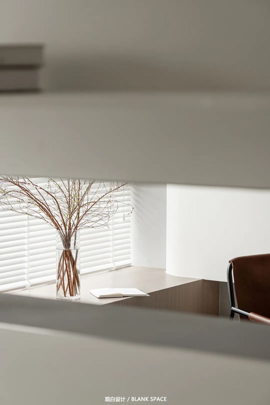
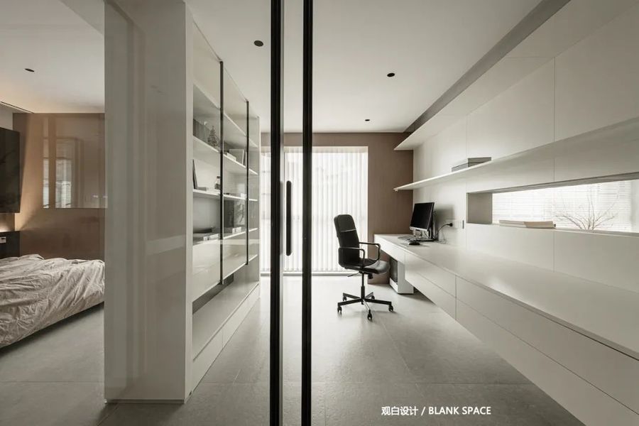
书房与卧室中间采用书柜作分隔,两边留出过道的设计,既区分了两个空间,又让空间显得更加通透简洁。
The study and bedroom are separated by bookcases, and the design of aisles on both sides not only distinguishes the two spaces, but also makes the space more transparent and concise.
卫生间门采用了无轨道式幽灵门,营造私密空间的同时,同样凸显装饰功能。同时卫生间也省去了门套的设计,从卫生间内部进行收口处理,从外观上让幽灵门更极简高级。
The bathroom door adopts trackless ghost door, which not only creates a private space, but also highlights the decorative function. At the same time, the design of door pocket is also omitted in the bathroom, and the closing treatment is carried out from the interior of the bathroom, which makes the ghost door more simple and advanced in appearance.
书房和客厅之间的“窥探”设计手法让彼此之间相互呈现,玻璃推拉门给了空间更通透的视觉环绕;色调上延续了餐厅空间以白色为基调,木饰面的加入让空间多了几分温度。
The "snooping" design between the study and the living room presents each other, and the glass sliding door gives a more transparent visual surround to the space; The tone continues the restaurant space, with white as the basic tone, and the addition of wood veneer makes the space a little more warm.
▁
06|卧室
BEDROOM
-
暗黑的色调
让空间充满神秘与安稳
-
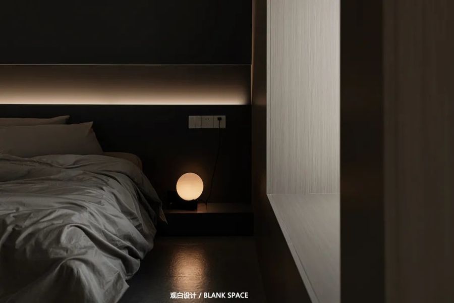
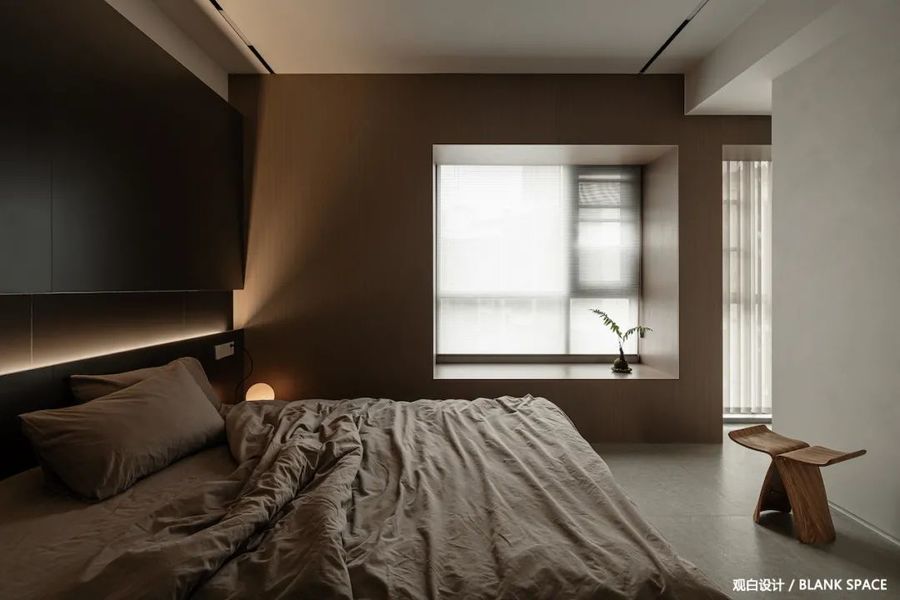
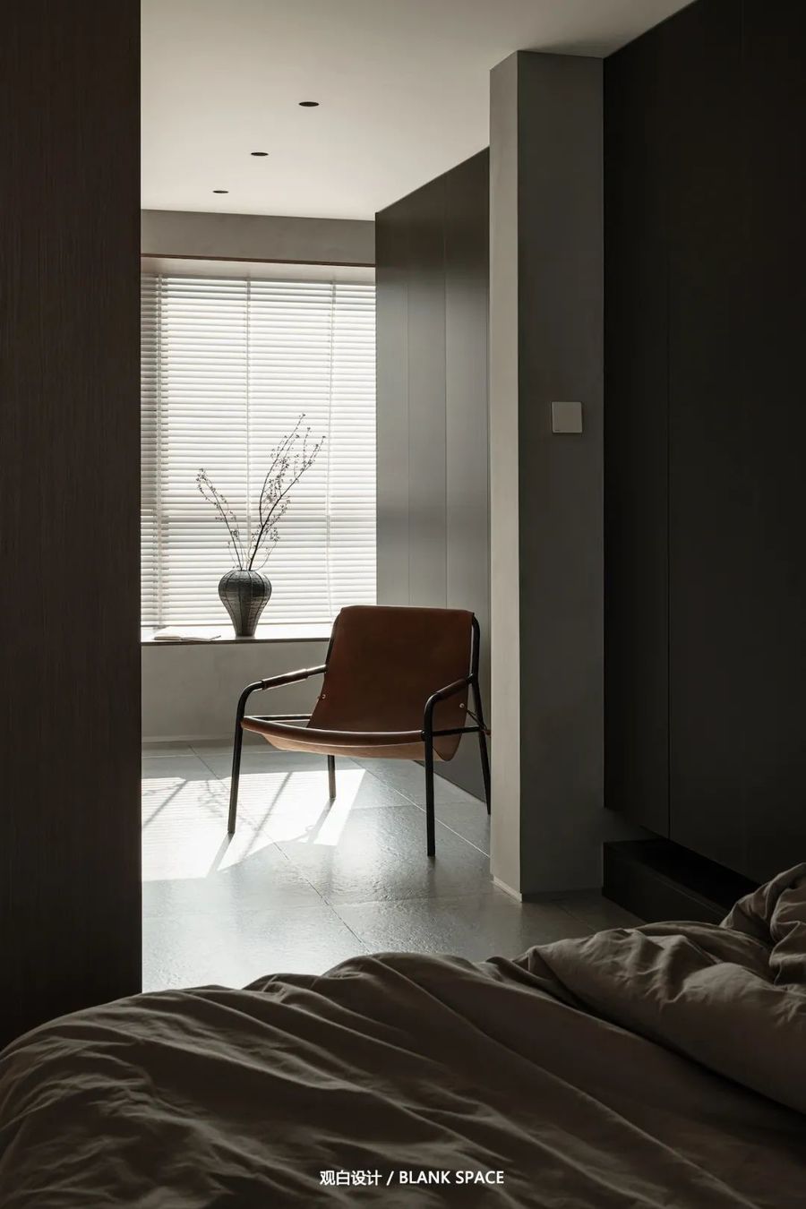
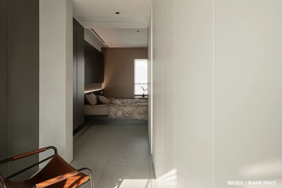
主卧以暗色为主,暗色更能获得内心的平静,床头背景采用了黑色墙板饰面更具高冷的气质,温润的木饰面与暖色的灯光,冷峻中又透出家的温度,打造出舒适的睡眠空间。
The master bedroom is dominated by dark color, which can better obtain inner peace. The bedside background adopts black wallboard finish, which has a higher and cold temperament. The warm wood finish and warm light can reflect the temperature of home in the cold, creating a comfortable sleeping space.
傍晚打开暖黄色的灯光,营造出整个卧室的静谧舒适的氛围。
Turn on the warm yellow light in the evening to create a quiet and comfortable atmosphere in the whole bedroom.
大面积的玻璃让视线在空间中畅通无阻。
The large area of glass makes the line of sight unobstructed in the space.
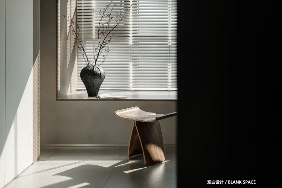
卧室左侧是衣帽间,双排衣柜为屋主提供了更多的储物空间,阳光的撒入让空间更具惬意与温暖,闲暇时刻可以在这看看书,享受休闲的时光。
On the left side of the bedroom is the cloakroom. The double row wardrobe provides more storage space for the owner. The sunshine makes the space more comfortable and warm. You can read books here and enjoy leisure time in your spare time.
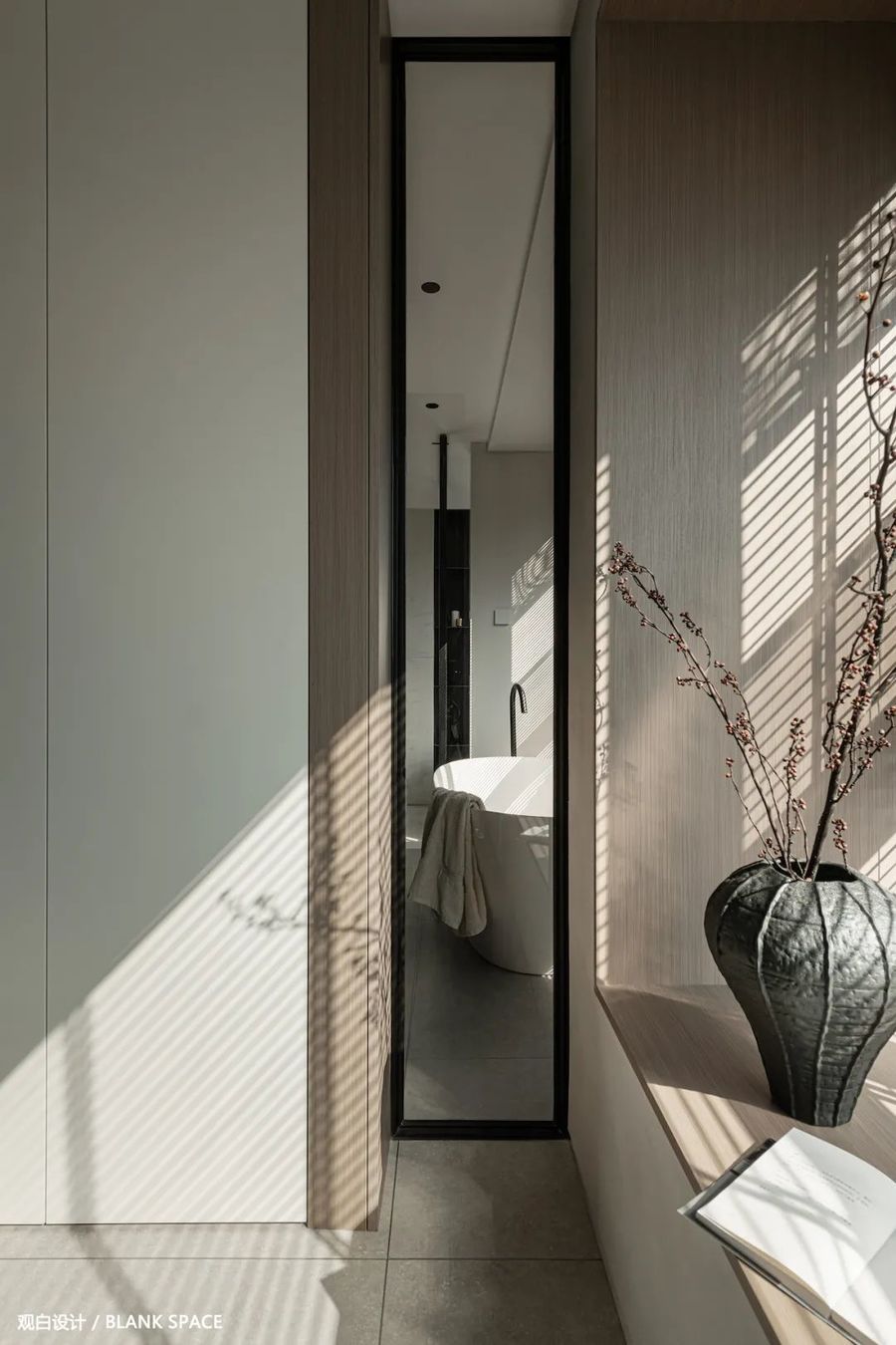
衣帽间左右柜子不同色,让空间色调上更有层次,左侧留缝处理,让视觉可以看到景观绿植的一角。靠窗的一侧与浴室之间采用玻璃阻隔,呈现似有若无的浪漫感。
The left and right cabinets in the cloakroom have different colors, which makes the space more layered in color. The left side is left with seams, so that the vision can see a corner of the landscape green plants. The window side and the bathroom are separated by glass, which seems to have a romantic feeling.
阳光透过百叶窗过滤出更柔和的光线,形成温暖惬意的一角。
The Sunlight filters out softer light through the shutters, forming a warm and comfortable corner.
▁
07|卫生间
TOLIET
-
光影重叠,明暗交织
分离式设计使用上互不干扰
-
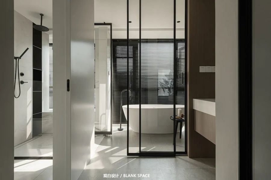
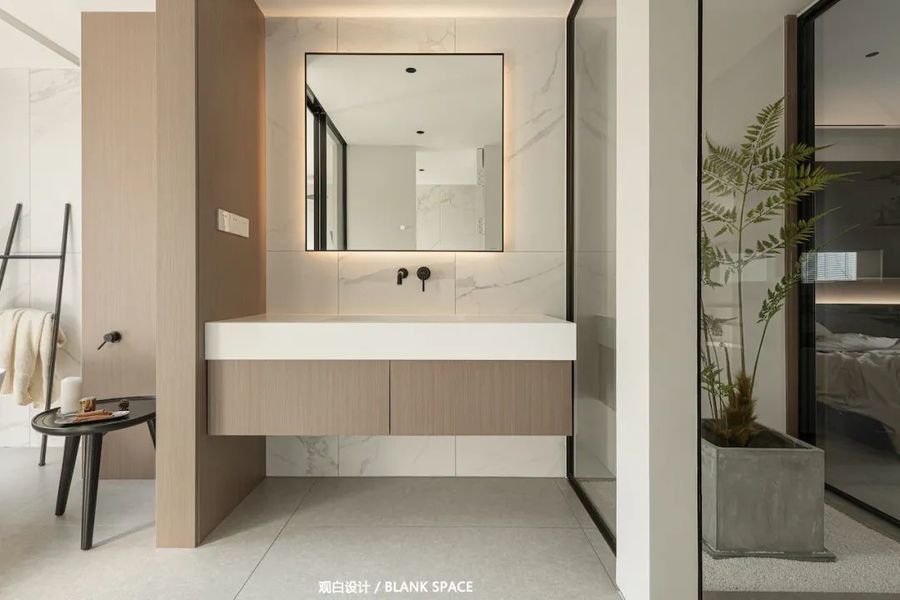
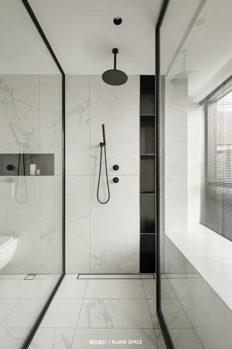
酒店式卫生间设计,采用四分离,各个空间互不干扰;色调上以白色为主,大面积的玻璃引入光线,呈现出干净、高级的氛围,让空间更通透,给人整体流畅的现代感觉;极窄边框的玻璃推拉门,无地轨无门套的设计让空间轻盈,同时分隔了浴室与洗面台也不阻挡阳光,让洗面台区域也能获得更多的光线。
The design of hotel toilet adopts four separation, and each space does not interfere with each other; The color tone is mainly white, and the large area of glass introduces light, presenting a clean and advanced atmosphere, making the space more transparent and giving people a smooth modern feeling as a whole; The glass sliding door with extremely narrow frame and the design without ground rail and door pocket make the space light. At the same time, it separates the bathroom from the washstand without blocking the sun, so that the washstand area can also get more light.
以白色为基色打造出明亮简洁的空间,木饰面和木色柜体带来自然的气息,入墙式水龙头高级细致,看起来更加简洁美观;右侧使用玻璃与景观分隔,无论在身处哪个区域都能欣赏到景观。
White is used as the base color to create a bright and simple space. The wood finish and wood color cabinet bring a natural flavor. The wall faucet is advanced and detailed, which looks more concise and beautiful; The right side is separated from the landscape by glass, so you can enjoy the landscape no matter where you are.
独立的淋浴间与马桶间,中间采用玻璃做隔断,在使用上互不干扰,接天连地的玻璃隔断让空间更加通透明亮嵌入式淋浴与隐藏式地漏将极简发挥到极致,黑色壁龛设计简洁,方便洗浴用品的存放。
The independent shower room and toilet room are separated by glass in the middle, which does not interfere with each other in use. The glass partition connected to the sky and the ground makes the space more transparent. The embedded shower and hidden floor drain give full play to the extreme simplicity. The black niche design is simple and convenient for the storage of bath products.
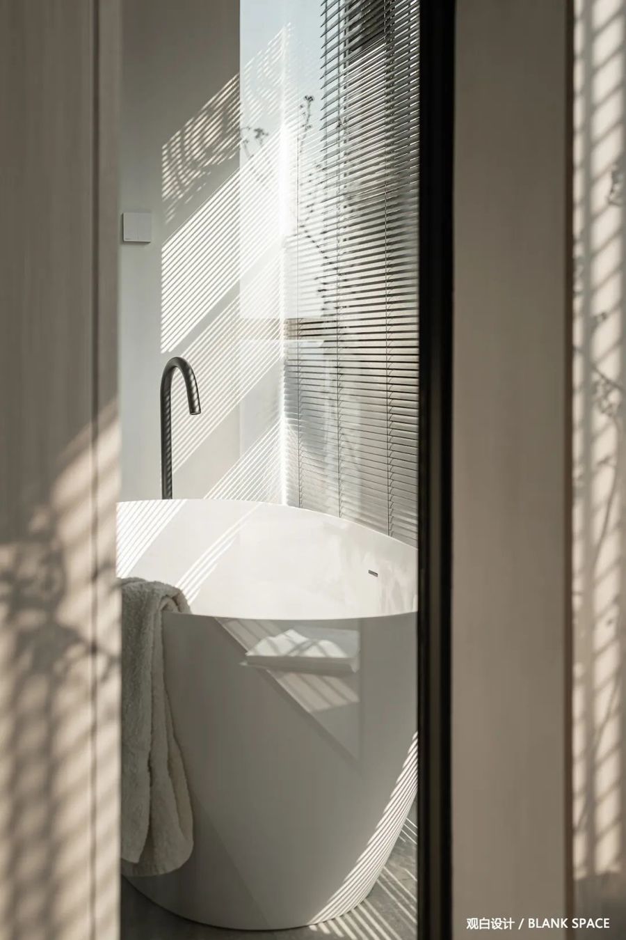
通过衣帽间与浴室的玻璃隔断让人对另一个空间形成窥探,可以看见彼此一角,阳光透过百叶窗斑驳的光影洒在浴缸上,名副其实的日光浴。
Through the glass partition between the cloakroom and the bathroom, people can peep into another space. They can see one corner of each other. The sun shines on the bathtub through the mottled light and shadow of the shutters, which is a real sunbath.
▁
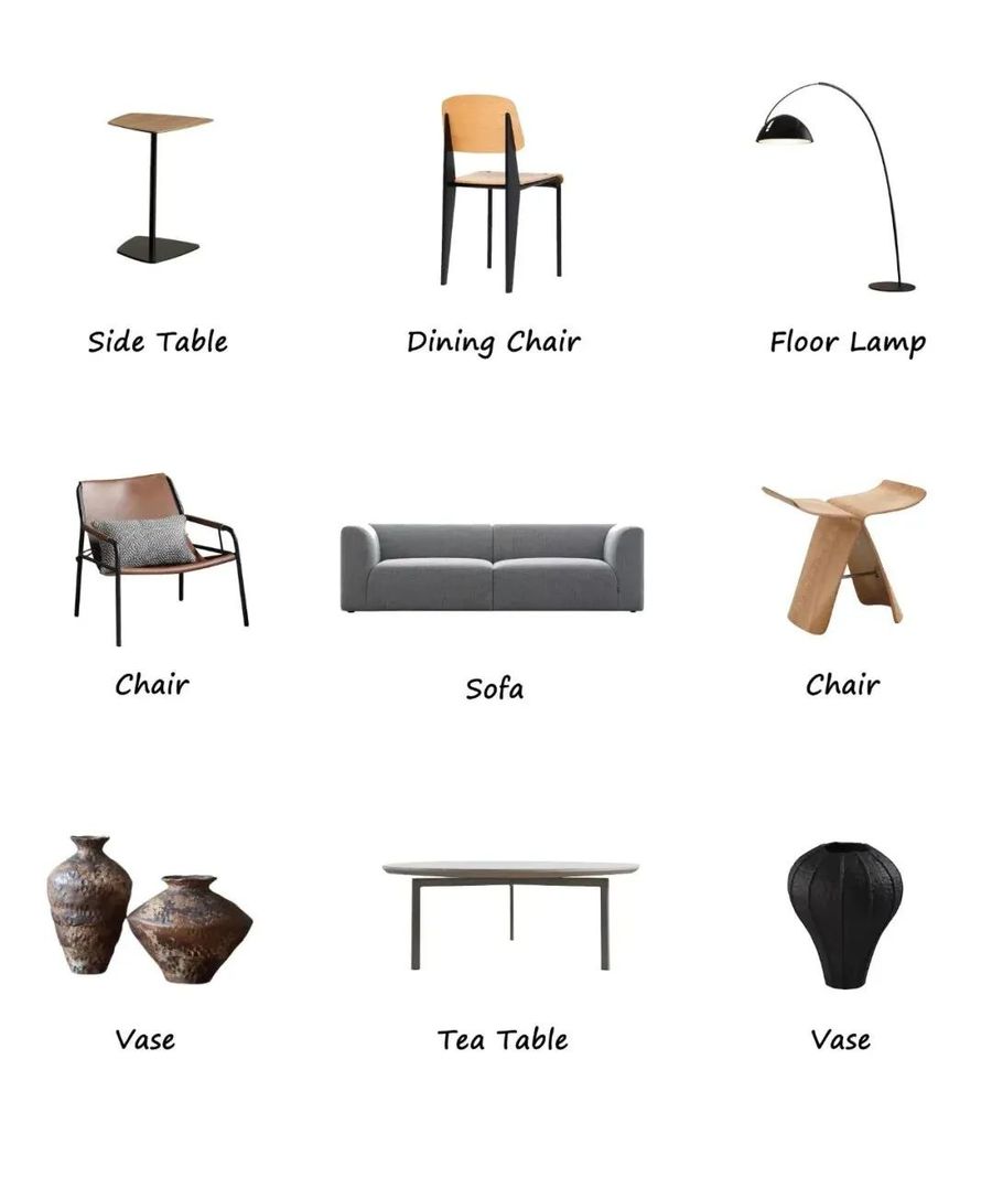
08|软装陈列
DECORATION LIST
-
个性化追求
选择自己心仪的








评论(0)