当传统的办公空间难以掀起内心的波澜,如何让现代化办公通过"点线面"的重新交融和组合,变成一种态度和追求。平淡之中也蕴含着理想和自由,工作也能成为一种享受。
When the traditional office space is difficult to stir up inner waves, how to make the modern office re-integrate and combine "points, lines and planes" becomes an attitude and pursuit. Insipidity also contains ideals and freedom, and work can also become a kind of enjoyment.
去繁就简,围绕"开放、简约、舒适"来设计的设计宗旨。用简洁的设计语言来打通以往局促的空间,营造出舒心自在的办公环境。
To simplify the complex, around the "open, simple, comfortable" to design the design purpose. Use a simple design language to open up the previously cramped space and create a comfortable office environment.
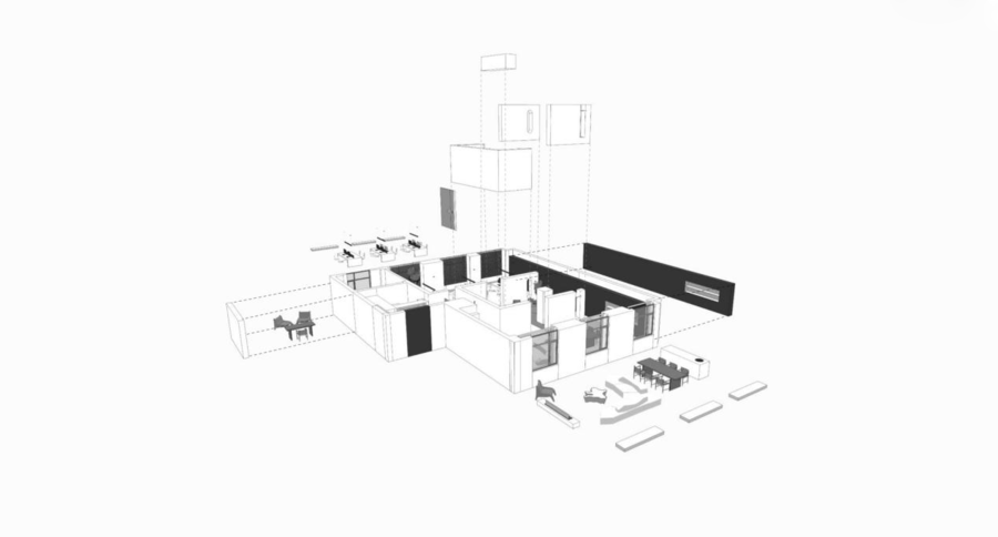
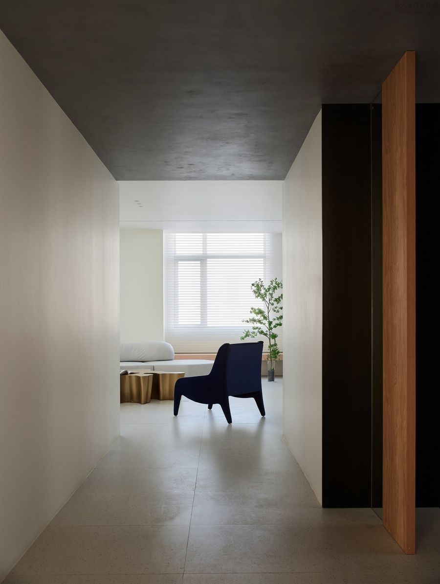
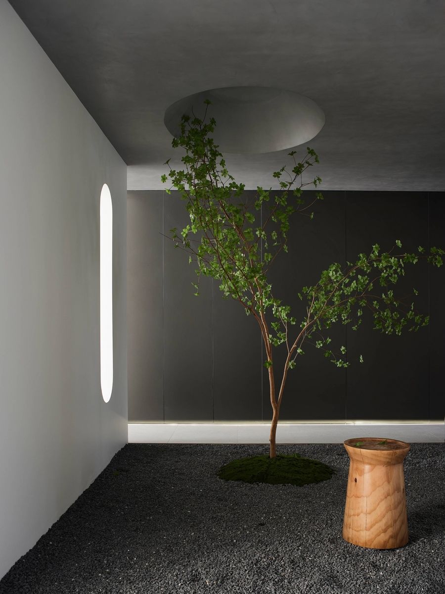
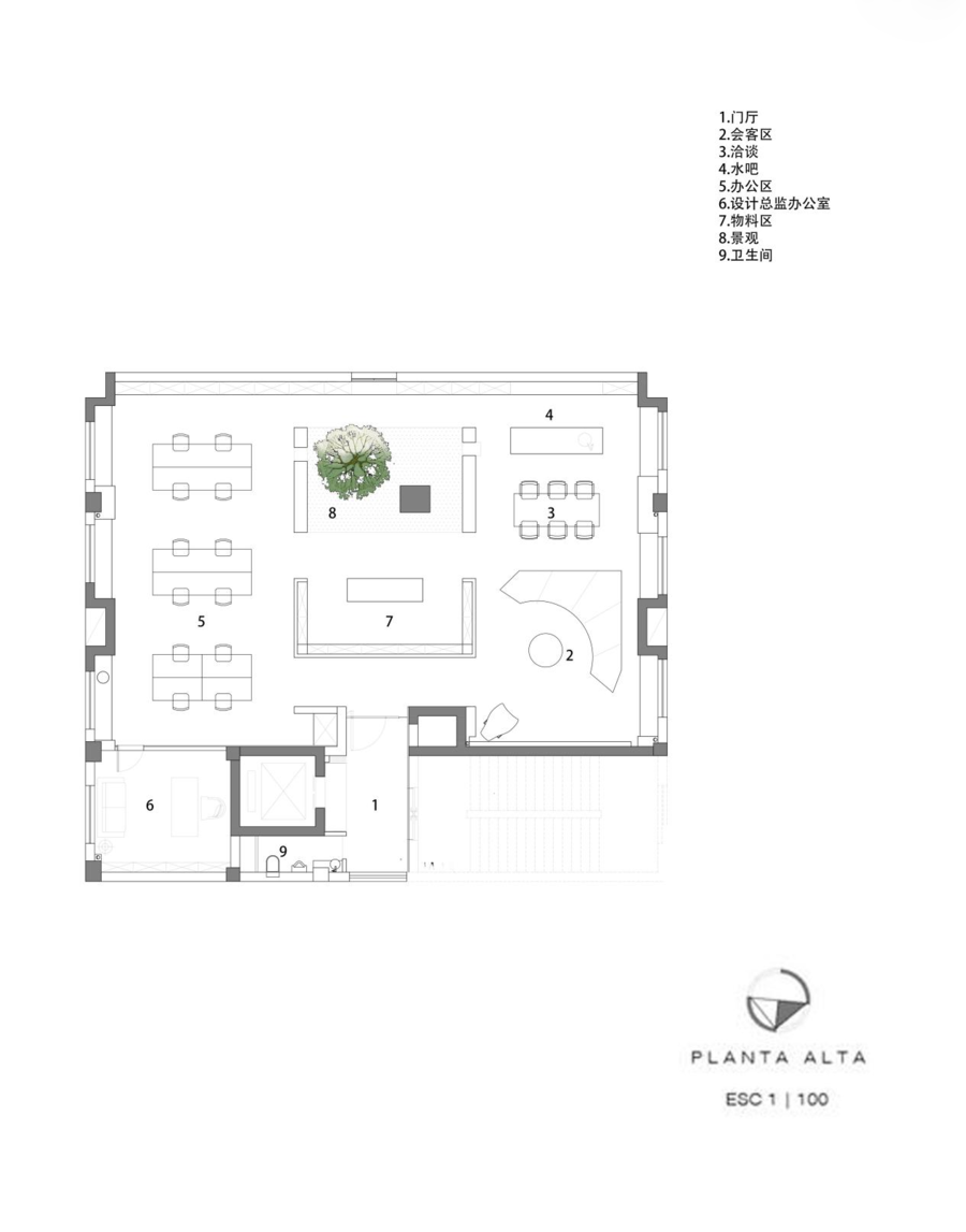
此次设计在原有老的场地上重新进行改造。为打破传统办公室容易给人造成封闭压抑的感觉,重新构建"开放通透,简洁舒适"的核心理念。空间规划上,采用"三段式设计",移步换景,会客+景观+办公三大区块,层层递进,彼此相连又各自独立。既不会给人突兀呆板之感,又兼顾到办公的一切功能属性。
The design is renovated on the original old site. In order to break the feeling of being closed and depressed in traditional offices, the core concept of "openness, transparency, simplicity and comfort" is rebuilt. In terms of space planning, the "three-stage design" is adopted, and the scenery is changed every step of the way, and the three blocks of reception + landscape + office are progressive, connected to each other and independent of each other. It will not give people a sudden and rigid feeling, but also take into account all the functional attributes of the office.
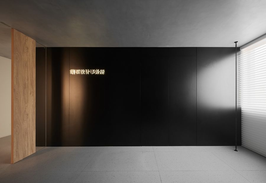
门厅在设计上希望能准确抓住并且传达整个项目的设计语言。所以整个材料体系由内而外延伸,以点线面的主元素来呼应整个项目。
The foyer was designed to capture and convey the design language of the entire project. Therefore, the entire material system extends from the inside to the outside, echoing the entire project with the main elements of point, line and surface.
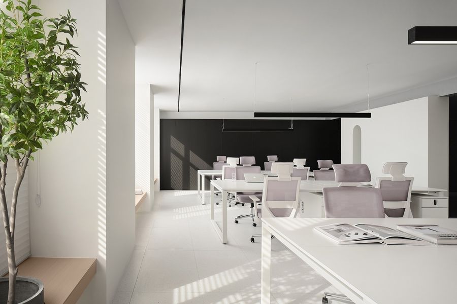
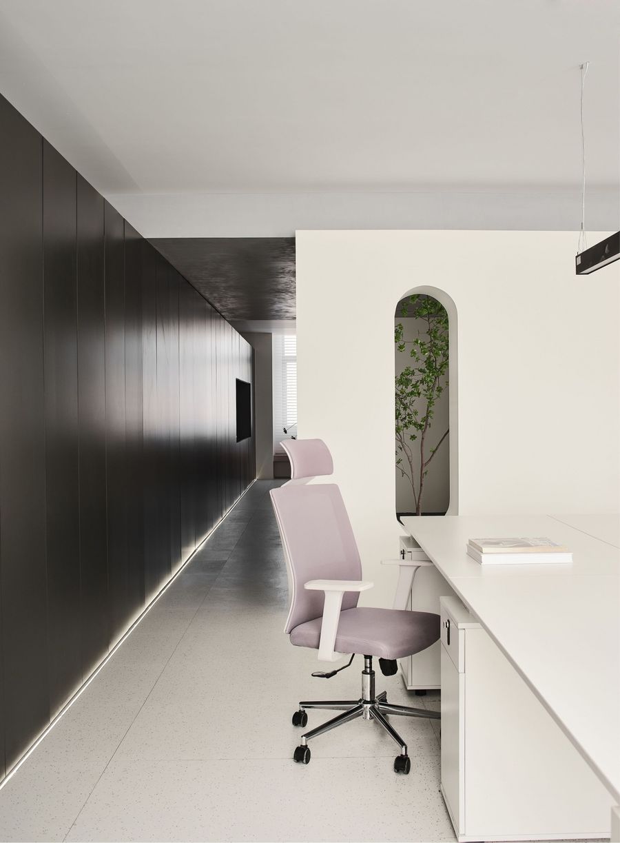
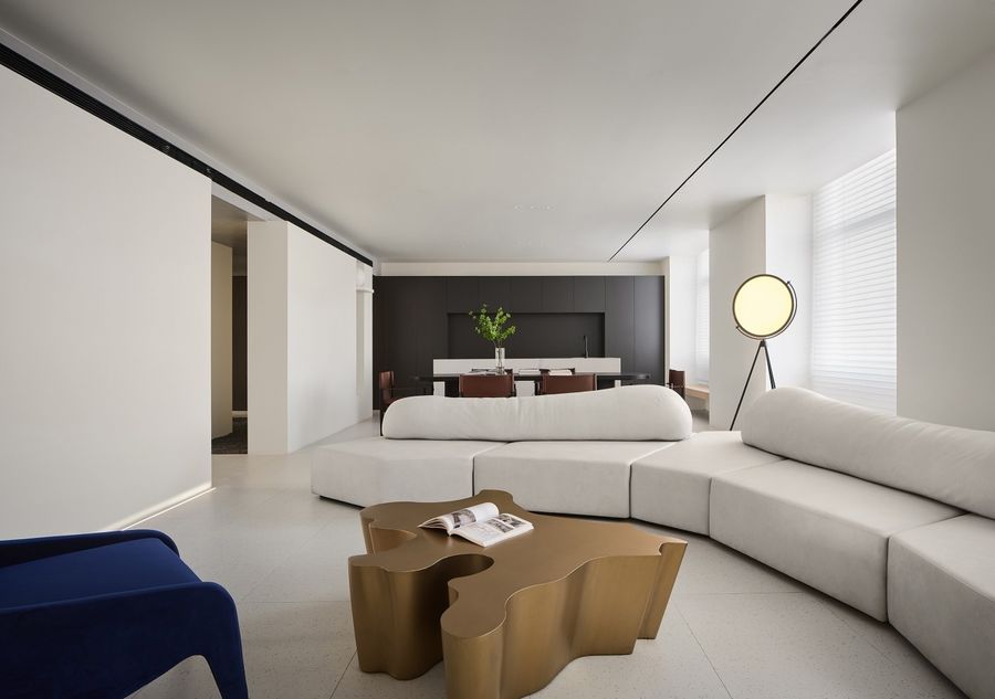
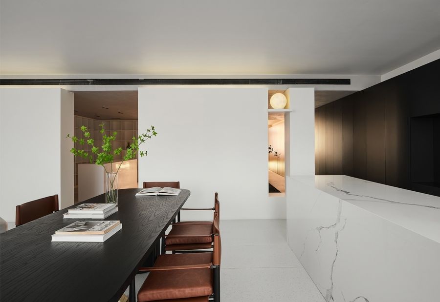
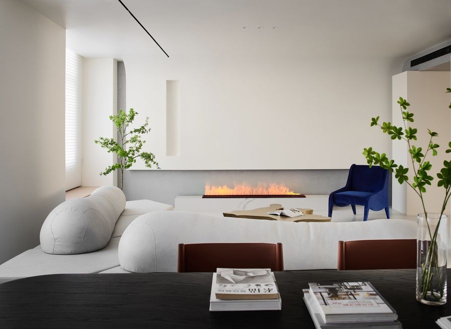
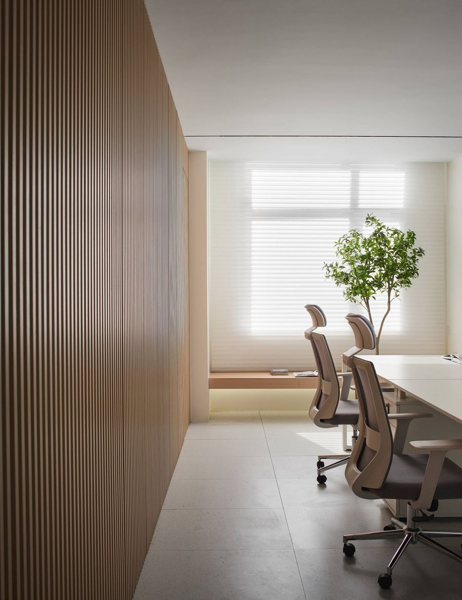
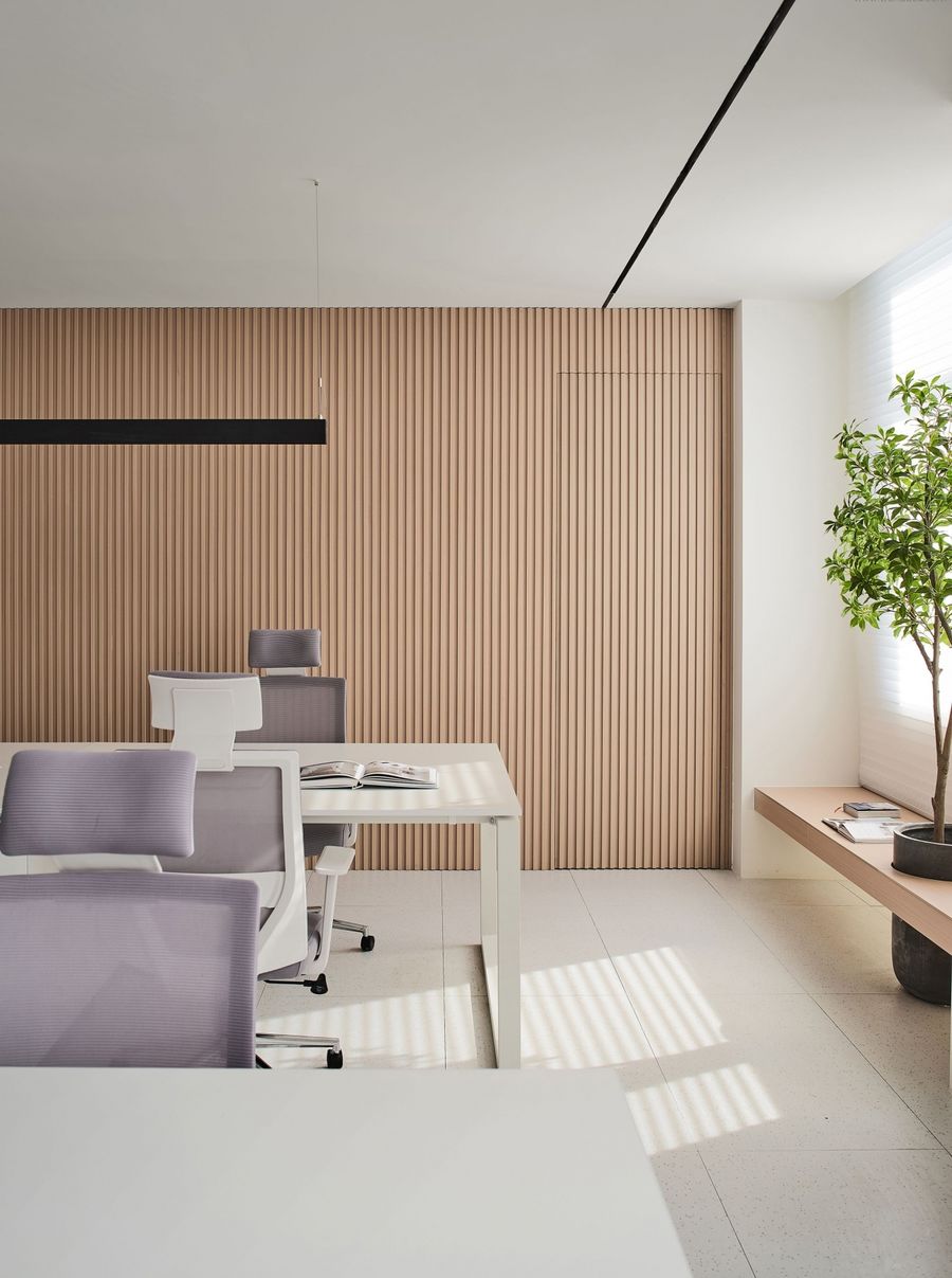
核心功能会客区的设计尤为关键。整体以黑白灰做基础色,嵌入些许调色,以此来活跃氛围,冲淡大色块冷调给人的严肃感。线,作为一个现代空间最好的体现元素,发挥着至关重要的作用。空间中水平线性元素使用比较多,从顶面的线性灯到空调风口再到贯穿三个区域的黑色柜体,都利用了线性设计来凸显美感。原本沿窗的界面比较杂乱,通过整理并在低位加入水平线的条凳来连接整体后,便形成了有序列感的边界。
The design of the core functional reception area is particularly critical. As a whole, black, white and gray are used as the basic colors, and a little color matching is embedded, so as to activate the atmosphere and dilute the seriousness of the cold tone of the large color blocks. Line, as the best embodiment element of a modern space, plays a vital role. There are many horizontal linear elements in the space. From the linear lights on the top surface to the air-conditioning vents to the black cabinets that run through the three areas, linear design is used to highlight the beauty. Originally, the interface along the window was relatively cluttered, but after arranging and adding horizontal benches at the lower position to connect the whole, a sequenced boundary was formed.
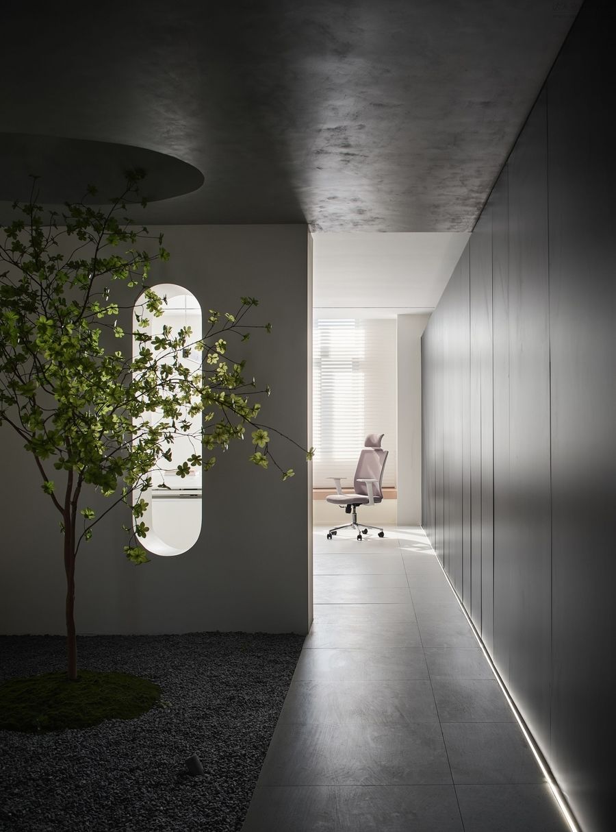
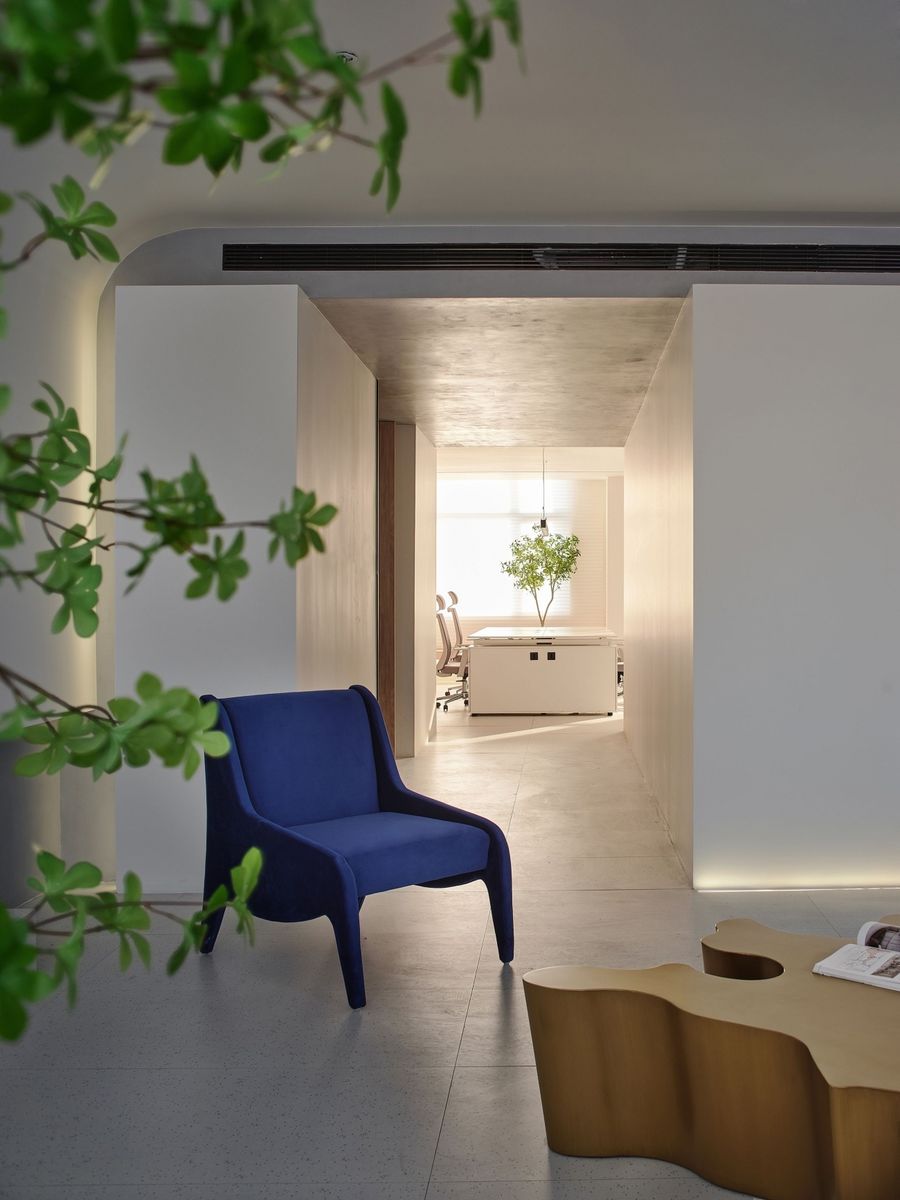
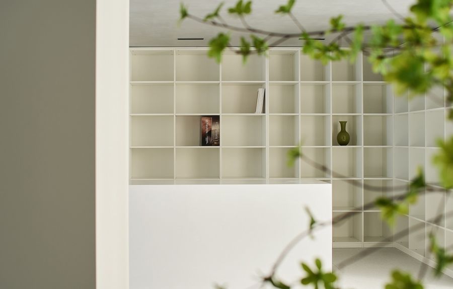
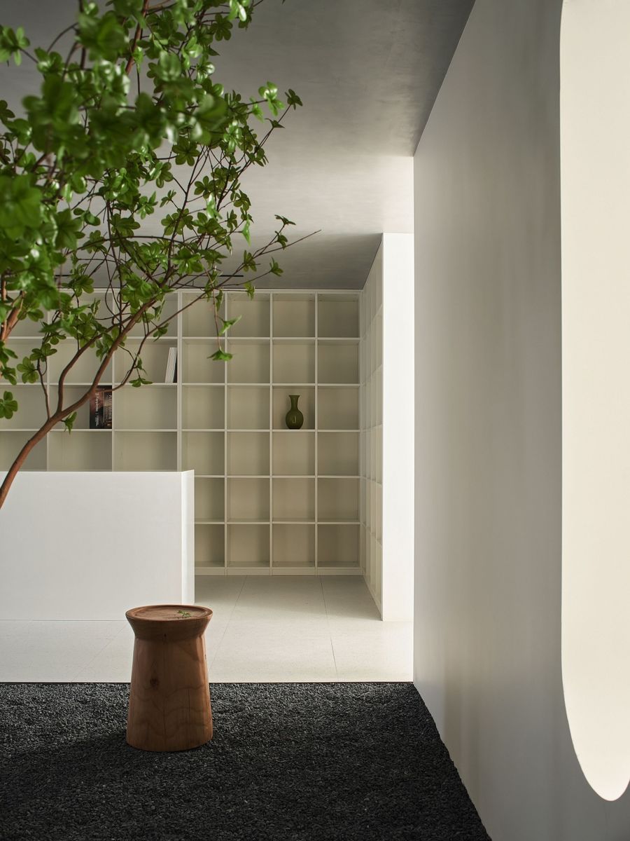
简洁的办公区域少不了新鲜绿植的点缀。油亮的翠绿色恰如其分地中和了灰白色系的背景和棕色的家具。串联会客和办公的同时,也让空间更具层次感和高级感。在一块大面积墙体上做出一些开洞,提升视觉,以此来增加空间趣味性。
The concise office area is indispensable for the embellishment of fresh green plants. The glossy emerald green perfectly neutralizes the off-white background and brown furniture. While meeting guests and working in series, it also makes the space more layered and advanced. Make some openings on a large area of wall to enhance the vision and increase the interest of the space.
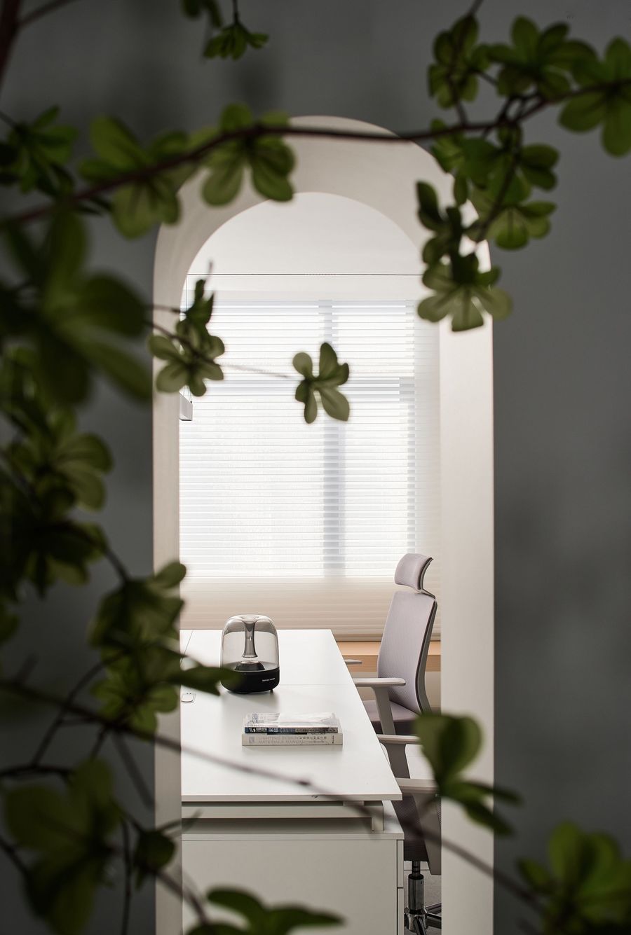
浅白系的运用,彰显了办公区的干净利落。而精巧的格栅窗帘,将洒落的阳光缔造出整齐纹理。如同温柔的肌肤,亲吻案台的书本和咖啡。紧张的办公,在这一刻显得从容而自由。
The use of plain white shows the cleanliness of the office area. The delicate grille curtains create a neat texture from the scattered sunlight. Like tender skin, kiss the books and coffee on the desk. The tense office seems calm and free at this moment.
办公室的装饰文化,承载的是一家企业的理念和价值。它不再是过去被认为的都市快节奏工作中的容器。从一个地方变成一个理想之地,它应该迎来自己的华丽蜕变。
The decoration culture of the office carries the philosophy and value of a company. It is no longer the container in the fast-paced urban work that it used to be considered. From a place to an ideal place, it should usher in its own gorgeous transformation.
项目名称丨自由理想
Project Name丨Ideal for Freedom
设计机构丨端石设计事务所
Design Institute丨Duanshi Design Office
设计师丨顾磊
Designer丨Gu Lei
主要建材丨水磨石瓷砖、微水泥、本杰明涂料、整体木作、大理石、玻璃、不锈钢
Main building materials丨Terrazzo tiles, micro-cement, overall woodwork, marble, glass, stainless steel
设计时间丨2021年6月
Design time丨June 2021







评论(0)