MY买手店——白色派的新旧对话
白色是一种极好的色彩,能将建筑和当地的环境很好的分隔开。像瓷器有完美的界面一样,白色也能使建筑在灰暗中显示其独特的风格——理查德迈耶
White isan excellent color, which can well separate the building from the localenvironment. Just as porcelain has a perfect interface, white can also make thebuilding show its unique style in gray - Richard Meyer
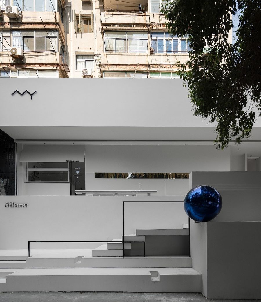
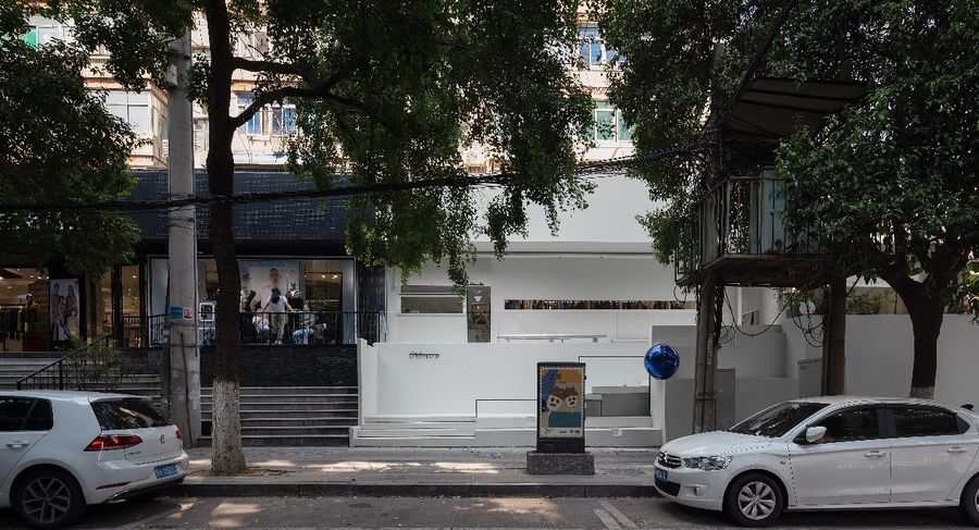
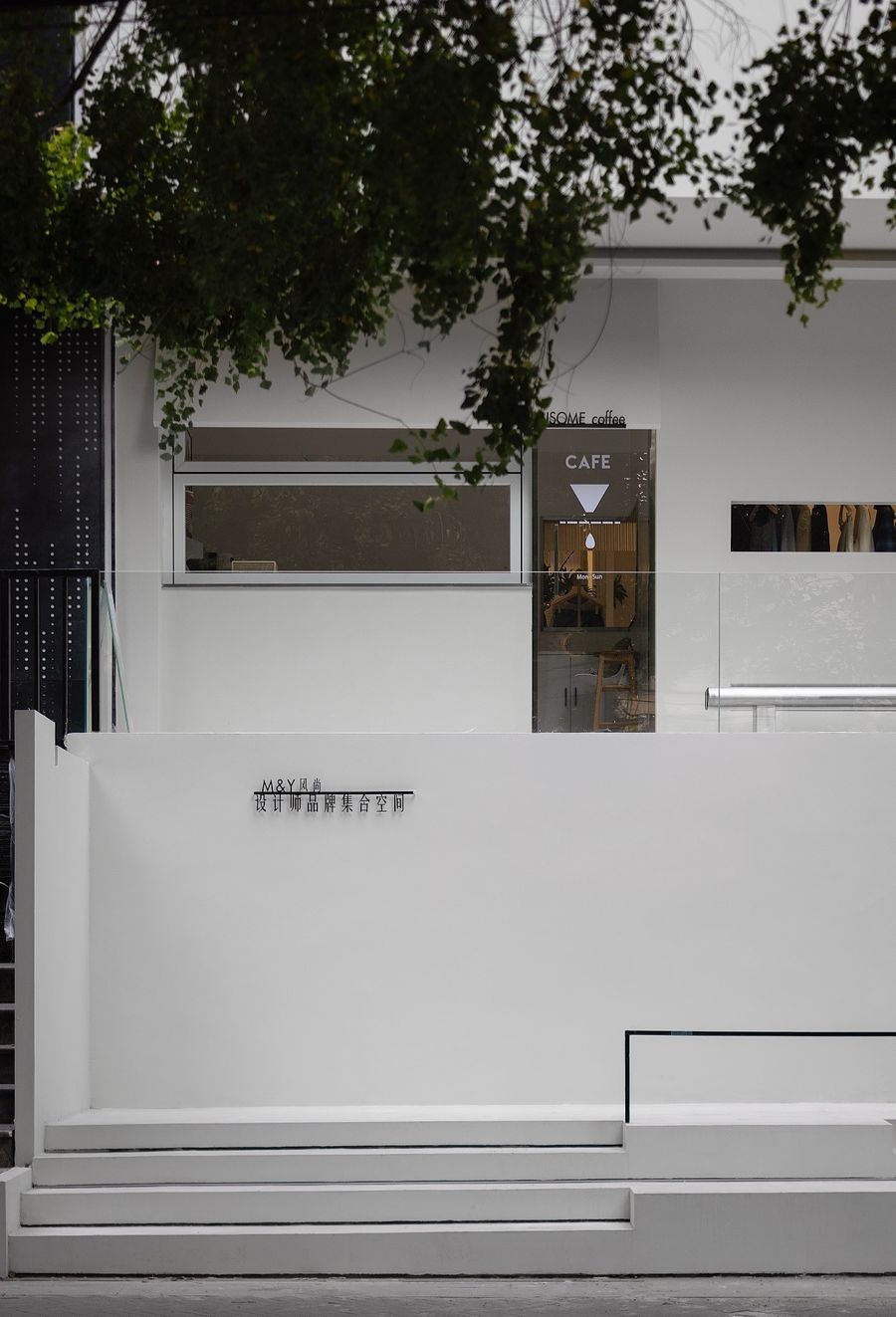
MY买手店想呈现一种冷峻克制的简约,以上演一年四季丰富的时装生活剧。于是设计师选用白色作为主基调,融入老城区绿色的自然景物之中。外立面的白色也能很好地融入老城,塑造和谐的关系
Mybuyer's shop wants to present a cold and restrained simplicity to stage a richfashion life drama all year round. So the designer chose white as the main toneand integrated it into the green natural scenery of the old urban area. Thewhite facade can also be well integrated into the old city to shape aharmonious relationship.。
富有生活气的老城区,白色的建筑外观既跳脱又融入。与周边和谐地对话、安静地观望,书写新旧城市的关系和变化。
The whitearchitectural appearance of the old urban area full of life is both jumping andintegrating. Talk harmoniously with the surrounding areas, watch quietly, andwrite about the relationship and changes between the old and new cities.
01
入口
Entrance
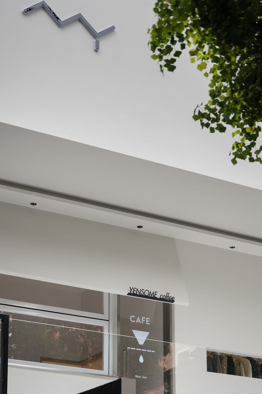
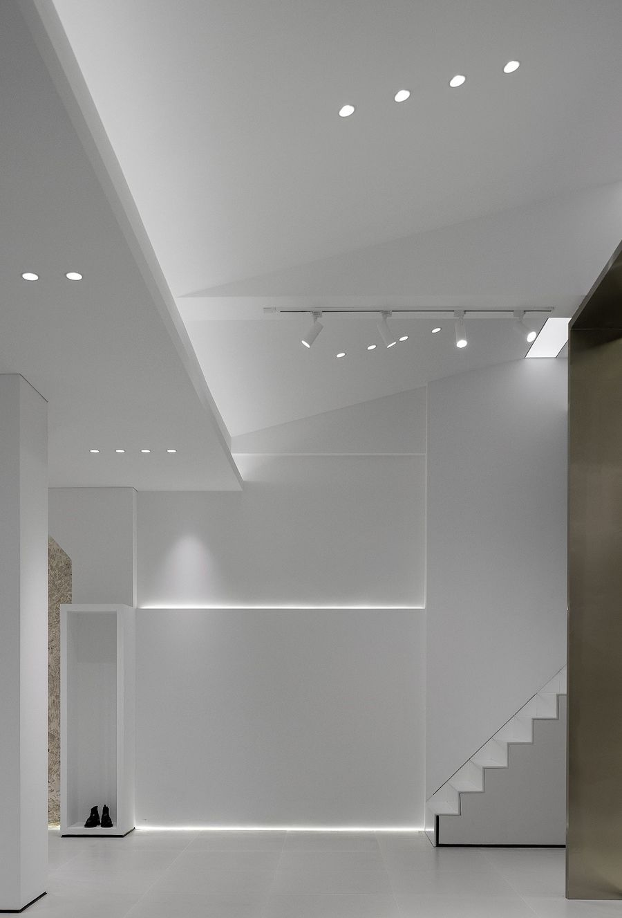
设计在立体主义构图的基础上,凸显光影的变化,强调面的穿插,讲究纯净的空间和体量,扩大尺度和空间的等级特征,通过对空间、光线以及格局等方面的控制,创造最纯粹的空间形态。
Basedon the Cubist composition, the design highlights the changes of light andshadow, emphasizes the interspersion of surfaces, pays attention to the purespace and volume, expands the scale and the hierarchical characteristics ofspace, and creates the purest spatial form through the control of space, lightand pattern.
02
院落
Courtyard
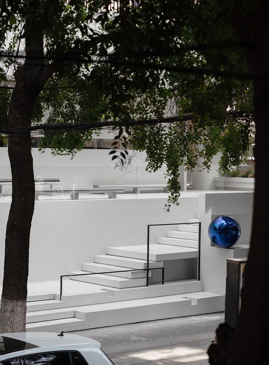
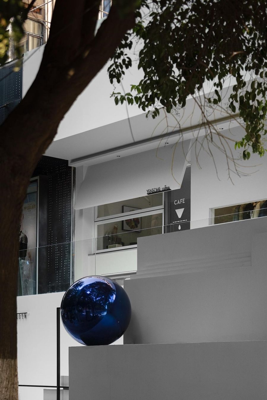
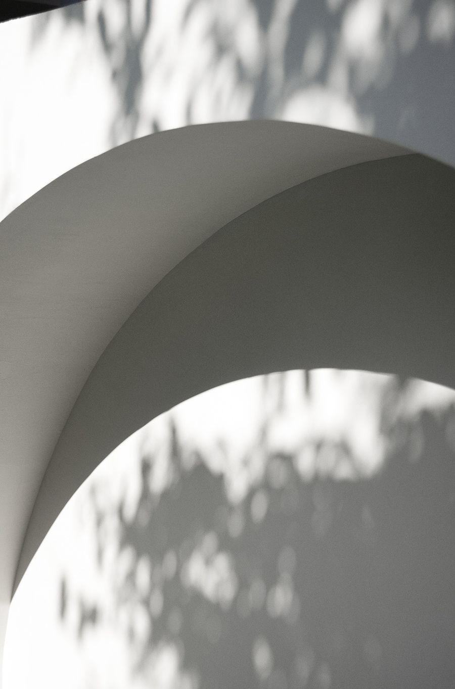
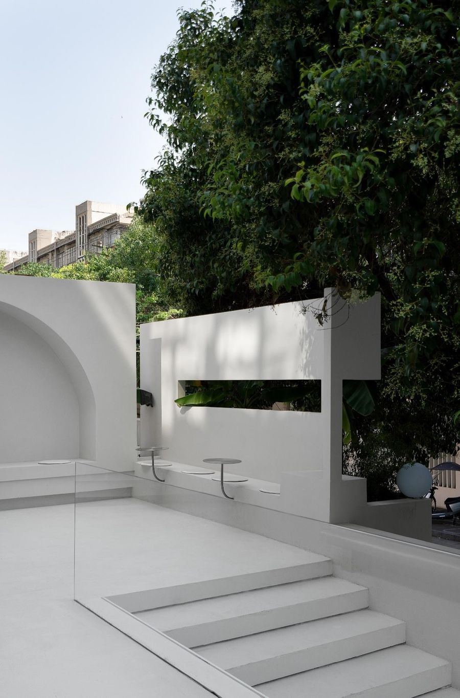
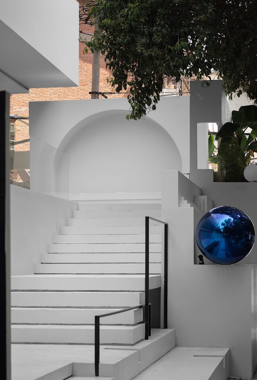
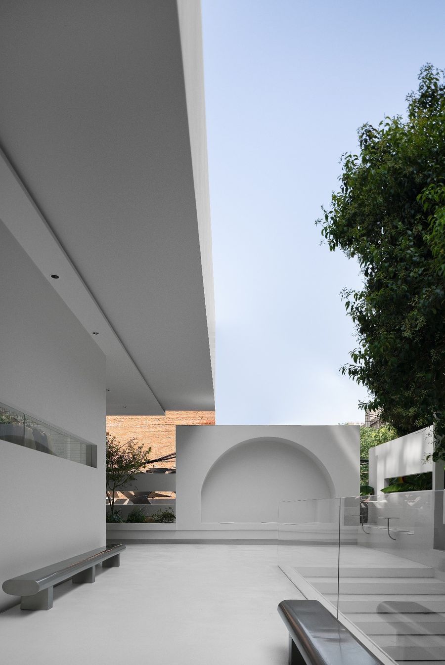
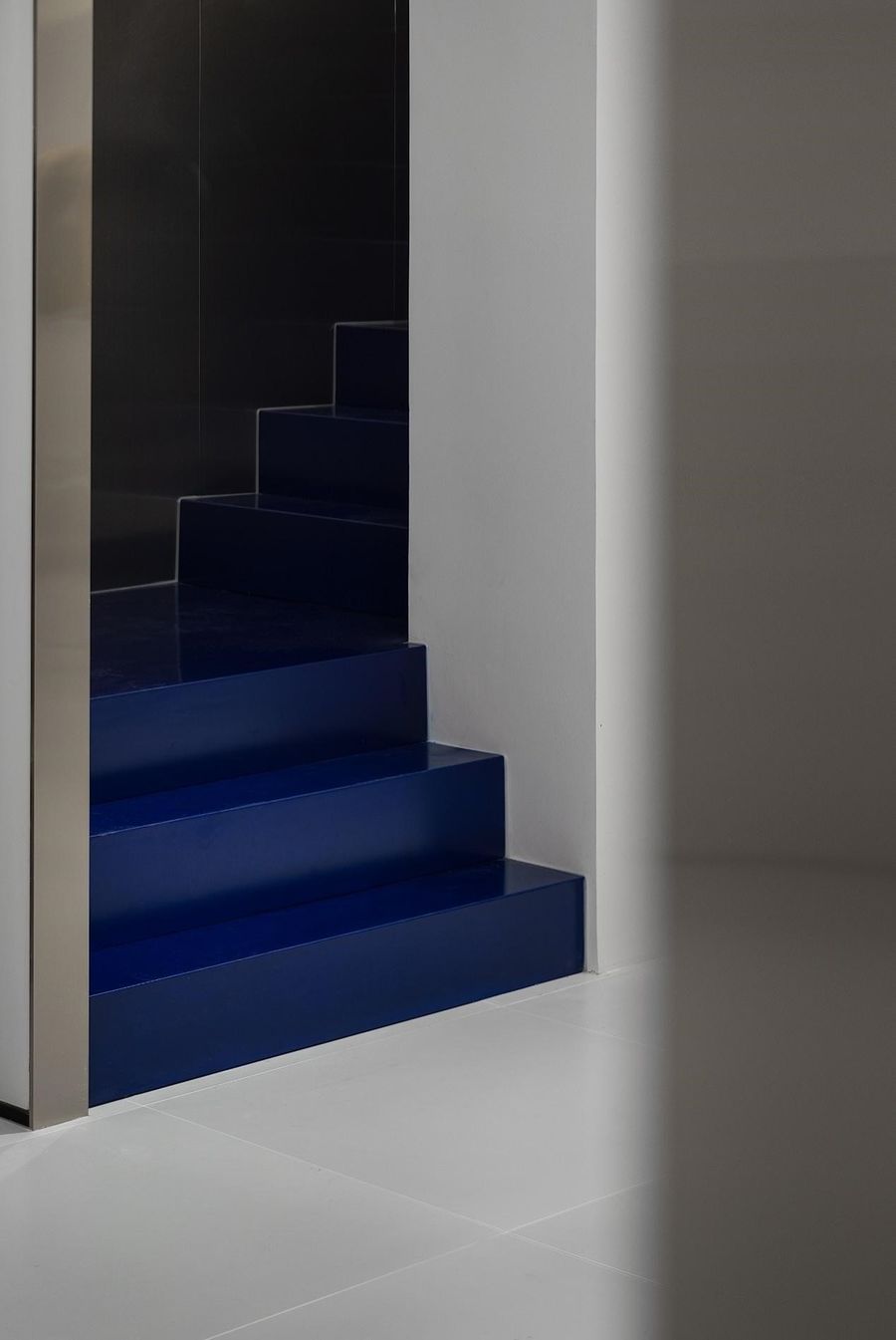
院落通过层级的台阶上到高处,近端的造型墙面成为视觉的聚焦点。一个空白的舞台,演绎一幕幕时尚生活剧。出挑的雨棚和户外的不锈钢长凳让户外空间与人产生联动性。白色的墙面如同画纸一般,光影可在上面自由的描绘出千变万化的图景。
The courtyard goes up to the high placethrough the hierarchical steps, and the modeling wall at the near end becomesthe focus of vision. A blank stage, performing scenes of fashion life drama. Theselected canopy and outdoor stainless steel bench make the outdoor spacelinkage with people. The white wall is like painting paper, and light andshadow can freely depict the ever-changing picture on it.
03
服装展示区
Clothing area
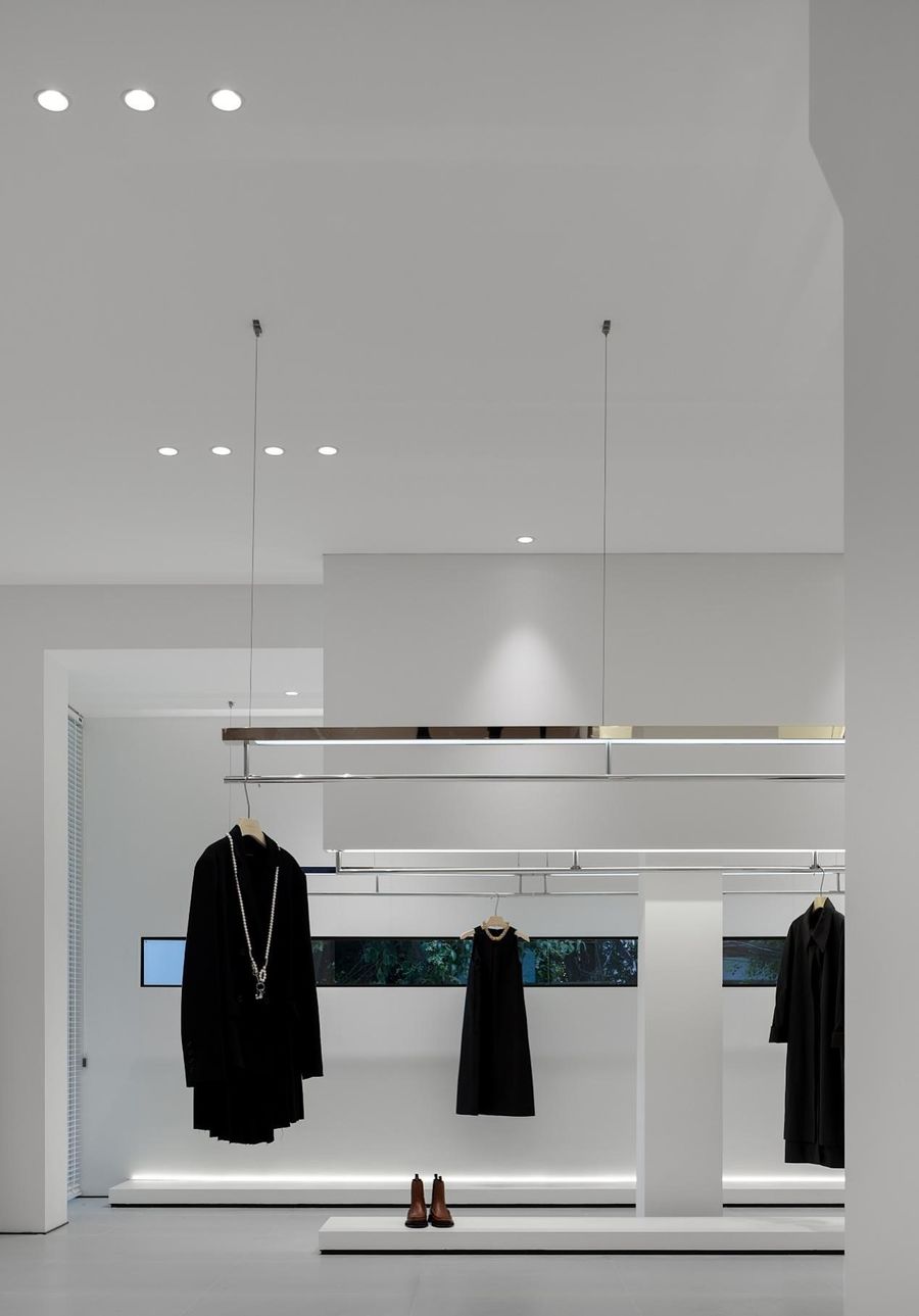
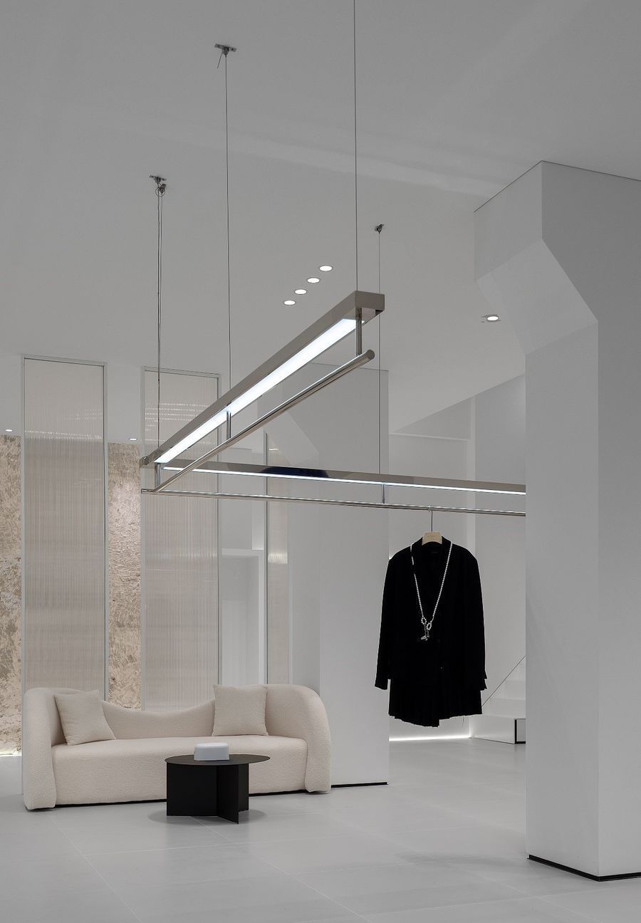
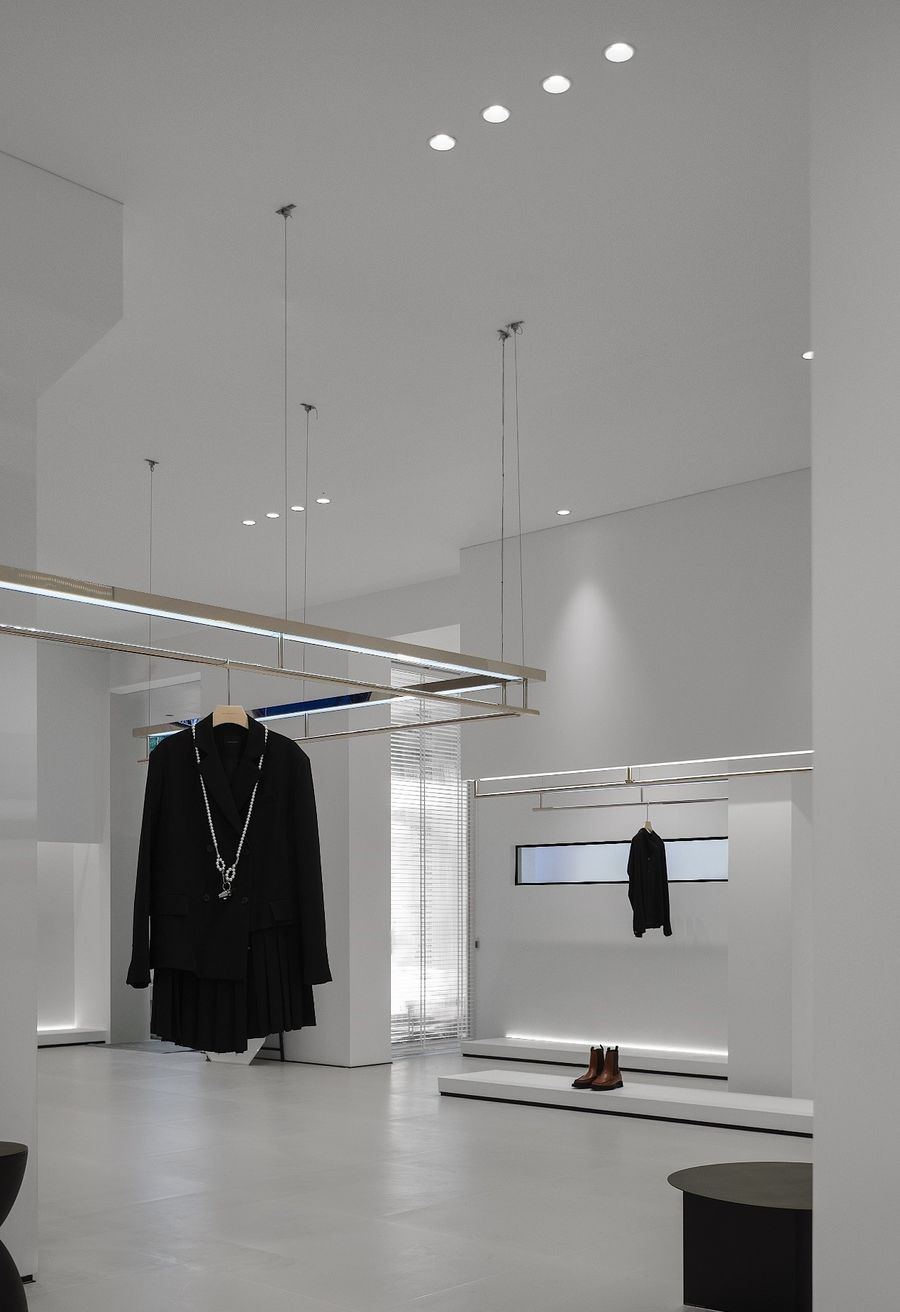
室内空间白色的层次变化结合黑色线条细节,勾勒出极简的空间,以凸显空间主题——四季衣物。衣架隐藏于墙面造型内部,结合灯光的氛围处理,增加展示区域的高级感。Thewhite layer changes of indoor space, combined with the details of black lines,outline a minimalist space to highlight the space theme - clothes in fourseasons. The clothes hanger is hidden inside the wall shape, combined with theatmosphere treatment of lighting to increase the height of the display areaAsense of class.04 收银区 Cardseat area
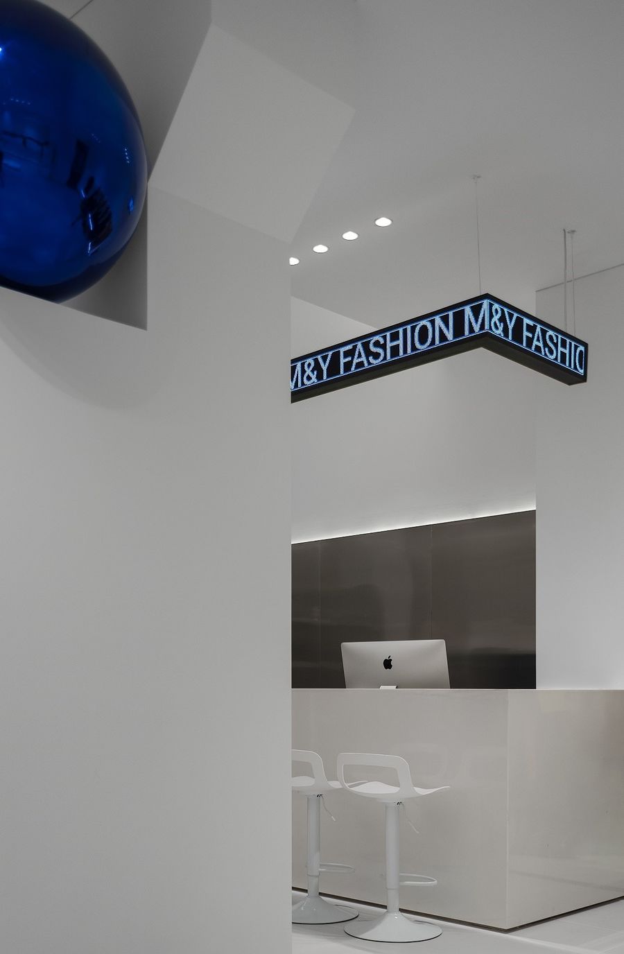
收银区不锈钢材质的局部运用以及蓝色球形造型的设计点缀,与室外的雕塑相呼应。水平与垂直的精心分割形成虚与实,方与圆,线与面的对比。
The local applicationof stainless steel in the cashier area and the design ornament of bluespherical shape echo with the outdoor sculpture. The careful division ofhorizontal and vertical forms the contrast between virtual and real, square andcircle, line and surface.
05
平面图
Plan
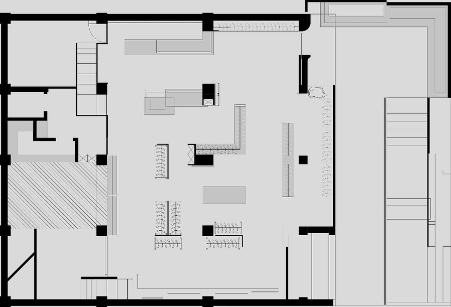
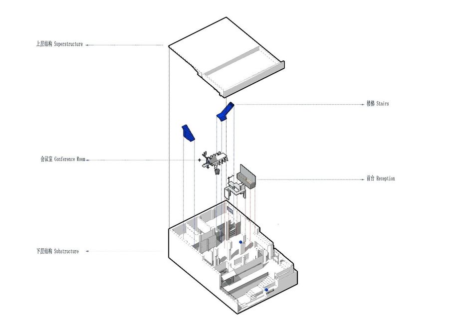
平面布局利用入口的院落空间将人流引入内部,再由灰空间过渡进入到室内,整体设计手法统一关联,室内外的层次和关系自然过渡。
The plane layout uses the courtyard space atthe entrance to introduce the flow of people into the interior, and thentransition from the gray space to the interior. The overall design practicesare unified and related, and the levels and relations between indoor andoutdoor transition naturally.
项目名称丨MY风尚女装设计师集合店
项目面积丨200M²
设计时间丨2021年 3月
完工时间丨2021年 9月
涉及范围丨室内设计,灯光设计,门头设计
项目地点丨合肥红星路190号
设计团队丨ASL建筑
核心成员丨王梦来 何文静 刘江 王莹莹 孙玮 邬成城
总设计师丨孙玮
参与设计丨孙明张哲范家兴
更多相关内容推荐






评论(0)