“一些新的东西并非站在旧的事物边上,而是从旧物中长出并和它交织。”事物决定了世界的空间维度,从而决定了对我们而言的关于世界的知识和可用性。
“Something new does not stand beside the old but grows out of it and is interwoven with the old.”
—— Peter Zumthor
01 空间的诗意
The poetry of space
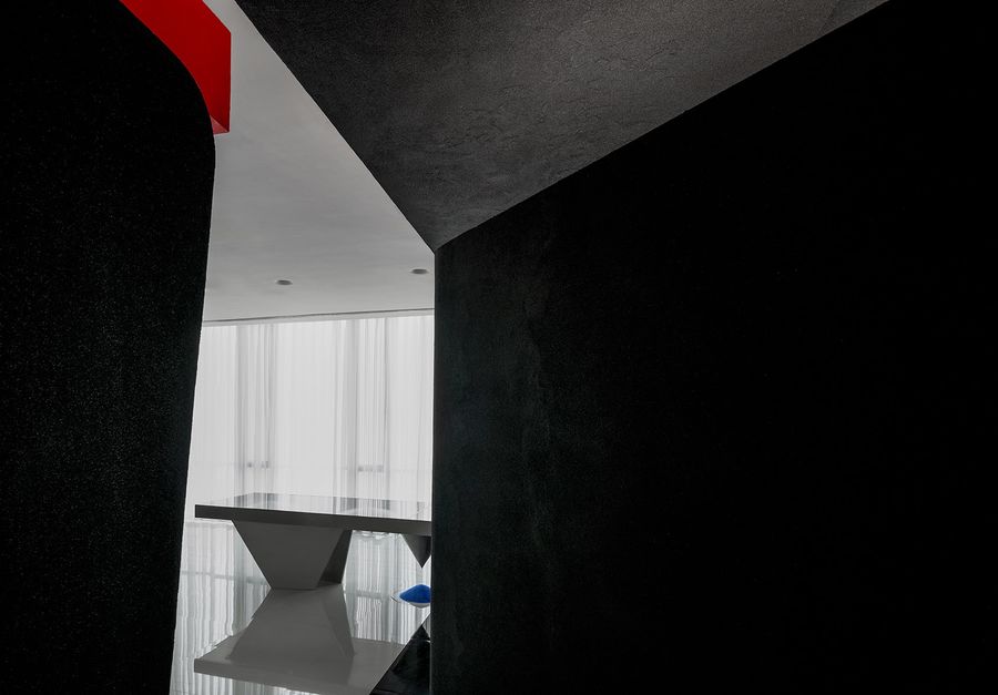
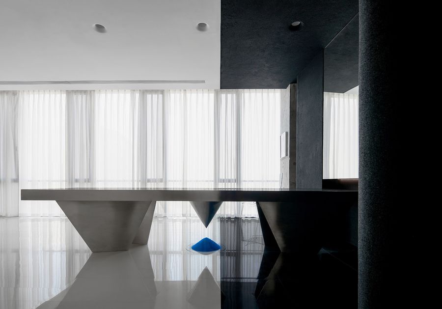
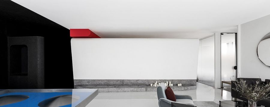
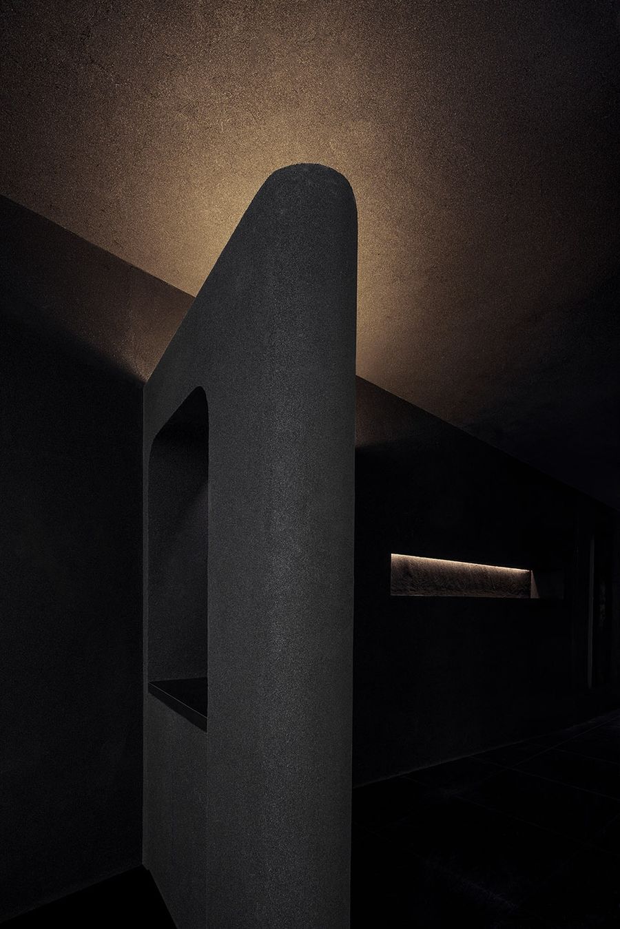
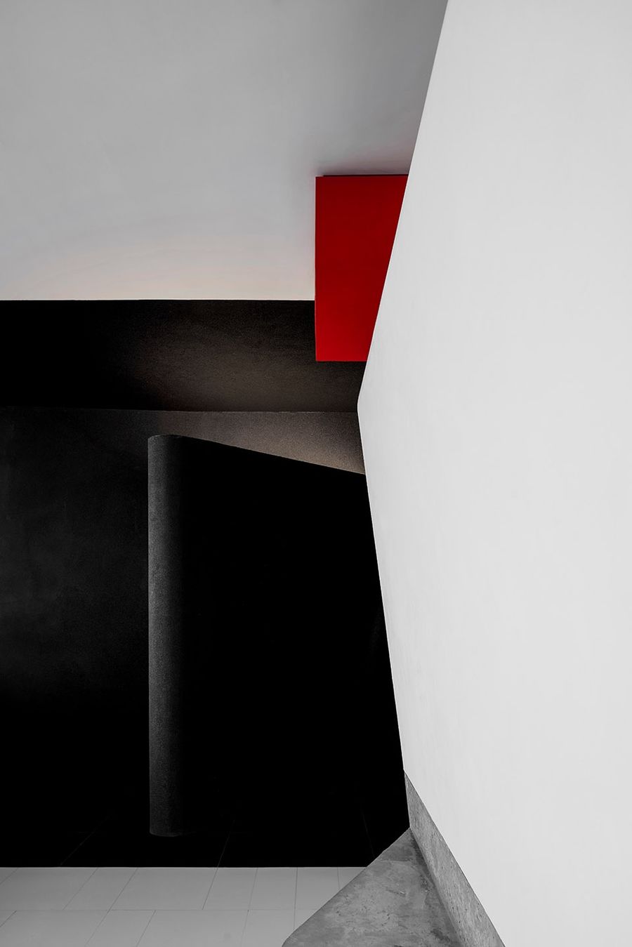
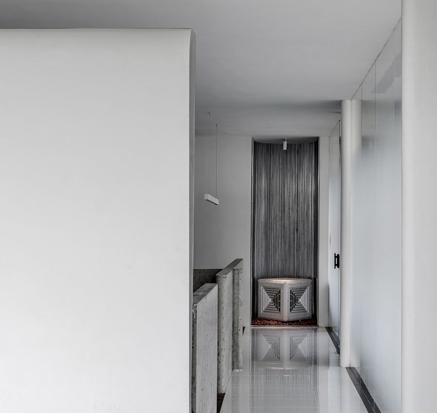
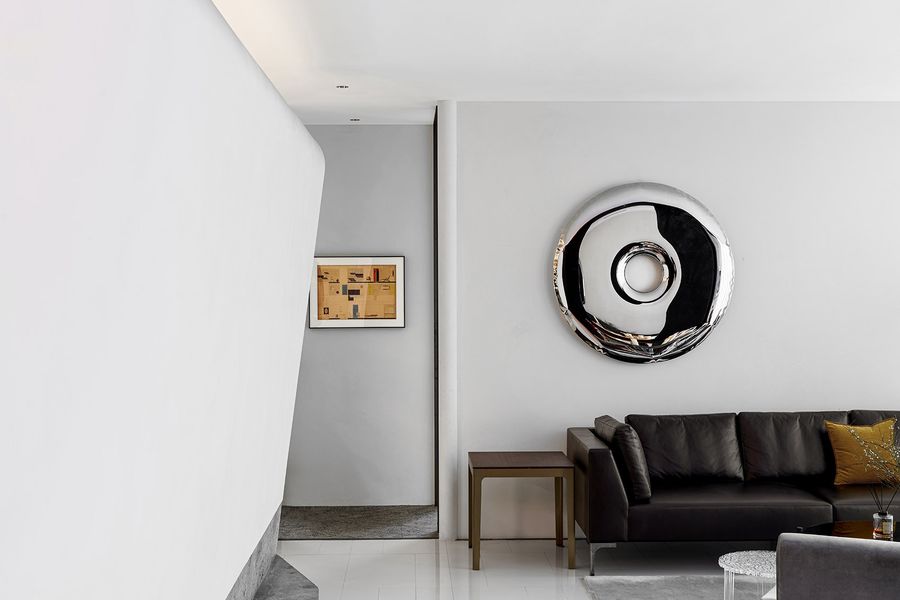
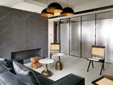
层层递进的空间划分,贯穿整个项目空间。入口处,我们采用了黑色的艺术涂料以及斑驳的金属钢板,黑洞一般地大面积吸收了光,黑色的体块与白色的会客区域形成了一道从地面至顶面的分割线,远处的明亮的落地窗此时更加明亮,如在隧道迈向出口引导步伐。
The progressive space division runs through the entire project space. At the entrance, we used black artistic paint and mottled metal steel plates. The black hole generally absorbs light in a large area. The black volume and the white meeting area form a dividing line from the ground to the top. The bright floor-to-ceiling windows are even brighter at this time, such as guiding the steps toward the exit of the tunnel.
▼入口
▼入口长桌
设计和艺术之间的关系一直很复杂,他们可能对抗、排斥也相互黏连,它们之间的界限也被打破,野口勇设计了很多艺术、雕塑属性的“物件”,我们也在考虑,是否可以把空间本身设计成艺术品、雕塑品,用空间本身去表达。
The relationship between design and art has always been complicated. They may resist, repel and adhere to each other. The boundaries between them have also been broken. Isamu Noguchi has designed many “objects” with artistic and sculptural attributes. We are also considering whether the space itself can be designed as an artwork or sculpture and expressed by the space itself.
▼透明座椅
▼细部
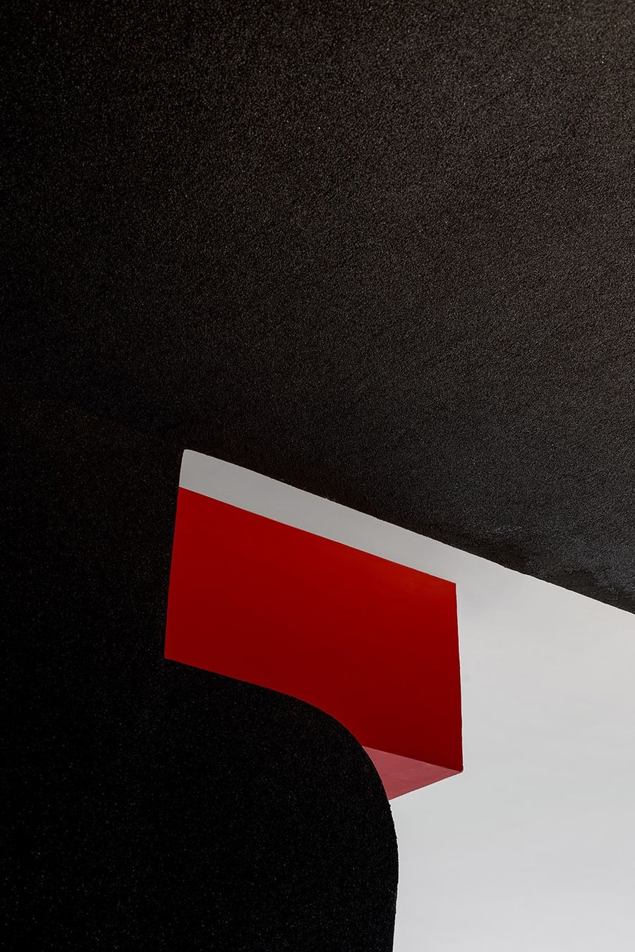
这种思考也贯穿在其它地方,在连成一整面的黑色墙体中我们诉说许多细节与故事,并用它自身的体块形成“雕塑感”。划分会客区与办公区的墙体在顶部戛然而止,给予了空间呼吸,让光和空气在内与外中流动。空间上方设置的一道红色的梁体在会客空间处看是一个点状块面,而在办公空间则是贯穿始终的线性块面。
This kind of thinking also runs through other places. We creative many details and stories in the whole black wall and use its own volume to form a “sculptural sense”. The wall dividing the meeting area and the office area, giving the space a breath, allowing light and air to flow inside and outside. A red beam set above the space is a point-shaped block surface in the meeting space, but a linear block surface that runs through in the office space.
▼雕塑感的墙体
▼细部
02 去城市库存
de-urban inventory
时代的发展更迭,城市库存的出现成为必然,在这里我们试图解决一些现有的城市问题,并把“去城市库存”的理念作为元素加入其中,唤醒人们对被漠视而真实存在并边缘化的事物记忆。
With the development and change of the times, the emergence of urban inventory has become inevitable. Here we try to solve some existing urban problems and add the concept of “de-urban inventory” as an element to awaken people’s disregard for the real existence and marginalization. Memory of things.
▼开放办公空间
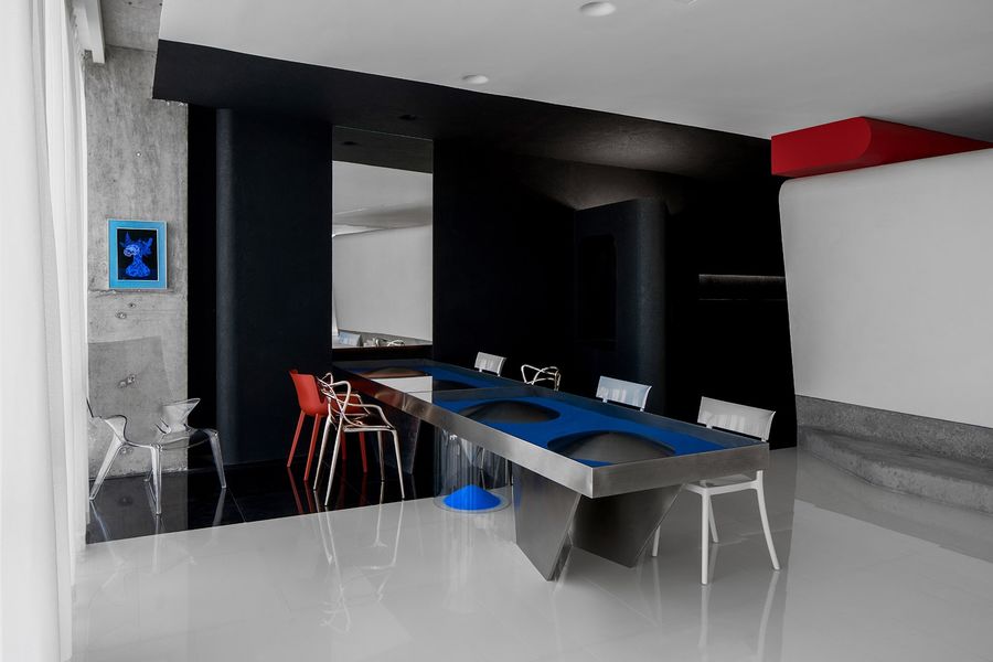
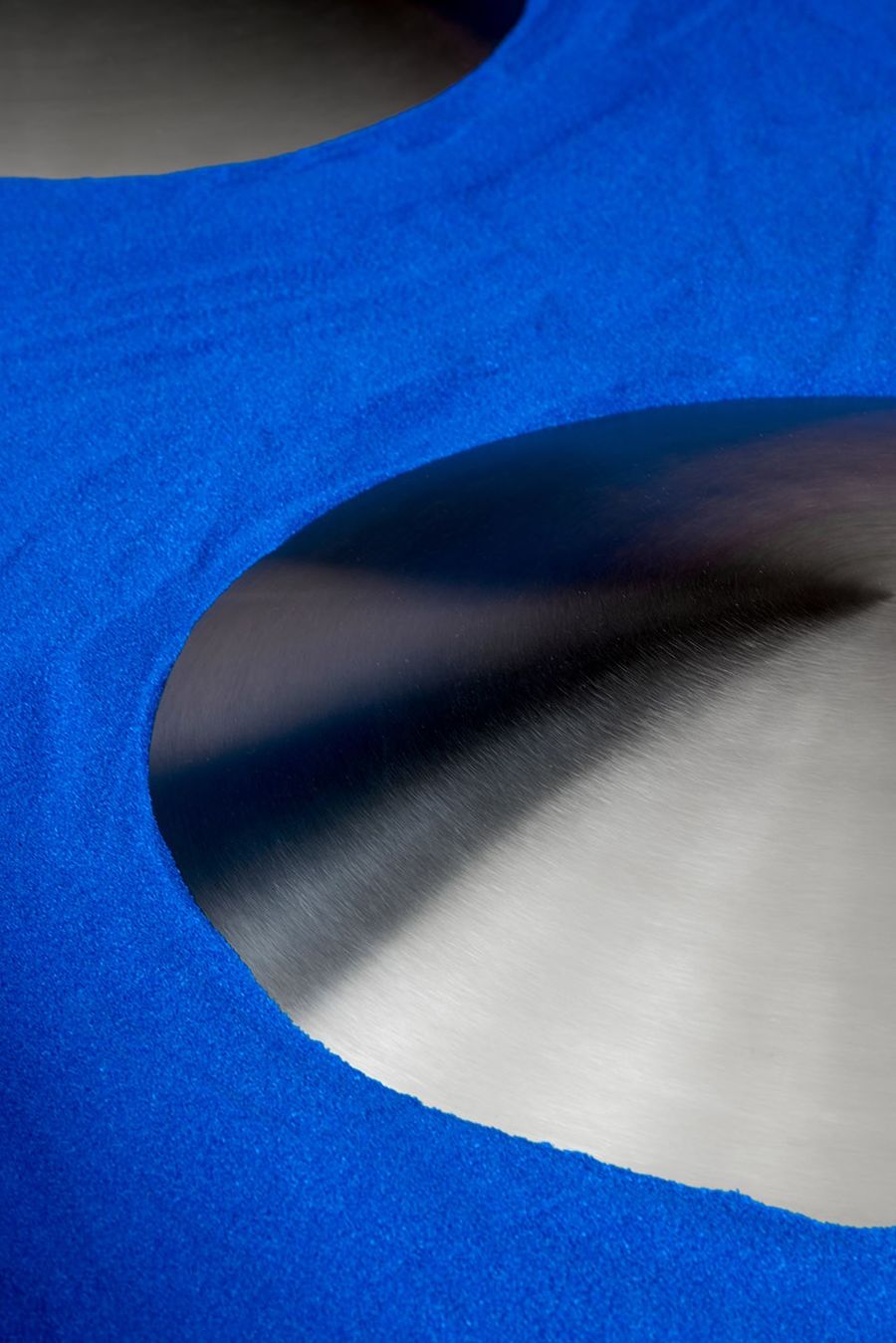
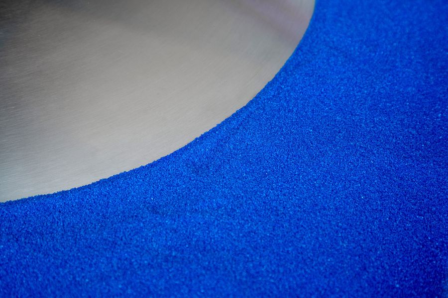
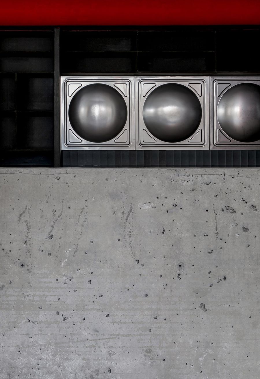
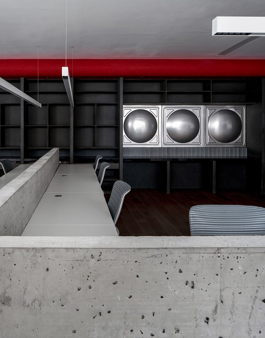
不锈钢消防水箱,曾经是每一栋房屋必备的设施,除了为消防队提供灭火水源外,还可在城市水网瘫痪时提供清洁的饮用水。然而作为必不可少的事物,有多少人知道“它”是什么样的?当“它”在若干年之后被淘汰又将去往何方?水箱是由阵列的正方形1mx1m的模块组合而成,每个模块中内嵌凸面的半球形,天然的单元式模型,在我们看来,它不仅仅具有雕塑感,同时也是空间中是一种装饰,也是一块碎片,唤起记忆,表达态度。
Stainless steel fire-fighting water tanks were once a necessary facility for every house. In addition to providing fire-fighting water sources for the fire brigade, they can also provide clean drinking water when the urban water network is paralyzed. However, as an indispensable thing, how many people know what “it” is like? When “it” is eliminated after a few years, where will it go? The water tank is composed of an array of square 1mx1m modules. Each module is embedded with a convex hemisphere. It is a natural unit model. In our opinion, it is not only sculptural, but also a kind of decoration in the space. , Is also a fragment, evoking memory and expressing attitude.
▼不锈钢消防水箱
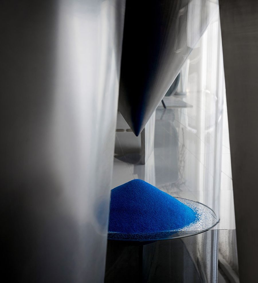
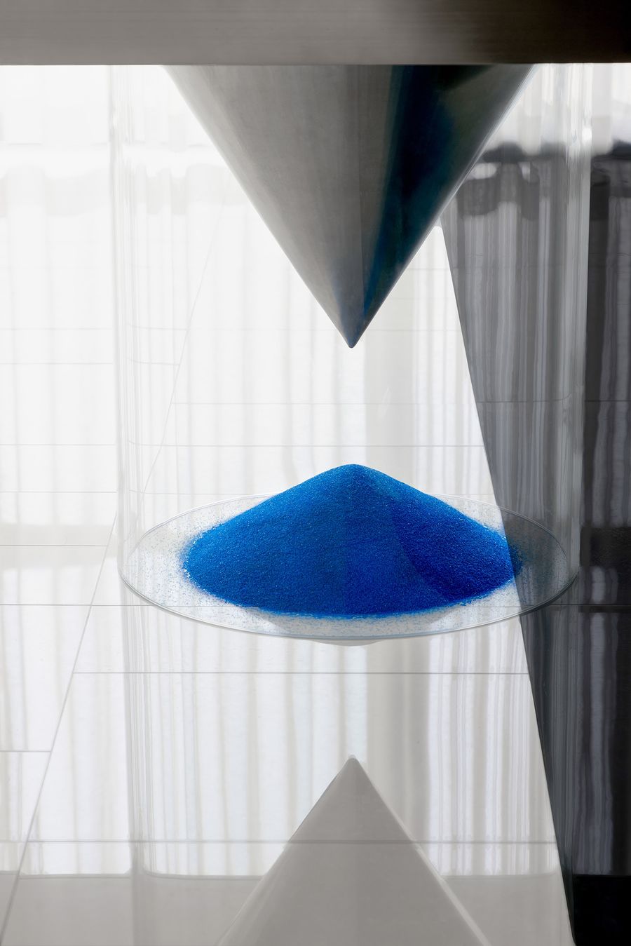
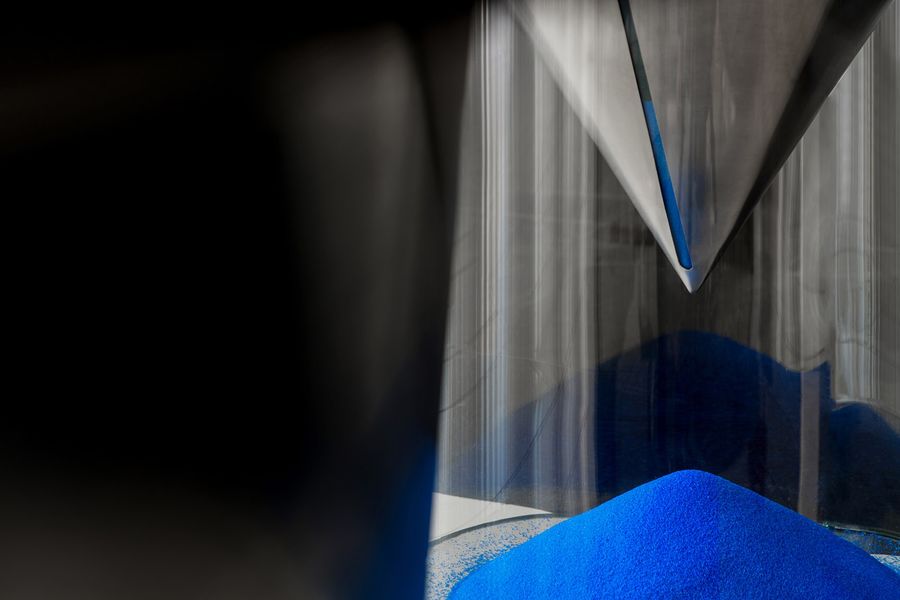
水箱也是我们关于“拿来主义”的一次思考与试验:“将世界上已经存在的工业化产物、生活用品‘拿来’,经过再设计使之组成空间,使用后还可回收再利用。这也是最常见的工业物品与艺术和极具生命力的自然事物做了一次冲撞和融合。”拆除、重解后的水箱可以被赋予新的生命,作为家具重新成为空间的一部分。当我们在设计时,在考虑桌子的功能性的同时,植入它的仪式性和幽默性。把整张桌子变成沙漏,感受时间流逝,过去与现在,当下与未来,思考就产生了。
The water tank is also a reflection and experiment of our “usage doctrine”: “Bring the industrialized products and daily necessities that already exist in the world, and redesign them to form a space, which can be recycled and reused after use. This is also the case. The most common industrial objects collide and merge with art and vital natural things.” The dismantled and re-disassembled water tank can be given new life and become a part of the space again as furniture. When we were designing, while considering the functionality of the table, we also implanted its ritual and humor. Turn the whole table into an hourglass, feel the passage of time, the past and the present, the present and the future, and thinking will be produced.
▼以工业物品为装饰
03 展现本质
About essence
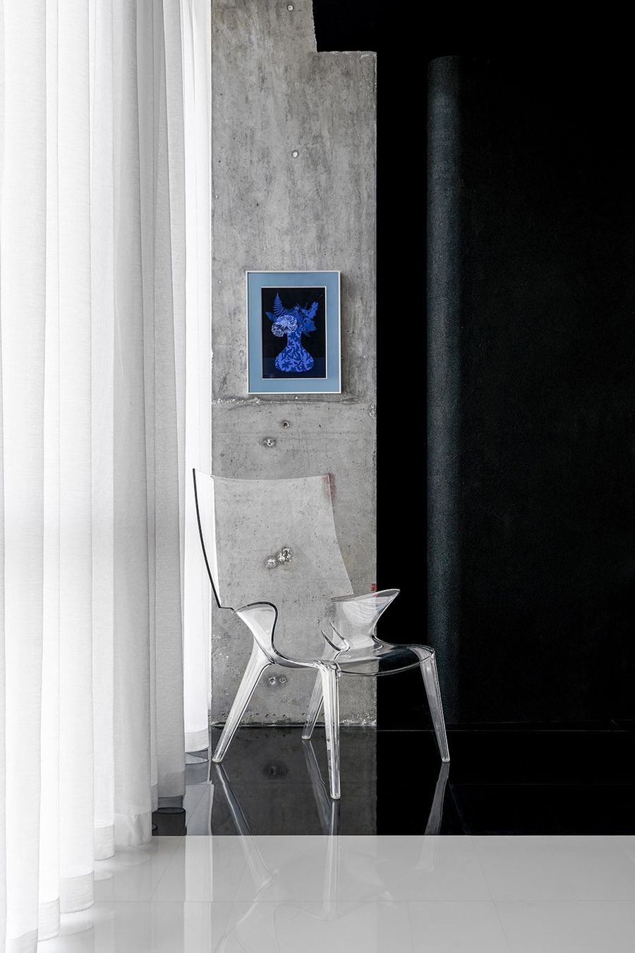
关于真实,被剥离出来的混凝土柱子,以最本真的样式呈现,没有过多修饰的语言。想必,在这个空间被重新设计前,它曾经的所有者在这些柱子前行走过,它在工人的操作下被浇筑出来时,留下了由钢筋而产生的圆孔。
Regarding reality, the stripped concrete pillars are presented in the most authentic style without excessively embellished language. Presumably, before this space was redesigned, its former owner walked in front of these pillars. When it was poured out under the operation of workers, it left round holes created by steel bars.
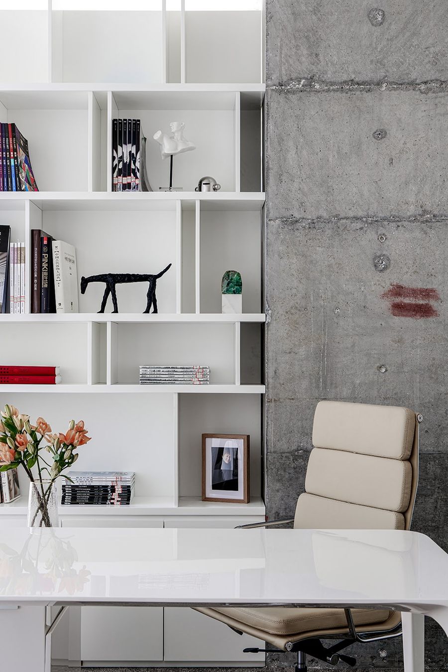
▼独立办公室中的混凝土墙体
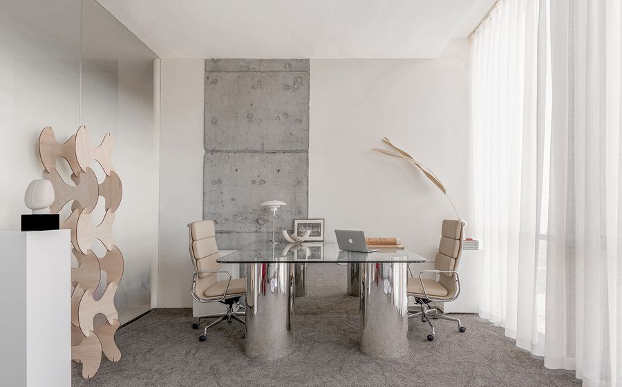
不需要过多的修饰,有时空间本身赐予的纯粹的形态,其表达的色彩与结构,能模糊繁与简的边界,带来更“真实”的空间感受。
There is no need for too much modification. Sometimes the pure form given by the space itself, the color and structure of its expression can blur the boundary between the complex and the simple, bringing a more “real” spatial feeling.
▼办公桌设计
04 开放与私密
Open and private
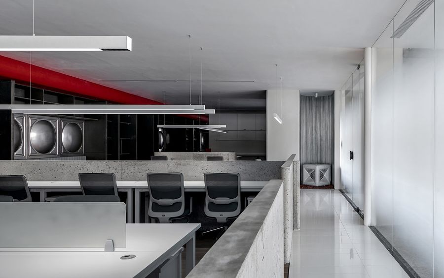
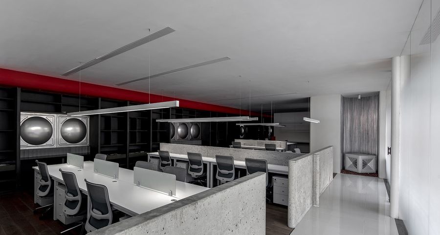
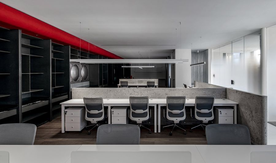
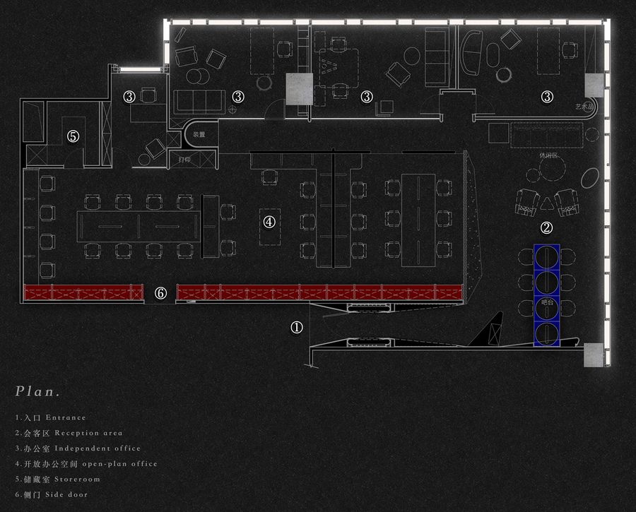
办公空间被一道笔直而朦胧的光束一分为二,一侧代表着开放,一侧代表着私密。开放空间由从地面生长起来的水泥墙体划分成几个区域,齐腰高的墙体在保持空间统一性时,更大程度保证了开放性,增加使用者的互动性,不困于小格间中,我们构想了使用方式,希望使用者可以在其中沟通与交流、思考与探讨。
The office space is divided into two by a straight and dim light beam, one side represents openness and the other side represents privacy. The open space is divided into several areas by the concrete wall that grows from the ground. The waist-height wall ensures the openness to a greater extent while maintaining the unity of the space, increases the interaction of users, and is not trapped in small compartments. In, we have conceived how to use it, hoping that users can communicate and exchange, think and discuss in it.
▼透明隔断
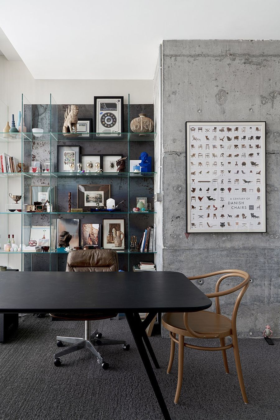
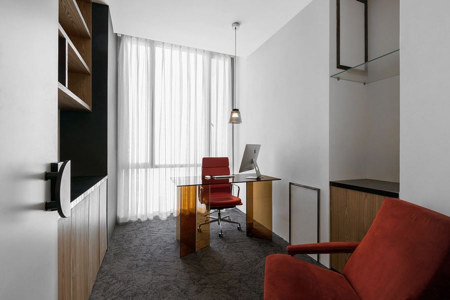
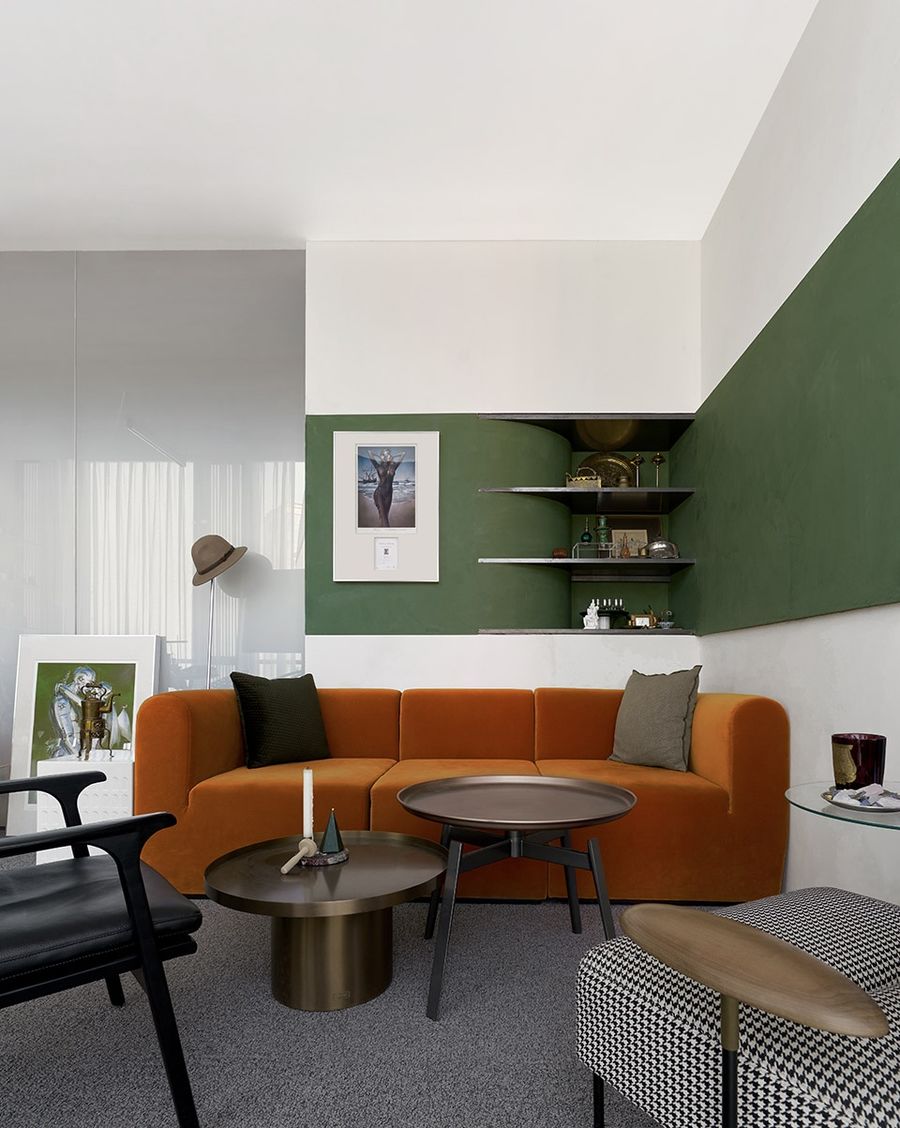
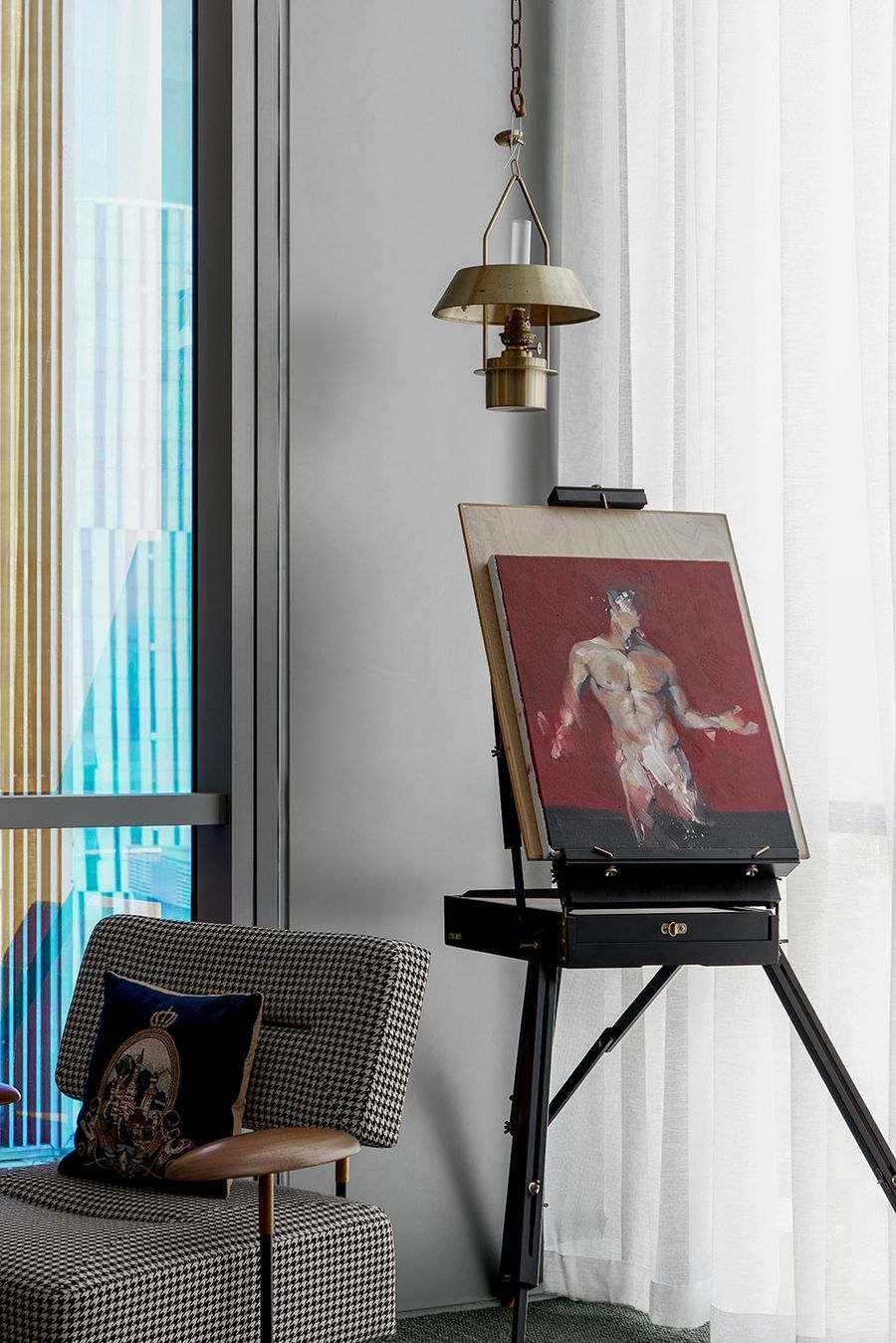
黑色的柜体与红色的线性块面一起延伸,充满整个区域,水箱元素被再次唤醒。作为实用性的存在,它是被隐藏的;作为空间发声者的存在,它又是那么鲜明。阳光从渐变磨砂玻璃被温柔地引入,另一侧独立办公室则展示了截然不同的一面。更多的是个性,收藏,喜好,多样化与协调并存。
The black cabinet body and the red linear block surface extend together, filling the entire area, and the water tank element is awakened again. As a practical existence, it is hidden; as a space vocalist, it is so vivid. The sunlight is gently introduced from the gradient frosted glass, and the independent office on the other side shows a completely different side. More is the coexistence of personality, collection, preferences, diversity and coordination.
▼风格多样的办公室
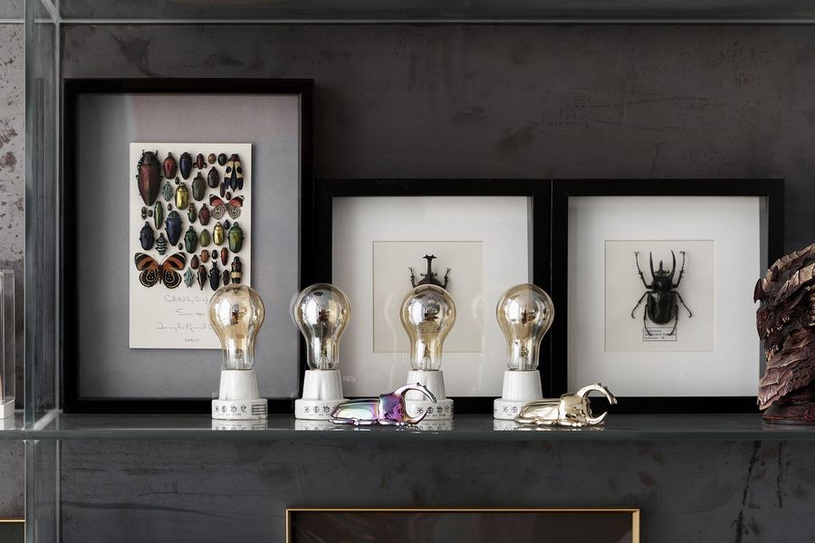
▼展示藏品的壁橱
05 品牌印迹
Brand Imprint
在整个项目空间中的,色彩的运用简单纯粹,除了黑、白、混凝土的本色外,只点缀了少量的红色与蓝色,用最简单的语言展现更丰富的设计。我们泛域设计Fununit Design的LOGO,也是同样的配色,将品牌的印迹融入在空间中,当使用者身处其中时并在空间中行走时,品牌的相貌与气质便被记住,从立体的维度中刻入脑海,这是所有Fununit Design能真切认同,且每一位来访者都能感受到的。
In the entire project space, the use of color is simple and pure. In addition to the natural colors of black, white, and concrete, only a small amount of red and blue are dotted, showing a richer design in the simplest language. The LOGO of Fununit Design, is also the same color scheme, integrating the brand’s imprint into the space. When the user is in it and walking in the space, the appearance and temperament of the brand will be remembered, from the three-dimensional The dimension is engraved into the mind, this is what all Fununit Design can truly agree with, and every visitor can feel it.
▼细部
有趣是一种单纯特性的表达,是当代社会最渴求的奢侈品。我们正在努力寻求建筑,空间与事物中每一个单元体之间的本质,关系,真实和一份简单的感动。
Interesting is an expression of pure characteristics, and it is the most desired luxury in contemporary society. We are working hard to find the essence, relationship, reality and a simple touch between each unit in architecture, space and things.
▼平面图
项目名称 :泛域设计办公空间
设计单位:泛域设计 Fununit Design
设计内容:办公空间设计
主案设计:朱啸尘
设计团队:周仁环、吕莉、卢黔兰
软装团队:俞婷、胡青青、胡晓娴
项目规模:389m²
施工单位:INNERFIX 奕赋筑造
灯光顾问:杭州乐翰照明工程有限公司
项目摄影:施峥/奥观建筑视觉
项目地址:浙江省杭州市远洋国际中心A座
完工时间:2020/5
主要材料:术木地板,凝诚艺术涂料,金属装置(浙江德耀金属制品有限公司),水泥,艺术玻璃







评论(0)