黄昏时分的临海古城,瓮城是孩子们的足球场,球撞向城墙,又弹回来,孩子们欢叫着,追逐着……可能他们根本不在意,刚才撞到的城砖,有可能来自宋朝……
At dusk, Wengcheng, as the old barbican of Linhai, Taizhou, Zhejiang Province, suddenly turns into a wonderful children’s football field, where kids shout joyfully, chase each other enthusiastically, kick the ball to the ancient city wall and wait for a perfect bounce-back without any concern, whereas the wall bricks the ball just hit might even be dated back to the Song Dynasty, i. e.about a millennium old!
说起历史,1600多岁的浙江临海难免会有些凡尔赛,始建于晋的台州府古城墙,日本和尚最澄受戒之所龙兴寺,巾山上建于宋、元、明、清四朝的四座宝塔,紫阳街,(戚)继光街,骆宾王祠堂……最近,紫阳街上新开了一间小店,叫江南赞。
]In terms of history, Linhai with a long history of more than 1600 years will inevitably stun all of us. It has lots of famed historic spots, such as the ancient city wall of Taizhou Prefecture built in the Jin Dynasty, Longxing Temple where Japanese monk Saichō, the founder of Tendai school of Buddhism, received his ordination, the four pagodas built in Song, Yuan, Ming and Qing Dynasty respectively, Ziyang Street, Jiguang Street, and Ancestral Temple of Luo Family the great poet Luo Binwang was born to. Recently, a new store called Jiangnan Zan has stated up in Ziyang Street.
江南赞店铺面积不大,由一座约200㎡的老房子改造而来,是浙江省古村落基金携故宫文创幕后推手之一的华胥氏文化,打造的文旅新IP“诗画江南”首店,其建筑、室内及软装由零壹城市建筑事务所一体化完成。
With the integration of architecture, interior and FF&E design by LYCS Architecture, Jiangnan Zan, a retail store transformed from an old modest house of about 200㎡, become the first fruit of a new cultural tourism IP program called “Picturesque and Poetic Jiangnan”. It is a joint venture of Ancient Village Protection and Utilization Fund of Zhejiang Province and HXS Cultures known as one of the significant driving forces of Beijing Palace Museum Culture & Innovation.[color=rgba(62, 62, 62, 0.61)]
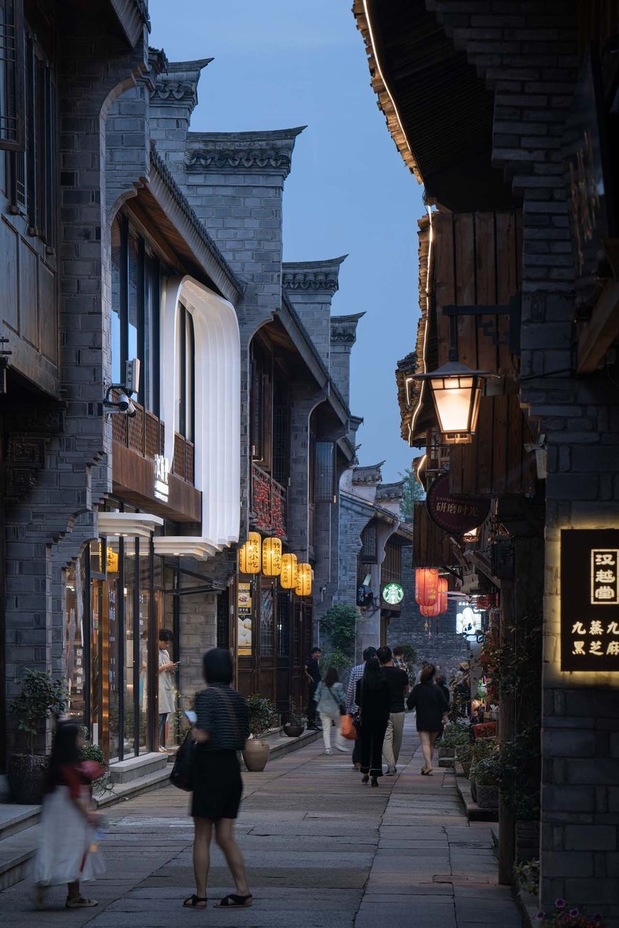
紫阳街至今依然保留着唐宋的里坊制格局,过去曾是临海的主要商业区,到现在也还有很多百年老店在此营业,可窄窄的街道不能通车,建筑古老又显得缺乏新意,古街在浮华鲜艳的现代都市包围中像个异类,越发的寥落苍老。
Ziyang Street used to be the main commercial zone of Linhai. Still retaining the ancient urban pattern of Tang and Song Dynasties, it has many notable century-old shops until now. However, in terms of its severe narrowness for traffic and the pre-modern and seemingly boring style of the ancient buildings, this old street, surrounded by and in contrast to the flashy and bright modern city, has been increasingly unattractive, declining and even weird in the eyes of the public.
2014年,一篇《雍正:感觉自己萌萌哒》走红网络,这套“文化IP+流行元素”的玩法,将古老的历史用年轻的方式表达,让600岁的故宫焕发了青春,随后,一股新文创的浪潮席卷全国。这引发了设计团队的思考。
In 2014, an article named Yongzheng : I Feel Myself Lovely went viral on the Internet in China. By virtue of depicting the ancient history in a modern and fashionable way, this new pattern of “Cultural IP + Popular elements” remarkably revitalized the old Forbidden City with a long history of more than 600 years, and thus became popular among the young, giving a rise to an incredible huge wave of new cultural and creative industries across the country. The phenomenon deeply inspired and encouraged the design team.
01 古城后“浪”
New Rising "Wave" of the Old City
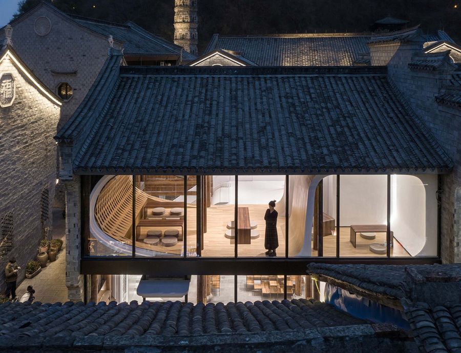
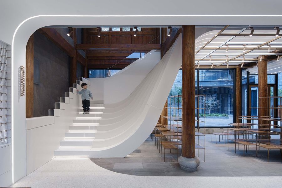
设计团队提出的设计概念是“浪”,通过在老房子内置入抽象形态的波浪元素,新旧对比形成超现实的艺术场景,传达一种乘风破浪、玩世不恭的年轻的精神态度,形成丰富多样、大气滂沱的趣味空间。
Proposing the special concept of new rising "Wave" symbolizing the young generation, the design team has subtly placed the element of abstract wave in the old house. By contrasting the new and the old sharply, it has created a wonderful surreal art scene, expressed a marvelously intrepid and free attitude of the contemporary young riding the wave, and thus effectively set up a diverse and vast space full of fun.
同时浪的设计概念也与临海城外灵江中奔涌的浪潮呼应,正是因为江中的洪水,兼具防洪功能的古城墙才能在人烟稠密处历经千年而保存完好。
At the same time, the distinct design concept of “Wave” finely echoes the real surging tide in the Lingjiang River outside Linhai city, on account of which the ancient city wall with the additional and reliable flood-control function can astonishingly survive and even be well preserved in the densely populated area after a thousand years.
02吞没式零售
Immersive Retail
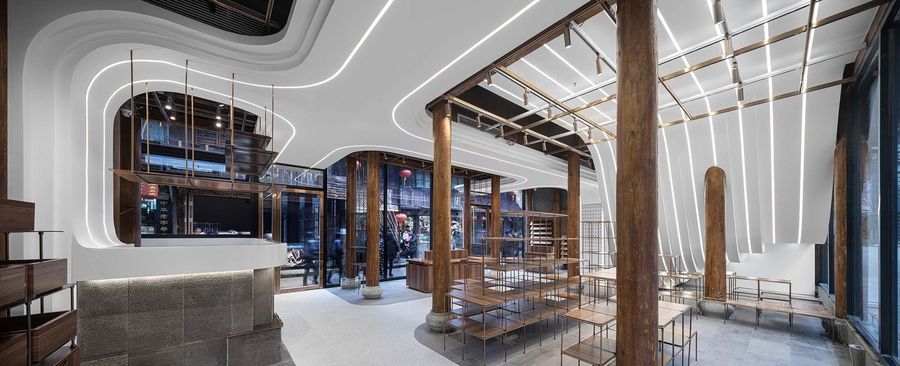
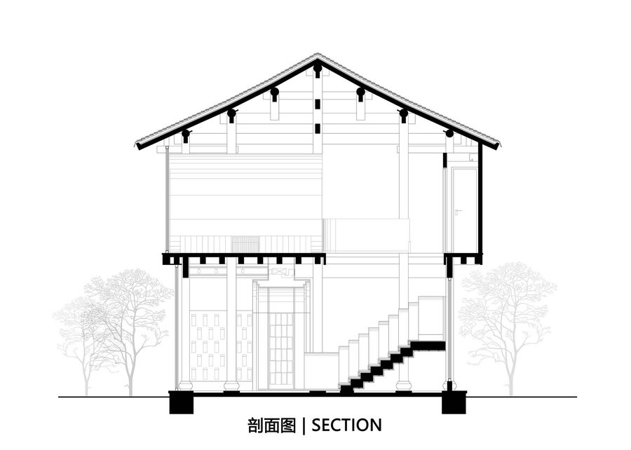
浪的设计概念同样融入了设计团队关于零售建筑的思考,如何在寸土寸金的租金下,最大化发掘使用空间是零售店面临的老问题,设计师用浪元素,模糊墙体,楼板,地面,屋顶的区隔,打破层的概念,重构空间体系,将两层的空间变为连续的整体,带来犹如在巨浪间冲浪的独特体验,形成一种吞没式的购物体验。
The design concept of “Wave” also contains the design team’s creative exploration into modern retail building. In order to solve the problem of maximizing the use of space under the heavy pressure of expensive rent which has always haunted the entire retail industry, the team has used the element of wave to blur the frozen boundaries of walls, floors, floors and roofs, break down the conventional concept of layers, and reconstruct the given spatial system. By ably transforming the original two-level space into a new continuous whole, this design has brought in a unique and exciting experience like surfing in midst of the huge waves, contributing to forming a kind of immersive shopping experience.
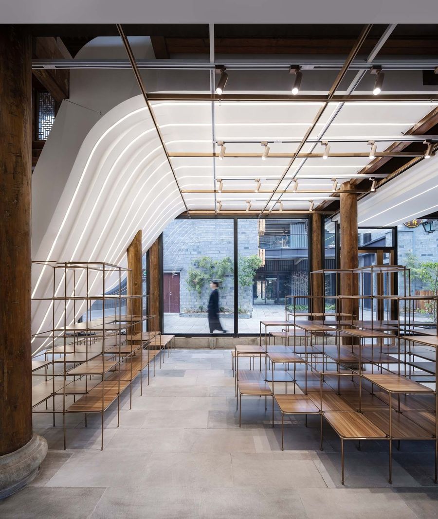
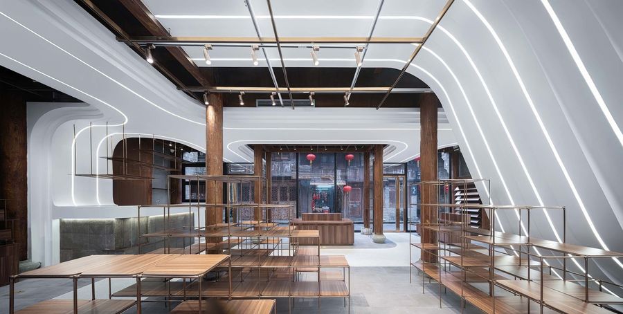
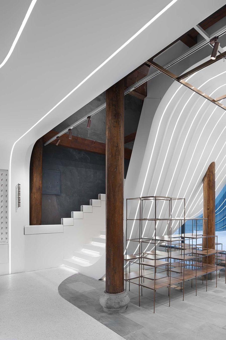
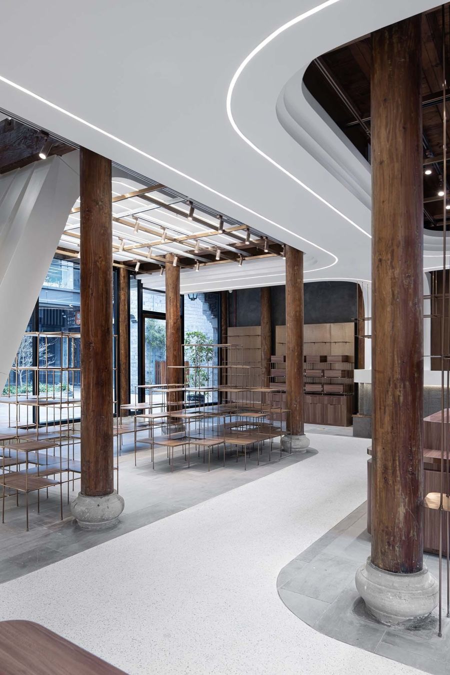
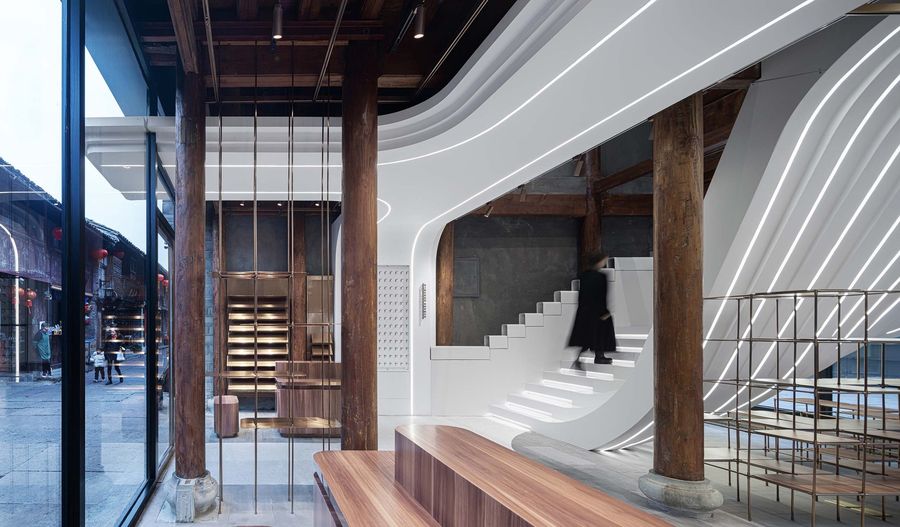
设计团队拆除冗杂的墙体,将原有的木结构和墙体等材料简单的暴露出来,在梁柱间置入犹如跃动的浪头翻涌的连续白色曲面,将设备管线、强弱电线路等隐藏其中,让视线可及处变得更加纯粹简约。
By means of thoroughly dismantling the jumbled and redundant walls and simply exposing the original wood structure and wall materials, the design team has placed a continuous white curved surface, which like a leaping wave, between the beams and the columns, and thus hidden inside the surface the equipment pipelines, the electrical lines, etc., so that the sight can be much clearer, purer and simpler without any confusion.
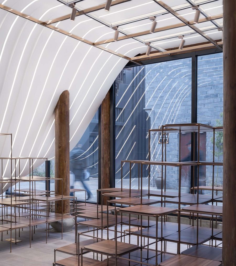
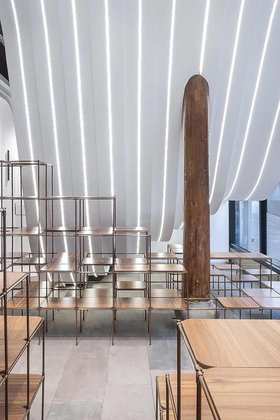
曲面边缘用层叠设计减弱体量感,增强速度感,最后用线性灯带描边,灯光亮起,照亮了巨浪与木柱,形成强烈的视觉碰撞,新的更加夺目,旧的更加隽永,仿佛时空碰撞,令人耳目一新。
With the help of cascade design, the edge of the curved surface has significantly weakened the sense of volume and enhanced the sense of speed. Set up subtly along the whole edge, the linear lights illuminate the huge wave and the wood pillars, perfectly forming a strong visual collision. As the new seems more dazzling and the old more meaningful, this visual effect turns to be more refreshing as if a dreamy spatio-temporal collision has happened.
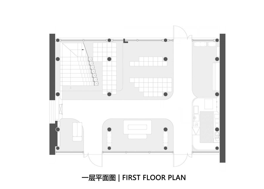
设计团队希望浪潮延续到地面,在尝试了金属,涂料后,选择了耐久的水磨石形成空间闭环,白色要素自然而然的将店铺区分为八大展区,每个展区都凸显出独特的个性 。
Hoping for the “wave” to continually surge down into the ground, the design team has finally chosen the durable terrazzo to constitute a closed loop after numerous experiments with the various kinds of metals and paints. The white element naturally divides the retail store into eight different exhibition areas, each of which highlights its unique feature perfectly.
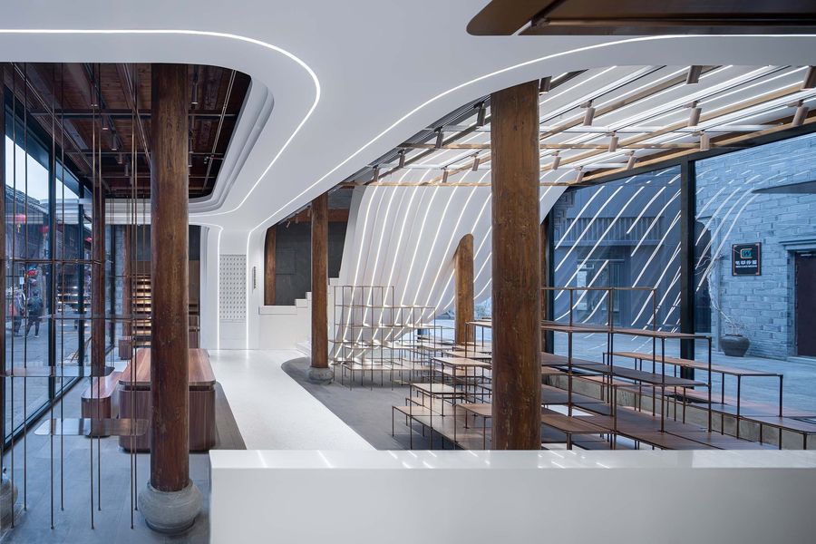
八大展区的展陈设计,设计团队以浪花为概念做了一体化设计,以金属,木饰面材质,设计了可上下调节的隔板,自由排列的支架,灵活机动的洞洞板等可变构件,适应零售店面商品种类繁多,换季更新的需求。
In terms of the exhibition design of these eight areas, the team has carried out an integrated design based on the concept of Wave. By adopting the metal and the wood veneering materials, LYCS team, in order to meet the unique needs of the retail store for holding a wide variety of goods and achieving seasonal renewal, has created lots of significant variable components such as the diaphragms that can be adjusted up and down, the brackets that can be freely arranged and the flexible and mobile cavern boards.
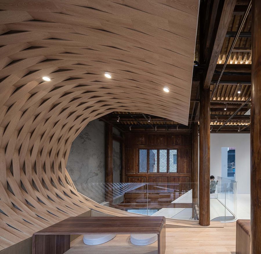
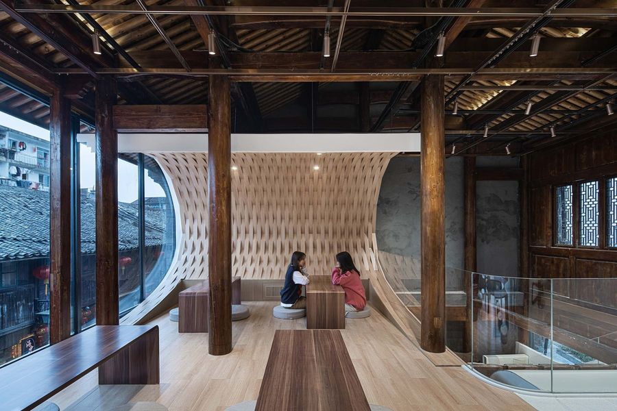
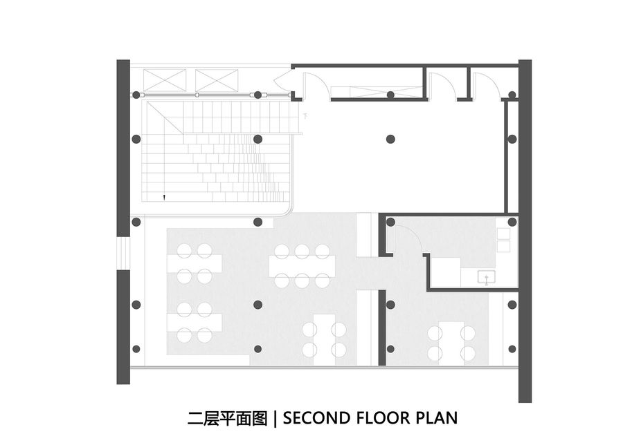
从一层走向二层,空间体验由浪下行走,变为乘浪而起,设计团队在空间的转换处设置拍照打卡点,将流线自然引向二楼茶座。
Stepping from the first floor to the second floor, the spatial experience will be changed accordingly from walking under the wave to riding the wave. The design team has already ably set up a perfect place for visitors to take photos at the transition point of space, which leads the streamline naturally up to the cozy teahouse on the second floor.
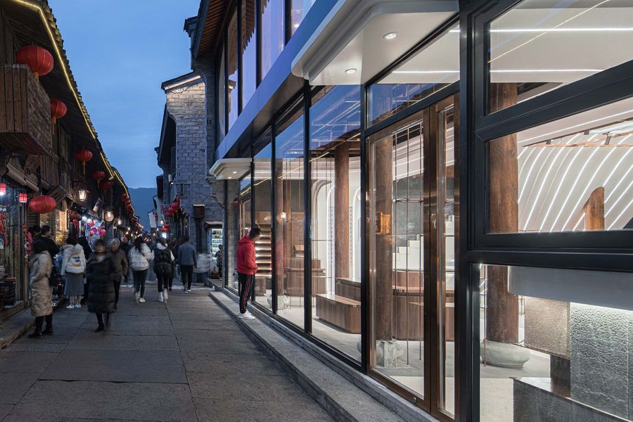
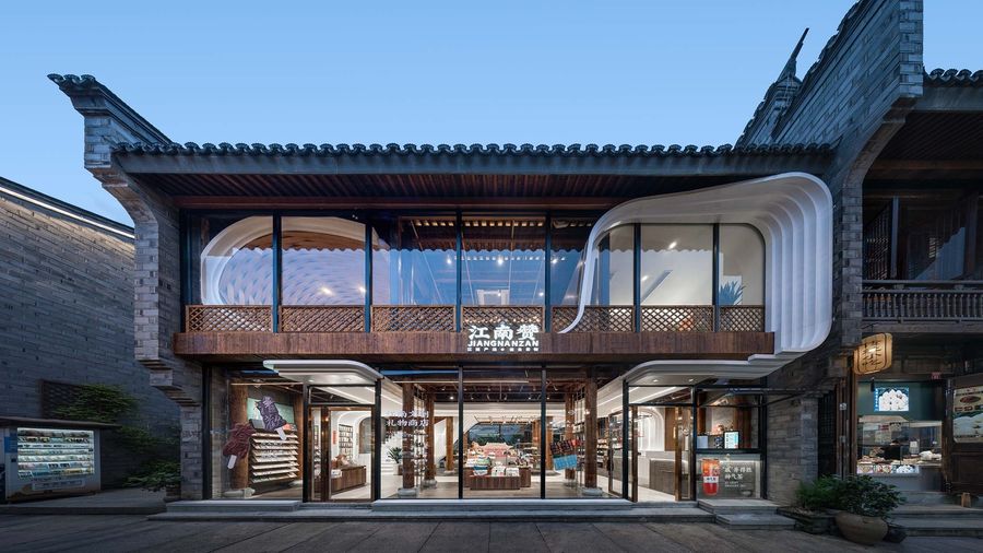
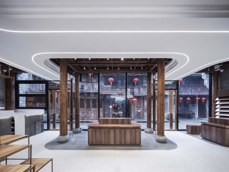
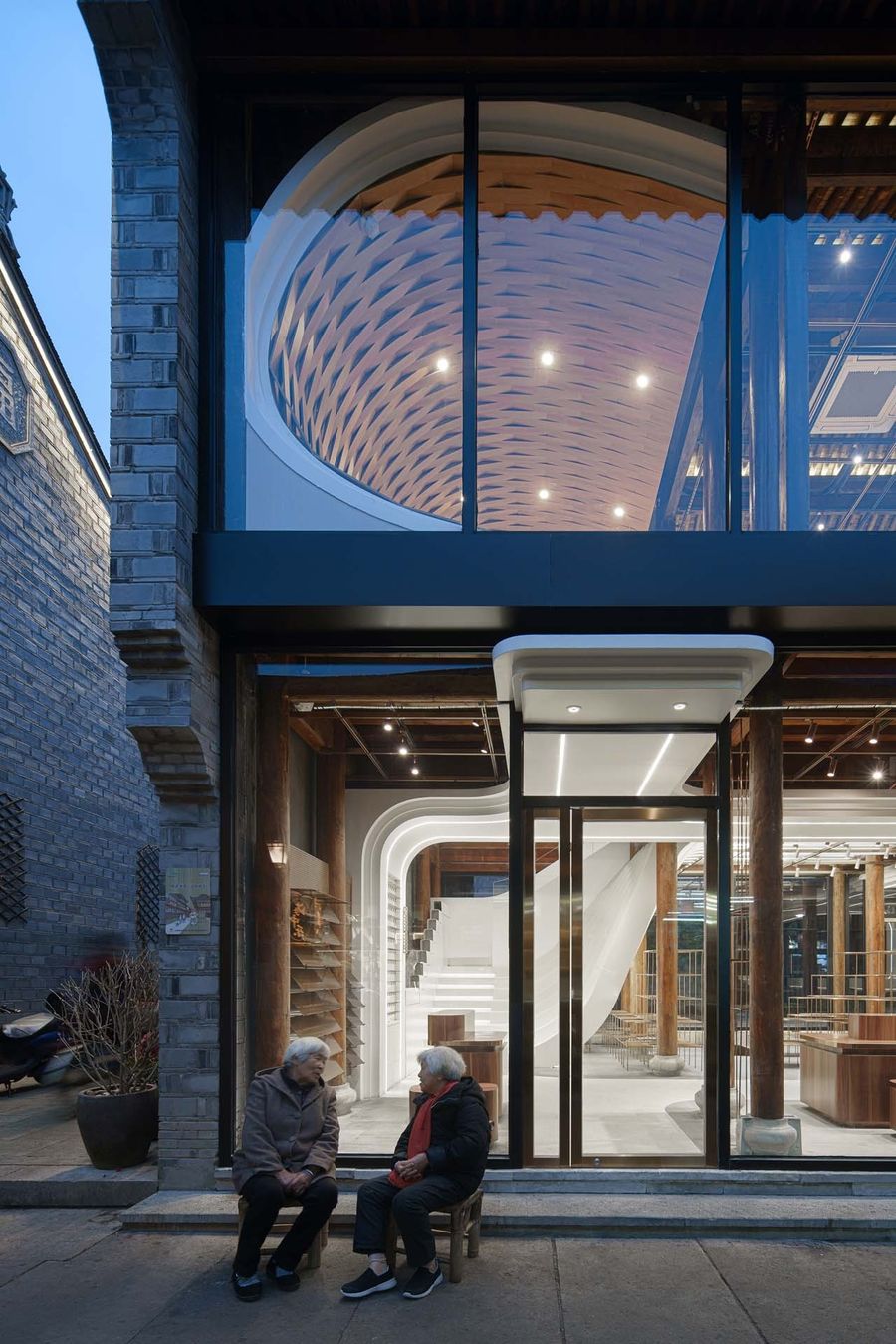
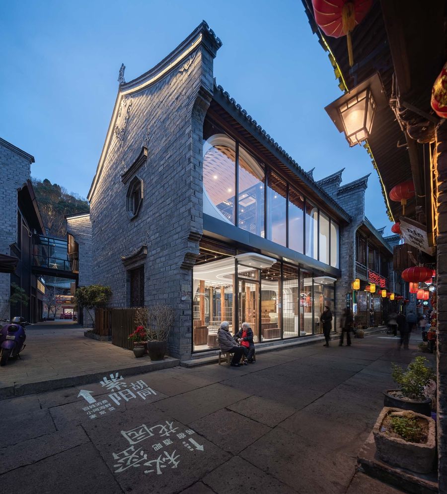
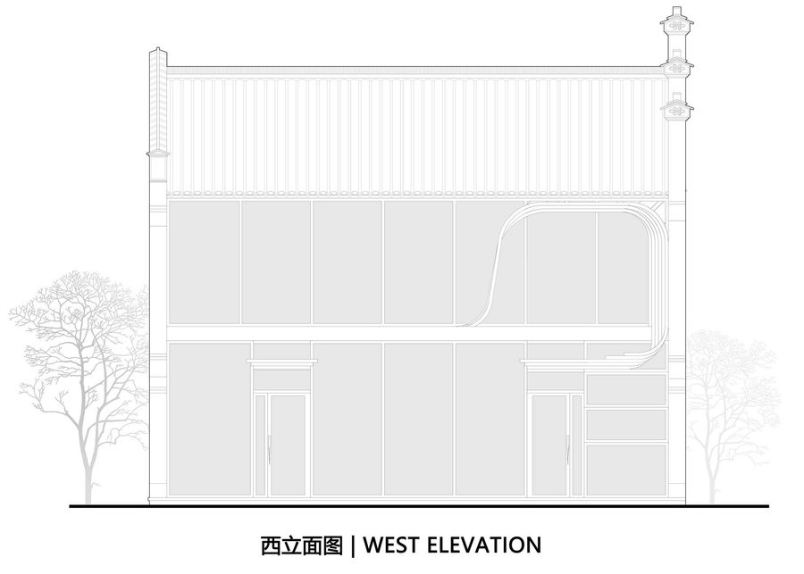
设计团队将沿街面的门窗全部拆除,用黑色不锈钢框架配以大面积落地门窗取而代之,让原本昏暗狭小的空间变得明媚而通透,巨浪从二层喷涌而出,向古街注入现代气息,使店铺从紫阳街脱颖而出。
Decidedly replacing all the doors and windows along the street with the large floor-to-ceiling ones and the black stainless steel frames, the design team has remarkably made the originally dark and narrow space become bright and transparent, and contributed to the huge “wave” pouring out from the second floor, as if infusing a modern vital pneuma into the old street. The whole design has already resulted in its significant distinction from other stores.
03
结语
Epilogue
江南赞现已开业,运营团队挖掘紫阳街的历史故事,设计开发了“戚开得胜”和紫阳真人两大产品系列,让紫阳真人和戚继光的大名重新在古城中流传。而零壹城市设计的江南赞成为了新文创的助推器和麦克风,让年轻人回到古街,为紫阳古街注入了新的活力。
Jiangnan Zan is now open for business. By virtue of exploring the historical stories of Ziyang Street, its operation team has designed and developed two product series “Qi Kai De Sheng” and “Zi Yang Zhen Ren”, contributing to the retrieval and re-spread of the reputation of the national hero Qi Jiguang of Ming Dynasty and the great Daoist Zi Yang Zhen Ren of Song Dynasty in this historic city. In addition, as the new rising “wave” of the old city, Jiangnan Zan designed by LYCS Architecture plays the key role of the new booster and “microphone” of the new cultural and creative industries, taking the young back and bringing a new vigor to Ziyang old street.
项目名称:江南赞
项目业主:北京华胥氏文化投资管理有限公司
项目地点:中国 | 台州 | 临海
建筑面积:200平方米
项目时间:2021年
设计公司:零壹城市建筑事务所(建筑设计、室内设计、软装设计)
摄影摄像:吴清山
PROJECT NAME: Jiangnan Zan
PROJECT OWNER: Beijing Huaxushi Culture Investment Management Co., Ltd
PROJECT LOCATION: Linhai, Taizhou, China
FLOOR AREA: 200 ㎡
STARTING TIME: 2021
DESGINER: LYCS Architecture (Architecture, Interior and Interior Decoration)
PHOTOGRAPHER: WU Qingshan








评论(0)