2020年,在胡大饭馆第二代管理人——郭冬和IN.X屋里门外的一同推动下,簋街胡大总店完成了20年来第一次翻天覆地的空间改造。In 2020, under the cooperation between Guo Dong - the second-generation manager of Huda Restaurant and the design team of IN.X, Huda Restaurant in Guijie completed its first refurbishment in the past 20 years.
重新开门营业时,人山人海的排队场面让设计师吴为松了一口气,但他也说这其实是预料之中的,胡大这把牌交出来,他是熟悉打法的。When the restaurant is reopened, the queuing crowd is a relief to the designer Wu Wei, who said that this was actually what he had expected, because he was familiar with the game rule of Huda Restaurant. 初始方案被两次质疑最终未修改一处The initial plan was questioned twiceBut finally, nowhere has not been changed “大家做好准备,有可能会全部重来。”——虽然心里有底,但吴为还是在最后一次讨论会之前给团队设计师发出这样一条信息。初次会议结束时,设计方案虽然全票通过,但在之后却迎来了两次全面质疑——对于胡大新面貌的方向、艺术化程度、传统和当代的处理方式等等,运营者和专家提出了很多疑虑。"Let’s get ready, we might need to start all over again." - Although known exactly what he designed, Wu Wei still sent such a message to the design team before the last meeting. At the end of the first meeting, although the design proposal was passed unanimously, it comes under doubts afterwards. Operators and experts put forward a lot of questions about the direction of new brand image, the artistry, and the traditional and contemporary treatment methods.
在多次沟通中,压力下的屋里门外夯实回应:“这一次,我们是站在未来看胡大,要抓住明天的客群和市场。”当整个方案逻辑完整地阐述清晰之后,最终得到了这样的回应——“既然你们的考量已经这么全面,那就按照最初的方案来吧。”于是,胡大在去年年末重新开张,宾客盈门的火爆场面再次成为簋街上一道风景。Facing this challenge and under such pressure, IN.X responded firmly: "This time, we design from the future perspective of Huda, and we must seize the customers and market of the future." After explaining the logic of the whole plan in detail, the design team finally got this response:”Since your considerations are so comprehensive, then just follow the original plan." As a result, when Huda Restaurant reopened at the end of last year, the scene of crowded guests at the door once again became a scenery on Guijie Street. 胡大和簋街是长在一起的Huda and GuijieAre grown as a whole
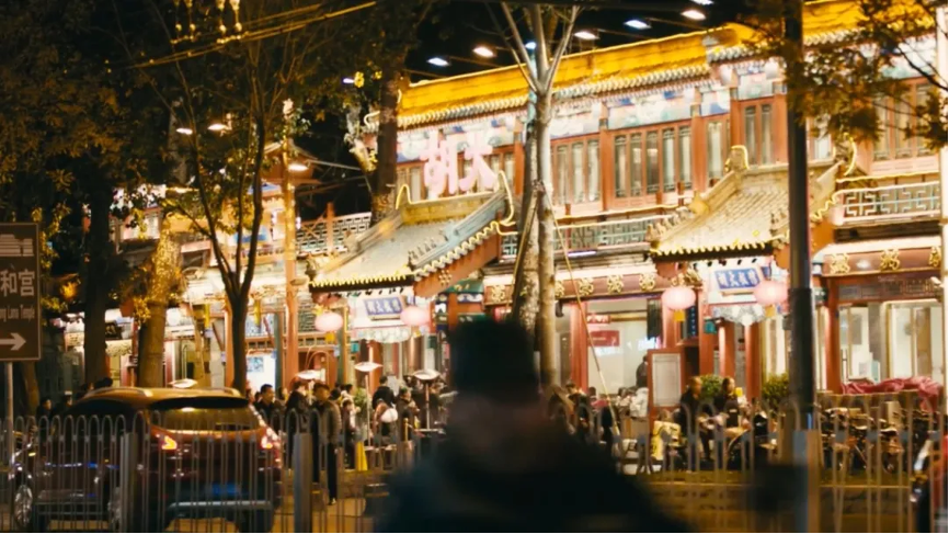
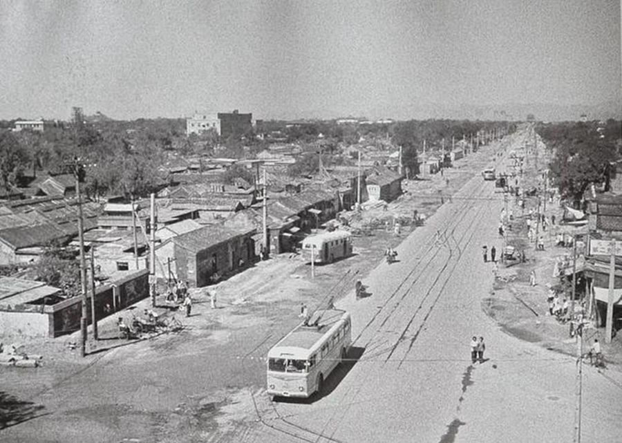
60年代初的东直门内大街(簋街)
80年代东直门内大街(簋街)
2016年,郭冬抱着“试试看”的心态,第一次将胡大分店交给了屋里门外,自此开始,他便从未失望过。吴为虽不善言辞,很少抛头露面于场面中,但他仍然成为圈子里、朋友口中,最懂商业的餐饮设计师。In 2016, it was the first time Guo Dong commissioned IN.X to design a branch of Huda Restaurant. Since then, he has never been disappointed. Although Wu Wei rarely shows in the public activities, he has been regarded as a skilled designer who understand business the most in catering space design field.
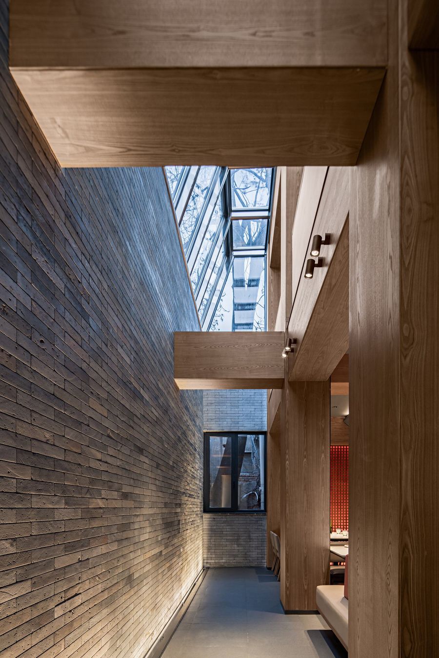
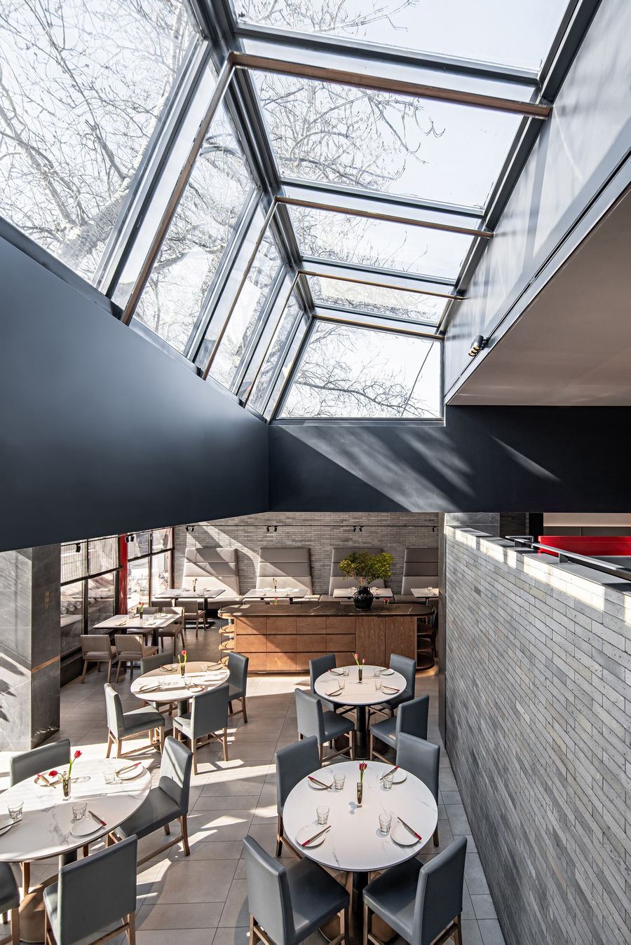
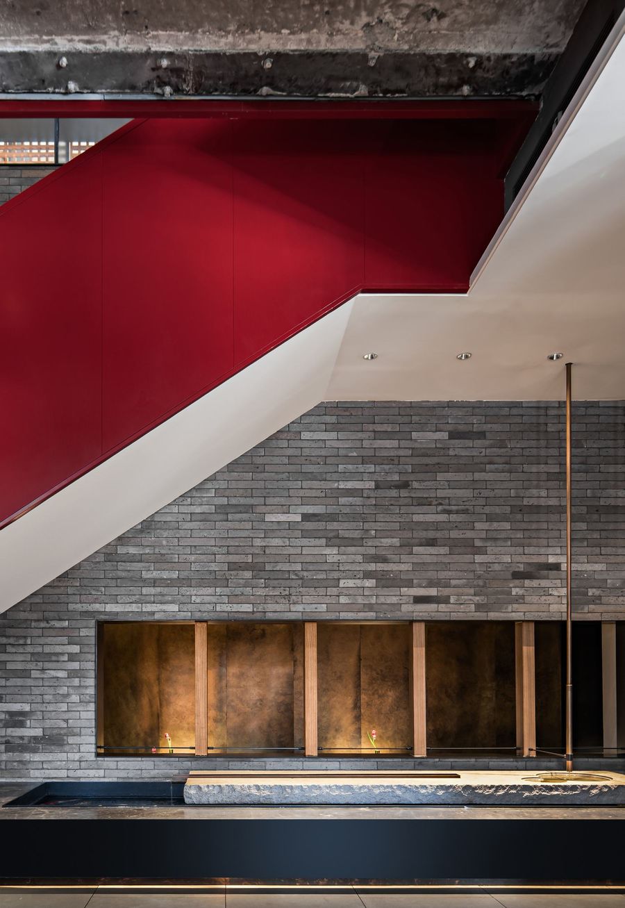
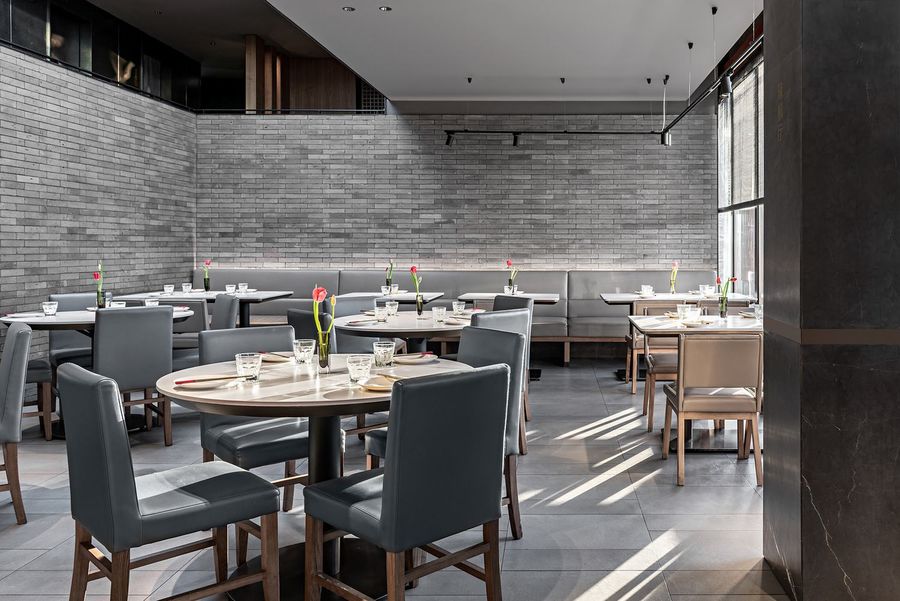
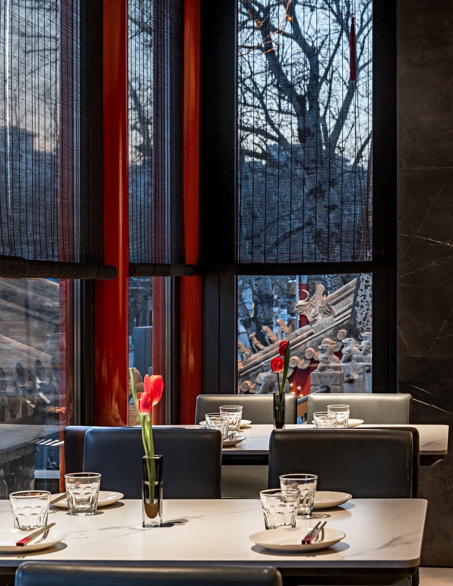
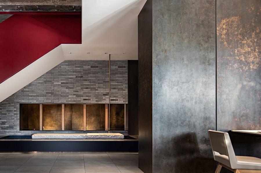
从室外到室内,大面积条形青砖的使用,将街面风格延续到了室内,餐厅仿佛从街道上生长出来,而不是突兀的存在。在二环内,北京老城区独具特色的胡同灰中,胡大店中日日红火的烟火气扑面而来。From exterior to interior, a large area of striped black bricks are used to extend the street style to the indoors, as if the restaurant grew from the street, rather then an unexpected existence. Located inside the second ring road in Beijing, the prosperous dining environment of Huda Restaurant is booming in the unique gray alley of the old urban district.
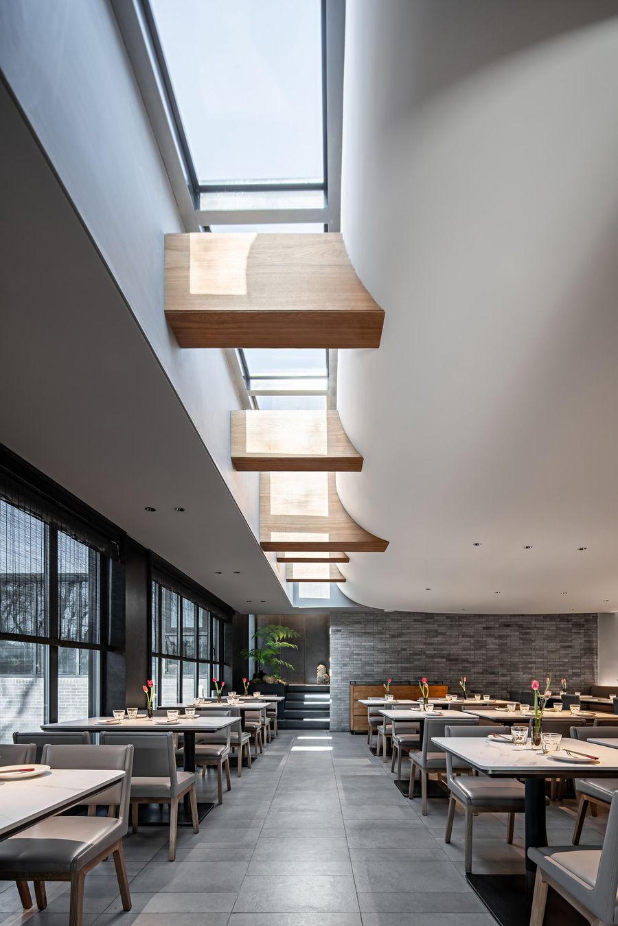
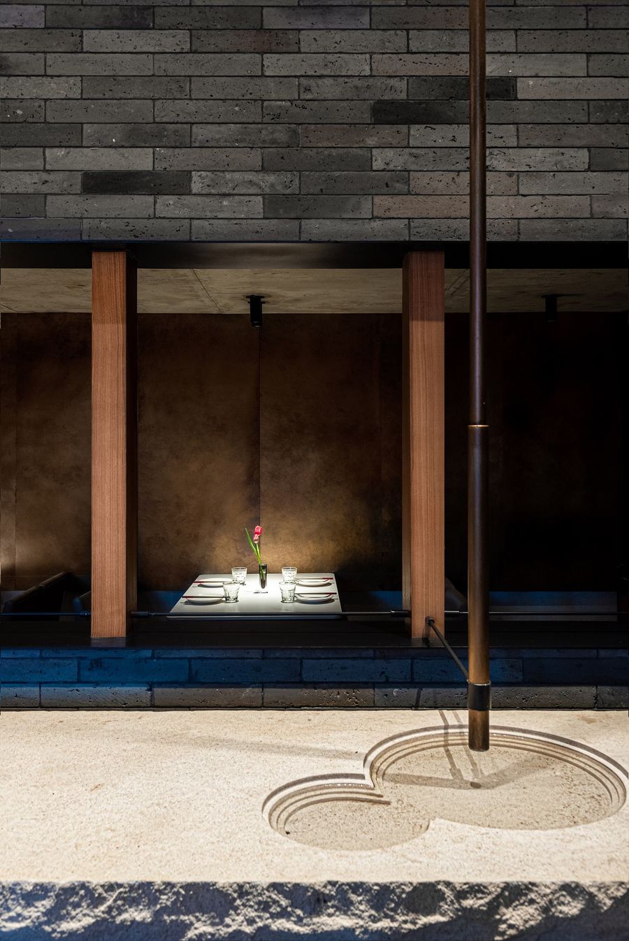
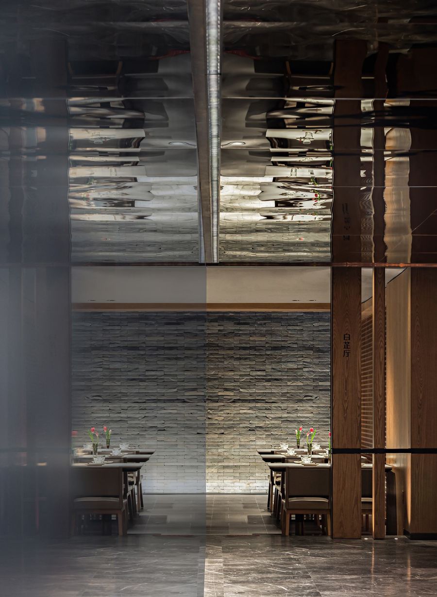
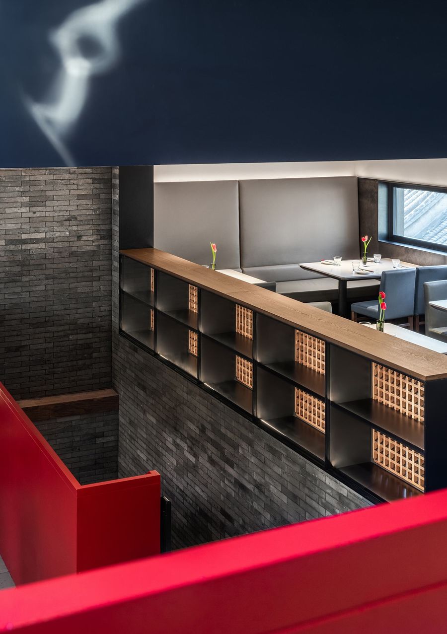
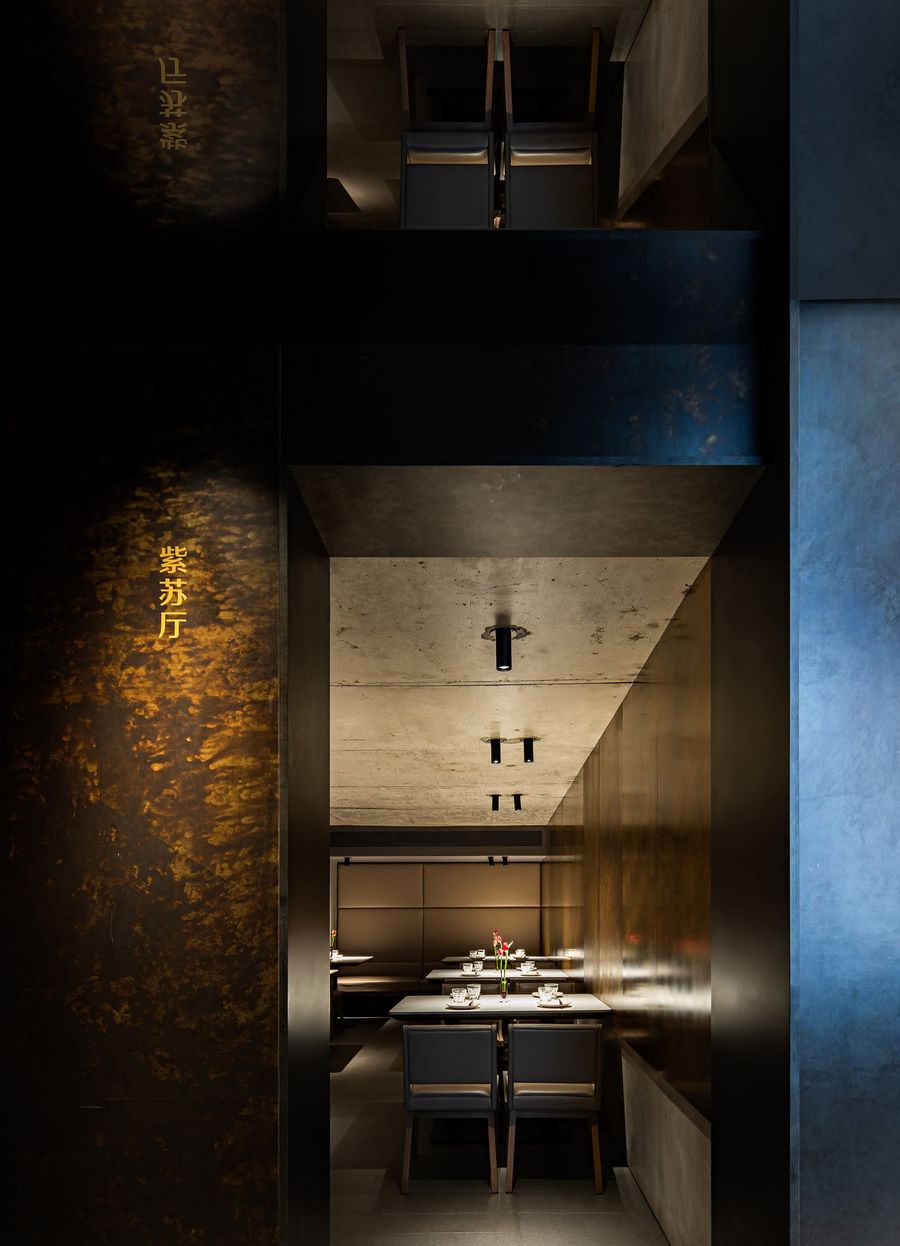
餐厅内,艺术性也是从具体的陈设物件转入更为宏观的空间本身。能够代表北京城的红与灰、被解构的传统建筑结构、天井与屋檐的再度演绎、通透而气息流畅的动线梳理、不动声色的光影游移、窗外天色行人变幻、内部功能扩充、灯光分时变化,甚至是卫生间的性别区隔消失都是设计中更加隐晦的艺术表达。Inside the restaurant, the artistry is conveyed from the furnishings to the overall space. As the typical color of Beijing, red and gray form the palette of space, where traditional building structure elements are deconstructed and recombined in patios and eaves. With transparent and smooth line, the interior light and shadow change quietly along with the weather and pedestrians outside the window. Even the space function arrangement, lighting change with time and the disappearance of gender divisions in the bathroom are more subtle artistic expressions in the design.
地理位置与景观历史为胡大烙上了厚重的文化基因,这是它可以借的力,于是空间本身的设计更趋于轻盈,一张一弛,反而获得四两拨千斤的效果。The location and landscape history gave Huda Restaurant a profound cultural gene, which is what it can borrow. As a result, the design of the space tends to be lighter, where the harmonious combination of tension and relaxation reach a good effect. “您的设计思路?”“给城市烟火造房子”"What’s your design idea?""Building a house for the passion for life."
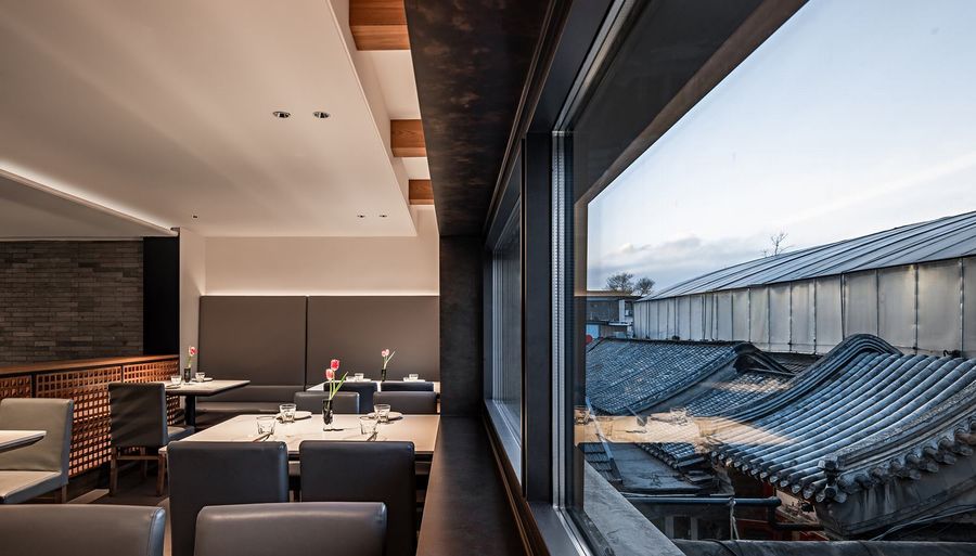
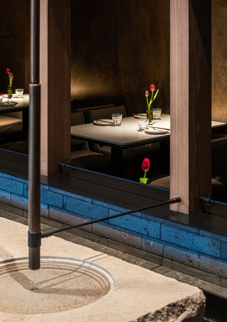
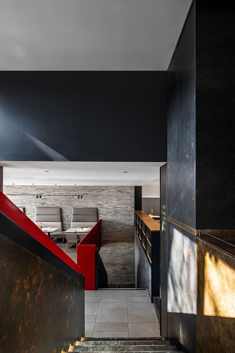
改造后的胡大首先是让人振奋和愉快的,二次建筑设计把原本像迷宫一样的餐厅区隔得格外清晰,各个区域彼此连通,而无论坐在哪里,阳光和室外景观都是构成区域的一部分。The renovated Huda Restaurant is inspiring and enjoyable. The design separates the restaurant function areas clearly, which was a disorder originally like a maze. After completion, each area is connected to each other to guarantee enough sunlight and outdoor landscape no matter where you sit.
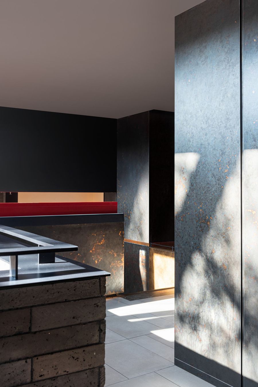
节奏感更强的拴马桩造型栏杆取代古建风格的旧栏杆,视线透过落地窗与室外景观贯通,这些栏杆成了最好的视觉焦点。Rhythmic railings in the shape of hitching post replace the old railings in the ancient architectural style. When the sight is connected to the outdoor landscape through floor-to-ceiling windows, these railings have become the best visual focus.
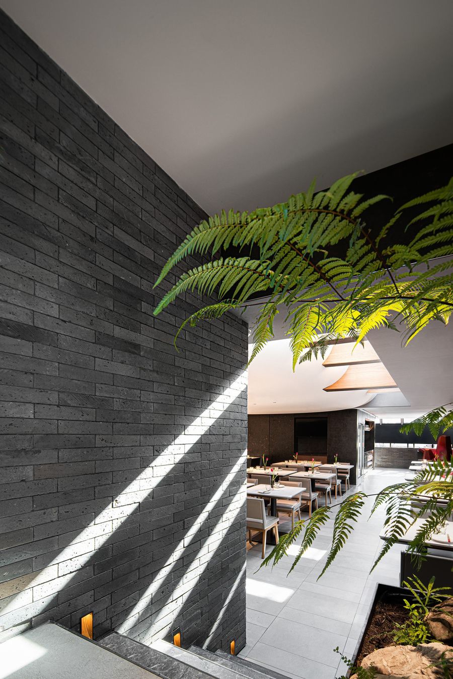
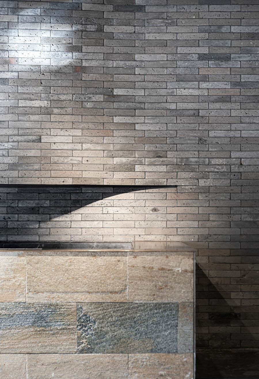
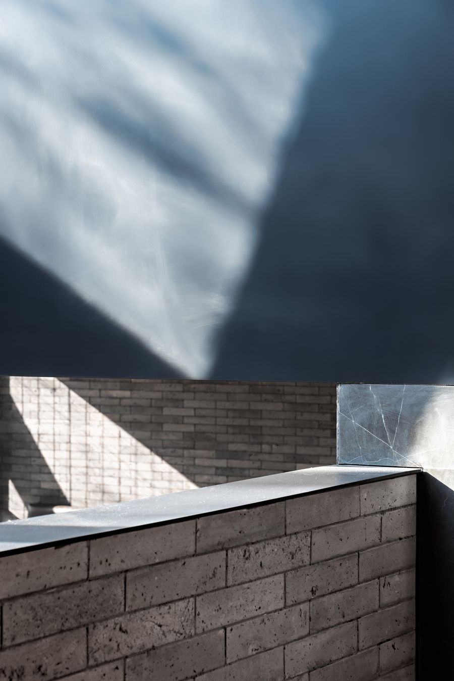
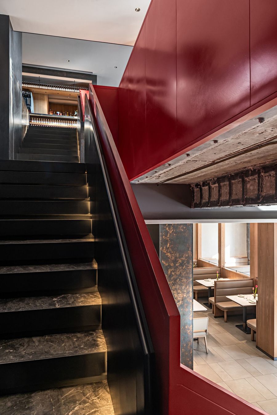
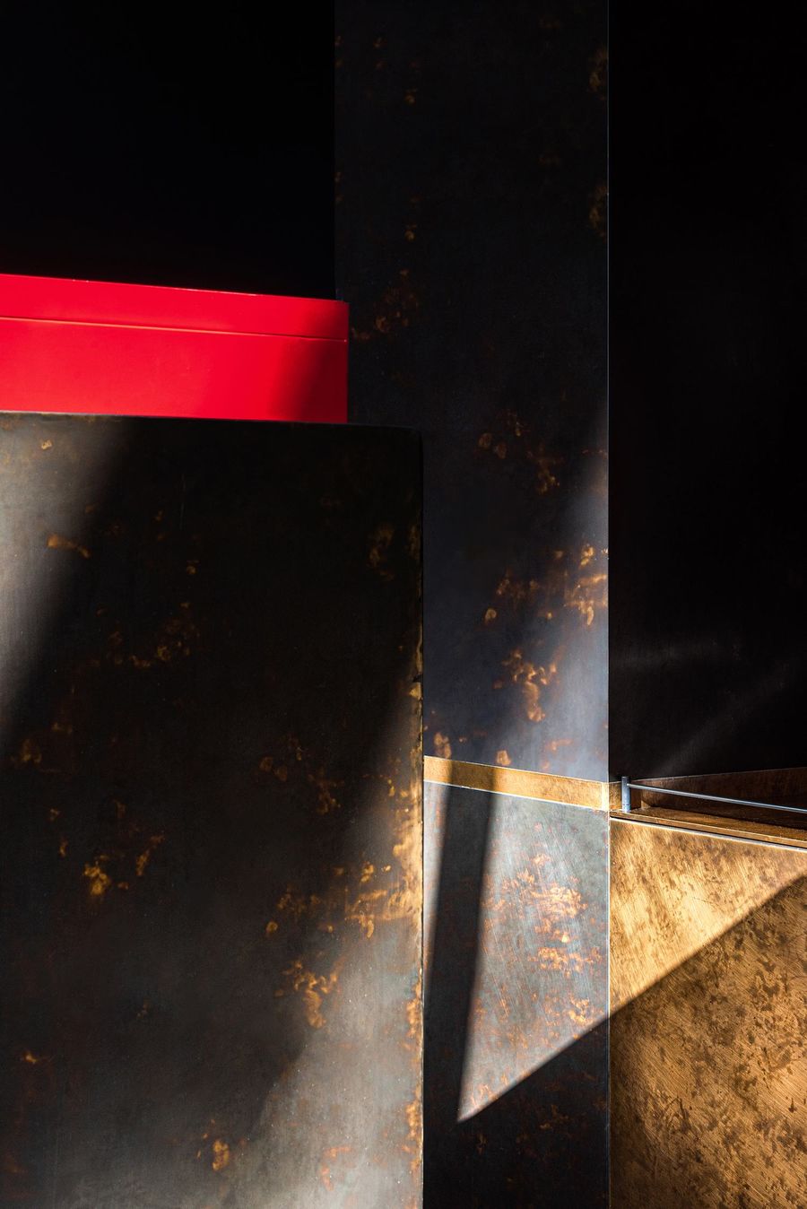
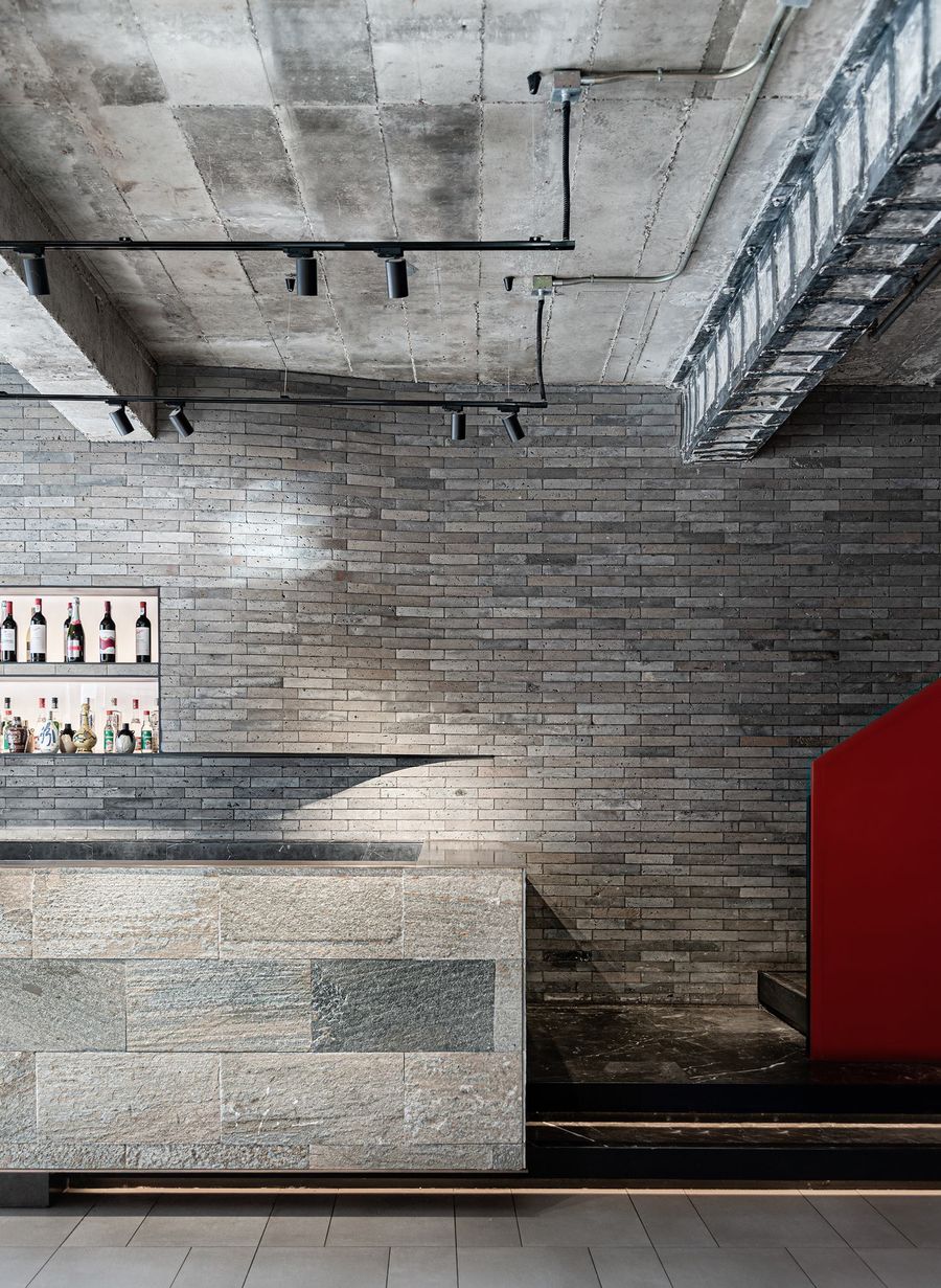
大面积的青砖在光影和切割细节的叠加下呈现出低调而丰富的层次感。能够代表胡大味道和京城的故宫红通过醒目的楼梯在第一时间抓住食客,它依托空间中明确的动线而设计,视觉性只是它的附加值。The large area of black bricks presents a low-key and rich layering under the superposition of light and shadow and cutting details. Forbidden City Red, which can also represent the taste of Huda Restaurant, catches the diners immediately through the eye-catching stairs. It is designed based on the clear movement in the space, and the visual effect is the added value.
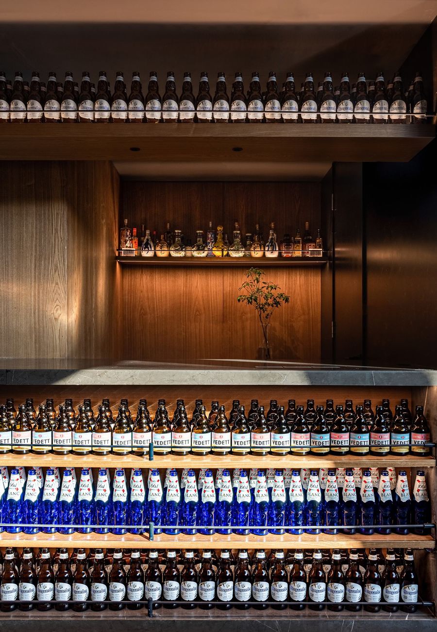
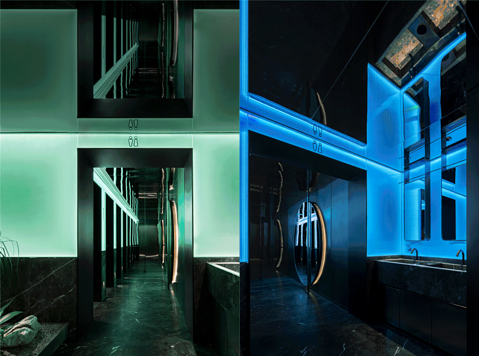
吧台作为新的功能区增加,补充等位区功能的同时给胡大增添了一份年轻的活力。同样突围的,还有本不起眼的洗手间区域——白天、就餐时间、夜宵三个时段的灯光色彩交错“转场”,剧情应和着情绪和时间变换。The bar counter was added as a new functional area, supplementing the waiting area and adding a young vigor to the restaurant. Another breakthrough was made in the washroom: the lighting colors change according to the three periods of daytime, meal time, and midnight snack time, echoing with mood and time.
传统材料尽管大面积使用,却因为现代手法的加工和设计演绎而使它们充满简洁高级的当代感,这种当代感是从最朴素之处生长起来的,带着浓郁的烟火气,也带着一份属于胡大和簋街的风范。Although traditional materials are used on a large scale, they are full of concise and upscale contemporary feeling because of the modern processing and design techniques. This kind of contemporary feeling grows from the simplest place, with a strong passion for life and a style that belongs to Huda Restaurant and the Guijie Street.
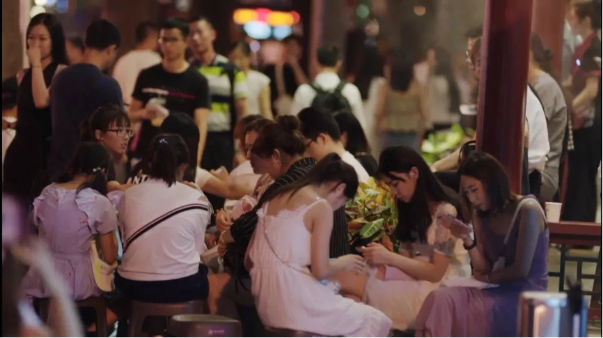
簋街游人如织,在胡大热闹的牌匾下动辄等位两三个小时,早已是种时髦。Crowded with tourists, It has already become a trendiness in Gui Jie Street to wait for two or three hours under Hu Da's signboard. 20年来,胡大作为与簋街互生共荣的餐饮品牌已经成为一张代表簋街,甚至代表北京的餐饮名片。面对不断迭代的未来客群以及区域、城市对餐饮文化的新需求,胡大必须完成升级以保证更持久的生命力。In the past 20 years, Hu Da, as a catering brand that co-exists with Guijie Street, has become a business card representing Guijie and even Beijing. Facing the future ever-changing customer group and the new needs of regional and urban culinary culture, Hu Da has to complete the upgrade to ensure a more lasting vitality. 餐饮策略三部曲是设计师吴为针对成熟餐饮品牌提出的一套设计策略,它帮助品牌有针对性地通过空间升级完成品牌升级,进而实现为成熟品牌持续赋能的价值。The catering strategy trilogy is a set of design strategies proposed by the designer Wu Wei for mature catering brands. It helps brands to complete brand promotion through space upgrading in a targeted manner, and then adds sustaining value for mature brands.
项目信息
项目名称:胡大总店
室内设计:IN.X 屋里门外设计
设计主创:吴为
设计团队:刘晨阳、贾琦峰、李岩
室内陈设:金升旭、宋江丽、应哲光
灯光设计:朱海燕
项目面积:1050㎡
项目摄影:郑焰
项目视频:飞翔
项目策划:楽品牌策略机构
Project data Project name: Huda Restaurant Main
StoreInterior design: IN.X Chief designer: Wu Wei
Design team: Liu Chenyang, Jia Qifeng, Li YanInterior furnishings: Jin Shengxu, Song Jiangli, Ying ZheguangLighting design: Zhu Haiyan
Project area: 1050 square meters
Project Photography: Zheng Yan
Project Video: Fei Xiang
Project planning: LELE Brand Strategy
策略為先,設計為後Strategy First, Design Follows
制定恰當的商業策略,是企業在自己所處行業中獲得可持續競爭優勢的重要戰略,而明確策略並以策略為先進行空間設計,是品牌打贏每壹階段市場和品牌戰役的有效方法。在商業策略管理中,我們將品牌劃分為三個不同階段:創業期、成長期、成熟期。針對三個不同階段也有相對應的策略。Formulating an appropriate business strategy is an important strategy for an enterprise to obtain a sustainable competitive advantage in its own industry, and a clear strategy and strategy-first space design is an effective way for a brand to win every stage of the market and brand battle. In business strategy management, we divide the brand into three different stages: the entrepreneurial period, the growth period, and the mature period. There are corresponding strategies for the three different stages.
商業策略好比品牌發展的整體戰,而每壹階段的品牌成長皆可看作是看做壹場戰役,每壹個空間的呈現則都是壹場戰爭。只有在整體戰略正確的前提下,每壹場戰役才會有更細化、更明確的作戰方針,而這套策略和方針幫助品牌在每壹場戰爭中明晰目標,即在每壹次空間設計中依照商業策略擁有明確的設計準則,這樣才能打贏每壹場戰爭,取得市場競爭中每壹階段的戰役勝利,最終幫助品牌獲得持久生命力,在激烈的市場競爭中屹立不倒。
Business strategy is like the overall battle of brand development, and each stage of brand growth can be seen as a battle, and the presentation of every space is a battle. Only on the premise that the overall strategy is correct, each battle will have a more detailed and clear operational policy, and this set of strategies and policies will help the brand to clarify the goal in every war, that is, in every space design China has clear design guidelines in accordance with its business strategy, so as to win every war and win every stage of market competition, and ultimately help the brand gain lasting vitality and stand firm in the fierce market competition.







评论(0)