本案位于
南京市鼓楼区高档住宅区沿街商铺
业态定位为高档童装零售
我们希望通过空间美学和艺术美学的融合
用设计带来品牌形象的提升
挖掘品牌的深层商业价值
打造出一个充满想象力和创造力的空间
Break
“打破”
突破原有的限制和约束
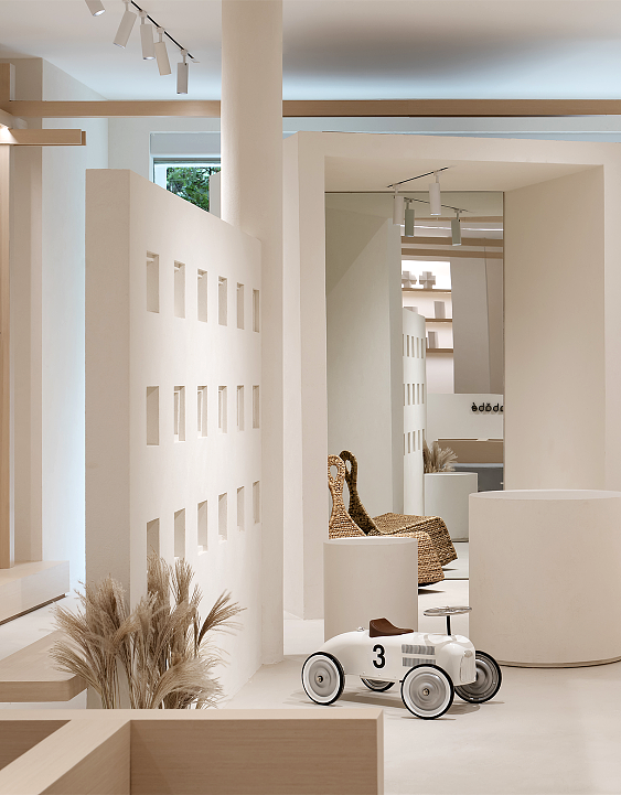
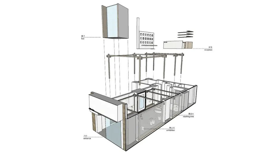
橱窗区我们打破常规,用内建筑的手法,通过一个BOX,将橱窗区域划分为入口、展示、情景三个空间。BOX本身所具有的平面、斜面、切面的形态特征,也构成了外立面视觉效果的拓展和延伸。
In the window area, we broke the convention and used the internal architecture method to divide the window area into three spaces: entrance, display and scene through a BOX. The morphological characteristics of plane, inclined plane and section of BOX itself also constitute the expansion and extension of the visual effect of the facade.
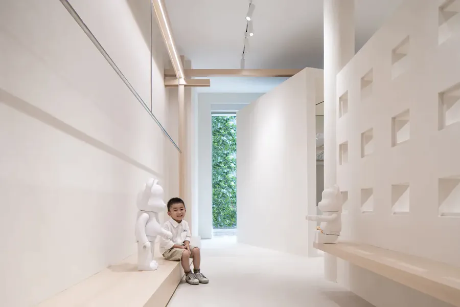
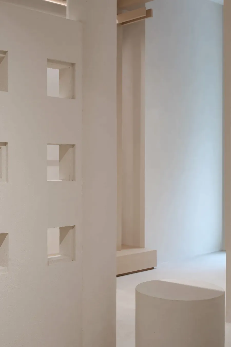
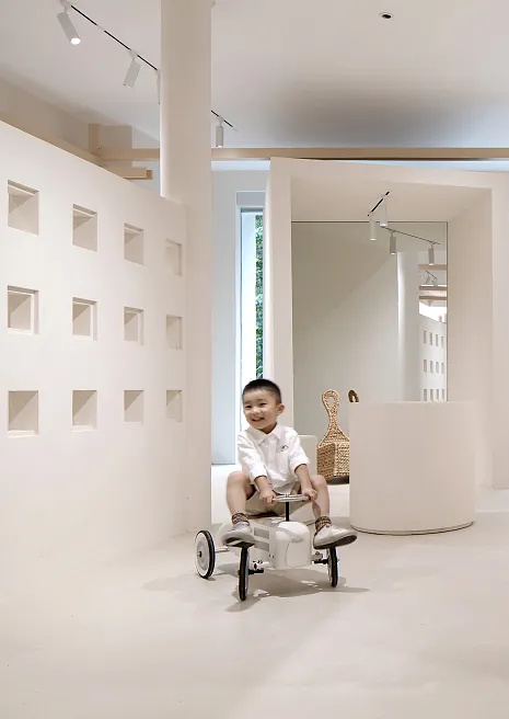
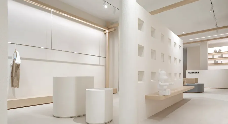
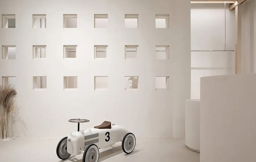
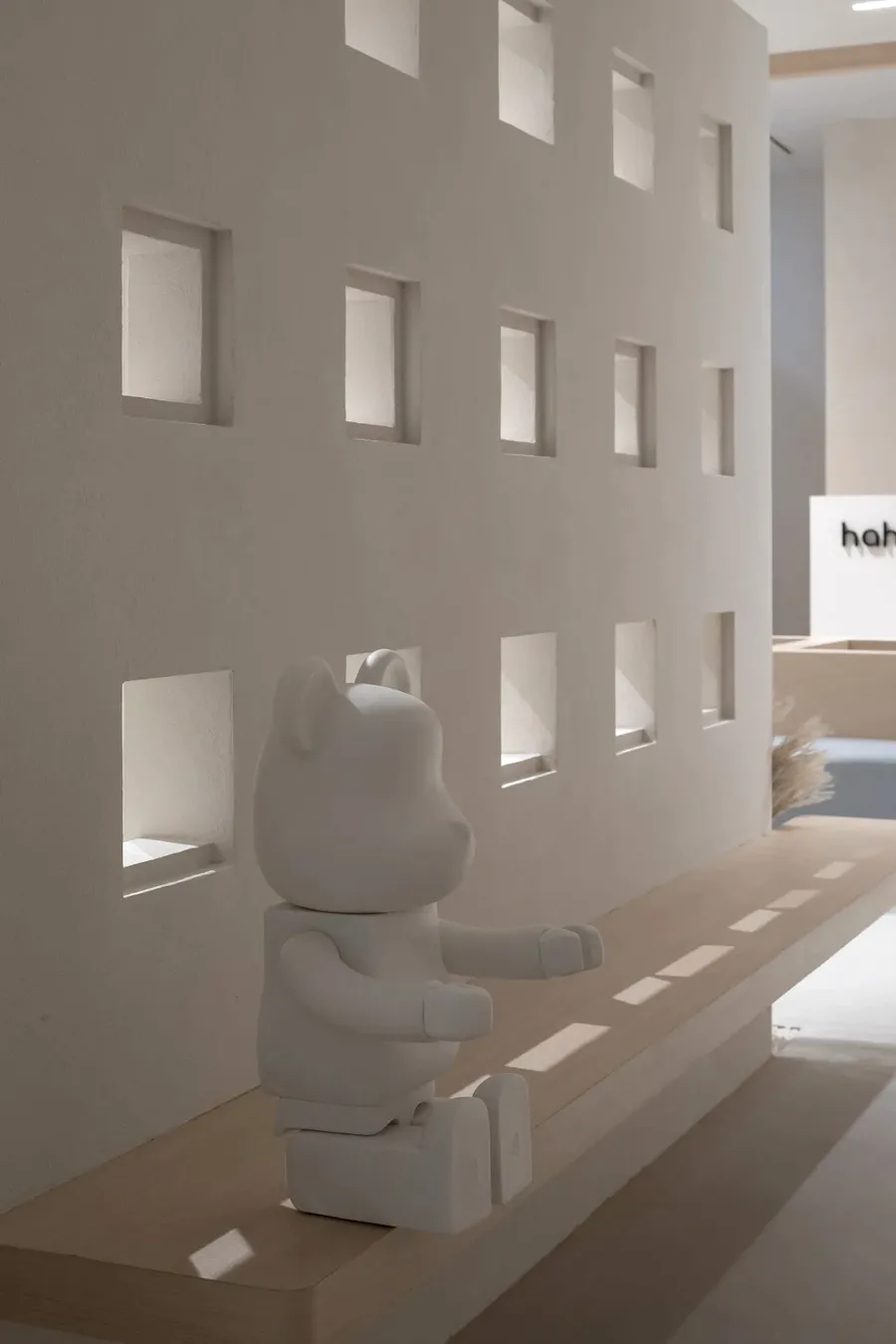
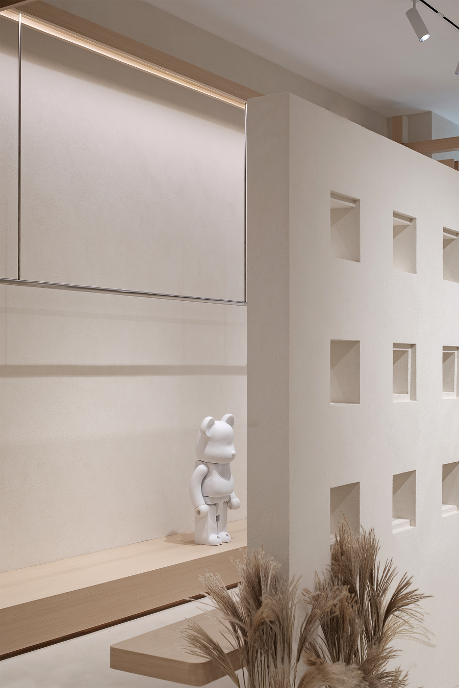
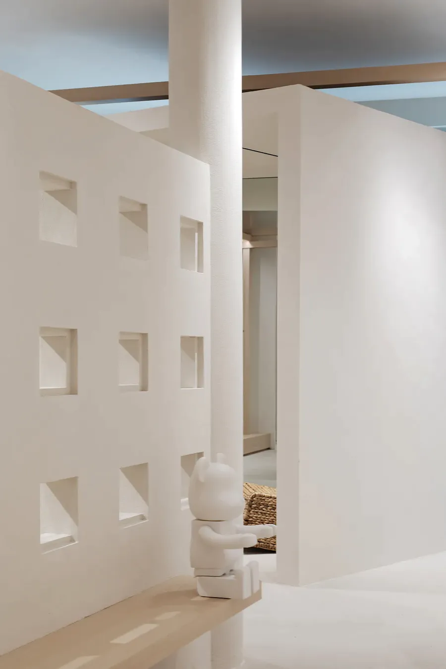
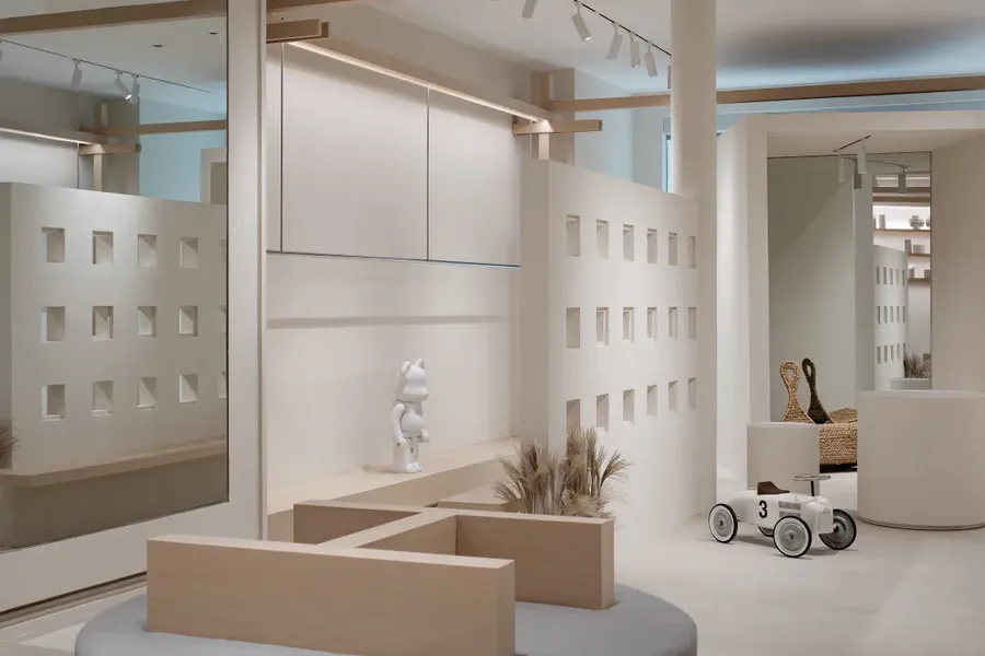
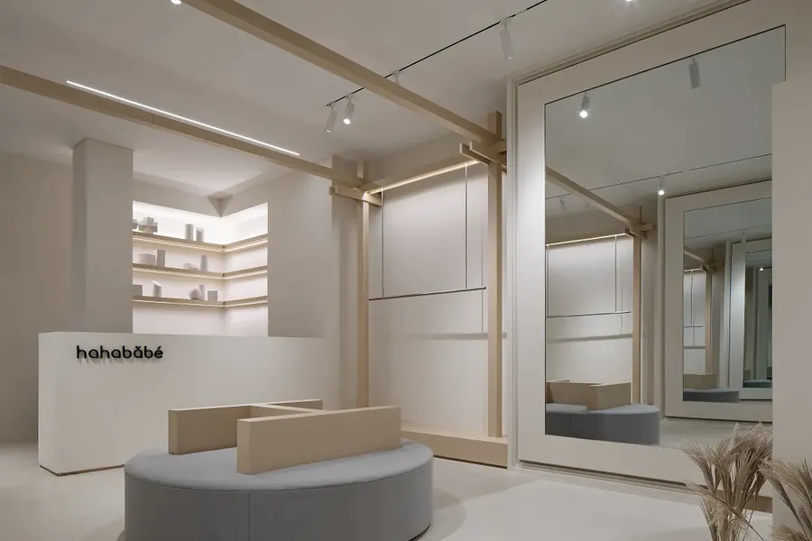
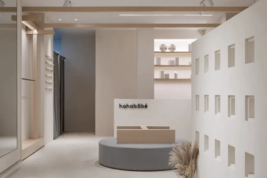
布满视口的隔墙,跳脱出传统意义上对空间的分隔方式。墙体不再是构成空间的基本元素,而是成为空间内被赋予了情感的艺术装置。纯净的白色让空间变得易于遐想和引人深思,毫无修饰的白墙平添了几分心理上的纯粹。
The partition wall full of viewports breaks away from the traditional way of separating space. The wall is no longer the basic element of the space, but an artistic installation endowed with emotion in the space.
The pure whiteness makes the space easy to reverie and evoke thought. The unmodified white walls add a bit of psychological purity.
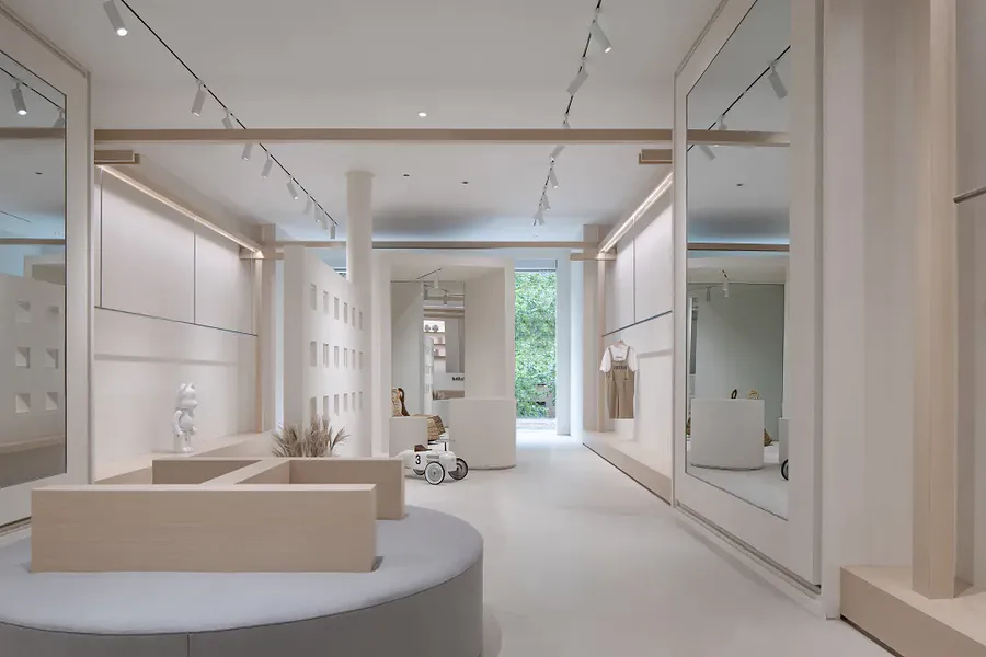
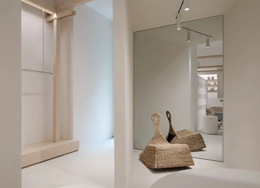
无限延伸的镜面,打破原有的空间隔阂,激发出空间富于想象力与创造力的特质。这些特质往往能给人带来无与伦比的视觉冲击和心理感受。
The infinitely extending mirror surface breaks the original gap and stimulates the imagination and creativity of the space. These characteristics can often bring unparalleled visual impact and psychological feelings.
BOX空间,既是对传统空间处理方式的颠覆,也回应了功能上的诉求。
The BOX space is not only a subversion of traditional spatial processing methods, but also a response to functional demands.
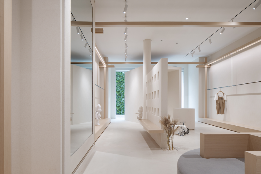
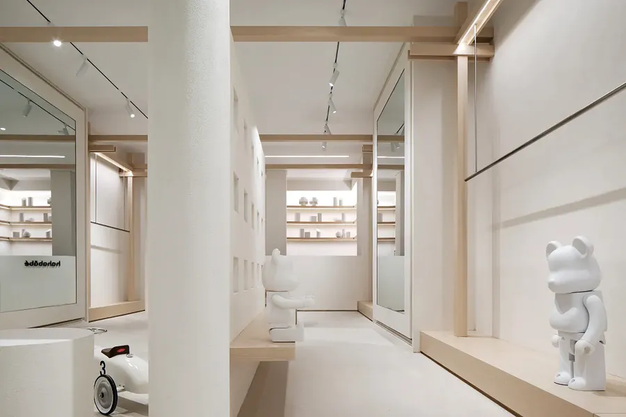
整个空间的布局体块、结构装饰,都是基于对几何学中正方形和圆形元素的拆分、提取,再以点、线、面的穿插形成新的组合,从而构成一个虚实结合的立体美学零售空间。
The layout and structural decoration of the entire space are based on the separation and extraction of square and circular elements in geometry, and then interspersed with points, lines and surfaces to form a new combination, thus forming a three-dimensional aesthetic that combines virtual and real Retail space.
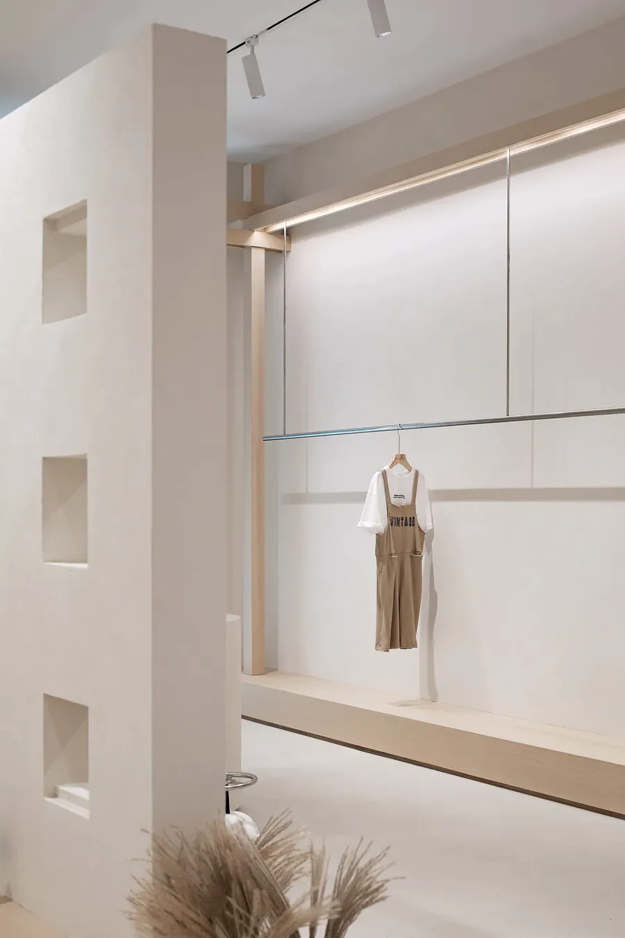
空间内的框架,在保留原始空间属性的同时,构成新的挂衣展示区域。
The frame in the space, while retaining the original space attributes, constitutes a new hanging clothing display area.
用分解的观念,强调打碎,叠加,重组。侧重空间内的个体,装置本身,反对总体统一而创造出天马行空的不确定感,进而衍生出像孩子打破常规一样的个性时尚。
Use the concept of decomposition to emphasize breaking, superimposing, and reorganization. Focusing on the individual in the space, the installation itself, it opposes the overall unity and creates a sense of uncertainty that is unconstrained, and thus derives a personality fashion like a child breaking the convention.
Break
“重构”
重新组合构成新的秩序
抬高的部分地面,除了满足功能空间的划分,也被赋予了叠放、展示、休闲等更多的可能。
The raised part of the ground not only satisfies the division of functional space, but is also given more possibilities for stacking, display, and leisure.
布满视口的隔墙,形成了空间上的游走和穿插,这种游走和穿插,加深了人与空间,空间与商品,商品与人之间的关联。
The partition wall full of viewports forms space wandering and interspersing. This wandering and interspersing deepens the relationship between people and space, space and commodities, and commodities and people.
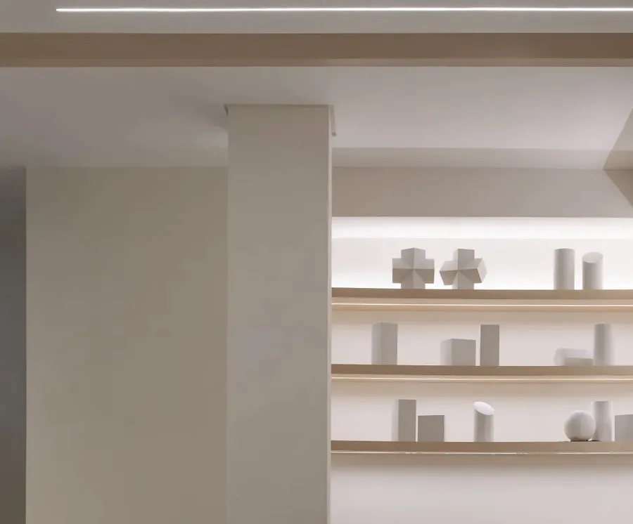
灯光设计上,我们全部采用Ra>90的进口光源,来提高展示服装材质的色彩还原度,同时运用点的装饰照明、线的辅助照明、面的重点照明的不同手法来丰富空间的层次。
In lighting design, we all use imported light sources with Ra>90 to improve the color reproduction of the display clothing materials. At the same time, we use different methods of decorative lighting, line auxiliary lighting, and surface accent lighting to enrich the level of the space.
Order
“秩序”
稳定的、具有可延续性的一种状态
打破之后便是重组和构成。通过对空间原生属性的破碎、分离、拉伸、变形、重组,我们打破了传统空间中空间属性对空间本身的桎梏。
After the break is reorganization and composition. By breaking, separating, stretching, deforming, and reorganizing the original properties of space, we have broken the shackles of space properties in traditional spaces.
重新构成的这个空间在某种意义上更像是一种艺术而不仅仅是空间本身。其中掺杂的偶然机遇、荒诞组合、随意堆砌等各种颠覆性的手法,赋予传统空间无法拥有的强烈的艺术气息。
The reconstructed space is more like an art in a sense than just the space itself. Incidental opportunities, absurd combinations, random stacking and other subversive techniques are mixed in, giving a strong artistic atmosphere that traditional spaces cannot have.
▲爆炸图
Exploded view
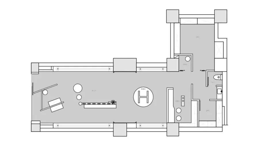
▲总平面图
General layout
Project Name | 项目名称
几盒
Location | 项目地址
江苏省 南京市 鼓楼区 凤凰西街
Area | 项目面积
100㎡
Chief Designer | 首席设计师
沈正全 姚俊
Design Company | 设计师公司
凹设计事务所
Start time | 开始时间
2020.06.06
Completion Time | 完工时间
2020.07.17
Photography | 摄影
EMMA















评论(0)