现代简约的设计主张和后消费主义成为人们关注的焦点,创意工作者们正在探索各种方法来温暖简约的空间。新地中海风格以意大利,西班牙和摩洛哥的传统为基础,植根于焦点,并通过天然材料和柔和的大地色拥抱极简主义。
Modern minimalist design ideas and post-consumerism have become the focus of attention, and creative workers are exploring various methods to warm the minimalist space. The Neo-Mediterranean style is based on the traditions of Italy, Spain and Morocco, rooted in focus, and embraces minimalism with natural materials and soft earth tones.
▼ Design concept
以新地中海极简主义概念与Jane express品牌文化融合为出发点,融入雕刻、不规则、拱形、大地色等多个元素协同工作,消除彼此的干扰,使空间不浮华又优雅精致。
Starting from the fusion of the new Mediterranean minimalism concept and Jane Express brand culture , it integrates multiple elements such as carving, irregularity, arching, and earth color to work together to eliminate the interference of each other, making the space not flashy and elegant.
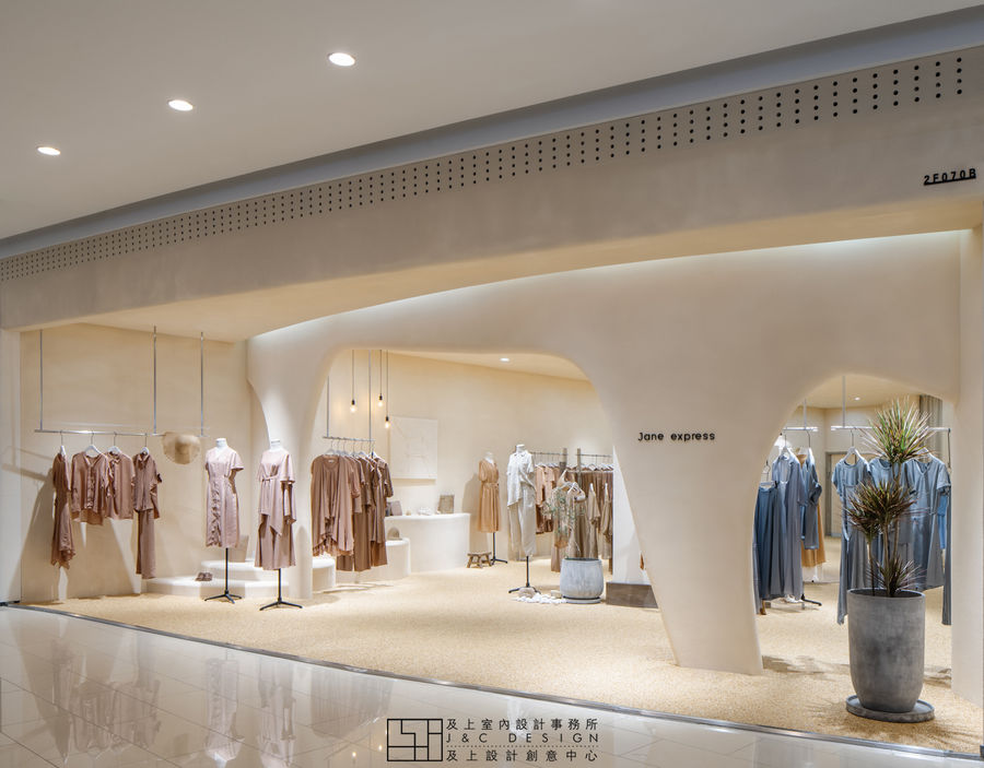
▼ Facade
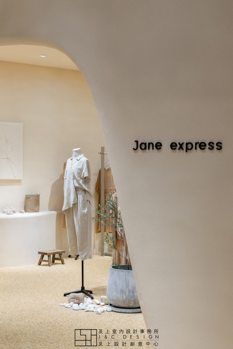
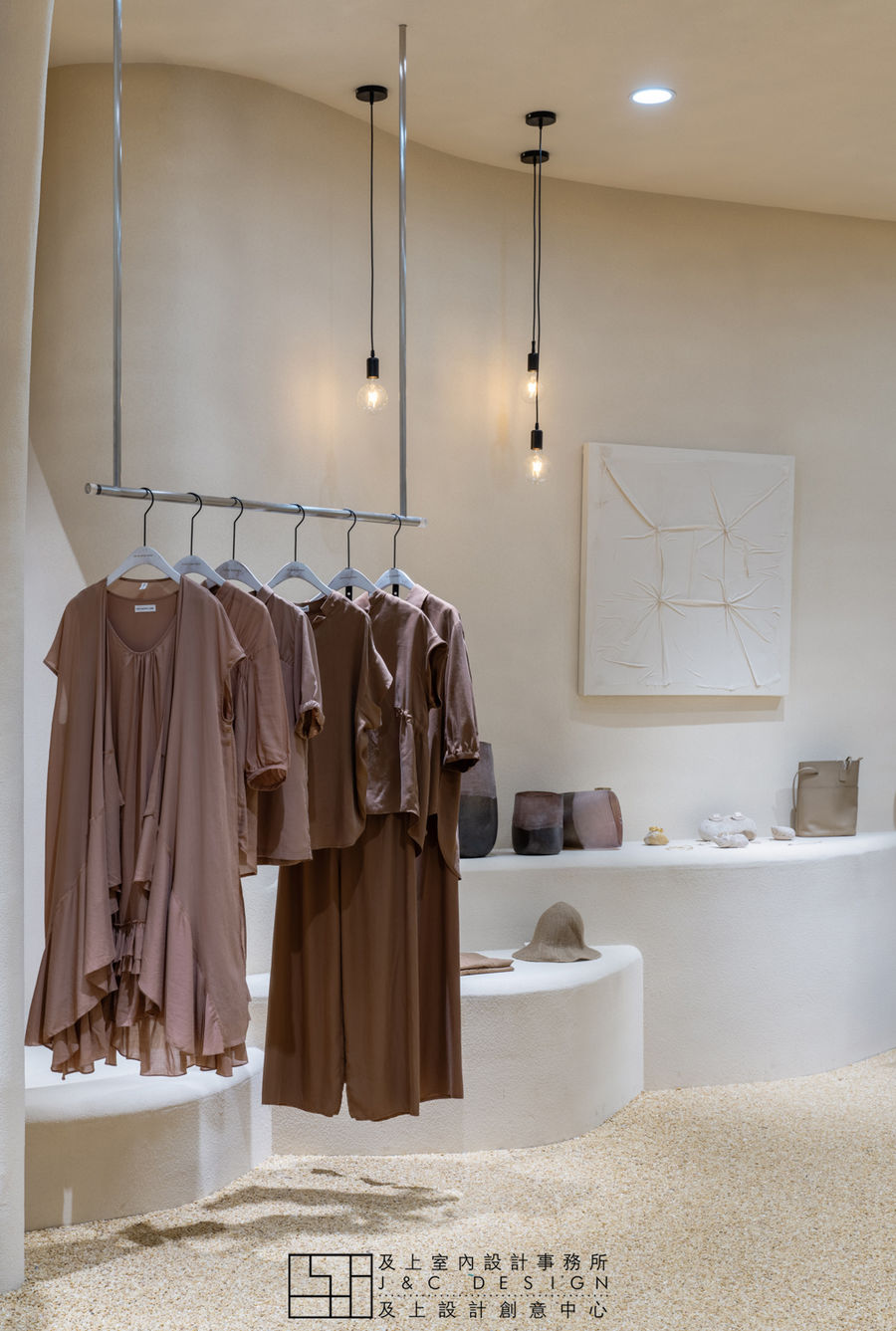
入口用原始手工雕刻的感觉塑造出不规则的有机形状,空间形态的线条不是直来直去的而是一种独特的浑圆造型,散发着Jane express的自然与随性。陈列展示以数个连接方式呈现,在走动观赏中,给人延伸般的透视感。
The entrance is shaped by the original hand-carved feeling of irregular organic shapes. The lines of the spatial form are not straight but a unique round shape, exuding the natural and casual nature of Jane express. The display is presented in several connected ways, giving an extended sense of perspective in walking and viewing.
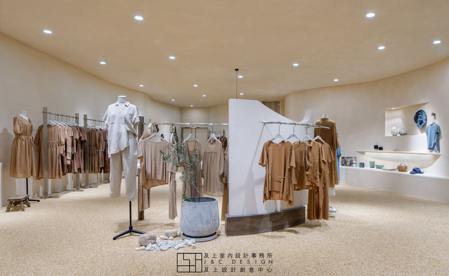
▼ Main space
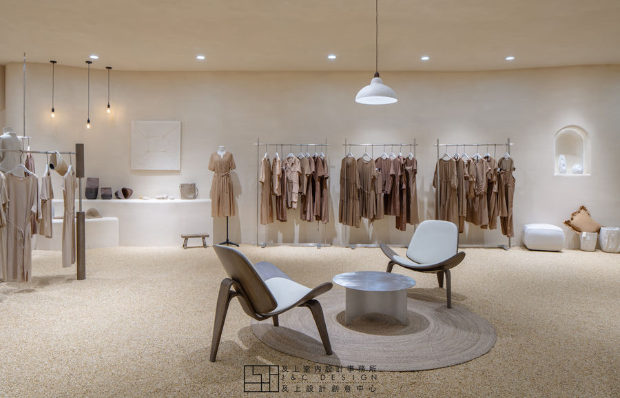
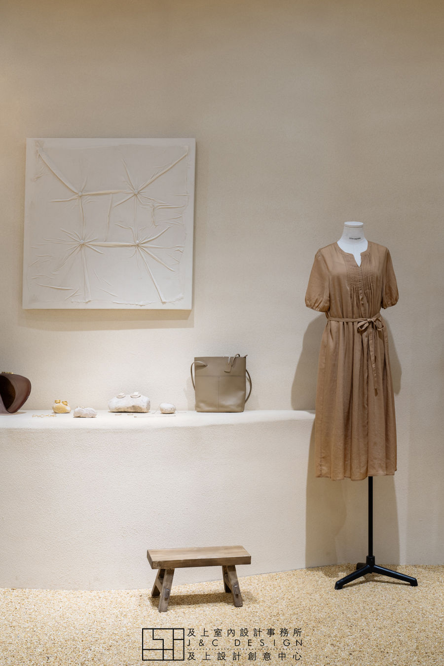
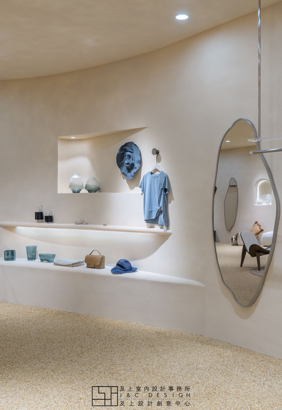
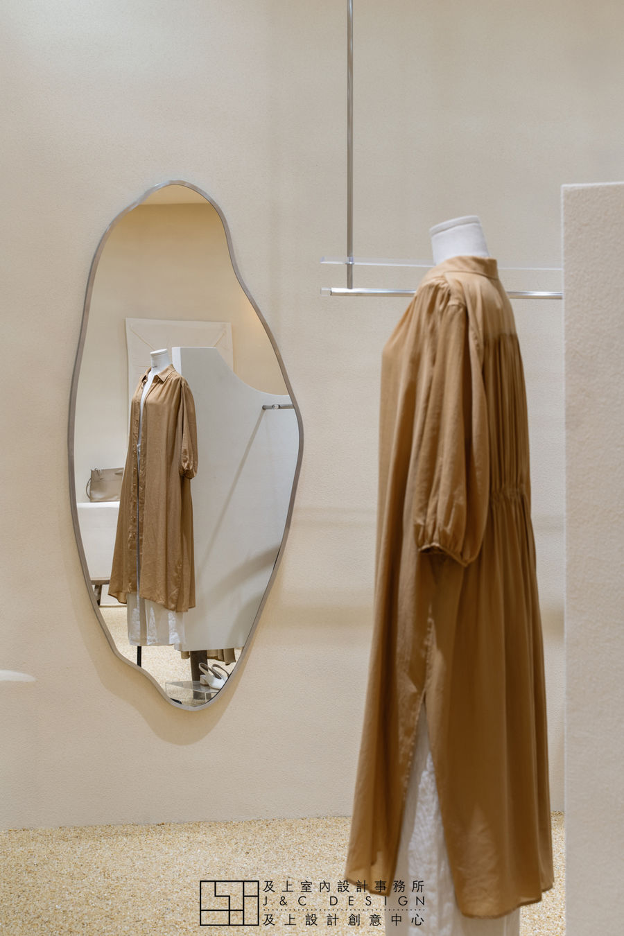
岩石、泥、沙等天然景观的土色,给人一种大地般的浩瀚感觉。在整体空间中,以该色调为基础,结合当代和复古的装饰,以天然材料来点缀凸显其自然特性。墙面不经意涂抹修正的结果也形成一种特殊的表面。半穿凿的景中窗也是空间里一个情趣之处。
The earthy colors of natural landscapes such as rocks, mud, and sand give a land-like sense of vastness. In the overall space, based on this hue, combined with contemporary and retro decoration, embellished with natural materials to highlight its natural characteristics. The result of inadvertent smear correction on the wall also forms a special surface. The half-cut window in the view is also an interesting point in the space.
▼ Parts
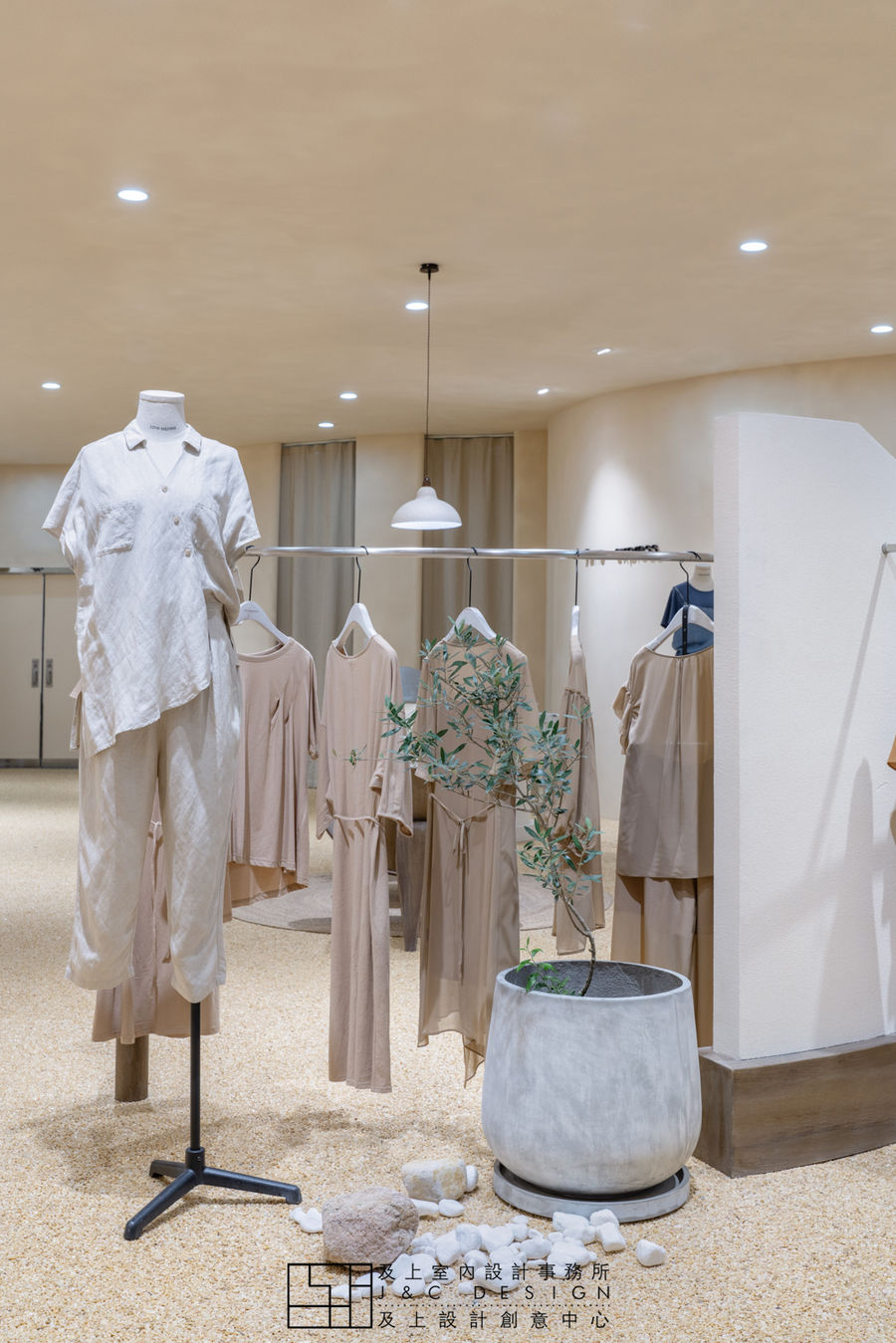
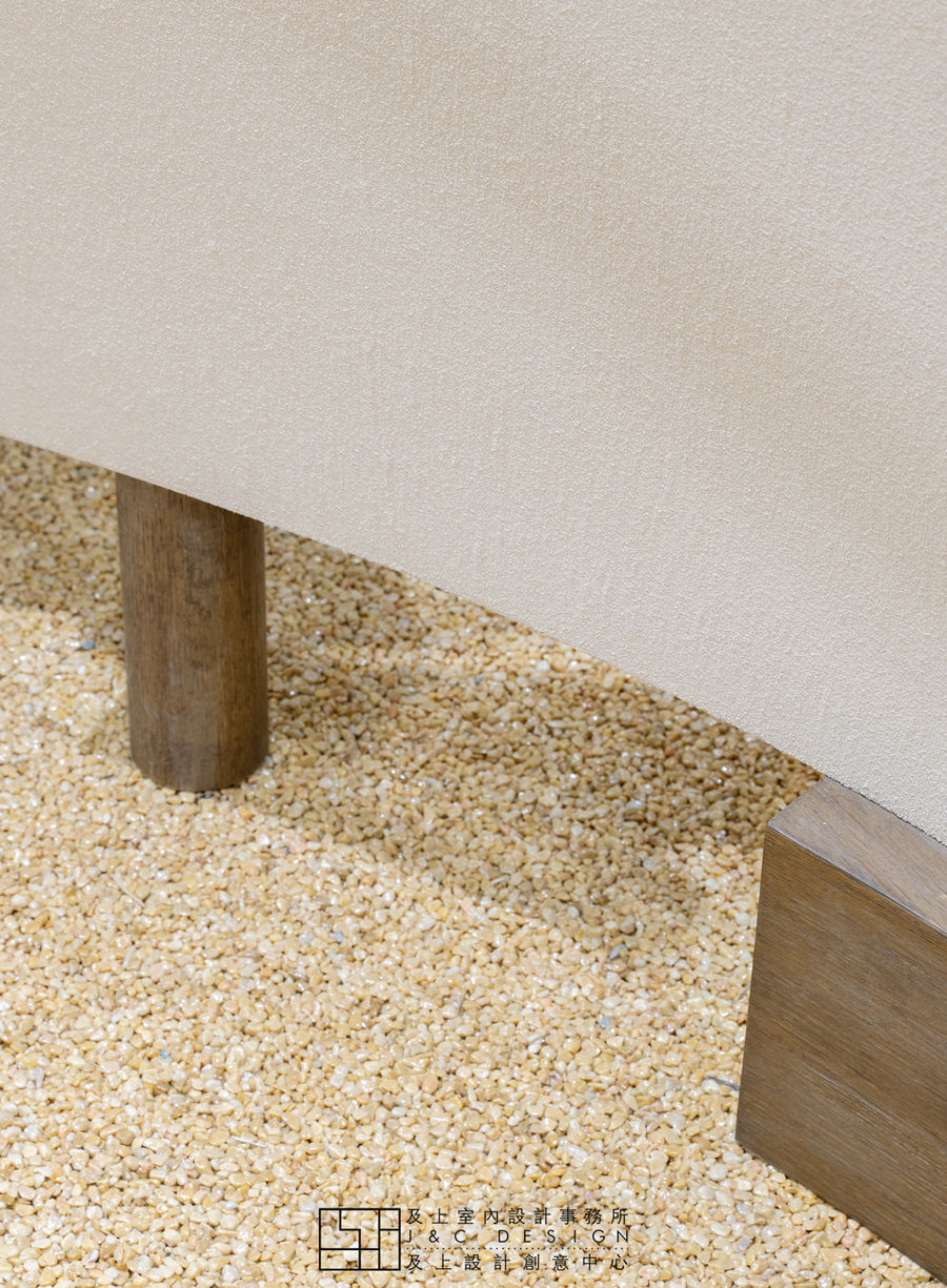
中场将不规则的形态进行到底,地面是大面积的小石子,这些仿佛都让了空间中的物体有了自然生命。在整个装饰上,到处都充满着和谐的温馨,让人感到温暖舒适。
The midfield will carry irregular shapes to the end. The ground is a large area of small stones. These seem to give objects in space a natural life. The whole decoration is full of harmonious warmth, making people feel warm and comfortable.
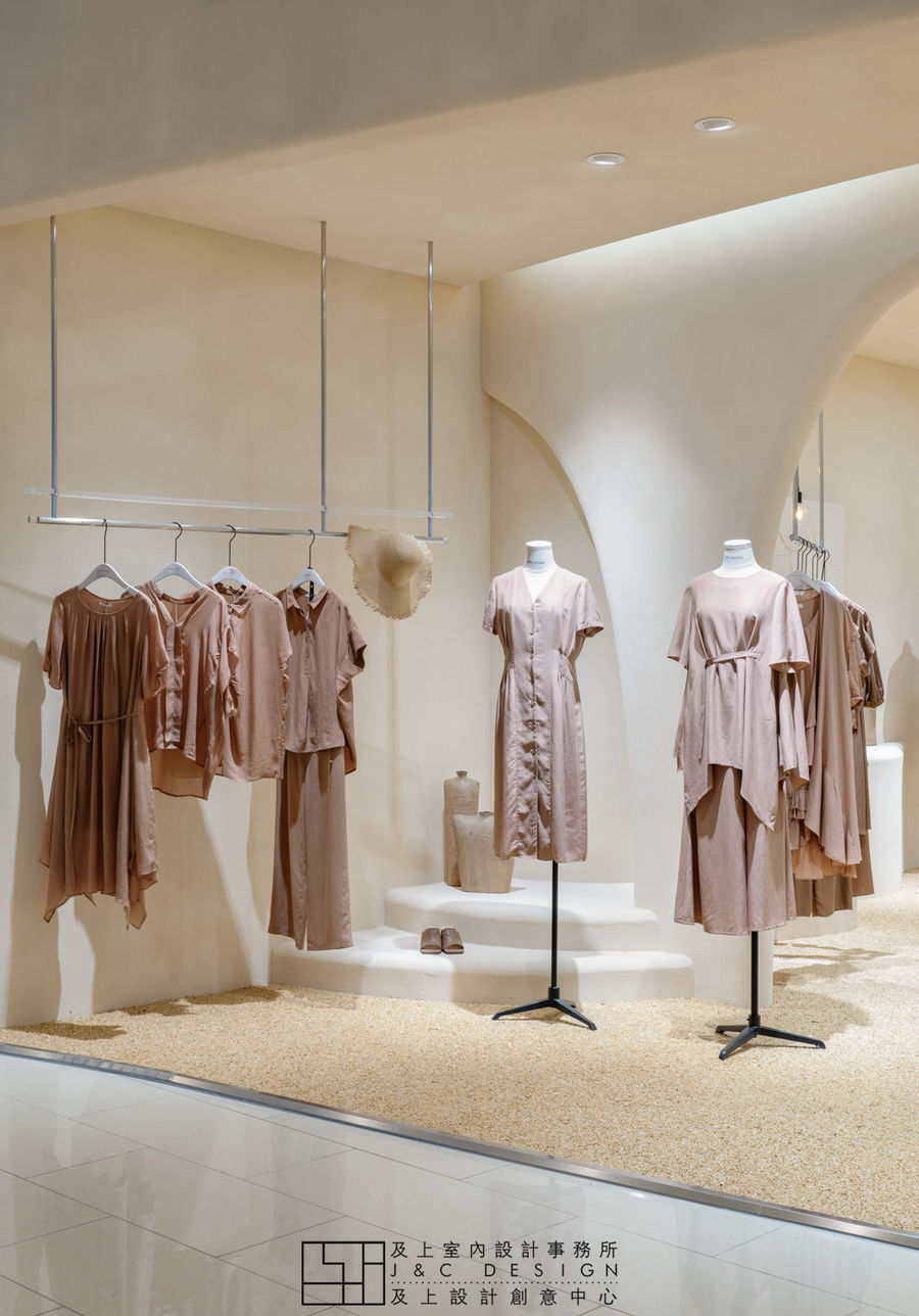
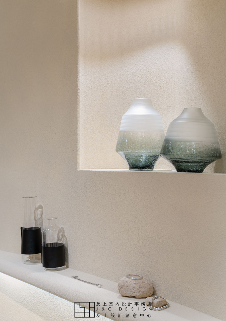
▼ Props
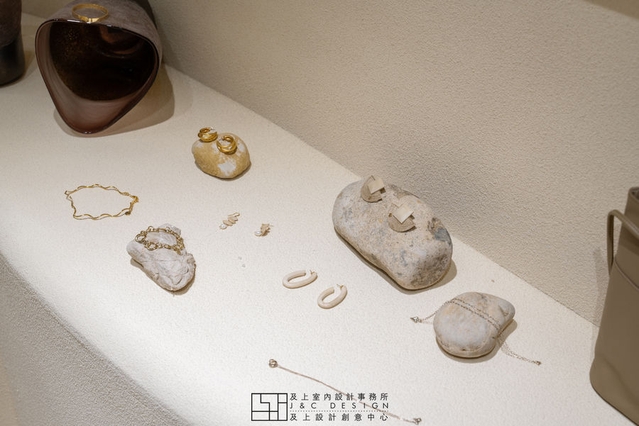
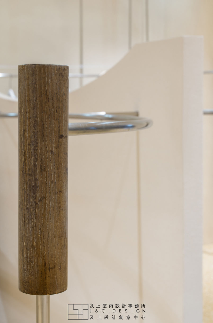
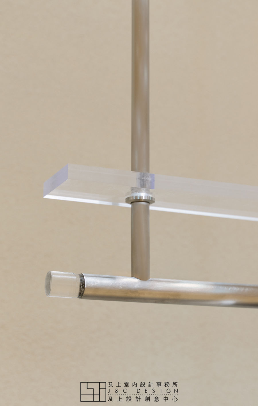
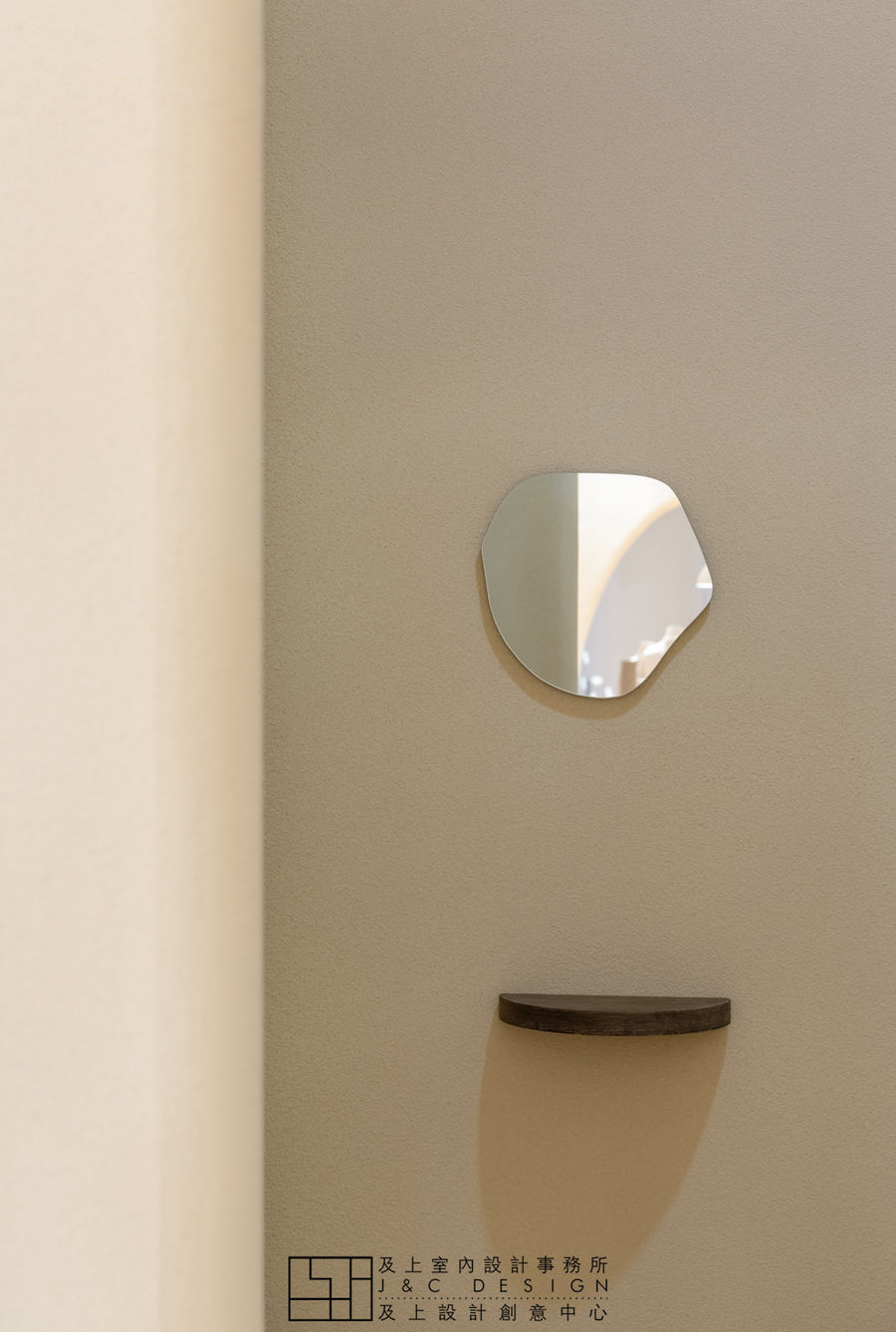
在简洁温柔的几何形态中融入大地色系和各种肌理材质质朴的美,无论是空间还是物体都焕发出光泽和生命力。丢弃繁复的色彩与装饰,在干净纯洁的空间中加入一点收工的痕迹,用质感舒缓情绪。
In the simple and gentle geometric form, the earth's color system and the simple beauty of various textures and materials are blended. Both the space and the object glow and shine. Discard the complicated colors and decorations, add a little trace of finishing in the clean and pure space, and use the texture to soothe the emotions.
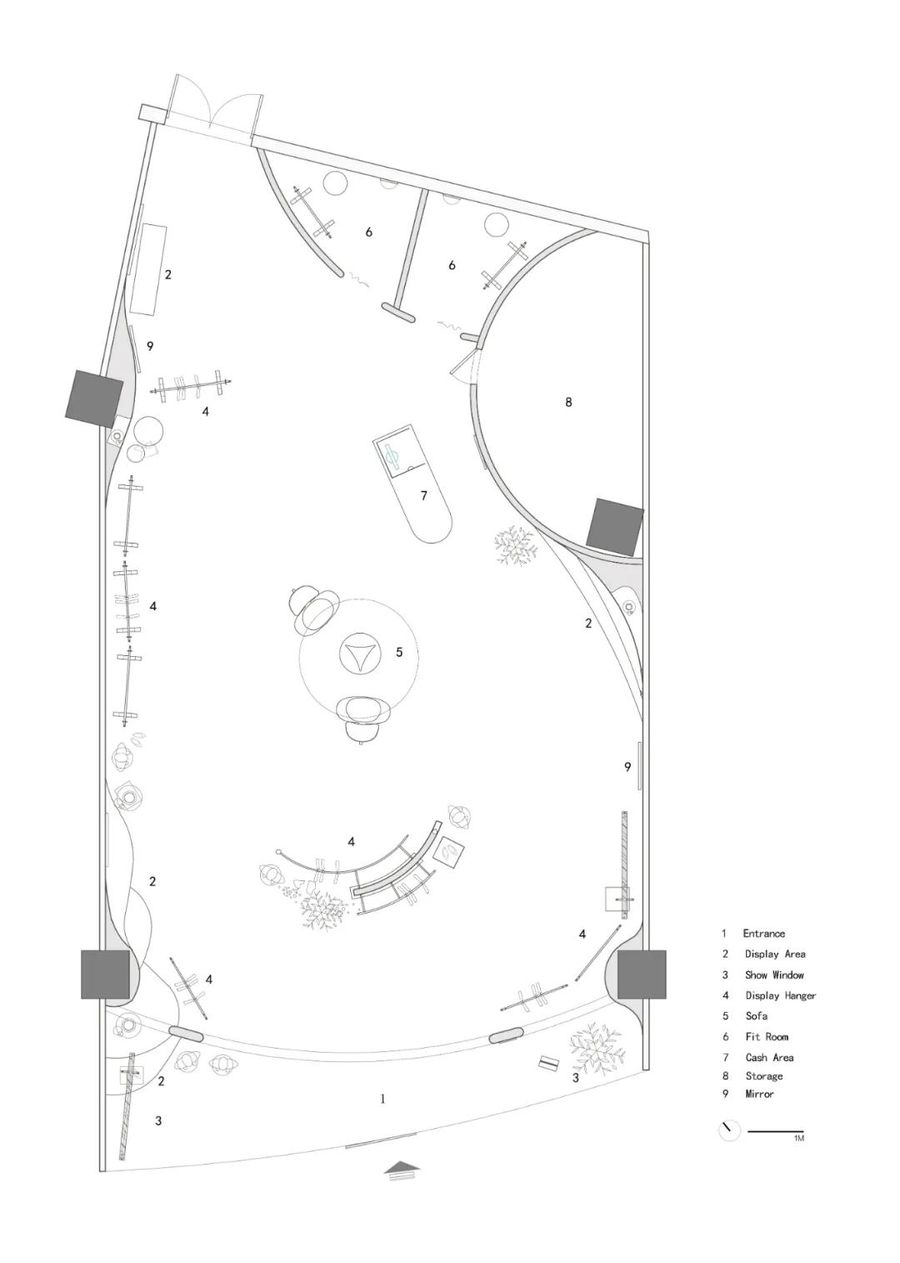
▼ Floor plan
Design:J&C Design
Photography:Wen Studio
Location:Jinan, ChinaArea:140㎡Completion date:Jun. 2020
更多相关内容推荐






评论(0)