UNI-X ASSOCIATES
云行空间建筑
Apartment&villa Exhibition Office Restaurant
Plain black
素黑
June 18th. 2020
Copyright ©The UNI-X ASSOCIATES
EDIT / © 芒芒
DESIGN / © 云行空间建筑
PHOTO / © 王海华
“整合室内相互穿插的界面,带来多维度的空间层次 ”
这是一套位于长江边上的房子,小区视野很好,可以看到江景。业主是一对从事设计行业的90后夫妻,自身有着很好的审美和明确的设计要求,他们希望未来的家是现代高级的,有属于他们二人独特的色彩与造型。
This is a flat on the side of the Changjiang River. The plot has a good view of the river. Owner is the husband and wife after 90 that is engaged in design profession, oneself have very good aesthetic appreciation and clear design requirement, they hope the home of the future is contemporary and advanced, have the colour that belongs to them distinctive and modelling.
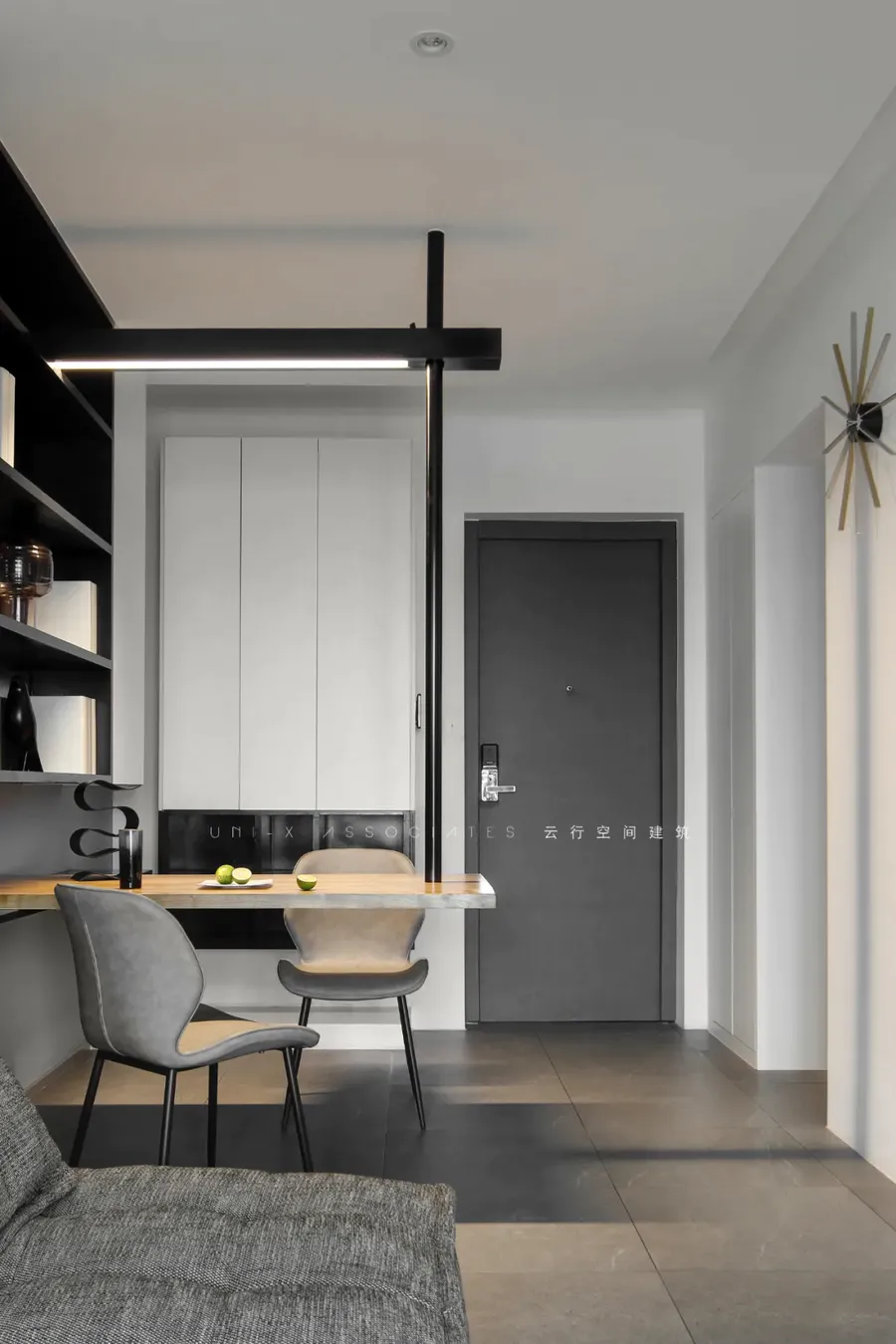
出于空间的限制以及个性化的需求,设计师融入了产品的思维,将餐桌和电视柜都做了悬浮处理,使其成为空间的一部分,而不只是家具,让这个不大的房子更加透气,也满足业主想要的独特性。
Due to the limitation of space and the need of individuality, the designer integrated the product thinking, levitated the dining table and TV cabinet, and made them become part of the space, not just furniture, so as to make this small house more breathable and satisfy the uniqueness that the owner wanted.
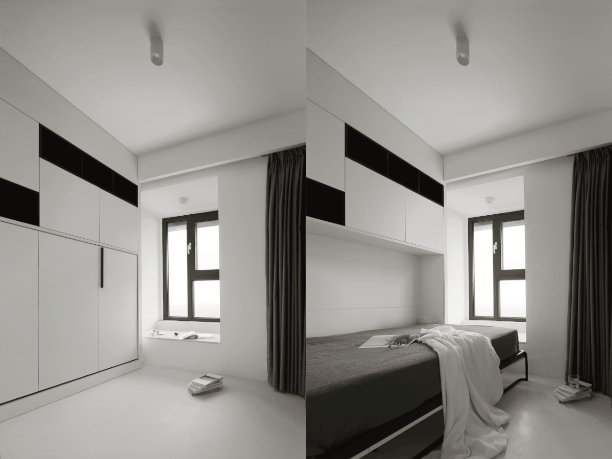
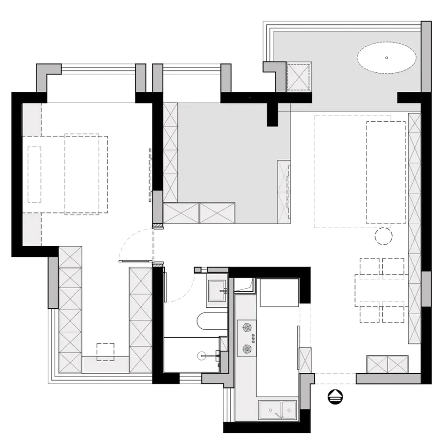
考虑到业主实际的居住需求后,设计师推掉了一些不必要的墙体,尽量敞开以获得通透。把次卧和客厅连通,同时利用收纳柜做一些分隔,次卧变成半开放式后,有较高的自由度,也一并解决了小户型的分隔与收纳,其他区域通过高差处理,形成空间分割,层次丰富也更有趣味性。
Taking into account the actual living needs of the owner, the designer pushed away some unnecessary walls and opened them as wide as possible to achieve transparency. Connect second lie and sitting room, use to receive ark to do a few Spaces at the same time, after second lie becomes half open mode, have taller degree of freedom, also solved the space of small family model and receive at the same time, other area is handled through height difference, form dimensional division, level is rich also have interest more.
▼餐厅
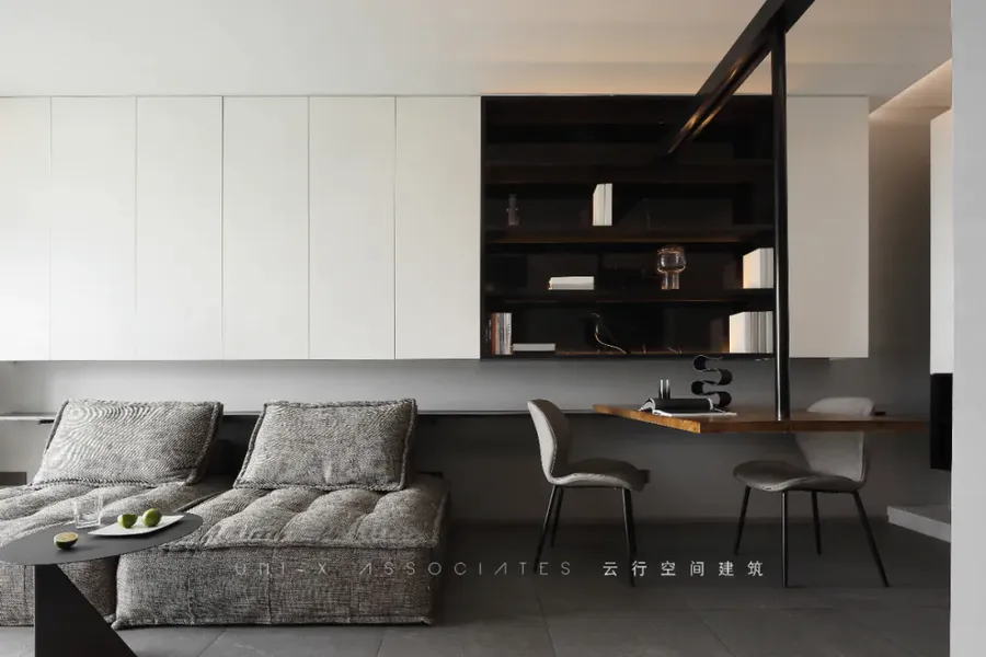
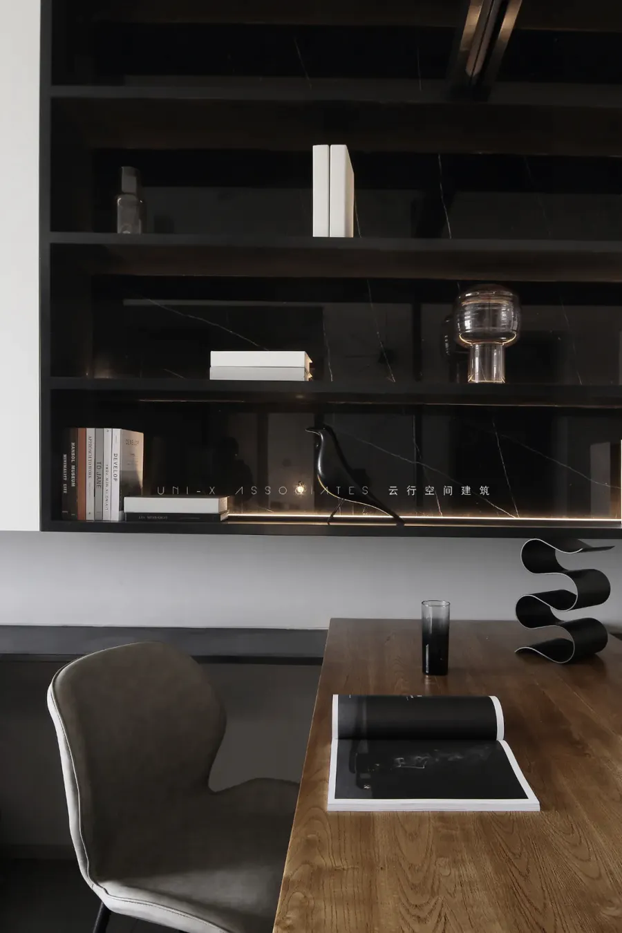
餐厅用了整面的收纳柜贯穿于餐厅和客厅,餐桌的构造比较特别,一边是搭在柜子上,另一端则是悬吊在顶上的。悬挑的方式主要是想减少桌面以下的东西,空间不大希望地面尽量整洁一些。不落地的家具都尽量做了悬空,方便打扫的同时,也方便家里两只宠物狗行走,避免它们乱钻。餐桌与餐吊是结合在一起的,都是现场制作的。灯具部分是木质的盒子,里面嵌了光源,桌子的吊杆实际是一个表象,它并没有起到承重作用,真正的承重主要是靠吊杆里面的吊筋,一端固定在顶上,一端固定在餐桌上,用产品的思维去做设计,往往也会有不一样的收获。被悬吊的餐桌看起来更加轻盈,简练,也非常特别。
Dining-room used whole receive ark to run through at dining-room and sitting room, the construction of mensal is more special, it is to build on the cabinet on one side, the other end is to hang on the top. The way that overhangs basically is to want to reduce the thing below desktop, the space hopes the ground not very much as far as possible neat a few. The furniture does not fall to the ground as far as possible to do the suspension, convenient cleaning at the same time, also convenient home two pet dogs walk, avoid them disorderly drill. The dining table and dining crane are combined and made on the spot. Part of the lamps and lanterns is a wooden box, embedded with a light source, the derrick of the table is actually a representation, it did not play the role of load-bearing, the real load-bearing is mainly depended on the hanging rib inside the derrick, one end is fixed on the top, one end is fixed on the table, with the product thinking to do the design, often also have different harvest. The suspended table looks lighter, shorter and very special.
▼客厅
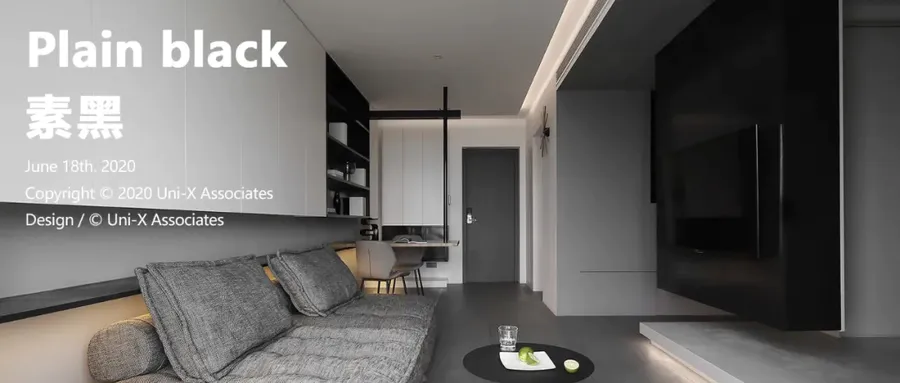
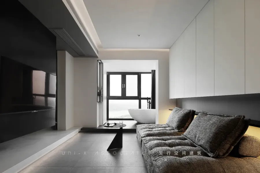
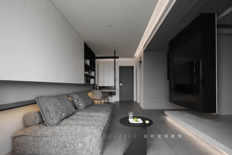
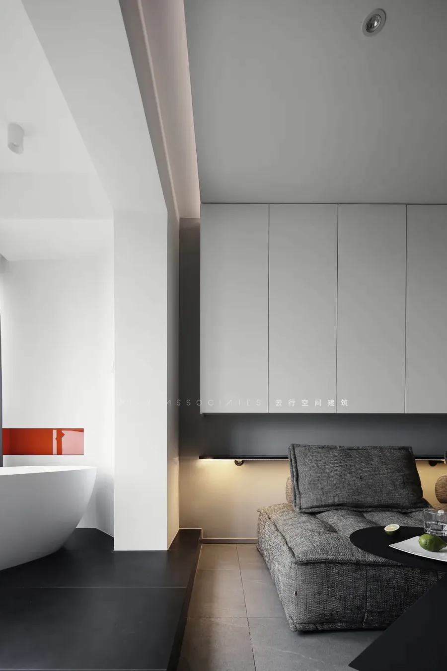
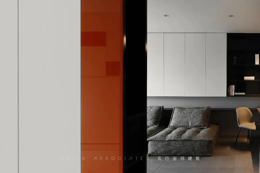
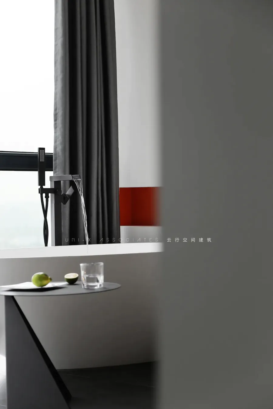
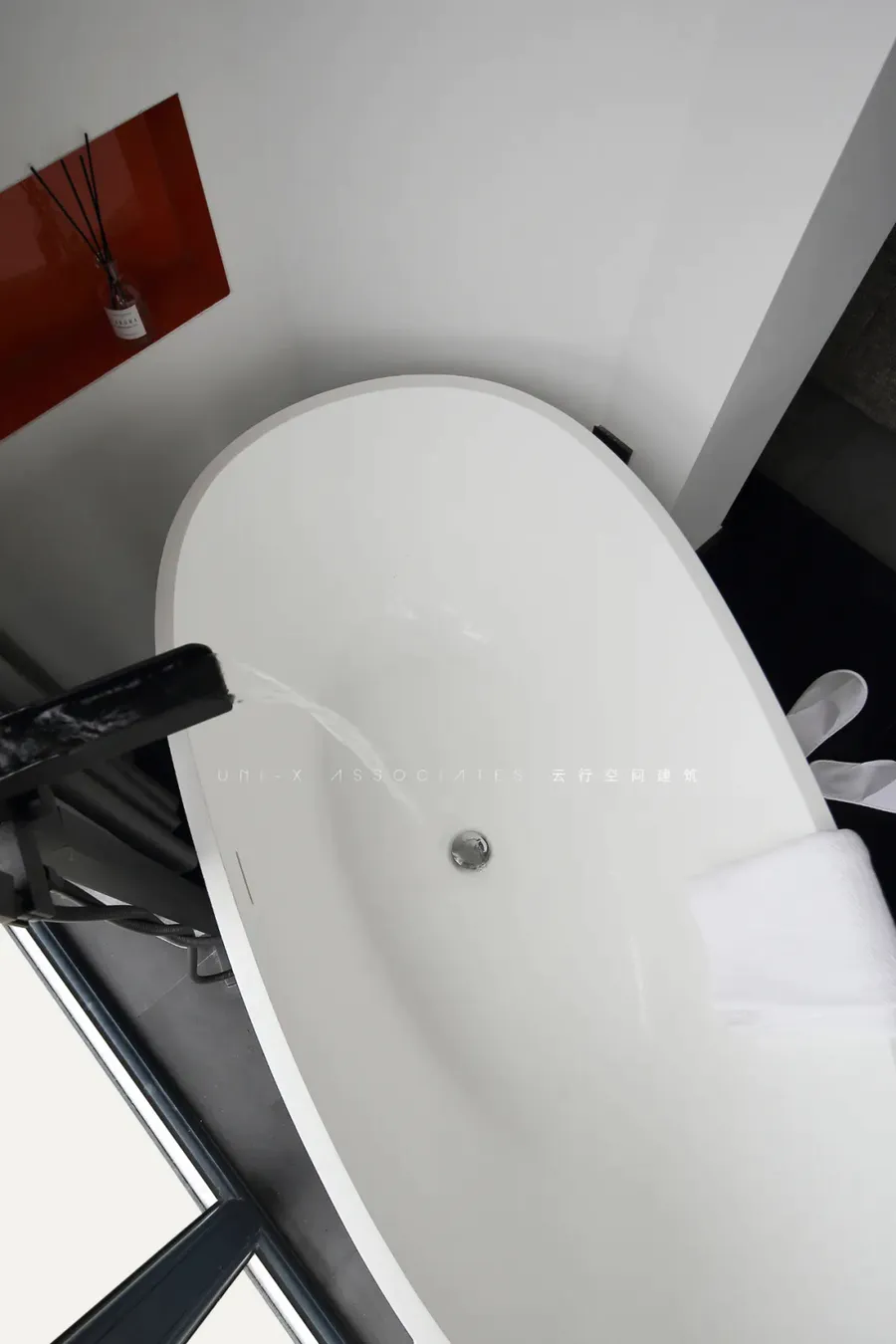
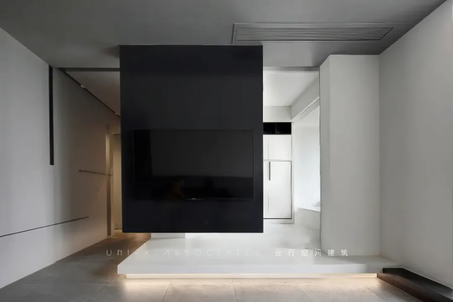
餐厅看向客厅的角度。电视柜也是悬吊与顶上,被悬吊的电视柜有了一种轻盈感,让这个空间变的更加的透气。电视柜做了双面柜的设计,朝着客厅那面是挂了电视,朝次卧室这边则做了收纳柜的处理。从阳台看向客厅的角度,黑白灰的空间调性,加入了暖色光源,层次感满满。浴缸边的壁龛是利用了原本包管的空间增加了一点厚度,嵌入了橘色的烤漆玻璃,给空间加了一点颜色。The Angle of the dining room towards the living room. TV ark is also suspension and go up, the TV ark that is suspended had a kind of lightsome feeling, let this space change more breathe freely. TV ark did the design of ark of double face, facing the sitting room that face is to hang TV, face next bedroom this side did receive ark processing. Look to the Angle of the sitting room from the balcony, the dimensional tonal sex of black and white ash, joined warm color illuminant, administrative levels feels full. The niche by the side of the bathtub is a little thicker by taking advantage of the original enclosed space and embedding orange painted glass to add a little color to the space.
▼阳台
床放下来的样子。空间的使用属性完全跟着需求来变化,对于小户型,每一分面积都是要精打细算的,利用好最重要。
The way the bed lay down. The use attribute of the space follows demand completely will change, to small family model, every cent area should be calculated carefully, had used the most important.
▼卧室
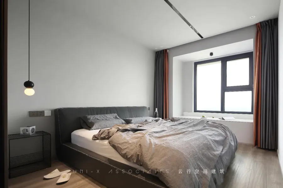
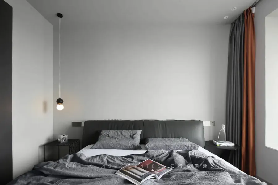
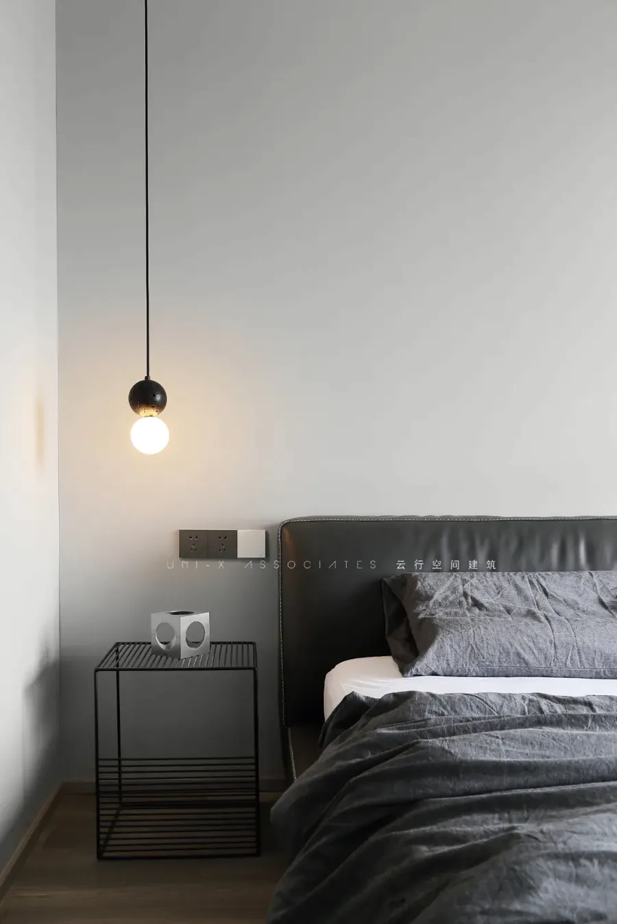
主卧室空间,大面积的灰色体块下,用了黑色的家具,增加了空间的厚重感,打破黑白灰冷感,同样用了橘色综合空间中的色彩。
In the master bedroom, under the large gray volume, black furniture is used to increase the thickness of the space and break the cold feeling of black, white and gray. Orange color is also used in the integrated space.
▼衣帽间
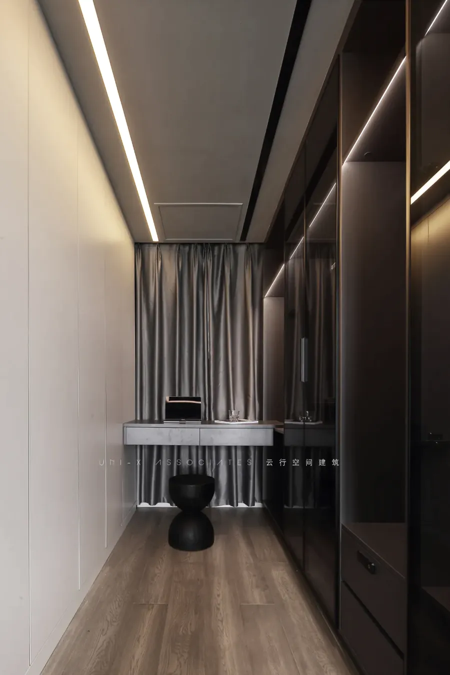
条桌可以做梳妆台或者书桌,衣柜的形式做了不同的处理,一边是实体的木质柜门,一边是虚体的玻璃柜门,让这个狭长的空间显得没有那么无趣,柜体结合灯光的处理,也增加了层次感。
Strip desk can do dresser or desk, the form of chest did different processing, it is the woodiness cupboard door of entity at one side, it is the vitreous cupboard door of empty body at the same time, let this long and narrow space appear not so boring, the processing that cabinet put oneself in another's position combines lamplight, also increased administrative levels to feel.
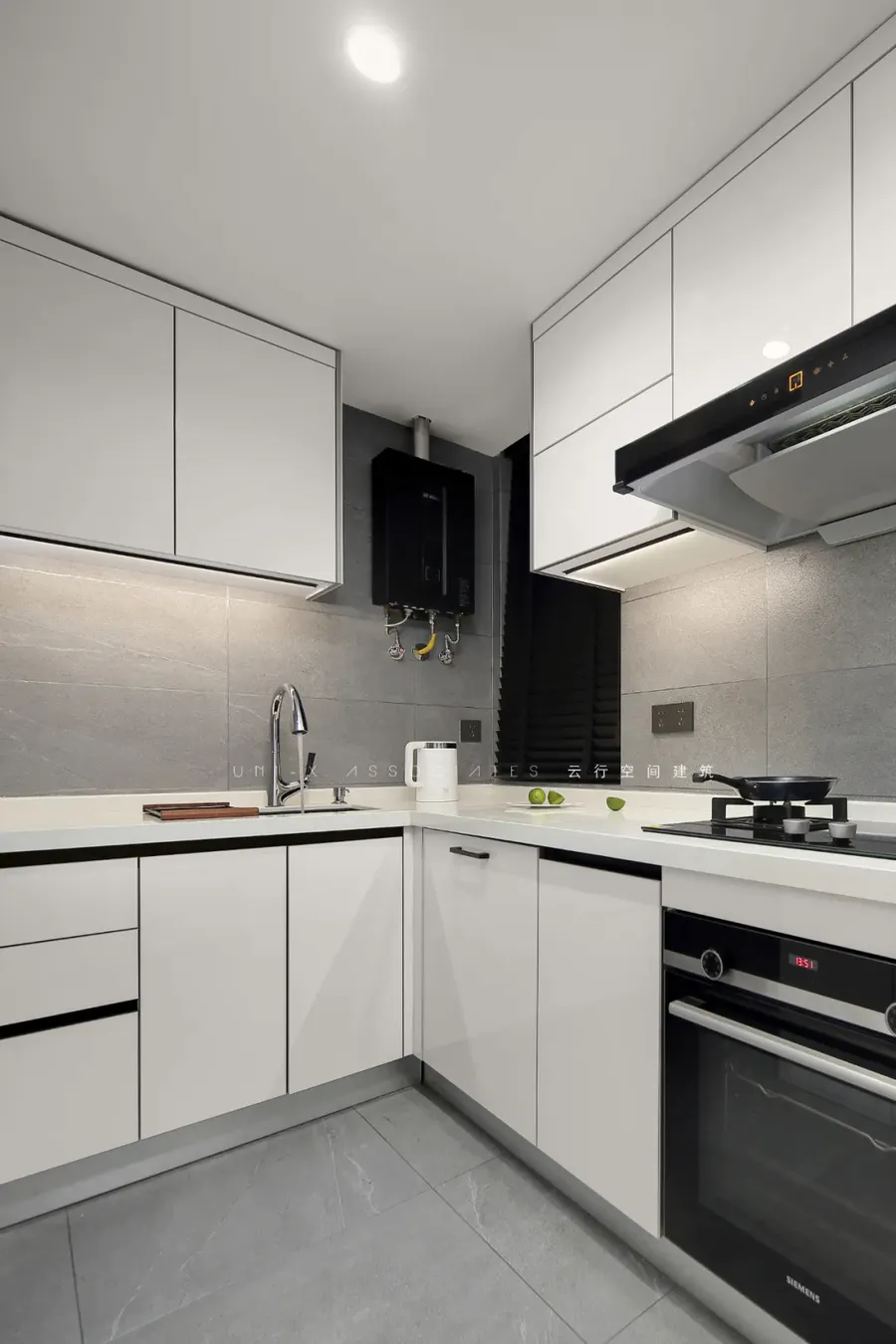
▼厨房
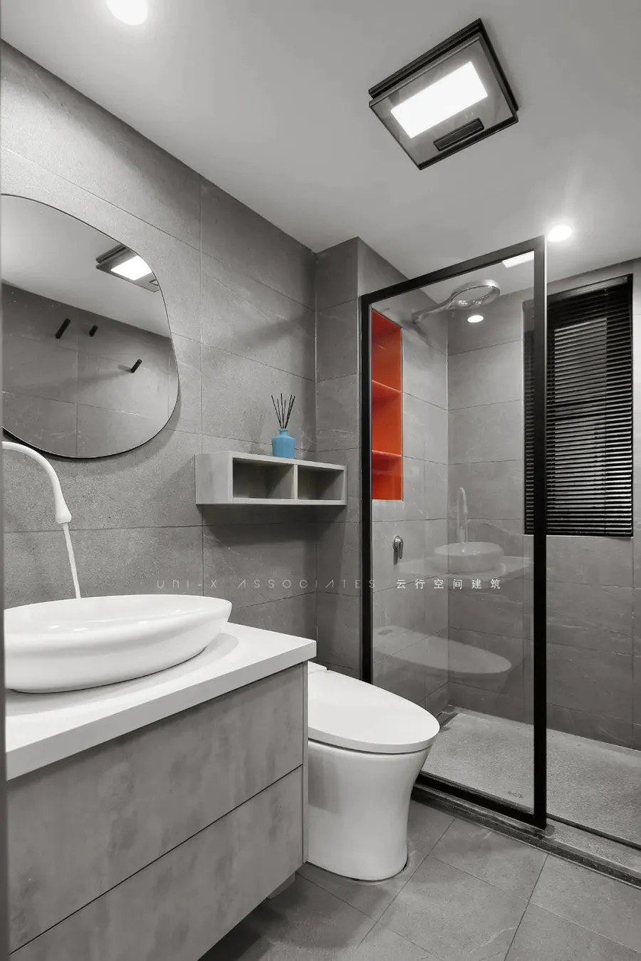
▼多卫生间
墙和地砖用了统一的灰色,同样做了橘色点缀,综合空间中的色感。Wall and floor tile used unified gray, did orange to adorn likewise, the color in integrated space feels.
▼走廊
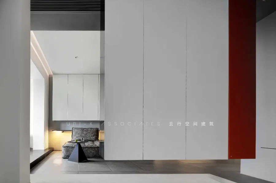
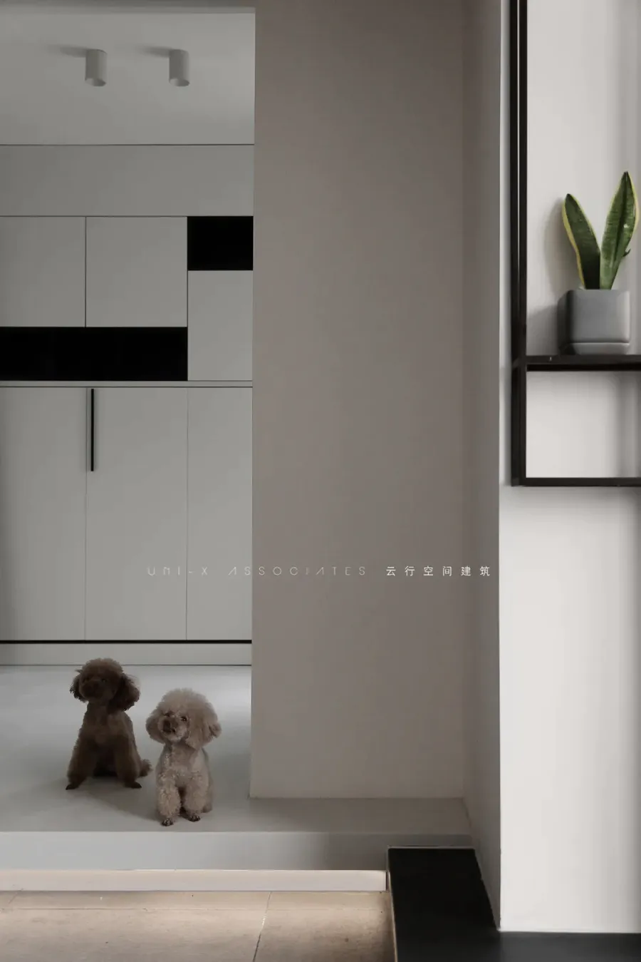
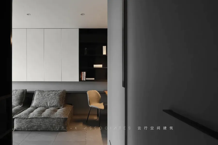
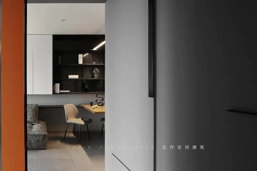
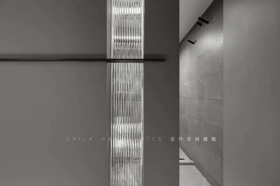
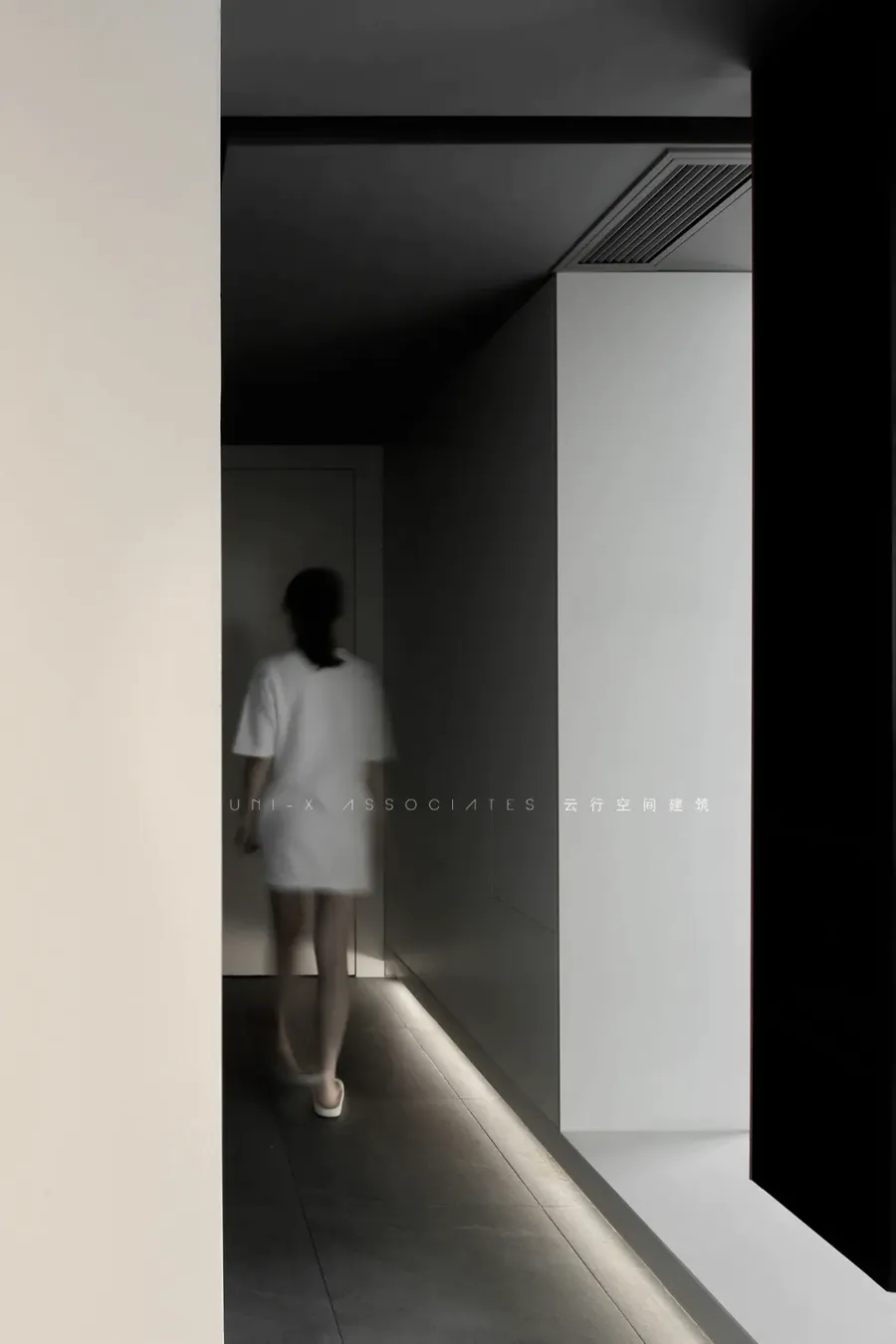
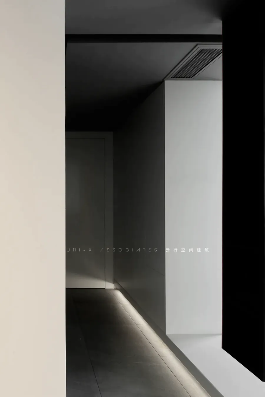
从过道看向客厅,对比中凸显层次。过道这边都是收纳柜的处理,地台因为暗藏灯带,也多了份漂浮感。走道看向卫生间,一条竖纹比例,增加线条感。
Look from corridor to the sitting room, highlight in contrast administrative levels. This side of corridor is the processing that receives ark, ground stage because hidden lamp is taken, also much a float feels. Corridor looks to toilet, a vertical grain scale, increase line feeling.
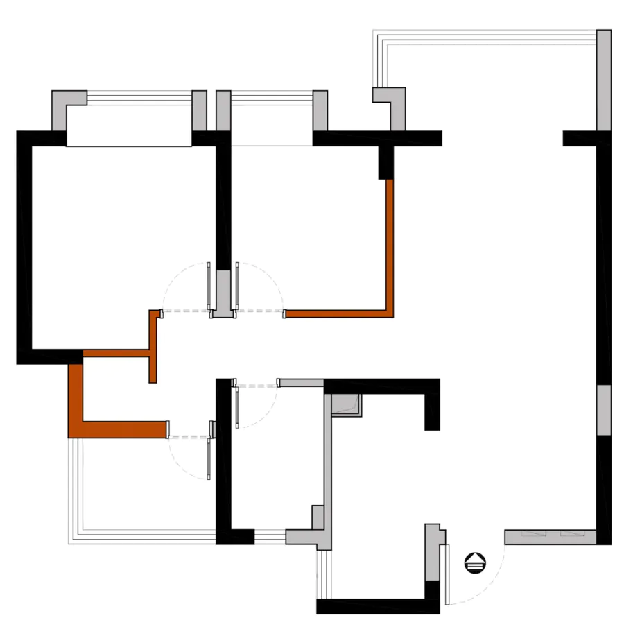
▼原始结构图






评论(0)