业主是个旅游编辑,工作性质的原因让她对未来的家有别样的要求。她是个感性的人,对温暖活泼的北欧风格心驰神往,对干练整洁的现代风格难以自拔,同时对淡雅节制的日式风格也是赞赏有加。我们将她的设计要求总结成几点:要温馨舒适,要与众不同,要融合各种风格,有很强的包容性。
The owner is a travel media editor, and the nature of her job leads to her different requirements for her future home. She is a creature of the emotions, fascinated by the warm and lively Nordic style and hard to extricate herself from the clean and tidy modern style. At the same time, she appreciates the elegant and restrained Japanese style. We summarize her design requirements into several points: to be warm and comfortable, to be different, to integrate various styles and to be with strong inclusiveness.
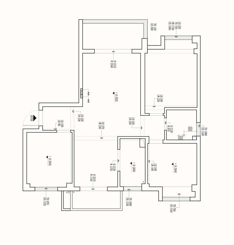
基于业主的要求,我们最终选择糅合各类设计风格。业主对房屋的功能性要求并不高,因为主要是一家三口居住,偶尔父母过来,留宿的可能性也很小。所以我们对原始的三房结构做改造,一切设计以空间居住舒适度为核心。
Based on the requirements of the owners, we finally chose to blend several kinds of design styles. The owners do not require high functionality of the house, because they live mainly in a family of three and the possibility of staying is very small when their parents come here occasionally. So we transform the original three-bedroom structure, and all the design is centered on the comfort of space.
门厅 VESTIBULE
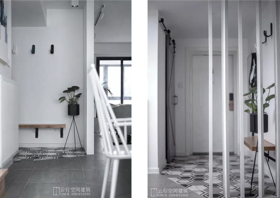
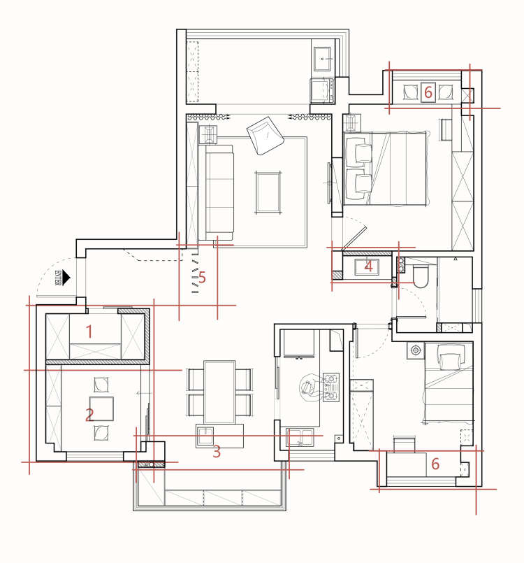
门厅区域,进门左手边是换鞋凳和穿衣镜,右手边是衣帽间,为生活带来舒适和便利。门厅地面材质为六角花砖,与客餐厅大面积灰色水泥砖相区分。换鞋凳以层板形式呈现,做了斜角处理,防止孩子被撞到。原本入户门正对卫生间门,以现场制作的内嵌钢筋木质隔断作为门客厅之间的屏障,改善视觉感受的同时强调了门厅区域。
In the vestibule, the shoe bench and the dressing mirror are on the left side of the entrance, and the cloakroom is on the right side. They bring comfort and convenience to life. The floor material of the vestibule is hexagonal tiles, which are distinguished from the large area of gray cement tiles in the living room and dining room. The shoe bench is presented in the form of a laminate and its angle is treated to a bevel to prevent the child from being hit. Originally, the entrance door was facing the bathroom door. So we use the on-site wooden partition with built-in steel bar as a barrier between the vestibule and the living room, which improves the visual experience while emphasizing the vestibule.
客厅 LIVING ROOM
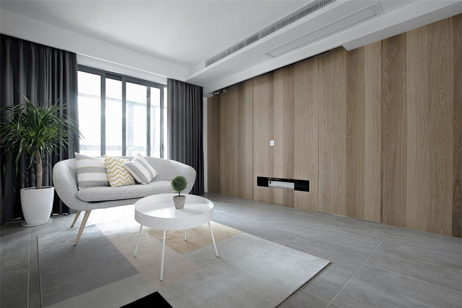
电视背景墙为整面木饰面,只开了一个长条形设备凹槽。主卧室门藏匿于背景墙右半部分,同时背景墙左侧做了相应的分缝处理,以保证对称性和视觉整体性。
The TV background wall is a full-faced wooden veneer, and only one bar shaped device groove is made. The master bedroom's door is hidden in the right half of the wall, and the left side of the wall is treated with a seam to ensure symmetry and visual integrity.
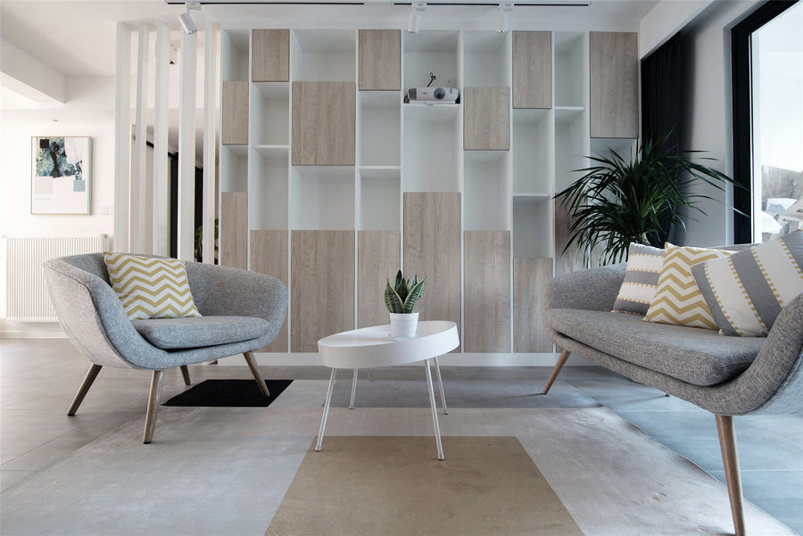
书架与主背景墙相对,形成虚实对比。整体偏暖的色调中和空间温度。沙发在背景墙的垂直方向相对而立,优雅而活泼。书柜单元无规律的高度变化,结合柜体的开放与封闭,颇具韵律感。
The bookshelf is opposite to the main background wall, forming a contrast. The overall warm hue neutralizes the space temperature. The sofas oppositely stand on the vertical direction of the background wall, elegant and lively. The irregular heights of the bookcase units, combined with their opening and closing, make the bookcase quite rhythmic.
餐厅 DINING ROOM
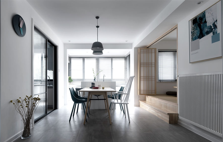
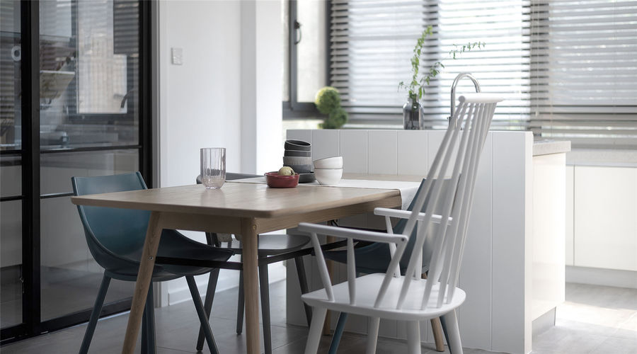
餐厅左侧是现代黑边移门,右侧是日式折叠门,不同风格的碰撞,随性且不违和。餐桌搭配不同造型的餐椅,体现出木质的包容性。
A modern black-side sliding door is on the left side of the dining room and a Japanese folding door is on the right side. The collision of different styles is casual and concordant. The dining table is equipped with different styles of dining chairs, reflecting the inclusiveness of wood.
日式榻榻米折叠门为三扇,全开后可有效增强空间的开阔感。活动式小台阶方便上下,平时也可作为板凳使用。
The tatami folding door has three pieces, which can effectively enhance the openness of the space when fully opened. The movable step is convenient for up and down and can also be used as a bench in normal times.
餐桌靠着岛台背面的矮墙放置,增强了用餐私密感。岛台为普通橱柜,背面用一堵矮墙遮挡,提高美观性的同时解决了水管插座的问题,一举两得。
The dining table is placed against the low wall on the back of the island, enhancing the privacy of the dining. The island is a common cabinet with a low wall on the back, which improves the aesthetics and solves the problem of water pipe and socket, killing two birds with one stone.
厨房 KITCHEN
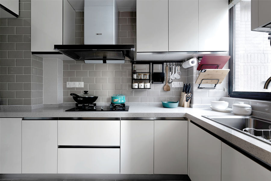
长方形厨房配置L形柜体、白色平板柜门、灰色台面、米灰色小方砖,体现整体性。
The rectangular kitchen is equipped with an L-shaped cabinet, white flat cabinet doors, a grey countertop and small beige gray square bricks, reflecting the integrity.
卫生间 BATHROOM
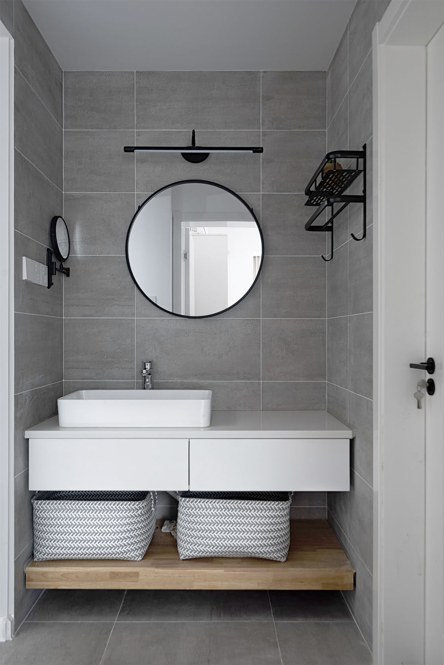
卫生间干区选择了圆镜、方盆,随性自然。
The dry area chooses round mirror and square basin, which is casual and natural.
多功能室 MULTI-FUNCTION ROOM
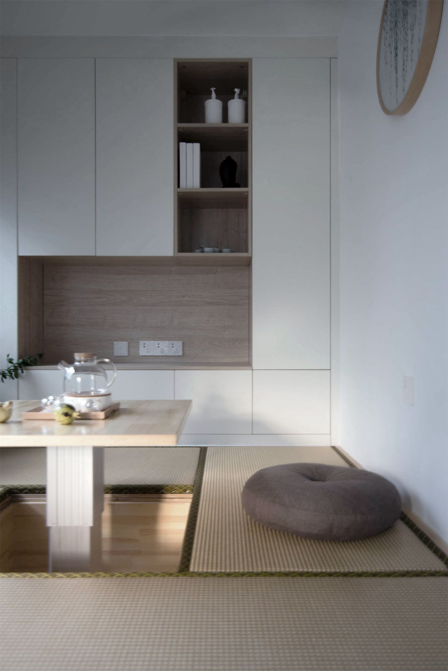
榻榻米与储物柜相结合,收纳空间无处不在。储物柜中间的凹台用于放置电视。草席和蒲垫的点缀,增添了空间的韵味。
The tatami and storage cabinets make storage space everywhere. A concave table in the middle of the storage cabinets is used to place the TV. The embellishment of the straw mat and the futon adds the charm of the space.
卧室 BEDROOM
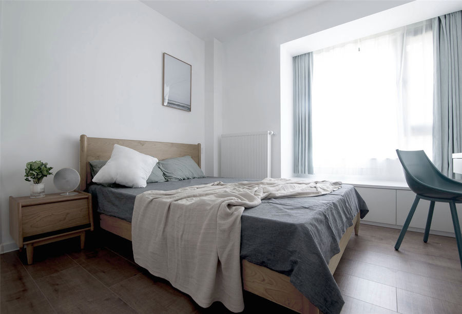
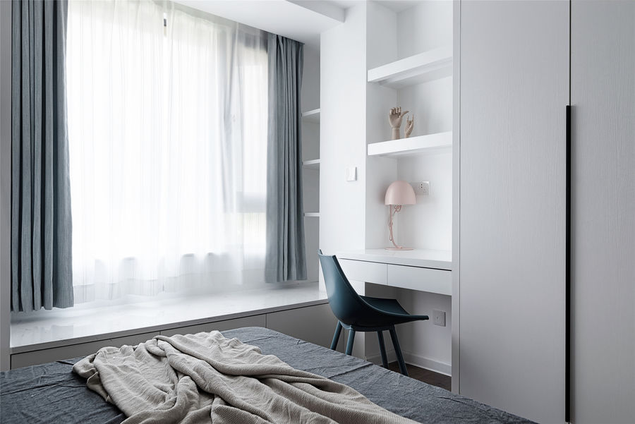
整面衣柜结合改造后的飘窗台,解决主卧收纳问题。衣柜旁的书桌也可作为梳妆台使用。
The whole wardrobe and the modified bay window solve the storage problem of the master bedroom. And the desk next to the wardrobe can also be used as a dressing table.
儿童房 CHILDREN'S ROOM
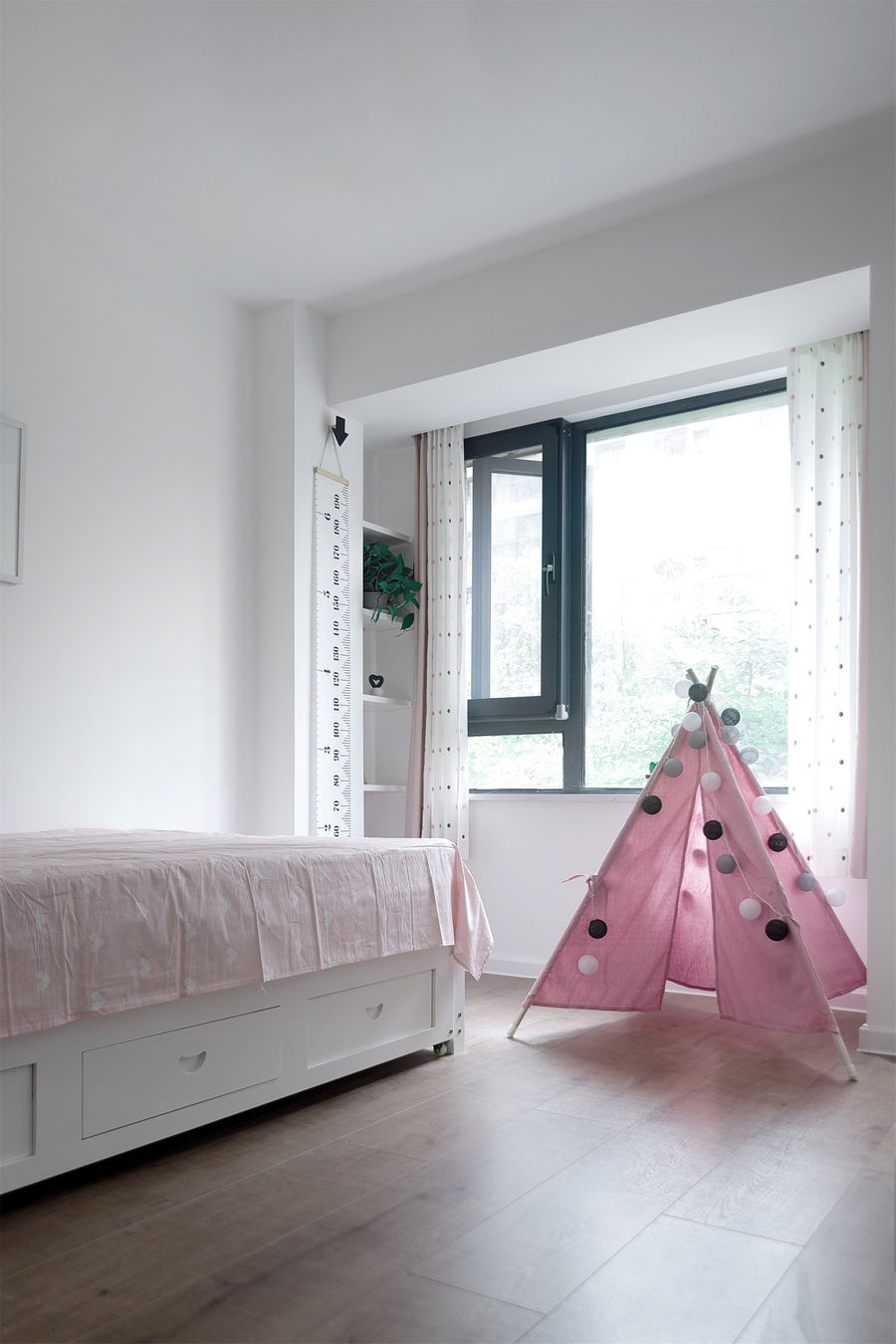
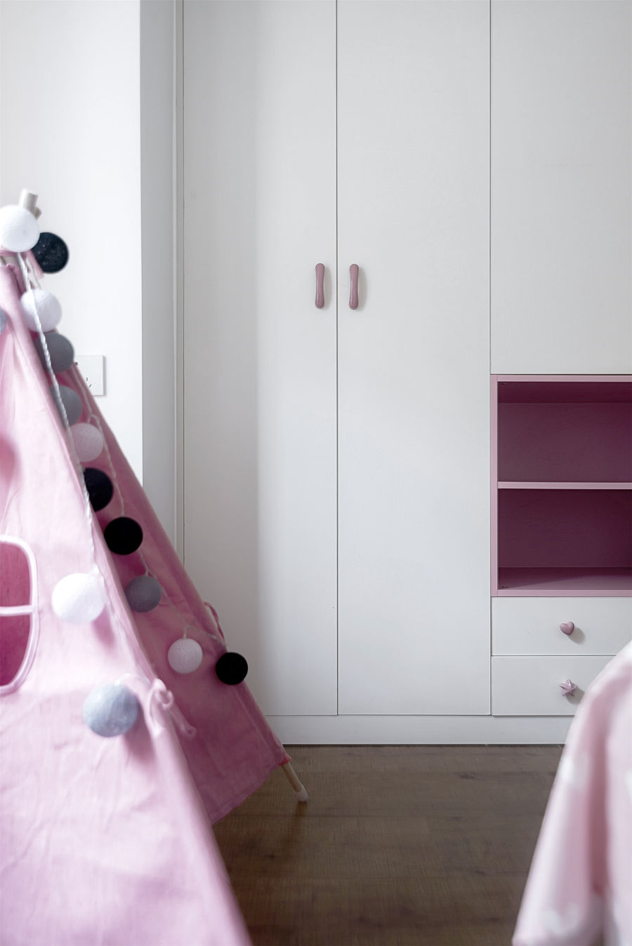
儿童房相对简单。随着年龄的增长,房间的状态是会产生变化的,因此这个阶段只是满足必要的功能性需求,为未来留下改动的余地。
The daughter's room is relatively simple. As their daughter grows old, the state of the room will change. At this stage, we are only to meet the necessary functional requirements, leaving room for changes in the future.
原始结构图 BUILDING SERVEY PLAN
平面布置图 FLOOR PLAN
项目名称 | 木睦
项目地址 | 明发城市广场 南京·浦口
主案设计 | 云行设计
设计团队 | 云行空间建筑
设计周期 | 2017.03-2017.10
建筑面积 | 108㎡
项目类型 | 平层
施工造价 | 25万
摄影版权 | 裴好好
主要材料 | 水泥砖、KD板、烤漆橱柜






评论(0)