设计说明:
考虑到这个项目是旧厂房进行改造的,所以我们在建筑结构上并没有很大改动,而是在原有的结构上设计,进一步美化外观。由于这是一个顺德私房菜,并且空间相对是很足的,所以我们优先考虑中式与小资风格的相结合,保留中华的装饰以及西方一些元素的结合,这样既不失原有的韵味,也能带点潮流的感觉,更好地提供一个用餐的环境。
我们用咖啡色来给冲孔镀锌板上色,最后用来装饰建筑的外观,装修里边用到了塑料瓦片和一些绿色植物,即使是低成本,也能营造一个很到位的气氛。
Design note :
Considering that this project was transformed by the old factory building, we did not make much changes in the building structure, but designed it on the original structure to further enhance the appearance. Since this is the private home cuisine in Shunde, and the space is relatively full, we give priority to the combination of Chinese style and petty bourgeois style, retaining the decoration of Chinese and some elements of the West, so as not to lose the original charm, but also A little bit of a trend, better to provide a dining environment.
We use brown color to give the color of the punched galvanized sheet. Finally, it is used to decorate the appearance of the building. Plastic tiles and some green plants are used in the decoration. Even at low cost, it can create a very good atmosphere.
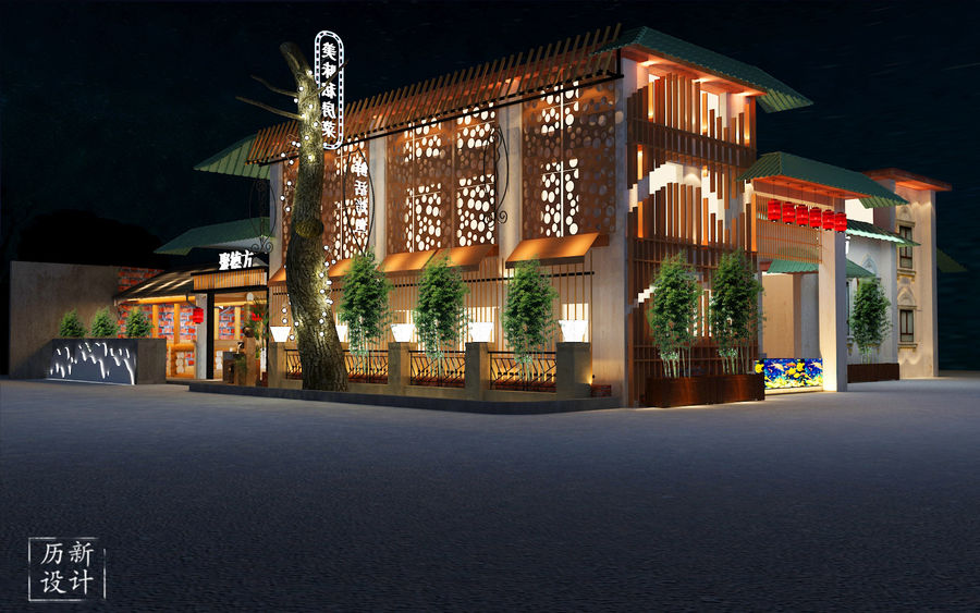
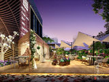
右侧方的一个总体效果图。我们可以看得出这个餐厅的占地面积还是比较大的,冲孔镀锌板的效果很是突出,使得总体不会死板沉闷,而是透出光芒,让人觉得十分高档大气。
An overall rendering of the right side. We can see that the restaurant's footprint is still relatively large, and the effect of punching galvanized sheet is very prominent, so that the overall will not be dull, and the light will make people feel very high-grade atmosphere.
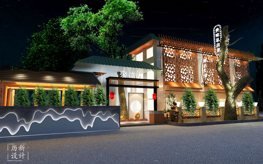
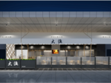
正面看餐厅的总体效果图。我们可以看到外观是比较中式的,入口处悬挂着两个灯笼,左边板块引入“高山流水”的说法,添了几分文人雅致以及品味。入口处右边造景,与左边相对应。整个餐厅都添了一些绿色植物,使得整体多了几分生机勃勃的气息。
Look at the overall rendering of the restaurant on the front. We can see that the appearance is more Chinese, with two lanterns hanging from the entrance, and the left panel introduces the expression of “lofty mountains and flowing water”, adding a bit of elegance and taste. The lands on the right side of the entrance correspond to the left side. The whole restaurant has added some green plants, which makes the whole part more lively.
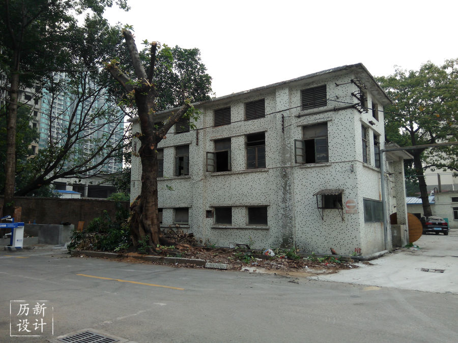
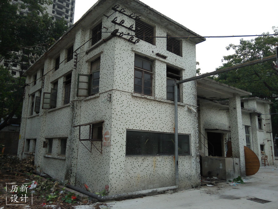
这是没改造前的形象,可以看出这栋楼是很高,面积很大的。
This is the image before the renovation. It can be seen that the building is very high and the area is very large.
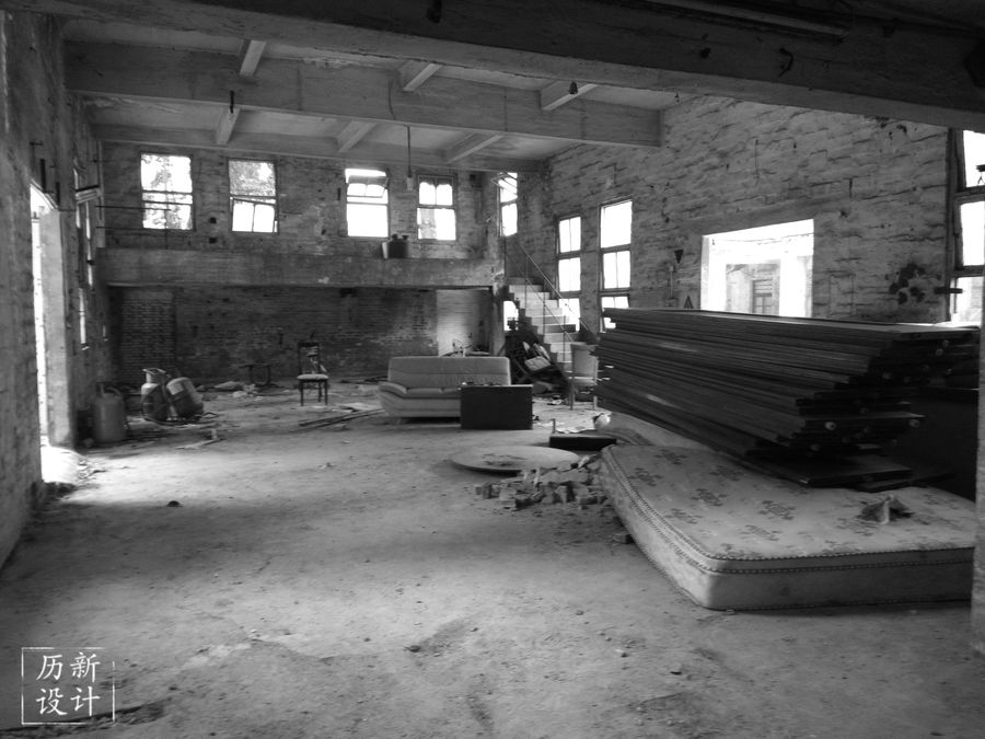
这是厂房的大厅,空间很足很宽敞,还有一个二楼可以稍加利用。
This is the hall of the factory, the space is very spacious and there is a second floor that can be used slightly.
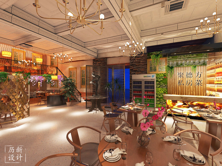
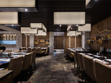
这是餐厅内的构造,收银台之后是清晰明了的餐厅名字,我们可看到桌椅是木制为主,正对着收银台的用餐区加以梅花装饰。左侧是镂空的鱼鳞形状屏风,但用到的材料则是金属,是中式的元素和现代的碰撞。在总体的构造下,我们还可以看到金属吊灯,造型奇特,灯光打在桌椅上,配以绿植和假花的点缀,用餐环境是很静谧也不失高雅的。
This is the structure inside the restaurant. After the checkout counter is the name of the restaurant. We can see that the tables and chairs are mainly wooden, and the plum blossoms are decorated in the dining area of the checkout counter. On the left is a hollow fish scale-shaped screen, but the material used is metal, which is a Chinese-style element and a modern collision. Under the overall structure, we can also see the metal chandeliers, the unique shape, the lights on the tables and chairs, with green plants and fake flowers, the dining environment is very quiet and elegant.
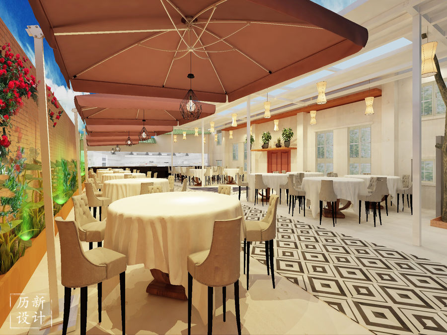
餐厅露天用餐区设计的颇有小资情调,总体以纯白色为主,桌椅整齐摆放,中间菱形花纹的地砖让总体格局显得别具一格。焦糖色遮伞下,是菱形的金属吊灯,黑色镂空可见暖黄色灯泡,温馨的灯光将在场的氛围又提高了。
The open-air dining area of the restaurant is designed with a petty bourgeoisie. The overall design is pure white, and the tables and chairs are neatly placed. The middle diamond-shaped floor tiles make the overall pattern look unique. Under the caramel color umbrella, it is a diamond-shaped metal chandelier, and a black light bulb can be seen in the black hollow. The warm light will enhance the atmosphere.






评论(0)