玩转概念元素,将品牌标识力量融入建筑结构
设计与家具之间的“野蛮”生长,不定义,不束缚
Play with conceptual elements,
incorporate the power of brand identity into the structure,
The "savage" growth between design and furniture is not defined or bound.
F L Y ¢ D E S I G N
⊙
# 迪 欧 展 厅 #
❧
美 · 因 苛 求
专注于家私板块的家居品牌DIO SPACE迪欧空间,二十余年发展历程一直致力于为消费者提供更满意的居住空间,拒绝墨守成规、标签化,探寻无限可能,这份偏执与热爱和菲拉在理念上如此契合,冥冥之中自有注定,迪欧&菲拉之间,必然会有一场美学碰撞,一场大秀帷幕即将拉开,与到访者来开启一场沉浸艺术展。
Focus on household brand furniture plate DIO SPACE DIO SPACE, more than 20 years development course has been committed to provide consumers with more satisfactory living SPACE, refused to rut, labels, and explore the infinite possibility, the paranoid and love and vera so fit on concept, shadow has its own doomed, DIO & vera, there will always be an aesthetics of the collision, A big show is about to open, with visitors to open an immersive art exhibition.
不虚无地为呈现而呈现,思量品牌故事、品牌力量,以logo文化变转结构形态融入空间设计;极具标识性的迪欧品牌D I O字母元素,将其解构放置建筑之内,元素、内涵、哲思,有所观、有所感;着力在结构上营造空间印象使其能包罗万象,基于展厅本身特质而产品高频率更换性的思考,以不变又幻变的形态应万变。
To present for the sake of presenting without nothingness, to consider the brand story and brand power, to change the structure of logo culture into the space design; Highly marked DIO brand D I O letter elements, its deconstruction placed in the building, elements, connotation, philosophy, some view, some sense; Focus on the structure of the space to create an impression so that it can be all-inclusive, based on the characteristics of the exhibition hall itself and the high frequency of product replacement of the thinking, with constant and unreal shape should change.
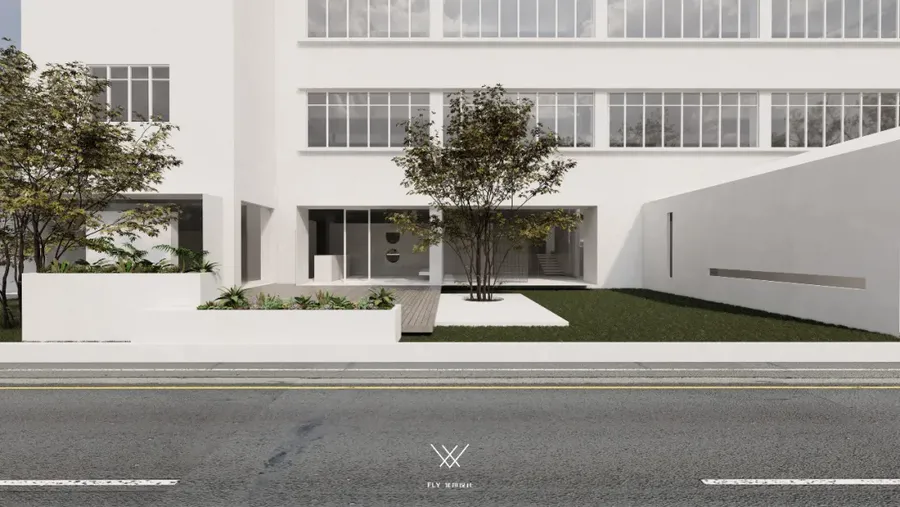
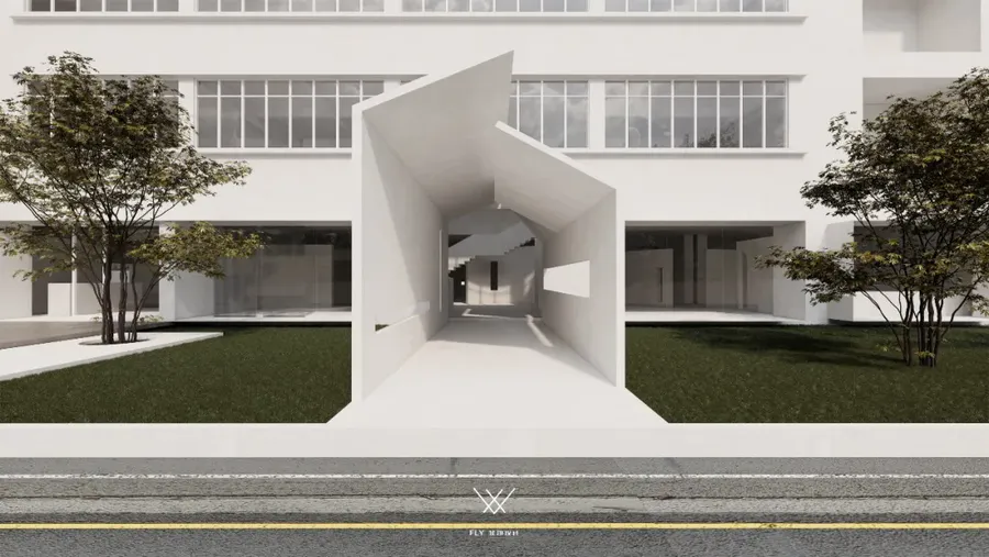
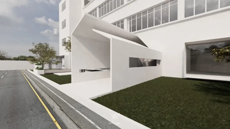
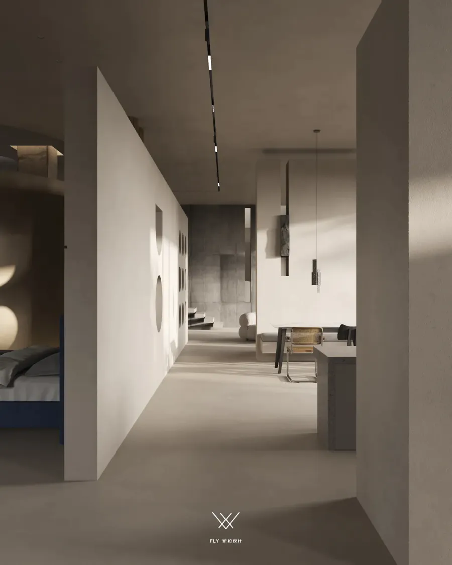
展厅入口通道以微建筑的概念展开,由小及大、由外及里,循序渐进的感官掌控形态;抛去承担通道的物理使用功能以外,悠长廊道更是扮演着一个氛围制造者的角色,通道与阻隔双重角度的作用,亦是内外空间的过渡,给予到访者恰当的情绪缓冲以及神秘感、好奇心的驱动加载时间,以更为匹配和饱满的情感状态回应所处功能空间。
The entrance passage of the exhibition hall is developed with the concept of micro architecture, from small to large, from outside to inside, the form of sensory control step by step; Cast to take physical function for the channel, the long corridor, the role of maker plays an atmosphere channel and blocking the role of double Angle, is also the transition of inner and outer space, to give visitors the appropriate emotional buffer and mystery, curiosity drive loading time, with more matching and full of emotional state response function space.
入口通道以结构打造包裹感、沉浸感的同时,不忘空间的开放与互动性,比例各异的长方形镂空于墙两侧,顶面新异的“人”字廊顶,丰富结构的多变性展现功能与趣味的结合。
At the same time, the openness and interactivity of the space are not forgotten. Rectangular hollowedness of different proportions is placed on both sides of the wall, and the new "people" corridor roof on the top surface enricses the versatility of the structure to show the combination of functions and interest.
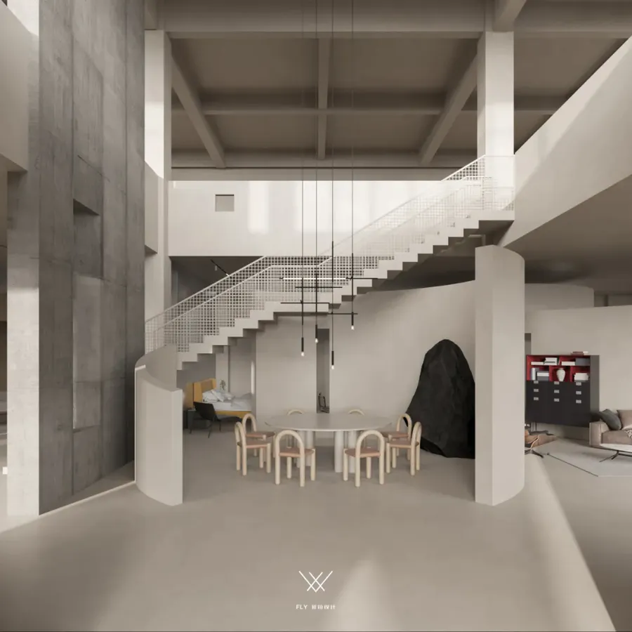
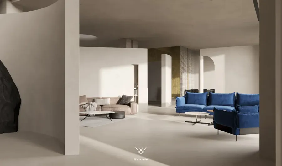
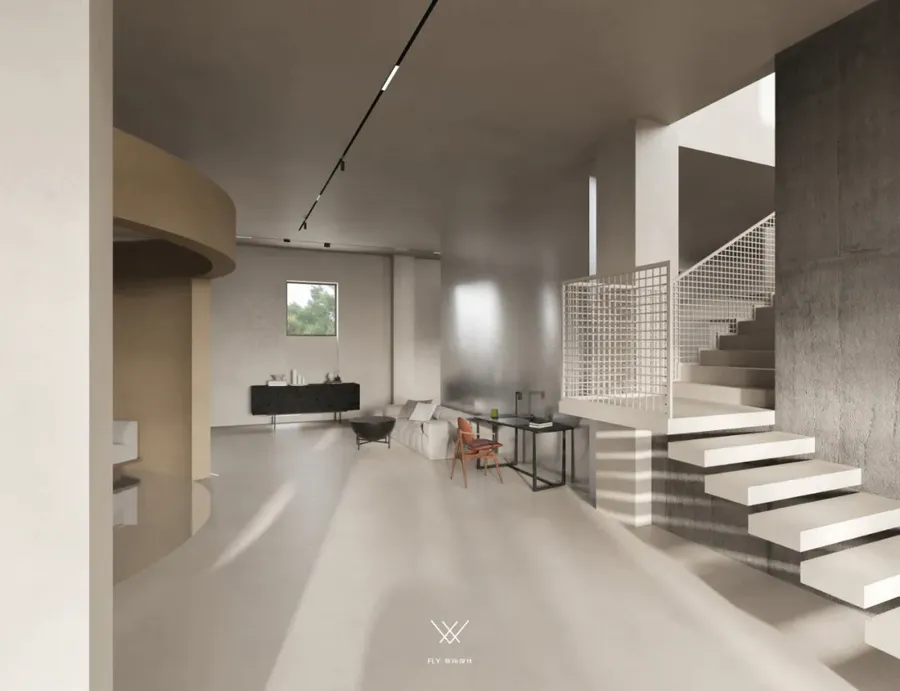
进入内部展厅直面第一视图,不规则的、不划边界的态势依然可呈现圆的包裹感,生成注意力落点令到访者自动聚焦的同时,网格镂空状楼梯悬浮而上,由左及右与呈现圆状结构仿若同胞之物,故事的交流与延伸传递着和谐与共生。
Inside the exhibition hall face to face with the first view, irregular, don't cross the border situation still can provide a sense of the package of round, generate attention point to visitors of automatic focusing at the same time, the grid is hollow-out shape on the stair is suspended and, by the left and right and present cone structure like compatriots, with communicate with harmony and symbiosis of the story.
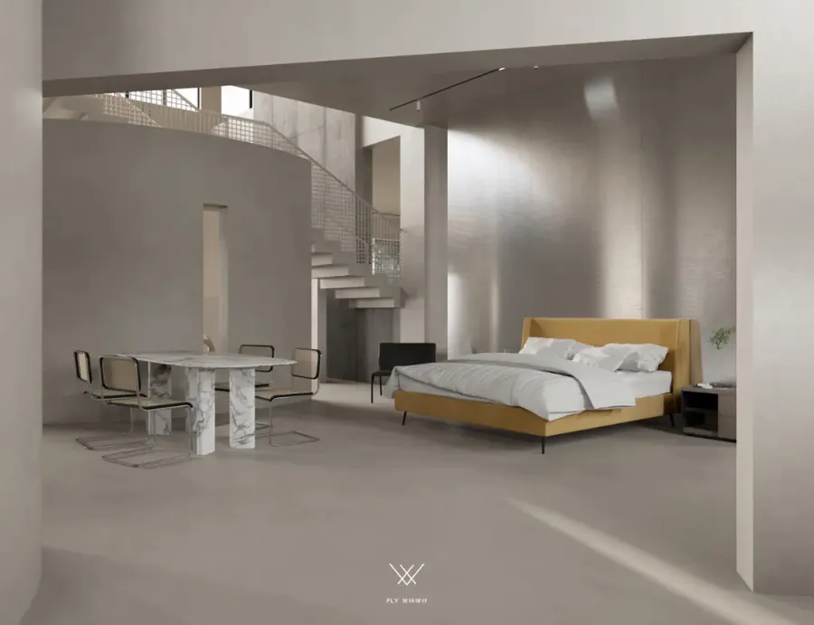
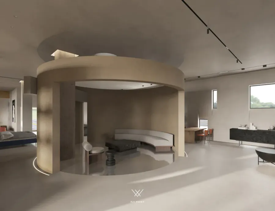
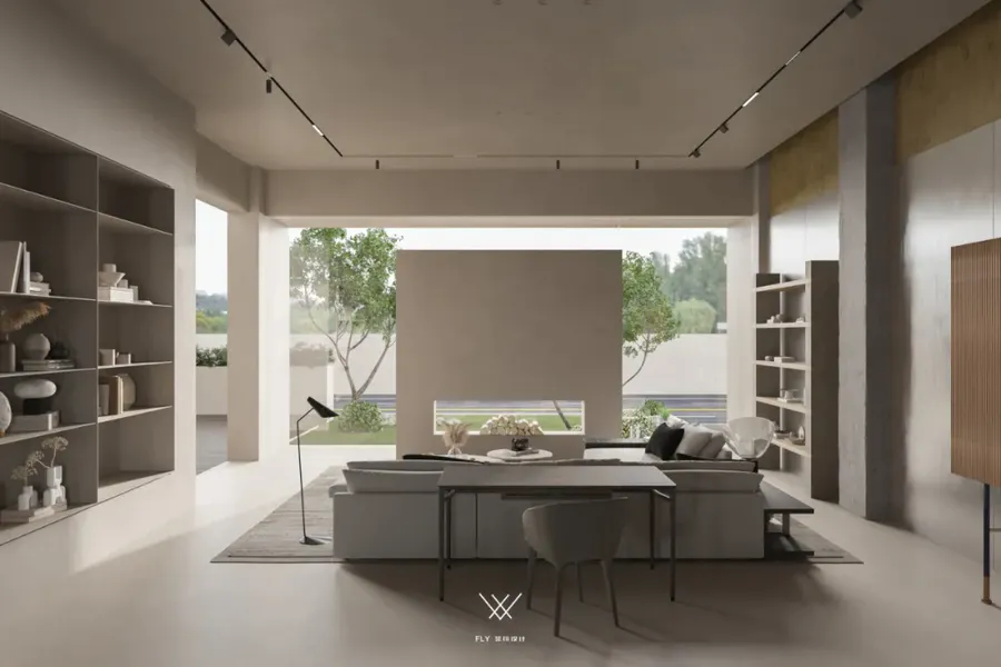
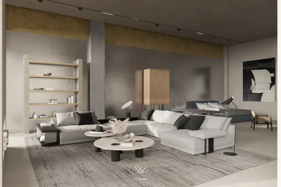
视角内斜插区域上空的横柱便是D I O中的I,借而体块的穿插重组形成新的限定空间,轻盈体感分割形成区域表达的独立空间。依据视觉认知方面的格式塔理论加入的曲线、椭圆等形状,相比硬朗的线条与几何形式,更具抚慰人心的作用,曲直辗转中和有度。
The horizontal column above the Angle of view is the I in D I O. The interspersed and reorganized volume forms a new limited space, and the light body sense segmentation forms an independent space expressed by the region. According to the gestalt theory of visual cognition, curve, ellipse and other shapes are more soothing than the hard lines and geometric forms, with moderate twists and turns.
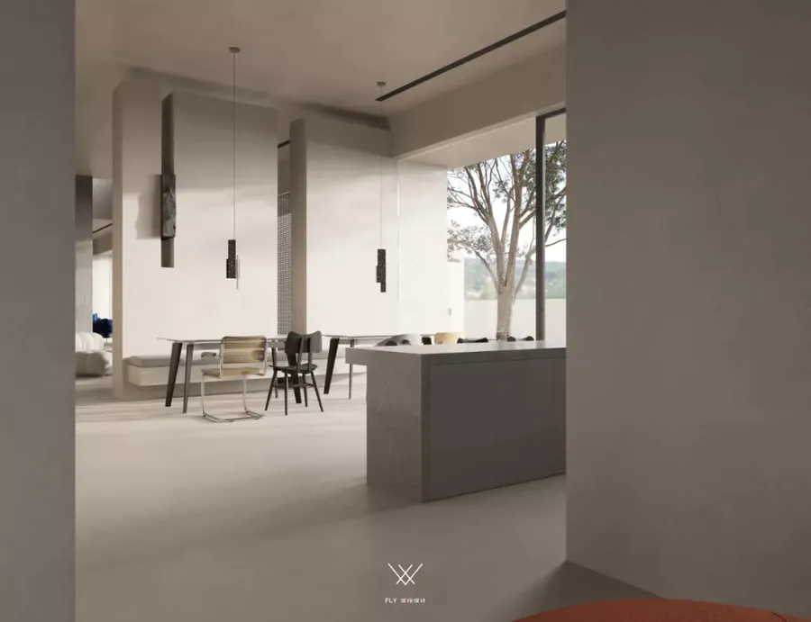
为使受众专注当下内容,避免眼花缭乱无所适从,以空间的配置规划形成引导作用,不止是建筑结构,更是一个藏匿其中的无形的空间指引者。
In order to make the audience focus on the current content and avoid being dazzled and confused, the space configuration and planning form a guiding role, which is not only the architectural structure, but also an invisible space guide hidden in it.
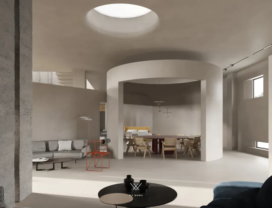
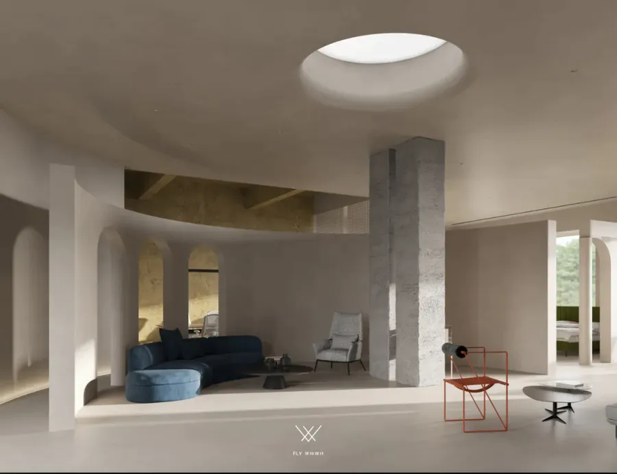
此区域的曲面空间是D I O 中的D衍生的结构形体,拱形门洞、边角制景、顶部仿天窗设计,全方位、多角度塑造空间氛围,我们更偏向于以艺术展览馆的形式去表达,注重当下生活的体验感与仪式感,诉说品牌调性。
The curved space in this area is the structural form derived from D in D I O. Arched doors, corner scenes and imitation skylight design at the top shape the space atmosphere from an all-round and multi-angle. We prefer to express it in the form of art exhibition hall, pay attention to the experience and ritual sense of current life, and tell the tone of the brand.
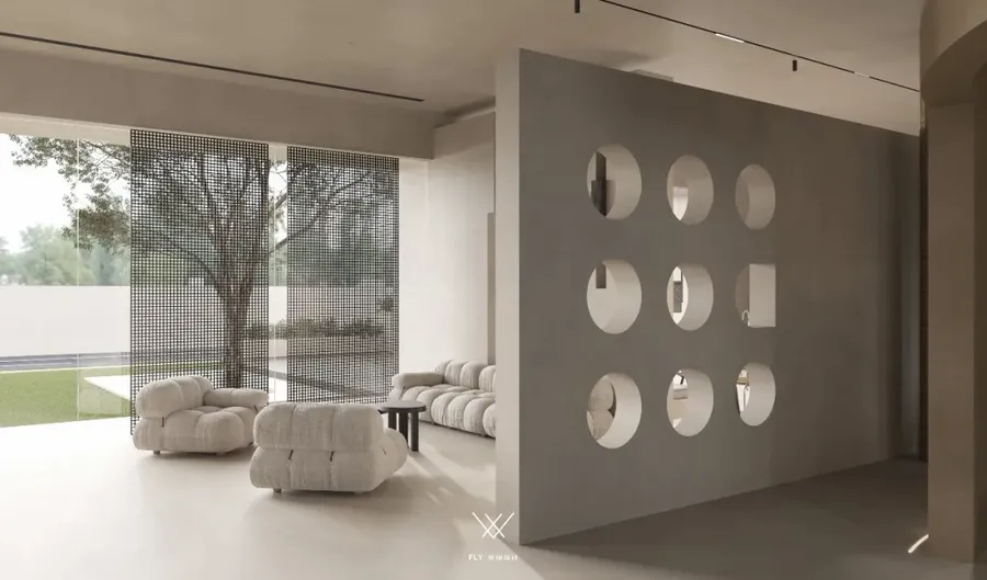
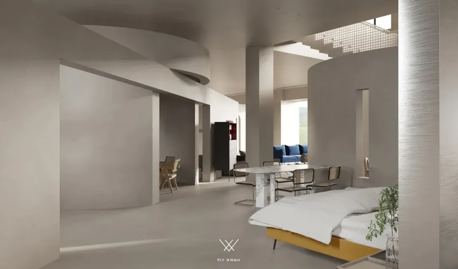
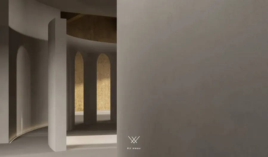
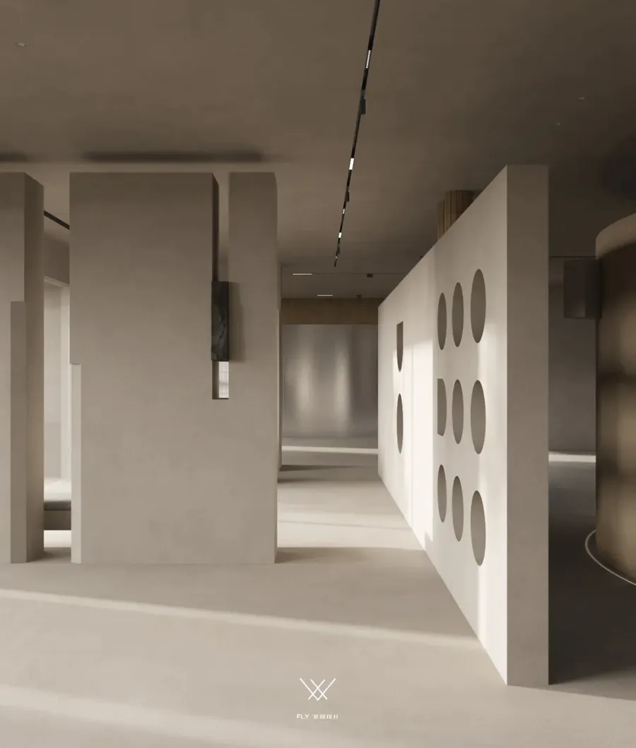
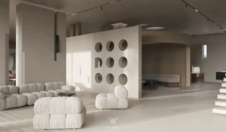
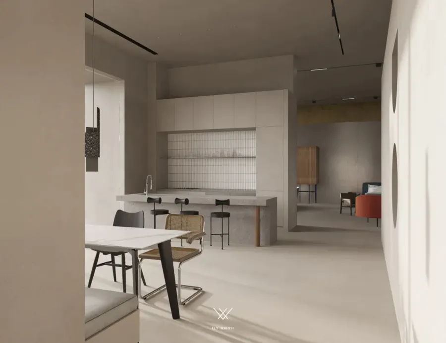
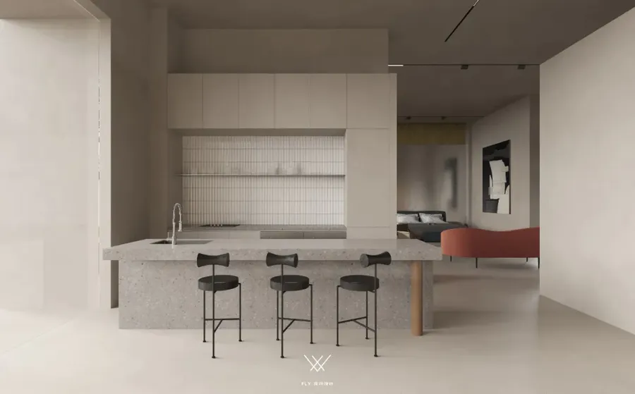
区域设计色彩与结构上有别于其他, 移步换景步步生花的游园式体验感沿途绽放。墙面多个洞口错落一改封闭逼仄,倾吐空间呼吸感;内外互动、光感调和,刚刚好的里外,拉近陈设与生活之间的家居环境,打造相似性、0距离感。
The color and structure of the regional design are different from others, and the garden-style experience of flowers blooms along the way.Wall holes scattered at random a closed narrow, pouring out the sense of breathing space; Inside and outside interaction, light sense of harmony, just inside and outside, close the furnishing and life of the home environment, create similarity, zero distance.
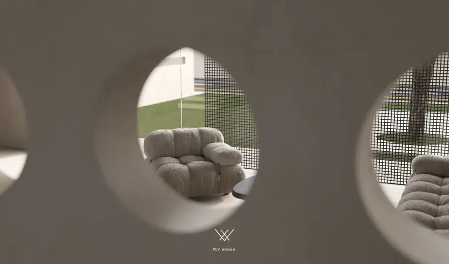
借由洞板的创意形式立于区域边界一侧,通透、趣味,模糊其功能本质,是隔断亦是装饰,利用方向位置为临街一侧作为对外展览窗口 ,进行空间升值化处理。
The creative form of the cavity board stands on the side of the boundary of the area, which is transparent and interesting, and fuzzy its functional essence. It is also a partition and decoration. The direction position of the side facing the street is used as an exhibition window to carry out space appreciation processing.
而更值得深究品味的细节,于九格洞板内不易察觉的D O暗示品牌标识,与无形处、于处处,见品牌魅力。
And more worthy of in-depth taste details, in the nine holes in the plate is not easy to detect D O hint brand identity, and invisible, everywhere, see the brand charm.
工具结构的功能转换,结构形式表达的无限可能;以具体的形态绘制我们抽象的理想,然后回归生活本身,将艺术与功能的天平达到和谐。
The function transformation of tool structure and the infinite possibility of structural form expression; Drawing our abstract ideals in concrete forms, then returning to life itself, harmonizing the balance between art and function.
设计机构 I Designer Department:菲拉设计
项目地址 I Project address:浙江杭州
项目类型 I Project type:硬装设计,软装宅配
面积 I Square Meters:800㎡
户型 I Door Model:商业空间
更多相关内容推荐





亲,您优秀的作品已获扮家家官方公众号推广
公众号文章详情:https://mp.weixin.qq.com/s/ahS-ahhe-wRUr1AvQyiWkg
欢迎转发关注~
更值得深究细细品味