地点:武汉市,东湖新技术开发区,k11写字楼
室内面积:500平方米建筑与室内
设计团队: ZONES众舍空间设计
设计团队:王辉,戴奇伟, 李伟军, 赖倩, 崔邦琛
设计内容:室内设计、灯光设计、软式设计
主要材料:木纹膜、块毯、钢化玻璃、钢板、亚克力
设计期:2018.05施工期: 2018.06-2018. 08
施工方:壹辰(武汉)装饰设计工程有限公司
摄影: 汪海波
Location: Wuhan, Donghu New Technology Development Zone, k11 office building
Indoor area: 500 square meters
Architectural and Interior Design Team: ZONES
Design team: Wang Hui , Dai Qiwei, Li Weijun, Lai Qian, Cui Bangyu
Design content: interior design, lighting design, soft design
Main materials: wood grain film, rug, tempered glass, steel plate, acrylic
Design period: 2018.05
Construction period: 2018.06-2018. 08
Construction party: Yuchen (Wuhan) Decoration Design Engineering Co., Ltd.
Photography: Wang Haibo
众舍设计受邀为最美期待(武汉)科技有限公司打造一个合作共享的办公空间,该项目位于武汉市,东湖新技术开发区,k11写字楼内,层高约4m。本项目旨在是激发灵感并改善工作环境,提倡随性自由,没有束缚感的办公空间。管理者与员工共同工作,上层与下属阶级模糊化,工作合作交流更加方便。
ZONESDESIGN Design was invited to create a cooperative and shared office space for the most beautiful (Wuhan) Technology Co., Ltd., which is located in Wuhan, East Lake New Technology Development Zone, in the k11 office building, with a height of about 4m. The project aims to inspire and improve the working environment, promoting an office space that is free and free from restraint. Managers and employees work together, the upper and lower classes are blurred, and work and cooperation are more convenient.
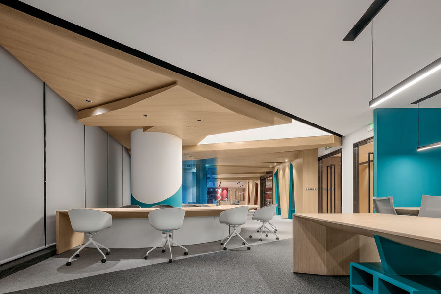
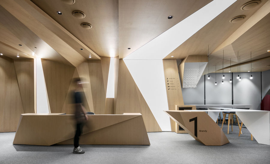
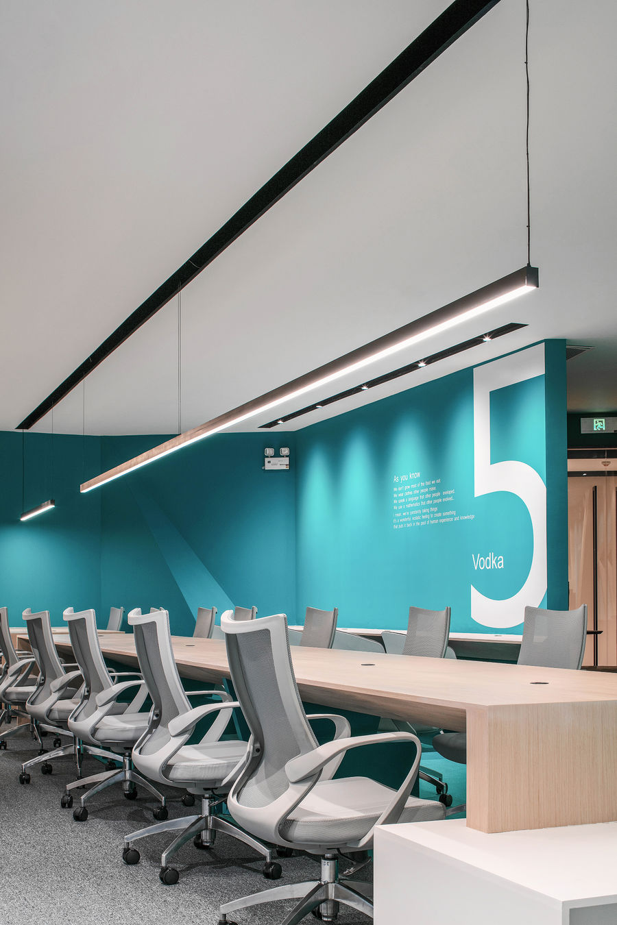
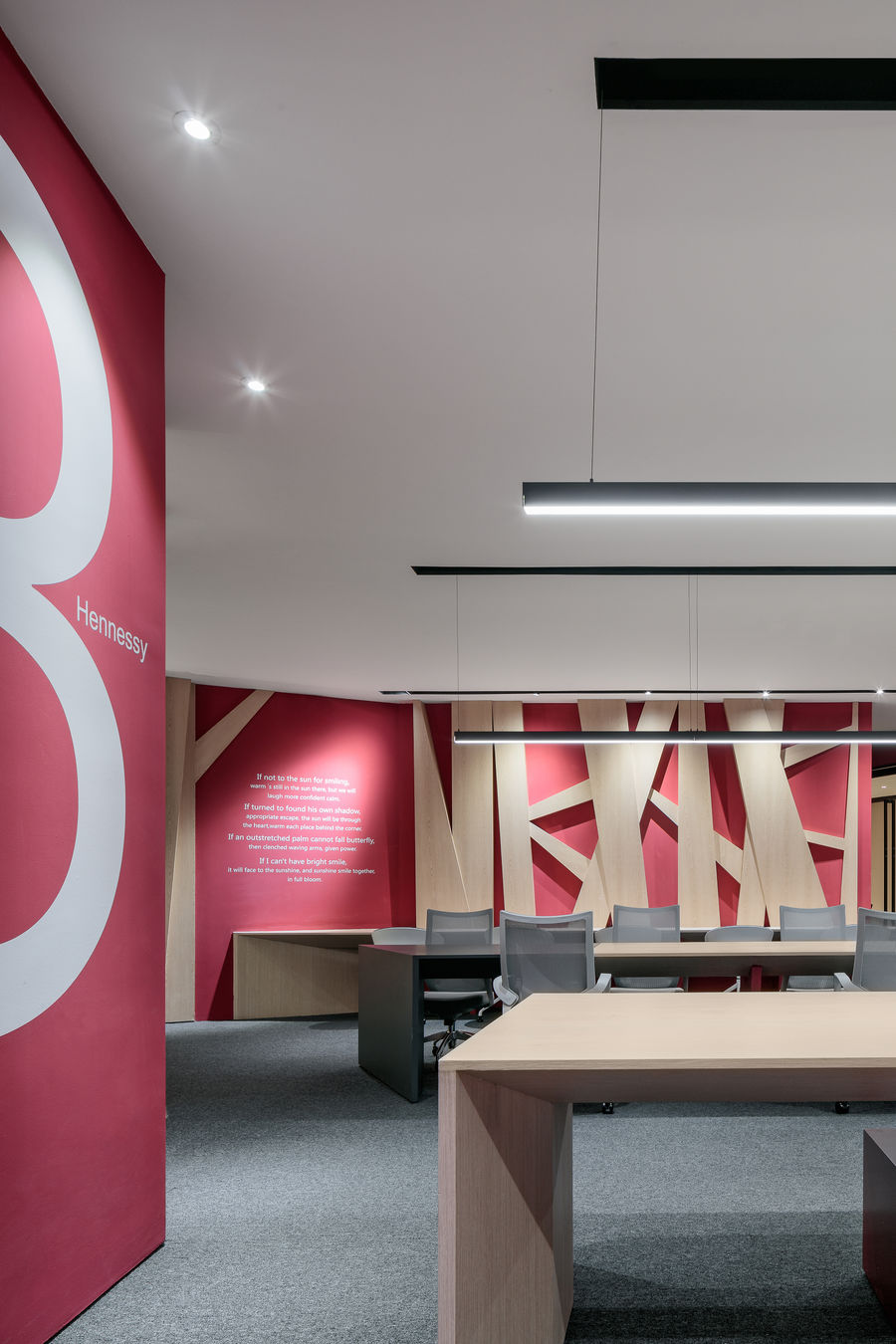
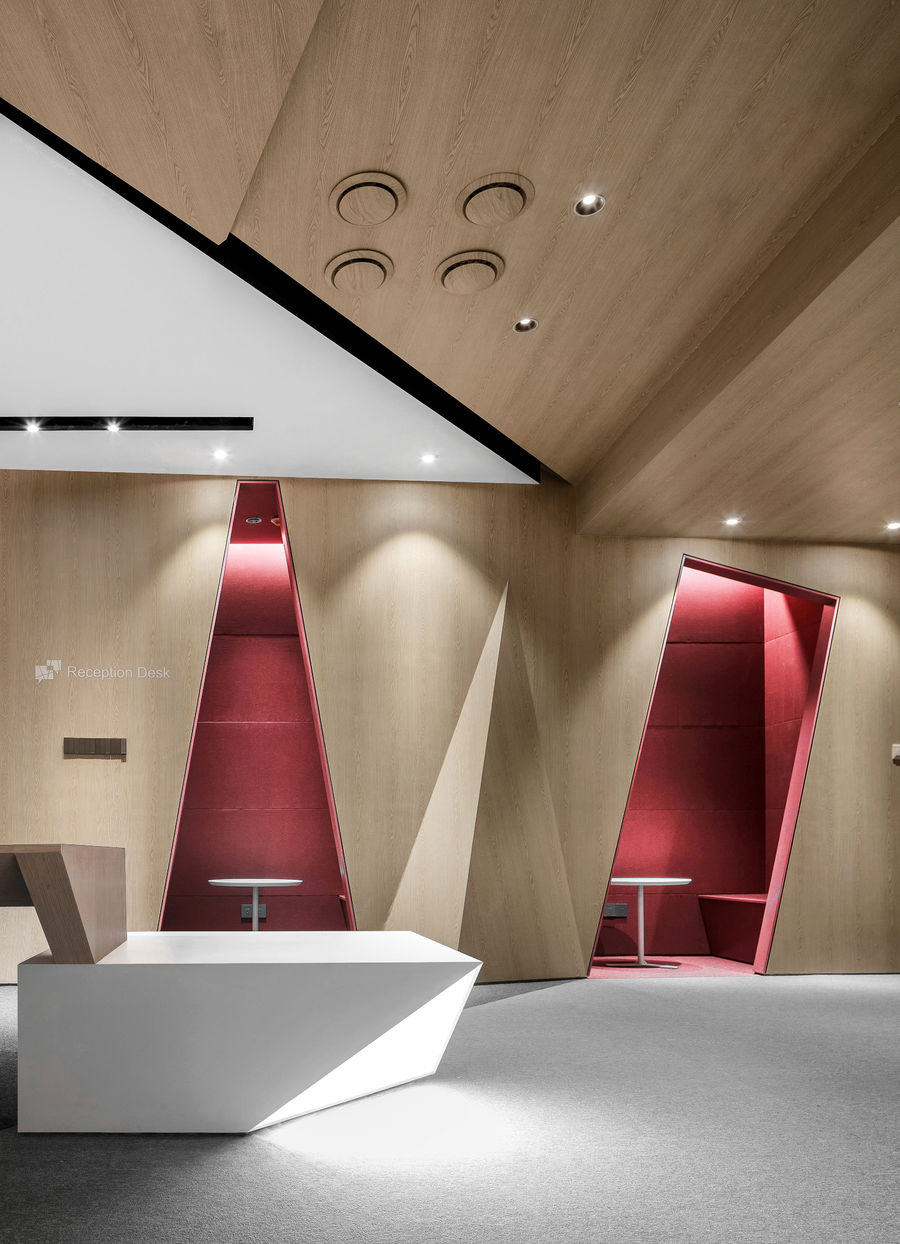
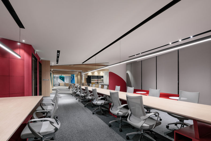
众舍设计为该空间打造了具有现代感的开放式设计方案,顶面与立面的木构造进行了几何化的切割,交叠,重组,看似随机但是依然有序,同时为空间带来一丝的不确定性。且在其中加入了软膜材质的灯光面,可以说是点睛之处,前台的家具设计上与顶面立面的木构造相呼应。明亮的色彩和木纹加以巧妙运用,使得整个空间简洁温暖而有活力。
ZONESDESIGN created a modern and open design for the space. The top and façade wood structures were geometrically cut, overlapped, reorganized, seemingly random but still orderly, while bringing a touch of space to the space. Uncertainty. And the light surface of the soft film material is added to it, which can be said to be the finishing touch. The furniture design of the front desk echoes the wooden structure of the top façade. The clever use of bright colors and wood grain makes the space simple, warm and vibrant.
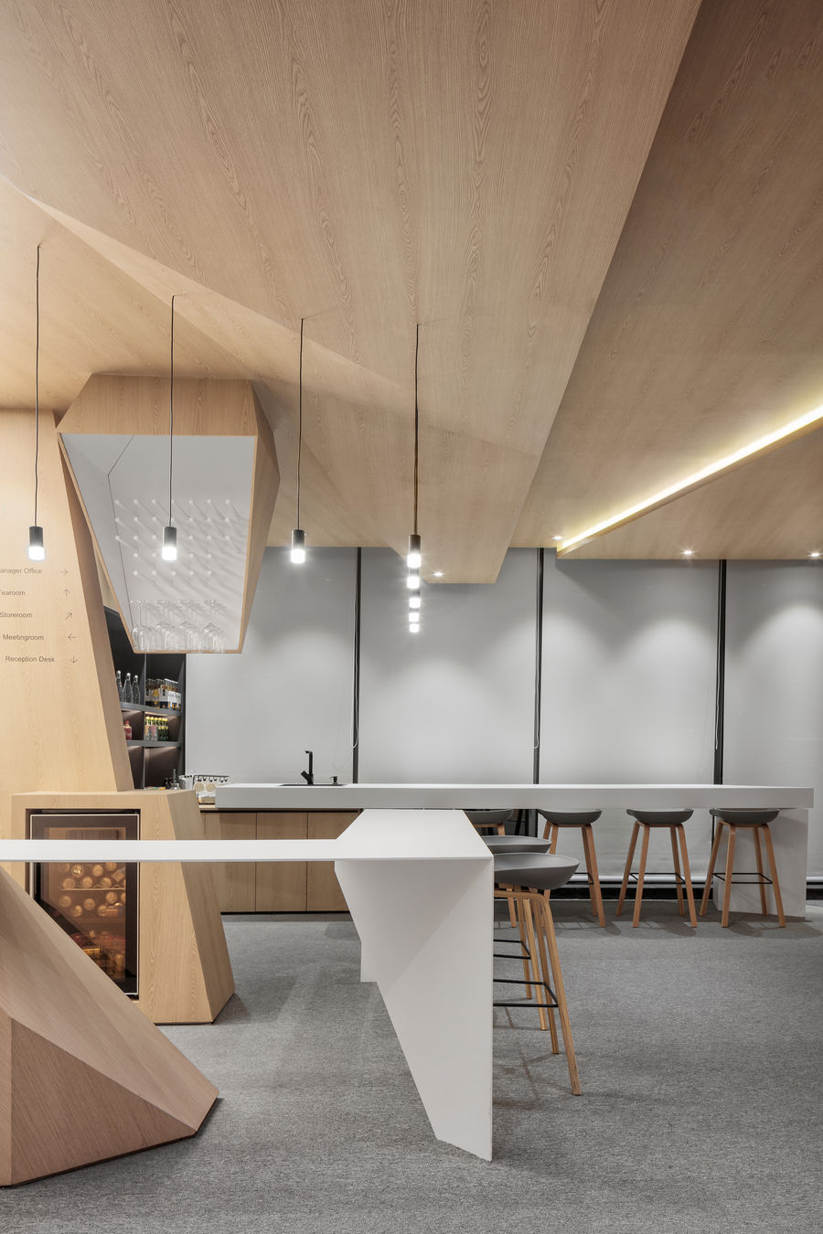
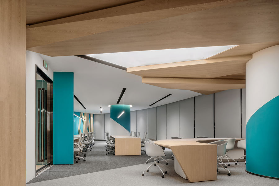
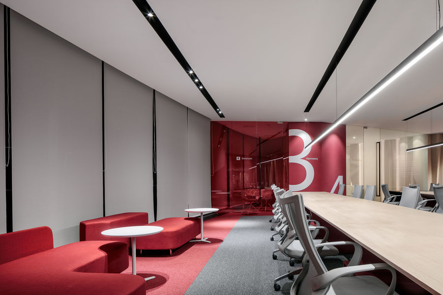
彩色的立柱与几何的地毯和简洁的家具相互搭配,显得十分的和谐。顶面的木构造贯穿了整个天花板,将工作区域和中间的公共区域连接起来。
The coloured columns are perfectly matched with geometric carpets and simple furniture. The top wood structure runs through the entire ceiling, connecting the work area to the common area in the middle.
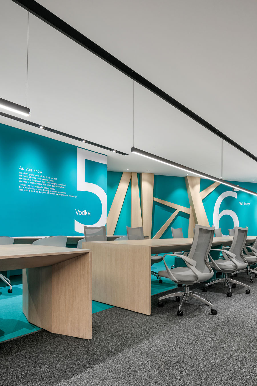
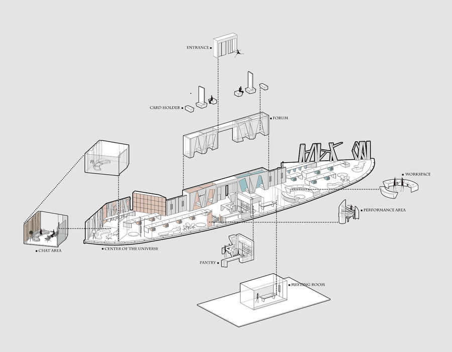
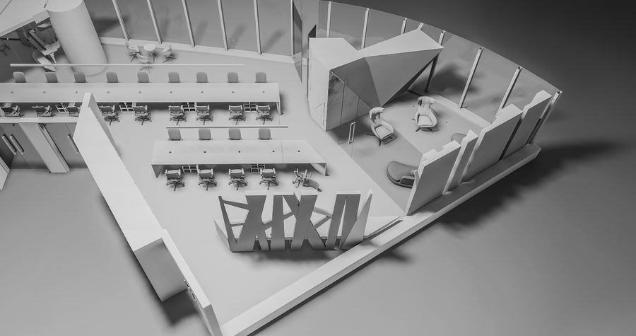
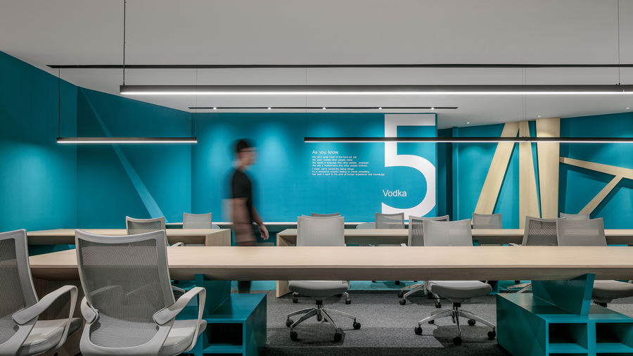
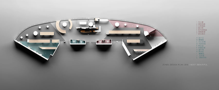
在平面布局上有意增强各个空间之间的联系,实现空间中的各种交流,通过不同的颜色进行细致的分区。墙面和地毯上的标识与色彩带来了强烈的视觉冲击,在一种流动的空间形式中划分出不同的区域。
In the layout of the plane, it is intended to enhance the connection between the various spaces, realize various exchanges in the space, and perform detailed division by different colors. The markings and colours on the walls and carpets create a strong visual impact, dividing the different areas in a flowing spatial form.







好看
这就是实拍噢!
像实景一样
像实景一样
这个好看
感觉还不错..
哇啊O!